
Team Leaf
Bold branding, modern web, and custom code.
New to Contra
Team is building their profile!

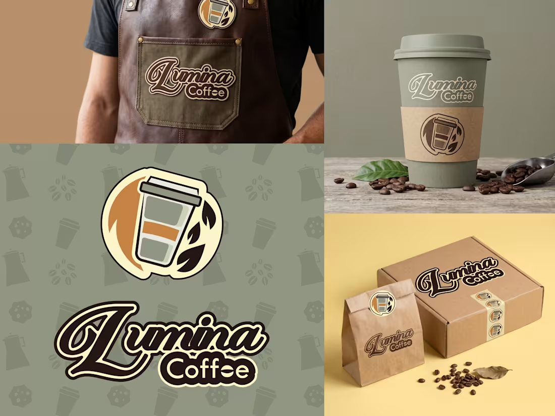
Welcome to the complete visual identity of Lumina Coffee, a brand built to radiate artisanal warmth and organic quality. For this project, we focused on creating a cohesive and versatile brand kit that looks just as stunning on physical merchandise as it does on a digital screen.
☕ The Core Identity: We crafted a flowing, retro-inspired script logo paired with a clean, circular emblem featuring a coffee cup and leaf motif. This duality allows the brand to scale perfectly across different formats.
🌿 The Aesthetic: The visual system is grounded in an earthy, natural color palette, complete with a custom, repeating background pattern of subtle coffee elements to reinforce the brand's organic roots.
📦 Real-World Application: To ensure the brand was fully market-ready, we applied the designs to comprehensive physical mockups, including a stamped shipping box, sealed coffee bags, custom cardboard cup sleeves, and an embroidered leather barista apron.
This project highlights our dedication to end-to-end vector design, ensuring every asset is print-ready and perfectly aligned with the client's vision.
1
1
49
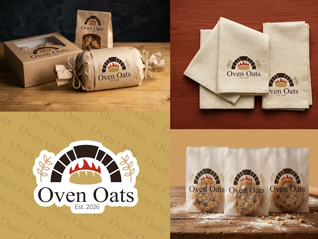
Take a look at how we brought Oven Oats to life! 🥐 We designed this bakery brand to feel immediately warm, inviting, and rooted in rustic, artisanal quality. The goal was to create a homegrown aesthetic that practically smells like fresh baking.
🍞 The Core Identity: We crafted a custom vector emblem featuring a classic brick oven, glowing flames, and a fresh loaf of bread, all framed by elegant wheat stalks. We paired this with a timeless serif font and an "Est. 2026" badge to give the logo a trustworthy, established feel.
🌾 The Aesthetic: The color palette is earthy and natural—using warm bakery browns, crisp blacks, and a vibrant pop of fiery red. We also designed a subtle, repeating background pattern of the brand name to tie everything together across all platforms.
📦 Real-World Application: A brand only truly shines when it's put to use, so we mapped our vector designs onto a full suite of physical packaging mockups. The identity scales perfectly across windowed kraft pastry boxes, twine-tied parchment rolls, stamped linen napkins, and transparent cookie bags.
This project is a perfect example of how a cohesive visual kit can turn everyday baked goods into a premium experience.
1
74