
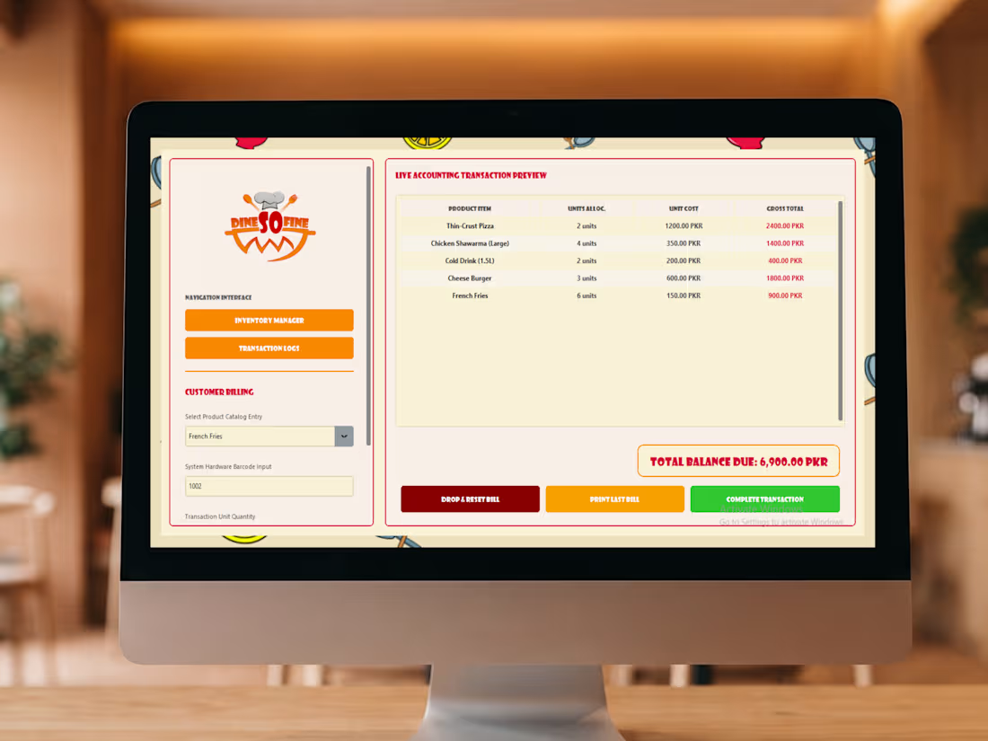
See how we brought the Dine So Fine visual identity straight into their daily operations! 🍔 For this project, we took our robust Enterprise POS architecture and completely reskinned it to match the vibrant, energetic brand we built for this fast-casual restaurant.
🖥️ The Custom UI: We stripped away the standard dark mode and injected the software with Dine So Fine's signature aesthetic. The interface now features a warm, inviting background, bright orange and red navigation buttons, and their custom food-illustration pattern subtly framing the workspace. The brand's chef-hat logo sits proudly at the top of the navigation interface, ensuring the software feels like a true extension of their restaurant.
🛒 Live Restaurant Billing: The screen highlights the live accounting transaction preview in action, effortlessly handling high-volume fast-food orders like pizzas, shawarmas, and burgers with real-time PKR calculations.
⚙️ Under the Hood: While it looks playful and completely bespoke on the outside, it runs on our lightning-fast, localized Python/SQLite architecture on the inside—guaranteeing they can process orders rapidly without ever worrying about internet outages.
This project is a showcase of Team Leaf's capabilities: marrying high-end brand identity design with heavy-duty software engineering to create a seamless, end-to-end business solution.
1
2
158
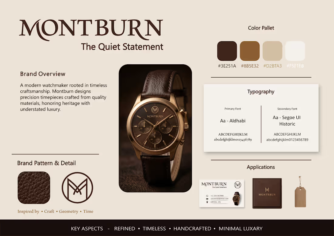
Take a look at the visual identity we crafted for Montburn! ⌚ We designed this modern watchmaker brand to embody timeless craftsmanship and understated luxury, perfectly capturing their core ethos: "The Quiet Statement".
🖋️ The Core Identity: We developed a sleek, geometric 'M' monogram enclosed in a perfect circle, drawing direct inspiration from craft, geometry, and time. We paired this sophisticated mark with refined primary typography (Aldhabi) and clean secondary fonts (Segoe UI Historic) to give the brand a heritage yet decidedly modern feel.
🤎 The Aesthetic: The entire visual system is rooted in minimal luxury, featuring a sophisticated color palette of deep leather browns, warm bronze, soft beige, and crisp off-white. We also integrated a rich, tactile leather texture into the brand pattern to emphasize the handcrafted nature of the timepieces.
📦 Real-World Application: To demonstrate how this identity translates to physical luxury, we mapped the design system onto a suite of high-end tangible assets. The identity scales flawlessly across minimalist business cards, elegant retail hang tags, and a premium presentation box.
This project showcases how a refined, minimal brand kit can elevate a product into a true luxury experience.
1
192
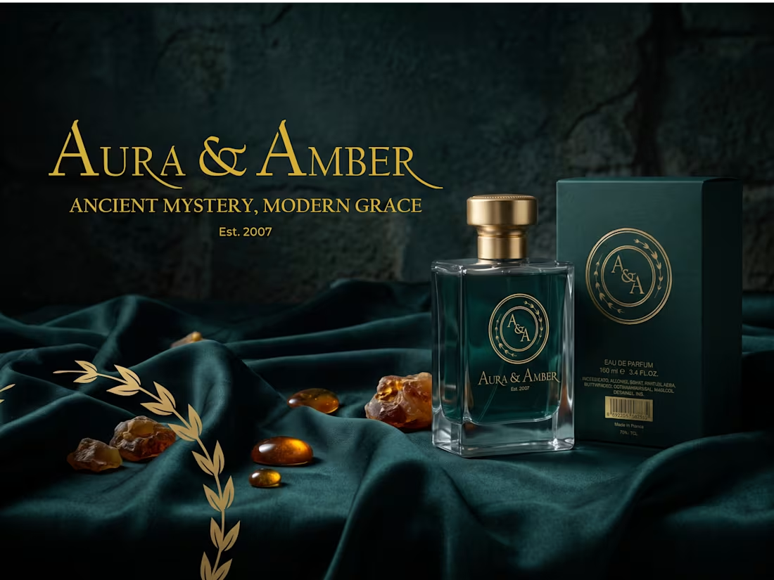
Step into the luxurious world of Aura & Amber! ✨ We designed this premium fragrance brand to exude elegance, sophistication, and a touch of the mystical.
🖋️ The Core Identity: We crafted a striking serif wordmark featuring sweeping, graceful flourishes, paired with a refined "A&A" interlocking monogram emblem framed by delicate laurel details. Anchored by the tagline "Ancient Mystery, Modern Grace" and an "Est. 2007" badge, the logo suite feels timeless and distinctly high-end.
🌲 The Aesthetic: The color system is pure luxury, built on a foundation of deep, moody emerald green contrasted with radiant metallic gold. Displayed alongside draped fabrics, a golden laurel branch, and raw amber stones, this aesthetic perfectly captures the rich, opulent essence of an elite eau de parfum.
🍾 Real-World Application: To showcase the brand in its natural element, we mapped the identity onto stunning packaging mockups. The sleek glass bottle with its heavy gold cap, paired with the matte green retail box, proves exactly how this visual system commands attention on a high-end vanity.
2
340
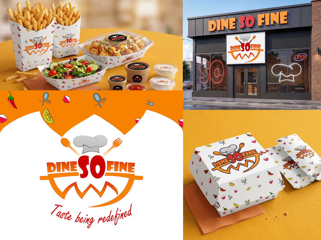
Check out how we cooked up the complete visual identity for Dine So Fine! 🍔 We designed this fast-casual brand to pop with energy, flavor, and a playful vibe that makes you hungry just looking at it.
🧑🍳 The Core Identity: We crafted a bold, appetizing logo that puts the spotlight right on the name, integrating a chef's hat, spoon, and fork right into the typography. Beneath the text, an orange smiling swoosh adds a welcoming touch, all tied together with their signature tagline, "Taste being redefined," in a flowing red script.
🌶️ The Aesthetic: To keep things fresh and fun, we built a bright, high-contrast color palette of vibrant orange, striking red, and crisp white. We then designed a custom, repeating pattern scattered with playful food illustrations—like chili peppers, lemons, and fresh herbs—to give the brand a lively, dynamic feel.
🥡 Real-World Application: We rolled this identity out across a massive fast-food packaging suite, applying the custom pattern to fry boxes, burger cartons, salad boats, paper bags, and sauce cups. We even mocked up a full physical storefront featuring neon window decals and bold exterior signage to show exactly how the brand commands attention on the street.
This project was all about bringing high-energy, mouth-watering visuals to life.
1
227