The network for creativity
Join 1.25M professional creatives like you
Connect with clients, get discovered, and run your business 100% commission-free
Creatives on Contra have earned over $150M and we are just getting started
Back to feedPost

Aesthetically pleasing 😍


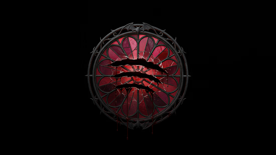
What would Spotify wear for Halloween? 🦇
I don’t usually like to design using well-known brands, but this one was too fun to skip hahaha
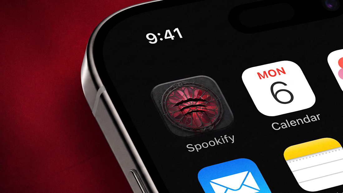
Concept: Spotify → Spookify 👻
- Went with a gothic stained glass window + with bats on the frame
- The original 3 sound waves are now claw...

The network for creativity
Join 1.25M professional creatives like you
Connect with clients, get discovered, and run your business 100% commission-free
Creatives on Contra have earned over $150M and we are just getting started



Related posts

What would Spotify wear for Halloween? 🦇
I don’t usually like to design using well-known brands, but this one was too fun to skip hahaha
Concept: Spotify → Spookify 👻
- Went with a gothic stained glass window + with bats on the frame
- The original 3 sound waves are now claw marks slashed right through the glass
- (Obviously) the green went full blood red
Still instantly recognizable, just a bit more… haunted.
If you use Spotify, would you like it to become Spookify during October? 👀

Great job
Wow 🔥🔥
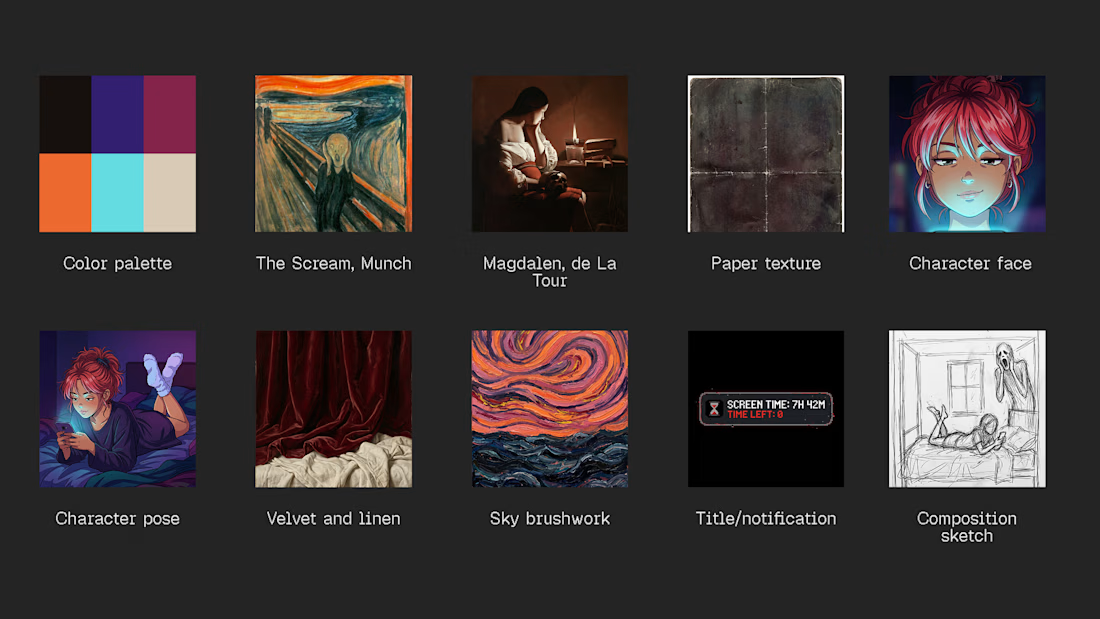
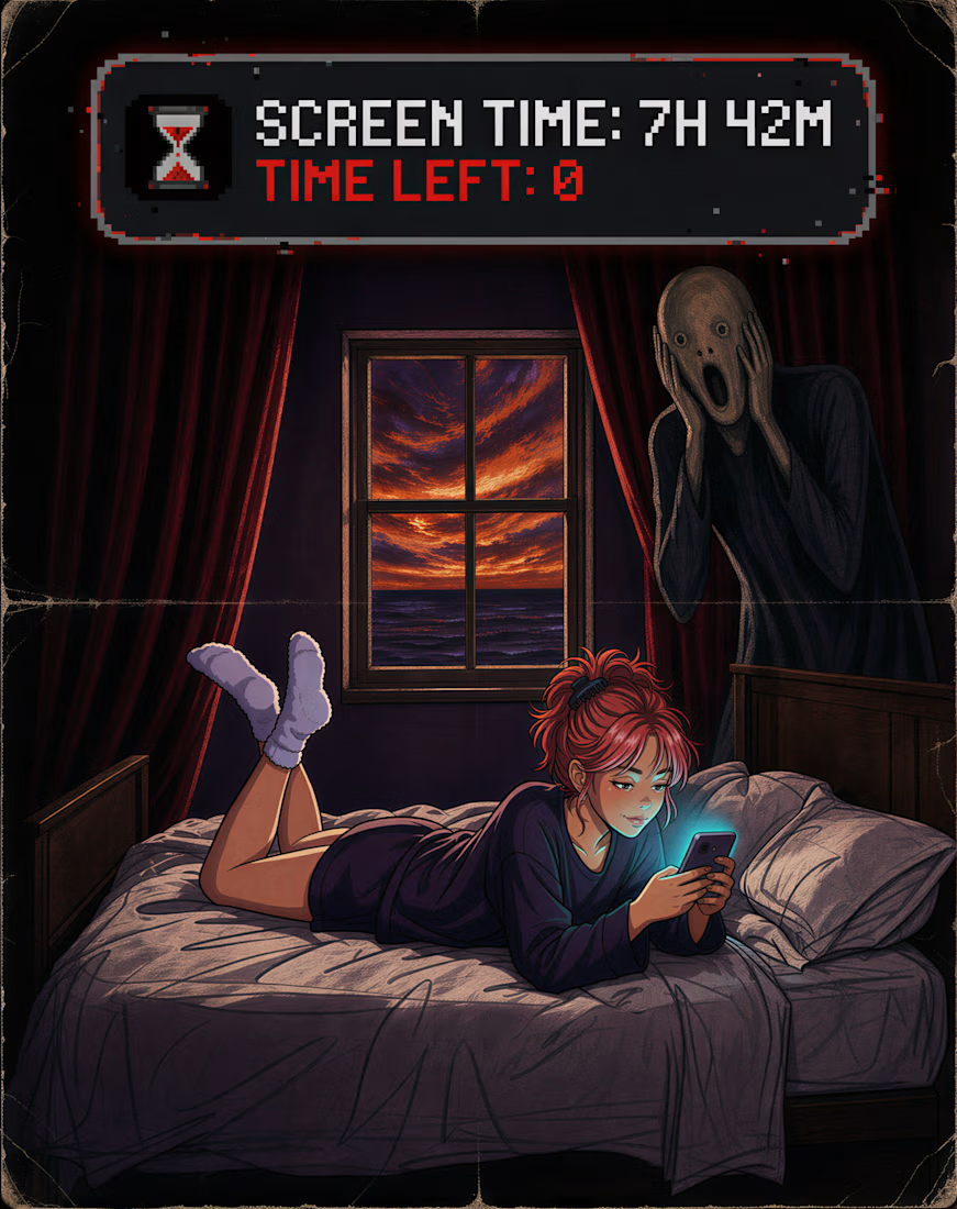
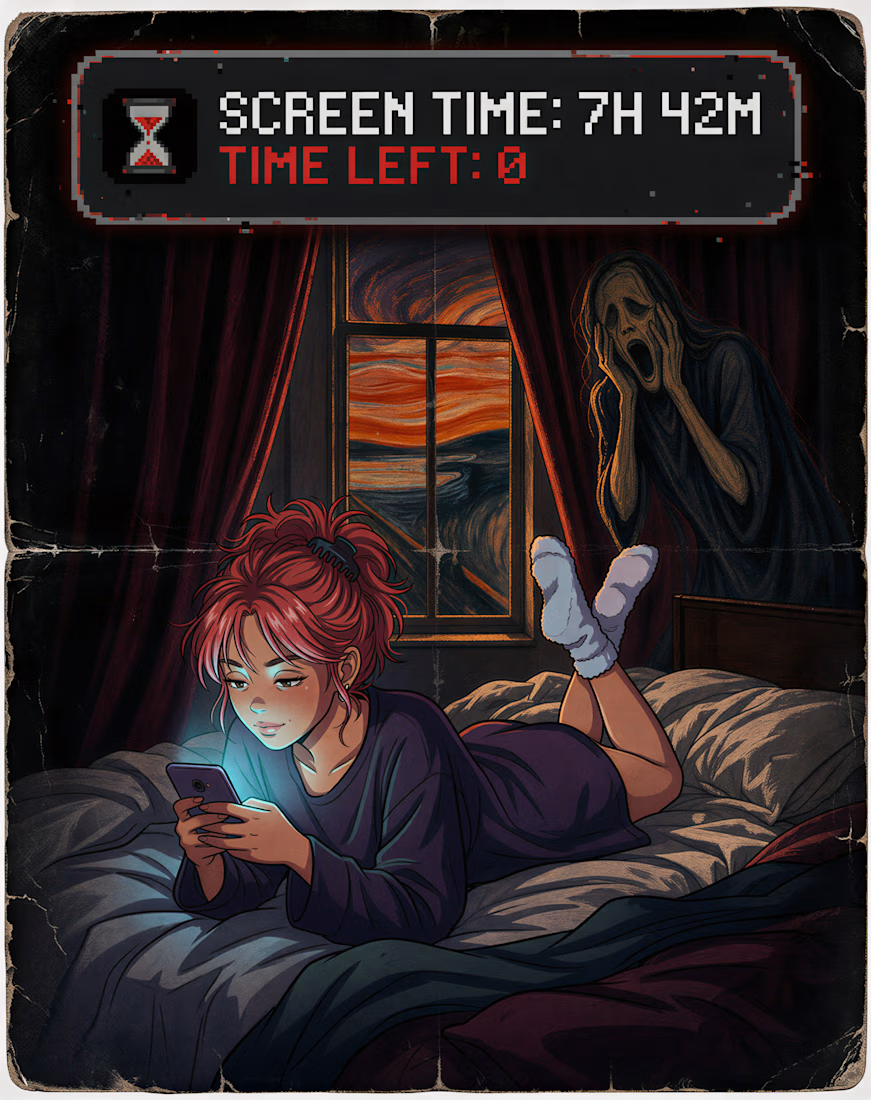
Can AI really juggle 10 REFERENCES? Let's put it to the test!! 👀
👁️ Goal: Create a Halloween poster: a girl doomscrolling in bed while Munch's Scream screams right behind her, and she doesn't notice, the title is "Screen time: 7h 42m. Time left: 0.", while mixing drastically...


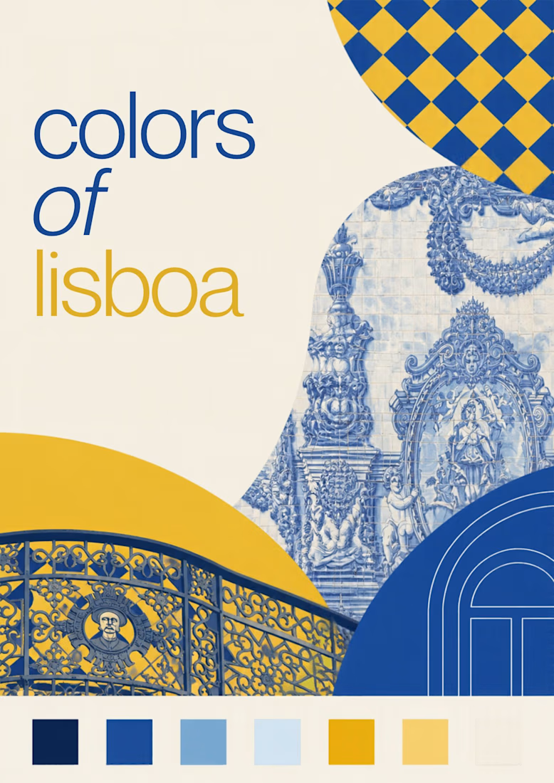
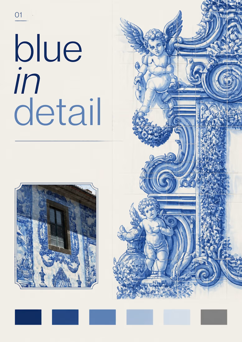
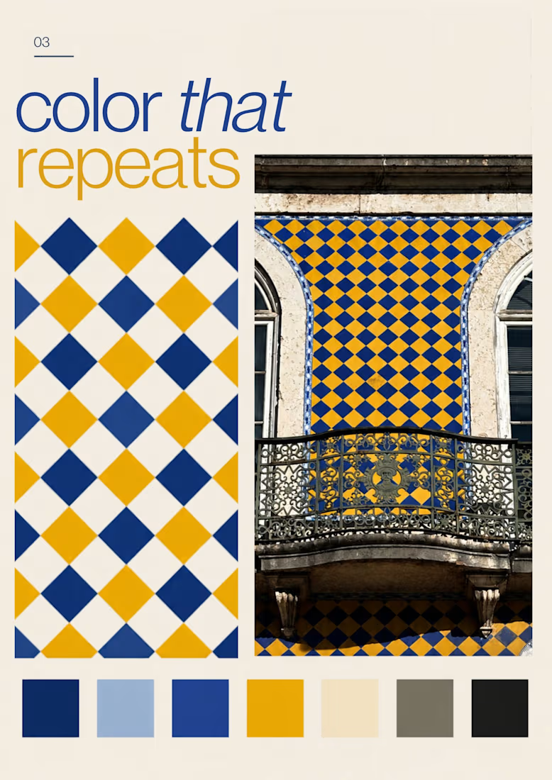
Turning the colors I notice around Lisbon into a series of posters, each inspired by a different photograph.
01 [Blue in Detail] started with the blue Portuguese tiles, exploring their intricate patterns, ceramic tones, and small details.
02 [Color on Repeat] explored the rhythm of blue and yellow tiles, using repetition as the starting point for the design.
I sampled colors from my photographs and used Canva Craft to explore layouts, typography, and graphic elements. Then I refined the designs by hand, adjusting the colors, spacing, and text.