Areeba Rasheed
Fixing messy, confusing, and mismatched identities
Ready for work
Areeba is ready for their next project!
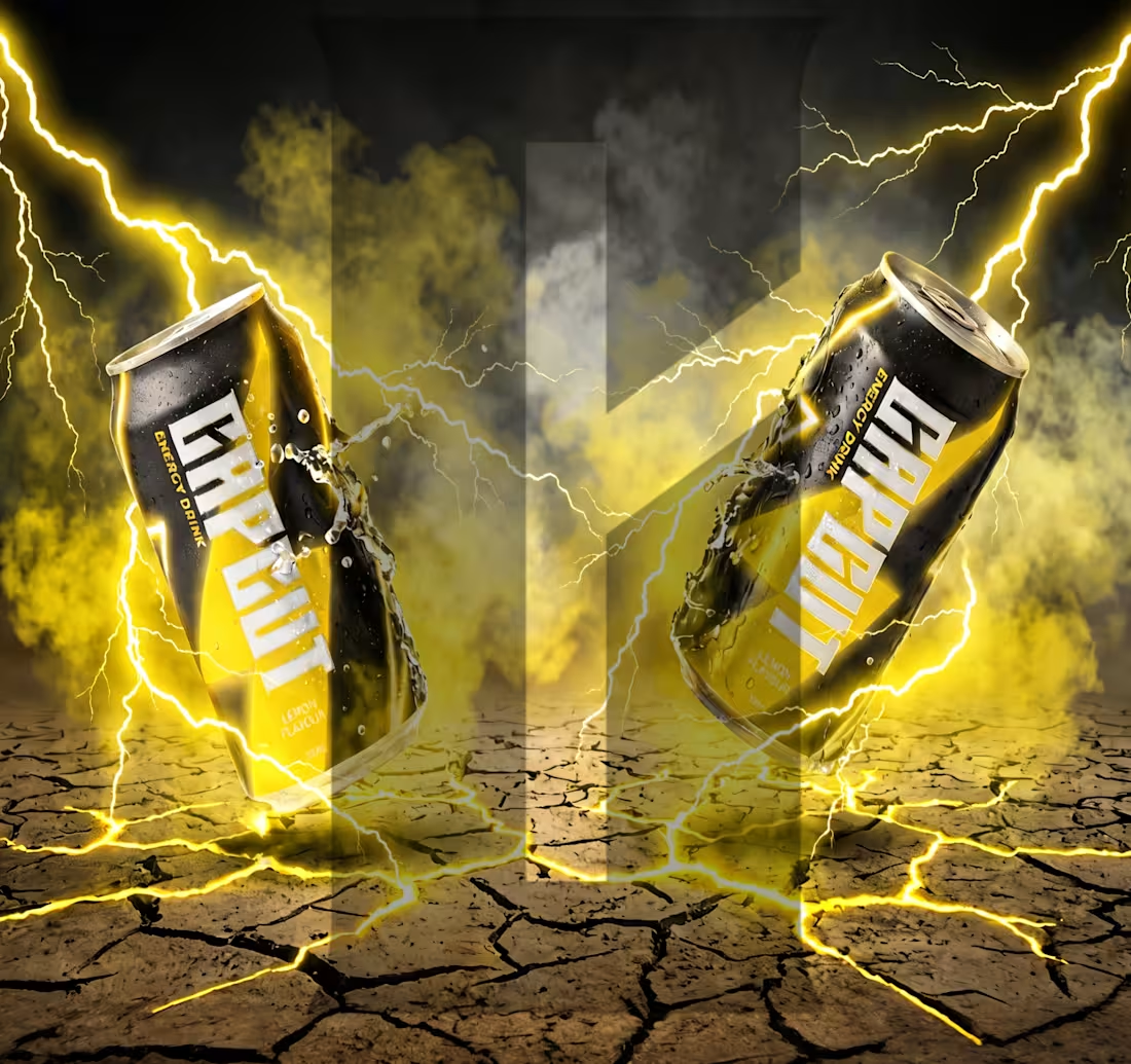
Direction A — CapCut as a Different Industry
CapCut doesn't just edit videos it gives people the power to transform raw material into something sharp and intentional. That feeling? Focused, electric, unstoppable. That's exactly what an energy drink sells.
So I built CAPCUT energy drink.
A beverage brand for creators who don't stop. Not a gym drink, not a gamer drink — the can sitting next to your keyboard at 2am while you're building something.
The name pulls directly from CapCut but earns its place naturally. In film, in design, in beverage, a cut is always an act of precision. The flavor naming follows the same logic, each variant named after a creative state, keeping CapCut's DNA alive without being obvious about it.
Visually matte black base, chromatic accent per flavor, condensed heavy typography, and splash photography that mirrors what a great edit feels like. Controlled chaos, frozen at exactly the right moment.
One question drove every decision: what does CapCut feel like if you could hold it in your hand?
creator name: Areeba Rasheed
contact: areebarasheed102@gmail.com
(mailto:areebarasheed102@gmail.com)Direction A: imagine Capcut as different industry- i chose energy drink
social post instagram:
https://www.instagram.com/p/DZOzIvFCn1K/?utm_source=ig_web_copy_link&igsh=MzRlODBiNWFlZA==
twitter: https://x.com/layeredaesthet/status/2063122370592907572?s=20
1
96
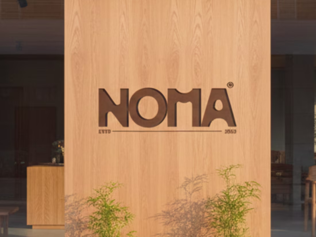
Noma sells Japanese furniture that's minimal by design. So the lookbook had to match that, no clutter, no noise. Just the pieces, the space around them, and clean typography.
watch the full lookbook project here:
https://www.behance.net/gallery/250358077/Noma-Japanese-Furniture-Lookbook-Design
1
37
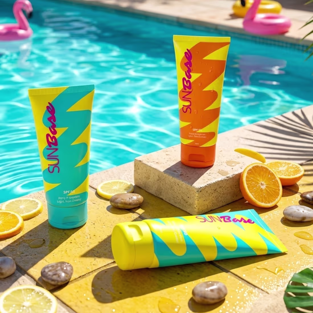
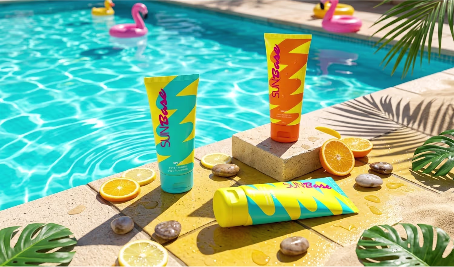
This project explores sunscreen packaging through the lens of everyday behavior rather than just aesthetics.
In real-life routines, especially during busy mornings, essential products are often overlooked. Most skincare packaging is designed to be minimal and subtle, which works in controlled environments but tends to disappear in cluttered, everyday settings.
The goal of this project was to address that gap by designing a packaging system that prioritizes visibility and immediate recognition. Through the use of bold color contrast, clear visual hierarchy, and dynamic graphic elements, the design is built to stand out naturally within chaotic environments such as dressing tables and retail shelves.
Instead of focusing only on visual appeal, the approach centers on usability ensuring the product is noticed, remembered, and consistently used. This project reflects a behavior-driven approach to branding, where design decisions are guided by how people actually interact with products in their daily lives.
Watch full project: https://www.behance.net/gallery/247723177/SunBase-Branding-Packaging-design
2
52
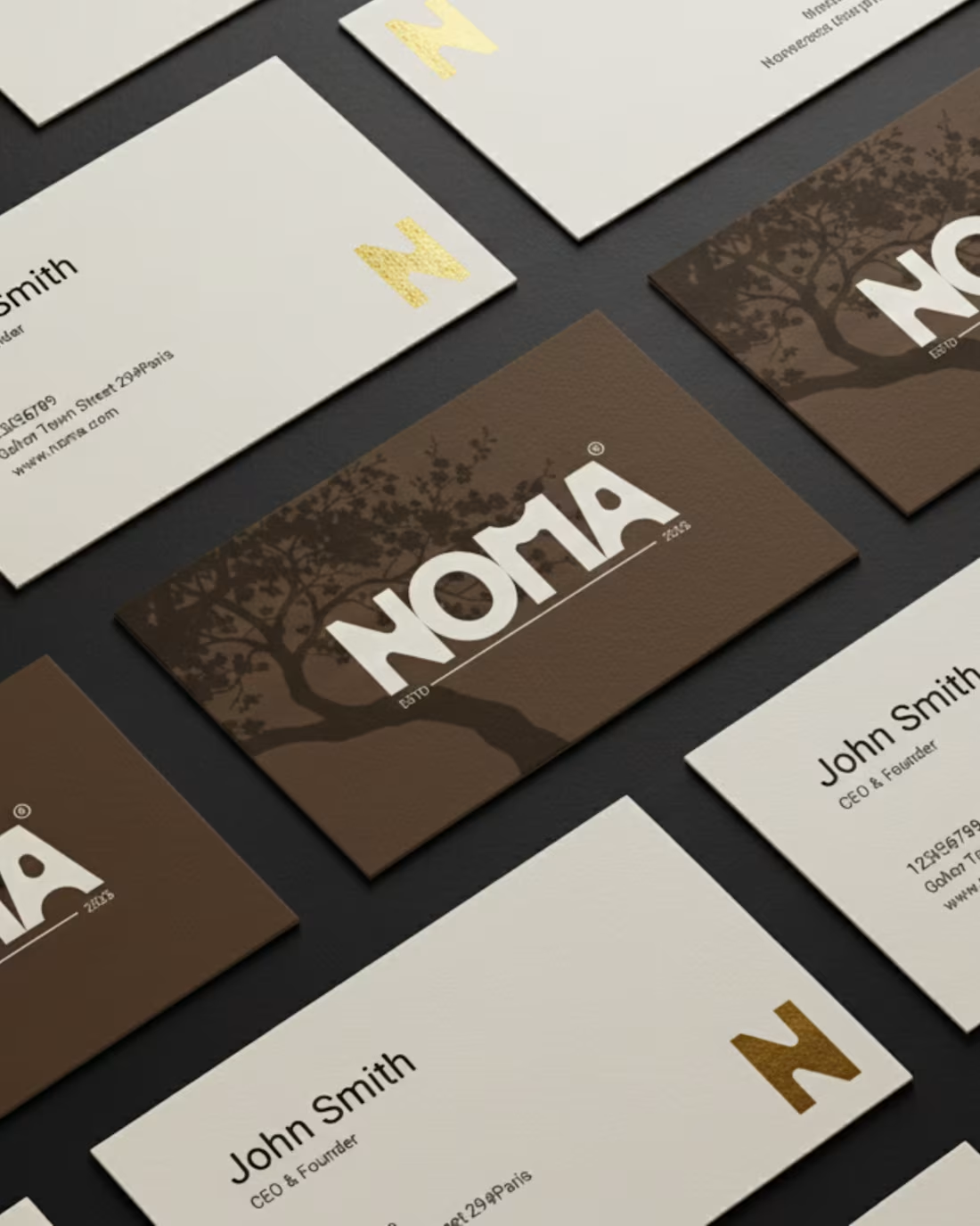
NOMA — Crafted Quietly, Built with Intention.
I helped NOMA’s brand reflect the calm, premium, and human touch of handcrafted Japanese furniture:
Logo: Handcrafted feel that signals premium quality.
Colors: Warm, natural tones inspired by real materials.
Typography: Bold yet approachable, balancing luxury with warmth.
Visuals: Minimal, spacious, structured, echoing Japanese design philosophy.
Looking for a brand identity that speaks with intention? Let’s create yours.
6
5
211
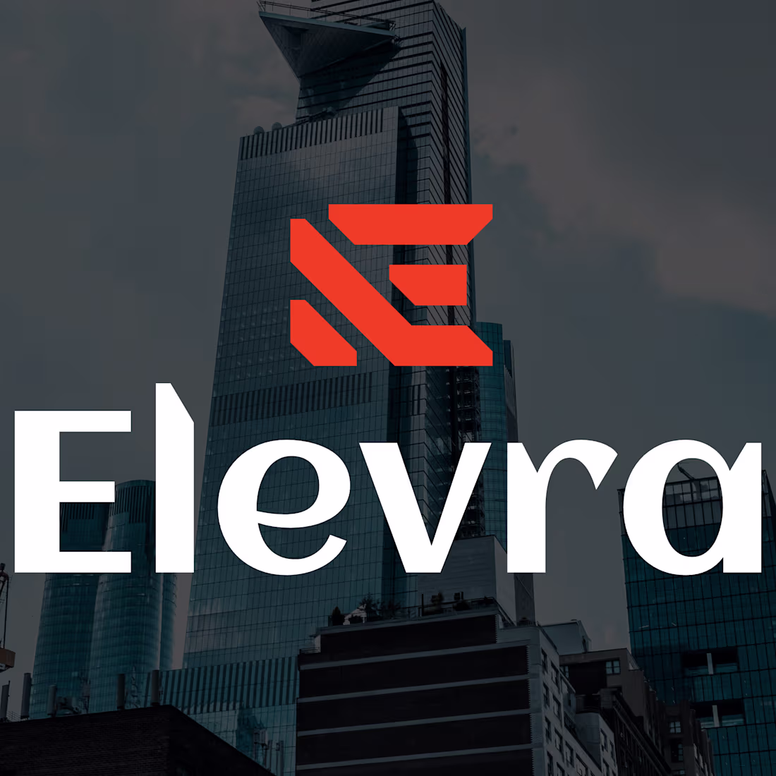
Designing Elevra’s identity wasn’t about making something “pretty.” Every element was strategic.
The symbol? Three rising lines forming an “E”, a structure being elevated, just like Elevra lifts ideas into real, functional spaces.
The angled sides? Inspired by beams and modern architecture, signaling thought, not decoration.
The color orange? Energy, movement, progress, confidence before a single word is spoken.
The type? Modern, clean, trustworthy. Clients instantly feel: this team knows what they’re doing.
Every decision had one goal: make Elevra look as strong and reliable as the structures it builds.
what you think about it?
1
3
107
crochet art| brand identity| brand designing| logo designing
1
2
Logo & brand design| Brew & co.
1
1
Herbalisia| brand designing| organic skin care
1
3