
Valentino Mateski
Brand Designer | Brand Strategy & Visual Identity | Branding
Ready for work
Valentino is ready for their next project!
There’s a point where design stops trying.
And just fits.
Palette, typography, layout, everything holds the same tension. Just a brand that knows exactly what it is.
1
1
58
What if strength looked a bit quieter?
When working on Restore, the goal wasn’t to make it feel like “wellness.”
It was to make it feel like something people in high-pressure roles would actually trust.
So the system leans on restraint. A grounded serif to carry weight, paired with clean, clear type that keeps everything easy to move through.
7
101
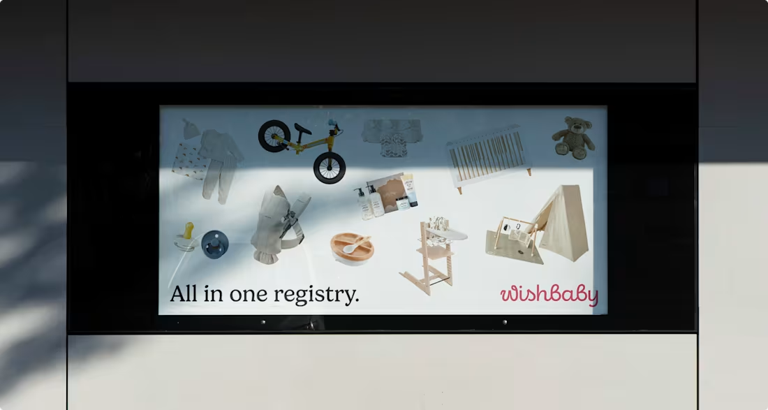
What does a baby registry look like when it actually feels calm?
For Wishbaby, the work wasn’t about adding more softness; it was about removing noise. Less “cute,” more clarity. Less scattered, more considered.
We designed a system that feels warm, but structured. Something that guides you without getting in the way.
Because when everything is in one place, it stops feeling like a task.
0
80
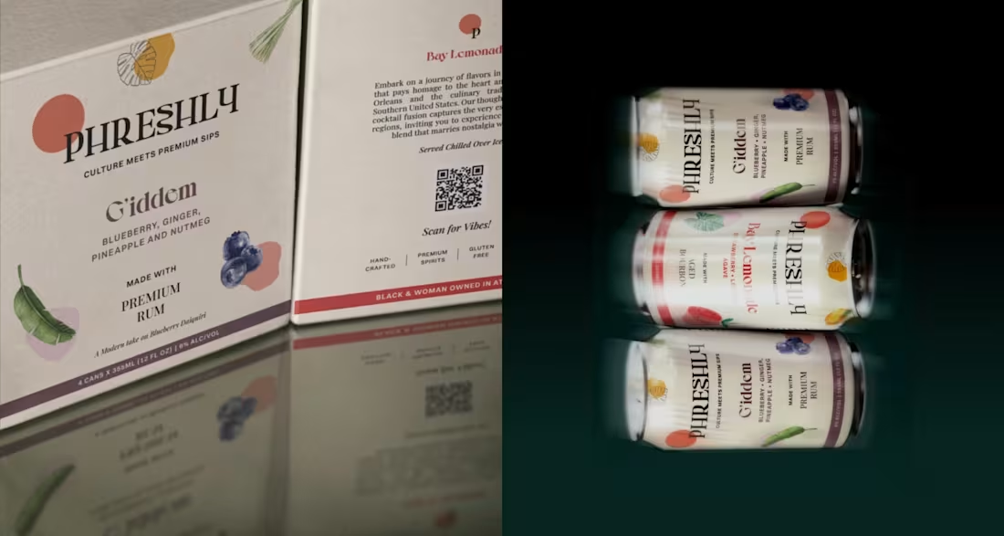
Can typography carry a whole package?
That was the starting point. Instead of building around graphics or effects, I let the type define the structure, how it sits, how it scales, how it holds everything together.
Once that was in place, the rest became a matter of restraint. Nothing needed to compete, just support.
It’s built so the packaging feels intentional the moment you see it.
1
89
What should a cocktail brand feel like before you even open the can?
When I started working on the identity for SeventhWave, that question shaped everything.
This isn’t a drink designed for a bar counter. It’s designed for the in-between moments: warm air, late afternoons, and plans that unfold naturally. Convenient, yes. But more importantly, effortless.
The brand design had to capture that balance. Playful, without feeling loud. Premium, without feeling formal.
2
2
105
Typography exploration for a client. ⬇️
As a brand designer, typography is one of the first places I test a brand’s personality. I ask myself: how should this brand sound if it could only speak through type?
I play with weight, spacing, and rhythm. Small shifts change everything. The same sentence can feel trustworthy, aggressive, or effortless just by adjusting the typography.
5
109
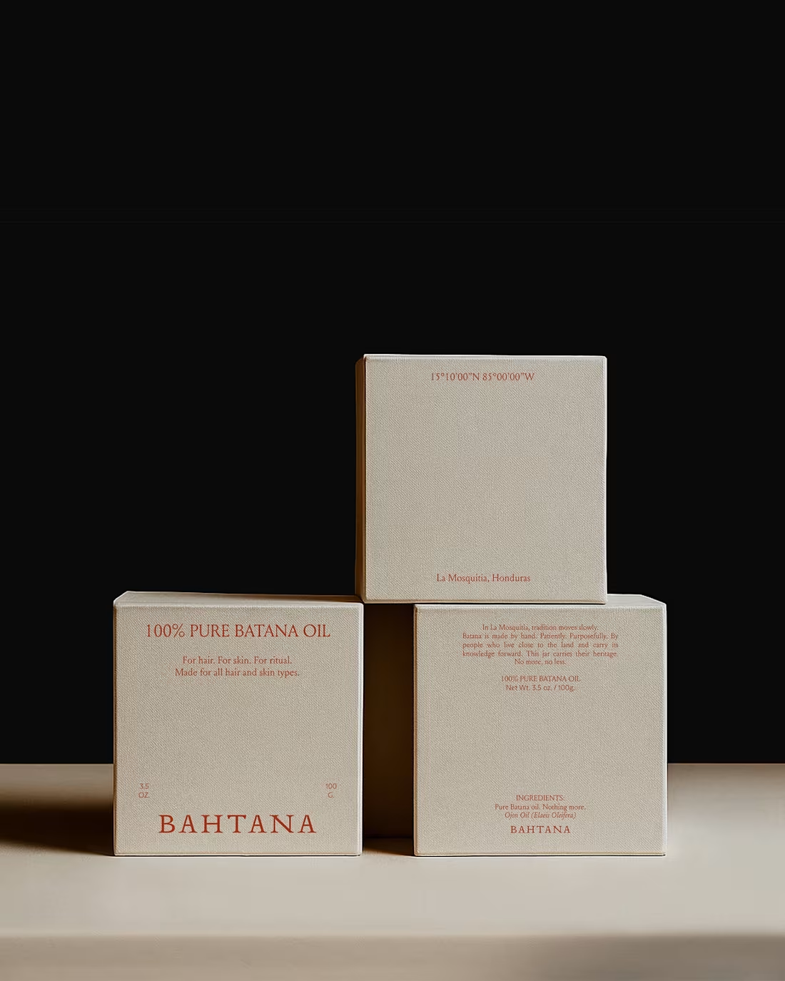
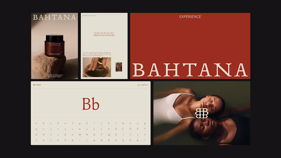
You all showed so much love to the Bahtana project, so I wanted to share a deeper look.
Here are more moments from the case study — the typography details, the earth-led palette in context, the packaging decisions, the quiet structure behind it all.
Bahtana was built around one idea: luxury is reverence. Every element had to feel rooted, not decorative.
Let me know which detail stands out to you the most.
1
92
Curious to hear from other designers, what does the future of sports branding look like to you?
Working on GRANDS meant building more than a booking app; the goal was to create a structured network where players can find the right opponents and grow through real competition.
The brand was positioned around progression and connection, not just scheduling.
The design reflects that through a dynamic logo, a bold but clean visual language, and a digital experience that feels fast, clear, and performance-driven.
2
1
116
Social media for a sports-tech brand can easily slip into clichés.
For GRANDS, I wanted something more controlled and more precise. The platform is built around alignment and competitive energy, so the social system had to reflect a structured approach, not chaos.
I designed a modular template system that works like building blocks. Match announcements, player highlights, feature updates, community moments: each format has its own layout logic, but everything lives inside one cohesive grid.
Bold typography creates impact. Clean spacing builds trust. Strong contrast keeps it sharp and credible.
2
8
160
When I started working on social media templates for Bahtana, I knew one thing: this couldn’t look commercial.
Bahtana is rooted in generations of tradition. That means every visual touchpoint carries responsibility.
The challenge was to create a flexible social media system that feels premium, grounded, and intentional, without becoming decorative or performative.
2
3
152
How do you create a color palette that feels fresh yet intelligent?
Check out this palette for CreatorKiwi, an analytics platform.
Balanced with warm neutrals and grounded tones, it keeps the brand smart and credible while still feeling creative.
1
2
150
Most security brands look the same, with overused tech icons that symbolize “protection.”
With Authox, I wanted something more intentional.
The challenge was to design an icon system that feels structured, precise, and intelligent without relying on clichés. Instead of drawing literal symbols, we built a dotted grid language. Each icon grows from a controlled matrix, forming clear shapes through alignment and repetition.
The result came exactly as I had envisioned: an iconography system that resembles infrastructure.
25
29
545
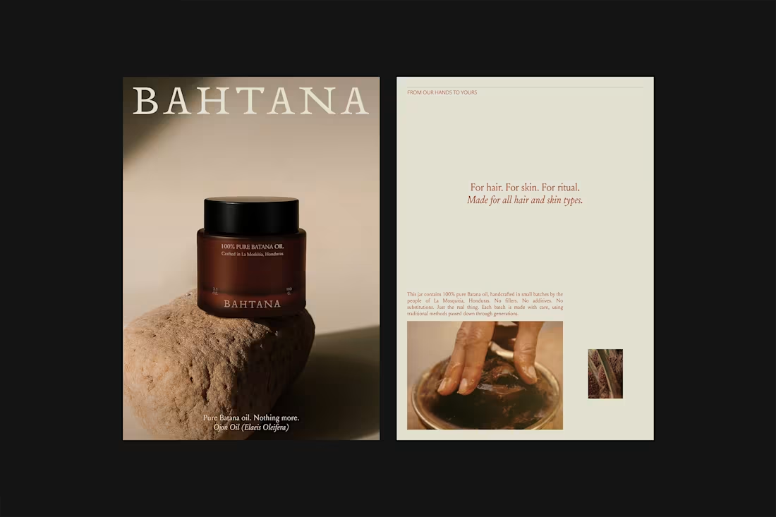
Designing for a premium, family-owned brand from Central America carries a different kind of responsibility 🌿
When heritage is real and passed down through generations, the identity can’t feel decorative. It has to feel authentic.
With Bahtana, my role was to create a brand identity that preserves tradition while positioning it confidently in a contemporary luxury space.
I hope you like it. I’m proud to be part of this brand’s story 🤎
48
64
1.1K
Brand Strategy, Brand Identity, Web Design, 12 Selected Projects
2
3
Authox – Brand Strategy, Visual Identity & Digital Systems
2
4
Bahtana Brand Identity & Web Design
4
9
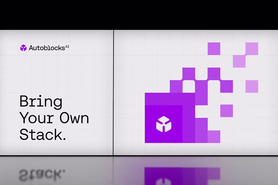
Autoblocks.ai Rebranding
0
4
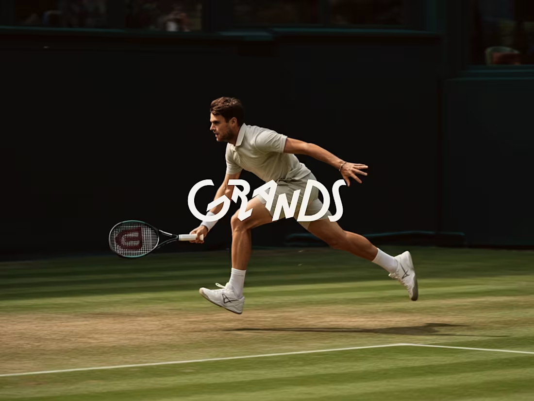
Grands - Social Tennis Club
3
10
Brand Identity and UX/UI Design for Restore
2
8
Wishbaby - Visual Identity, Website & UX/UI
1
2
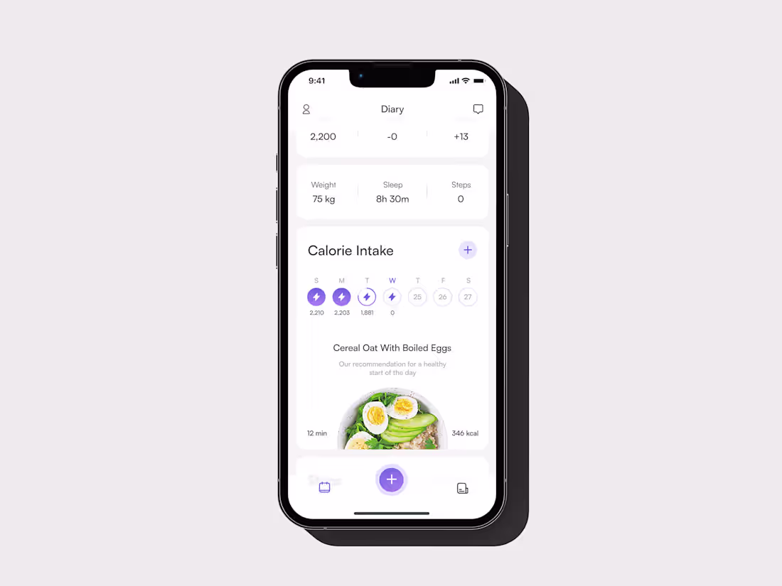
WeightQuest Health and Wellness App Design
0
2
Lumosolar Brand Identity Design
1
3
Woolbaron
0
3