Bahtana Brand Identity & Web Design
Valentino Mateski
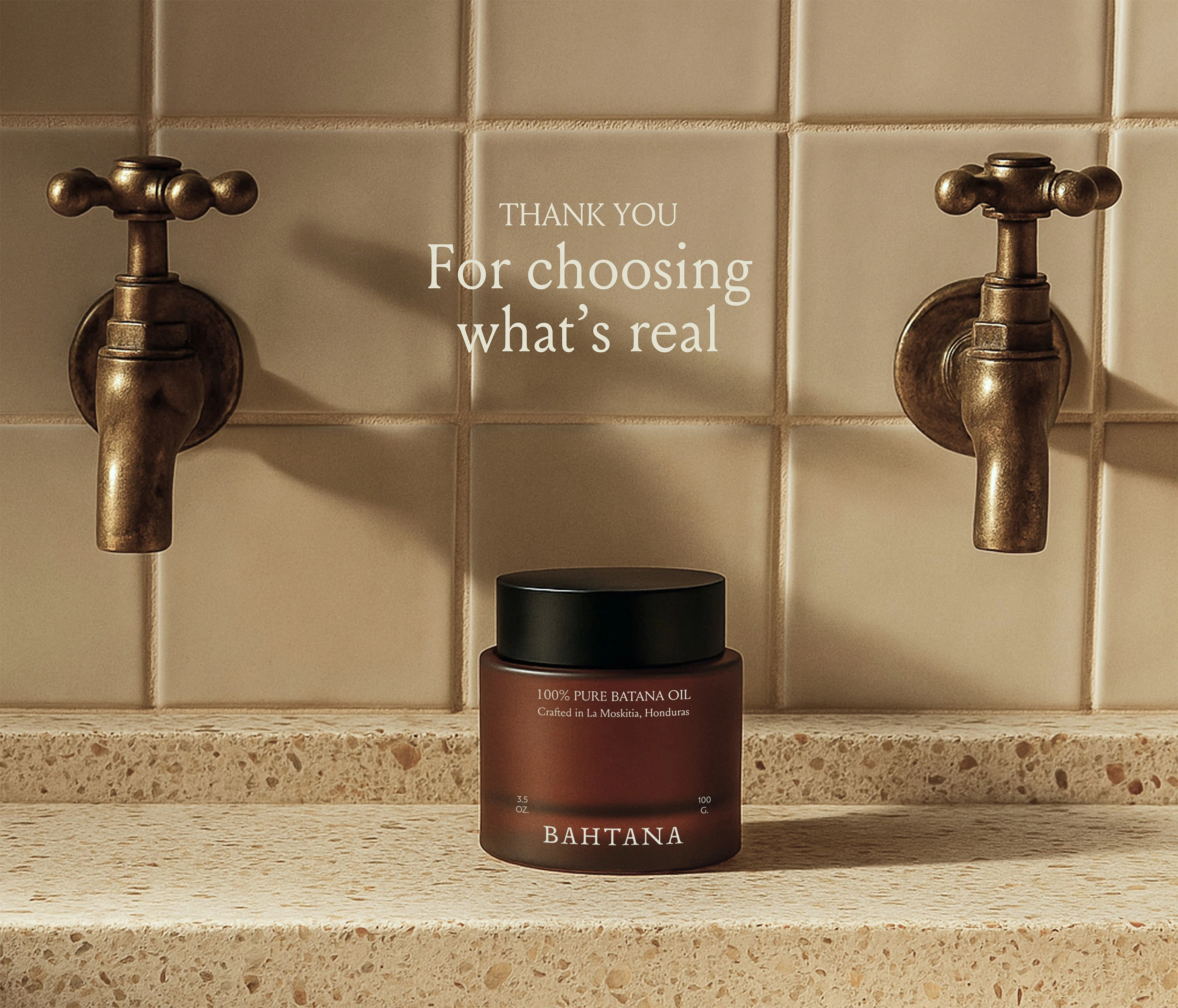
Bahtana
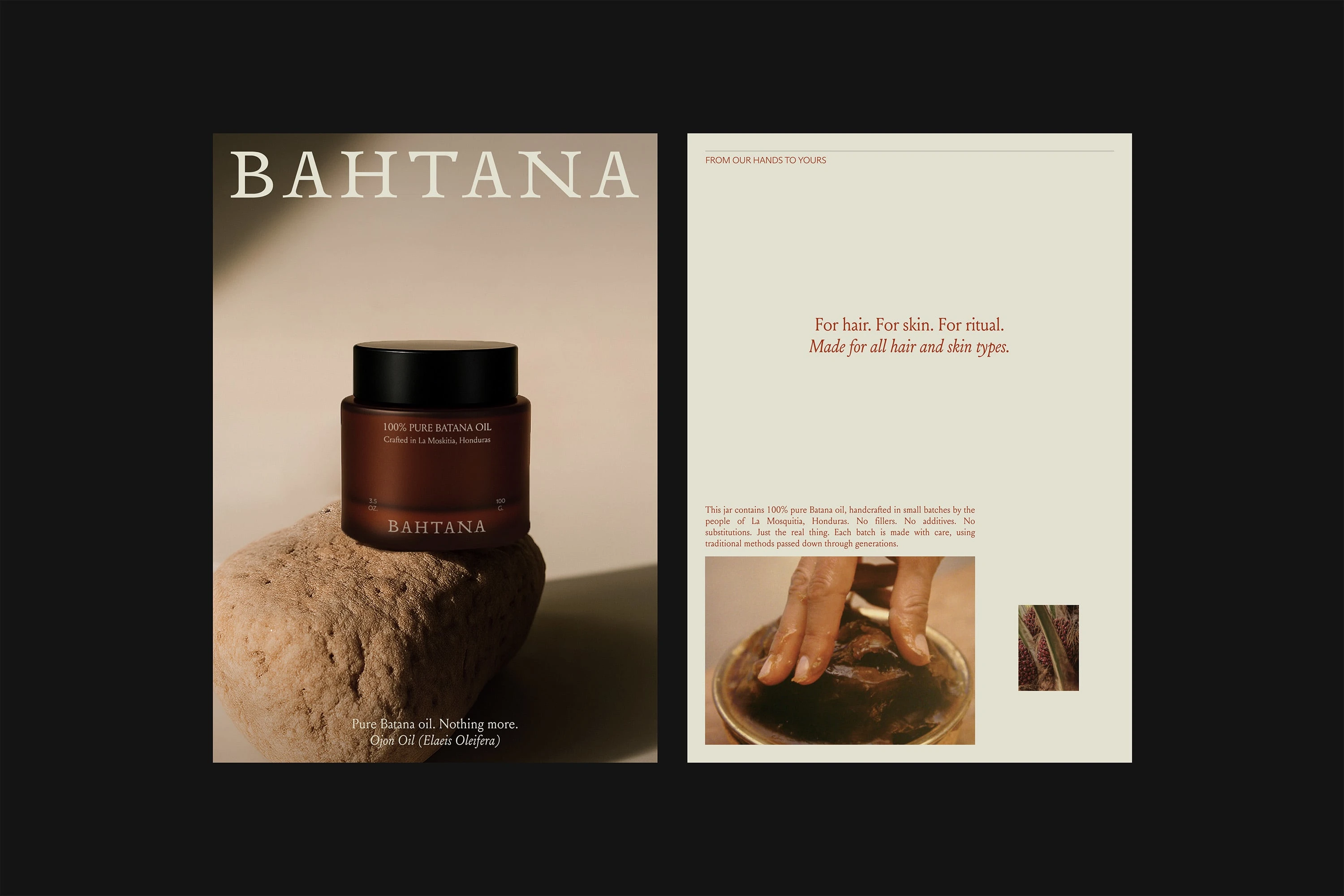
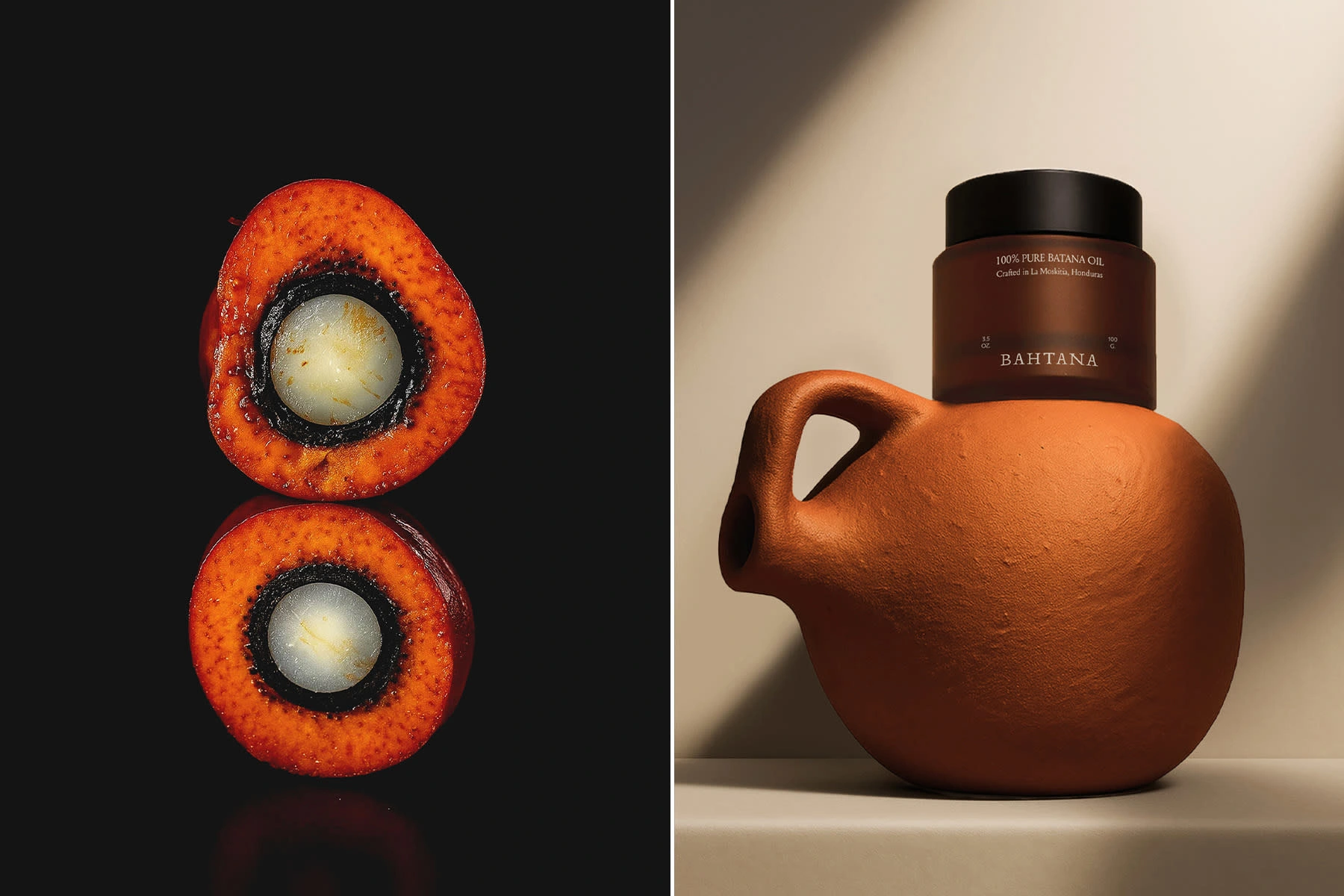
Bahtana is a premium, family-owned brand from Central America offering pure, handcrafted Batana oil sourced directly from the Miskito people of La Ceiba, Honduras. Grounded in tradition and crafted with integrity, Bahtana honors age-old rituals while inviting a new generation to experience the natural power of Batana. Focused on purity, sustainability, and fair sourcing, Bahtana it’s a bridge between cultural heritage and conscious self-care.
Brand identity
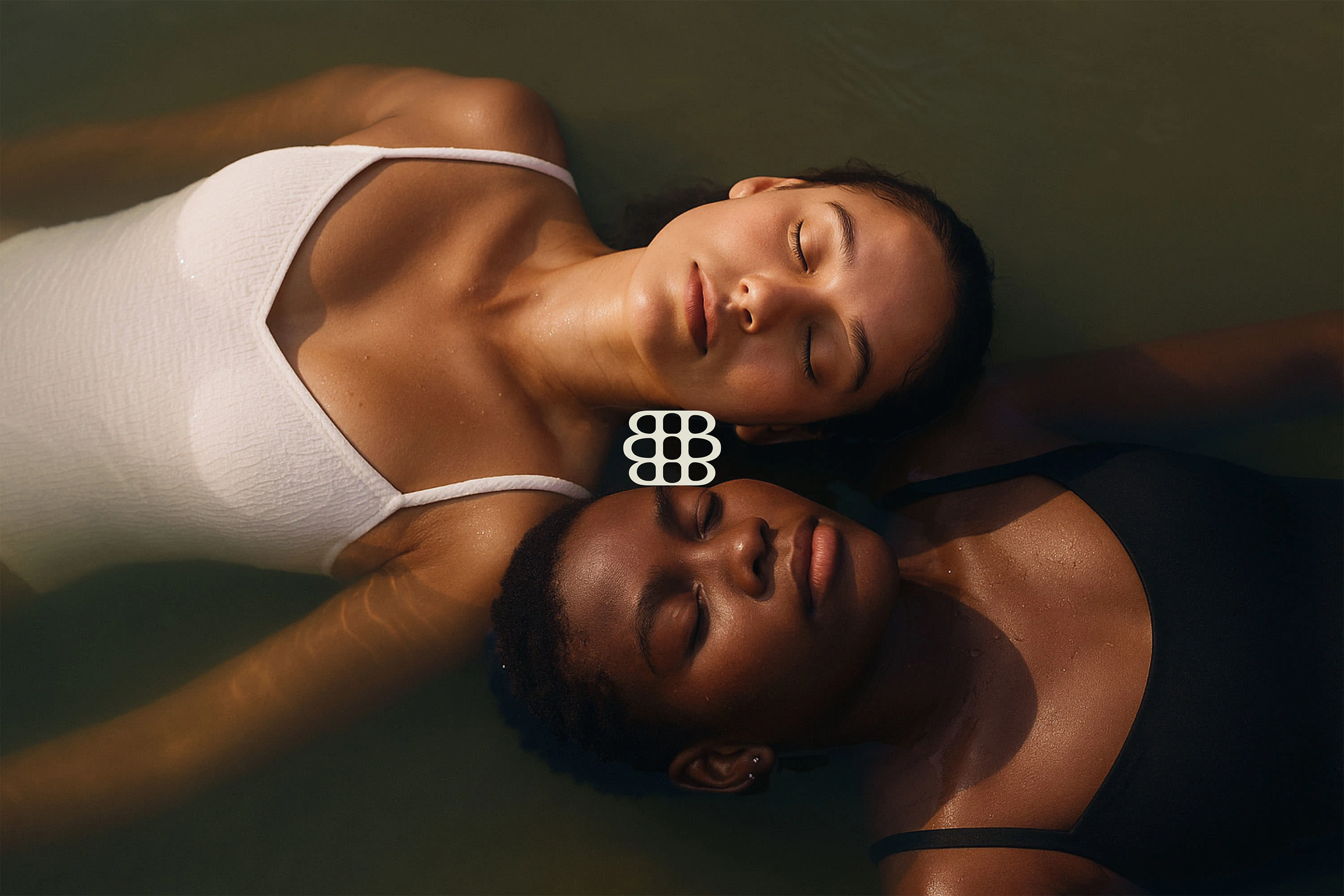
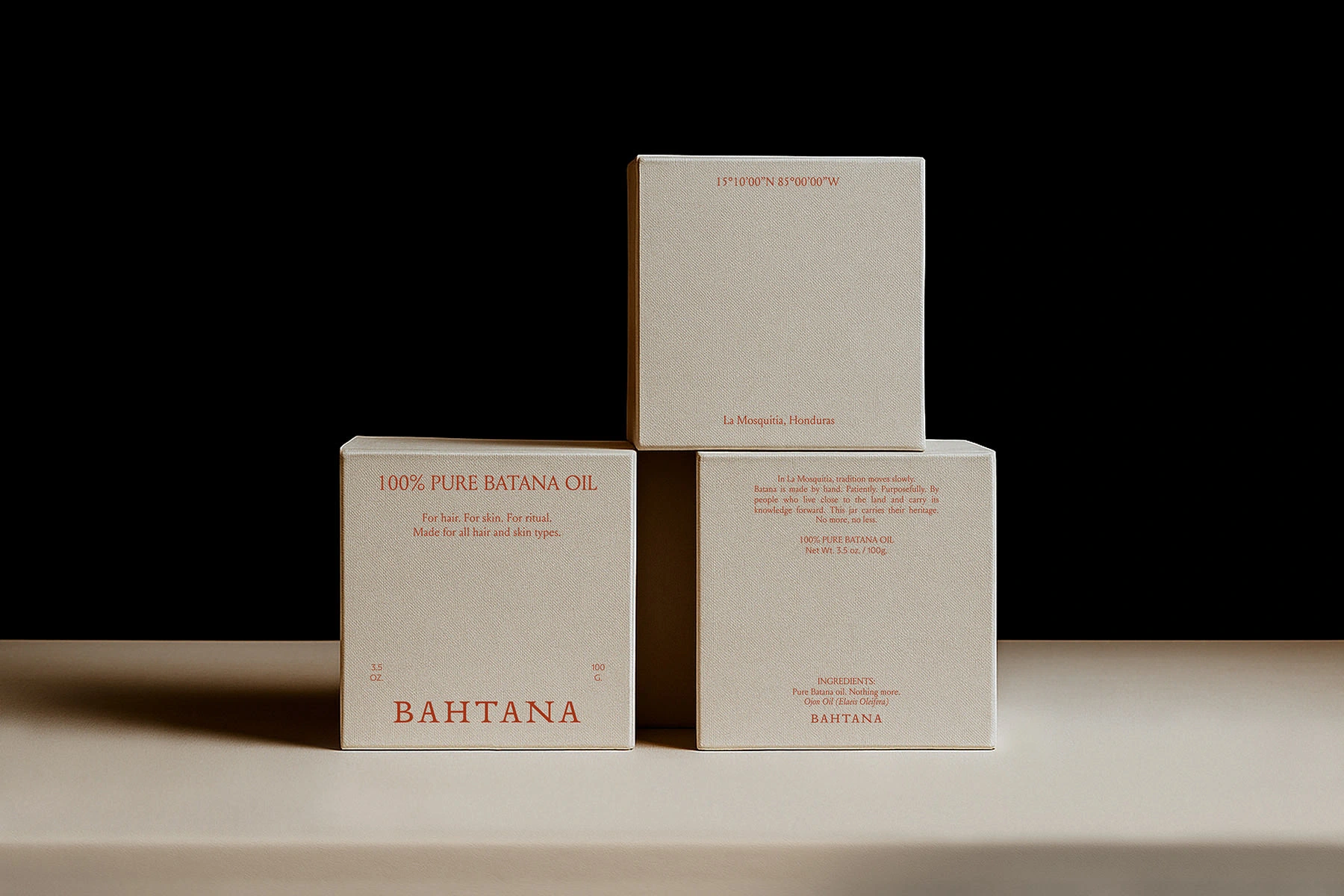
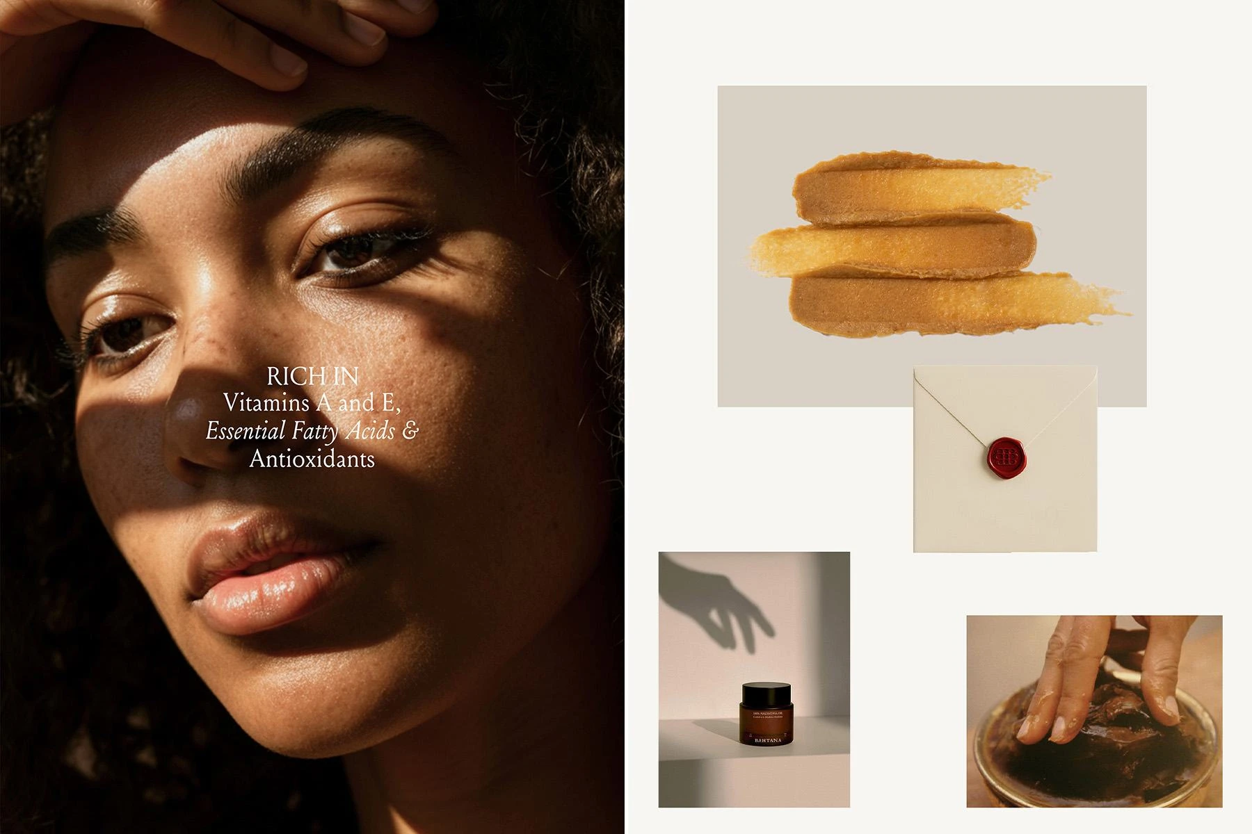
Bahtana is an experience, not just a product. Every visual element is carefully chosen to reflect its purity, craftsmanship, and purpose. This direction shapes how Bahtana is seen, felt, and remembered, from the logo to the packaging, every decision builds an immersive identity that embodies quiet luxury and deep authenticity.
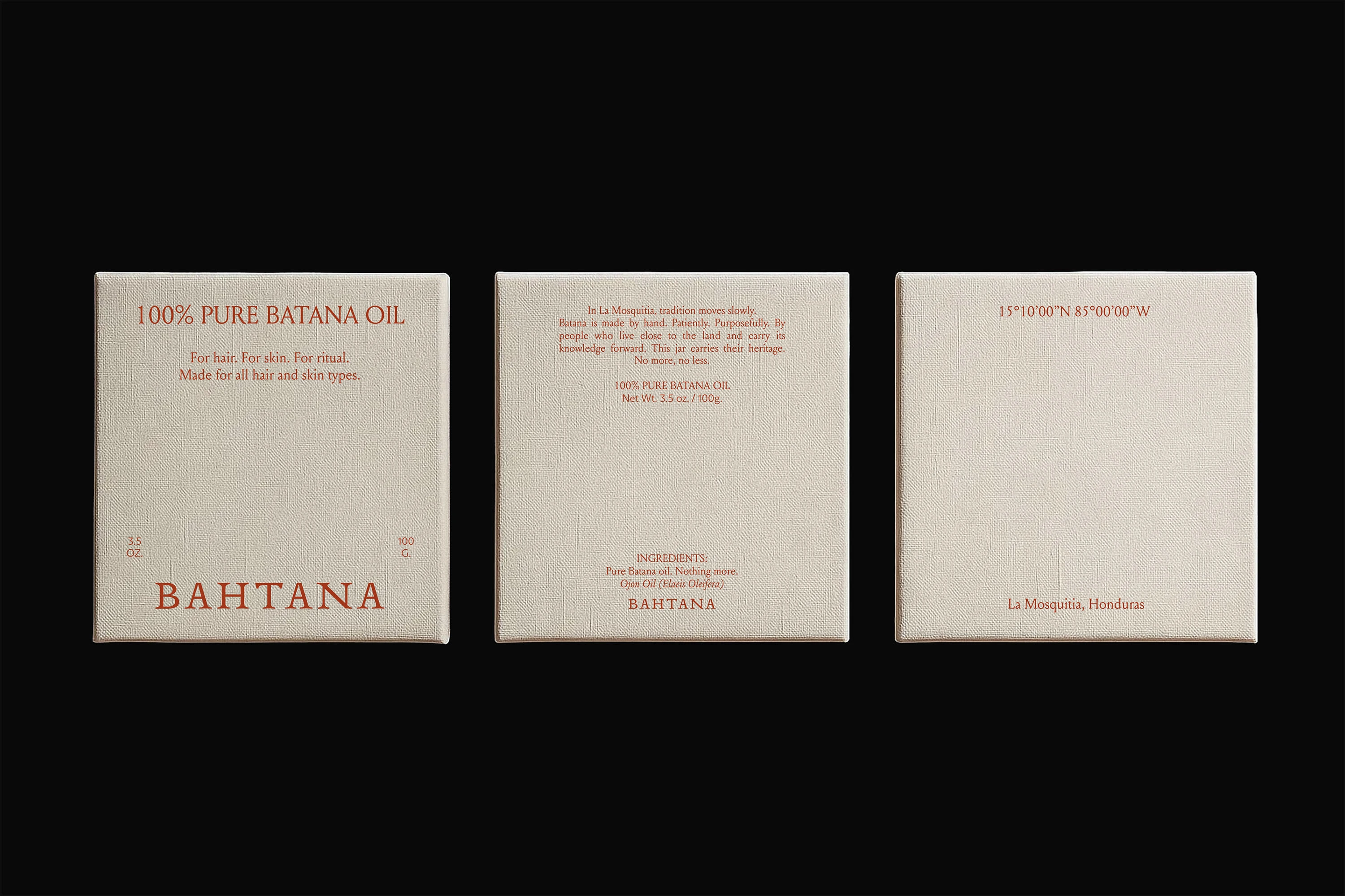
THE LOGOTYPE
The typeface has a balanced contrast between thick and thin strokes, adding a sense of sophistication and craftsmanship. The slightly elongated serifs evoke tradition and prestige, while the spacing ensures clarity and presence. The slightly irregular characteristics give it a human touch, reinforcing the brand’s connection to artisanal craftsmanship.
THE TYPEFACE
Bahtana’s type system blends serif and sans-serif fonts, striking a rhythm that feels timeless yet modern, structured but effortlessly elegant. This interplay creates visual interest and a hierarchy that supports storytelling across all brand touchpoints.
Like this project
Posted Nov 7, 2025
Bahtana is a premium Central American brand crafting pure Batana oil, honoring tradition, sustainability, and conscious self-care.