Autoblocks.ai Rebranding
Valentino Mateski

Autoblocks is reshaping how teams build with AI.
Born from the frustration of unreliable agents, it was created to give developers the clarity, control, and confidence they need to trust what they ship. What began as a powerful tool needed clearer positioning and a stronger brand presence to fully convey its value.
This rebrand marked a pivotal shift: from an experimental product to essential infrastructure. We reframed their narrative around reliability, precision, and trust, and built a visual identity and digital presence that reflect their ambition.
Today, Autoblocks stands as a clear, credible, and category-defining brand - with a form and shape as strong as its engineering.
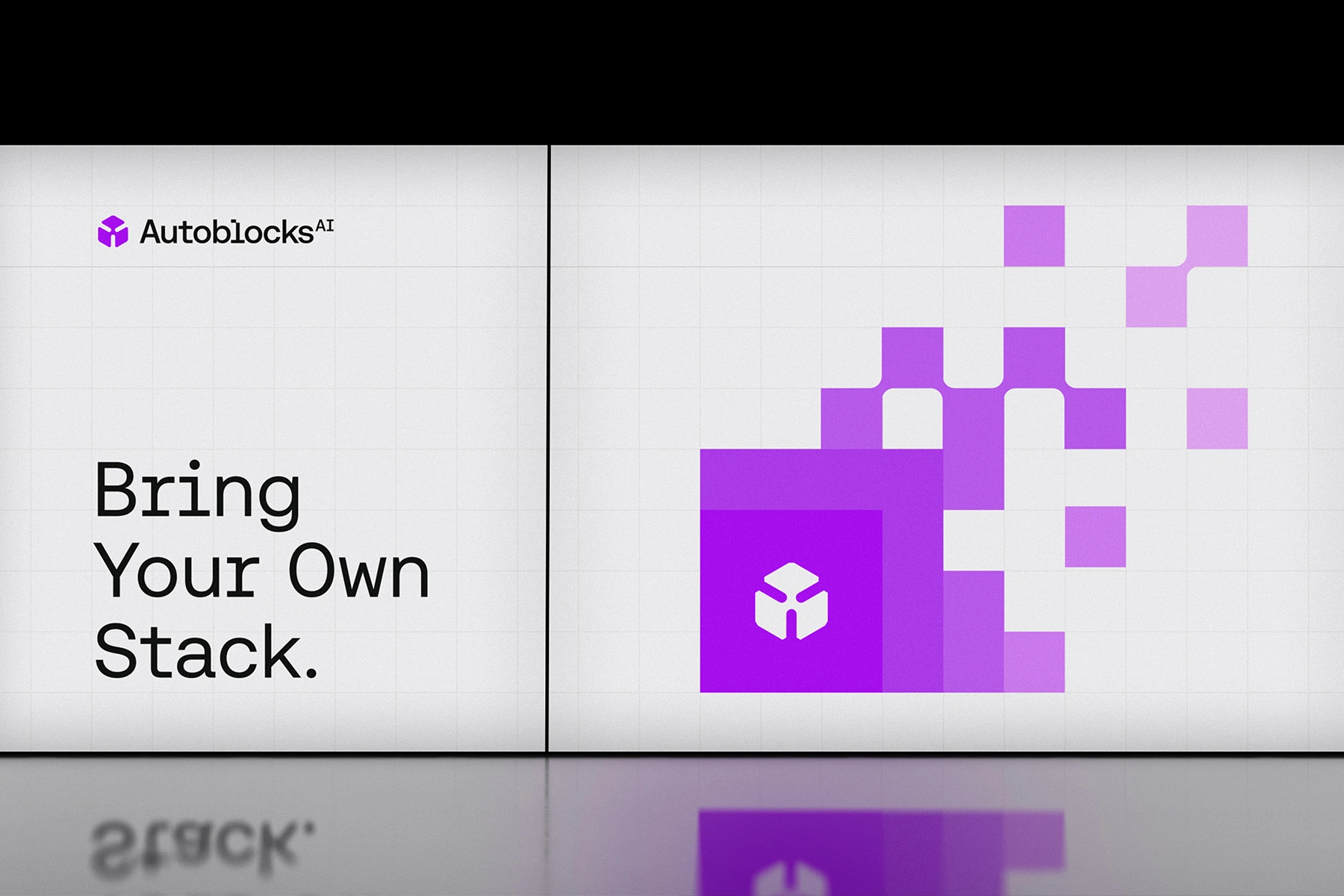
Brand Identity
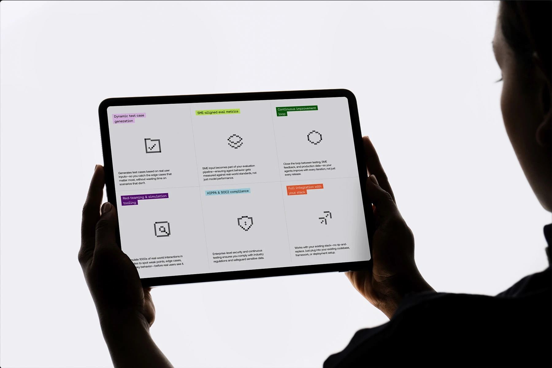
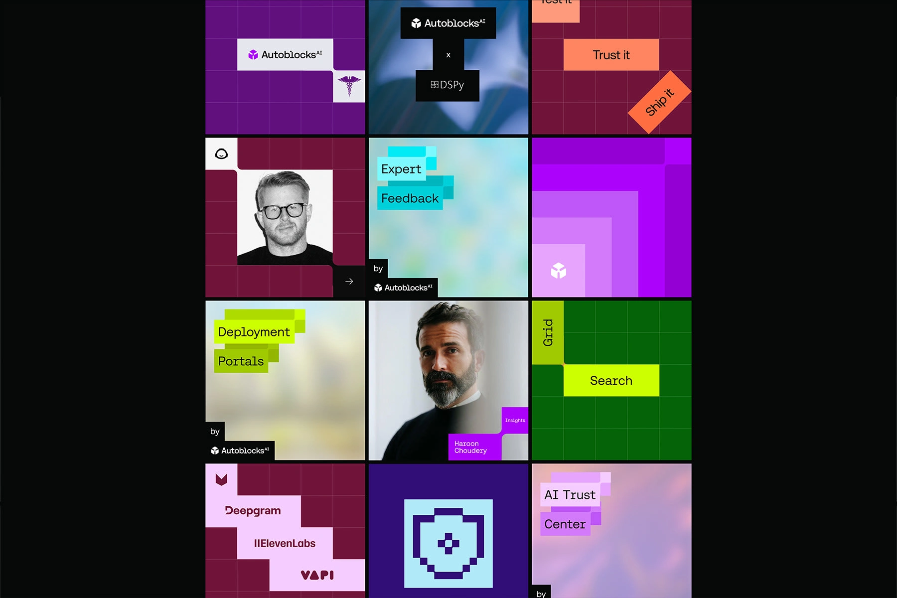
Autoblocks is more than a platform - it’s a trust layer for the future of AI. Every visual decision was made to reflect its core values: clarity, reliability, and precision. This direction repositions Autoblocks from a complex developer tool to a category-defining infrastructure brand. From the symbol system to the web experience, the identity communicates control, structure, and technical depth -empowering teams to build with confidence.
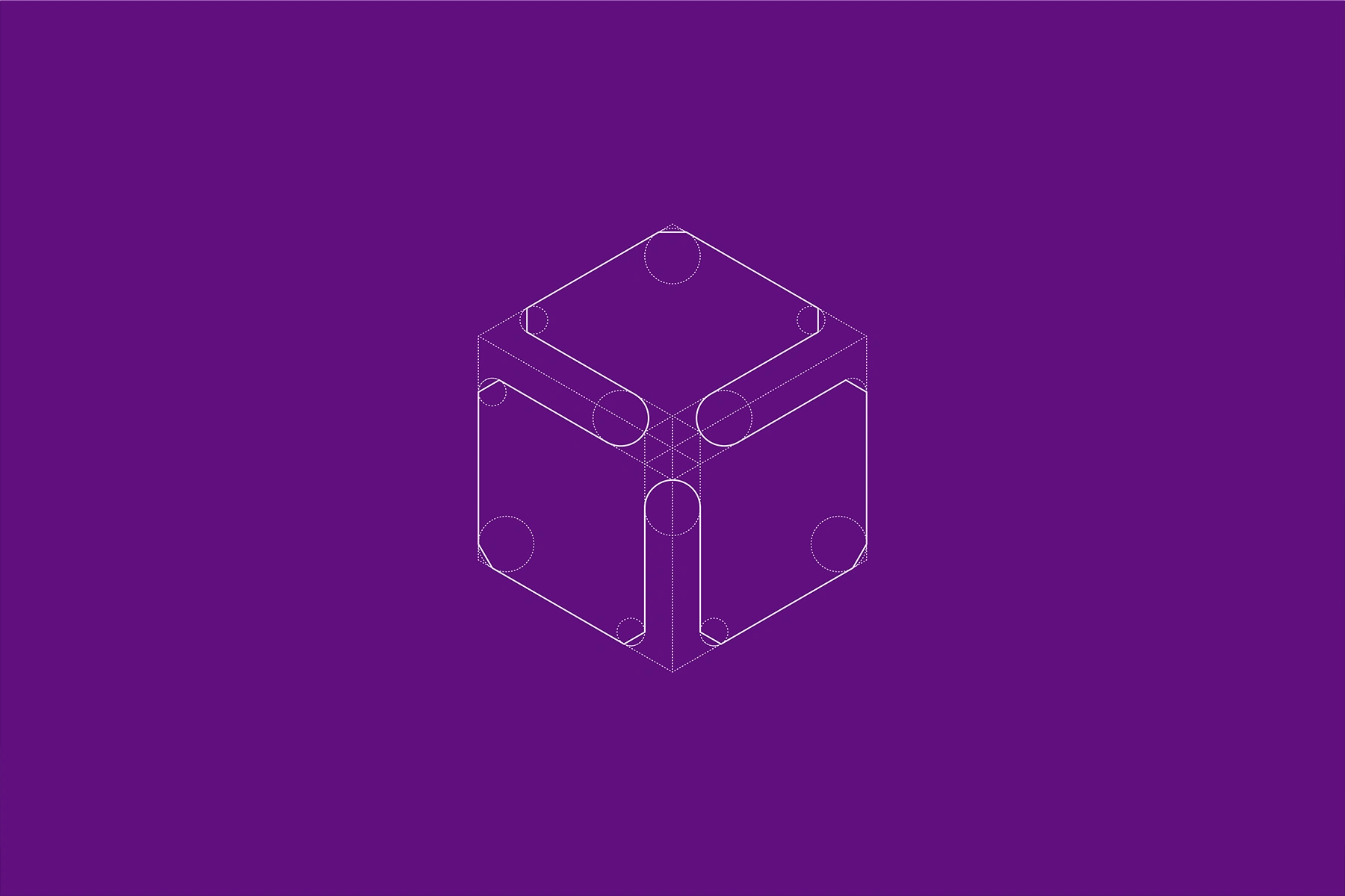
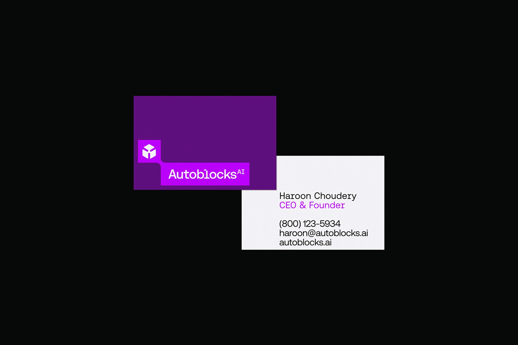
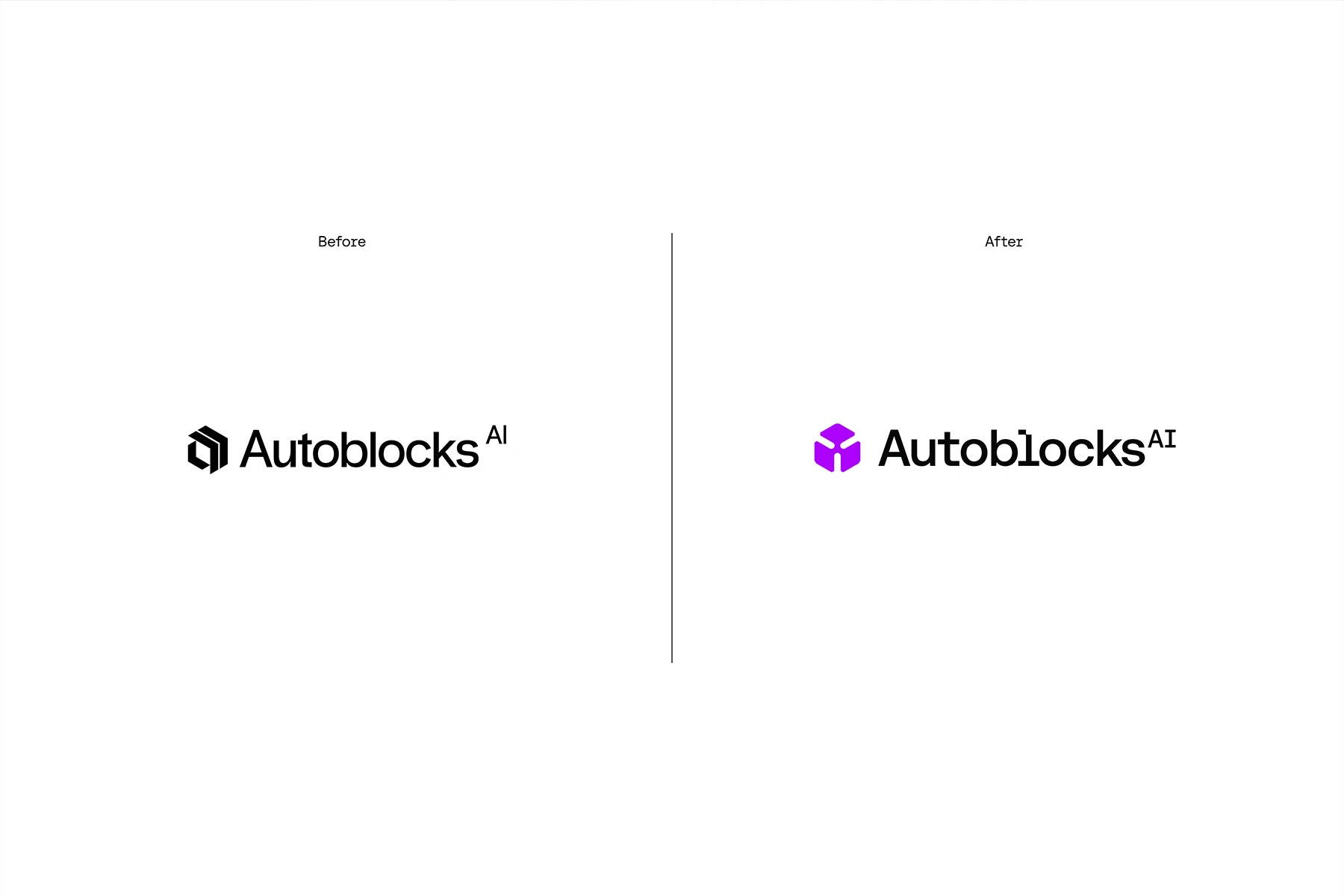
THE LOGOTYPE
The custom logotype is built on a strict geometric grid, balancing sharp precision with modern simplicity. Its solid, engineered letterforms signal stability and authority, while subtle spatial refinements convey clarity and intentionality. The result is a mark that feels systematic yet human, mirroring Autoblocks’ role as a dependable backbone for AI systems
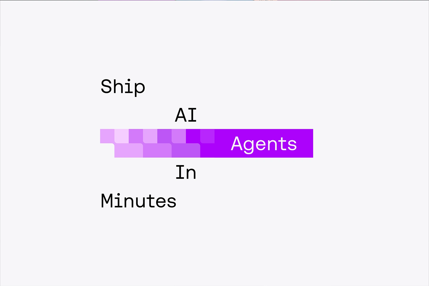
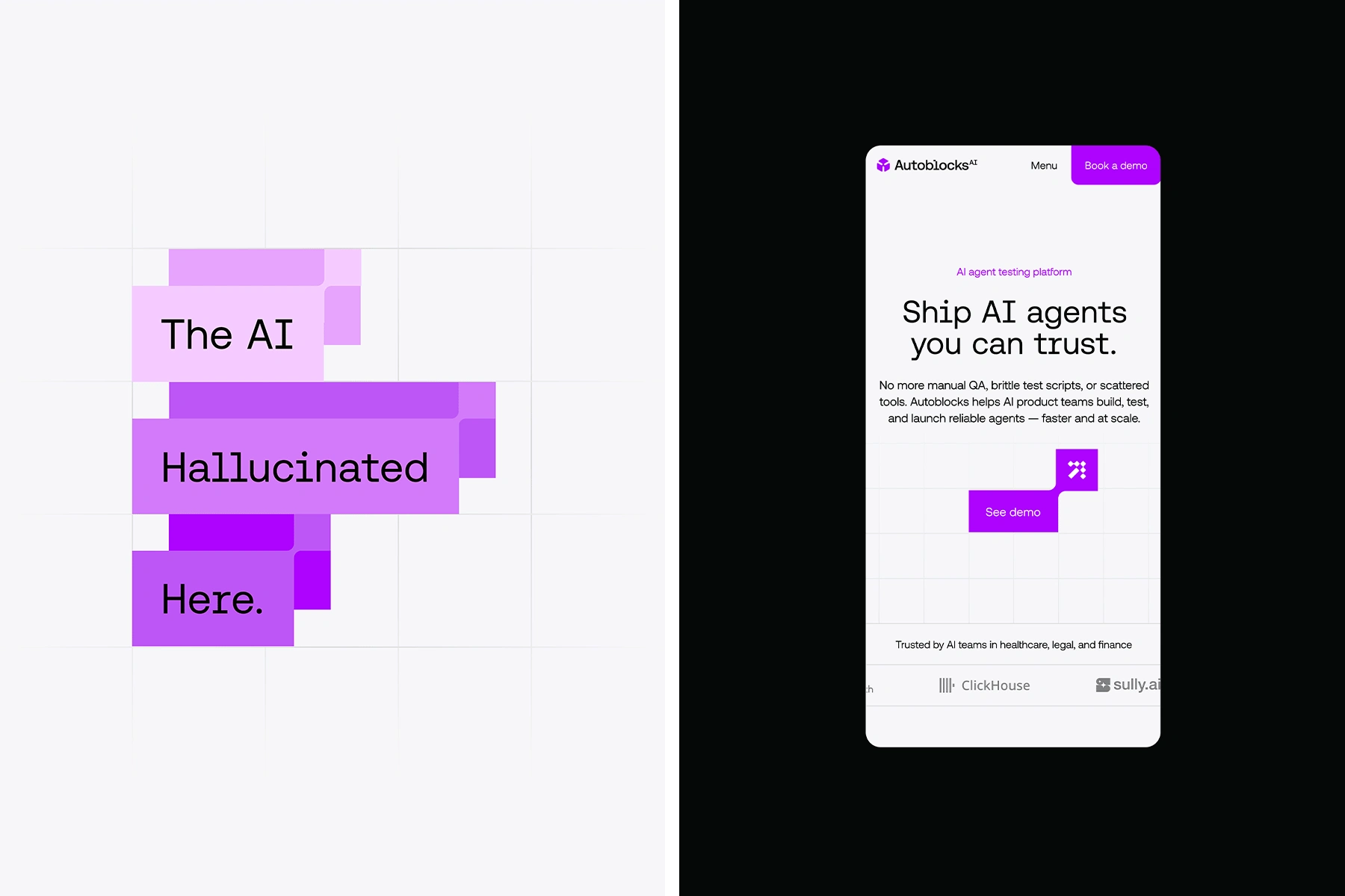
THE TYPEFACE
Autoblocks’ type system pairs a neutral, squarish sans-serif with a mono-spaced variant, reinforcing the product’s technical nature. This combination creates hierarchy and rhythm across interfaces while maintaining a clean, minimal aesthetic. It brings a sense of order to complex information, supporting clear communication at every touchpoint.
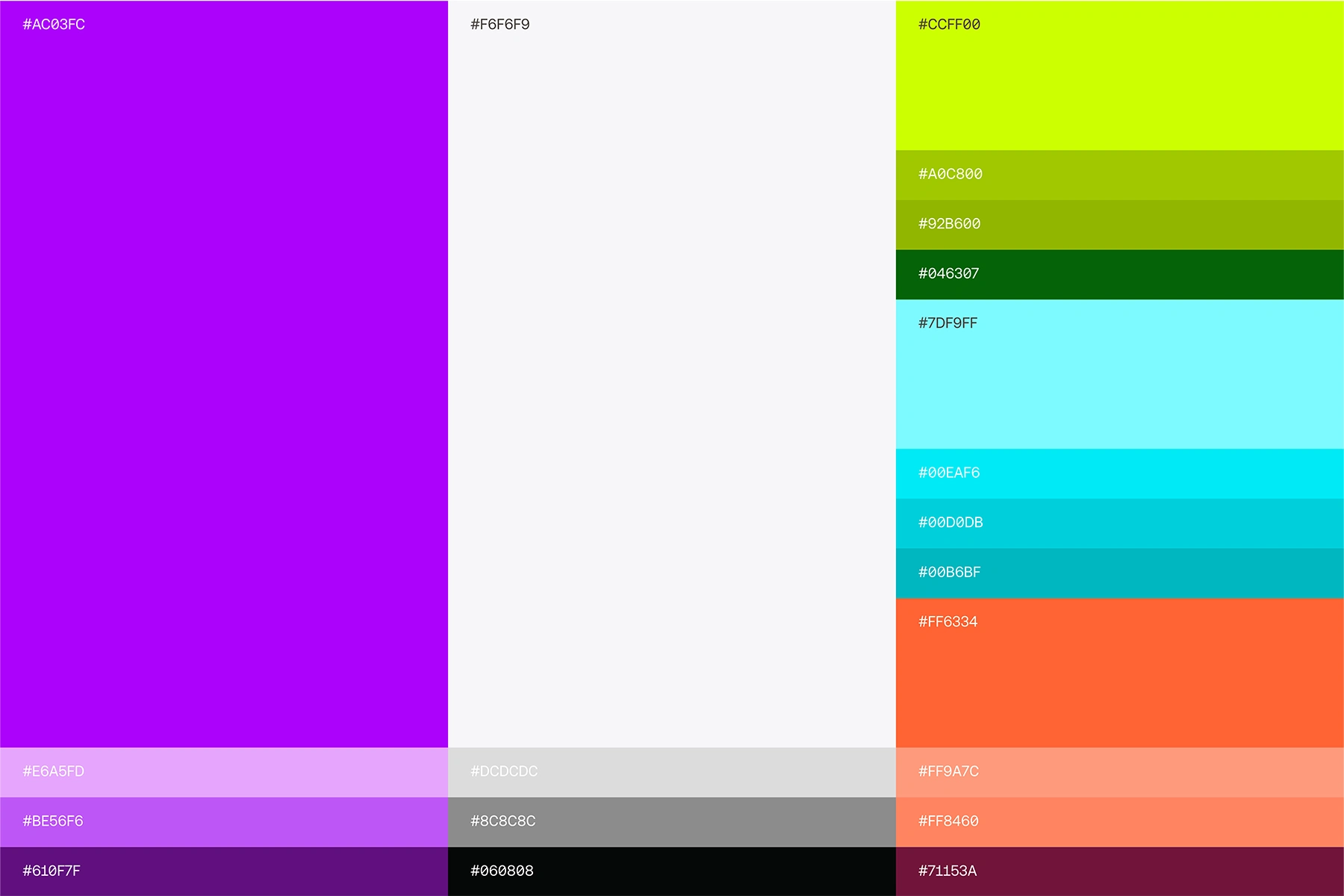
THE COLOR SYSTEM
Autoblocks’ color system is designed to embody clarity, confidence, and technical precision. A high-contrast core palette anchors the brand: deep neutrals convey stability and trust, while clean white space emphasizes structure and focus. Strategic accent tones introduce energy and guide attention across complex interfaces without overwhelming them.

Like this project
Posted Nov 8, 2025
Autoblocks redefined its identity around reliability and precision, transforming from a promising tool into a confident, cohesive, and scalable platform.