Grands - Social Tennis Club
Valentino Mateski
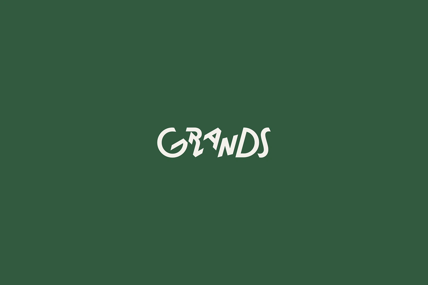
Grands
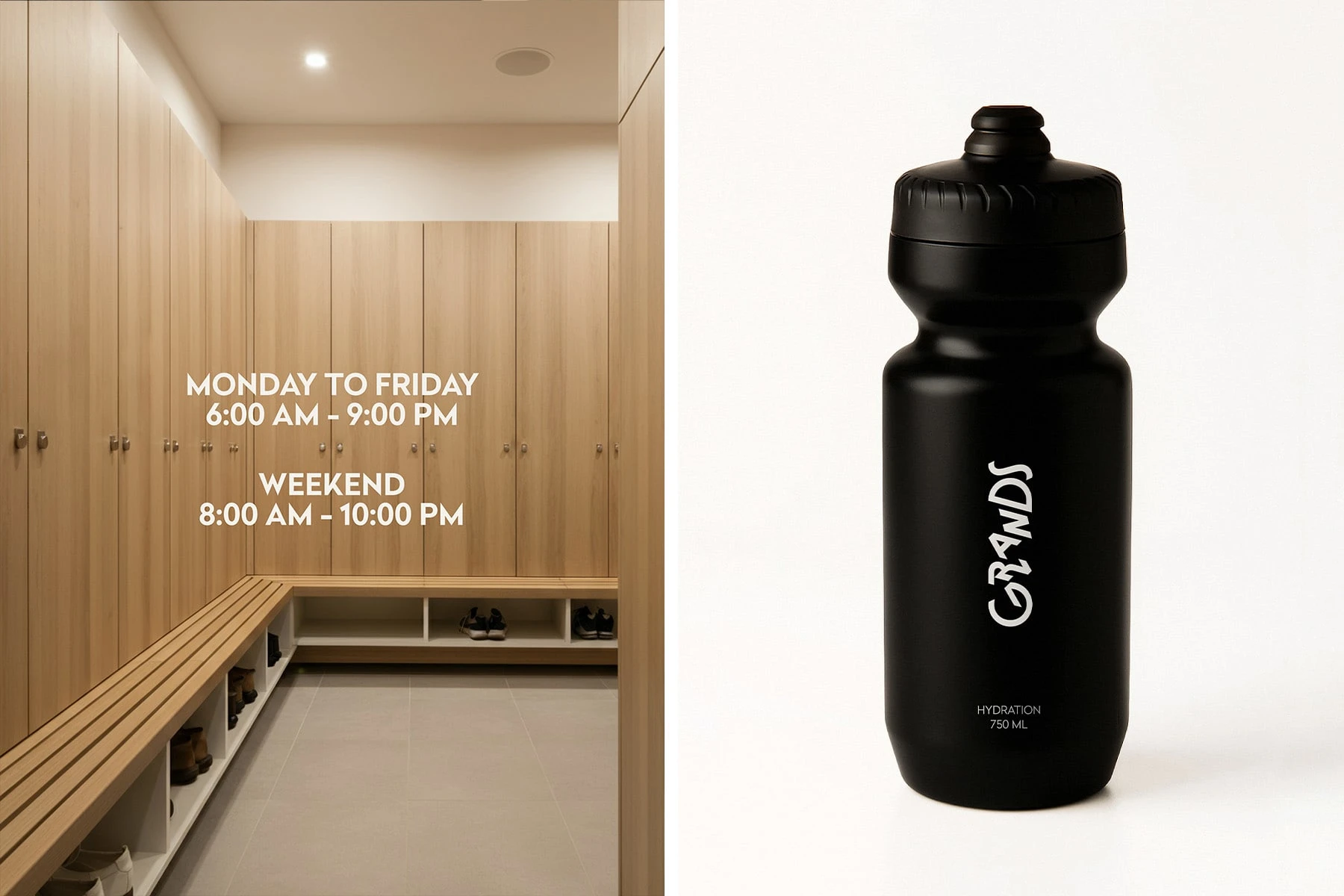
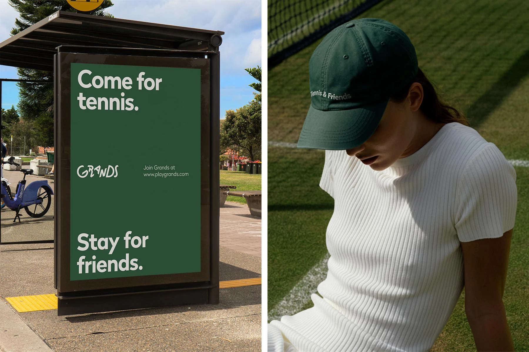
Grands is a social tennis club where it’s easy to find someone to hit with, whether it’s a new face or a familiar one. Live in Stockholm, Helsinki and Sydney.
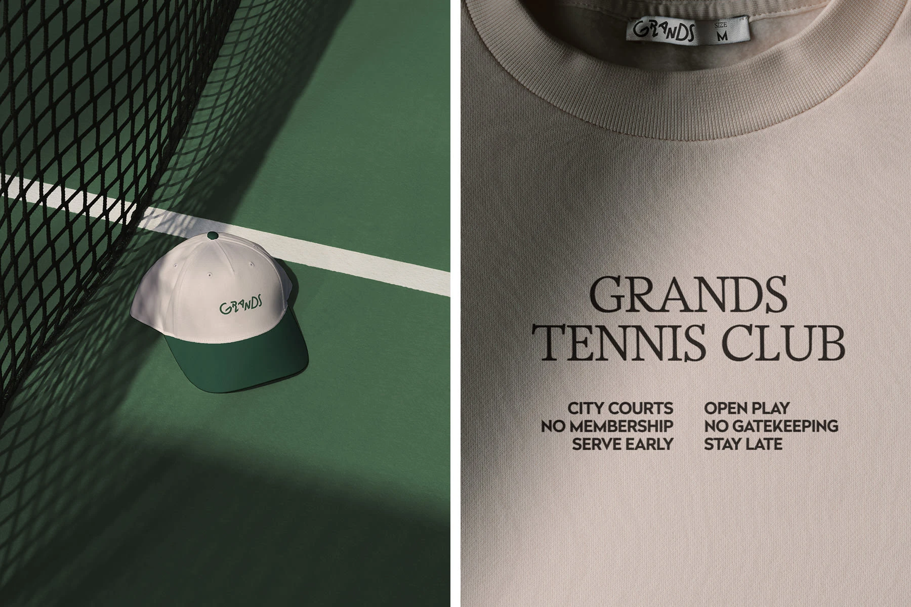
THE LOGOTYPE
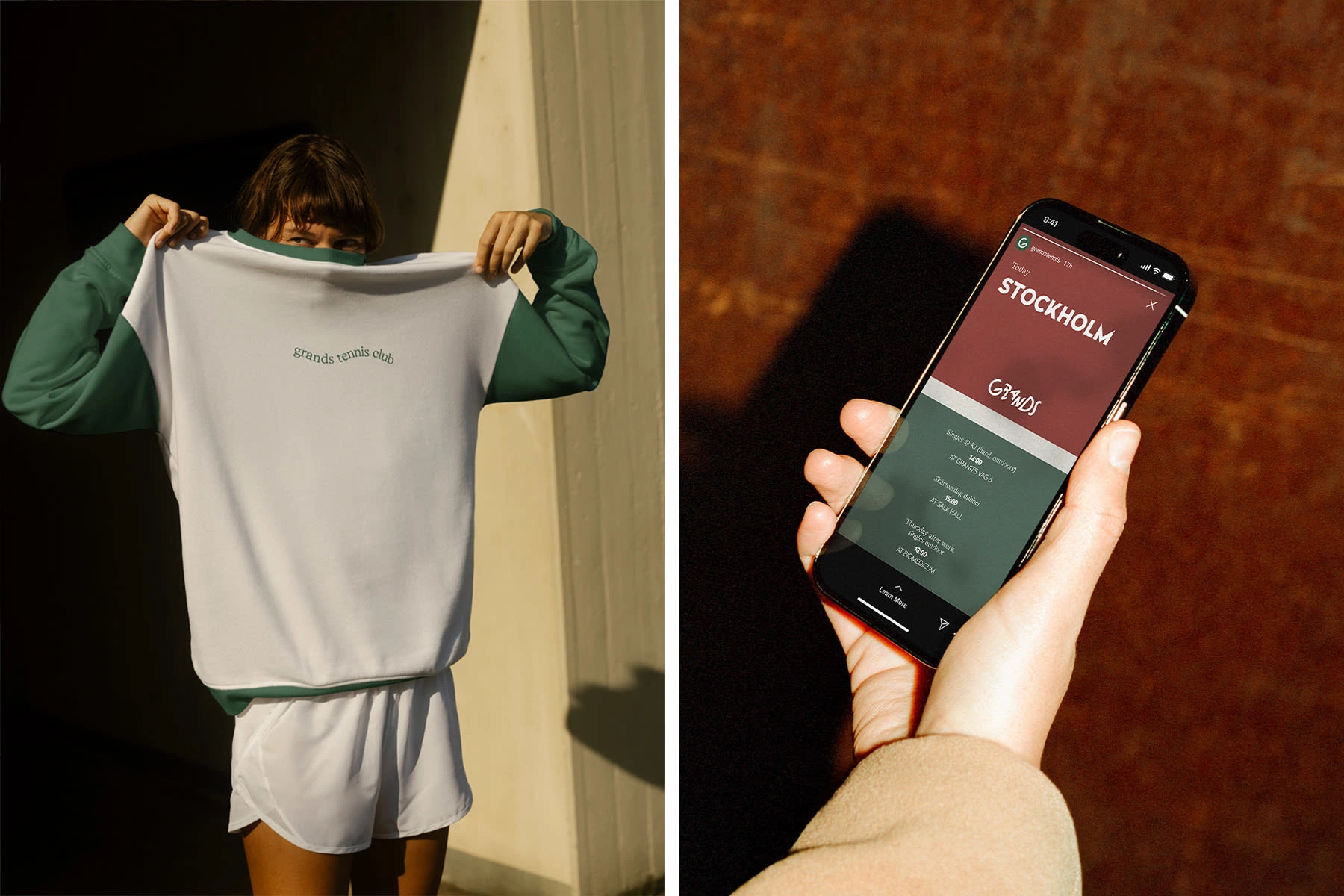
The Grands logo breaks away from the traditional tennis aesthetic with a playful, energetic wordmark full of motion. Each letter has its own posture, giving the mark a dynamic, rhythmic character like players mid-match, each with a distinct stance but moving as one team.
The custom typography embraces purposeful asymmetry and irregularity. This isn’t about precision, it’s about presence. The logo feels fresh, confidently offbeat, and unapologetically original. It embodies what Grands stands for: not tradition, but evolution. Not formality, but energy.
It stands out on courts, in content, and most importantly, on people.
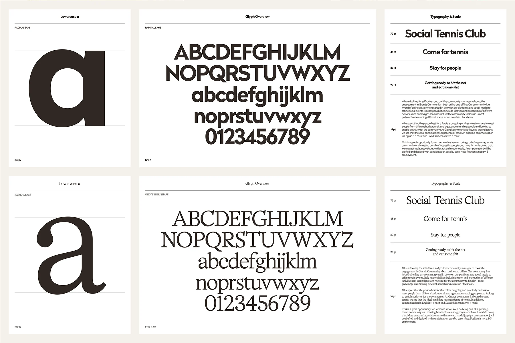
Typography
The Grands typographic system bridges sport and lifestyle. Radikal delivers the bold, athletic foundation of the brand, while Office Times Sharp introduces a refined, editorial layer. Together, they create a distinctive visual voice that feels modern, energetic, and effortlessly confident.
THE SERIF
Radikal is the hero font. Used in both Light and Black weights, it drives brand personality across headlines and copy. Its sharp geometry and clean structure give the brand a modern, athletic tone, confident but approachable.
THE SANS SERIF
Office Times Sharp serves as the accent typeface. A refined serif with a contemporary edge, it’s used for subheadings, campaign callouts, and editorial moments. It adds character, contrast, and a subtle nod to heritage, perfect for elevated brand expressions and merch details.
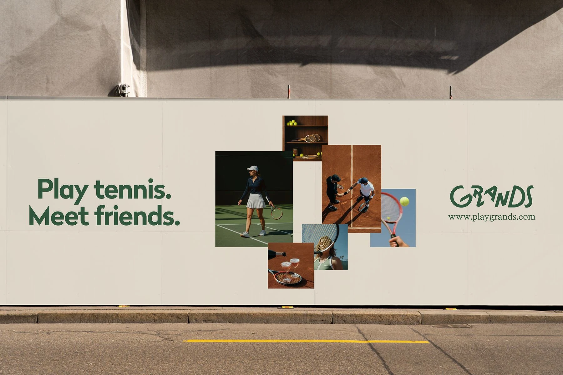
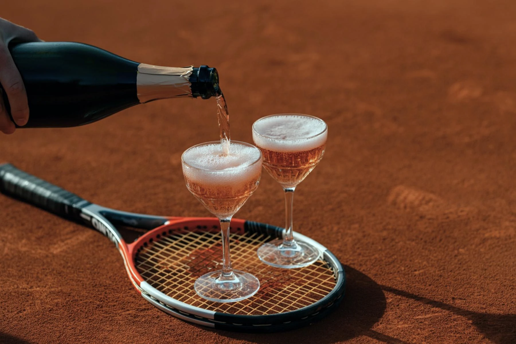
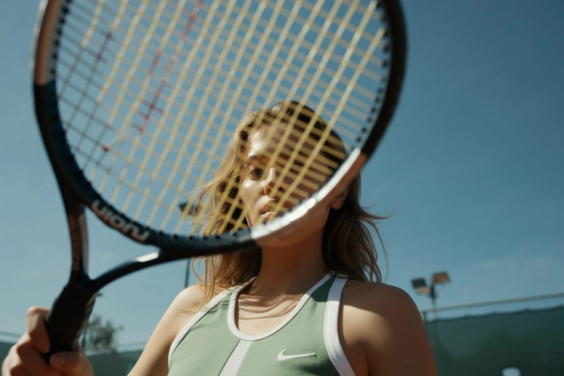
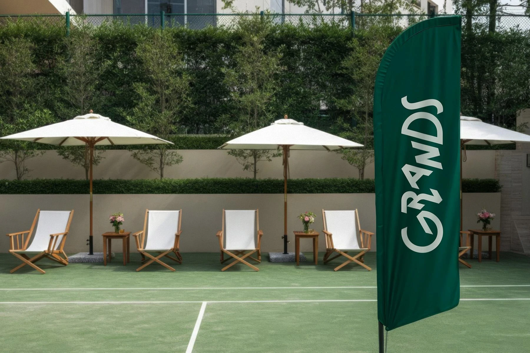
The new visual identity of Grands is designed to reflect a shift in tennis culture, from exclusive to inclusive, from structured to spontaneous, from traditional to city-powered.
It captures the energy of movement, the ease of connection, and the confidence of a brand built for people, not just players.
This isn’t just a new look.
It’s a new way to show up, and stand out.
Like this project
Posted Nov 7, 2025
Grands blends sport and lifestyle, uniting competition and community through a modern, energetic identity that feels fresh and connected.