Brand Strategy, Brand Identity, Web Design, 12 Selected Projects
Valentino Mateski
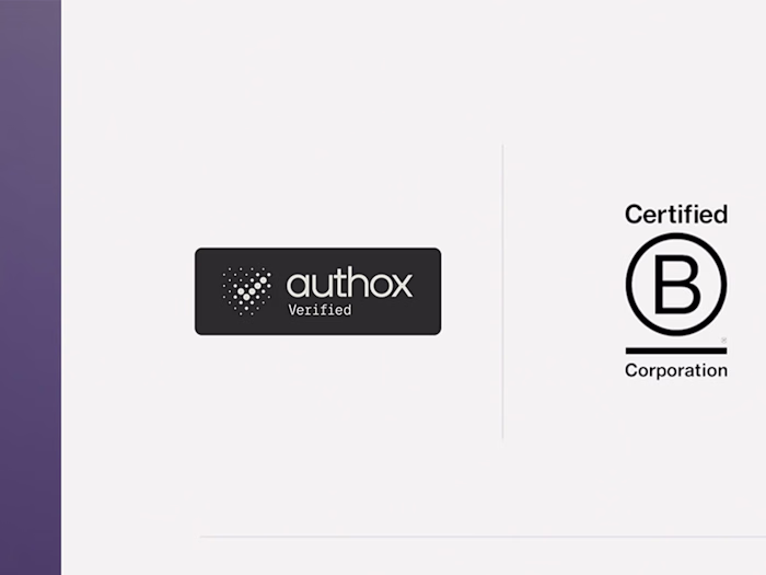
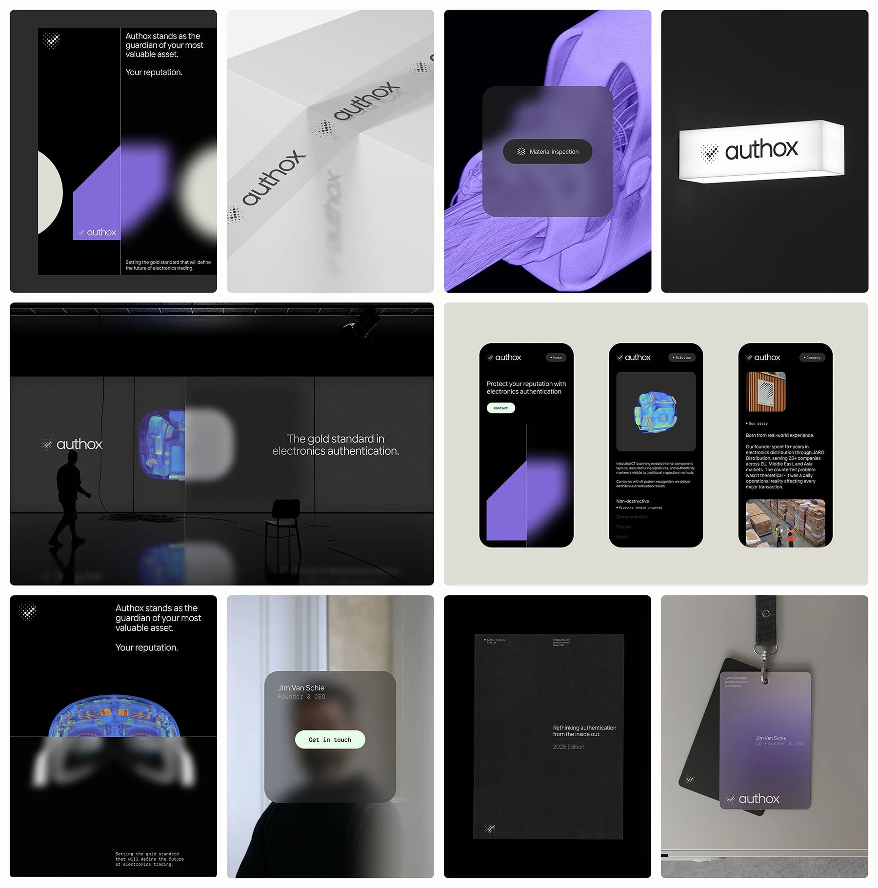
Authox
Brand Strategy, Visual Identity & Web Design + Development for a Supply Chain Authentication Platform
Authox was built to turn authentication from a point of friction into a mark of trust. Electronics distributors had long been forced to choose between moving fast and staying safe. Authox positioned itself as the system that protects what matters most: reputation.
The visual identity reflects this promise with a precise, high-contrast design language: black and white for authority and trust, sharp geometric forms for structure, and digital gradients to signal innovation and speed. Together, the system communicates control, confidence, and credibility across every touchpoint.
Delivered: Brand strategy, Visual Identity, Messaging Framework, Website Design, Web Development, Marketing Materials and Brand Guidelines.
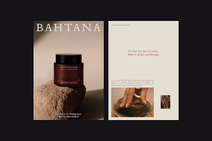
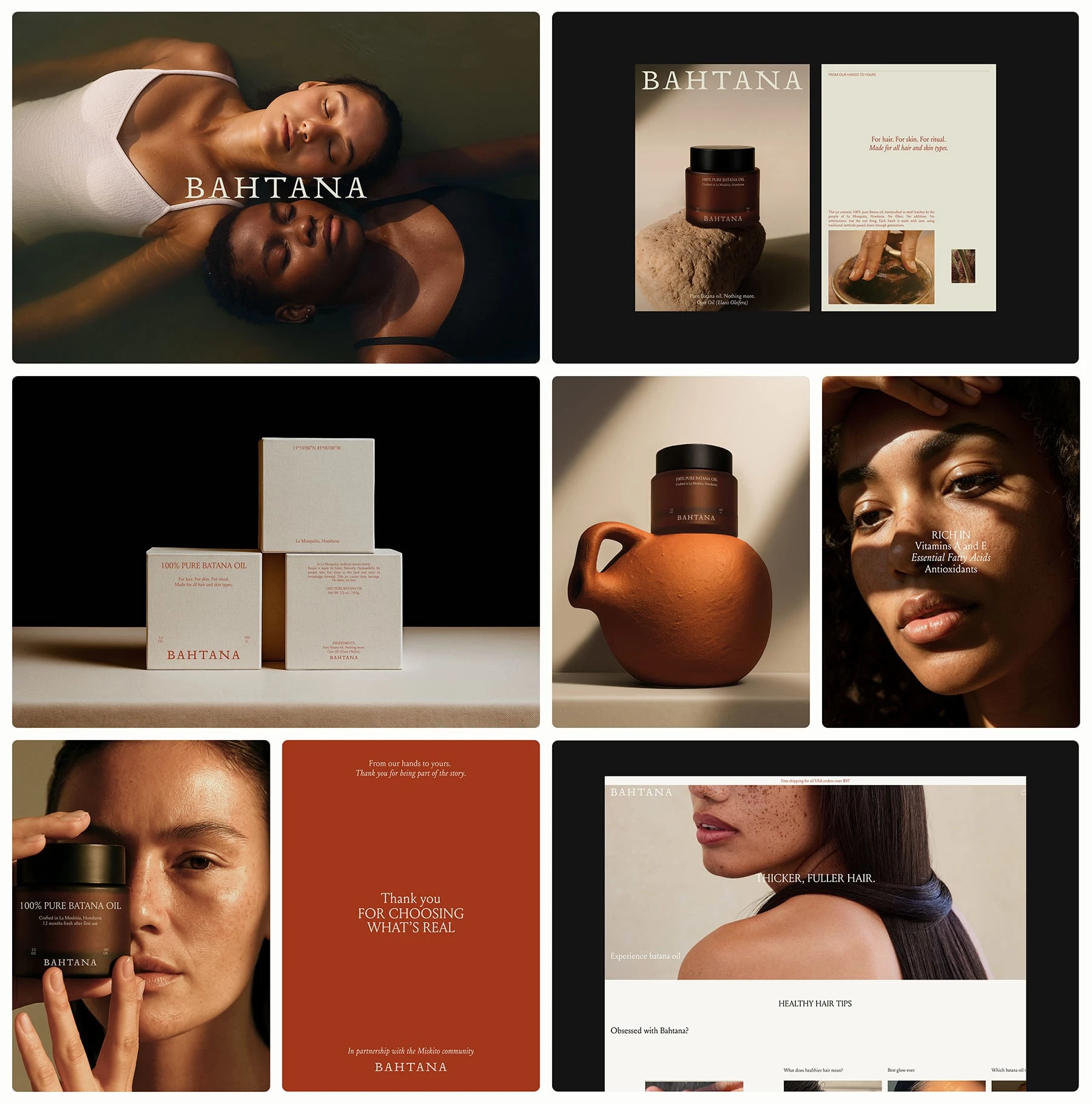
Bahtana
Brand Strategy, Visual Identity, Packaging and Web Design for a Luxury Skincare Line
Bahtana’s brand strategy, visual identity, packaging system, and web design were crafted to merge cultural heritage with modern luxury.
The brand is rooted in the Miskito community’s centuries-old batana oil tradition. The work positioned Bahtana as a premium beauty line that elevates indigenous wisdom into a luxury ritual.
The identity system blends warm earthy tones, refined serif typography, and editorial-style photography - creating a premium yet authentic presence across packaging and communications.
Delivered: Brand strategy, Visual identity, Packaging design, Website design, Art direction, Brand guidelines
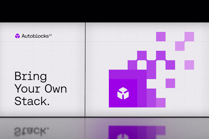
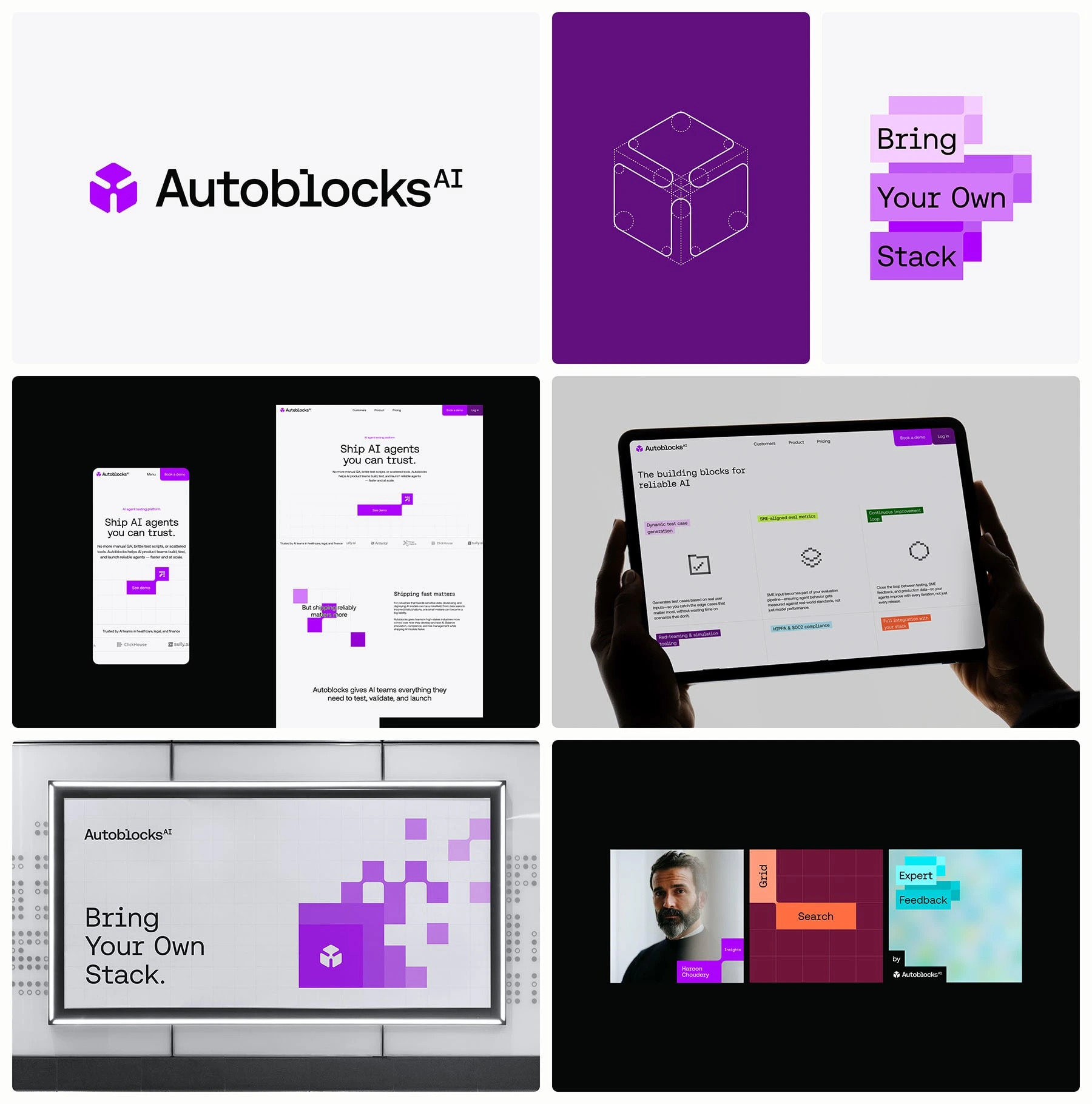
Autoblocks.ai
Brand Strategy, Visual Identity & Website for an AI Infrastructure Platform
Autoblocks was created to solve a critical frustration: reliable AI wasn’t about smarter models, but about building systems developers could actually trust. The challenge was transforming them from just another AI tool into the infrastructure teams depend on.
The work repositioned Autoblocks as the platform that elevates AI development from fragile demos to engineered systems. The new identity and language communicate clarity, trust, and technical authority - combining bold visuals with a modular design system that reflects their product philosophy: “Bring Your Own Stack.”
Delivered: Brand strategy, Visual identity, Website design, Product interface, Messaging framework, Marketing materials, Brand guidelines
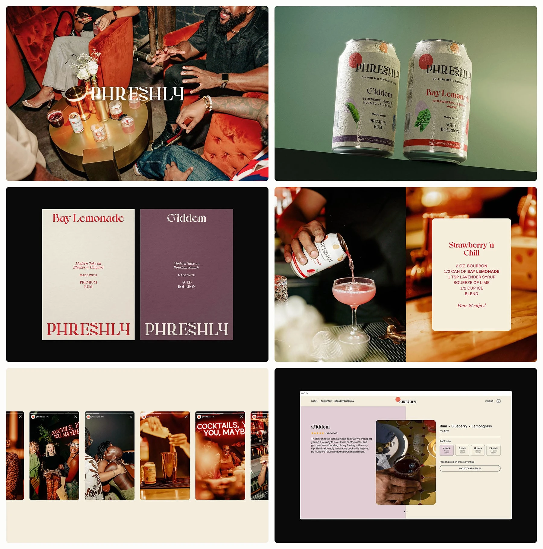
Phreshly
Brand Strategy, Packaging, Visual Identity & Website Design + Development for a Modern Cocktail Brand
Phreshly set out to disrupt the ready-to-drink cocktail market with flavors rooted in culture and crafted with authenticity. The challenge was creating a brand that celebrated tradition without losing its modern appeal — premium but accessible, vibrant but credible.
I developed the brand identity, packaging system, and website experience to reflect this duality. Bold typography, rich photography, and color cues inspired by nightlife and community gatherings give the brand energy and inclusivity, while the website design and development ensure a seamless digital presence that matches the on-shelf experience.
Delivered: Brand strategy, Packaging design, Visual identity, Website design, Website development, Marketing collaterals, Art direction, Brand guidelines
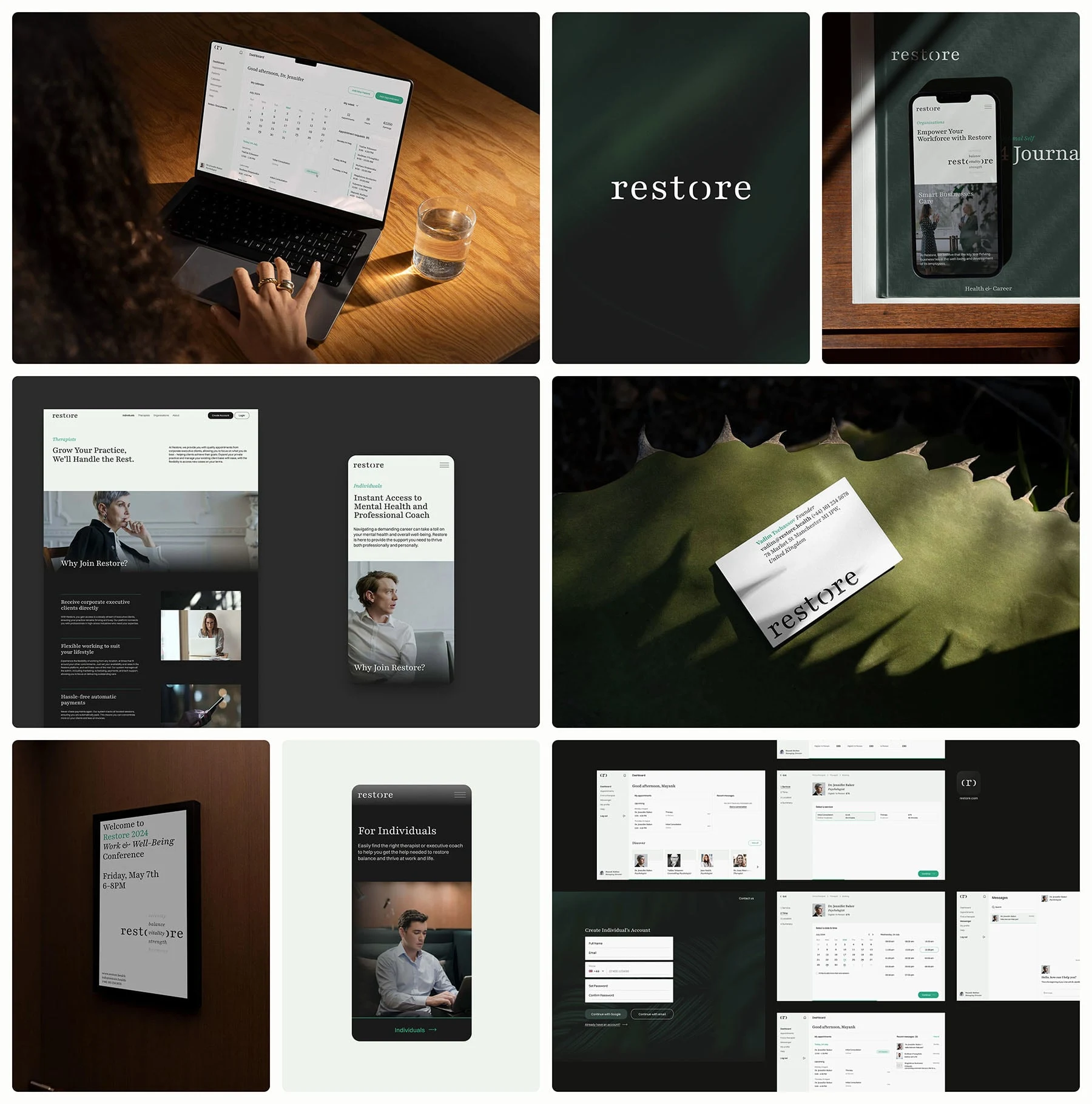
Restore
Brand Strategy, Visual Identity & Website Design + Development for a Wellness Platform
Restore needed a brand that reframed mental health support for high-performing professionals. The challenge was shifting the perception of therapy from a vulnerability to a strength - positioning it as an executive-level tool for performance optimization and sustainable success.
The brand identity was built to be minimal and sophisticated, using calm tones, spacious layouts, and modern typography to communicate authority and trust. This visual system carried seamlessly into the website design and development, where accessibility and professionalism were emphasized at every touchpoint to ensure credibility with a demanding audience.
Delivered: Brand strategy, Visual identity, Website design, Website development, Messaging framework, Brand guidelines
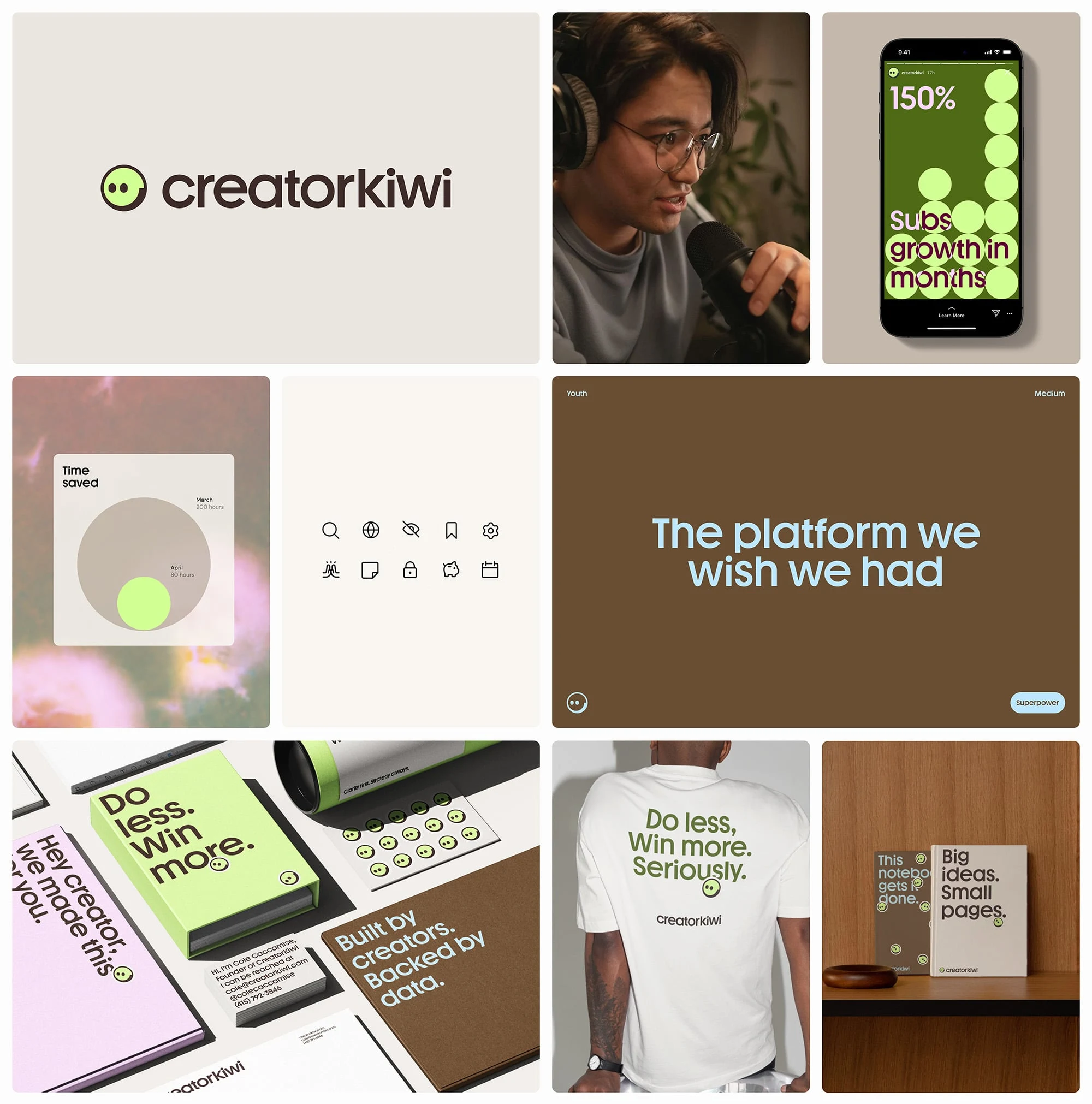
Creator Kiwi
Brand Strategy & Brand Identity for a Creator Economy AI Startup
Creator Kiwi set out to empower content creators with tools to better monetize and manage their work. The challenge was creating a brand that felt approachable and playful, yet still professional enough to build trust with partners and users in a fast-moving industry.
The identity system drew from geometric precision and minimalism, blending clean iconography with fresh color accents to reflect both creativity and reliability. Brand applications extended this same clarity - designed to resonate with digital-first audiences while keeping the brand versatile across all of the digital touchpoints.
Delivered: Brand strategy, Visual identity, Messaging framework, Brand guidelines
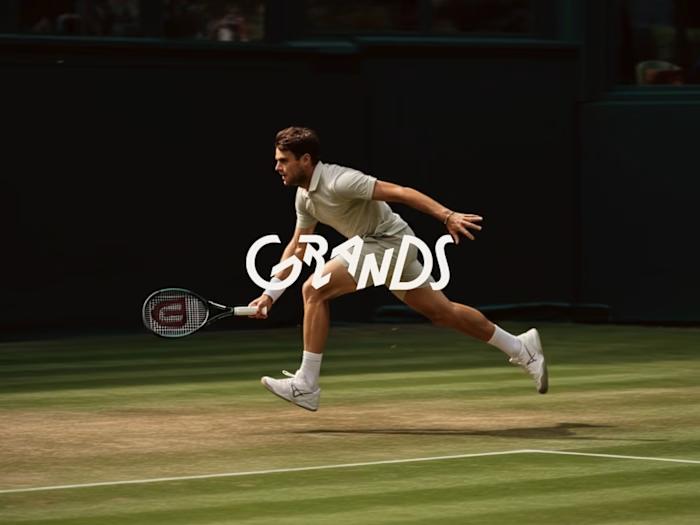
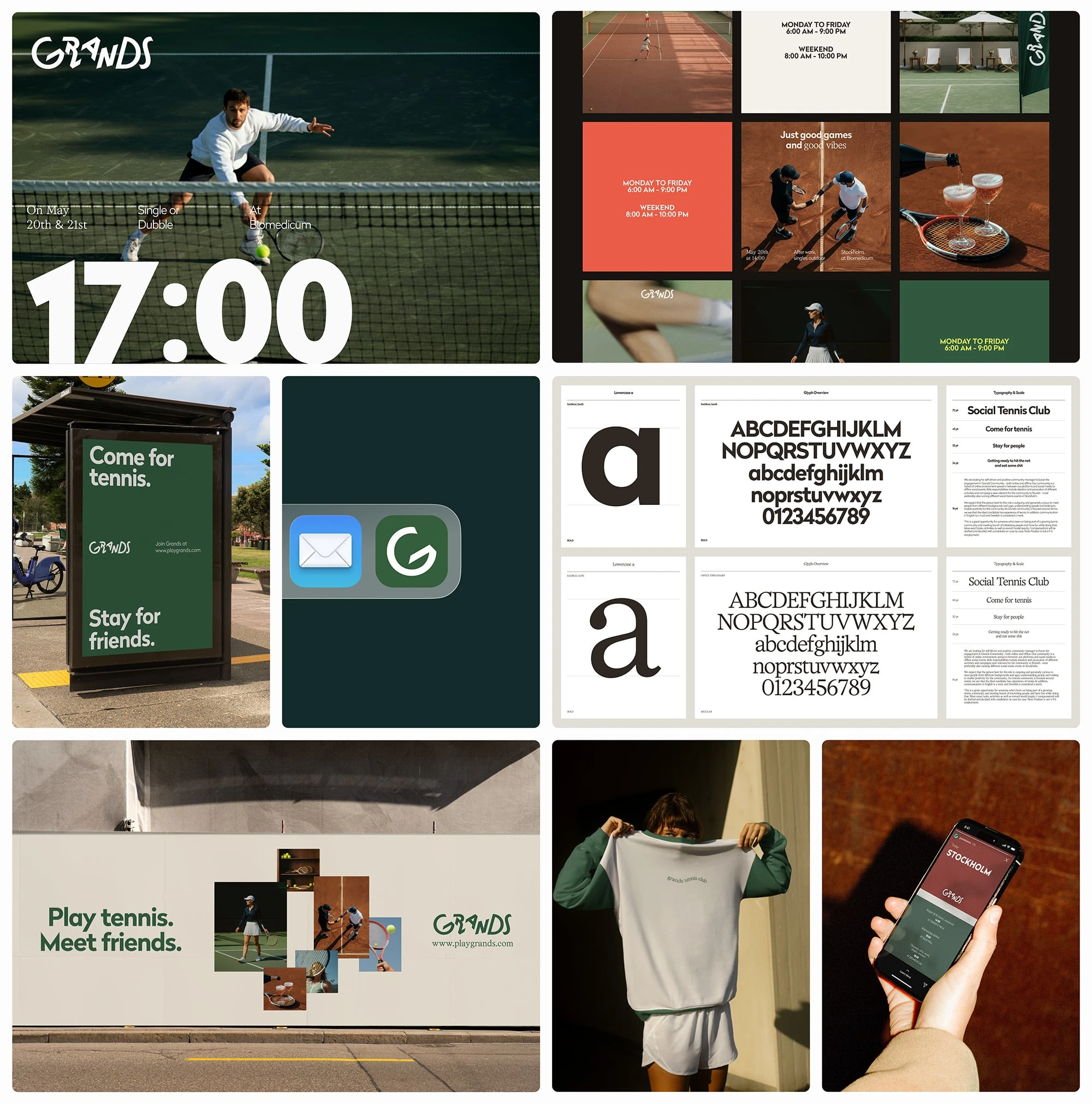
Grands
Brand Strategy, Visual Identity & Digital Direction for a Tennis Community
Grands is redefining how tennis players connect by creating a modern community platform that bridges lifestyle, sport, and culture. The task was to craft a brand that feels energetic and approachable, while carrying the authority needed to position Grands as a trusted hub in the tennis world.
The brand strategy uncovered opportunities around inclusivity, progression, and cultural relevance. These insights guided the identity system: bold typography paired with a dynamic color palette inspired by the court, movement, and community energy. Visual language and digital direction ensured consistency across both physical and digital touchpoints, making the brand recognizable, adaptable, and scalable as the community grows.
Delivered: Brand strategy, Visual identity system, Messaging framework, Art direction, Website direction, Brand guidelines
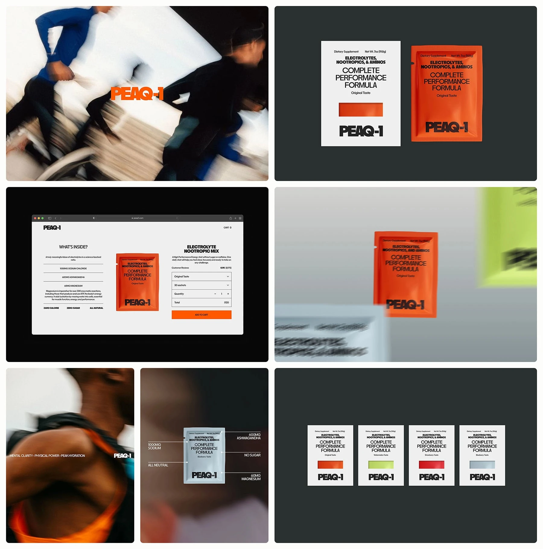
PEAQ-1
Naming, Brand Strategy, Visual Identity & Art Direction for a Sports Supplement Brand
PEAQ-1 was created to stand out in the crowded sports nutrition space with a name and identity that embody performance, progression, and community. The project began with naming exploration, where the final choice was designed to feel bold, energetic, and distinctive - a name that athletes could rally behind.
From there, the brand strategy established positioning rooted in motion, exclusivity, and team spirit. This foundation guided the creation of a visual identity defined by strong geometric typography, a vibrant athletic color palette, and dynamic layouts. The art direction extended the brand into lifestyle photography and product visuals, capturing the authenticity and drive of real athletes.
Delivered: Naming, Brand strategy, Visual identity system, Art direction guidelines
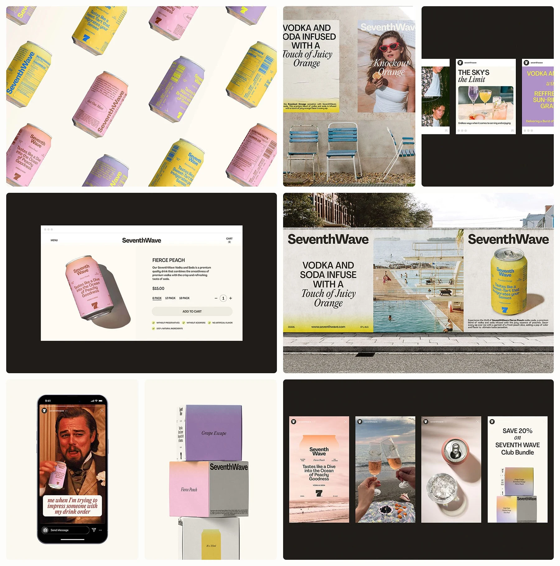
SeventhWave
Brand Strategy, Naming, Visual Identity & Packaging for a Beverage Brand
SeventhWave was conceived as a lifestyle-driven beverage brand inspired by energy, flow, and natural vitality. The project began with strategy and naming, where the focus was on creating a concept that would resonate with modern consumers while standing out in a crowded drinks category.
The chosen name, SeventhWave, captures both movement and momentum - a metaphor for riding the peak of possibility. This identity was supported with strategic positioning that placed the brand at the intersection of lifestyle, culture, and everyday coolness.
The visual identity drew inspiration from surf culture and youth lifestyle aesthetics. Bold typography, clean layouts, and a fluid color palette channel the feeling of freedom, rhythm, and community. Packaging design carried this system into physical form, pairing vibrant tones with minimal layouts to create shelf presence that feels fresh, modern, and instantly recognizable.
Delivered: Naming, Brand strategy, Visual identity system, Packaging design, Art direction guidelines
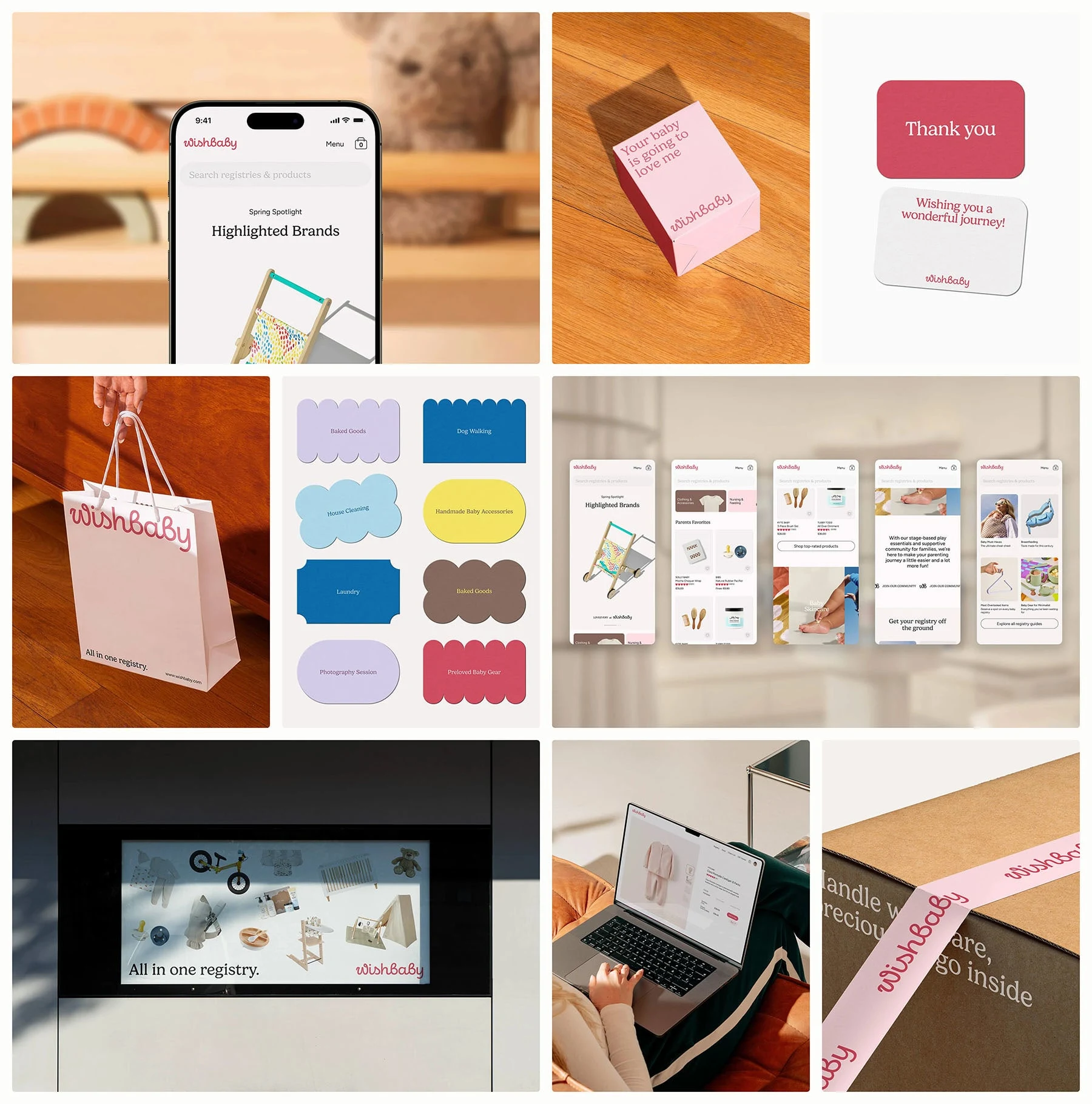
Wishbaby
Brand Strategy, Visual Identity, Packaging & Web Design for a Baby Essentials Brand
Wishbaby was built around a simple but powerful idea: to bring care, trust, and warmth into everyday essentials for newborns and young families. The project began with strategy, where the focus was on defining the brand’s purpose, values, and personality - blending functionality with emotional resonance.
The visual identity was designed to feel soft yet modern. Rounded typography, a calming color palette, and gentle iconography communicate safety, love, and simplicity without falling into clichés. This language extends across packaging, where clean layouts and thoughtful details ensure the products feel premium, trustworthy, and approachable.
Delivered: Brand strategy, Visual identity system, Packaging design, Website design, Art direction guidelines
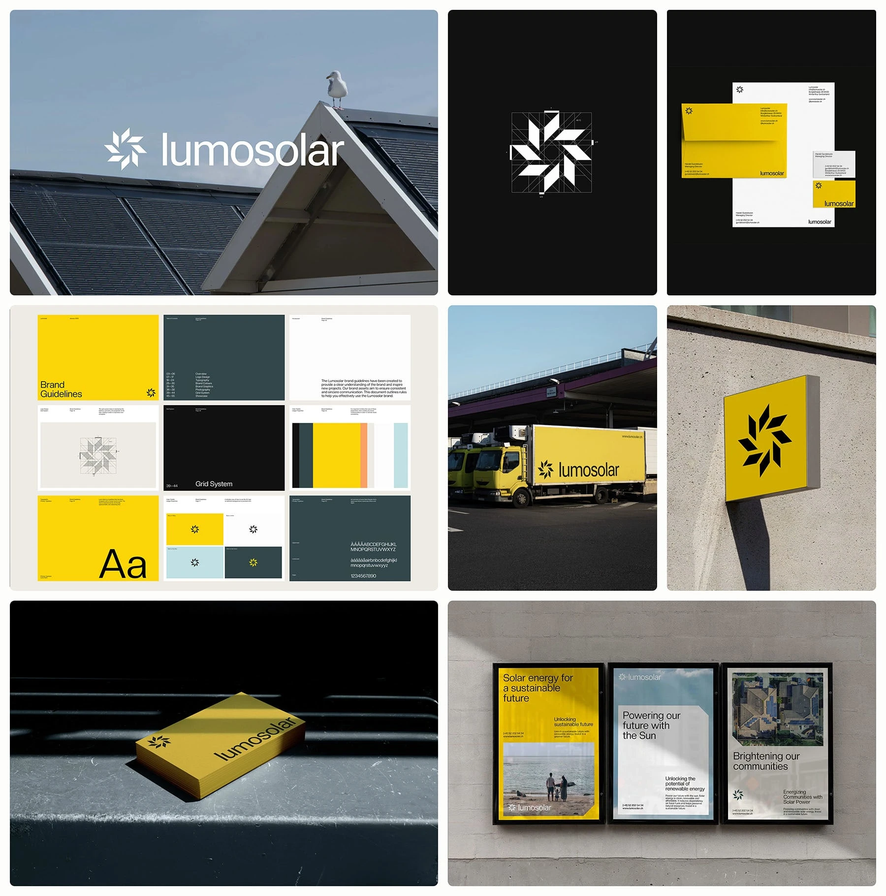
Lumosolar
Visual Identity and Art Direction for a Renewable Energy Startup
Lumosolar needed a brand that could communicate innovation and trust in a sector often filled with technical jargon and visual noise. The project began with strategy, focusing on positioning the company as both forward-thinking and approachable, bridging the gap between advanced solar technology and everyday accessibility.
The visual identity system reflects this balance: a clean, modern logo paired with a bright yet grounded color palette, geometric typography, and subtle graphic motifs inspired by light and energy flow.
Delivered: Visual identity system, Art direction, Brand guidelines
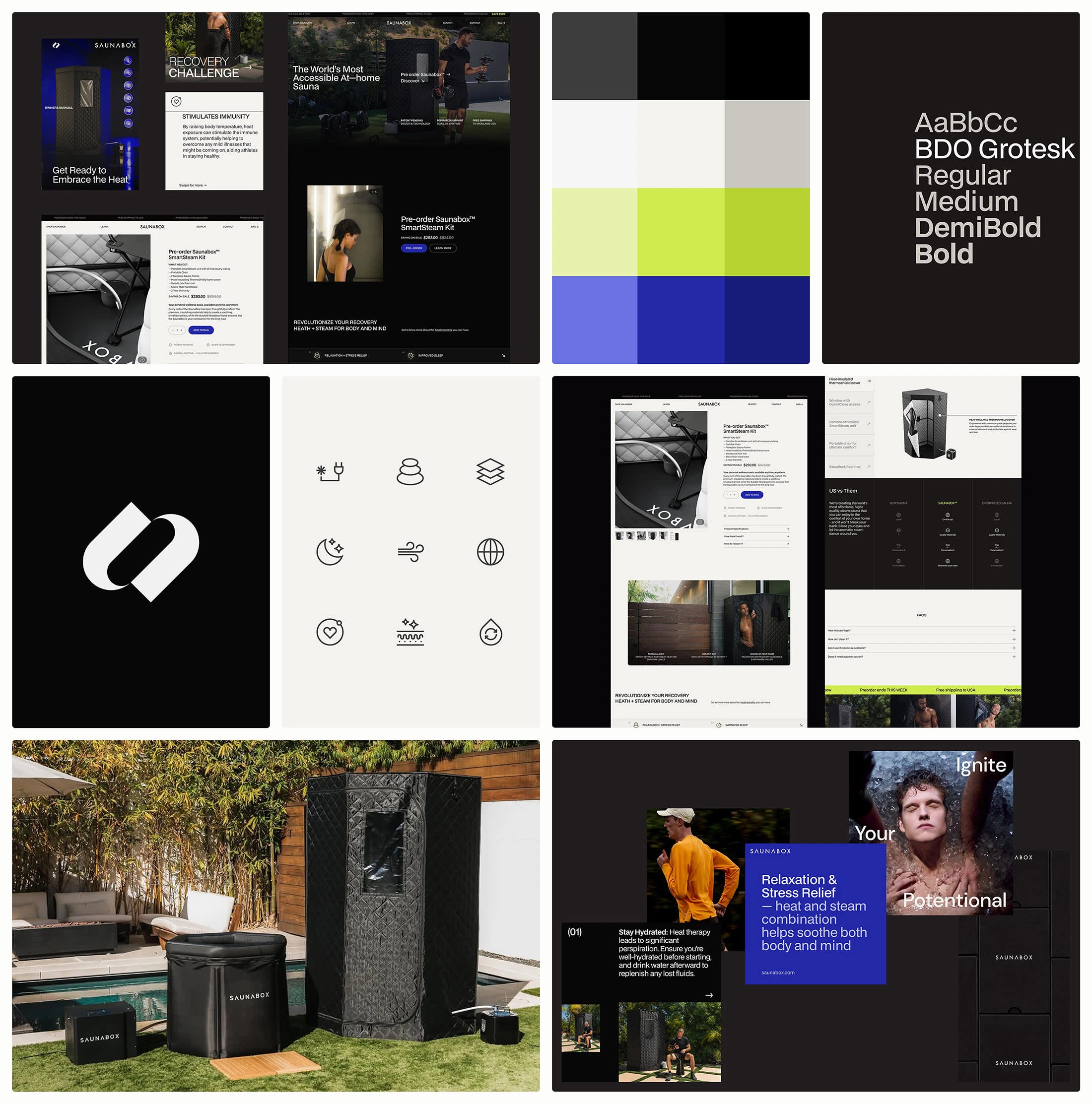
Saunabox
Brand Strategy, Brand Identity, Packaging & Web Design for a Wellness Startup
Saunabox set out to modernize the traditional sauna experience and bring it closer to urban lifestyles. The brand needed to feel approachable yet premium, blending the restorative qualities of wellness with the sleekness of a lifestyle product.
The strategy work focused on positioning Saunabox as more than a product - as a ritual of self-care. From this foundation, the visual identity was built around minimal forms, soft gradients, and calming neutrals paired with clean, modern typography. The system was crafted to communicate warmth, renewal, and simplicity while staying versatile enough for digital and physical applications.
This identity extended into packaging design, where materials and layouts were chosen to reflect both functionality and a premium feel. Clear information hierarchy, tactile finishes, and consistent use of the visual system ensured every touchpoint reinforced Saunabox’s vision of accessible luxury wellness.
Delivered: Brand strategy, Visual identity system, Packaging design, Iconography, Web design, Brand guidelines
Like this project
Posted Nov 7, 2025
A showcase of 300+ projects where strategy and design unite to build clear, consistent brands that last, across SaaS, B2B, wellness, and beyond.