pro
shivani mundra
Visual Systems Designer for Scaling Brands & Products
- 5.00
- Rating
- 84
- Followers
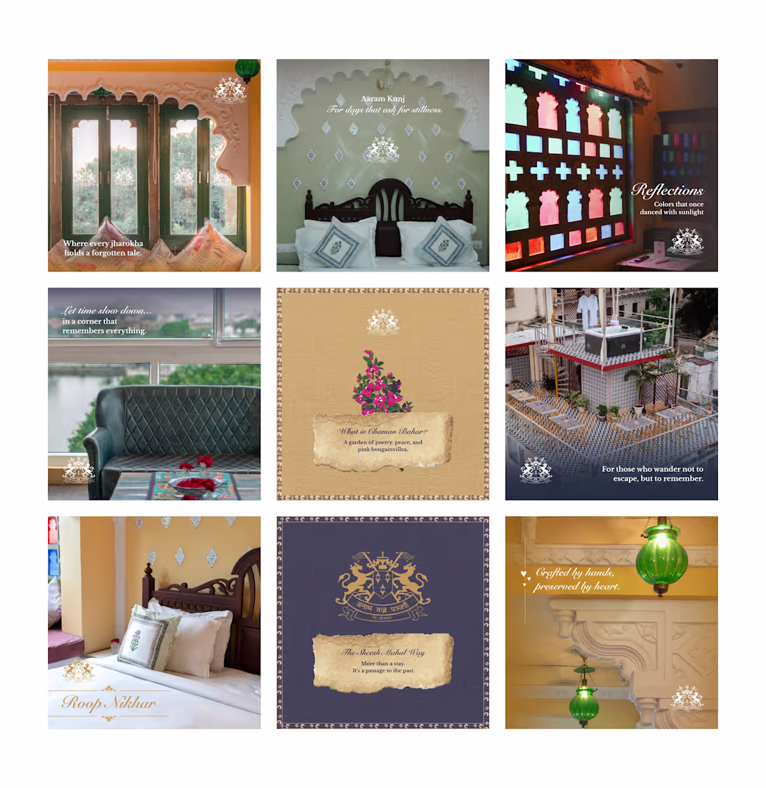
Designed a complete brand experience for this project, from identity to social media.
Every visual element was crafted to reflect the space’s character while maintaining consistency across digital touchpoints.
From storytelling-led posts to performance-driven creatives, this work translated into campaigns that not only looked refined but also supported real engagement and ad performance.
Campaign visuals used across social media and paid ads.
1
125
OrangeDS – UI/UX, Landing Page & Web Redesign
8
22
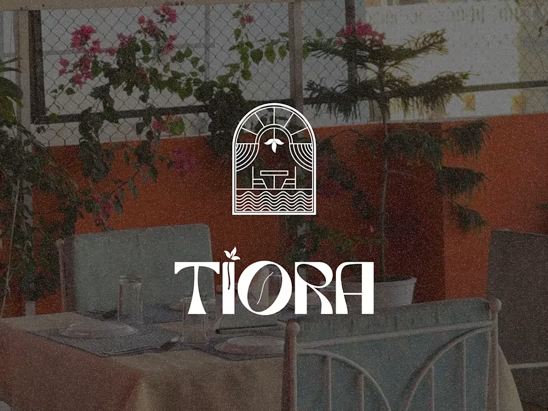
Tiora Café & Restaurant Brand Experience
11
23
This brand identity was built from listening before designing.
Listening to the place, the textures, the mood; not just the brief.
Instead of starting with trends or templates, the focus was on origin, clarity, and what this brand needs to become next.
Modern, rustic, playful, bold, but always grounded.
A system designed to respect where it comes from while leaving room to evolve.
Still shaping the full case study, but this project reminded me why I love brand work that starts with story.
21
22
613
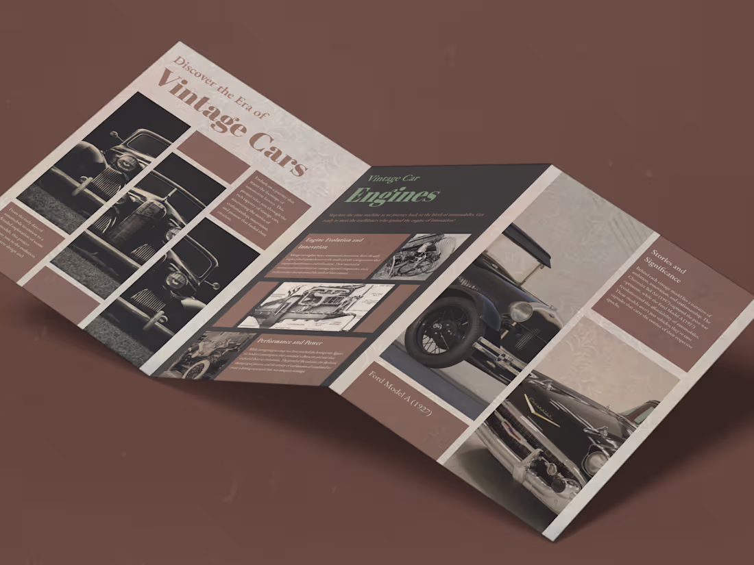
Vintage Car - Magazine Design
8
11
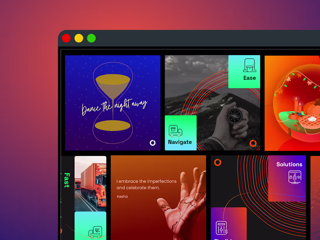
OrangeDS Social Media Visual Design Project
8
14
19
20
458
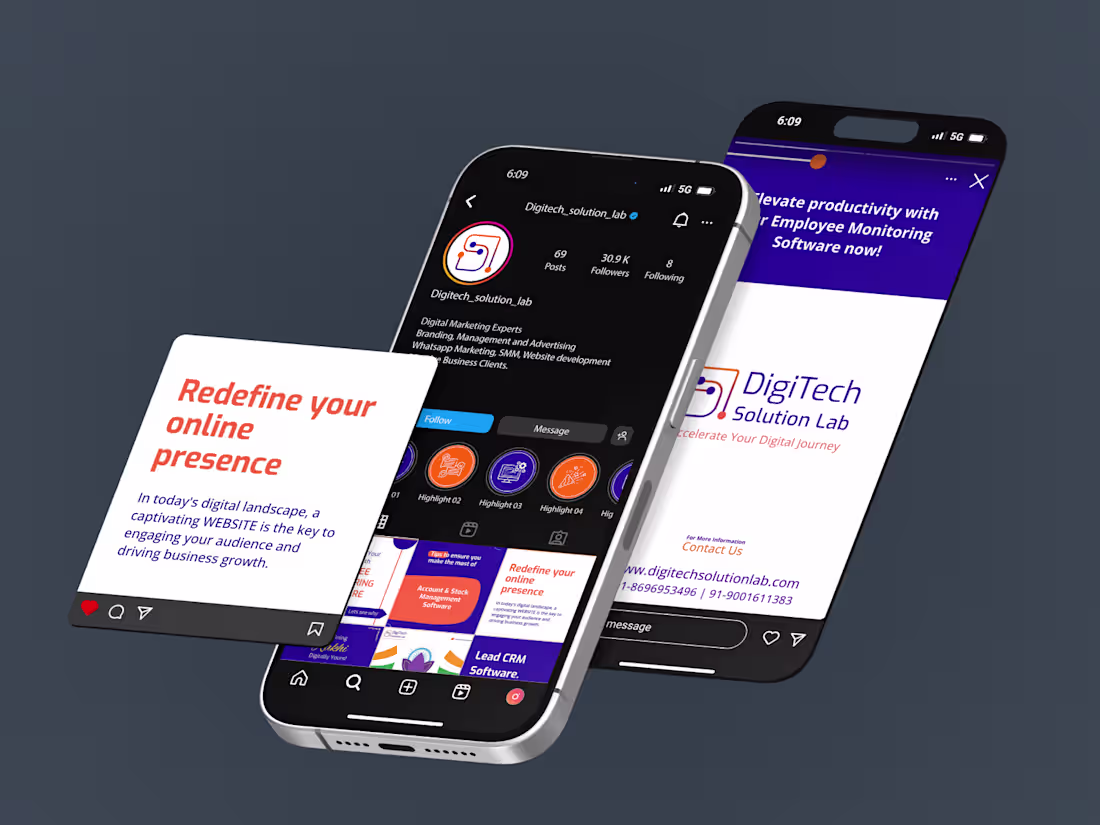
Building a Scalable Brand Identity for a Digital Growth Studio
9
9

Designed a landing page that explains services without explaining too much.
Clear hierarchy.
Friendly visuals.
One strong CTA.
The goal was simple:
make the value obvious in under 5 seconds.
Would you scroll… or click?
2
101
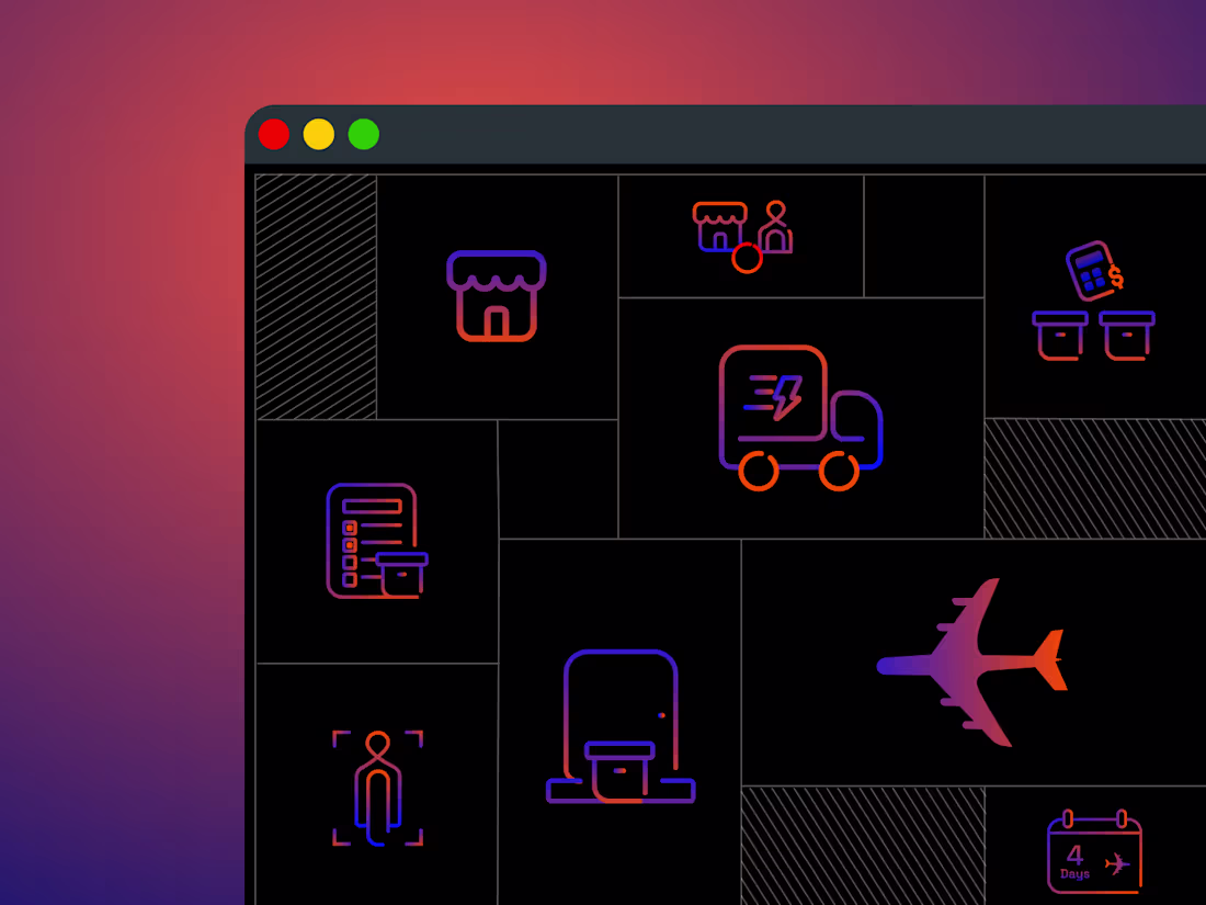
OrangeDS Iconography & Visual System Design
8
7
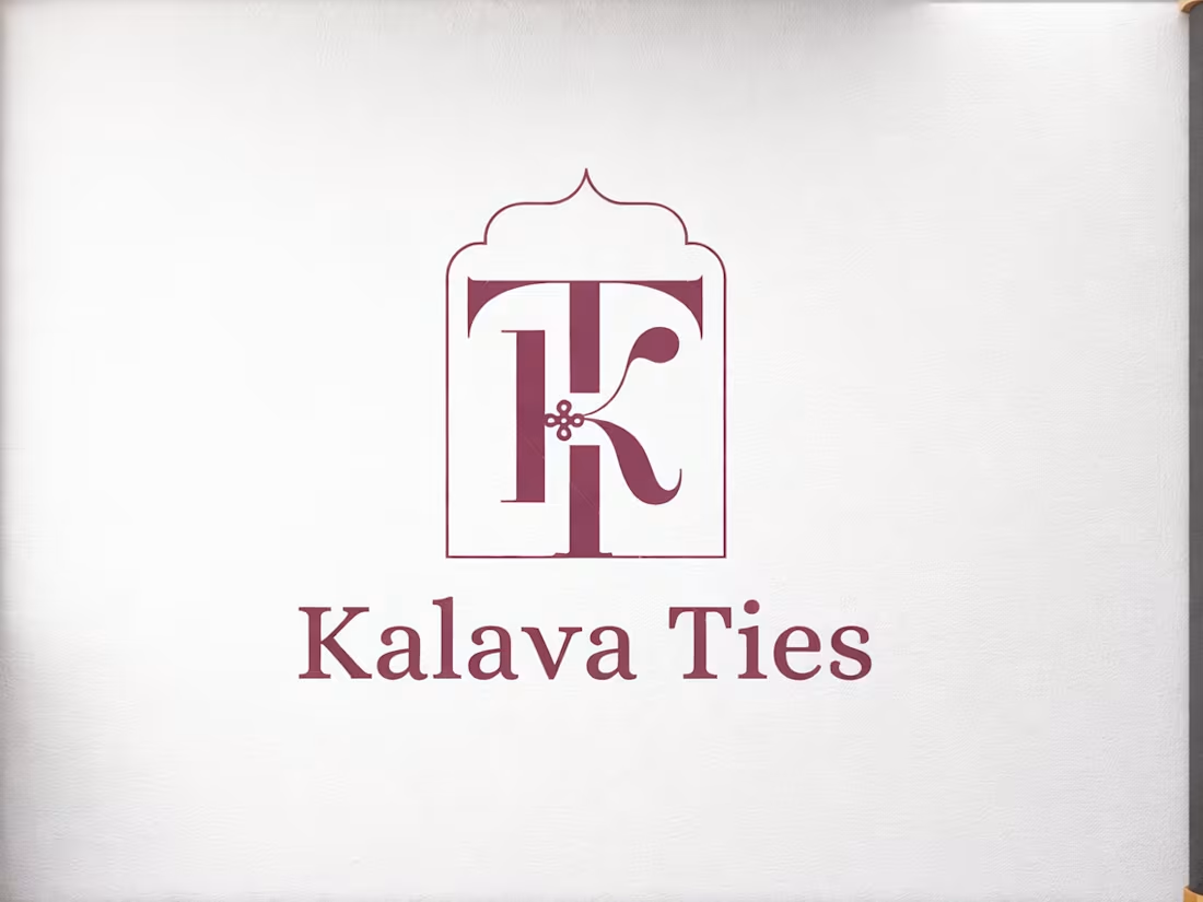
I recently designed logo for Kalava Ties, a wedding brand.
So, the idea started from something simple - a tie.
Not just visually, but what it means.
Two people. Two families. Things coming together.
The monogram is built around this idea of a tie that never really ends. The form flows, loops, and reconnects.
In many Indian traditions, a kalava is tied as a mark of protection, intention, and continuity.
A simple thread, but it carries meaning
There’s more than one way to read this mark.
What stands out to you first?
2
63
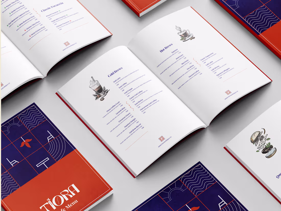
Tiora Café and Restaurant Menu Design
8
12
4
5
185
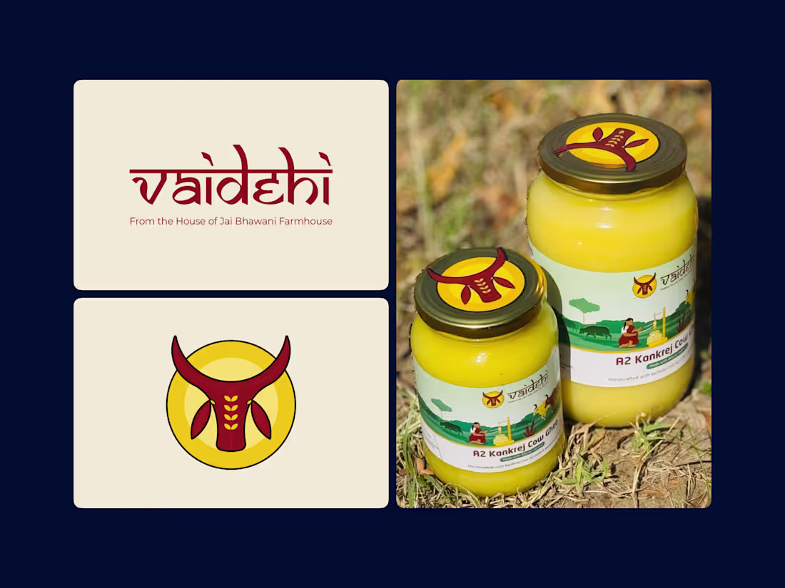
Vaidehi Ghee Brand Identity and Packaging Design
8
15