Tiora Café & Restaurant Brand Experience
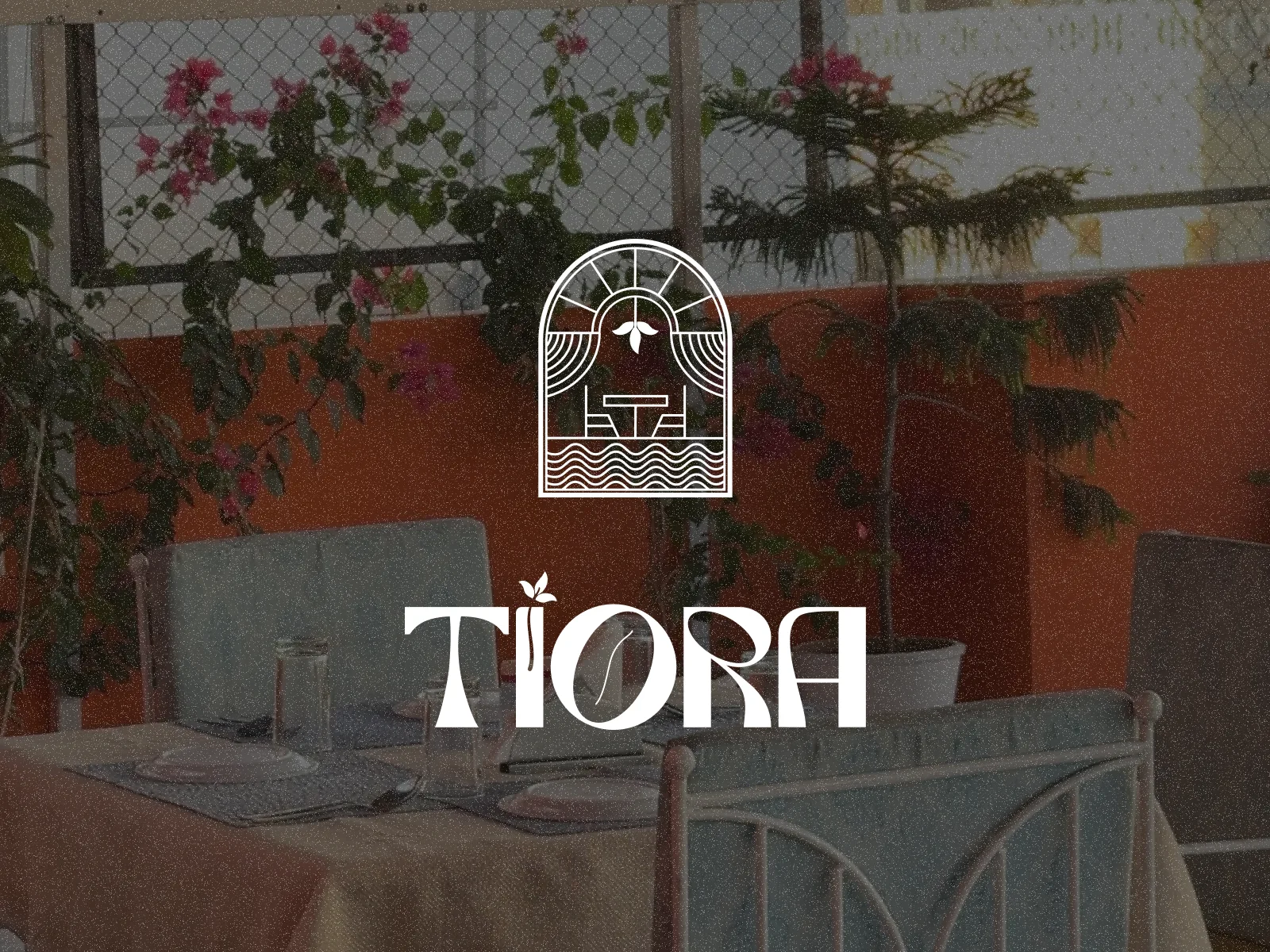
Tiora Café & Restaurant - Creative Direction, Website Design & Brand Identity
Project Summary
Tiora is a culture-inspired café and restaurant in Udaipur where I led the complete physical and digital brand experience. From identity design, menu systems, packaging, and iconography to social presence, spatial graphics, and visual storytelling, I shaped Tiora’s brand memory across every touchpoint. The goal was to blend Rajasthani warmth with modern minimalism and create a dining experience that feels culturally rooted, premium, and unforgettable.
About The Brand
Tiora Café & Restaurant brings together rustic modernity, youthfulness, and cultural depth. Rooted in local flavors and global sensibilities, the brand focuses on warm hospitality, clean visual identity, and a refined dining atmosphere.
My Role
Creative Director
Brand Identity Designer
Logo & Symbol Design
Menu & Print Design
Spatial Visual Language
Social Media Visual Direction and Management
Food Photography
Project Goals
Build a culturally rooted yet modern brand identity
Create a cohesive physical and digital experience
Develop an editorial menu system that elevates the dining flow
Design icons, patterns, and illustrations that tell Tiora’s story
Ensure consistency across menus, packaging, signage, and social media
Establish a premium hospitality presence from day one
Design Approach
The identity is built around five cultural pillars - संस्कृति (Culture), विरासत (Heritage), समावेश (Inclusion), तरुण (Youth), and नींव (Foundation). These inspired the monoline emblem, earthy palette, typographic pairing, illustrated motifs, and a flexible visual language that balances heritage with modern clarity.
Process
1. Discovery & Research
Studied cuisine, audience, competitors, local culture
Created moodboard blending rustic textures + editorial minimalism
2. Logo & Symbol
Designed a monoline emblem inspired by arches, sun rays, and Rajasthani motifs
Built scalable logo variations for print, signage, and digital
3. Identity System
Color palette inspired by terracotta, indigo, and sandstone
Typography pairing with serif warmth + sans-serif clarity
Illustrated elements + monoline iconography
Pattern system for packaging and collaterals
4. Menus & Physical Touchpoints
Food and beverage menus
Table cards, thank-you cards, signage
Bill folder design
5. Digital Presence
Website design & feel direction
Social media grid structure
Highlight covers and iconography
Results & Impact
The final identity elevated Tiora into a warm, premium café experience with strong cultural storytelling. The menus feel editorial and clear, the visual system is consistent across space and digital, and the brand now carries a distinct, memorable personality rooted in culture but built for modern hospitality.
Key Learnings
Cultural storytelling becomes premium with minimal execution
Menu hierarchy and typography directly influence dining experience
Consistency across physical and digital touchpoints builds brand memory
Hospitality brands thrive when identity supports mood + atmosphere
If you’re building a hospitality or café brand and want a culturally rooted, modern identity, I’d love to collaborate.
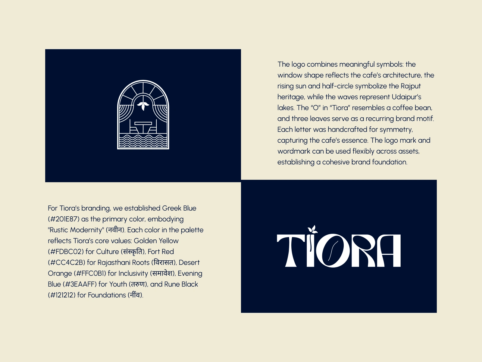
The Tiora symbol blends culture with modern minimalism, forming the foundation of the brand’s visual language.
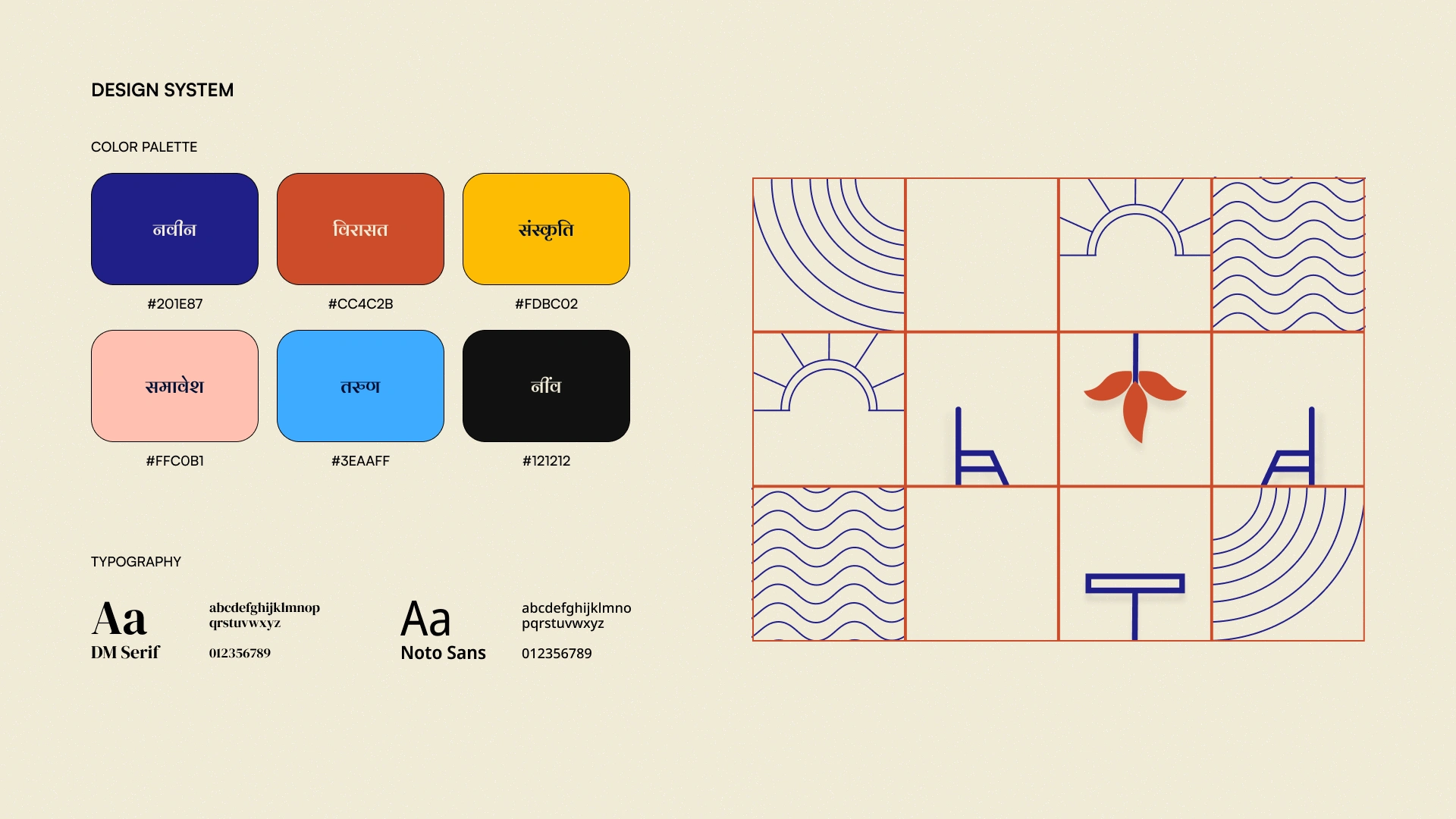
A culturally rooted identity system shaped by five pillars - Culture, Heritage, Inclusion, Youth, and Foundation.
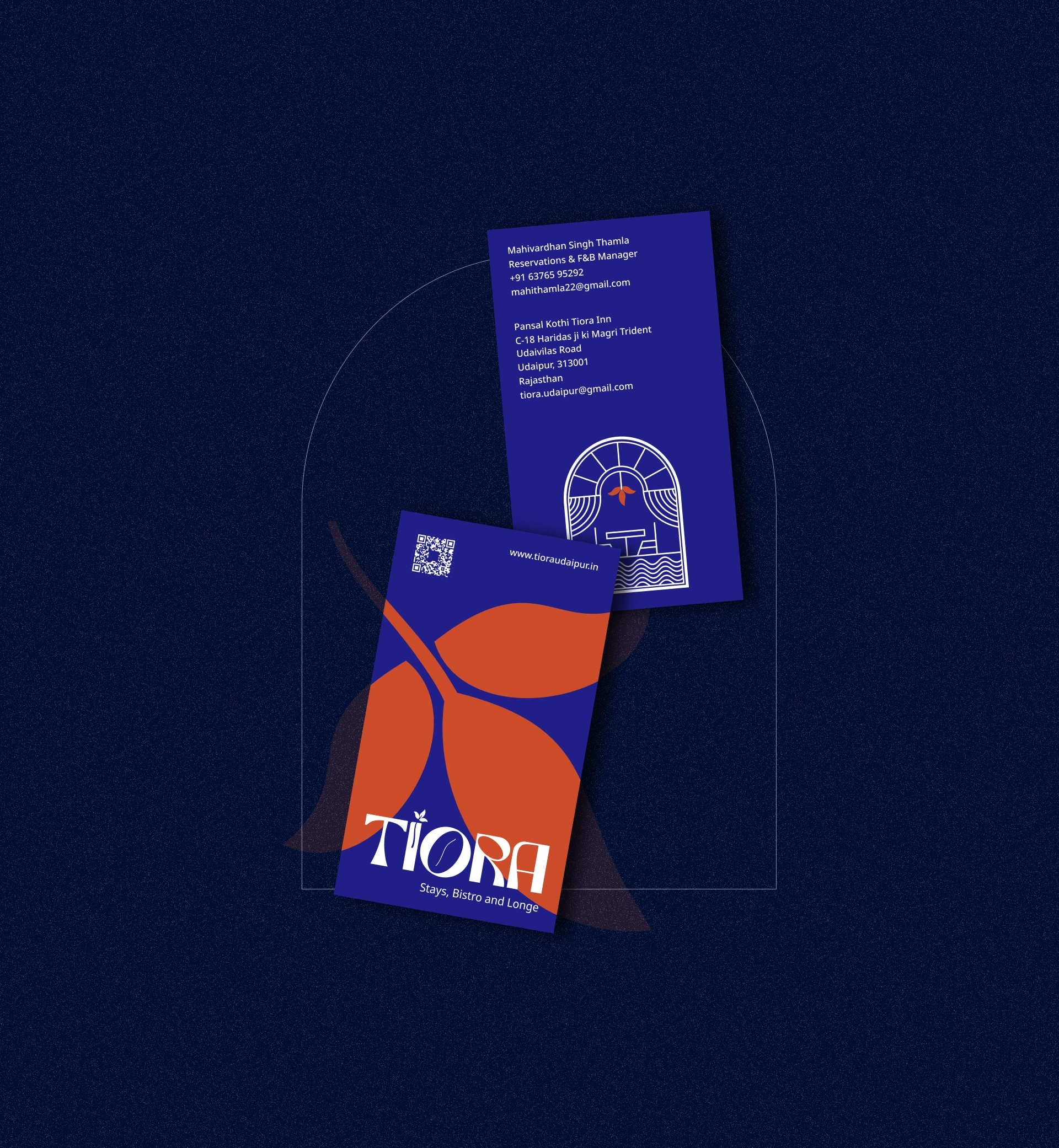
Brand touchpoints designed to feel warm, premium, and editorial - consistent across print and digital.
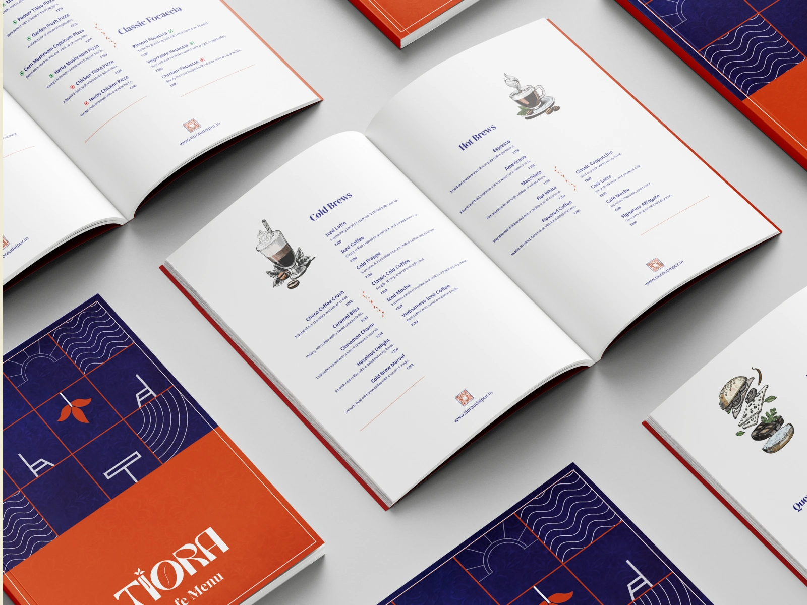
A clean editorial menu system that enhances the dining experience and reinforces Tiora’s storytelling.
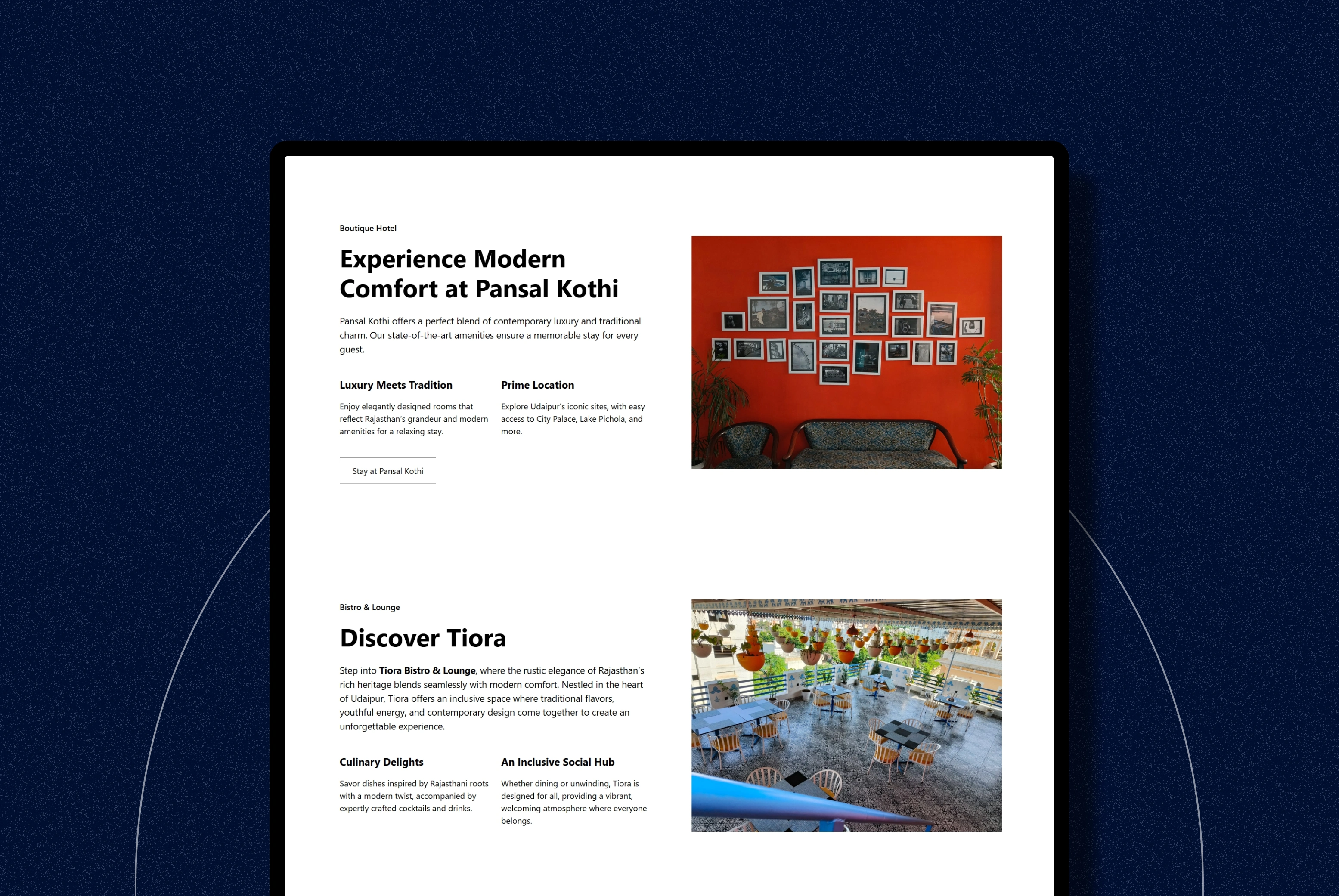
Digital touchpoints designed to match the warmth and editorial aesthetic of the physical café.
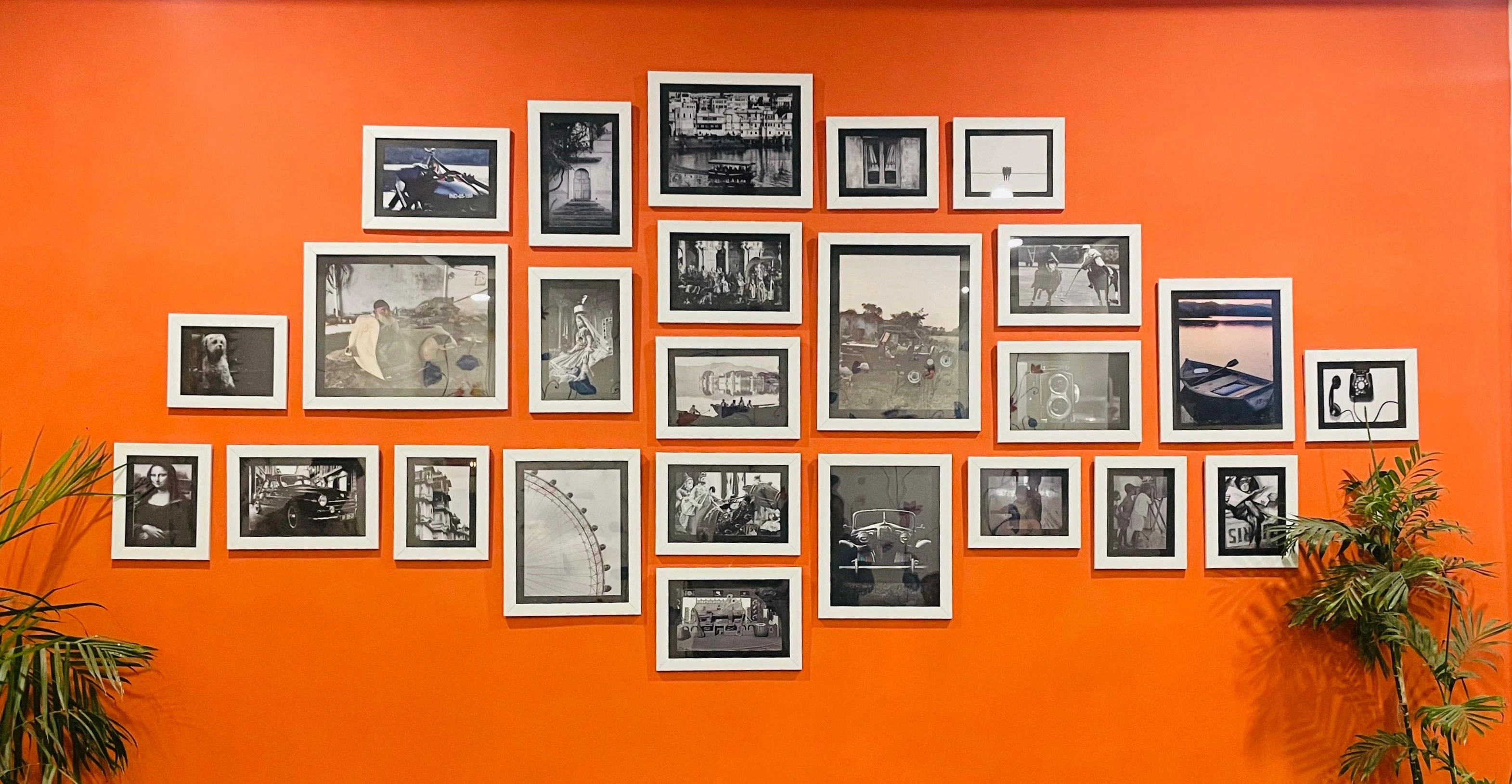
Brand colors, textures, and visual cues flow seamlessly into the space, shaping the guest’s sensory experience.
Like this project
Posted Nov 24, 2025
Led Tiora’s full brand experience - identity, menus, illustrations, website, and spatial storytelling - blending Rajasthani warmth with modern minimalism.
Likes
10
Views
21
Timeline
Aug 8, 2024 - Ongoing

