Vintage Car - Magazine Design
shivani mundra
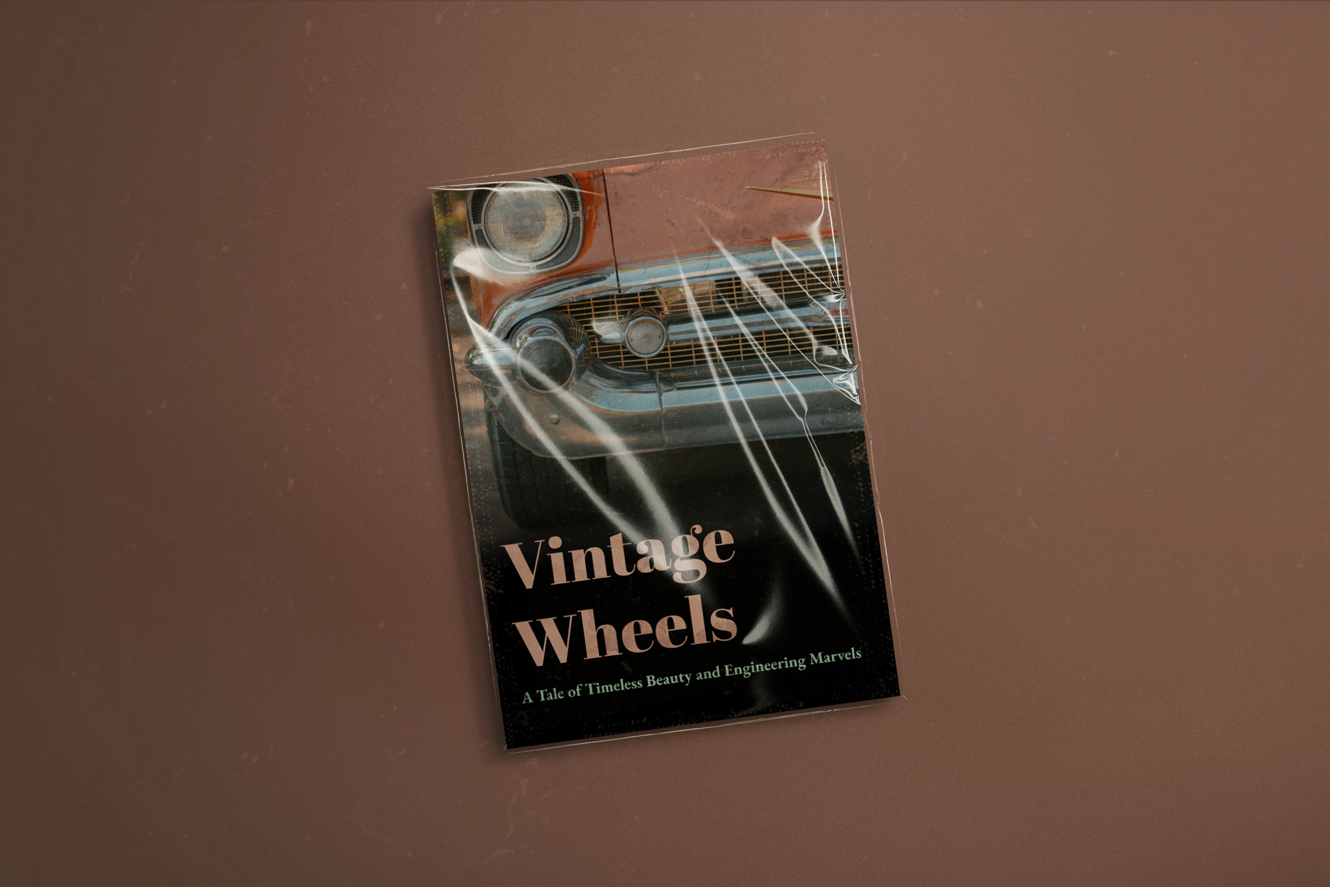
Vintage Wheels: Editorial Layout Exploration
Overview
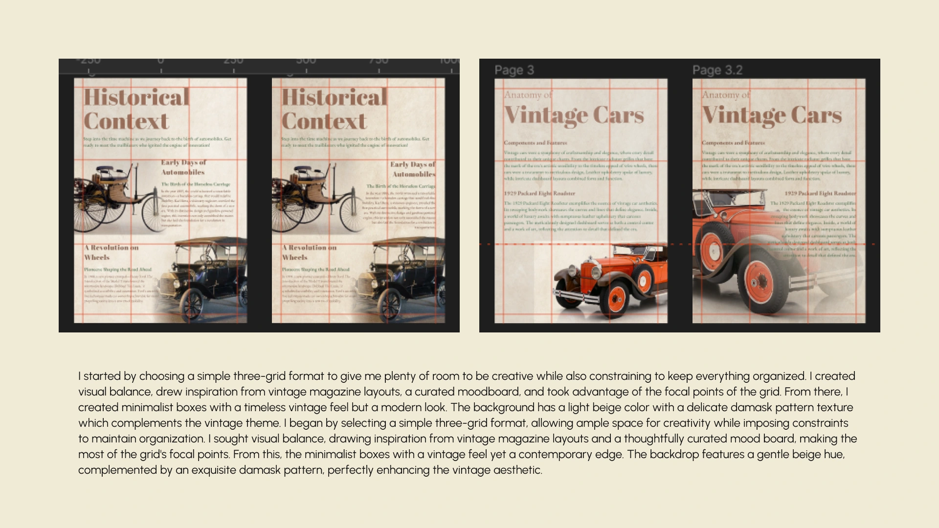
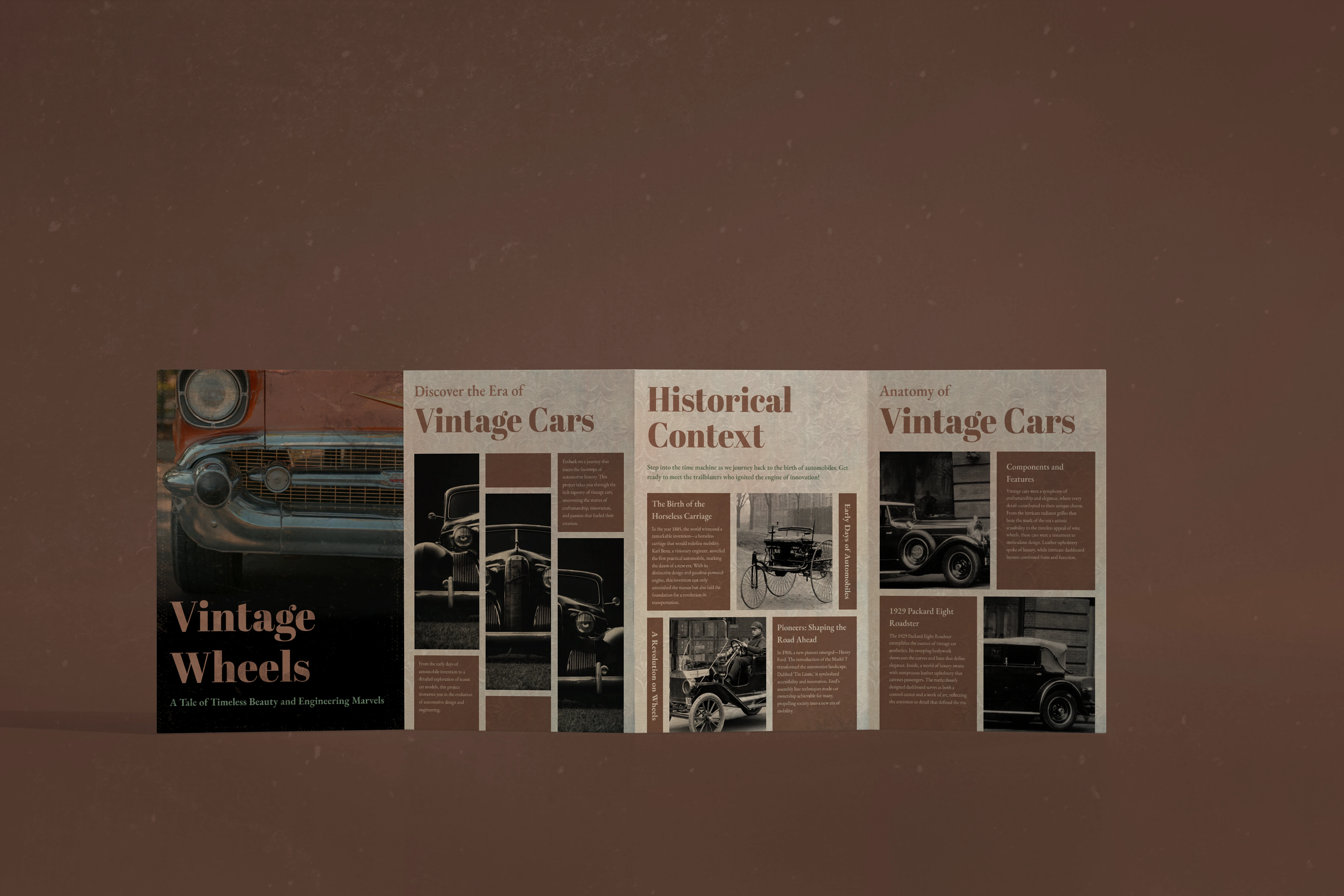
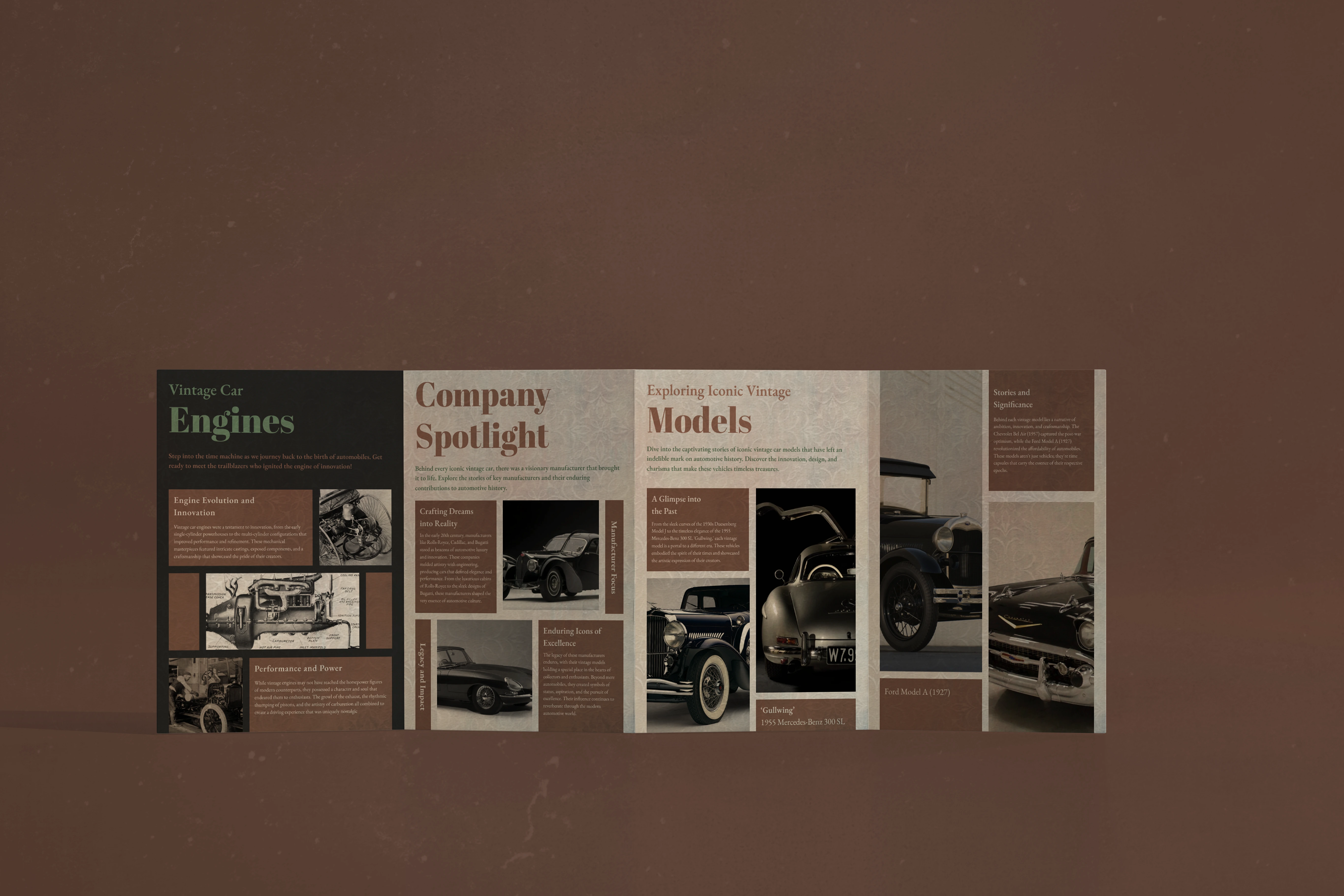
I designed a magazine spread exploring the evolution of vintage cars, using a structured three-column grid to focus on typography, hierarchy, and layout discipline.
Challenge
The goal was to balance vintage character with modern clarity, bold typography, nostalgic imagery, and detailed content, without letting the layout feel cluttered or chaotic.
Approach
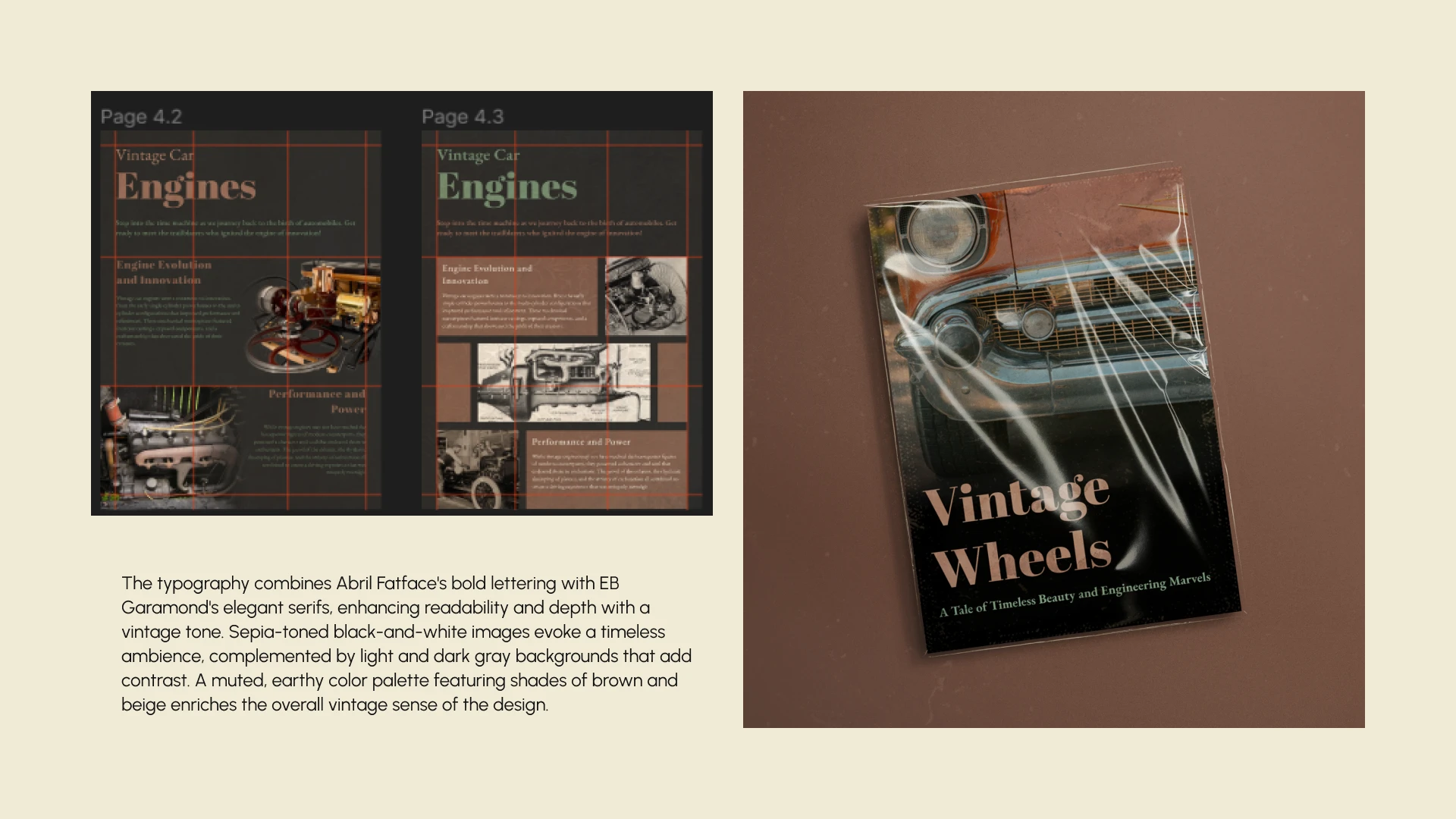
I built the layout around a consistent grid system and paired expressive headlines with elegant serif typography (Abril Fatface and EB Garamond). A restrained color palette and sepia-toned imagery supported the editorial tone without overpowering the content.
Outcome
The final spread feels cohesive, readable, and intentional. More importantly, it demonstrates how strong grids and hierarchy can carry visual storytelling, even when the content is dense and detail heavy.
Think less decoration, more structure with a bit of vintage elegance.
Like this project
Posted Jan 23, 2026
Designed a vintage car magazine spread with a strong grid and elegant typography. Adding vintage elegance through patterns, textures and color palate.