OrangeDS Iconography & Visual System Design
shivani mundra
OrangeDS - Iconography & Visual System Design
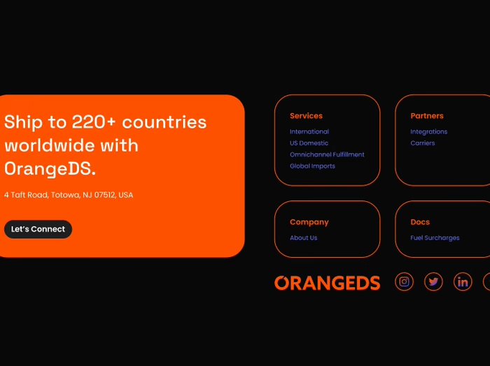
OrangeDS is a global ecommerce logistics company serving 220+ countries. I was responsible for designing a complete iconography and illustration system that simplifies complex logistics information and strengthens brand consistency across web, product UI, social media, and event banners.
My role covered research, creative direction, grid development, system design, iconography, illustration, and visual storytelling.
Challenge
Logistics is complex, users often struggle to understand technical concepts like landed cost, customs clearance, cross-border shipping, and parcel tracking. OrangeDS needed a visual system that could:
Simplify information
Improve usability
Express the brand identity
Maintain consistency across all touchpoints
Stand out from competitors visually
Approach
1. Research & Moodboarding
I collaborated with the senior team to understand the product ecosystem, service hierarchy, and user pain points.
We conducted moodboard sessions focusing on:
Logistics workflows
Ecommerce behavior
Visual direction (minimal, geometric, expressive lines)
How top logistics brands simplify information
I also studied a dedicated course on iconography to align my work with global standards.
2. Defining the System (Type, Color, Form, Function)
Before sketching, I built a foundational system guided by 4 pillars:
Type: Based on Space Grotesk’s geometric structure
Color: Brand blue (#021BFF) + Orange (#FF5100) gradients for modernity
Form: Rounded strokes, soft corners, expressive gap-lines
Function: Must work at small sizes, be instantly recognizable, and readable across web + print
3. Grid & Structure
I developed a 16×16 and 24×24 geometric grid, ensuring:
Perfect balance
Pixel-sharp clarity
Consistency across 100+ icons
Smooth scaling for both UI and large expo banners
Every icon began as a pencil sketch → refined using geometry → completed in Figma.
4. Sketching, Refinement & Digitalization
I explored multiple concepts for:
Tracking
Cross-border shipping
Landed cost
Customs duty
Drop-off points
Warehousing
Partner store onboarding
Customer service
Omnichannel fulfillment
Icons were iterated until they matched the visual language perfectly.
I used continuous-line motifs + round gaps to reflect movement, speed, and connectivity, key brand values.
Solution
A Complete Iconography System
I delivered:
100+ icons
Complex pictograms for product features
Illustrations for hero sections and banners
A modular visual language built on geometric consistency
A Unified Look Across Platforms
The system was deployed across:
Website
Product UI
Social media feed
LinkedIn communication
Expo banners
Pitch decks
Email communication
Marketing campaigns
Impact
The new visual system created measurable improvements:
Improved comprehension of logistics workflows
Strengthened brand recall through consistent color & form
200× increase in social media reach in 15 days after iconography rollout
Higher user engagement on the website
Increased booth visibility at the White Label Expo
Modernized the brand without losing functionality
The icons helped users instantly understand complex logistics services, reducing cognitive load and enhancing decision-making.
What I Delivered
Research & Moodboards
Grid System
Iconography System (100+ icons)
Pictograms
Illustrations
Hero visuals
Visual consistency guidelines
Export-ready assets
Key Learnings
How visual systems drive clarity in tech-heavy industries
Balancing aesthetics with strict functionality
Building scalable icon systems that work across product and marketing
Creating brand memory through color & geometry
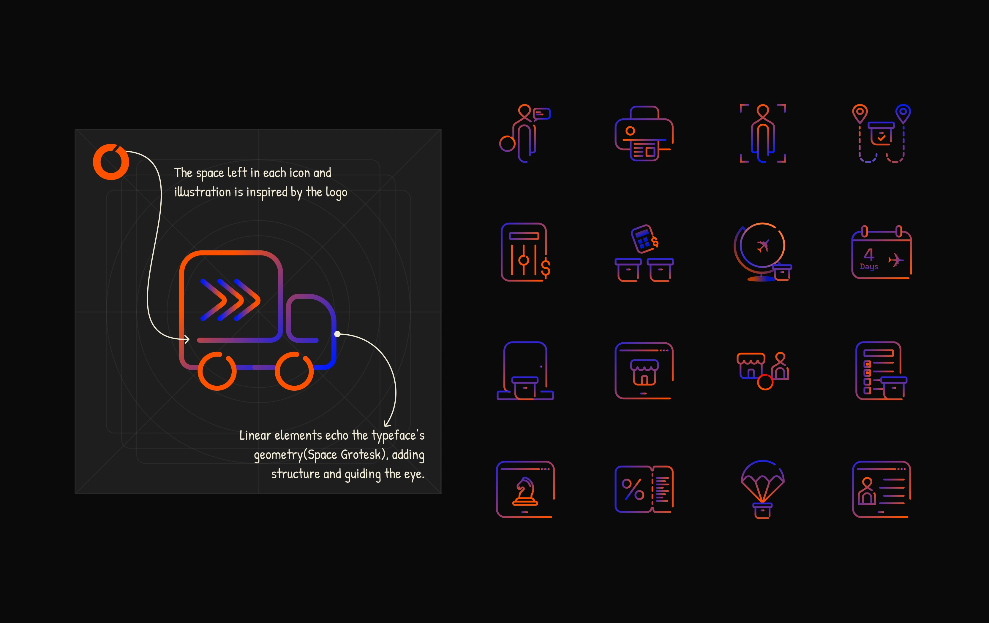
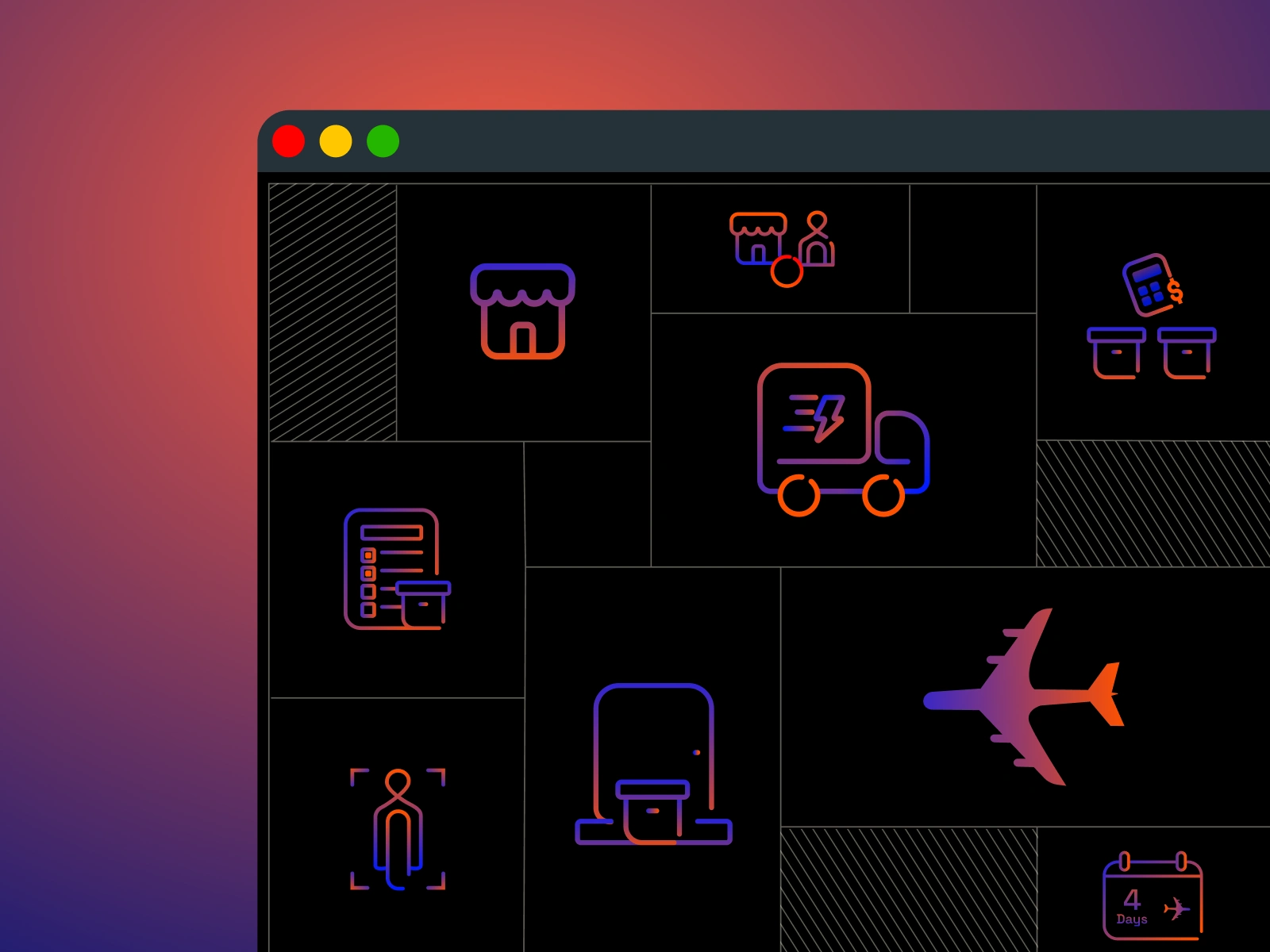
Early icon explorations built on a custom geometric grid, establishing structure, rhythm, and consistent visual language across the entire system.
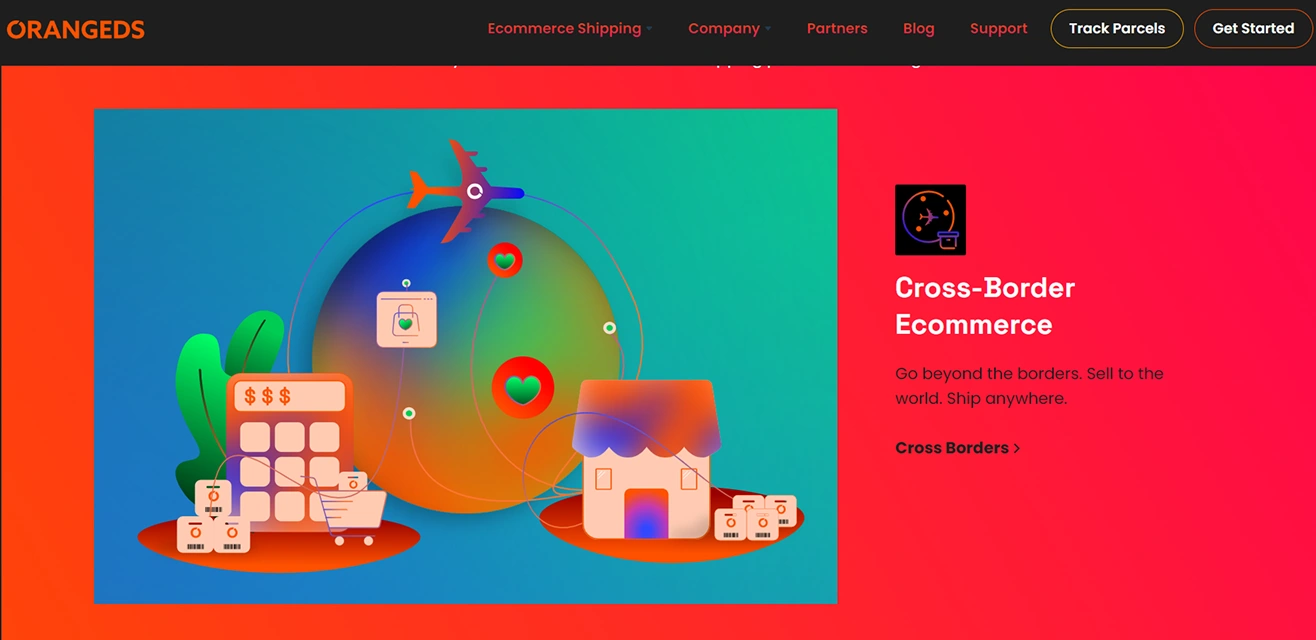
Feature-specific illustrations used on the OrangeDS website, simplifying complex logistics services into clear, intuitive visual narratives.
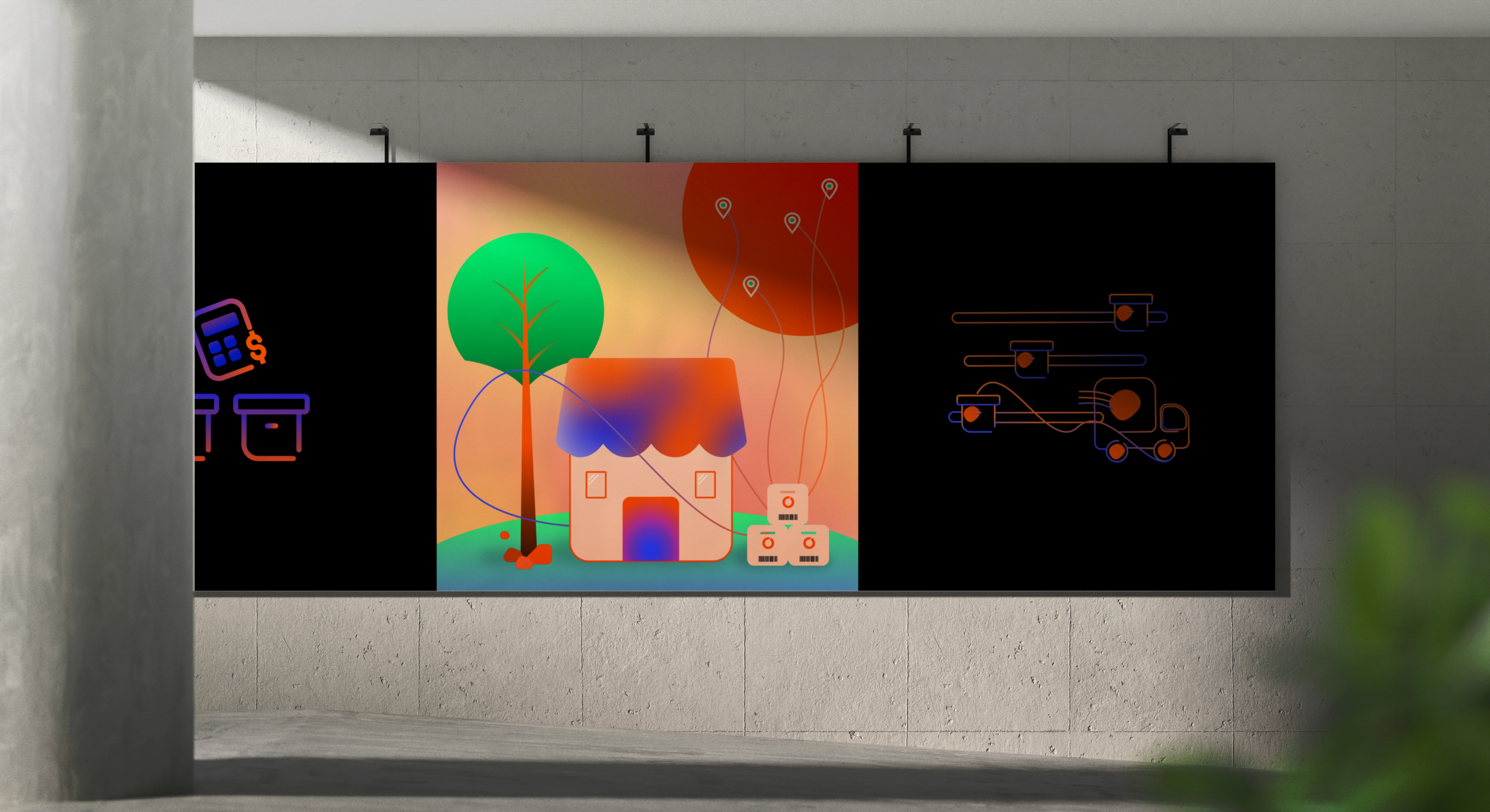
Illustrations scaled for large-format expo displays, highlighting key logistics offerings through gradient storytelling and brand-led visual cues.
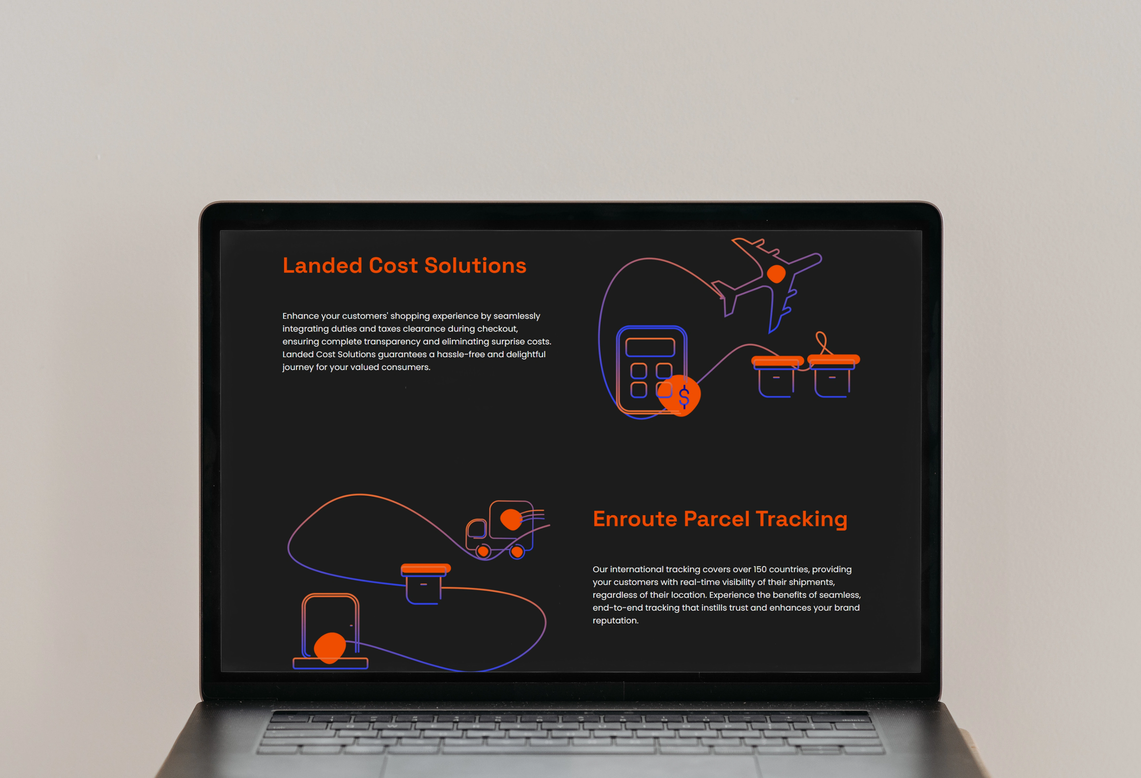
Feature-specific illustrations used on the OrangeDS website, simplifying complex logistics services into clear, intuitive visual narratives.
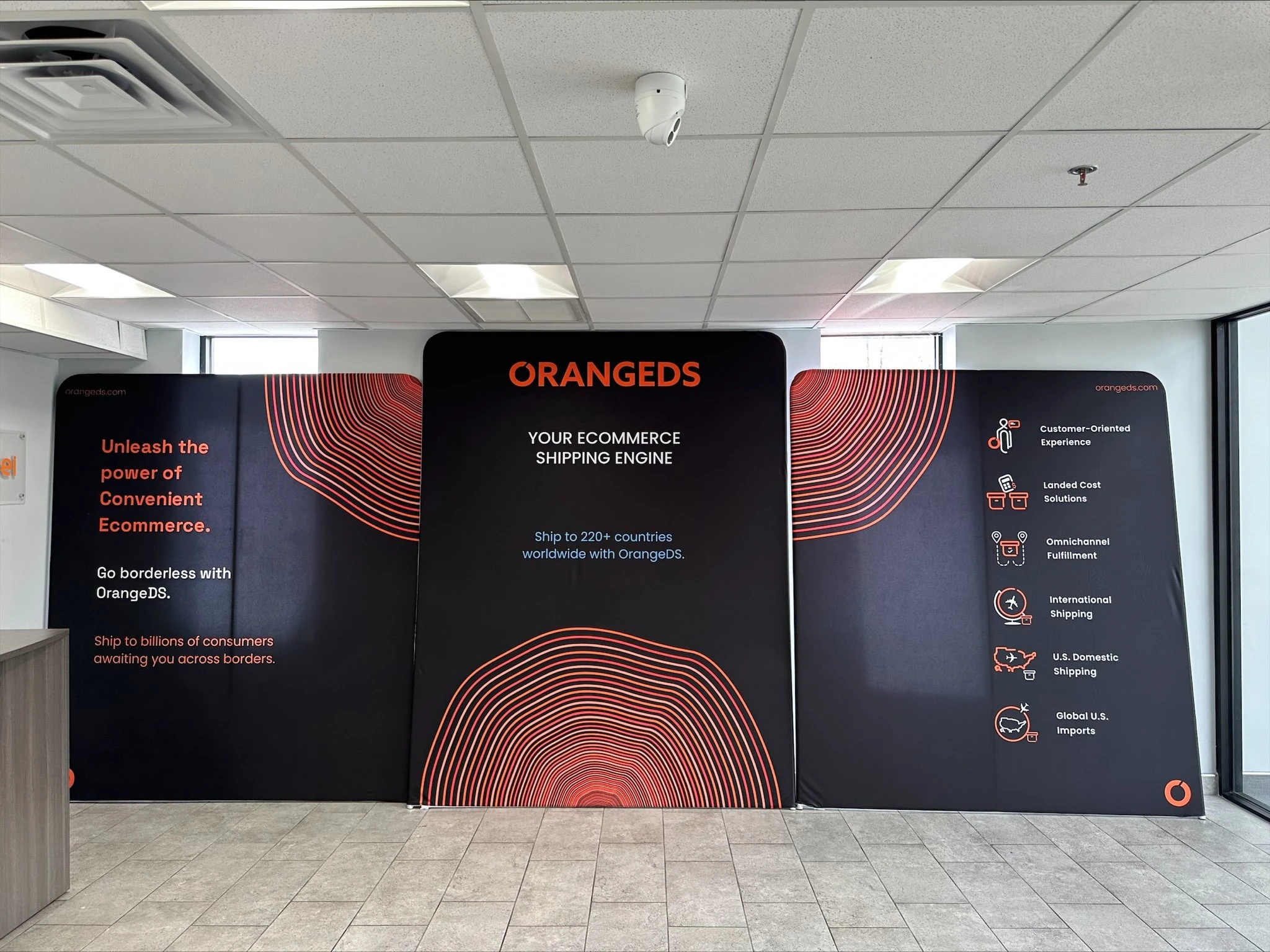
Final iconography and illustrations applied to full-size expo standees, boosting brand visibility and instantly catching visitor attention at White Label Expo.
Like this project
Posted Nov 24, 2025
Designed iconography and illustration system for OrangeDS to simplify logistics info and strengthen brand consistency.
Likes
8
Views
7
Clients
Orange Distribution Solutions