OrangeDS Social Media Visual Design Project
shivani mundra
Designing a Scalable Social Media System for a Global Logistics Brand
Designed a scalable social media visual system for OrangeDS to simplify complex ecommerce and logistics concepts while strengthening brand recall across platforms.
Context
OrangeDS is a global ecommerce shipping company operating across 220+ countries. The challenge was to communicate logistics-heavy information in a way that felt clear, engaging, and unmistakably on-brand.
My Role
• Social Media Visual Design
• Illustration & Iconography
• Campaign & Festive Creatives
• Motion Design
• Art Direction (with Senior Designer)
Process
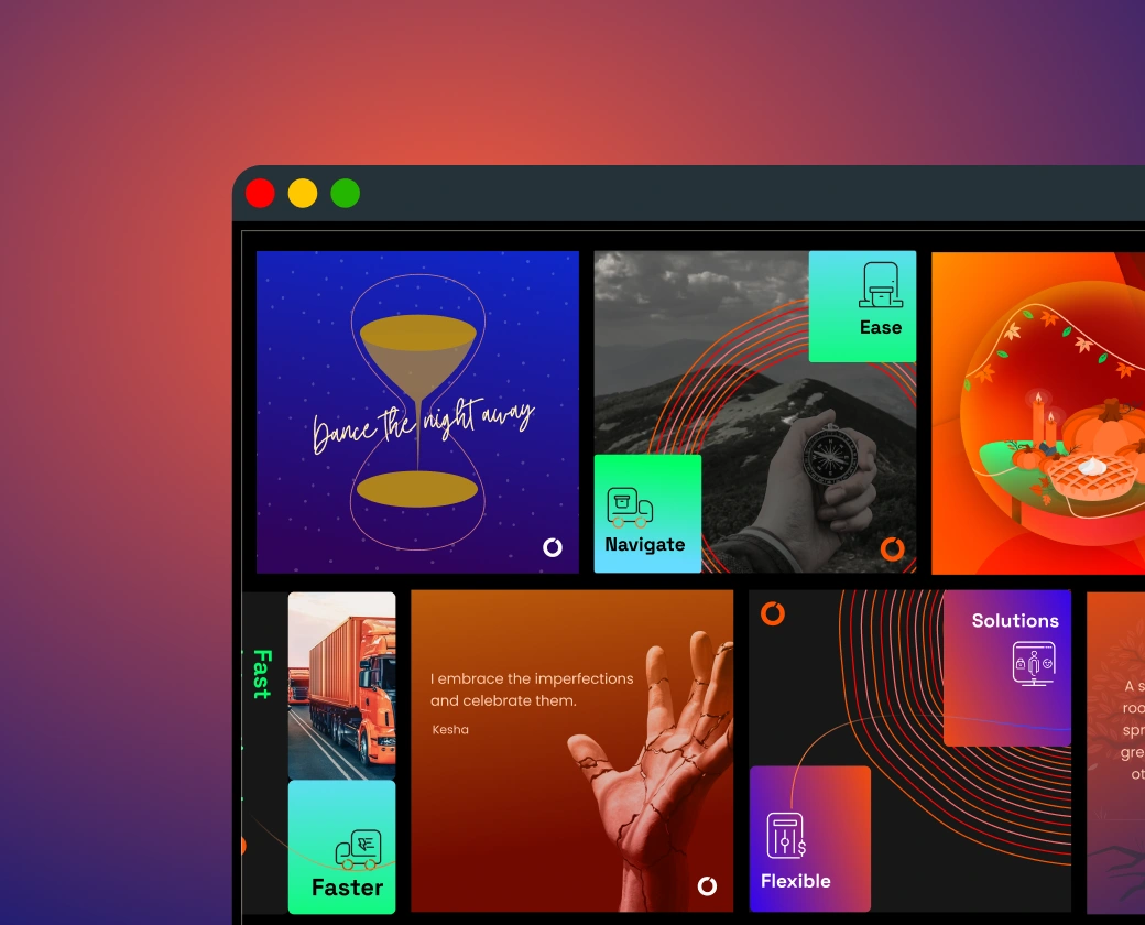
Each campaign began with moodboarding and ideation, followed by concept-led visuals using metaphors, gradients, and custom iconography. Festive posts avoided generic greetings and instead focused on storytelling while staying consistent with the core brand system.
Impact
• 200× increase in reach within 15 days
• Higher saves and re-shares on educational content
• Improved brand recall through consistent visual language
• Used across Instagram, LinkedIn, website banners, and expo displays
If you’re looking to build an engaging visual identity for your brand’s social media, I’d love to collaborate.
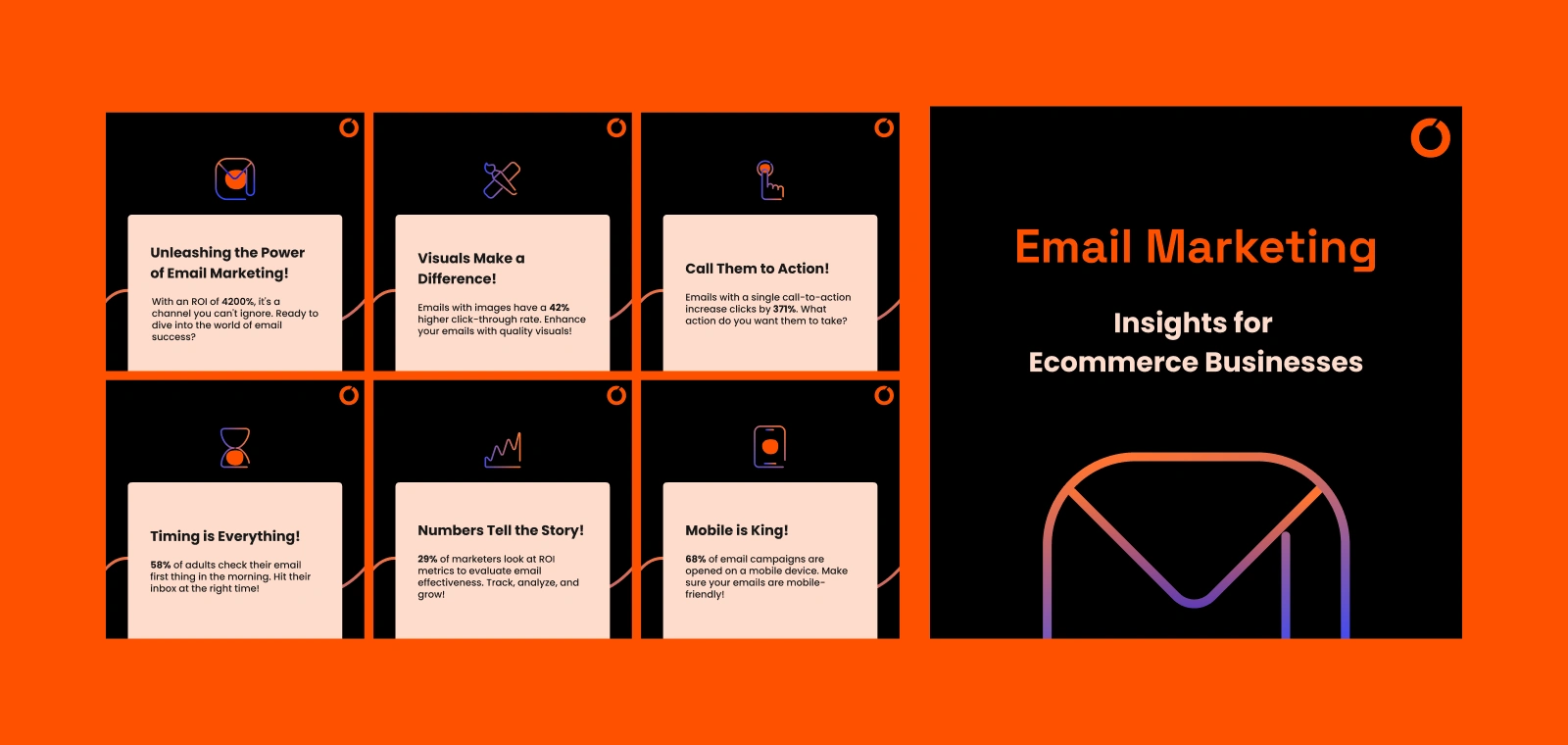
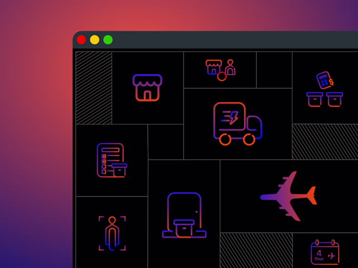
Awareness and educational posts built to simplify ecommerce and logistics concepts, using custom pictograms and strong visual hierarchy.
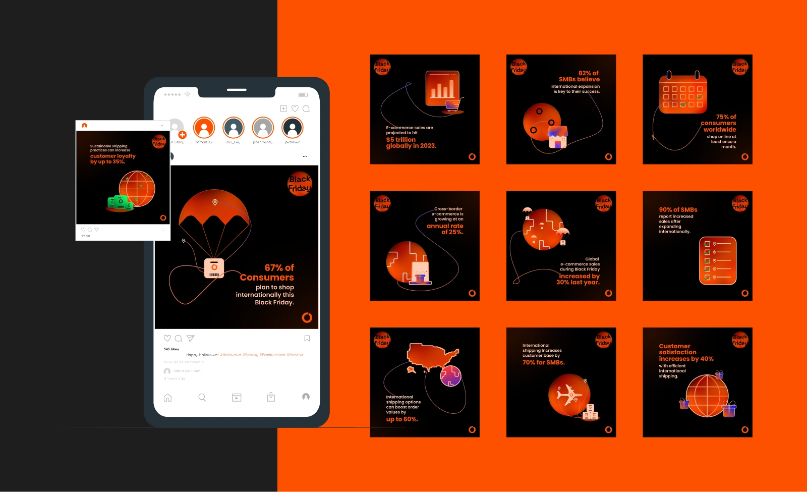
Campaign visuals focused on communicating key shipping functions through metaphors, bold color framing, and clean line illustrations.
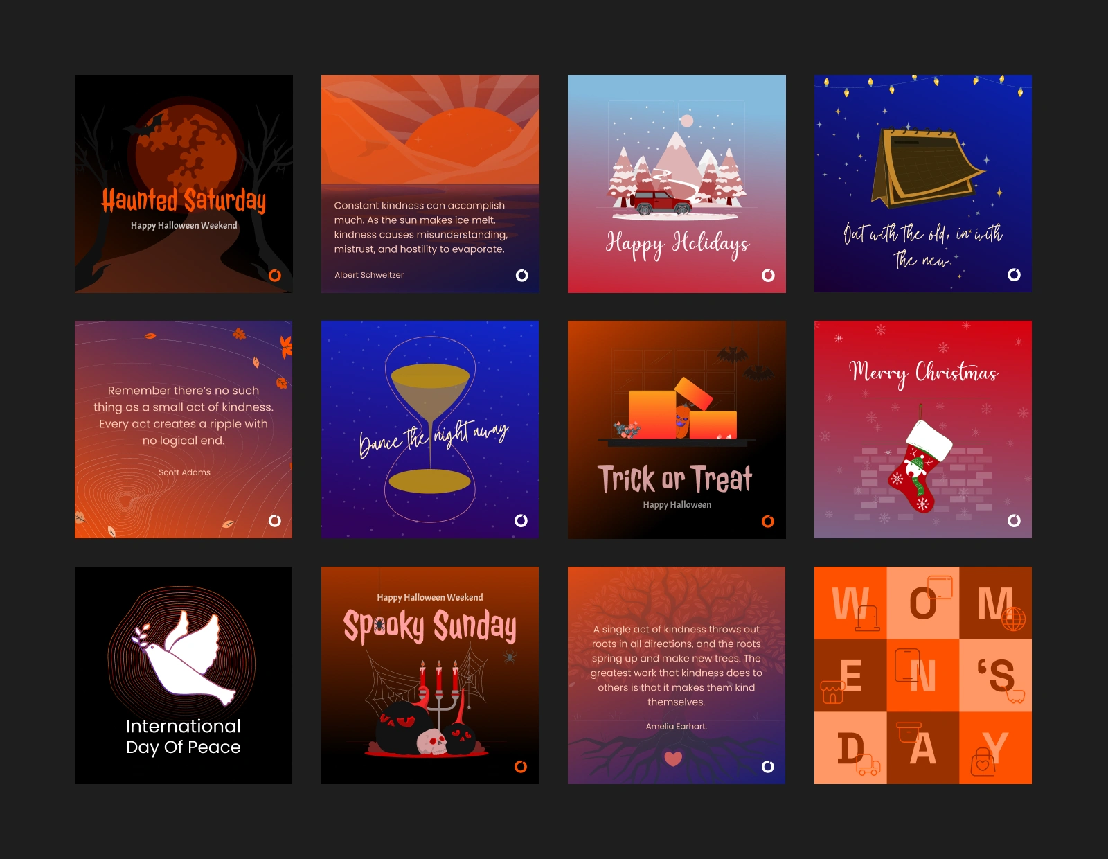
Festival and cultural posts designed from unique mood boards, expressing brand personality and emotional storytelling while maintaining consistency.
Like this project
Posted Dec 4, 2025
Created a cohesive social media visual system for OrangeDS to translate complex ecommerce logistics into clear, engaging, brand-led content.
Likes
8
Views
14
Timeline
Sep 17, 2022 - Nov 8, 2024
Clients
Orange Distribution Solutions