OrangeDS – UI/UX, Landing Page & Web Redesign
shivani mundra
How I simplified complex logistics through a scalable visual system
Orange Distribution Solutions (OrangeDS) is a global logistics company enabling U.S. and international retailers to ship across borders through ecommerce parcels, fulfillment, and distribution services.
As the business scaled, the design did not. Information-heavy logistics workflows were presented through cluttered layouts, text-dense pages, and inconsistent visuals across platforms. With both B2B and B2C audiences to serve, the lack of structure made it difficult for users to understand services, navigate the platform, and trust the brand.
The challenge wasn’t to “make it look modern” - it was to bring clarity and consistency to a system handling complex, high-stakes information.
The Real Problems
Complex logistics terminology was difficult to understand and differentiate
Visual inconsistency across web, social, and brand touchpoints diluted trust
No design system existed to guide decisions or scale new assets
Design workflows were reactive, slowing teams down instead of supporting growth
Research & Insight
Early analysis revealed two key insights:
Complexity needed translation, not decoration
Users didn’t need more visuals; they needed clearer visual language to understand logistics concepts quickly.
Scale required systems, not one-off screens
With frequent updates, campaigns, and an upcoming industry expo, OrangeDS needed reusable rules, not isolated designs.
Approach
Instead of starting with layouts, I stepped back and asked one question first:
What needs to stay consistent no matter how fast this grows?
That led to three priorities:
A clear visual language for complex logistics concepts
Strong hierarchy for information-heavy pages
Systems that worked across web, social, and physical touchpoints
The goal was simple: fewer decisions, less confusion, more clarity.
Key Decisions & Rationale
1. Build the system before polishing screens
I established layout, spacing, and hierarchy rules first, so future designs didn’t need to be reinvented every time.
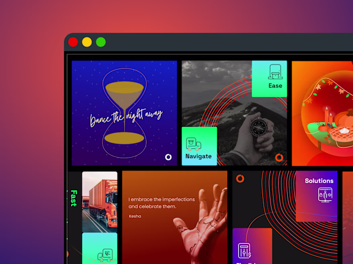
2. Create a custom iconography system
Logistics terms were broken down into visual components and rebuilt into intuitive icons. Geometry and spacing were derived from the logo and primary typeface (Space Grotesk), so everything felt intentional, not decorative.
3. Design for both B2B and B2C clarity
Hierarchy and content flow were adjusted to support two very different user groups without overwhelming either.
4. Systemize content production
Social media moved from “design it today, post it today” to a planned, system-led workflow. Fewer fire drills. Better consistency.
The System
A grid and layout system to maintain consistency across pages and components
A custom iconography and illustration system to translate complex logistics into clear visual language
Visual hierarchy rules to improve scannability and reduce cognitive load
Brand-aligned patterns applied across web, social media, print, and expo assets
Once the system was in place, new assets stopped feeling like fresh problems.
Impact
Website traffic increased by 30%
Average session time improved by 25%
Clearer visuals led to a 40% increase in customer inquiries
Refreshed brand presence resulted in a 50% increase in booth visitors at industry expos
Brand consistency improved to the point where users could identify OrangeDS assets instantly
Design stopped being a bottleneck and started supporting growth.
New Landing Page for Consecutive Countries.
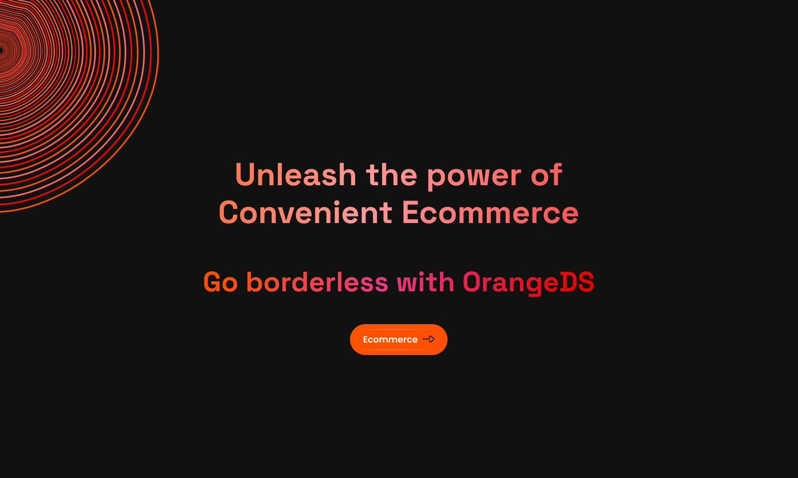
Redesigned Landing Page.
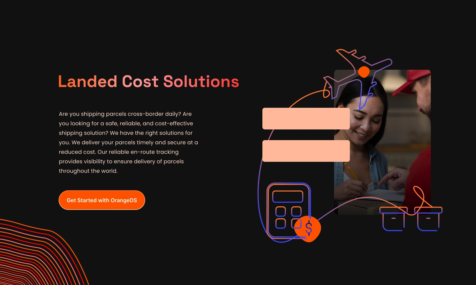
The Service Specific Page.
The Redesigned Footer with Motion design.
A clear CTA Page.
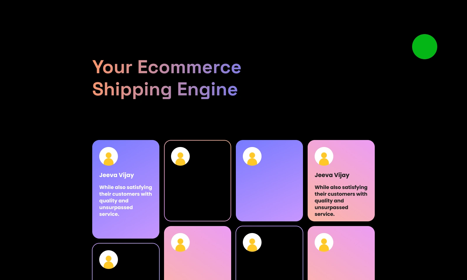
The Testimonial Page.
Like this project
Posted Aug 26, 2025
Redesigned the OrangeDS website, landing pages, simplifying complex SaaS logistics into user-friendly, responsive experiences with clear flows & strong visuals.
Likes
8
Views
22
Timeline
Aug 1, 2022 - Oct 31, 2024
Clients
Orange Distribution Solutions