pro
shivani mundra
Visual Systems Designer for Scaling Brands & Products
- 5.00
- Rating
- 84
- Followers
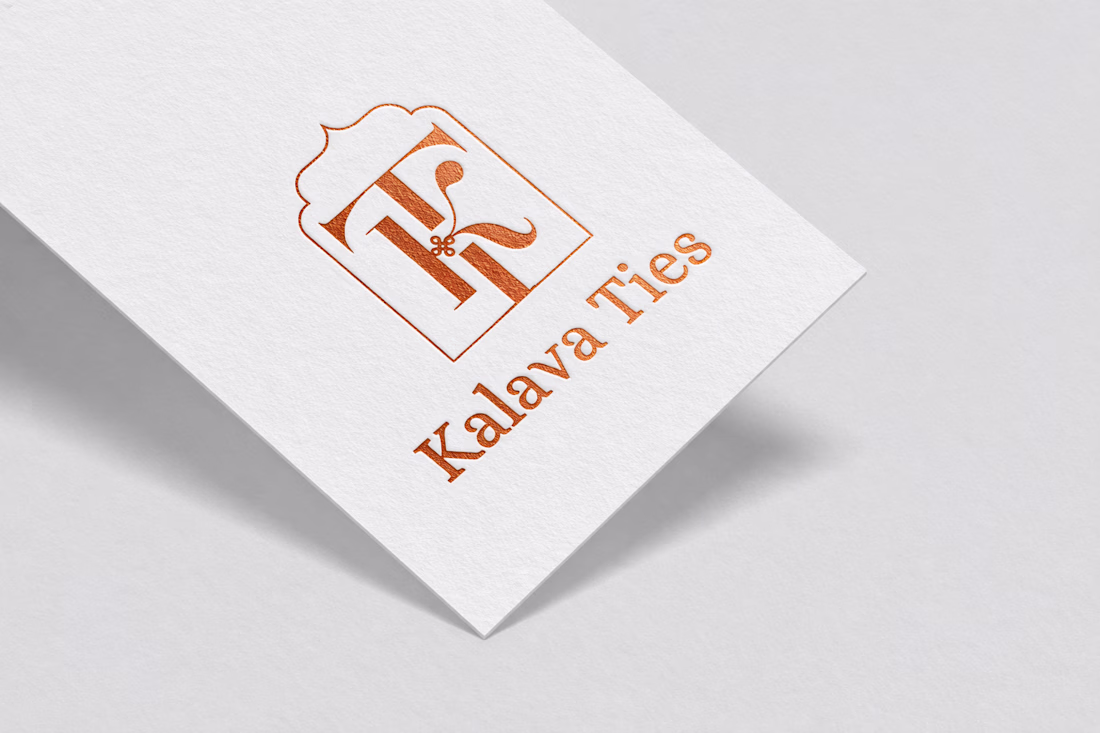
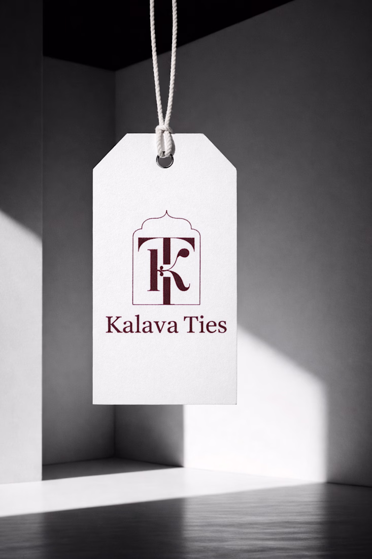
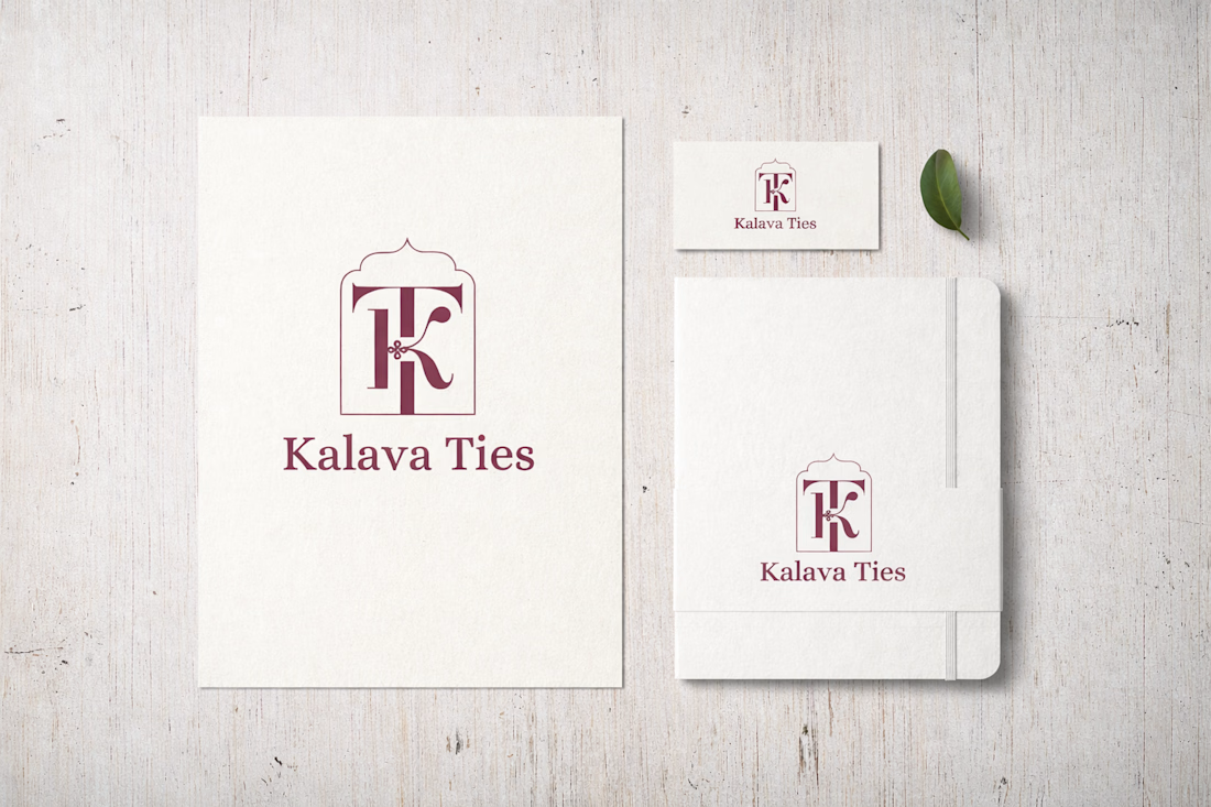
I recently designed logo for Kalava Ties, a wedding brand.
So, the idea started from something simple - a tie.
Not just visually, but what it means.
Two people. Two families. Things coming together.
The monogram is built around this idea of a tie that never really ends. The...
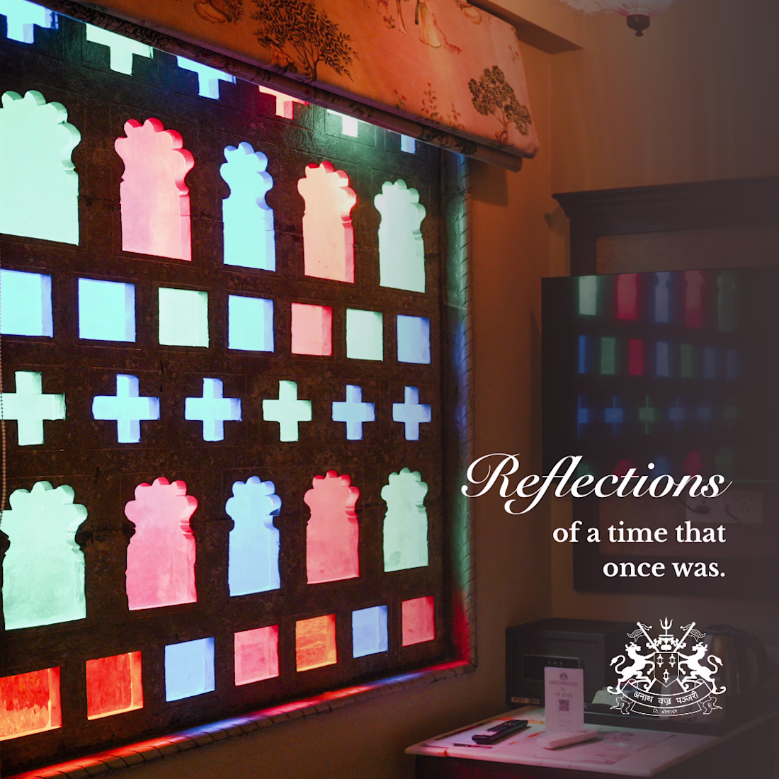
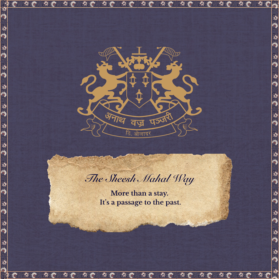
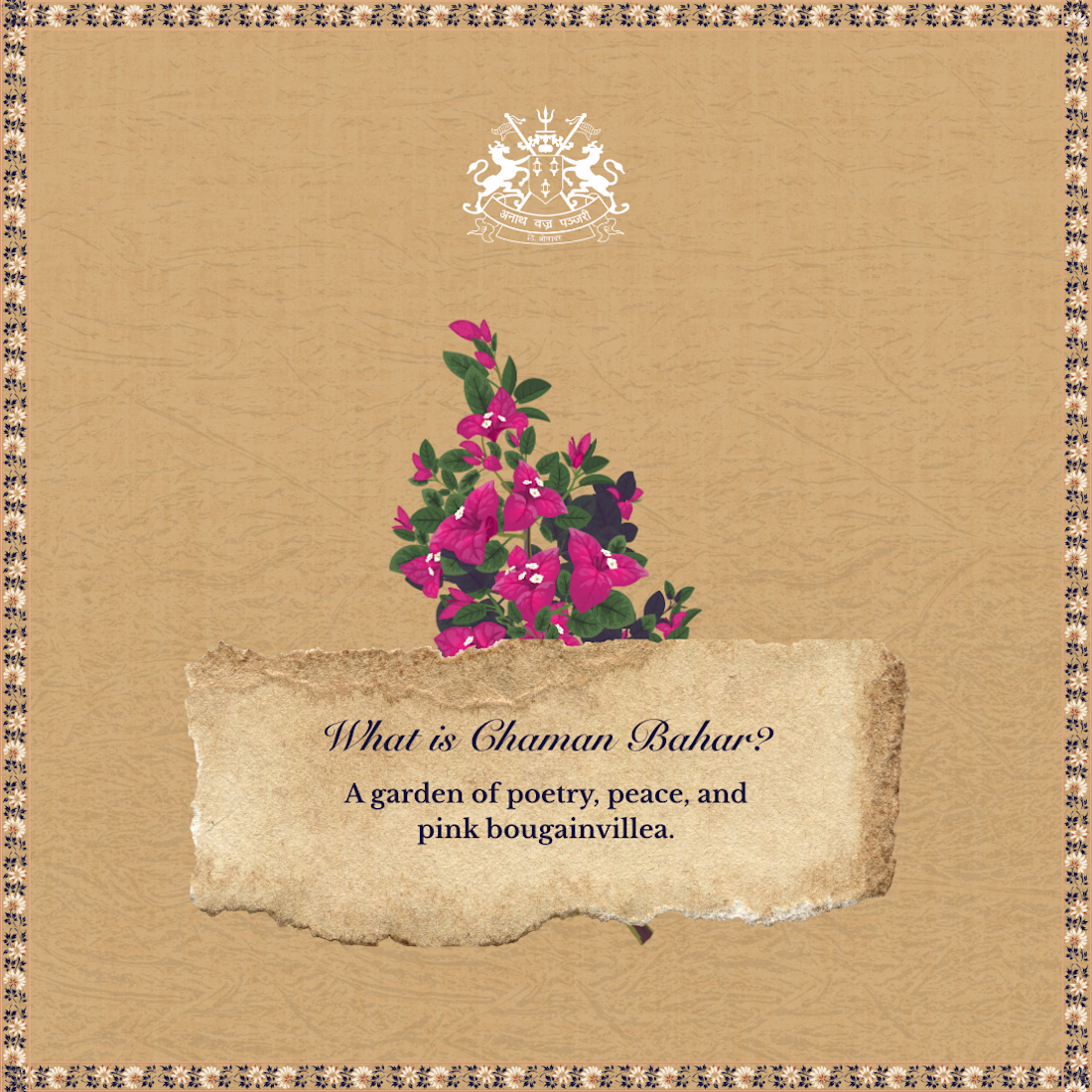
Designed a complete brand experience for this project, from identity to social media.
Every visual element was crafted to reflect the space’s character while maintaining consistency across digital touchpoints.
From storytelling-led posts to performance-driven creatives, this...
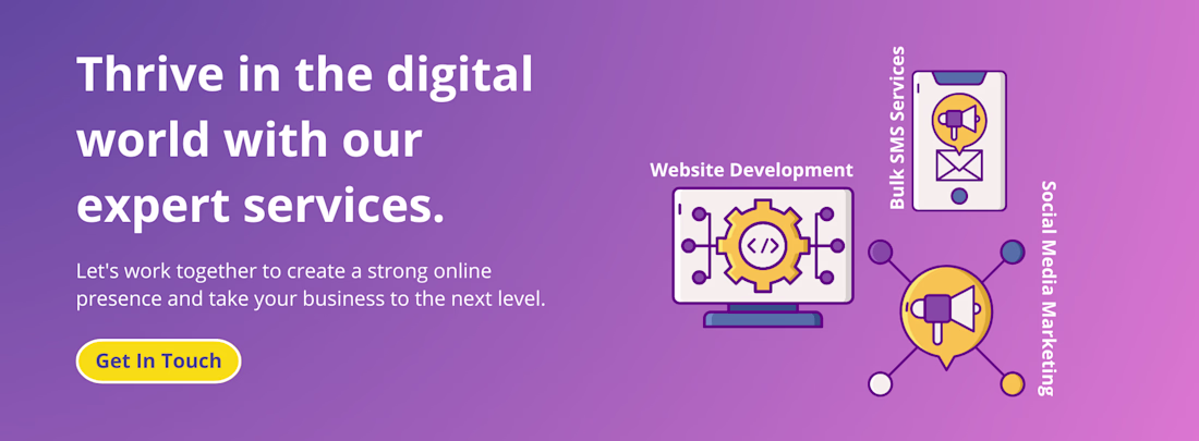
Designed a landing page that explains services without explaining too much.
Clear hierarchy.
Friendly visuals.
One strong CTA.
The goal was simple:
make the value obvious in under 5 seconds.
Would you scroll… or click?
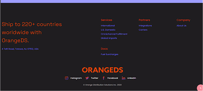
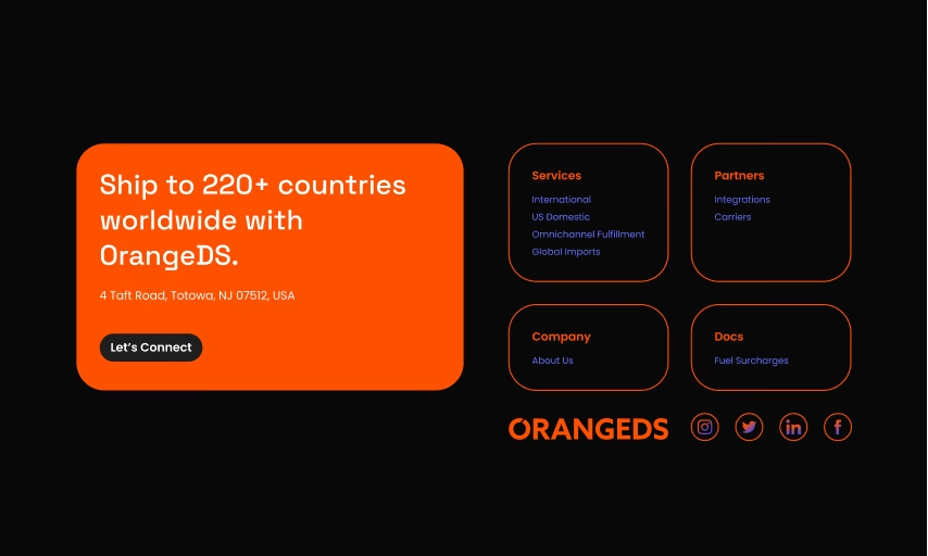
Redesigned the OrangeDS footer using a bento-style layout with subtle motion.
The intent was clarity, grouping services better, improving scan flow, and guiding attention of the user.
Footers don’t need to be passive.
Which one impressed you?
0 voted
0%
3 voted
100%
3 votes
Closed
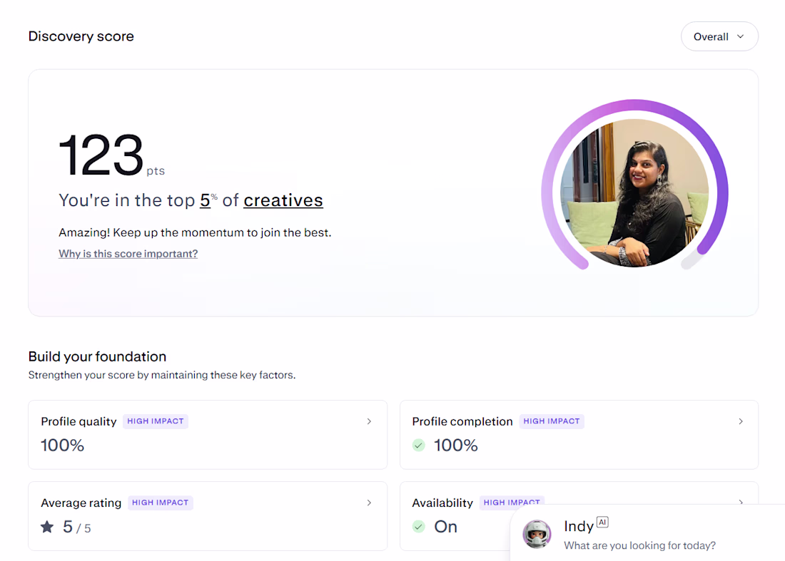
Positive Monday note
It took time to understand how Contra works, what to share, how to show process, and how to stay consistent.
But today I’m officially in the top 5% of creators on Contra.
Still learning. Still refining.
Looking forward to landing my first project here soon...