


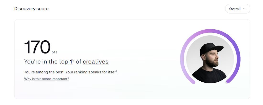
Top 1% on Contra. 🎉
A little milestone, but a reminder that showing up and doing good work consistently actually pays off.
If you're just starting out and wondering if it's worth it: it is. Keep going.
Thanks to all my clients and everyone here who's been so supportive.


I have posted a Kargen direction a while back that didn't make the cut with a client, but the feedback was great, so I kept pushing it.
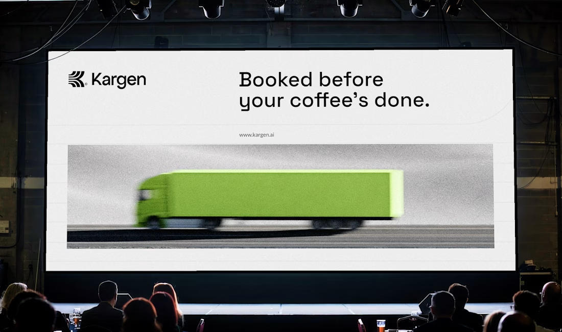
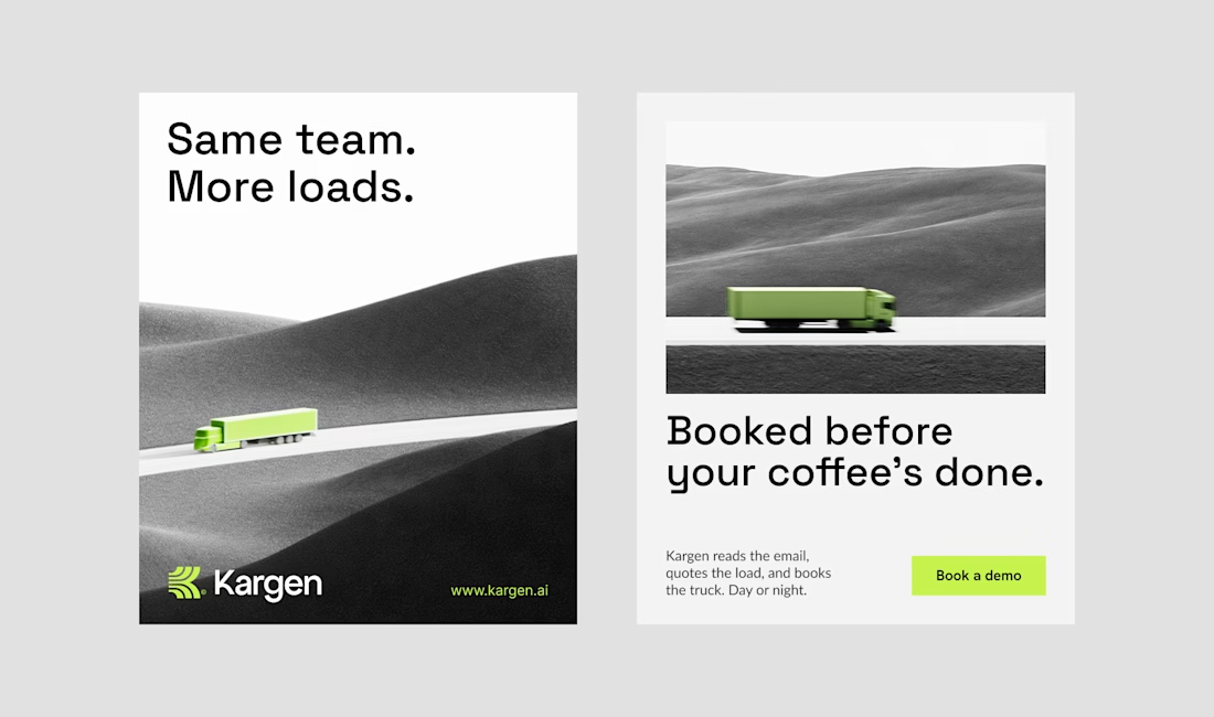
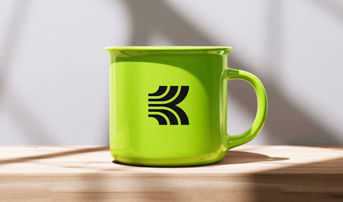
This is where it landed. the concept speaks for itself once you see it move. the K carries the momentum and quietly turns into a road at the...


One of the directions I explored for Kargen. It didn't make the final cut, but I think it holds up. We decided to go totally different route.
Kargen is an AI that books freight on its own. It reads the email, quotes the load, and books the truck, day or night. The brand had to feel as fast as the product, but calm with the pace.

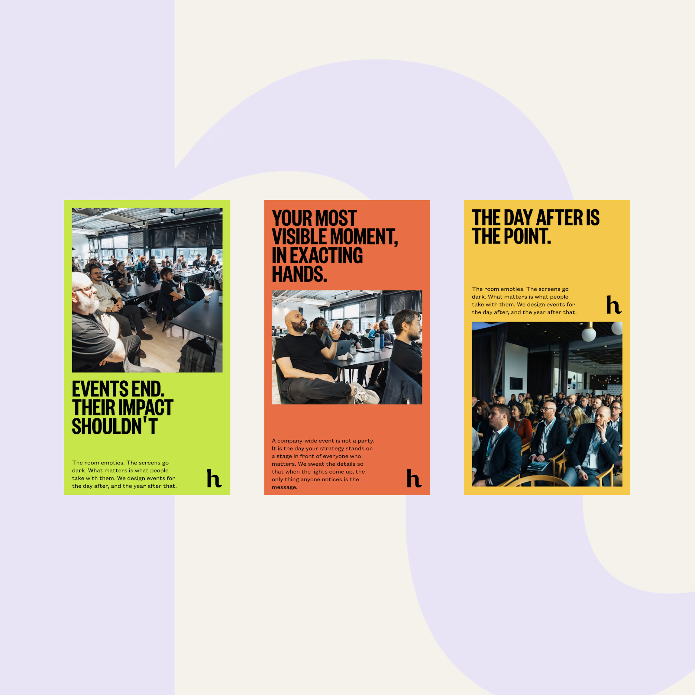
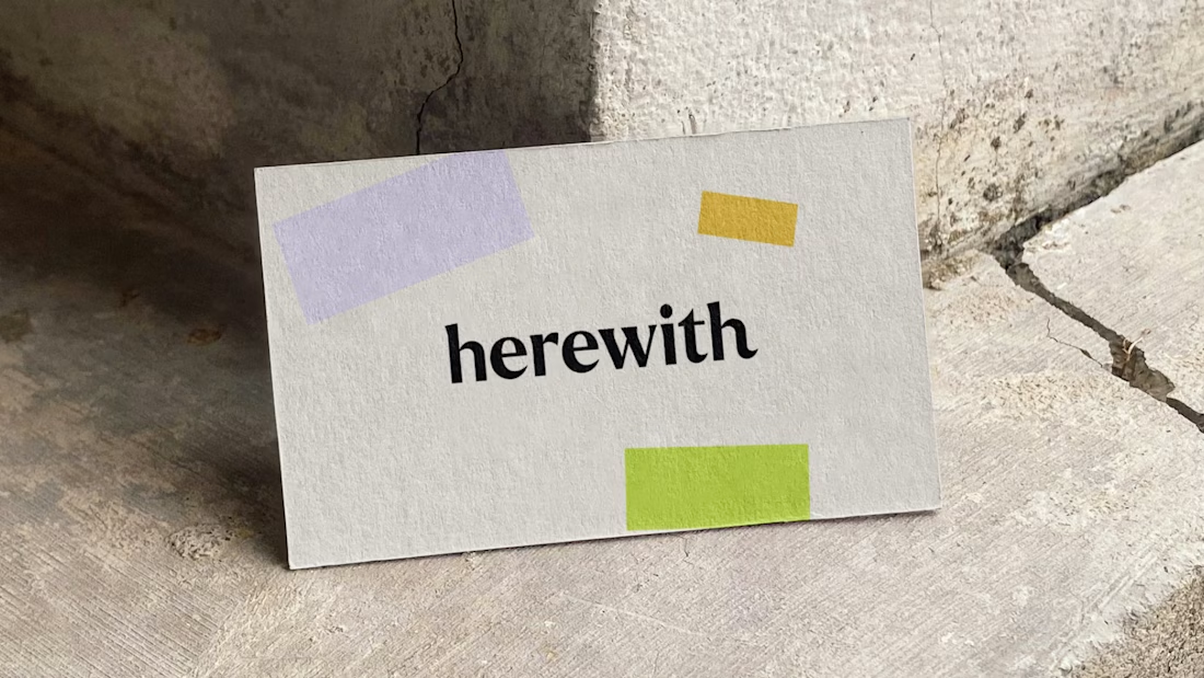
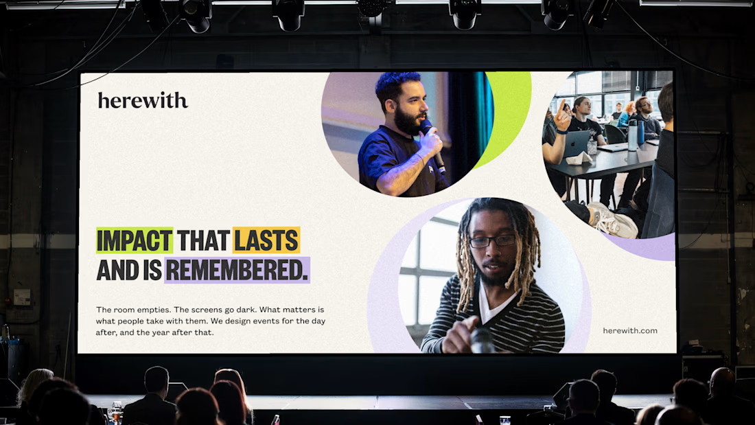
Meet herewith.
A recent identity for a company that builds events made to outlast the day.
The goal was simple to say and hard to do: make a brand people remember without making it shout. herewith isn't in the business of one-night spectacle. They design events that stay with you,...


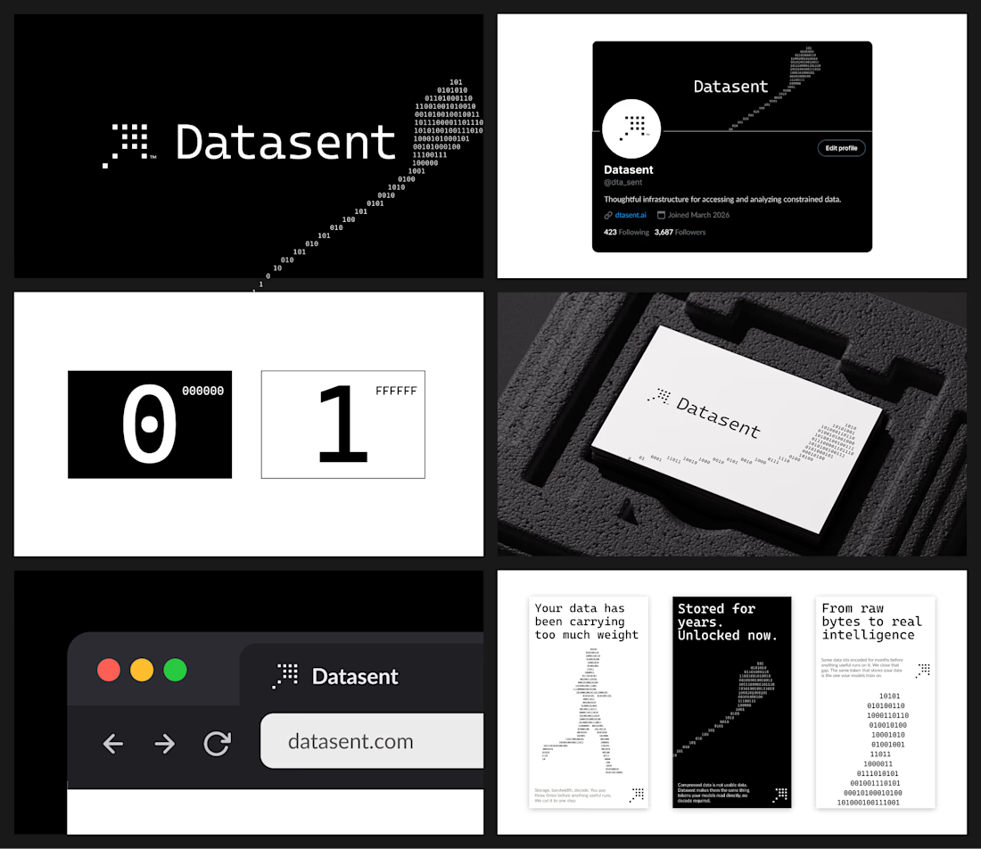
Not every brand needs color. The idea behind this direction for Datasent was to build everything around 0 and 1 - nothing in between. So: black and white only, with the key visual shapes formed from 1s and 0s.