


Customers never measure a logo. They still notice when it's off.
For Magnus, a barber supply brand, I built the whole mark on one unit: x, the width of a single letter stem.
The gap between the icon and the wordmark: 3x.
The icon rises above the letters: 0.5x.
Why it matters for the business: one rule instead of a hundred decisions. Whoever puts the logo on packaging, the shop or other spaces - doesn't have to guess spacing. It always comes out the same.
Barbering is a craft of precision. The brand should be built the same way.
7
7
238
I have posted a Kargen direction a while back that didn't make the cut with a client, but the feedback was great, so I kept pushing it.
This is where it landed. the concept speaks for itself once you see it move. the K carries the momentum and quietly turns into a road at the same time. the motion runs A to B, so you feel the movement, which is really what Kargen is about.
There is a lot more to the identity than just this. the whole thing is meant to feel impactful, calm and professional.
25
25
1.9K

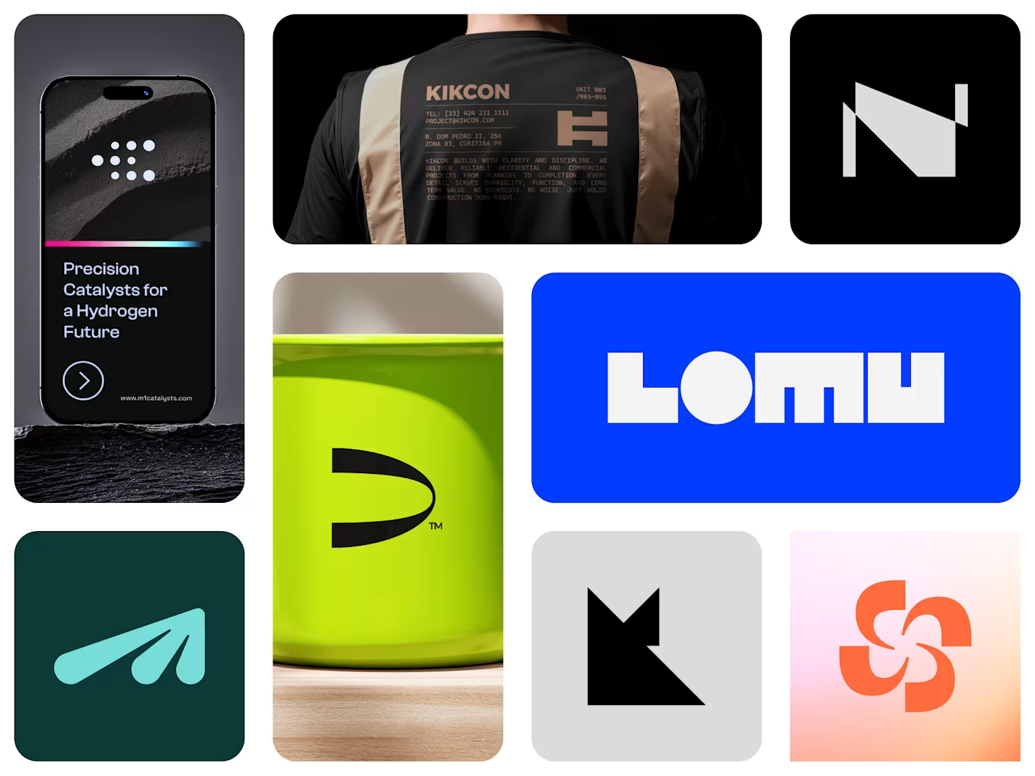
Kikcon Visual Identity Project
1
25

LOGO COLLECTION VOL.01
3
22