Kikcon Visual Identity Project

Pawel Nosal


Introduction
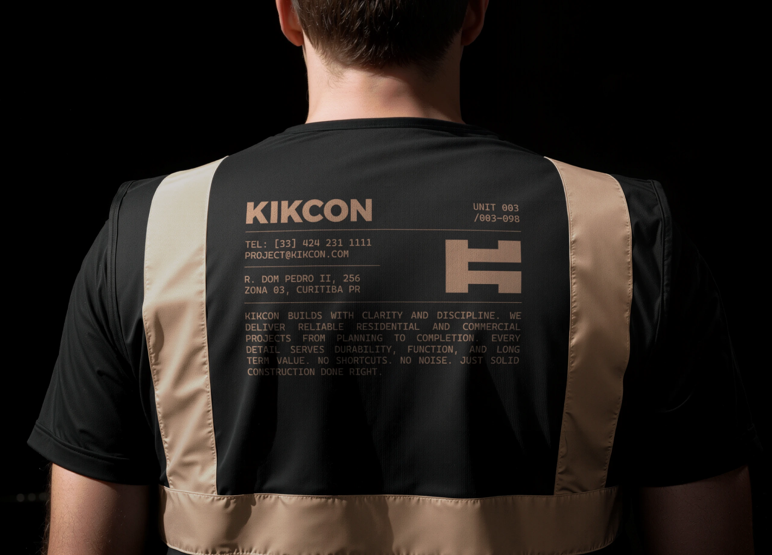
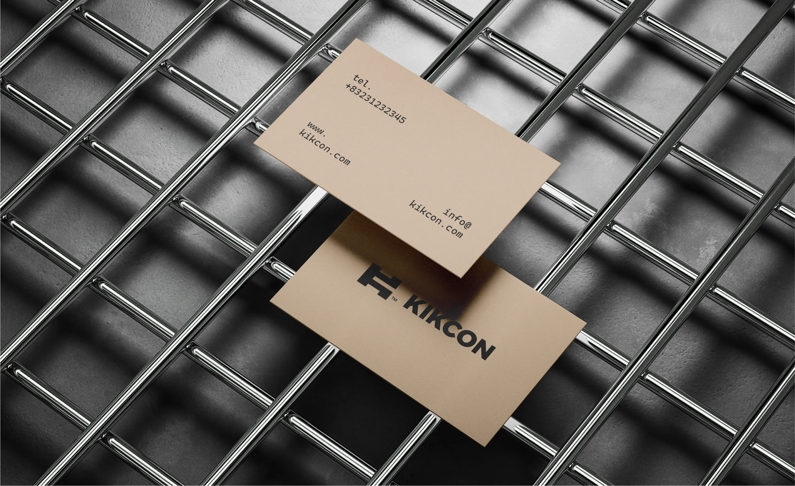
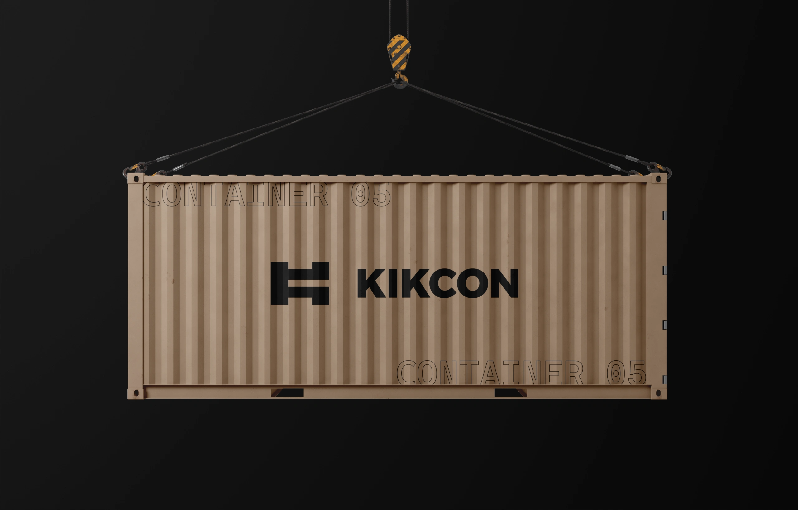
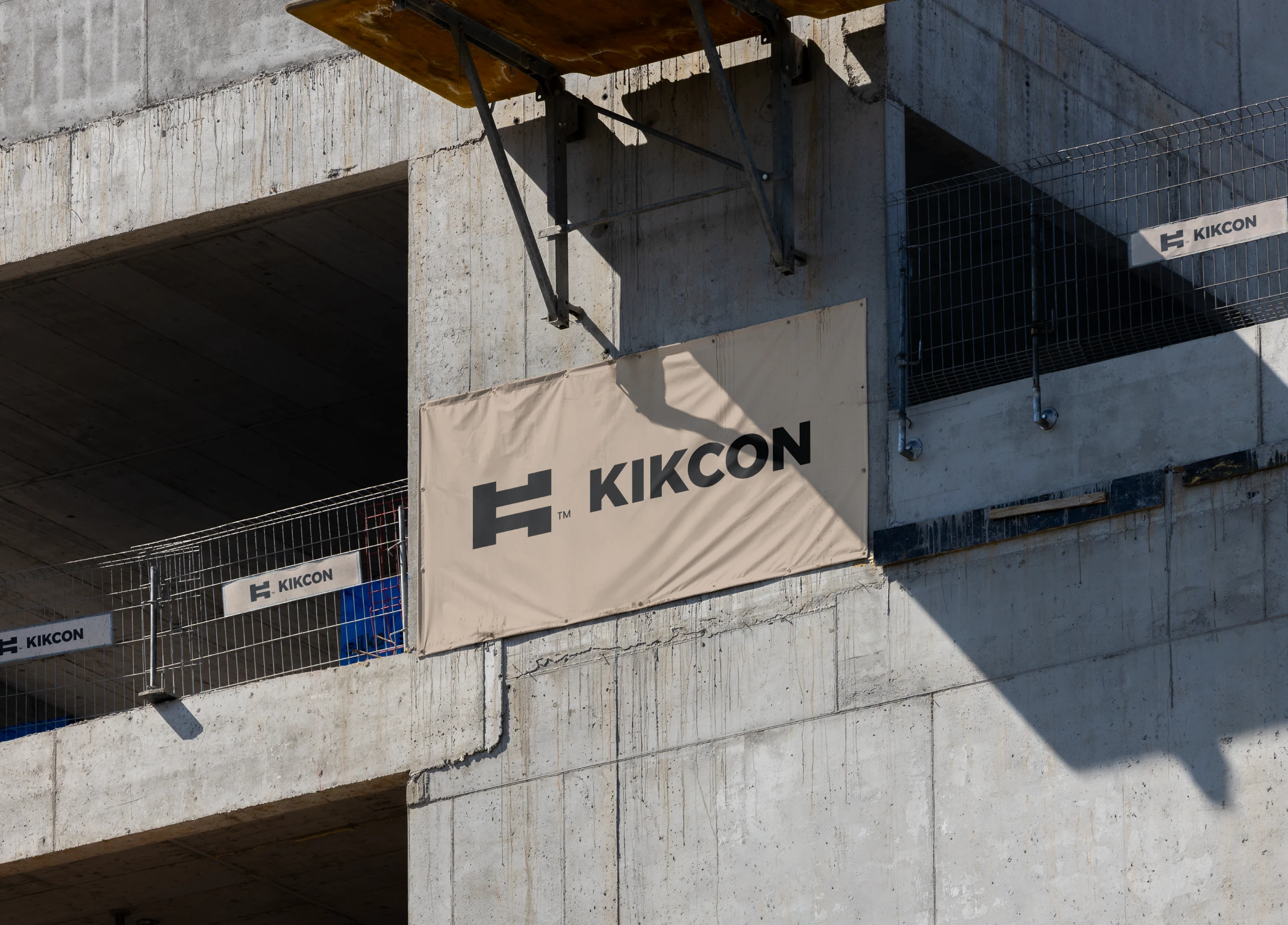
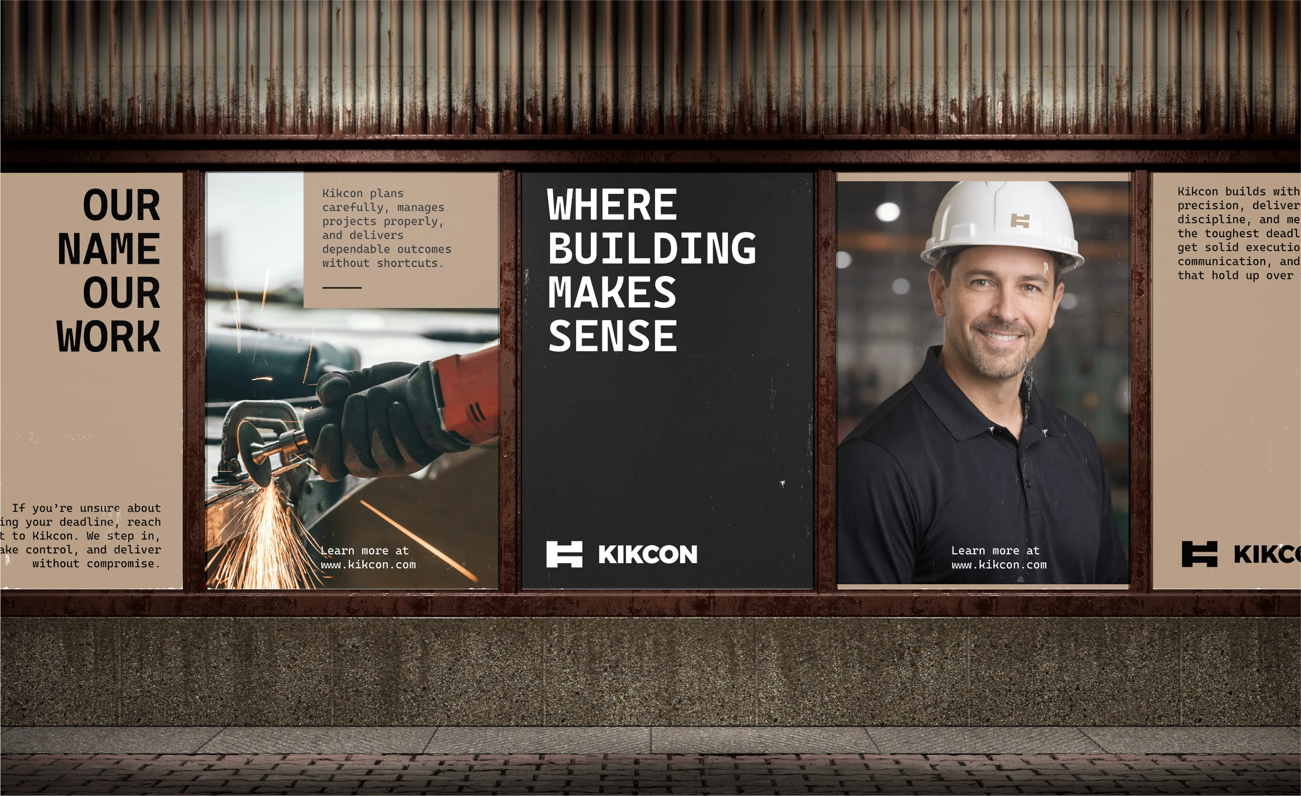
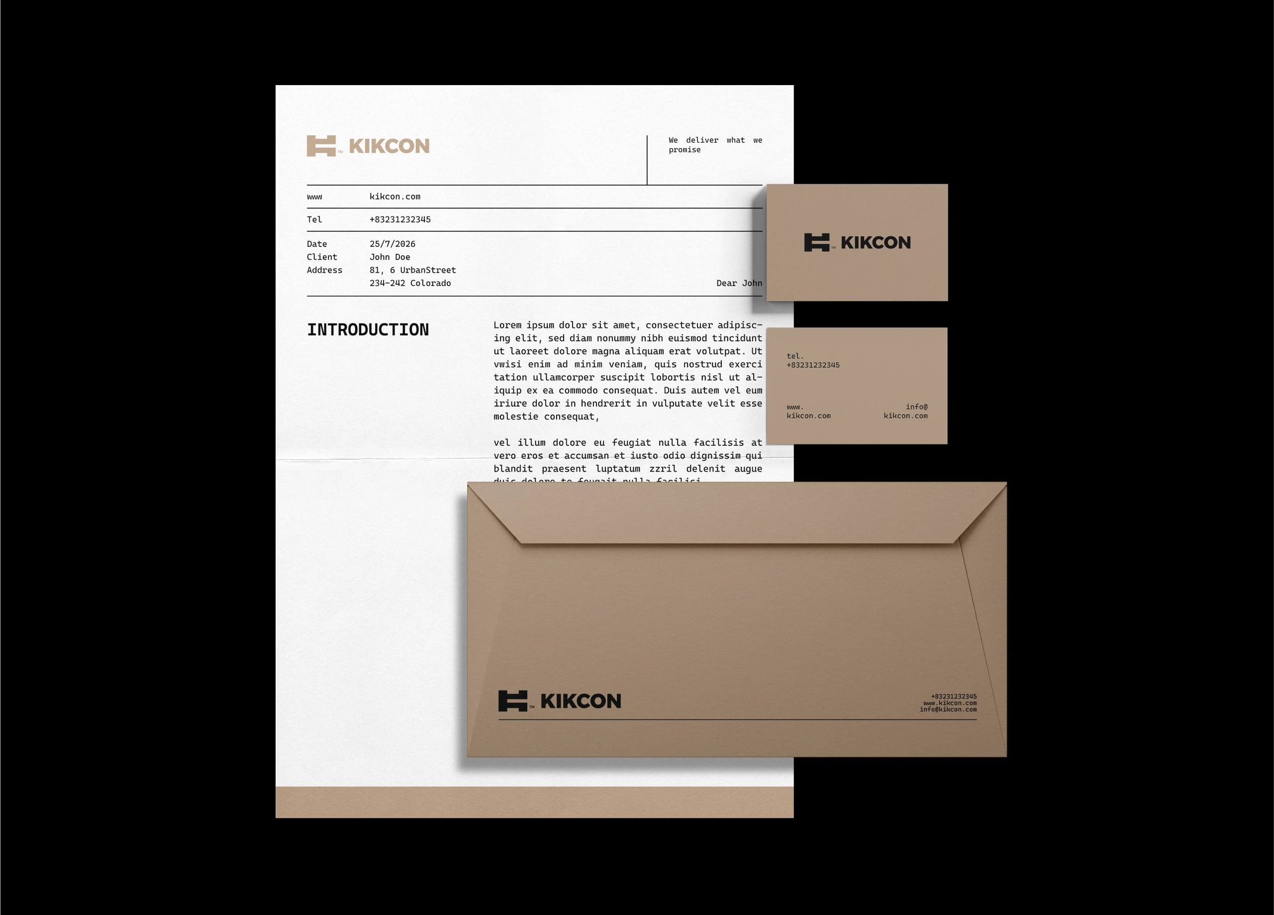
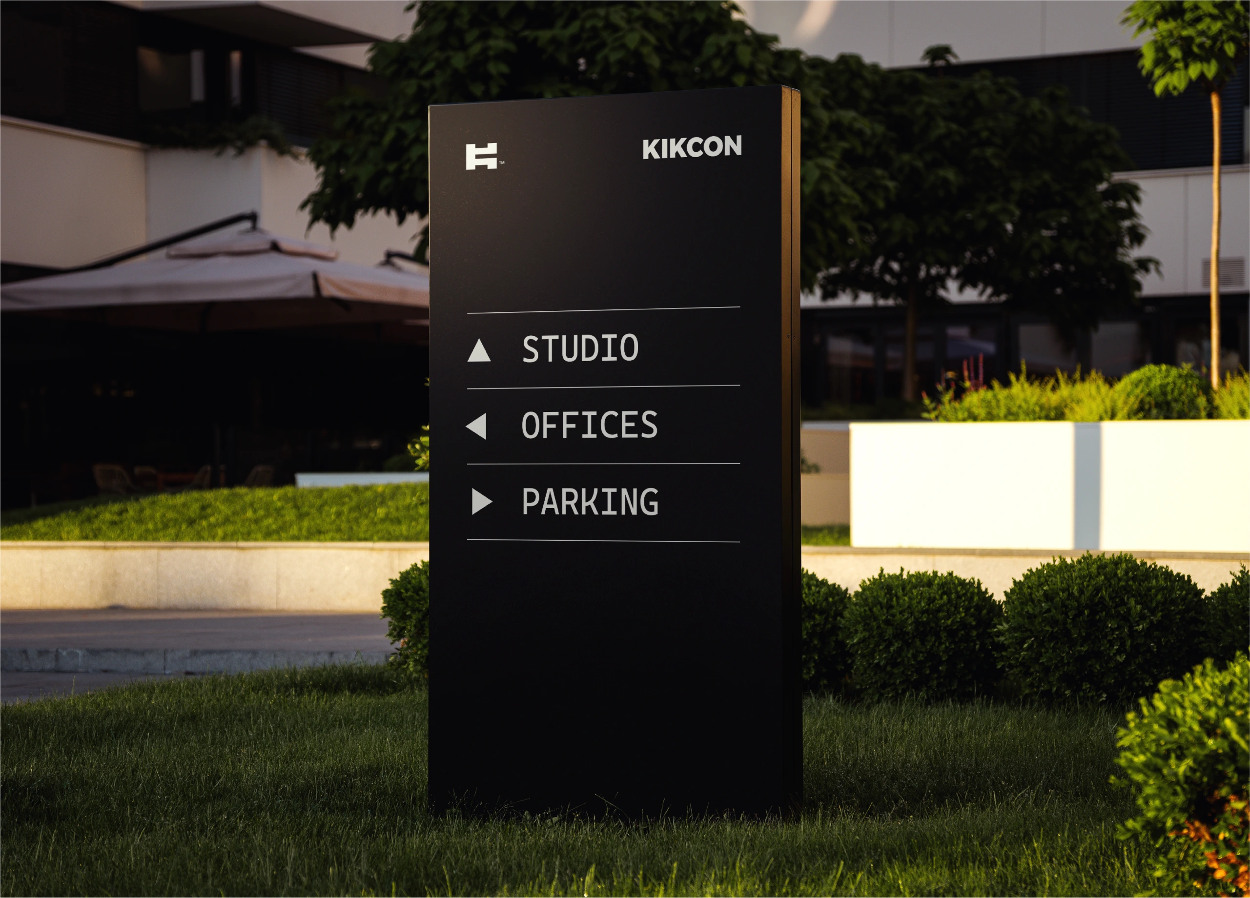
Developed in close collaboration with the client, Kikcon’s visual identity reflects its family-built foundation and its commitment to quality construction in South Australia. Rooted in accountability and long-term thinking, the brand translates a calm, considered approach in an industry often driven by speed and shortcuts.
The direction focuses on clarity, trust, and solid execution, expressing values such as integrity, dependability, and honest communication. A grounded and confident identity, built to stand the test of time.
Challenge
What does a construction company look like if you build the brand like a tech one?
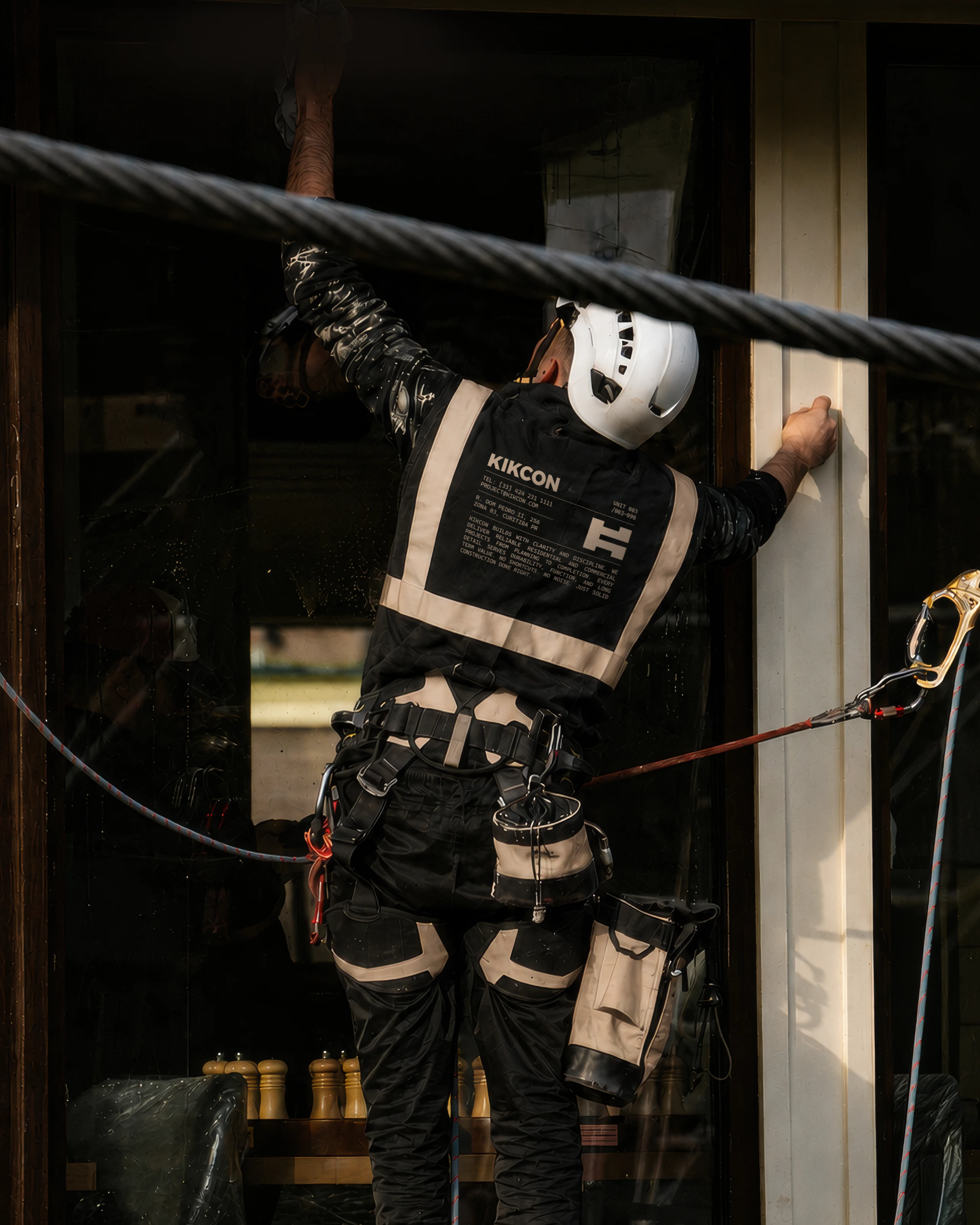
That was the question behind KIKCON, a family-run builder in South Australia. calm, technological and accountable, the kind that cares about doing things properly, in an industry that usually runs on speed and shortcuts.
The job was to turn that into a visual system that felt solid and engineered, but still easy to trust. Tested across touchpoints.





Like this project
Posted Jun 14, 2026
Kikcon's identity reflects a family-built business committed to quality construction in South Australia. Calm and considered, in an industry of shortcuts.