Wellcaddy Brand Identity Development
Pawel Nosal
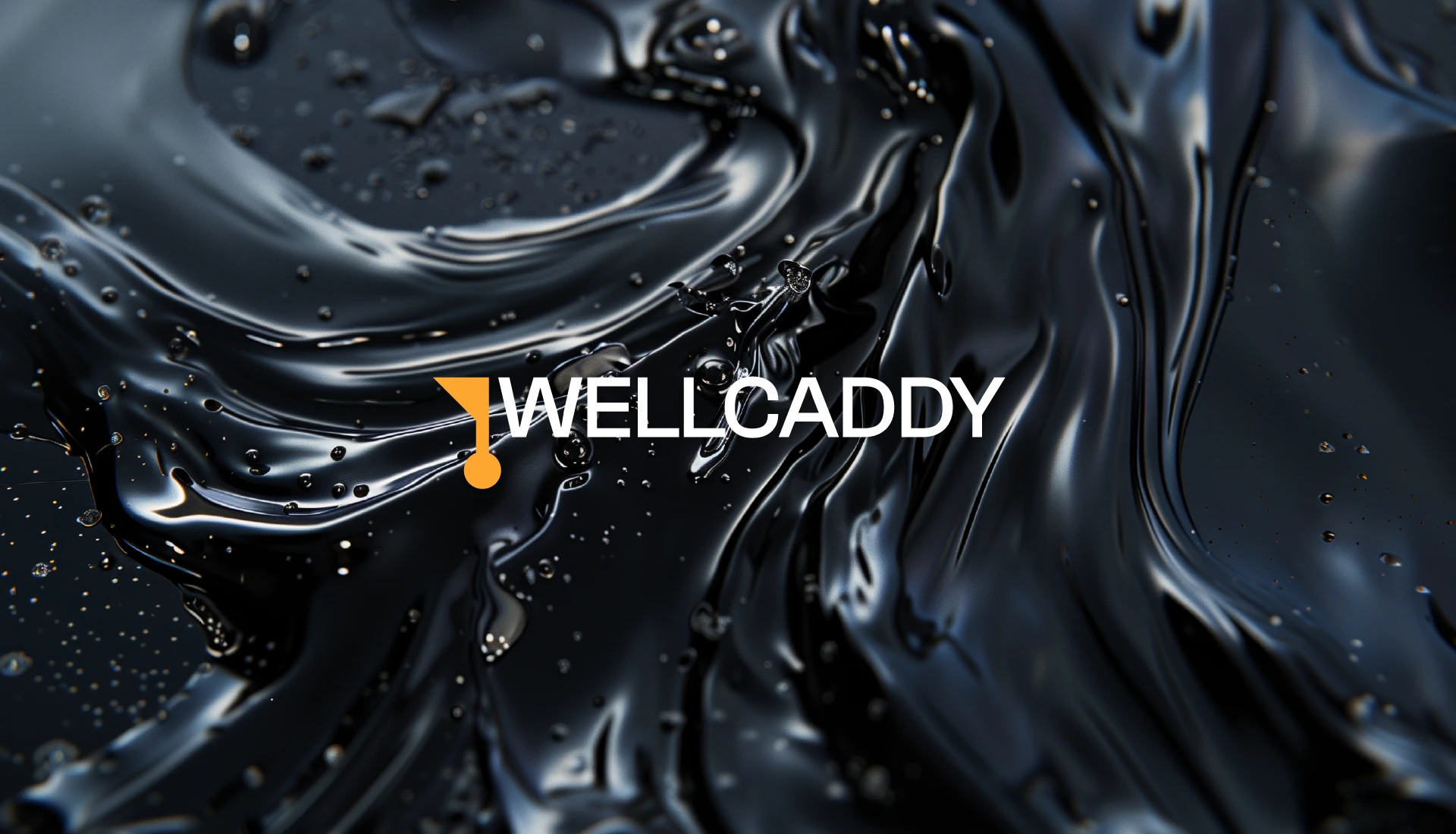
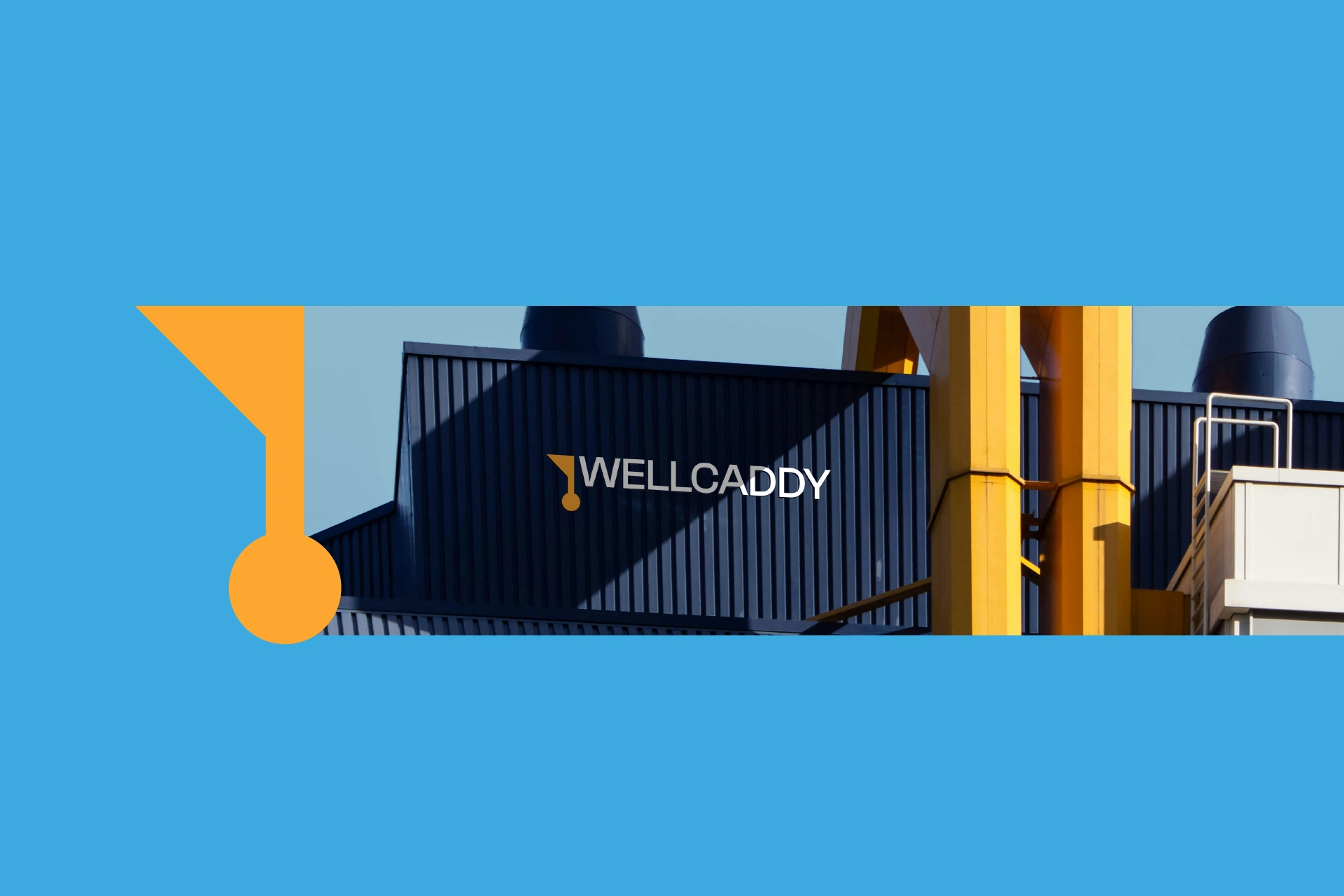
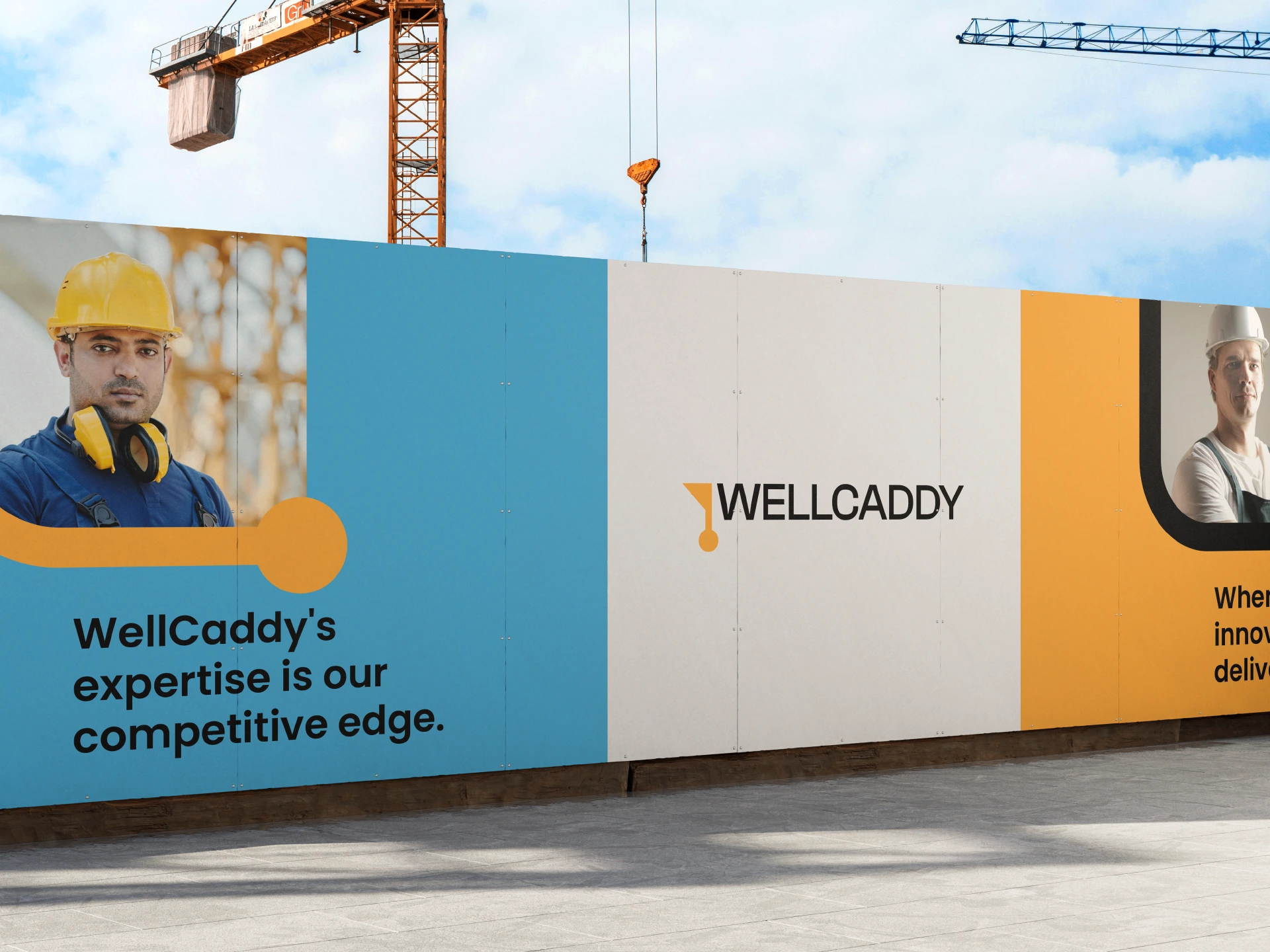
Wellcaddy ⎯ Inspired Energy Products
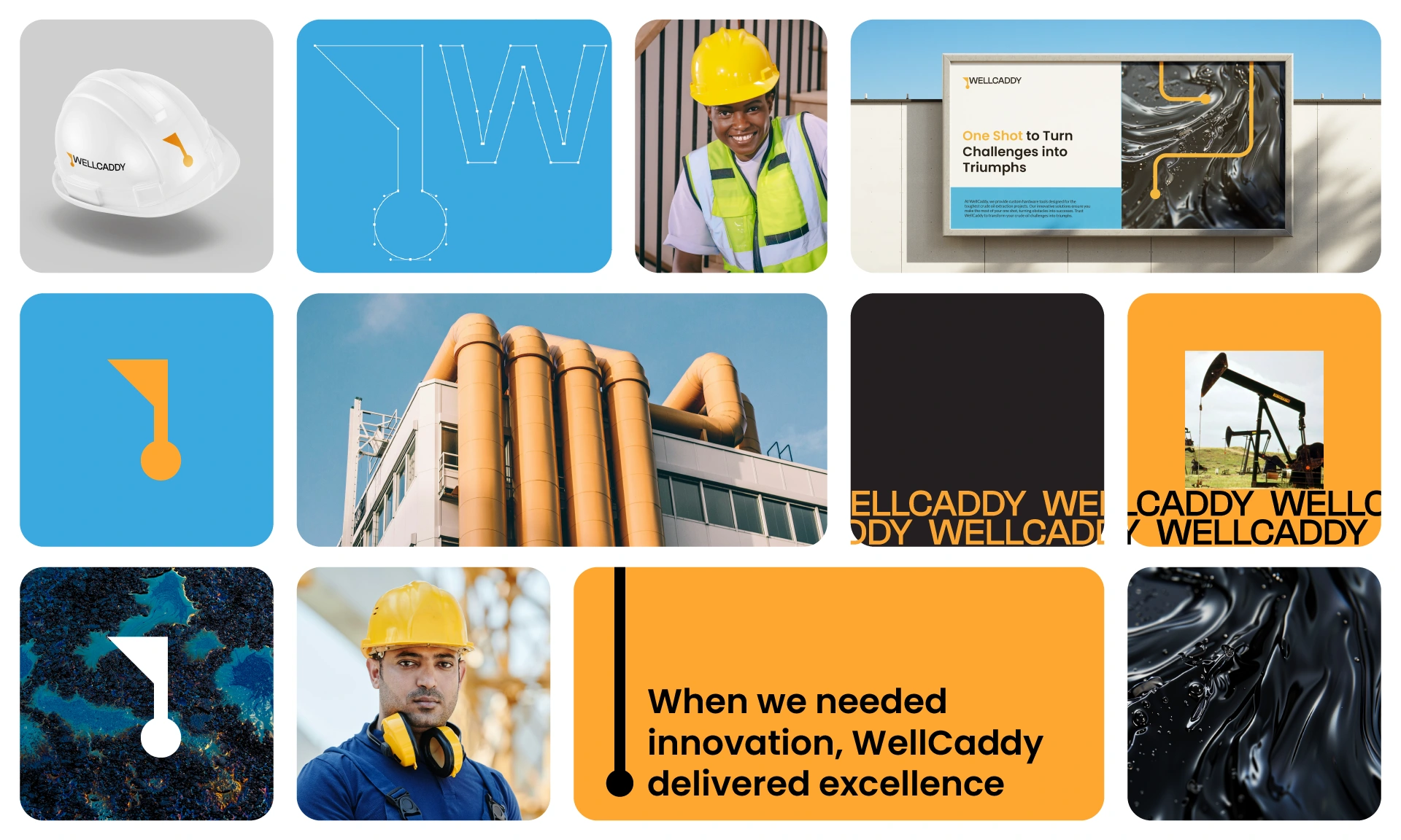
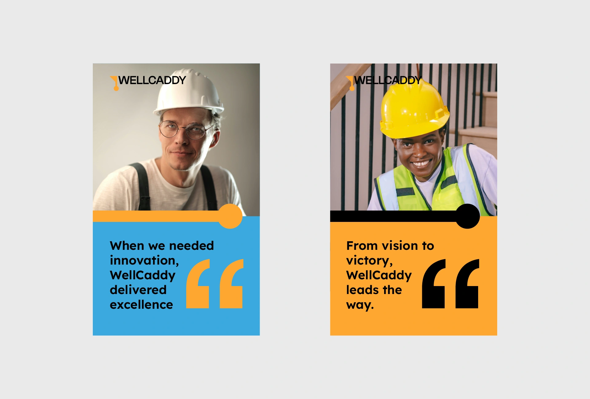
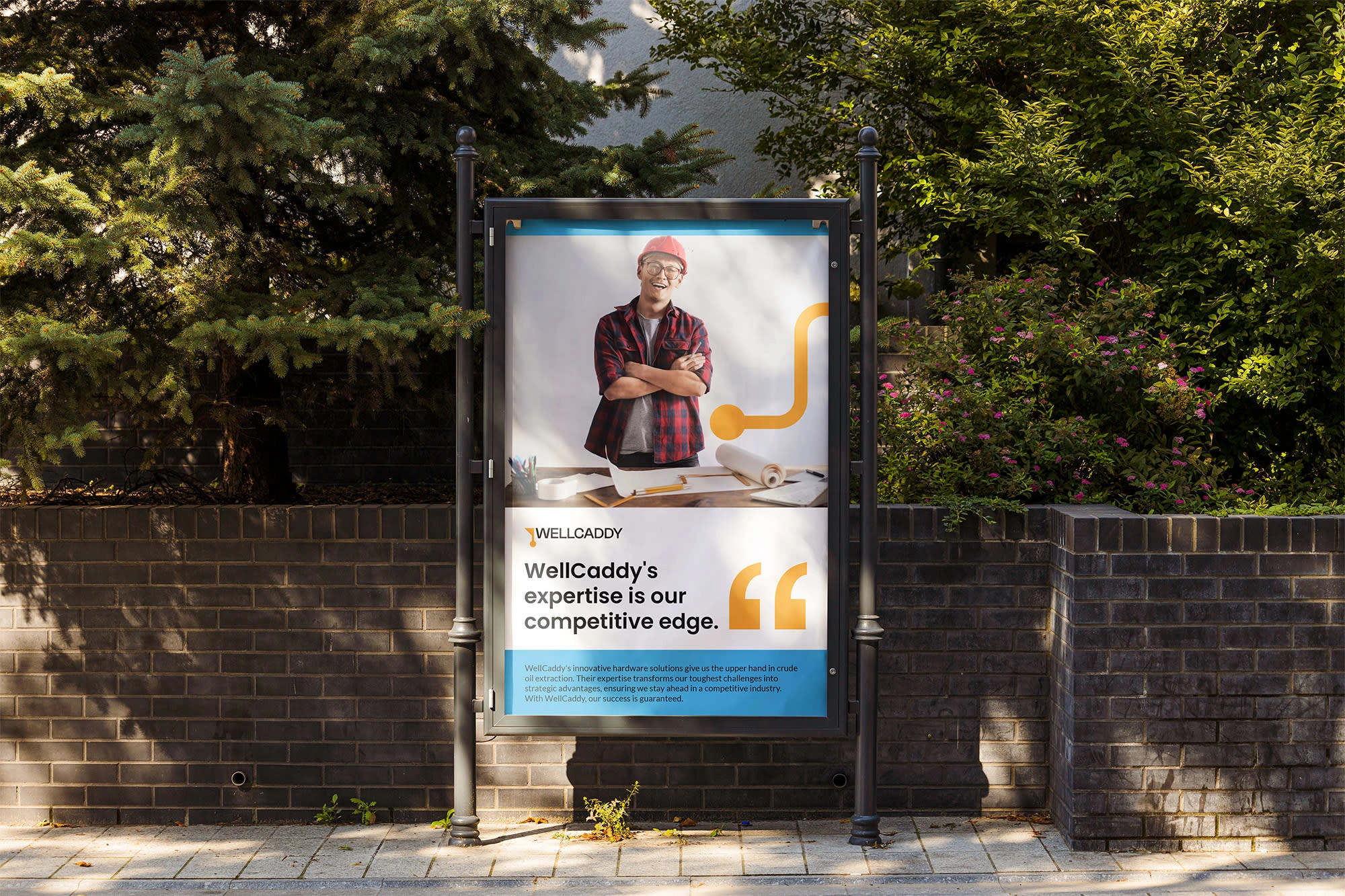
WellCaddy provides innovative, precision-engineered downhole tools that help industries access challenging energy sources like oil and gas. Their solutions empower companies to harness energy efficiently while supporting sustainable technologies for the future. With a strong focus on performance and user experience, WellCaddy guides projects from concept to implementation, ensuring every client achieves their energy goals seamlessly.
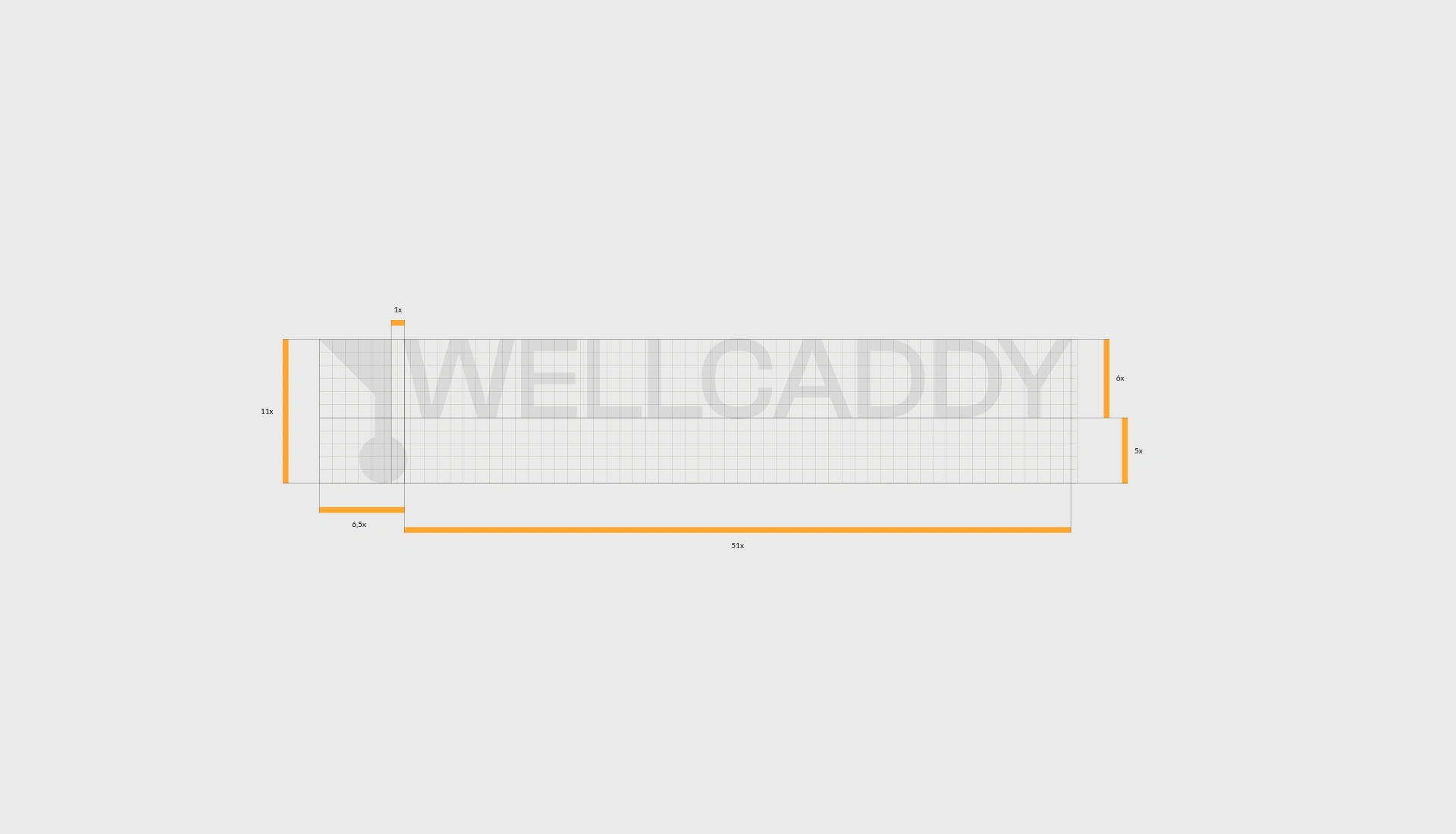
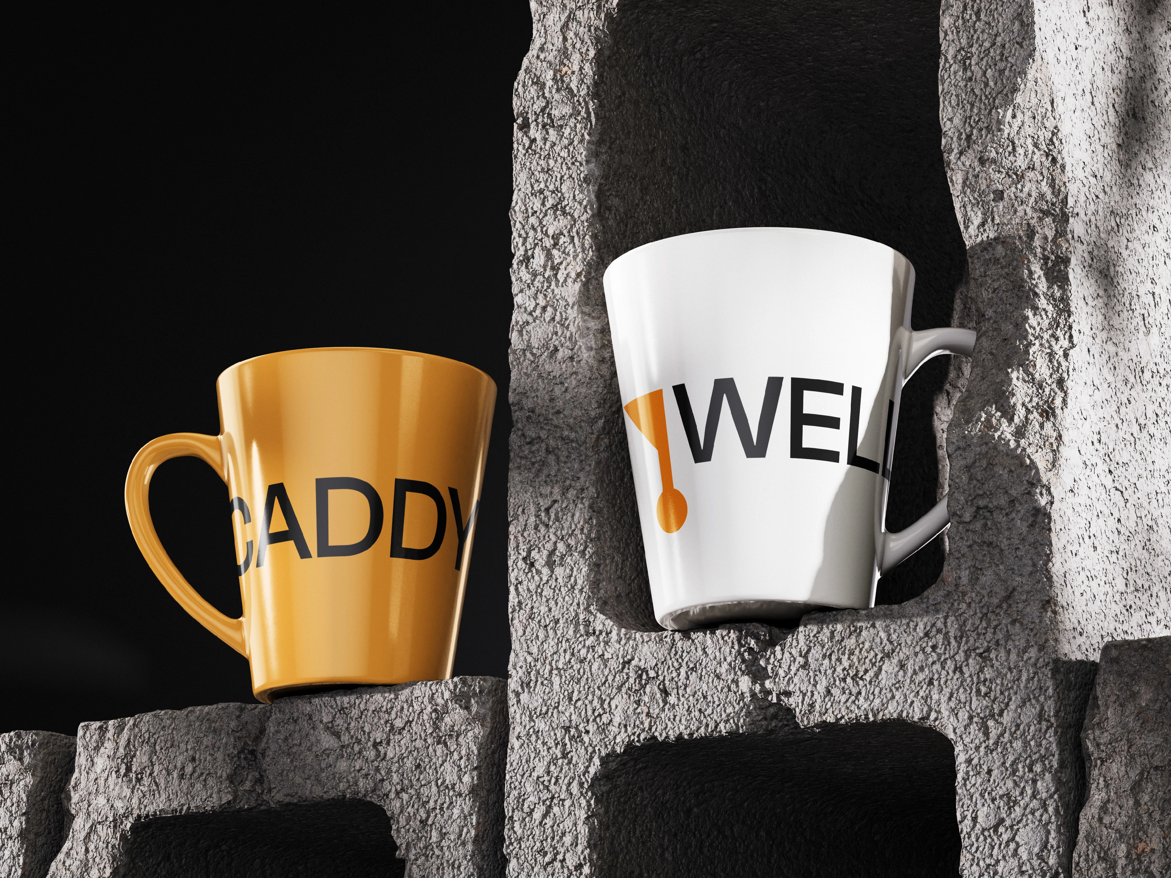
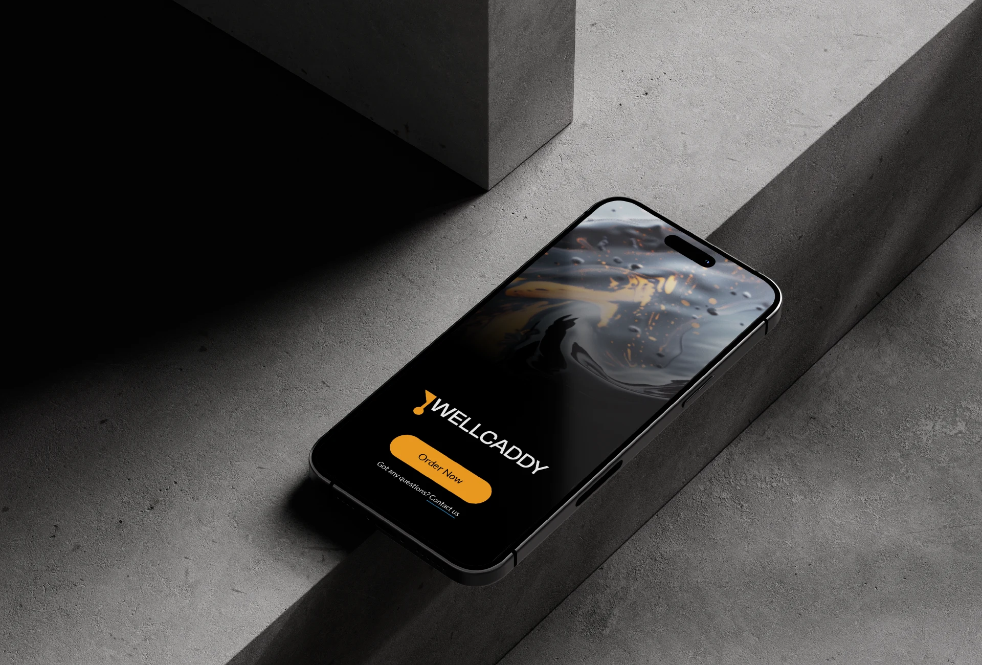
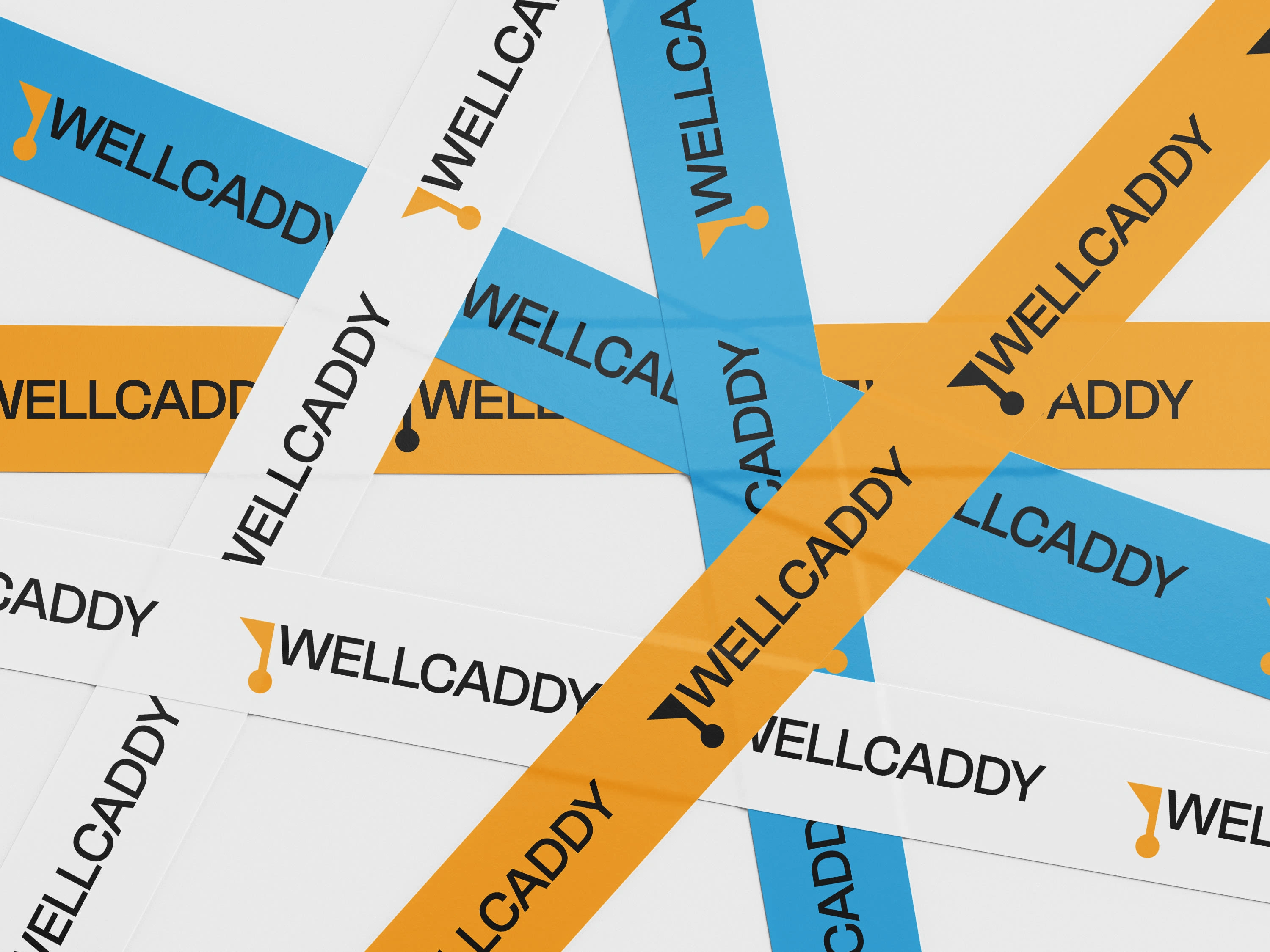
The brand is built around the idea of smart engineering and reliability. My approach was to uncover and deliver a solution that truly captured that essence. After defining the brand strategy and positioning, we developed a geometric symbol inspired by a caddy hole—a visual metaphor for tapping into deep, hard-to-reach energy reserves. Positioned beneath the logotype, the symbol reflects WellCaddy’s precision, depth, and commitment to helping industries reach their targets efficiently and confidently.
Client: Wellcaddy — Service: Brand Identity — Year: 2024 — Creative Direction: Pawel Nosal©
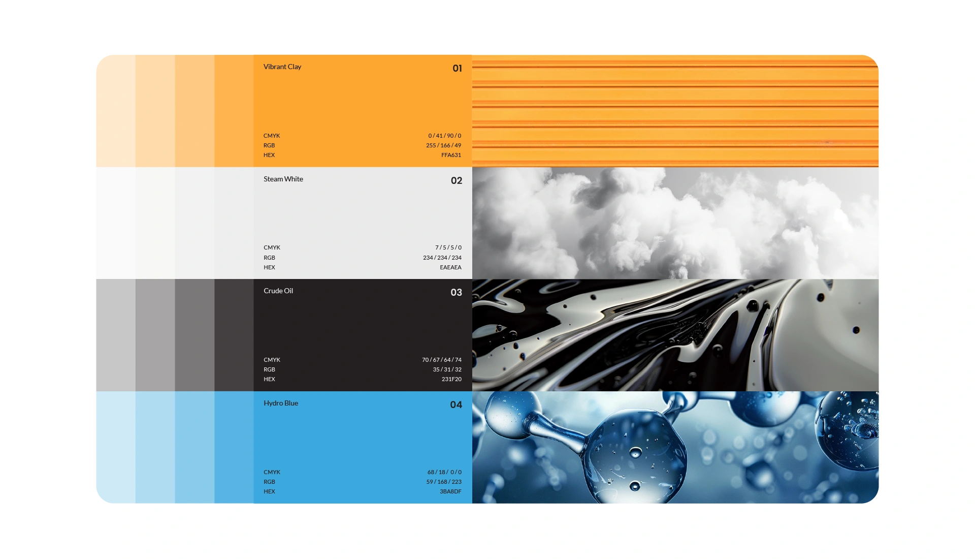
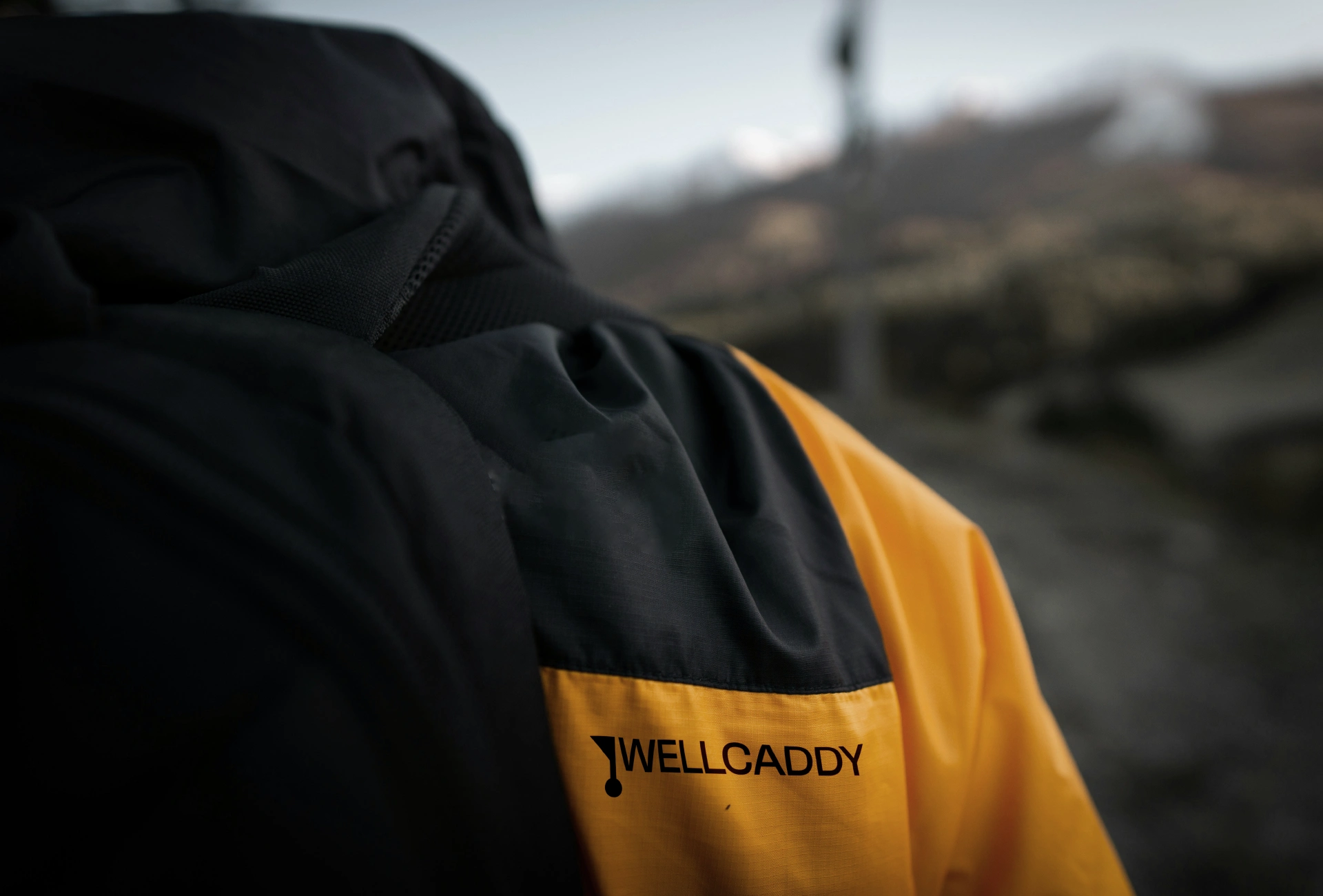
Scope of work: Analysis — Logo design — Visual strategy — Brand communication strategy — Brand Manual — Design of identification elements

Like this project
Posted Nov 5, 2025
Brand Identity created for Wellcaddy. Precision-engineered downhole tools helping industries tap into challenging energy sources with efficiency and innovation.