Brand System and UI/UX for Mita Finance
Mikhail Yakovlev
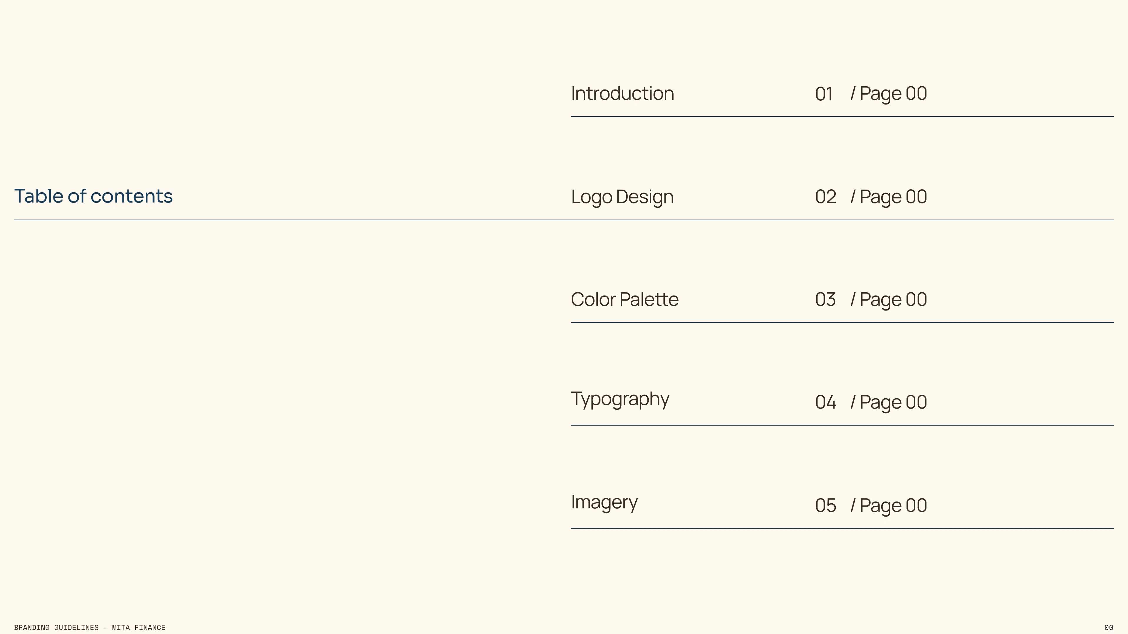
Project Overview
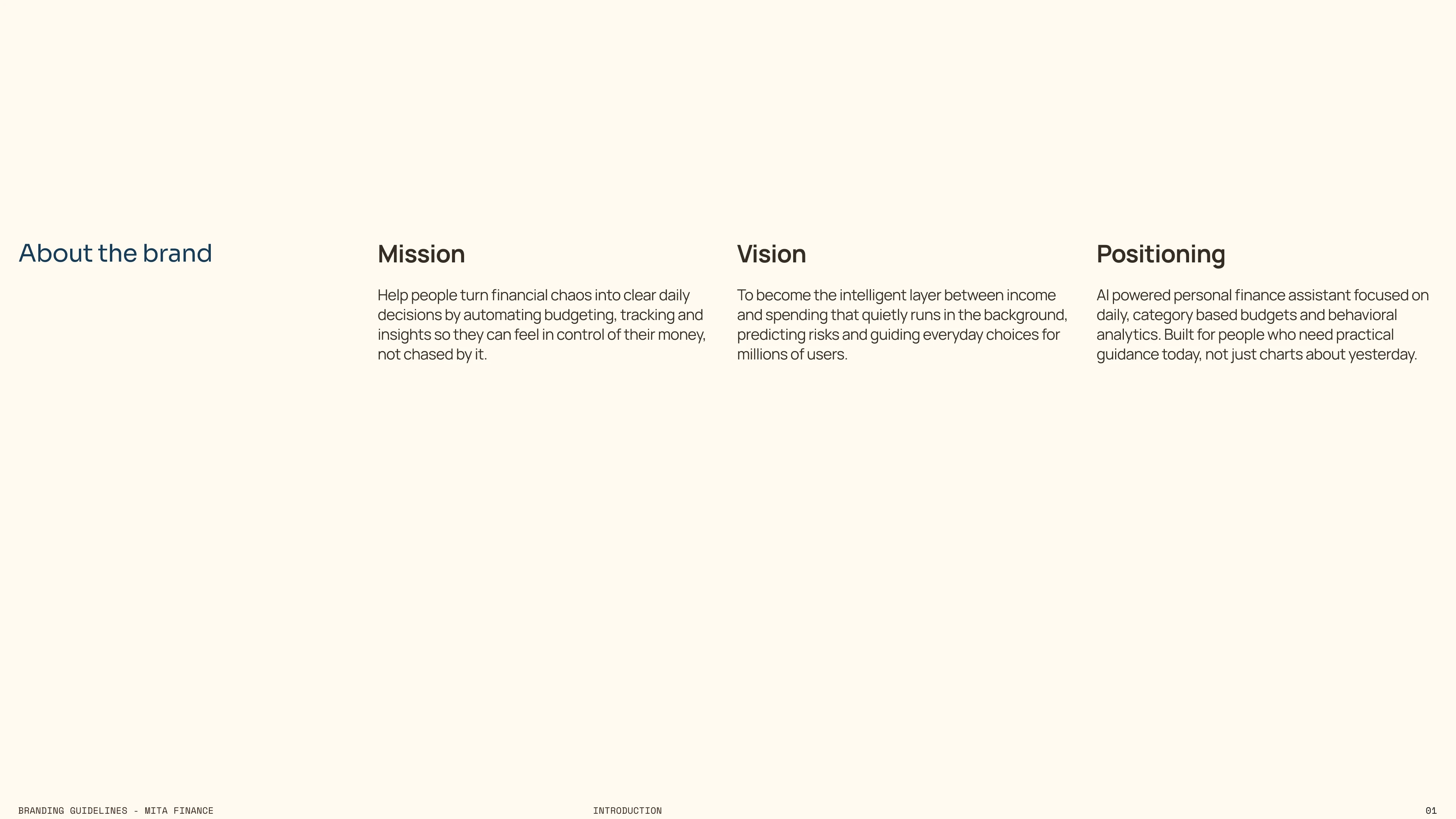
Mita Finance is an AI powered personal finance platform designed to transform monthly income into structured daily financial decisions. Unlike traditional budgeting tools that analyze past behavior, Mita actively guides users in real time through adaptive daily category based budgets.
The project included building a complete brand identity and product ecosystem from the ground up. This involved developing a scalable visual system, defining a clear fintech positioning, and designing a full mobile experience aligned with the core redistribution engine.
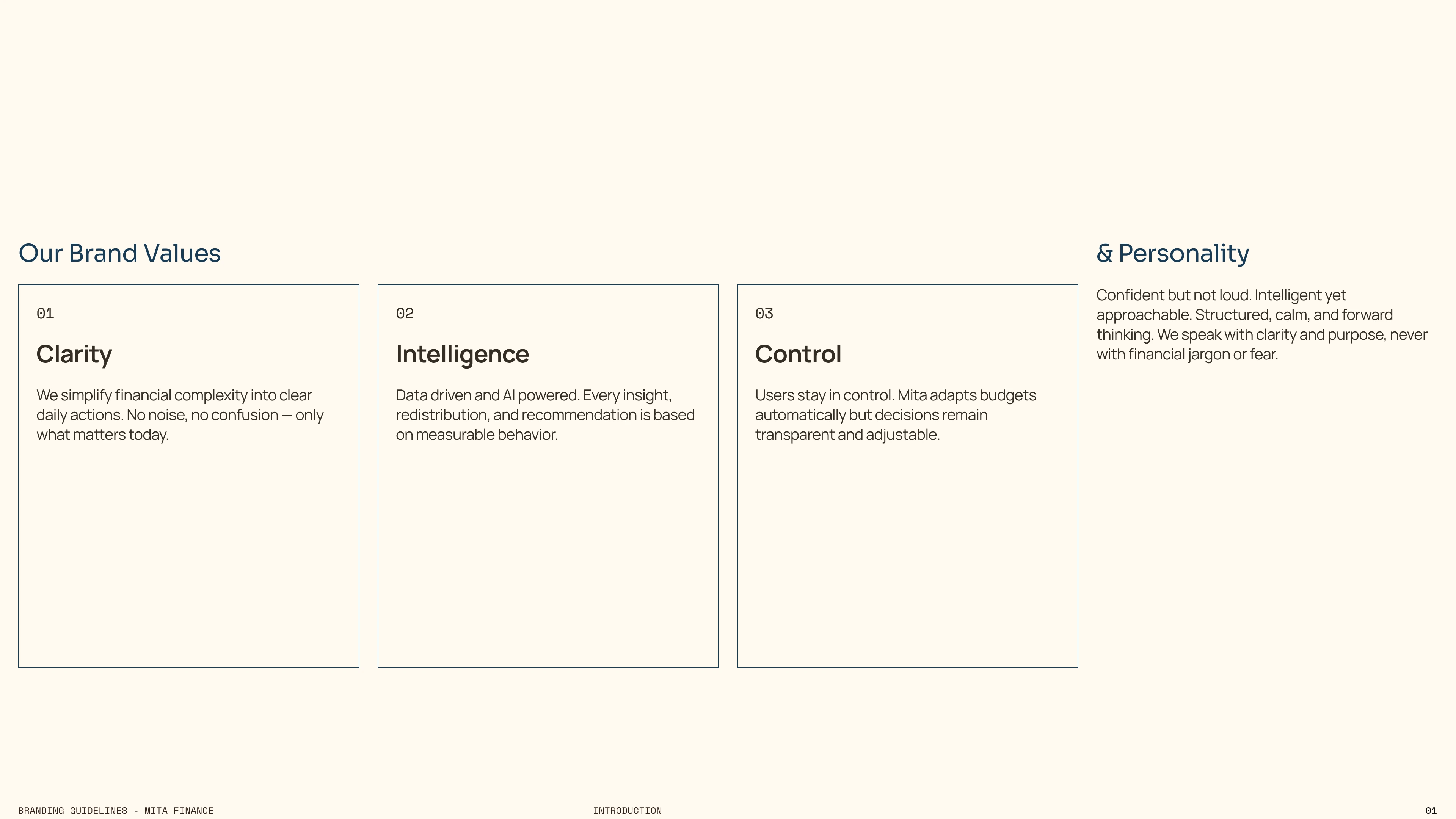
The objective was to create a calm, intelligent, and forward looking financial assistant that feels precise yet approachable, combining behavioral analytics, automation, and strong product clarity into one cohesive system.
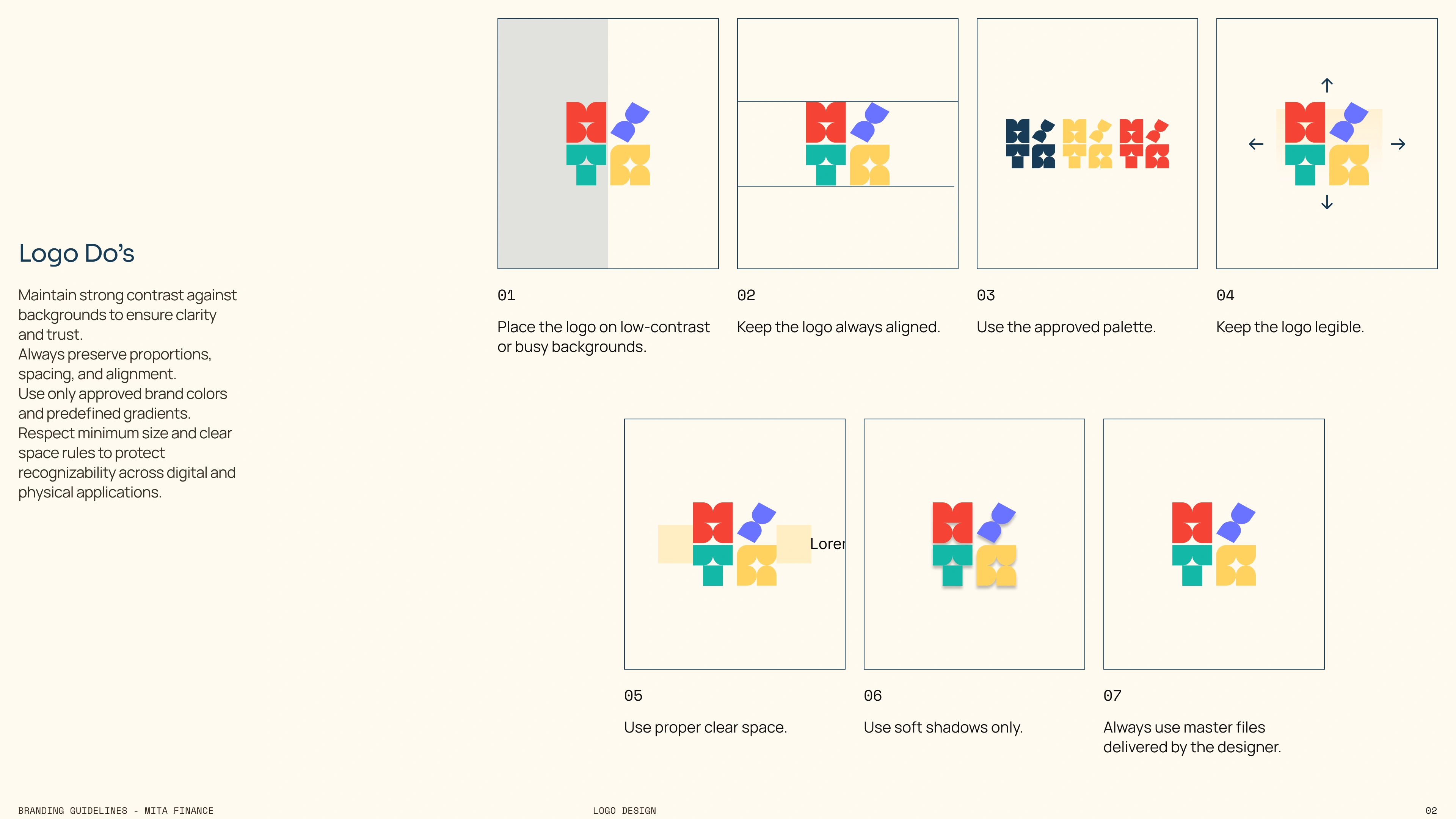
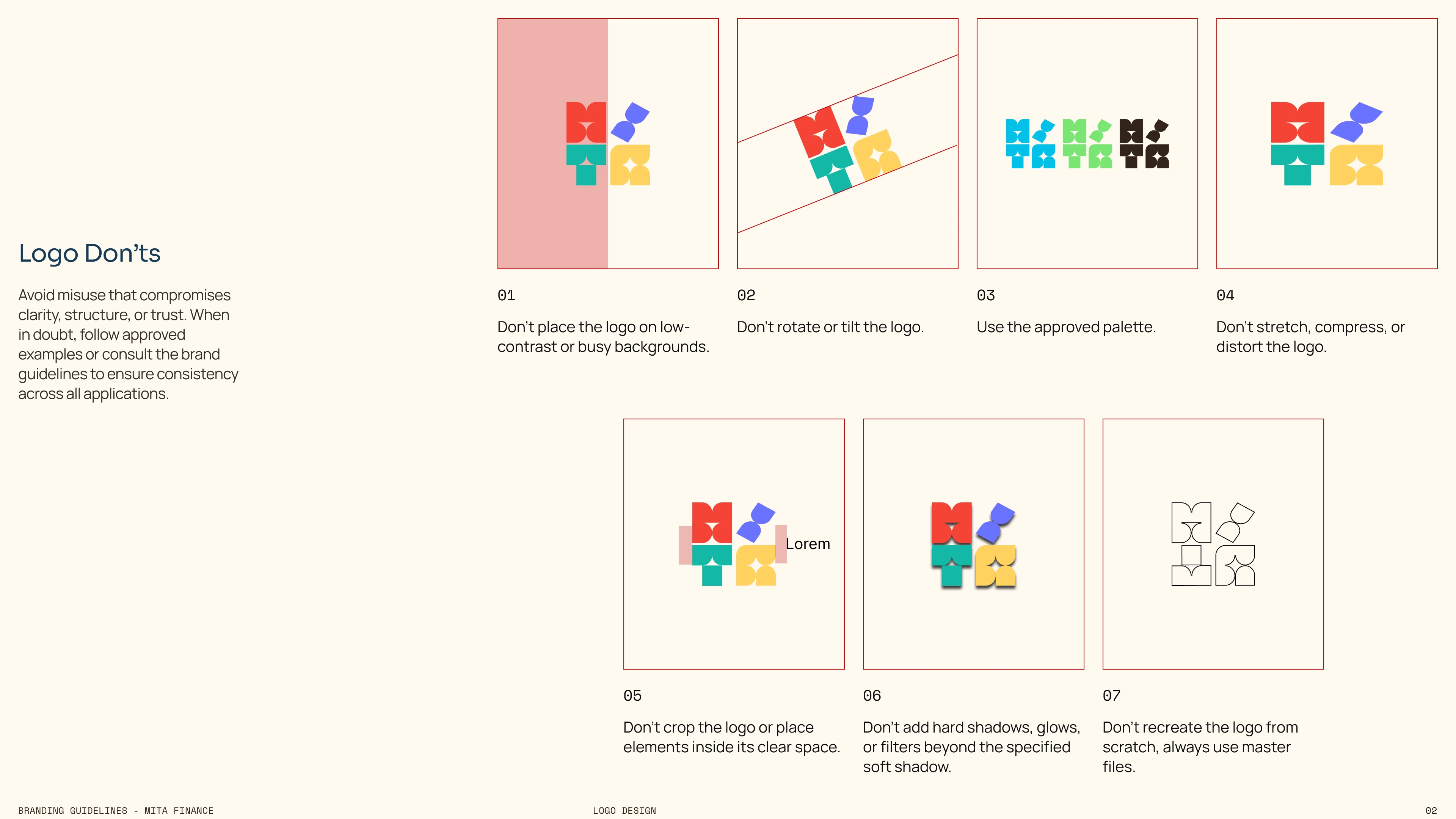
Logo Concept & Construction
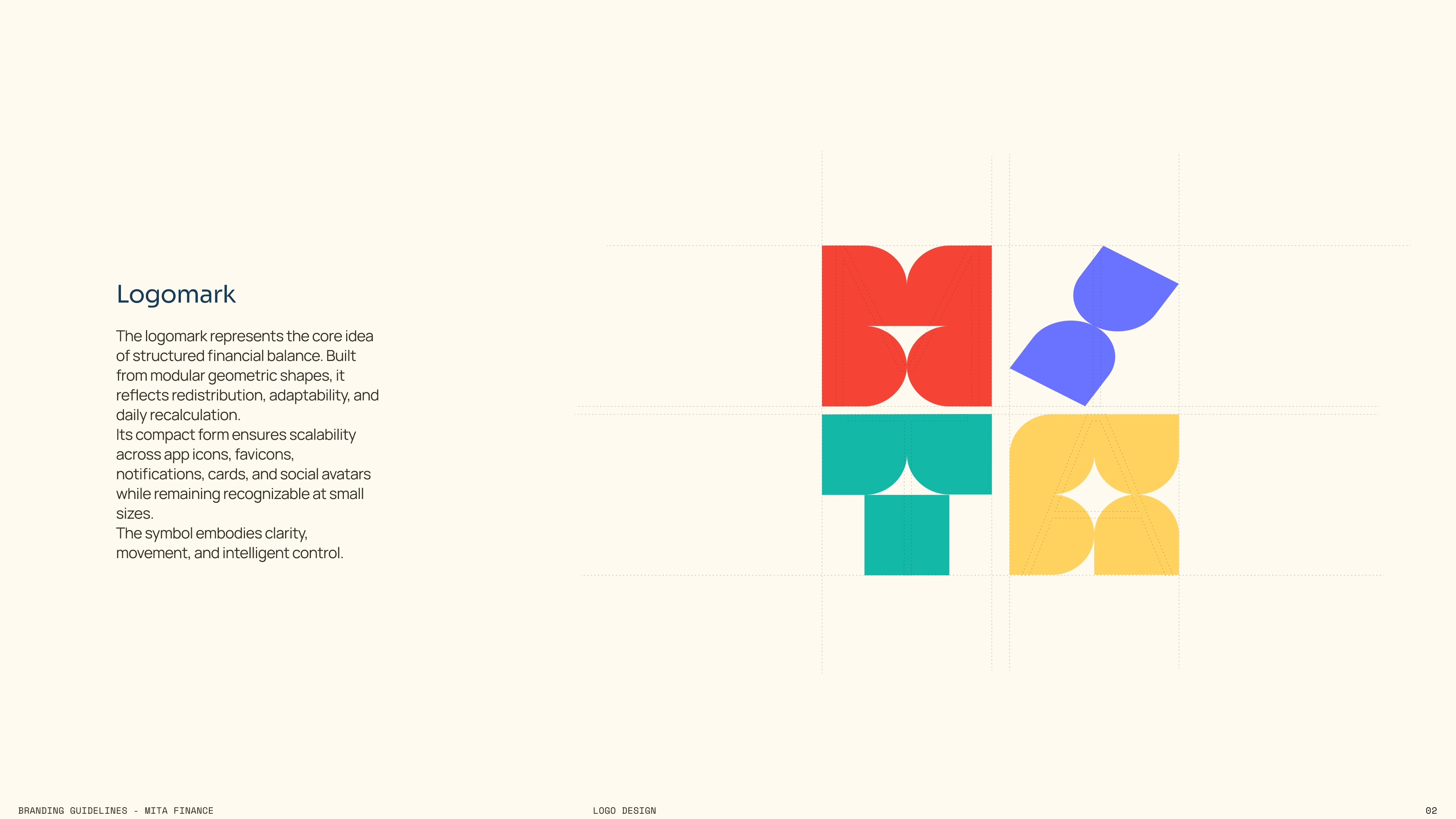
The logomark was constructed as a modular geometric system built from simplified, rounded forms. Each shape represents a structured unit, symbolizing categorized daily budgets that work together as one controlled financial ecosystem.
The composition forms a compact square, reinforcing the idea of balance, stability, and redistribution. The modular structure visually reflects how Mita reallocates budgets dynamically across days and categories.
Rounded inner curves soften the geometry to avoid a rigid banking aesthetic. This keeps the brand approachable while maintaining structural precision.
The separated upper element introduces subtle movement, representing adaptability and AI driven recalculation rather than static budgeting.
Why this approach
Traditional fintech logos often rely on arrows, charts, or monograms. Instead, this symbol abstracts the core engine logic of Mita into a visual system of balance and redistribution.
The goal was to communicate intelligence, control, and modular adaptability without literal financial clichés.
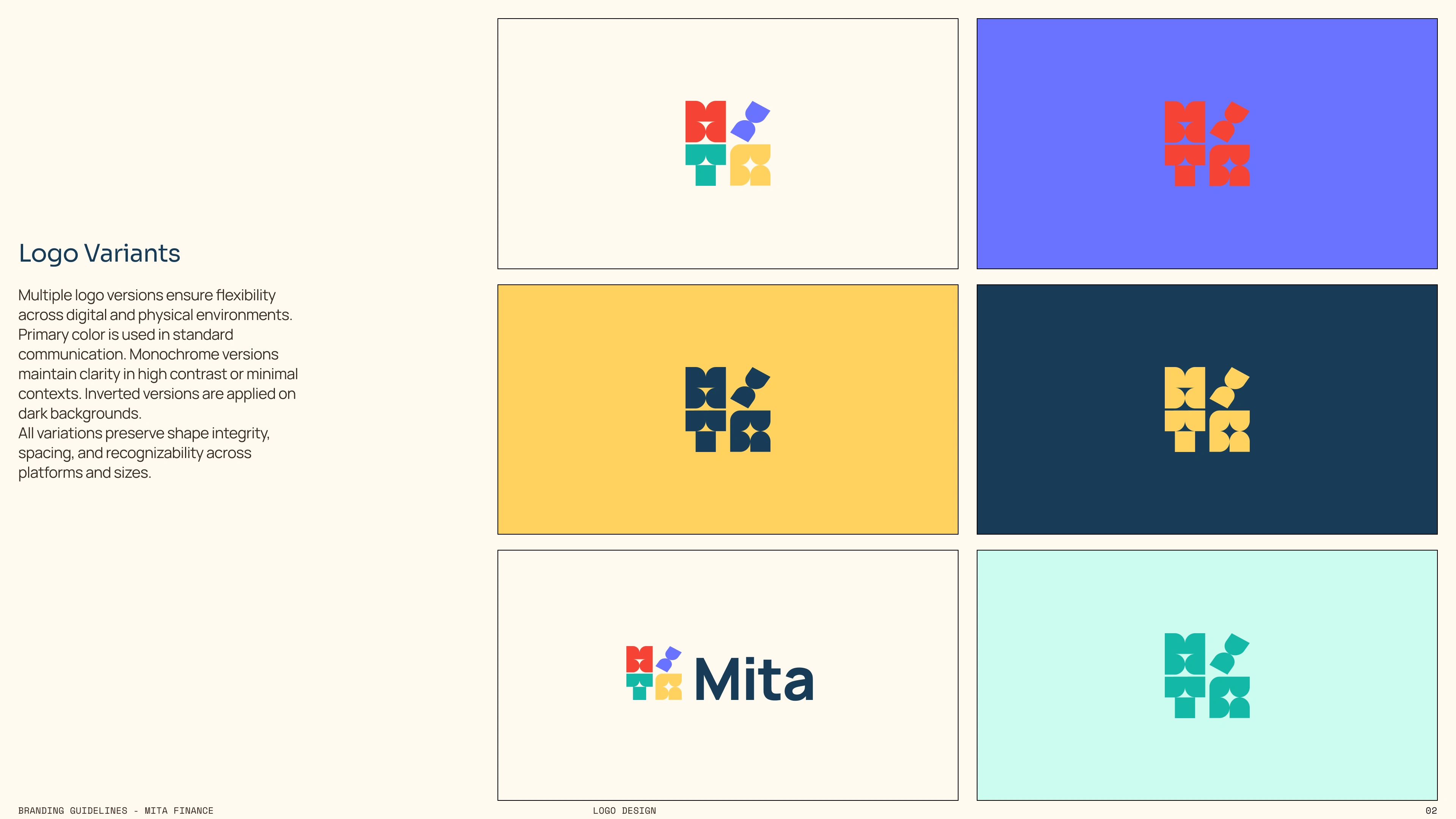
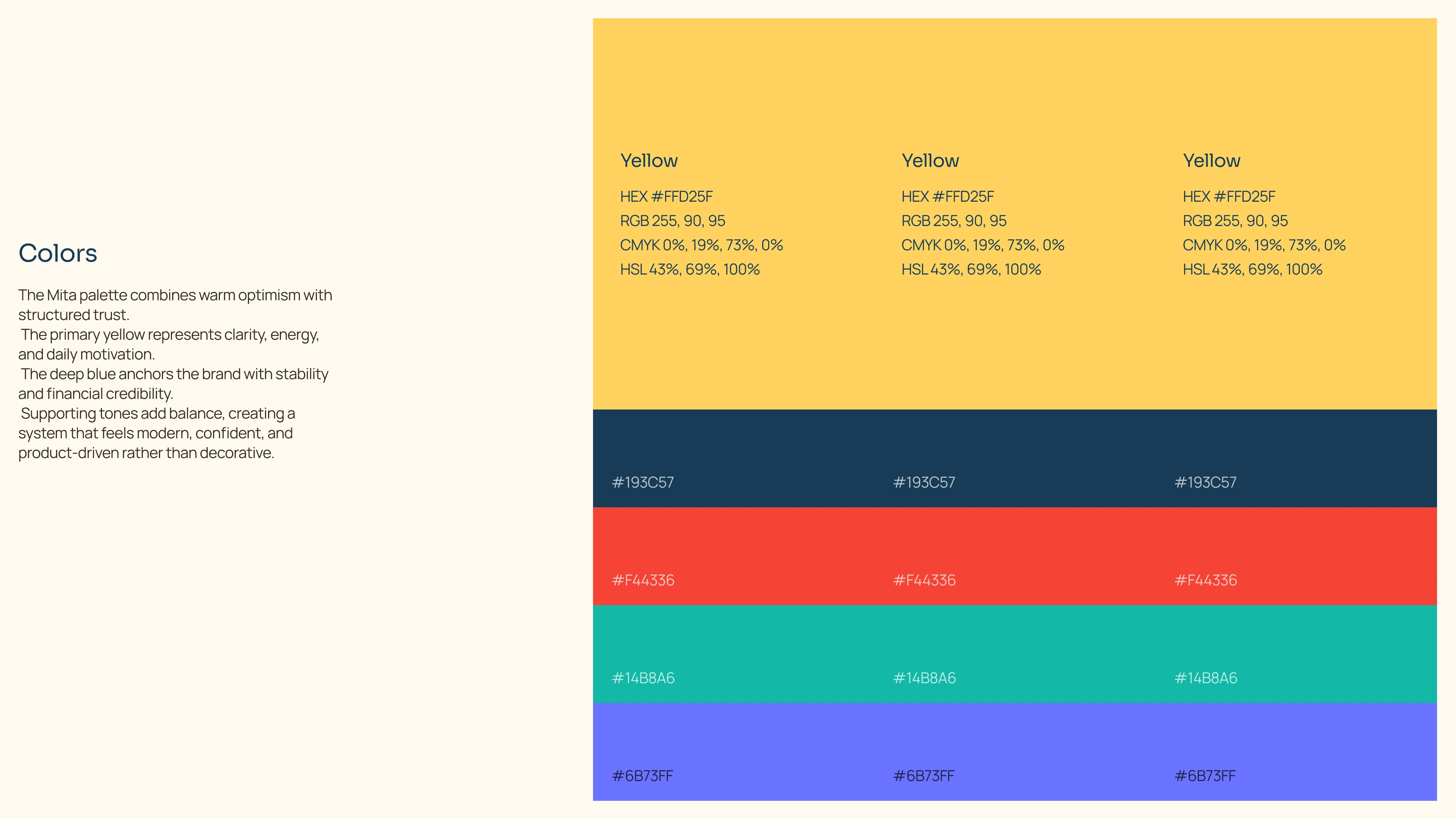
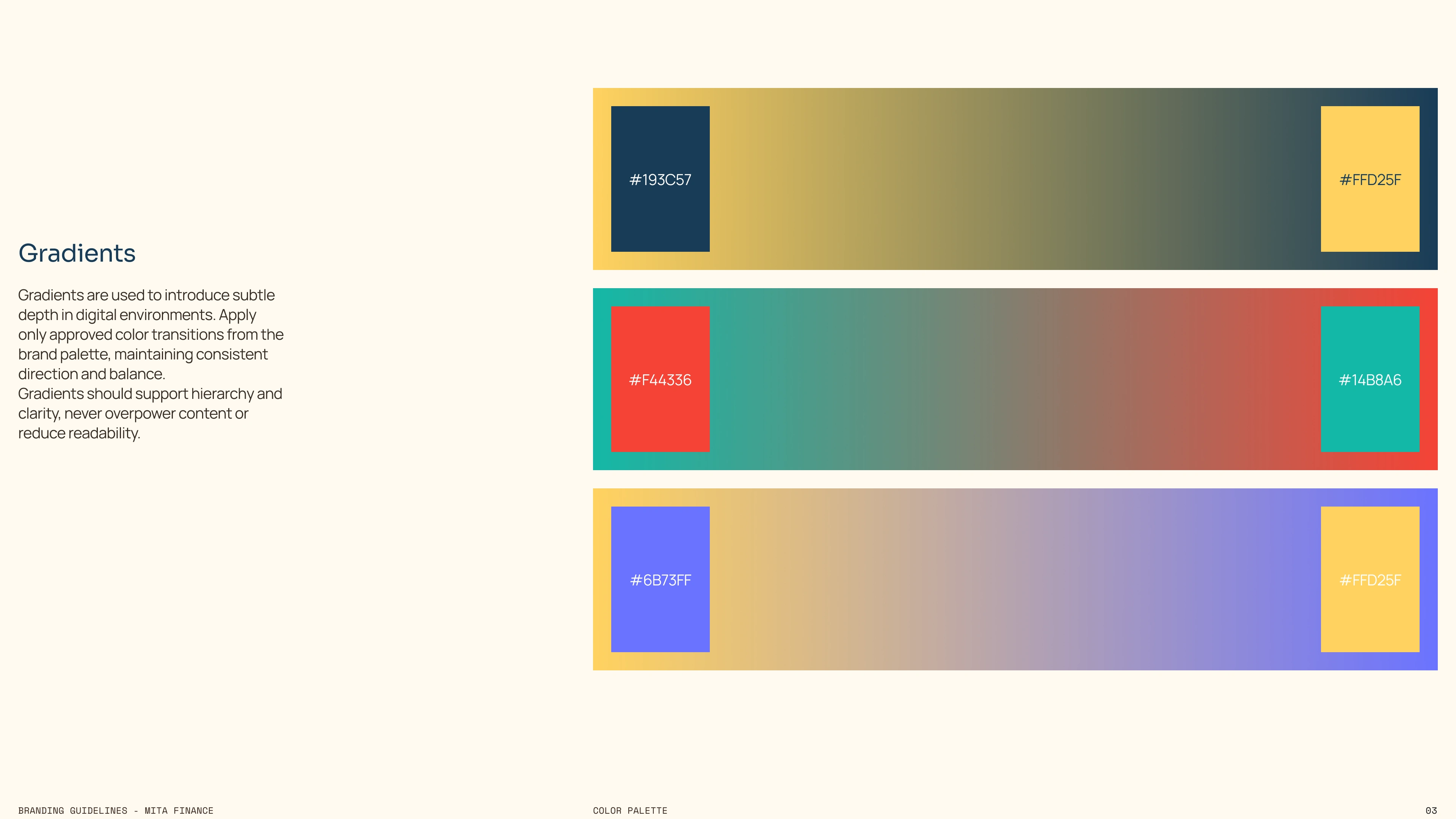
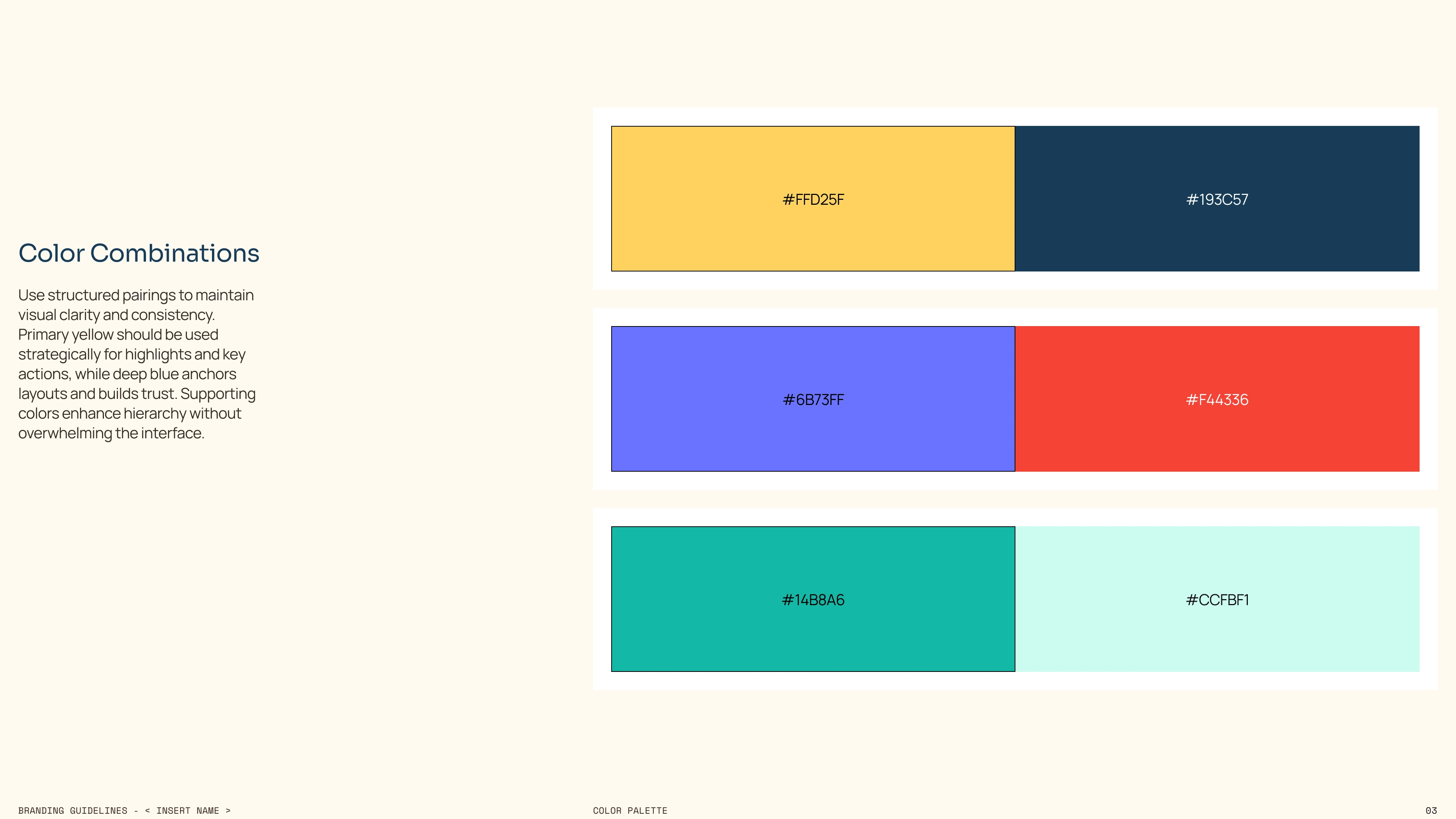
Color Strategy
The palette was designed to balance motivation and financial credibility.
Warm tones introduce energy and daily engagement, reinforcing action and forward movement. Deeper tones provide structure, stability, and trust, grounding the interface in a serious fintech context. Supporting colors add hierarchy and emotional cues without overwhelming the system.
Together, the colors create a brand that feels intelligent, optimistic, and controlled rather than rigid or intimidating.
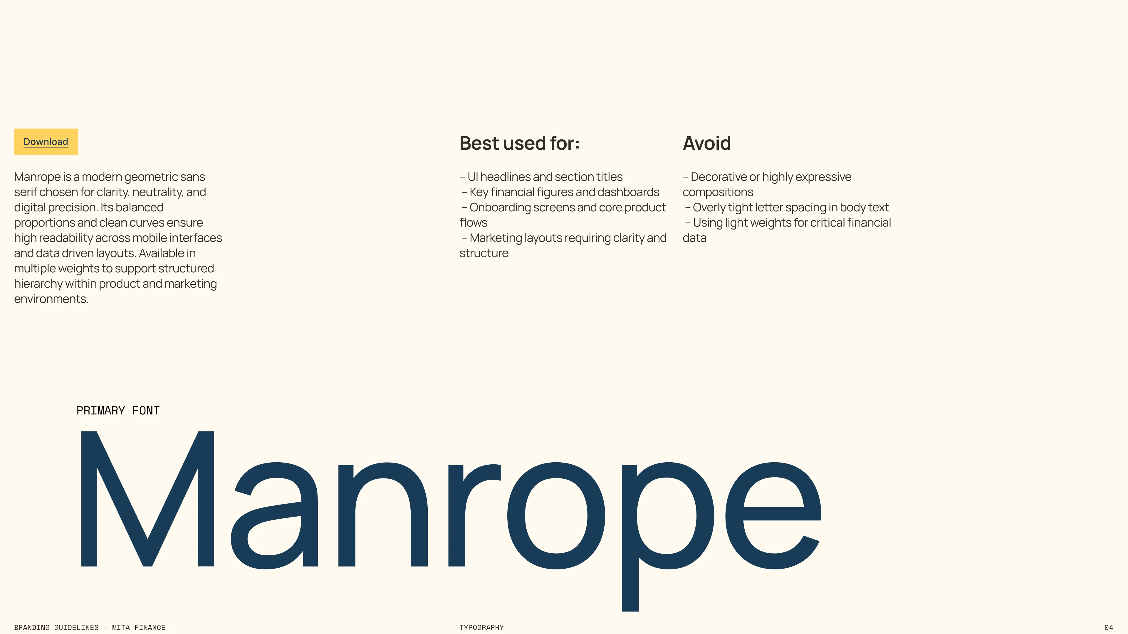
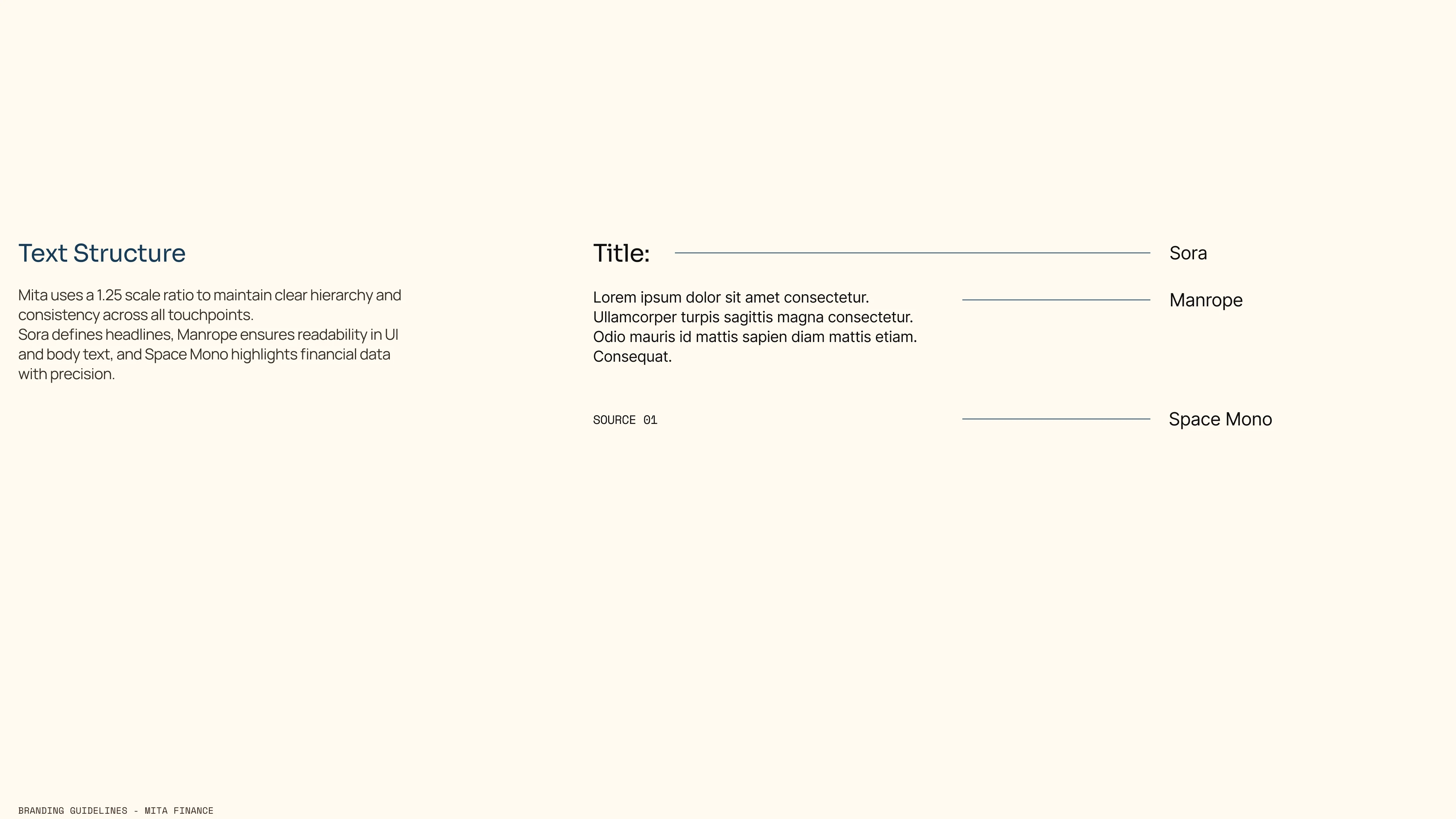
Manrope — Why
Manrope was selected as the primary typeface for its clarity, neutrality, and digital precision. Its geometric construction supports structured layouts and data heavy interfaces, which is critical for a budgeting platform. The balanced proportions ensure excellent readability across dashboards, financial figures, and dense UI environments. It reinforces logic, control, and trust.
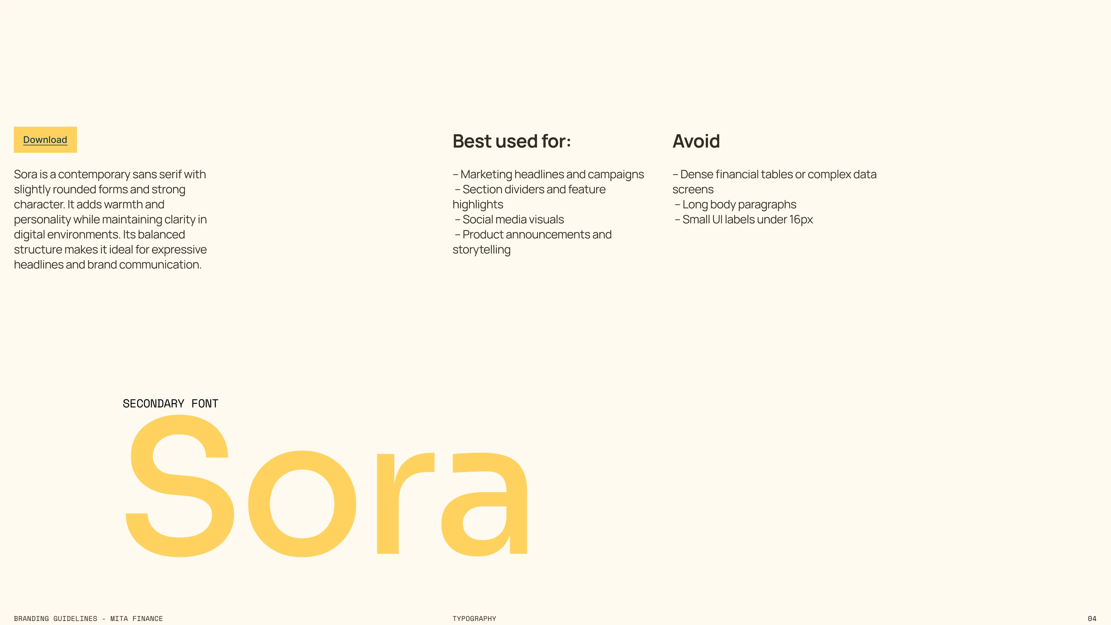
Sora — Why
Sora was chosen as the secondary typeface to introduce warmth and brand personality. Its slightly softer forms and modern character make it ideal for marketing headlines and expressive communication. It balances the technical precision of Manrope, preventing the brand from feeling overly rigid while maintaining a contemporary fintech tone.

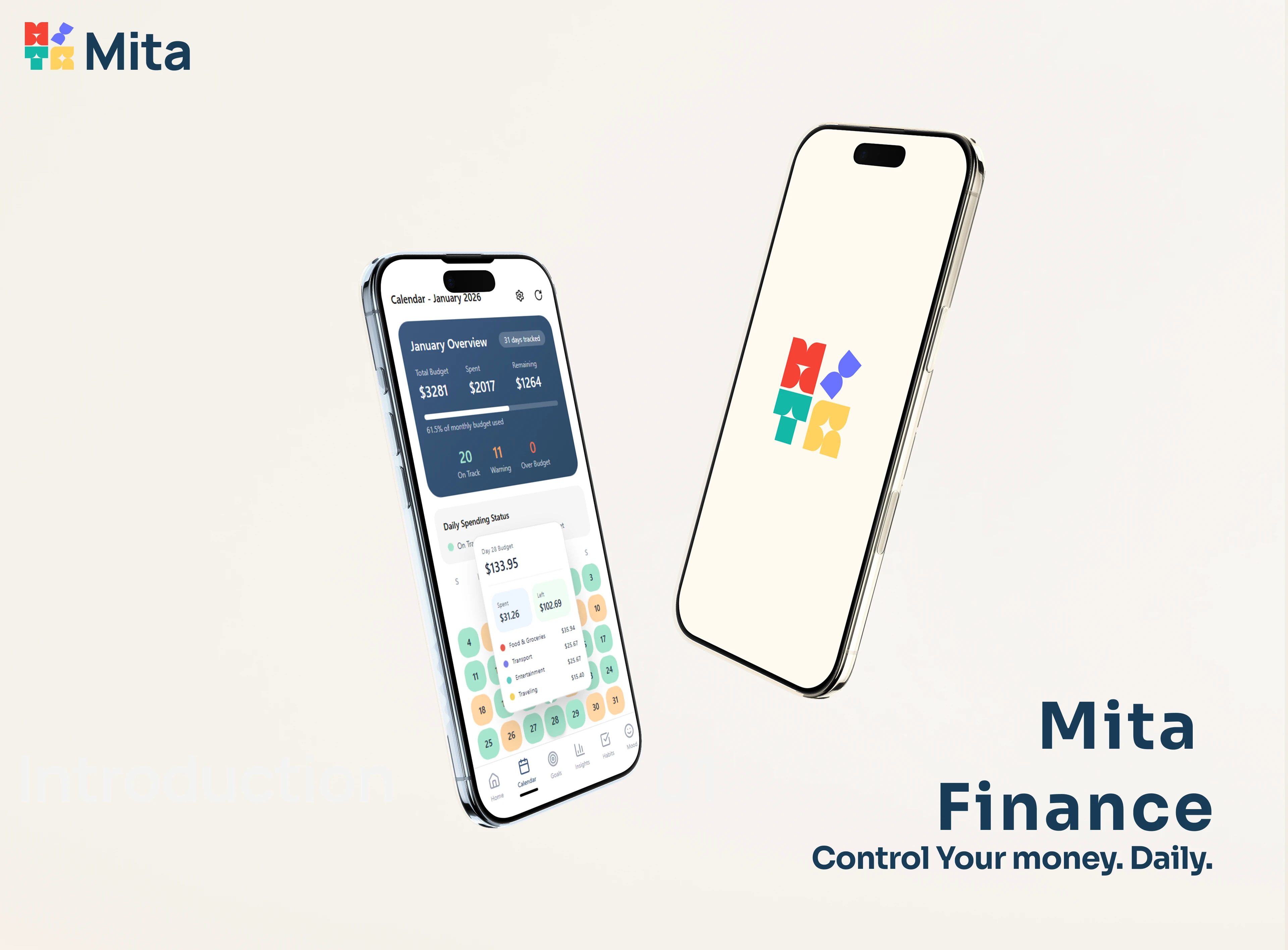
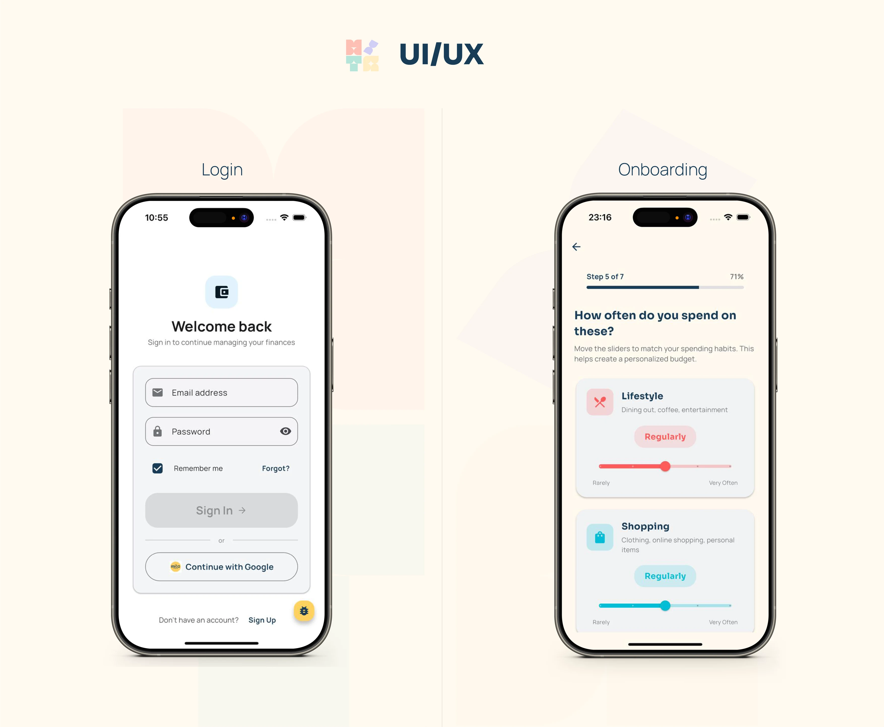
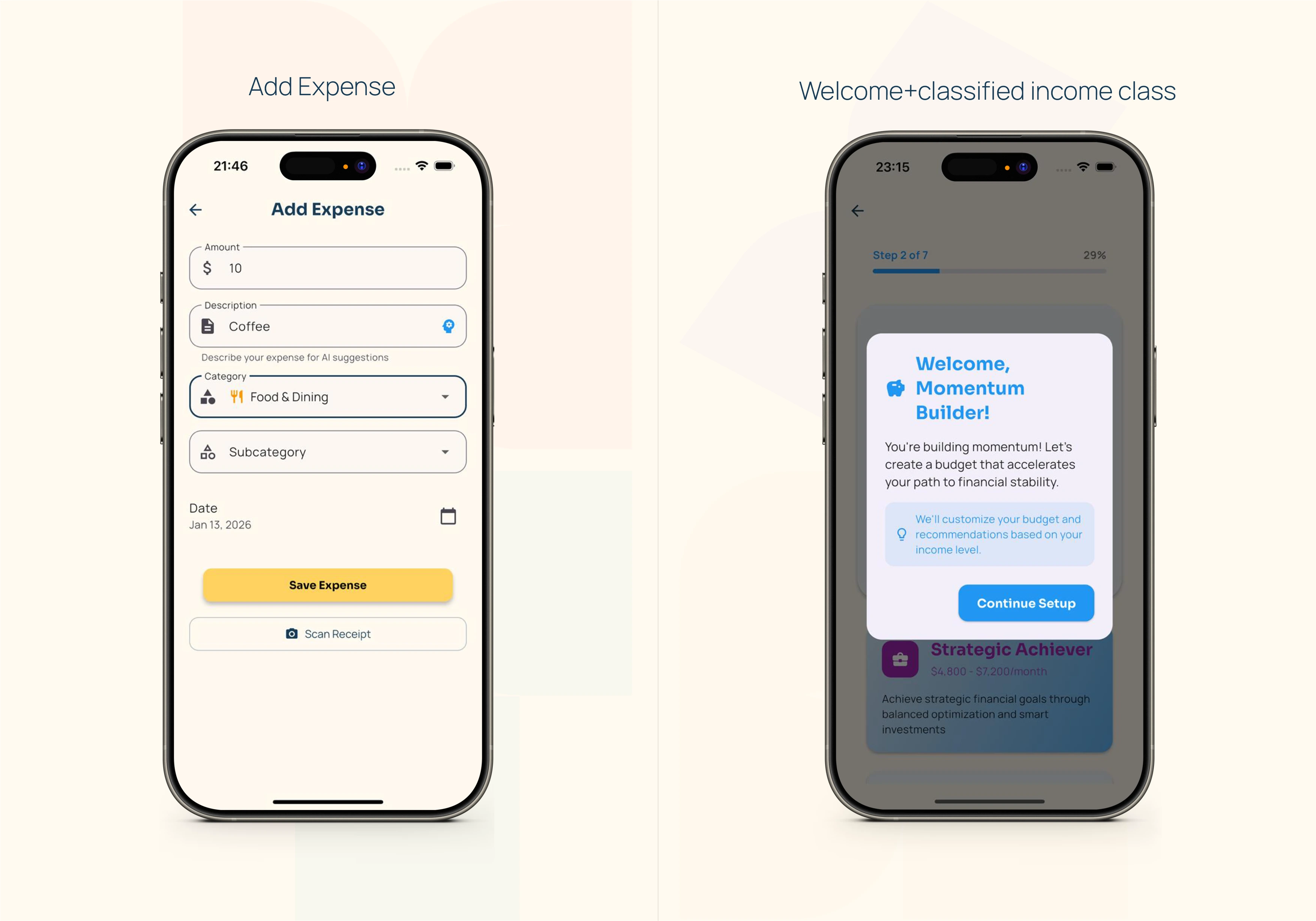
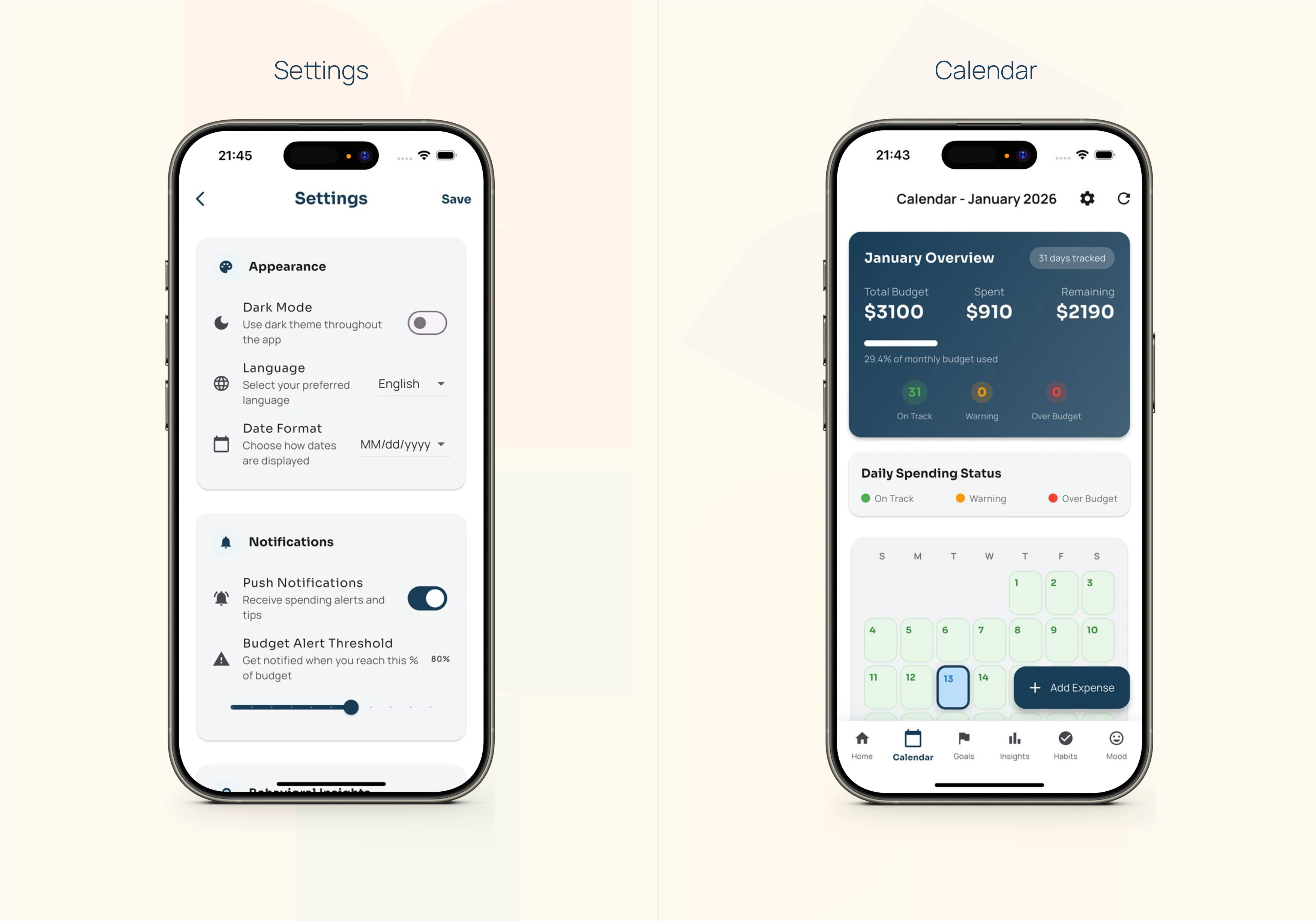
Key UI/UX Design Screens
The UI was designed to translate a complex financial engine into a calm, structured, and intuitive mobile experience. Each core screen supports clarity, speed, and behavioral guidance rather than overwhelming users with data.
Authentication and onboarding focus on simplicity and momentum, reducing friction while collecting meaningful behavioral input. The expense entry flow prioritizes speed and AI assistance, making daily tracking effortless.
The calendar serves as the central control hub, transforming budgeting into a visual daily system instead of a static monthly report. Settings and personalization features reinforce transparency and user control without exposing technical complexity.
Overall, the experience was built to feel intelligent, supportive, and forward looking, aligning design decisions with Mita’s adaptive budgeting logic.
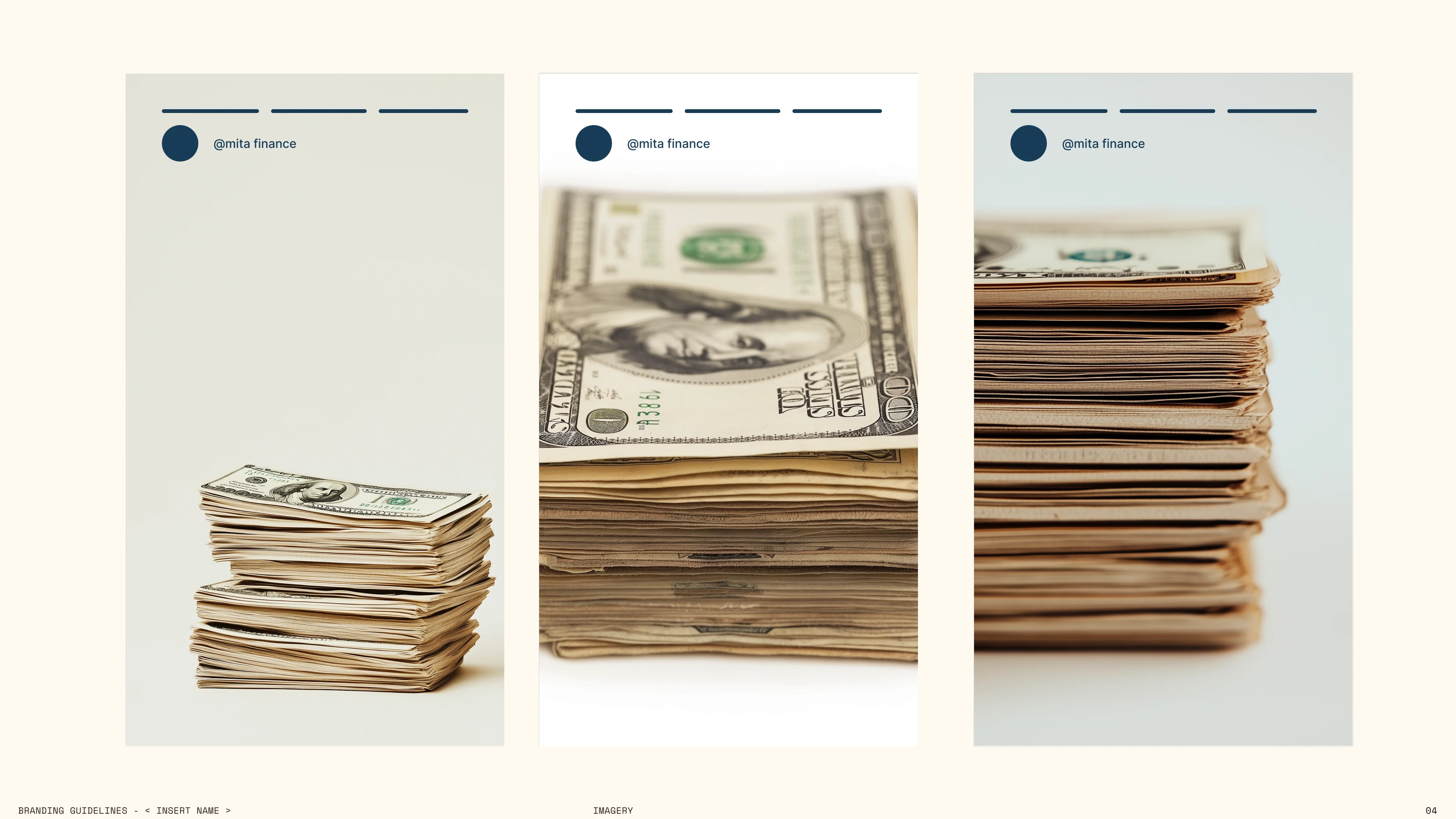
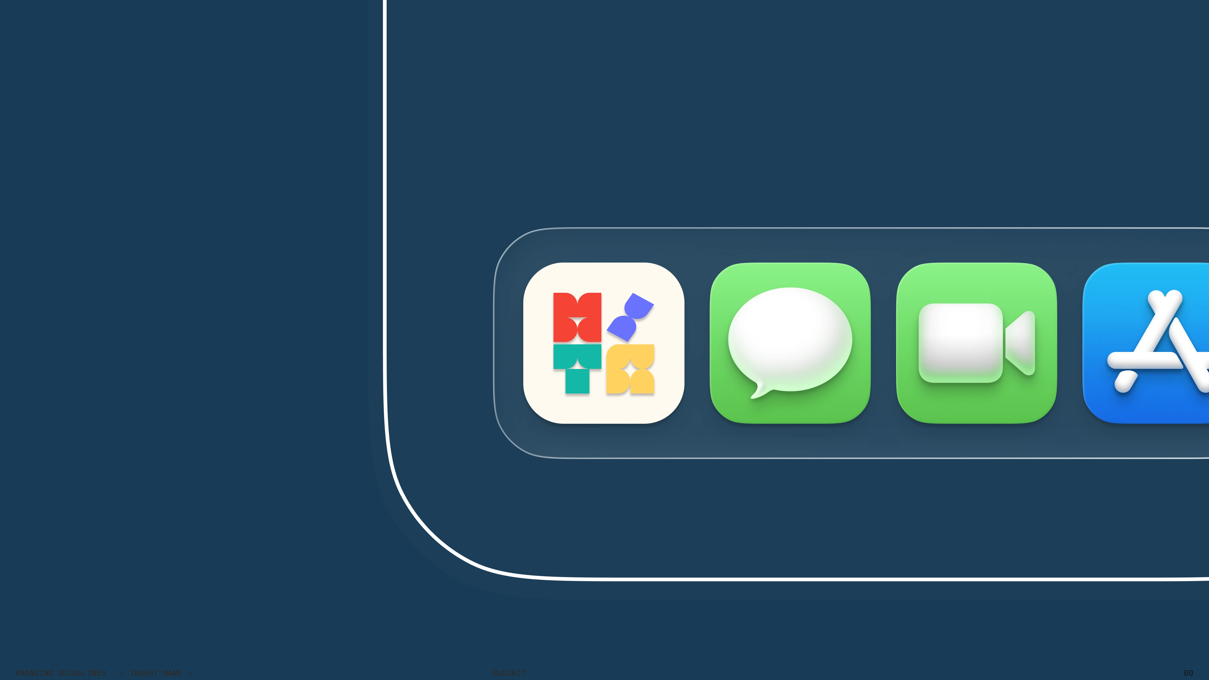
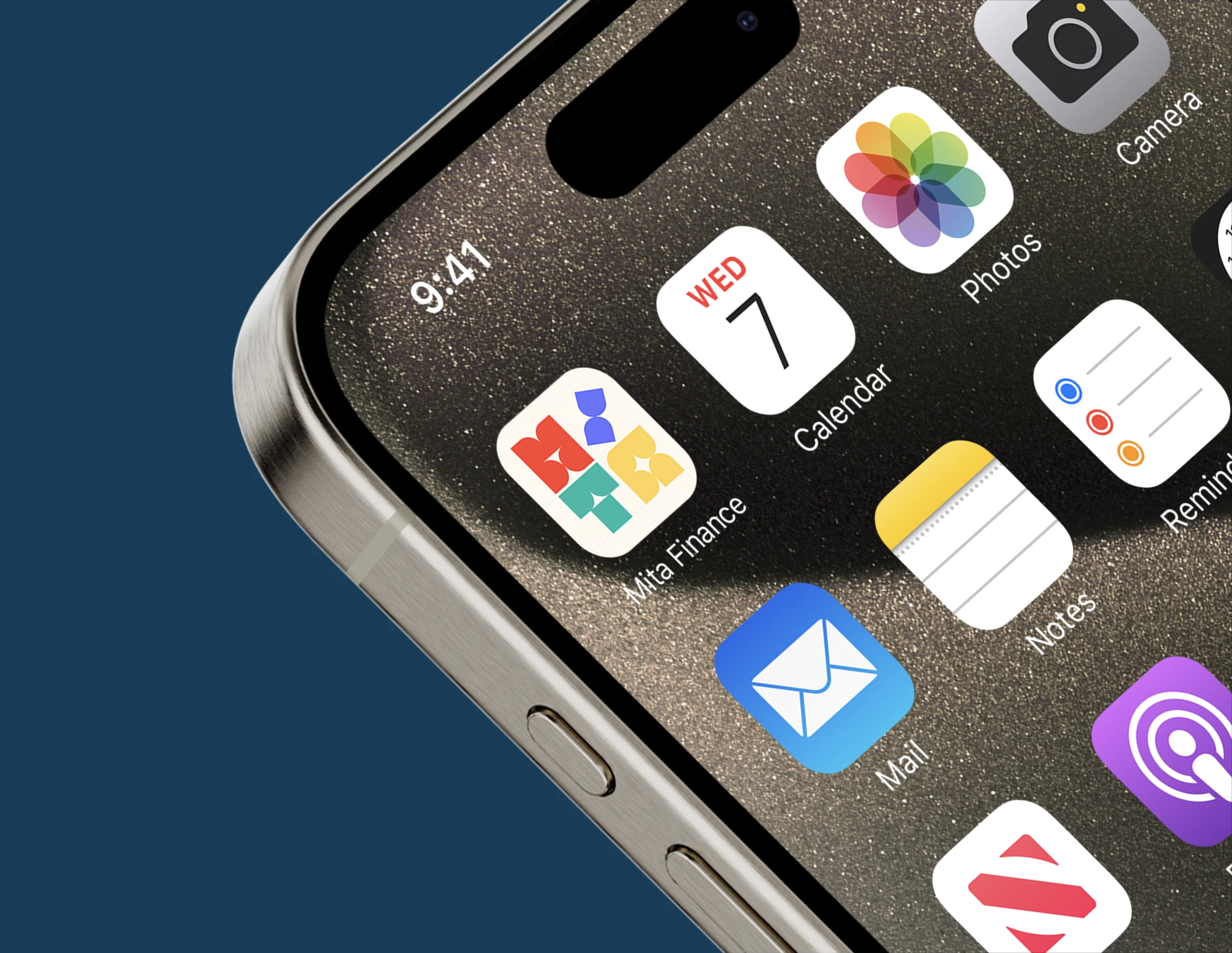
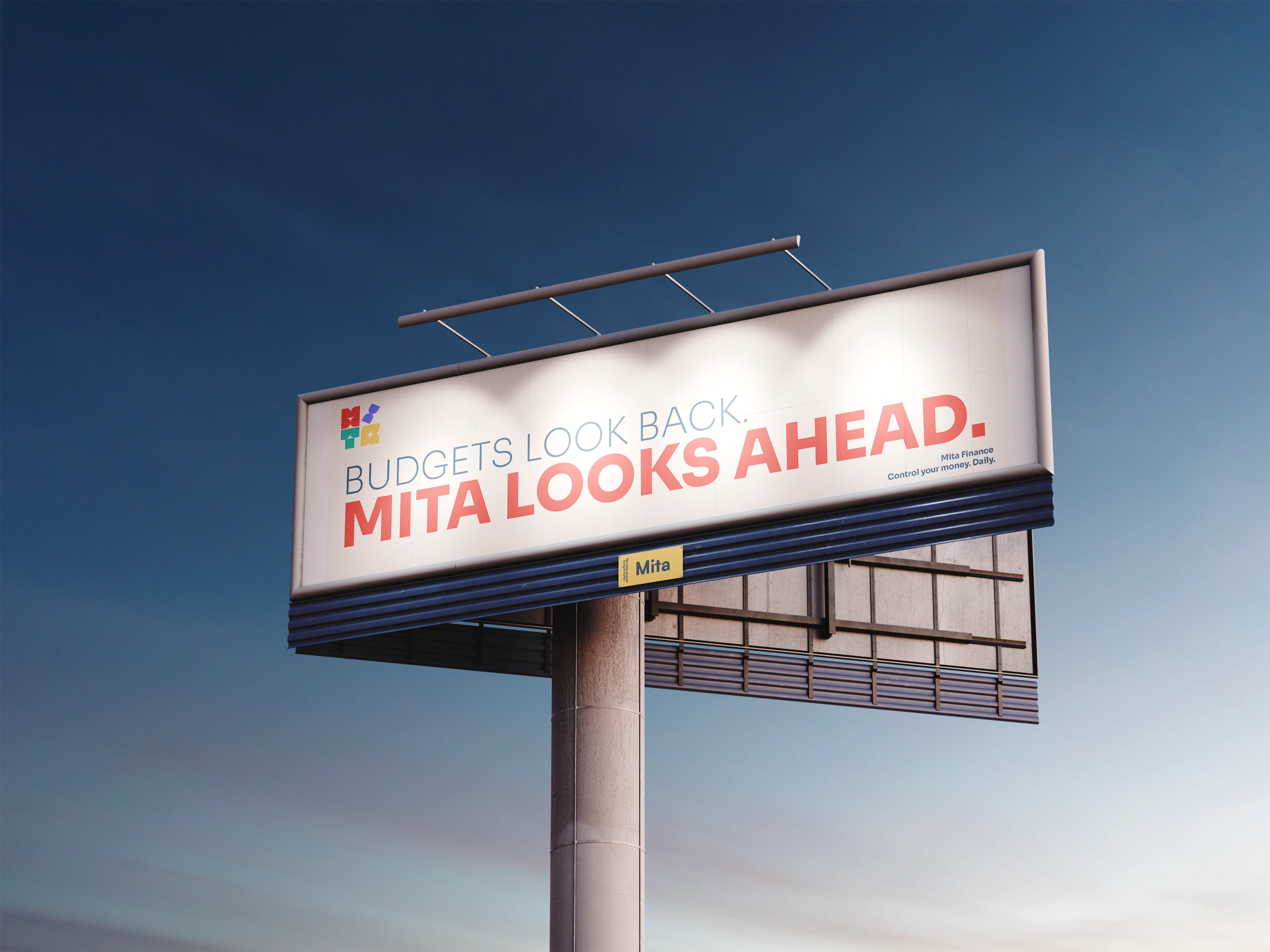
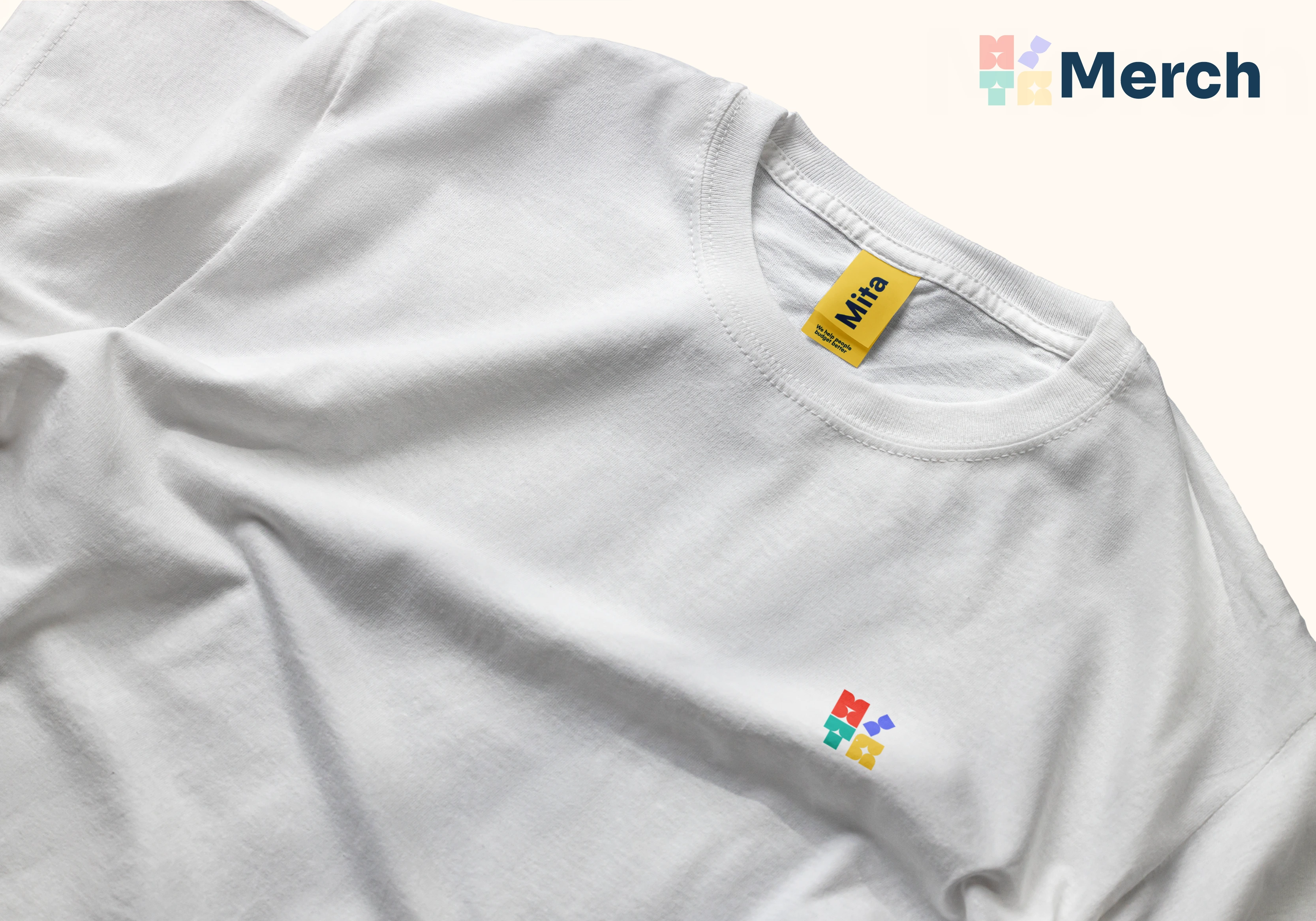
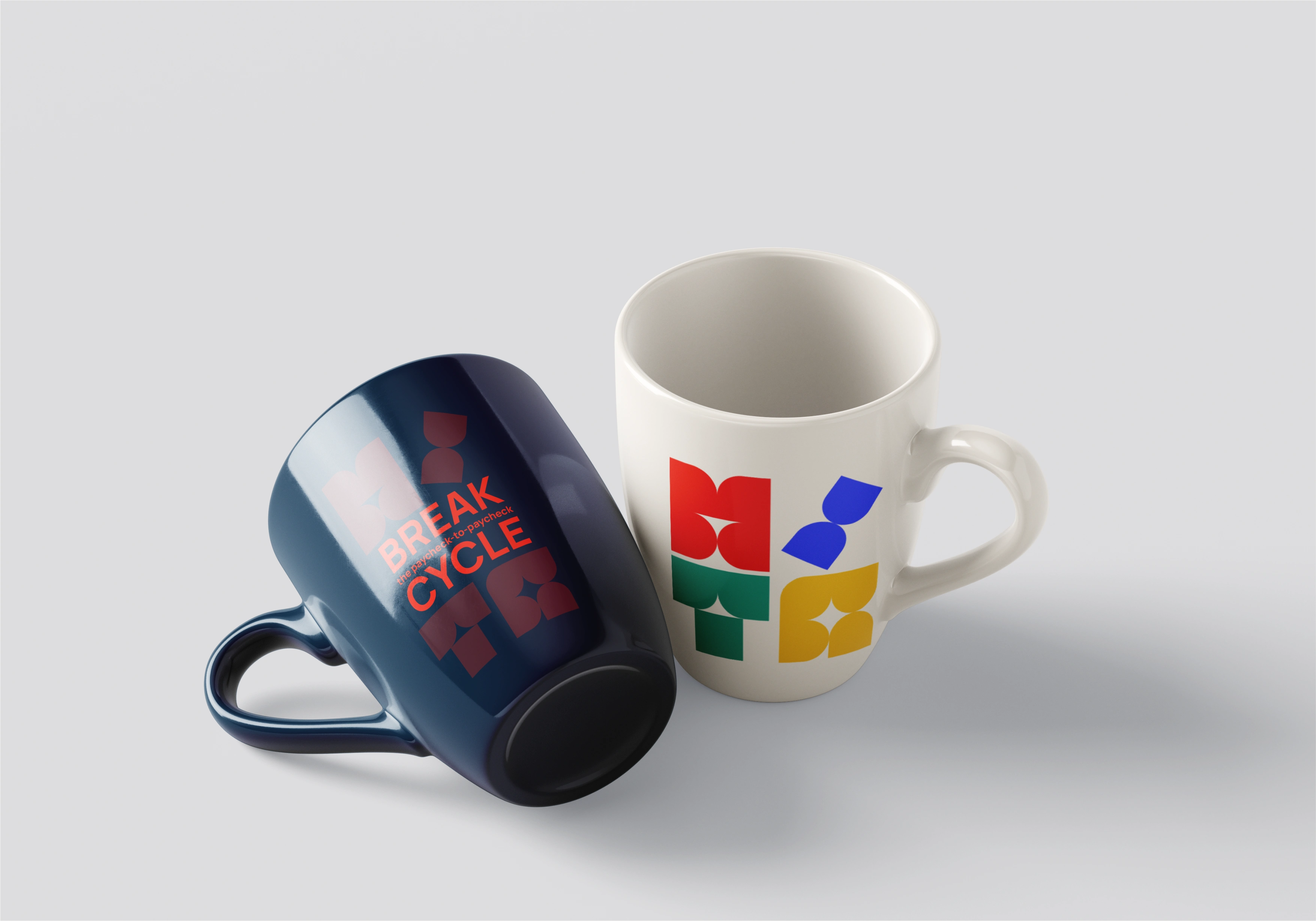
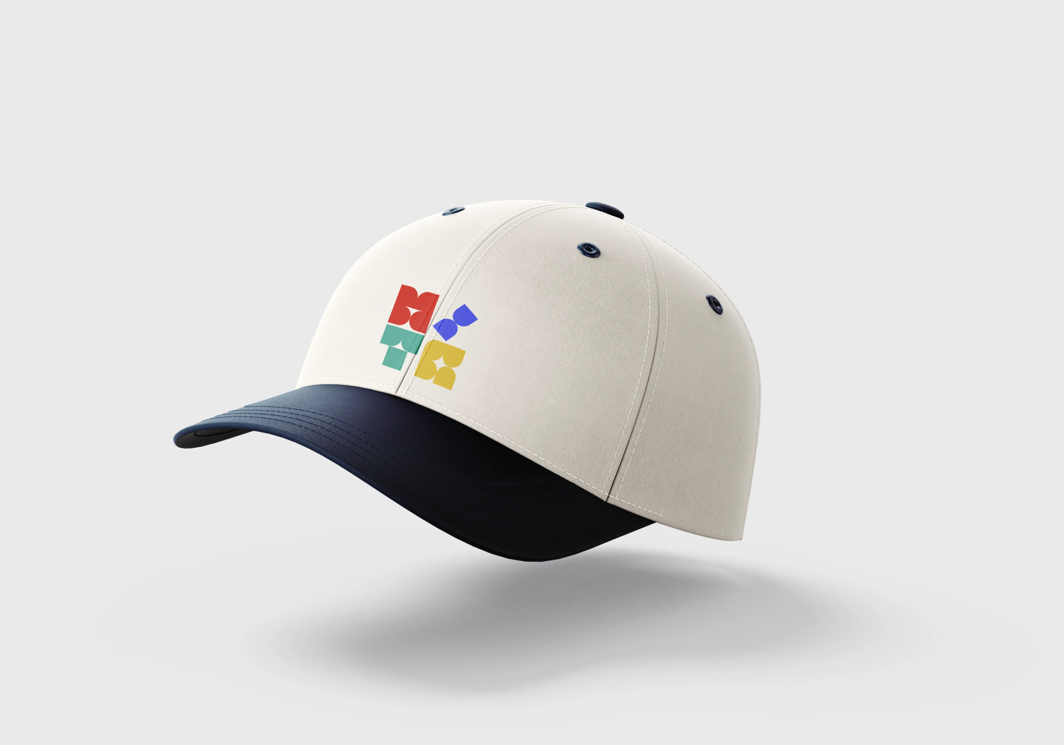
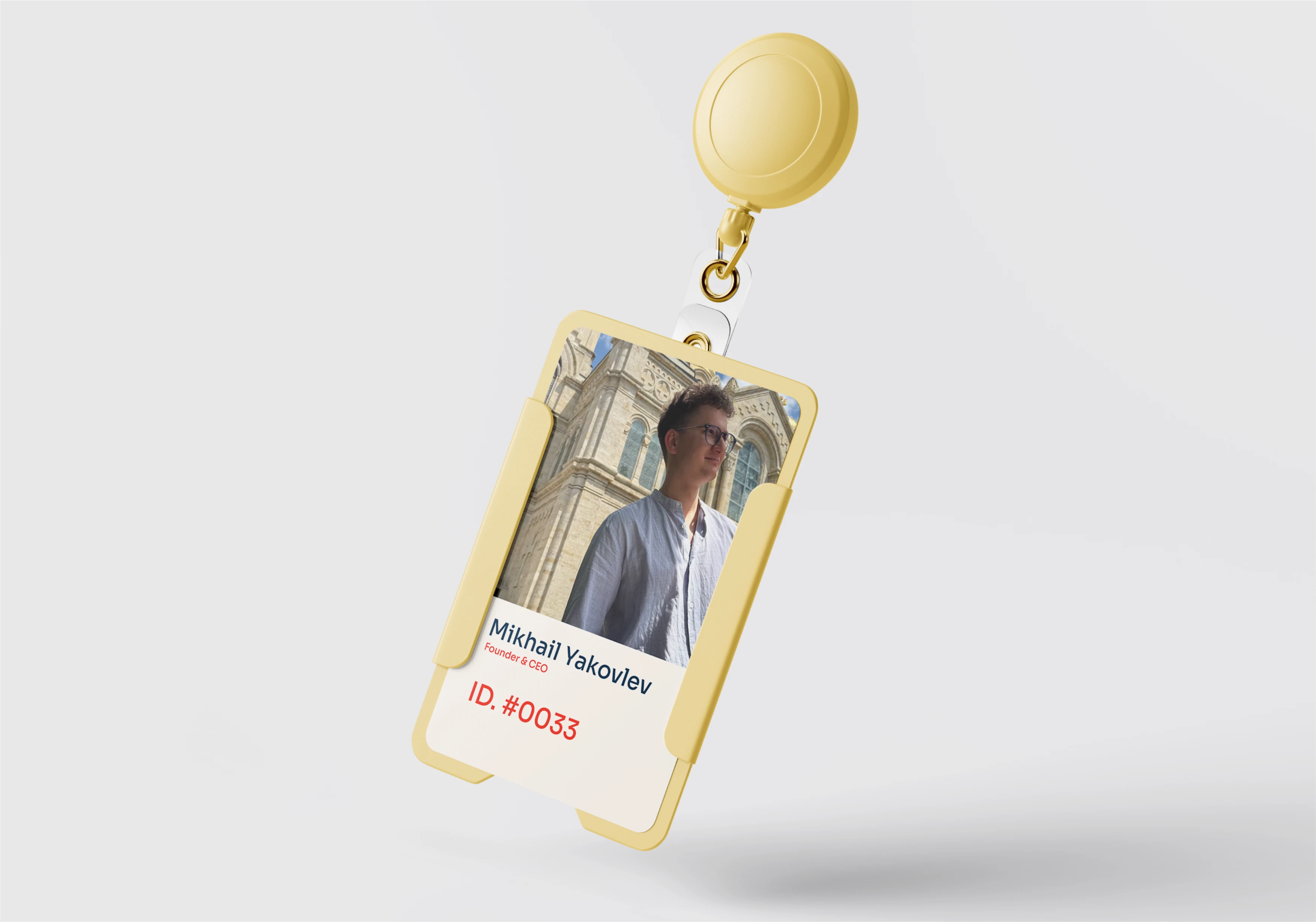
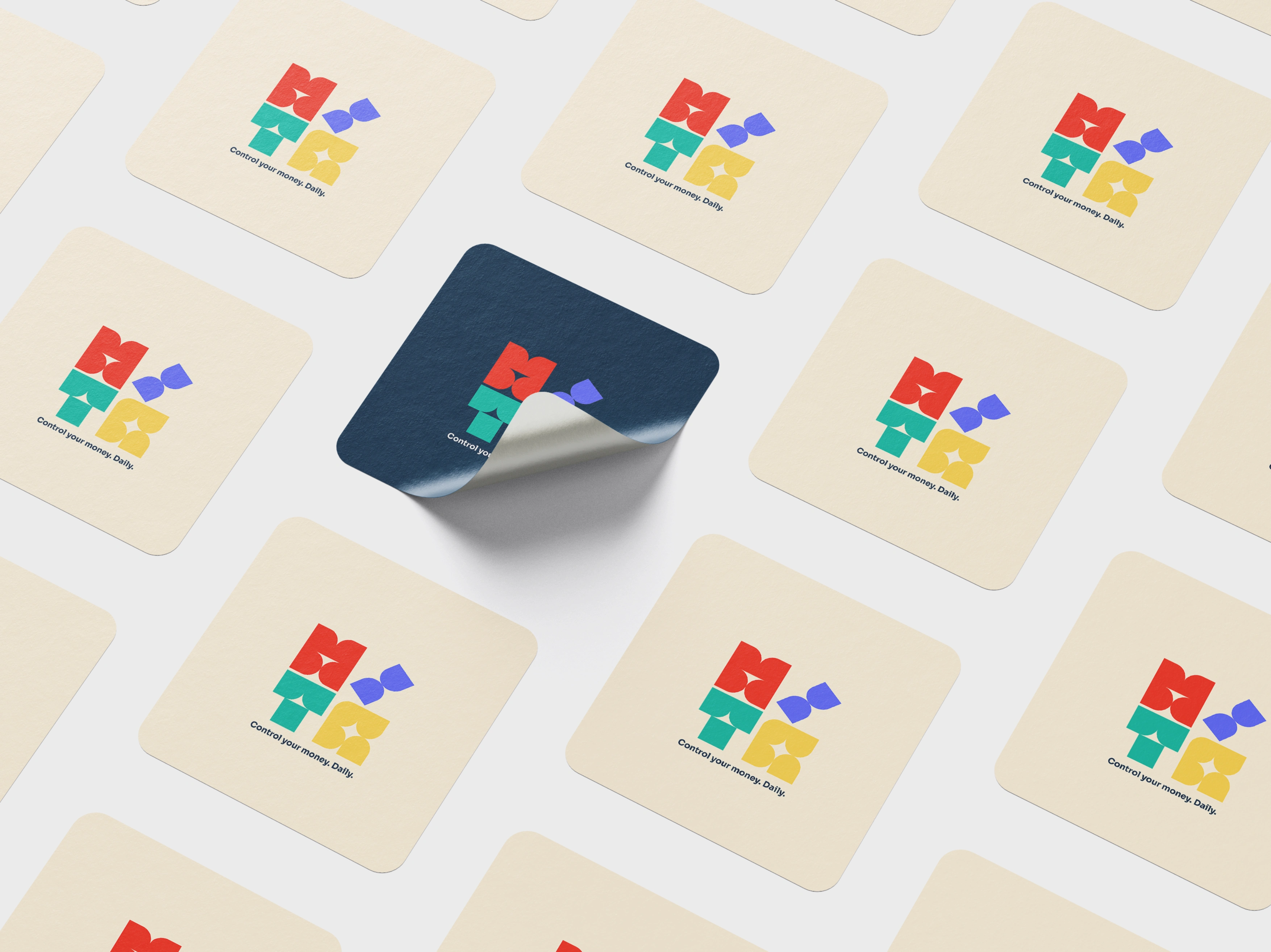
Brand Applications & Merchandise
The brand system was extended into physical applications to test scalability beyond the digital product.
Merch items such as apparel, mugs, caps, and ID badges demonstrate how the modular logomark and color palette function in real world environments. The symbol remains recognizable at small embroidery sizes, large prints, and single color applications.
Neutral base materials were intentionally chosen to allow the vibrant brand palette to stand out without visual overload. This reinforces the balance between structure and energy present in the digital interface.
Typography and color are applied consistently across objects, ensuring the system feels cohesive whether on screen or in physical form.
Overall, these applications validate that Mita operates as a complete brand ecosystem, not just a mobile app.
Project Finalization & Results
Mita Finance was developed as a full cycle brand and product ecosystem, from strategy and positioning to visual identity and functional mobile experience. The project combined brand architecture, logo system, color strategy, typography hierarchy, UI design, and scalable visual language into one cohesive fintech platform.
Beyond surface level design, the system was aligned with a real technical foundation, including an adaptive budgeting engine, AI driven insights, behavioral analytics, and a production ready infrastructure. This ensured that branding decisions were directly connected to product logic, not purely aesthetic choices.
The result is a structured, future oriented fintech identity that communicates clarity, intelligence, and control. The brand successfully translates complex financial automation into a calm and intuitive experience while remaining scalable across digital, physical, and marketing environments.
Mita evolved from a concept into a fully articulated brand system with a functioning product foundation, positioning it as a serious and technically credible fintech startup rather than a visual prototype.
Like this project
Posted Feb 21, 2026
Built a full brand identity and scalable product system for Mita, an AI powered fintech platform focused on adaptive daily budgeting and behavioral insights.