Institutional Brand Identity for Blackridge Capital
Mikhail Yakovlev

Blackridge Capital: Institutional Private Equity Identity
Intro
Blackridge Capital is a European private equity firm investing in AI infrastructure, SaaS, fintech, and cybersecurity.The goal was to build an identity that feels disciplined, controlled, and institutional — not trendy or aggressive.
This was a project about authority through restraint.
Project Overview
The brand needed to communicate governance, precision, and long-term value creation.
As defined in the thesis:
“We invest in structure, not noise.” Blackridge Capital
The visual system reflects that mindset through monochrome color, structured typography, and strict grid alignment.
The result is a composed, credible identity built for institutional trust.

Challenge
Blackridge Capital required a refined brand identity for a European private equity firm focused on AI infrastructure, enterprise SaaS, fintech, and cybersecurity. The challenge was to express institutional credibility and financial discipline without appearing aggressive or trend-led. The identity needed to feel mature, controlled, and authoritative, resonating with experienced founders and institutional investors.
Approach
I positioned Blackridge around disciplined capital allocation and structured growth. The system was built on clarity, restraint, and precision rather than expressive branding. A structured grotesk typographic direction reinforces rationality and institutional strength, supported by a controlled monochrome palette centered on deep graphite and soft white.
The layout architecture relies on strict alignment, generous spacing, and grid-based structure to visually communicate governance and financial rigor. The identity was implemented across stationery, investor materials, and digital platforms to ensure consistency and credibility in high-level financial communication.
Logo Construction & Structure
The Blackridge logotype is built on a strict grid system, emphasizing precision, alignment, and proportional balance.
The restrained letterforms and clear hierarchy between “Blackridge” and “CAPITAL” reinforce authority and institutional discipline.
The structure reflects the firm’s philosophy: control, stability, and strategic rigor.

Color System
The identity is built on a restrained monochrome palette: Structured White and Graphite Black.
This controlled contrast reinforces clarity, discipline, and institutional strength, avoiding distraction while maintaining authority and visual precision.

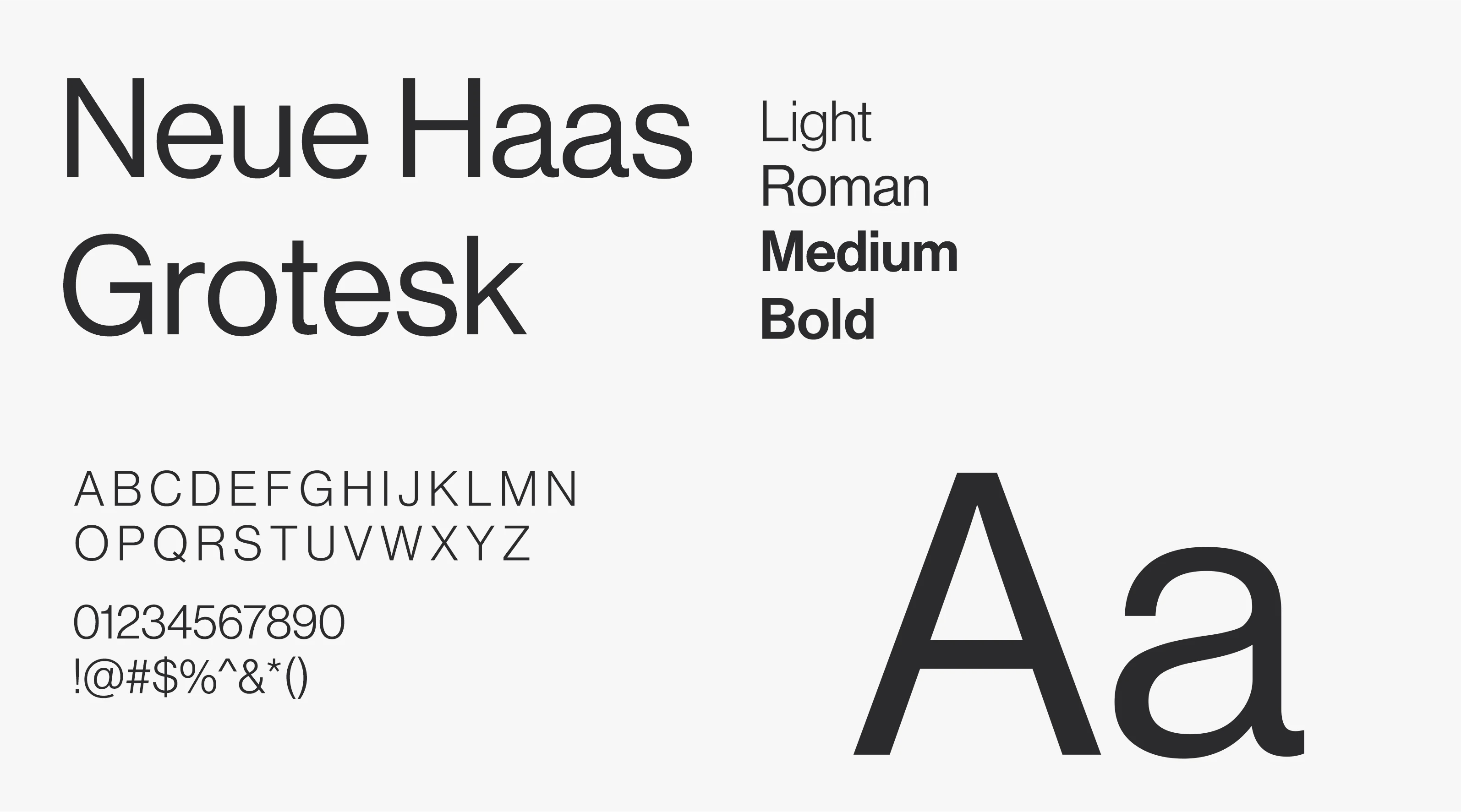
Typography System
Neue Haas Grotesk was selected to reinforce clarity, neutrality, and institutional authority.
Its structured grotesk forms communicate rationality and precision, while multiple weights allow hierarchy without visual excess — supporting disciplined, high-level financial communication.
Stationery & Print System
The stationery system translates the identity into a controlled, high-credibility print presence.
Strict alignment, generous spacing, and minimal contrast reinforce governance and financial discipline. The restrained layout ensures clarity, while the monochrome palette strengthens authority across investor communication and corporate materials.


Digital Presence
The website extends the identity into a controlled digital environment.
Dark graphite tones, restrained motion, and structured layout reinforce authority and strategic focus. The interface prioritizes clarity and hierarchy, ensuring that investment theses and portfolio insights are communicated with confidence and precision.

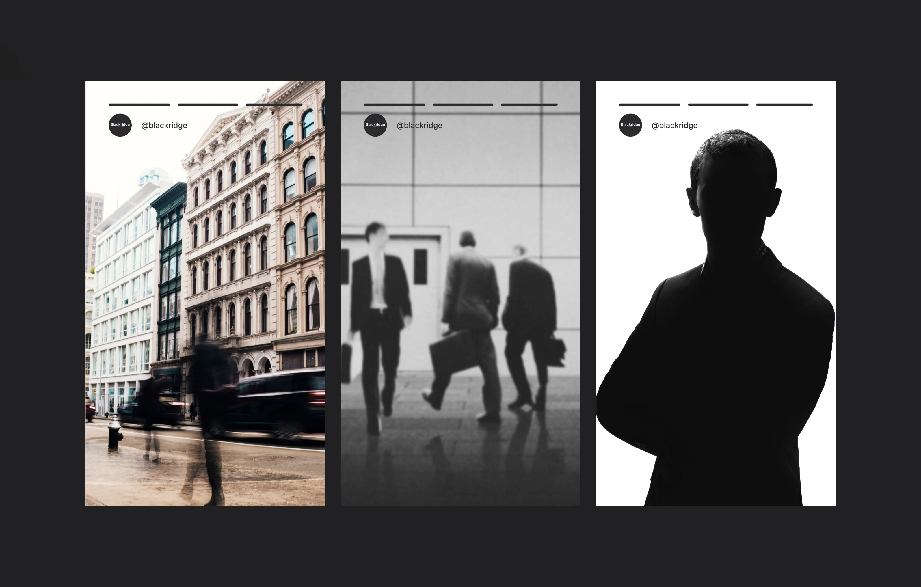
Visual Language & Brand Imagery
The imagery system focuses on architecture, motion, and silhouette to convey scale, discretion, and institutional presence.
Urban structures reflect permanence, blurred movement suggests active capital, and minimal human representation reinforces authority over personality. The result is a visual tone that feels composed, strategic, and deliberately restrained.
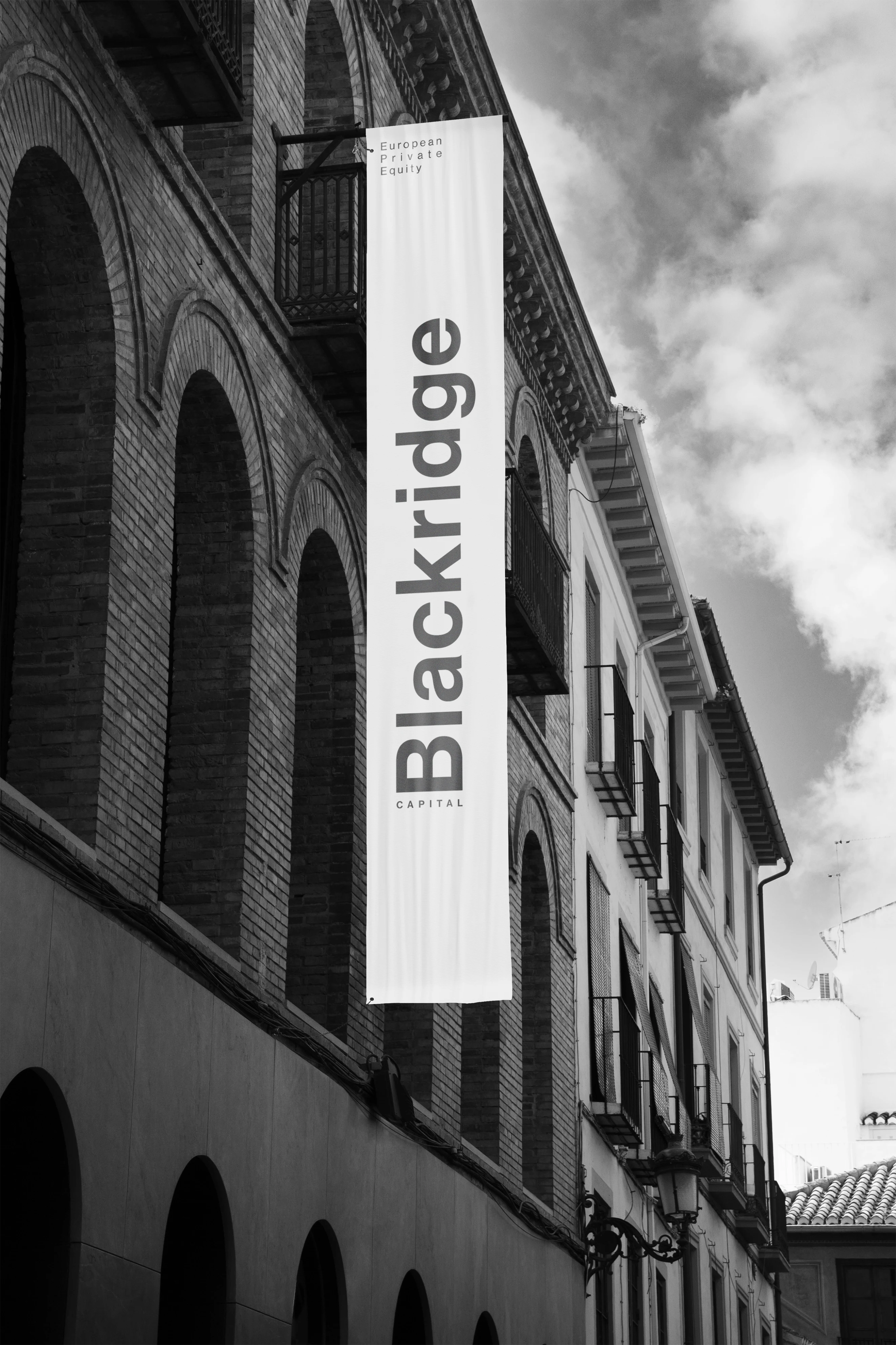
Environmental Application
The large-format banner demonstrates how the identity scales in real-world environments.
Vertical typography, generous spacing, and monochrome contrast create strong street presence while maintaining restraint. The brand integrates naturally into architectural contexts, reinforcing permanence and institutional credibility.

Brand Philosophy
“We invest in structure, not noise.” defines the strategic stance of Blackridge Capital.
The statement rejects trend-driven speculation and positions the firm around discipline, governance, and long-term thinking.
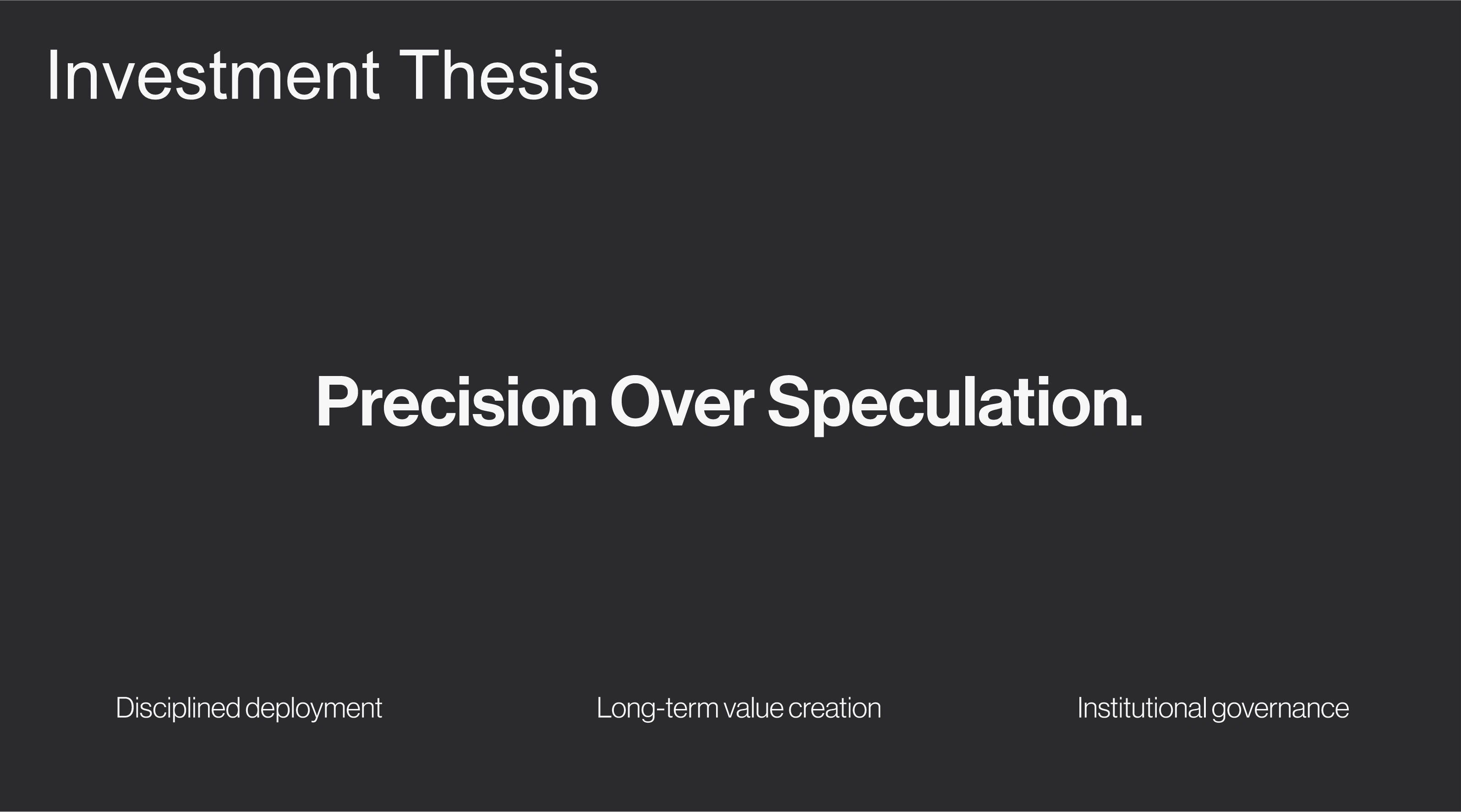
Investment Thesis
“Precision Over Speculation.” reinforces the firm’s analytical approach.
Clear pillars — disciplined deployment, long-term value creation, and institutional governance — structure the narrative and communicate measured, strategic capital allocation.

Public-Facing Communication
This application demonstrates how the identity performs in high-traffic environments.
The dark, minimal composition stands confidently against movement and noise, reinforcing composure and control. Even in a dynamic setting, the brand remains stable, structured, and unmistakably institutional.

Summary
Blackridge Capital was built around discipline, structure, and institutional clarity.
Every element — typography, layout, color, and messaging — reinforces precision over speculation and long-term strategic thinking.
The identity avoids trends and expressive branding in favor of restraint, governance, and credibility.
Results & Achievements
✔ Established a mature, institutional visual system
✔ Strengthened perception of authority and financial discipline
✔ Created a scalable identity across print, digital, and environmental formats
✔ Positioned the firm as a composed, long-term strategic investment partner
The result is a brand that feels controlled, credible, and built for serious capital.

Like this project
Posted Feb 20, 2026
Built a disciplined, institutional brand identity for Blackridge Capital, emphasizing structured growth, governance, and long-term value creation.
Likes
16
Views
19
Clients
Blackridge Capital