Built with Jitter
The Lost Eggs: A Story-Driven Egg Brand Identity
Mikhail Yakovlev
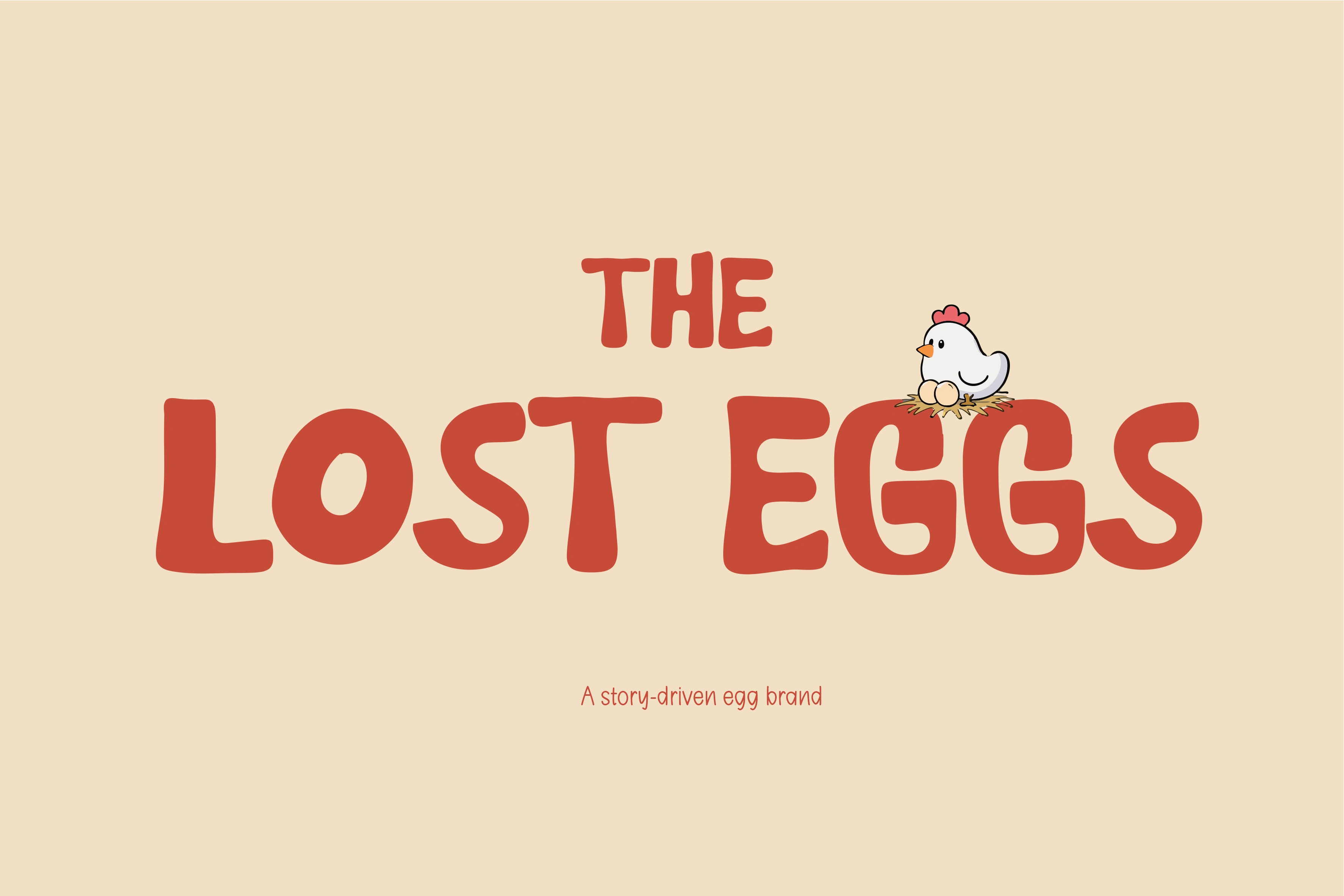
The Lost Eggs: A Story-Driven Egg Brand Identity
When I approached The Lost Eggs, the goal was not to design another rustic farm logo. The ambition was different: build a brand identity for eggs that feels human, emotional, and narrative-driven rather than commercial and loud.
The concept of The Lost Eggs is not about “organic” labels or supermarket competition.
It is about fragility, care, responsibility, and quiet protection — told through design.
This project explores how storytelling can elevate even the simplest product into something meaningful.
🎨 Design Strategy
The visual language was developed around three strategic pillars:
1. Narrative-First Visual Language
Instead of trend-driven aesthetics, the system is built around thematic consistency:
Characters that tell a story
Typography that feels gentle and intentional
Layouts that invite breathing space
This creates a visual rhythm that feels like reading a story rather than absorbing marketing messages.
2. Symbolism Through Character
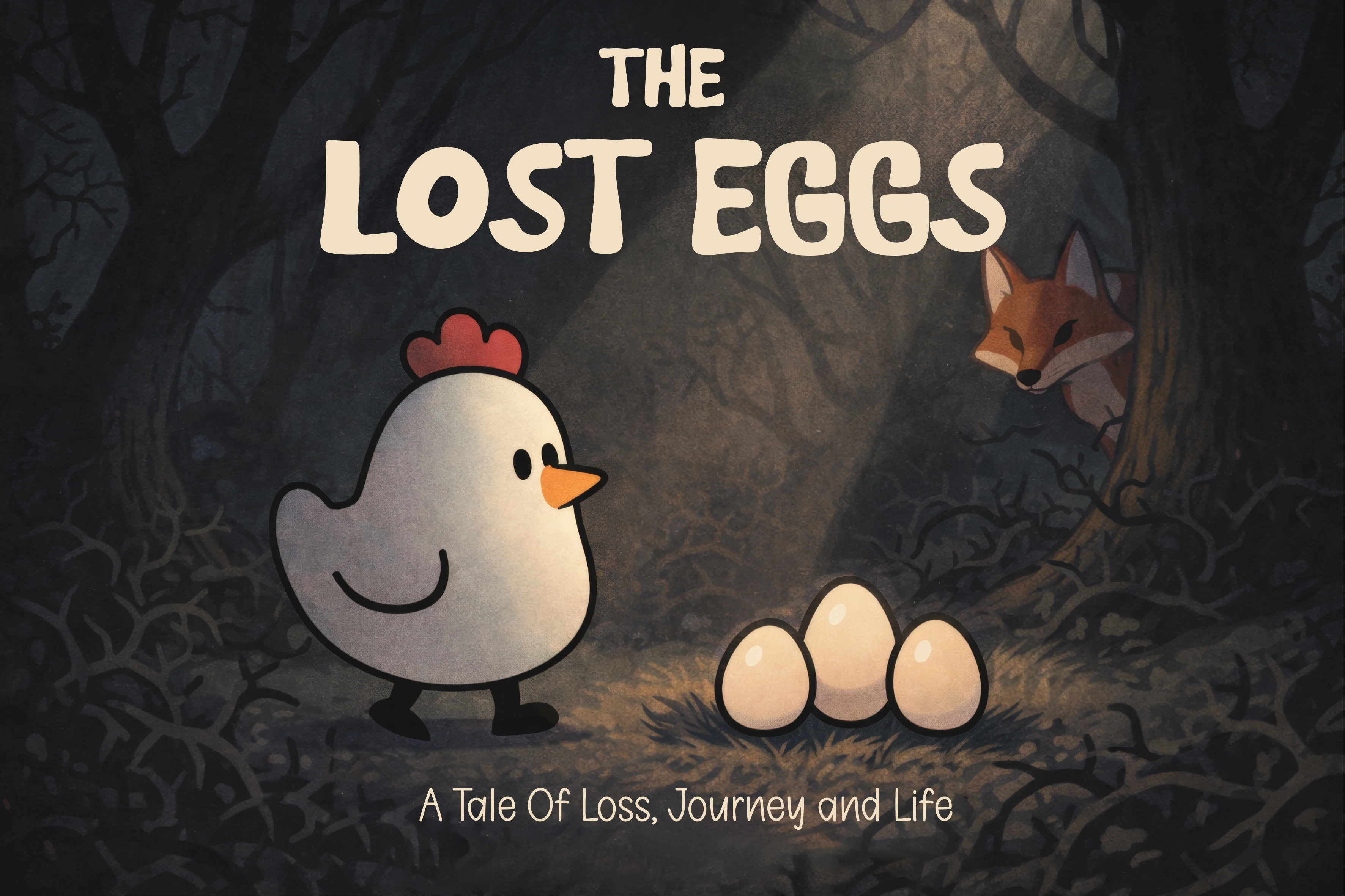
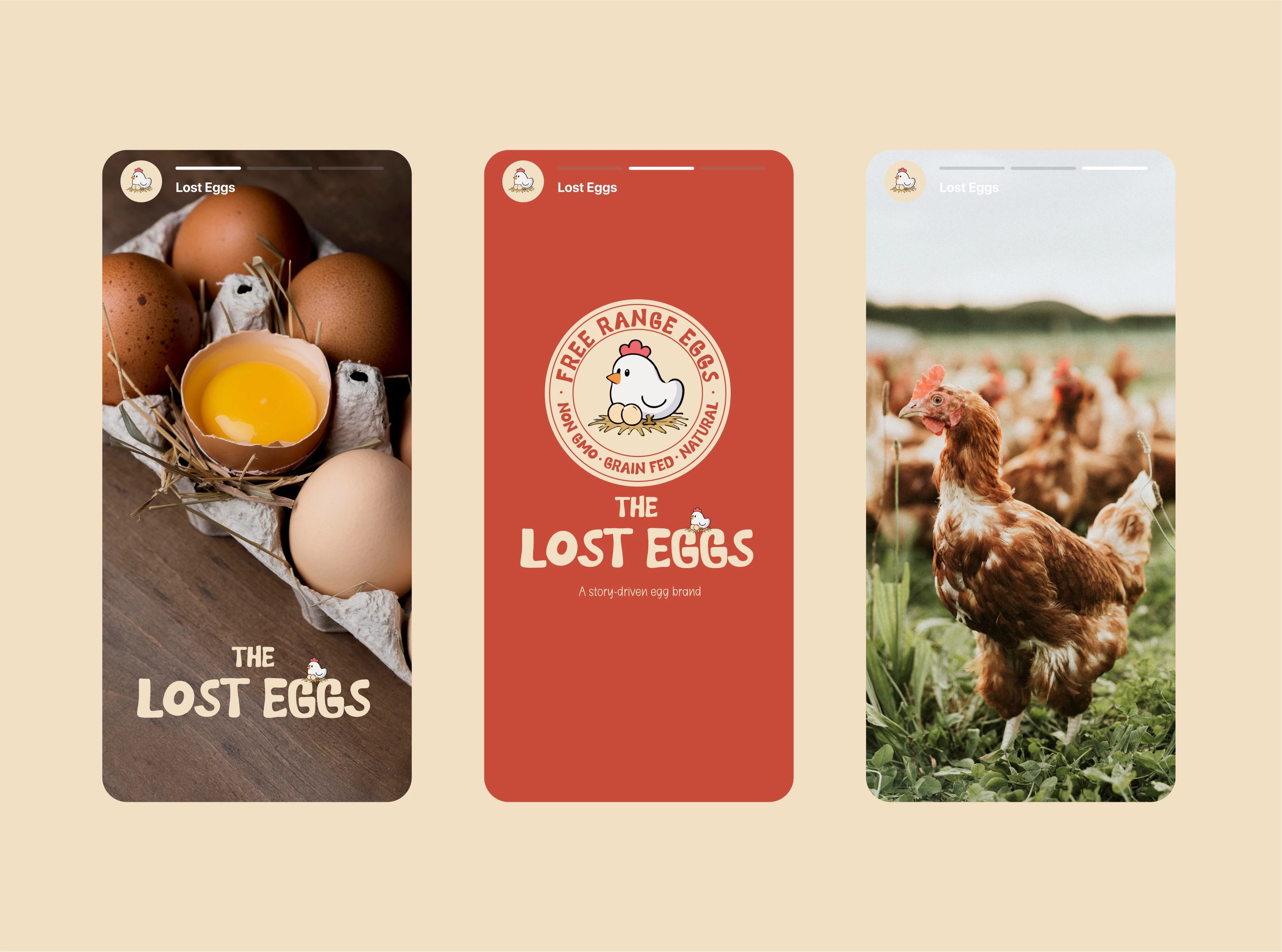
The chicken character is not a mascot for fun. Its purpose is symbolic:
🐔 A guardian of the fragile
🥚 Physical representation of protection
🎨 Narrative anchor for the entire identity
This transforms visual language into an emotional symbol instead of a brand cliché.
3. Emotional Restraint as Positioning
Where most brands scream for attention, this one whispers:
calm colors
careful spacing
soft organic forms
The restraint supports the brand’s emotional posture: gentle, reflective, human.
🧱 Identity Components
Logo & Mark System
The logo system functions like a narrative emblem. It does not just represent the name — it plays a role in the story.
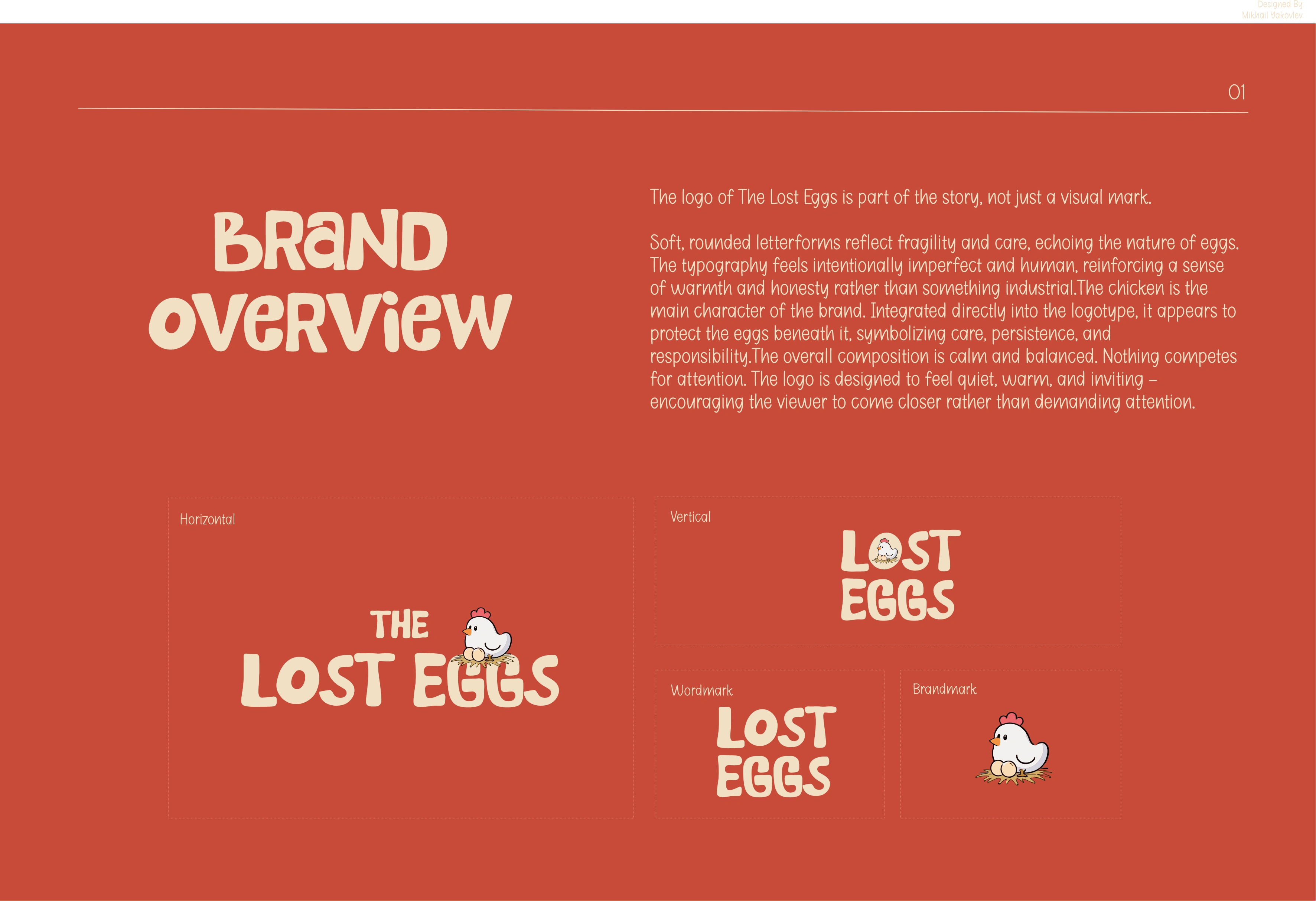
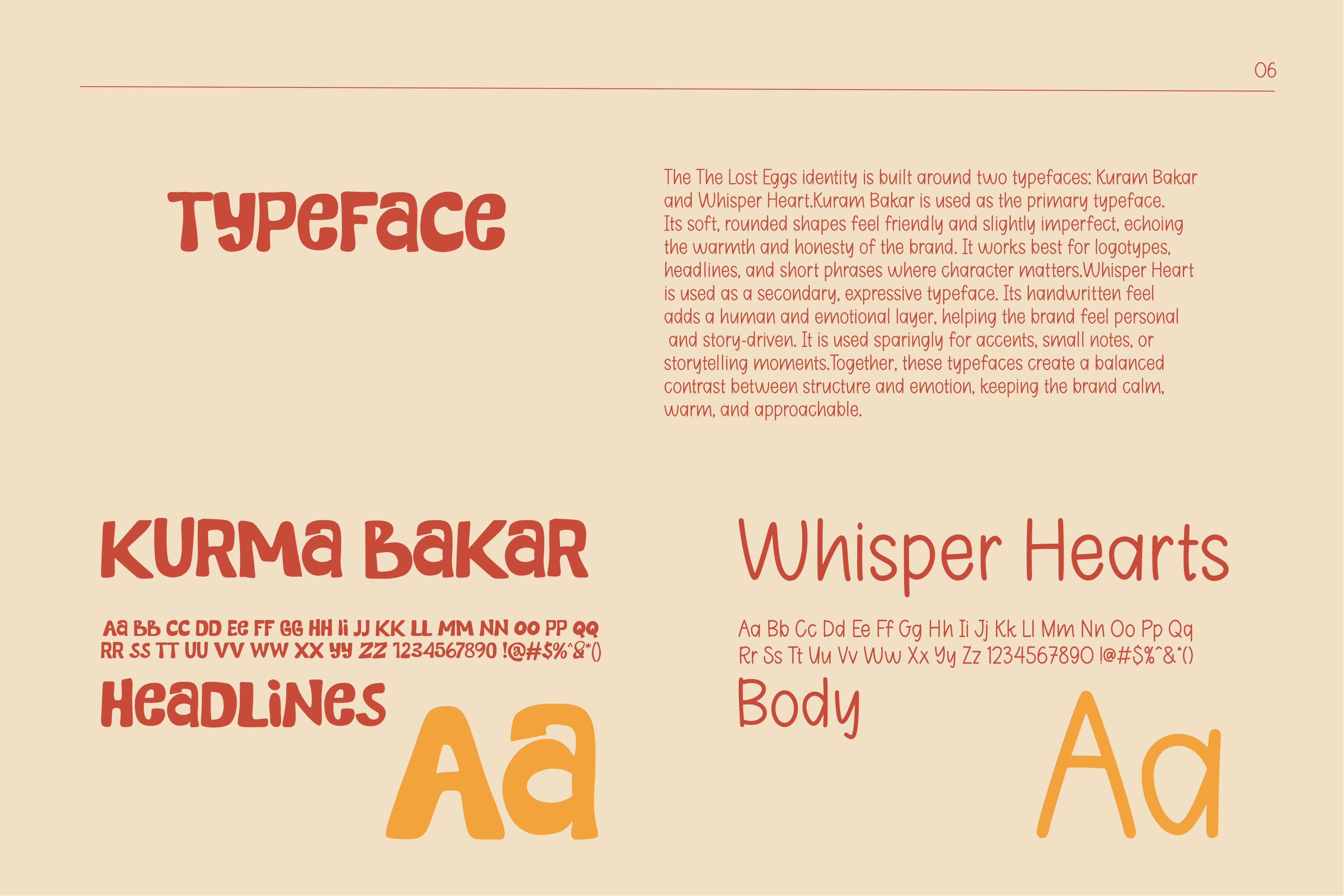
Typography System
Typographic choices feel intentional: soft and inviting, reinforcing humanity and approachability over corporate broadcast tone.
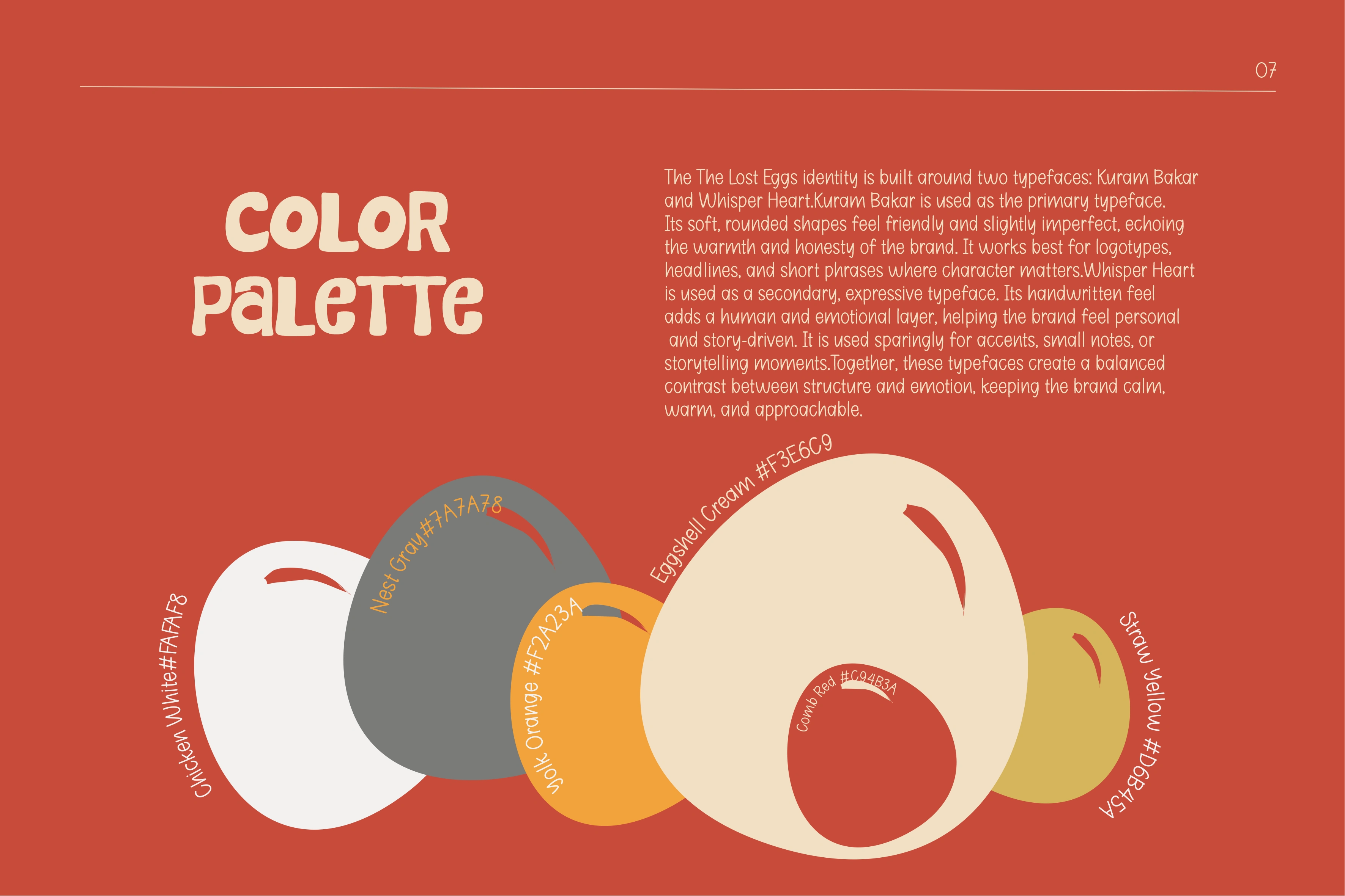
Color Palette
Warm, muted tones that feel organic and comforting. These tones support emotional calm rather than market aggression.
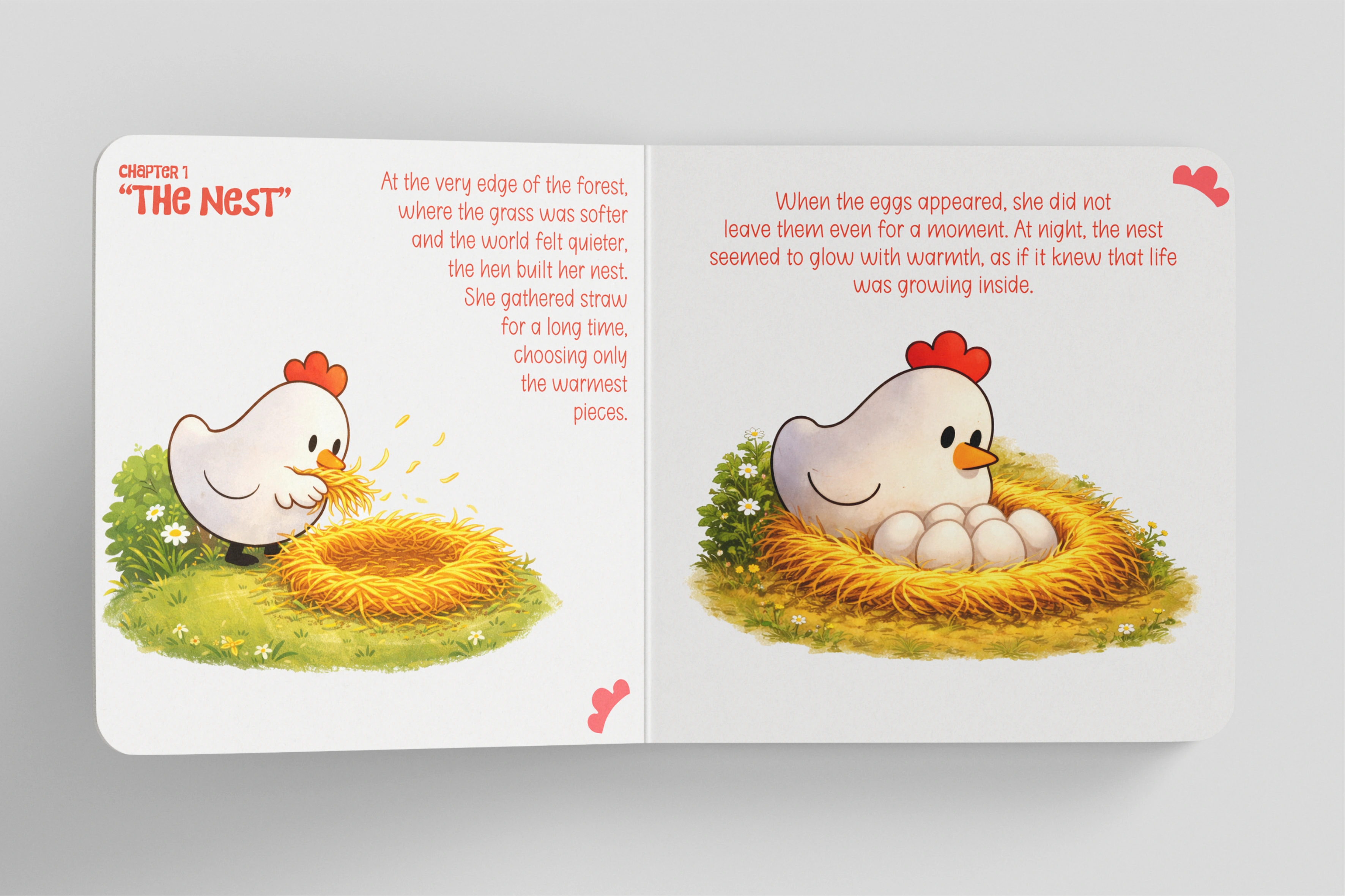
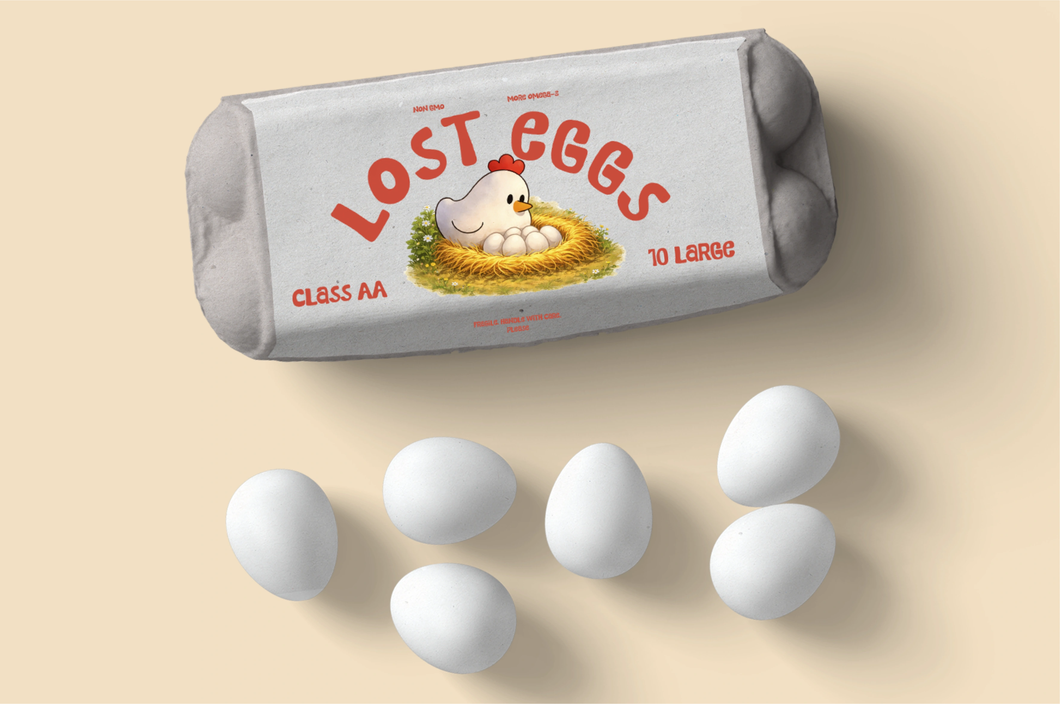
Packaging & Application
The packaging becomes a story canvas, not a label carrier — every visual element contributes to narrative context instead of commodity signaling.
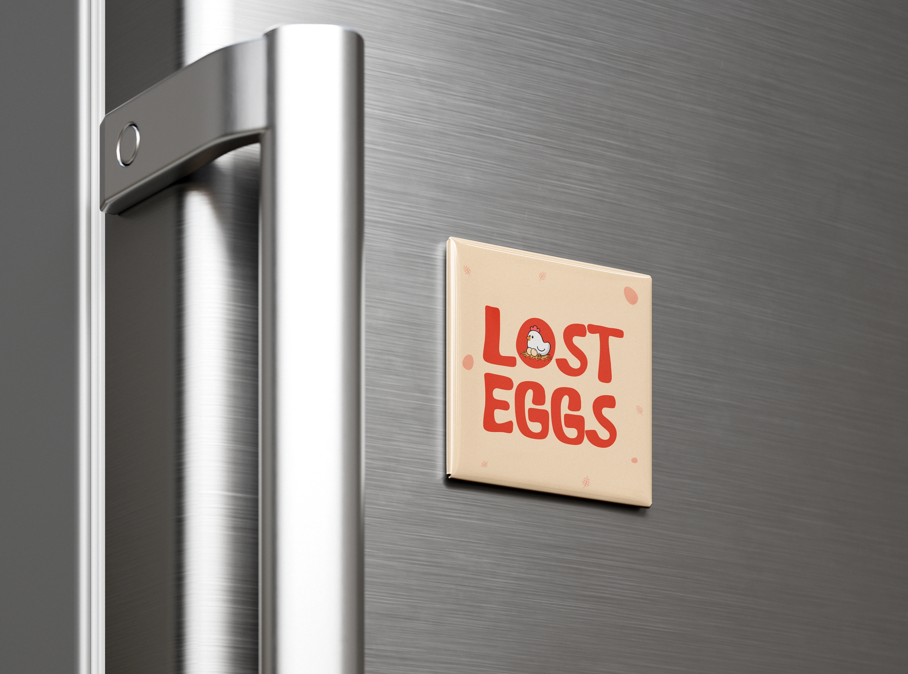
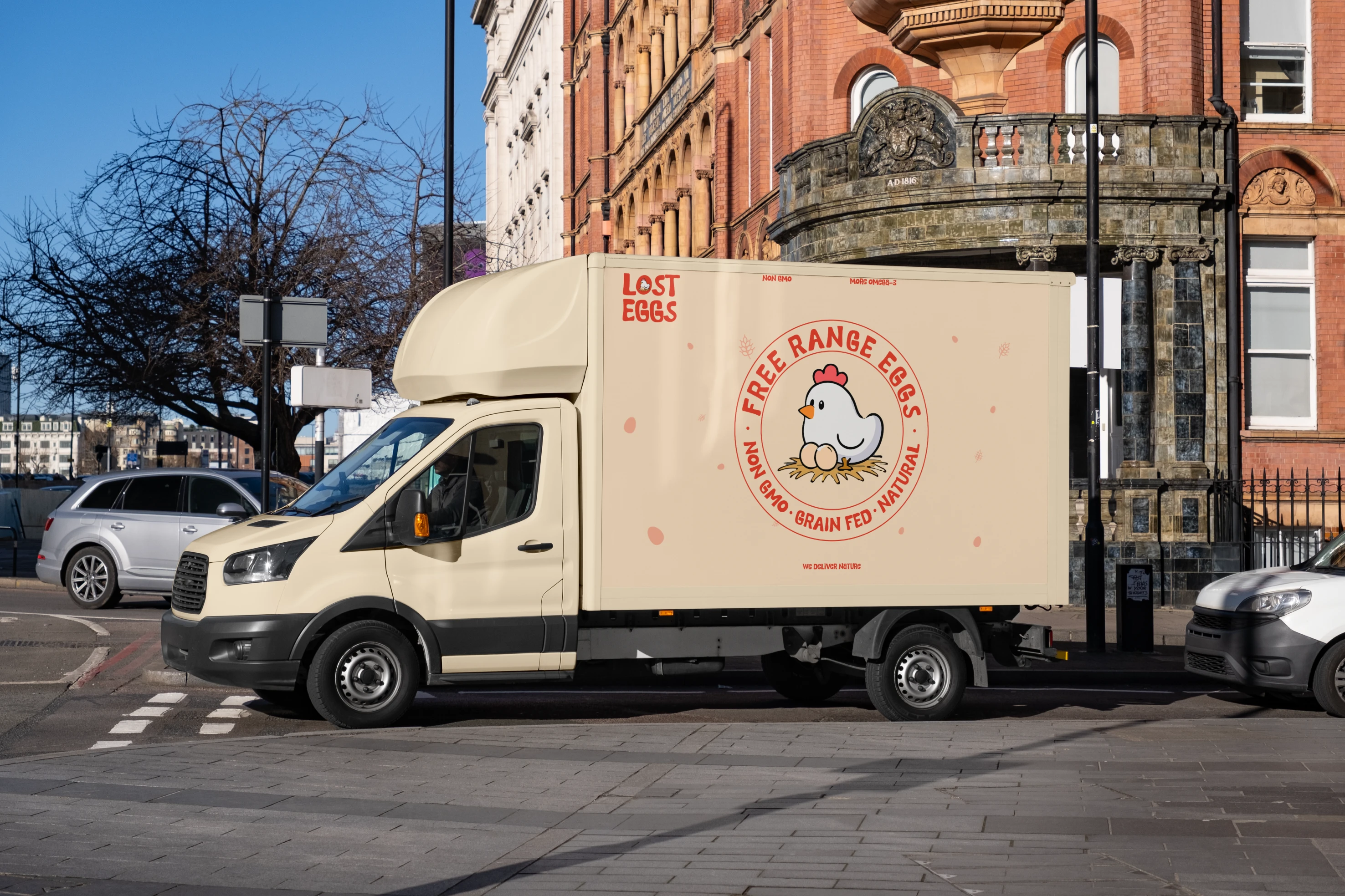
Identity in Action
Across all touchpoints — packaging, print, digital mockups — the story remains consistent:
✔ Every element serves narrative intent
✔ Nothing feels superfluous or detached
✔ The brand invites engagement through meaning, not noise
This is brand design as storytelling crafted with purpose, not just style.
📌 Strategic & Emotional Impact
This work positions The Lost Eggs beyond a category product — it makes the brand:
✔ emotionally memorable
✔ conceptually distinct
✔ story-driven instead of trend-driven
✔ human-centered not corporate
✔ reflective not aggressive
This strategic positioning helps the brand avoid commoditization and instead become an emotive narrative experience.

Like this project
Posted Feb 19, 2026
Developed a story-driven brand identity for The Lost Eggs, combining emotional storytelling, packaging design, and character-led visual branding.
Likes
18
Views
6
Clients
The Lost Eggs