Built with Jitter
Music Glass: Full Cycle Design System
Mikhail Yakovlev
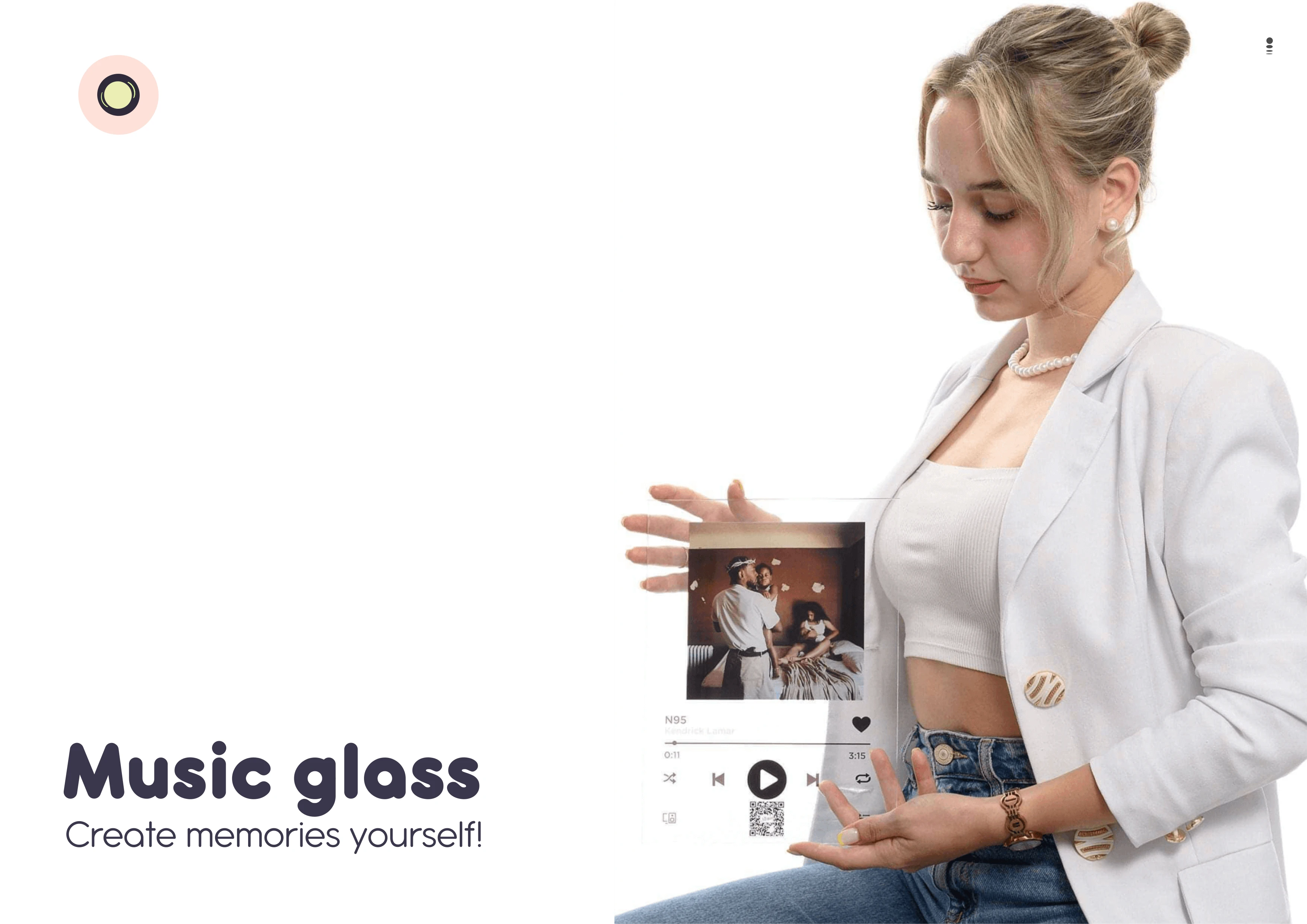
Music Glass: Full Cycle Design System
When I started the Music Glass project, the challenge was clear:
This brand wasn’t just selling a product. It was selling emotion, memory and personal connection. My goal was to create a full cycle visual system — not only a logo, but a complete design language that supports the brand across every touchpoint: web, social ads, packaging, and production.
🧠 Project Context
Music Glass creates personalized glass music plaques — objects that hold a photo and a meaningful song. The emotional value is the core product. For buyers, this is gift giving with depth. It’s not about aesthetics alone; it’s about emotion, memory, and connection.
My approach was grounded in that insight.
🛠 Problem & Objective
When I began, Music Glass lacked a unified visual identity. Multiple visuals, inconsistent layouts, and disconnected materials confused potential buyers rather than inviting them into the emotional experience.
I was tasked with:
Defining brand strategy through visual language
Designing a scalable identity system
Creating marketing materials that convert
Preparing production-ready design assets
Ensuring brand cohesion across platforms
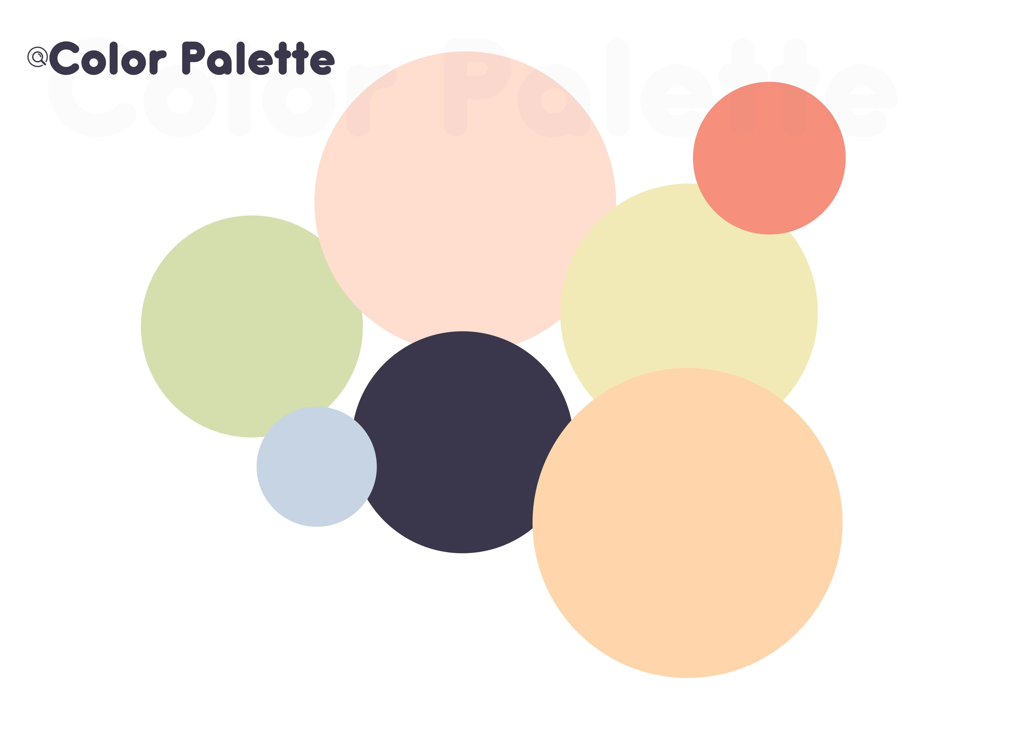
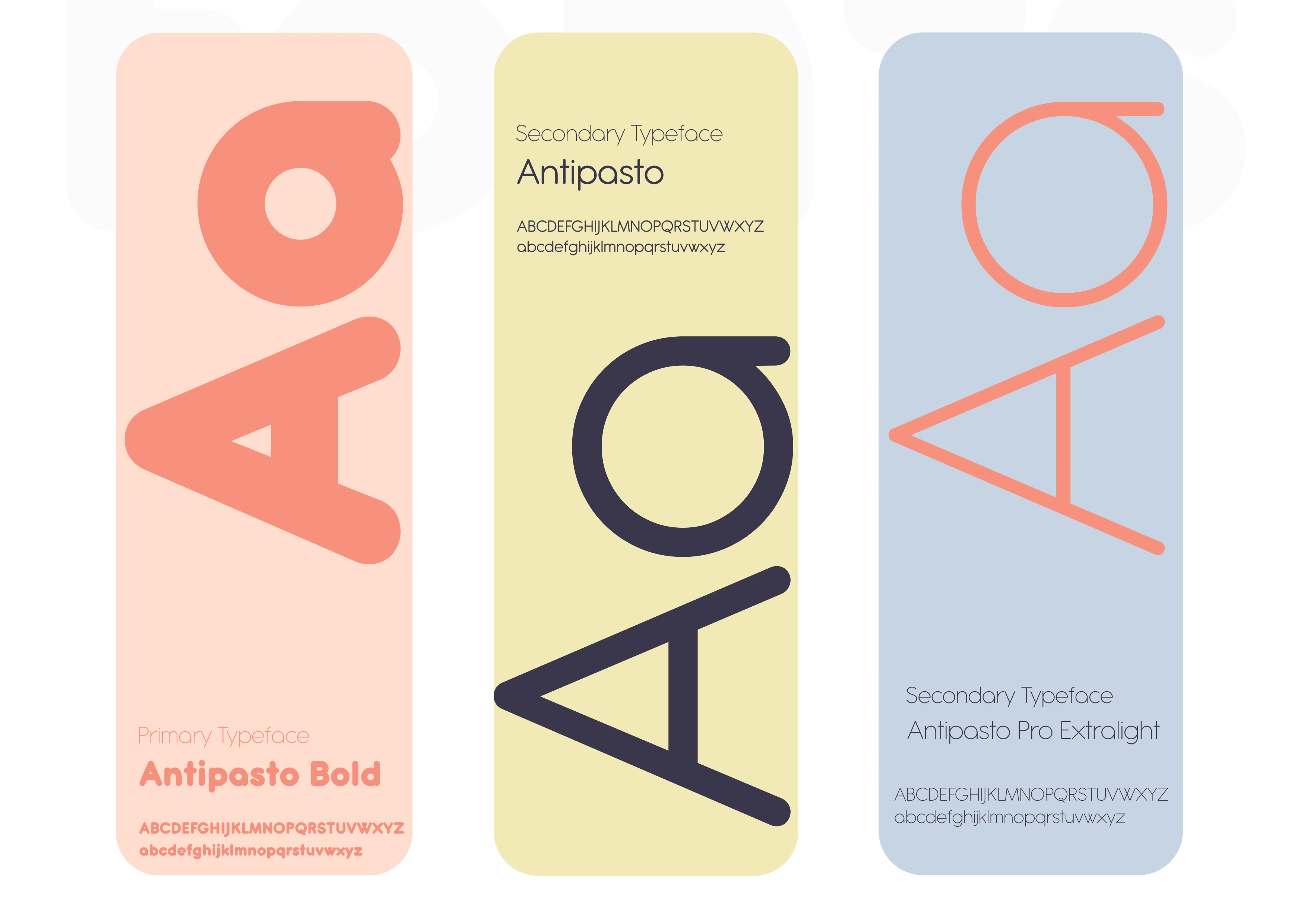
🔤 Visual Strategy
I structured the system around three foundations:
1. Emotional Core
The visuals had to evoke warmth, memory, and personal connection.
This was achieved with:
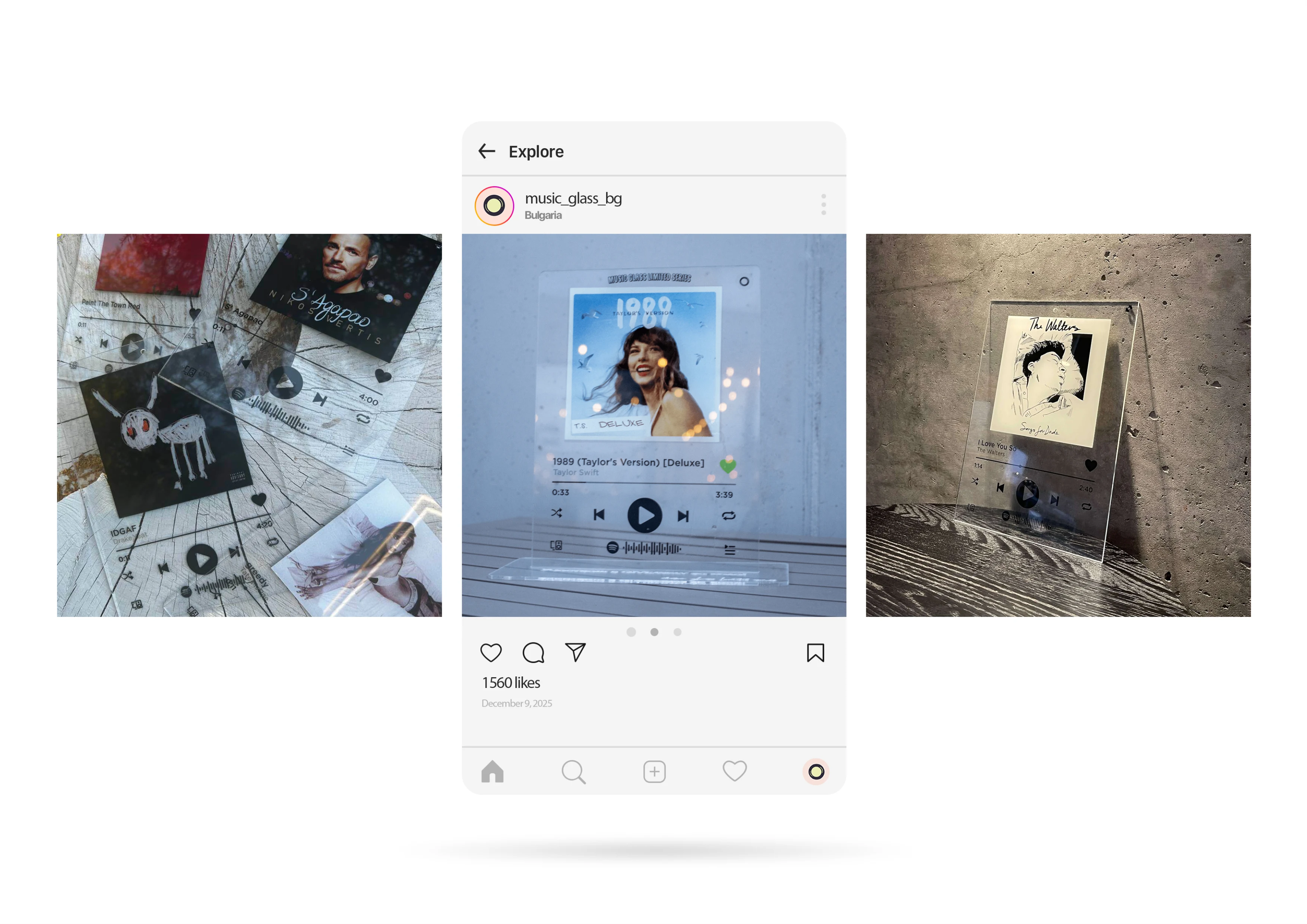
photographic choices that feel real, warm, nostalgic
soft, inviting colors that feel sentimental but premium
typography that feels elegant but not cold
From the beginning, every visual decision was tied back to how it would make the audience feel.
System in Action
One of the most important parts of the case was showing the system working across real contexts:
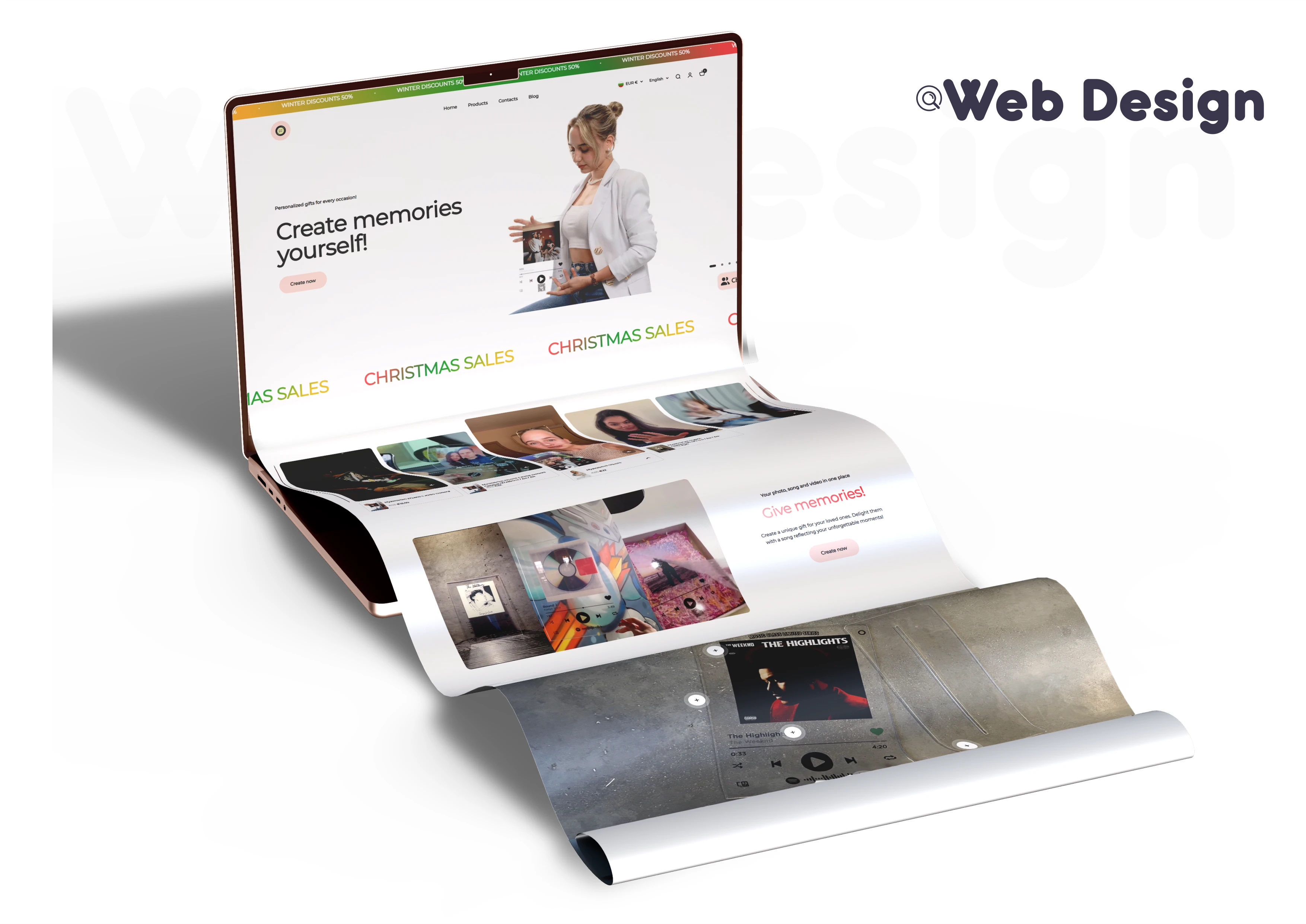
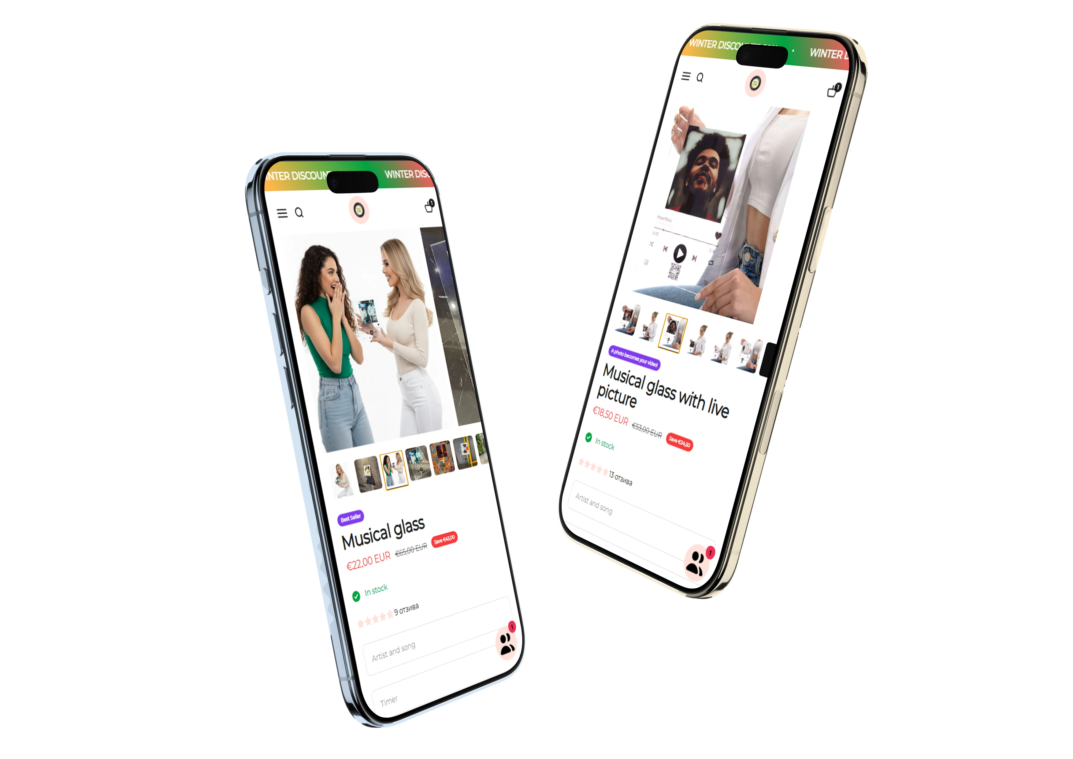
Web / Landing
I designed layouts that guide visitors emotionally — from first homepage impression to product exploration and checkout.
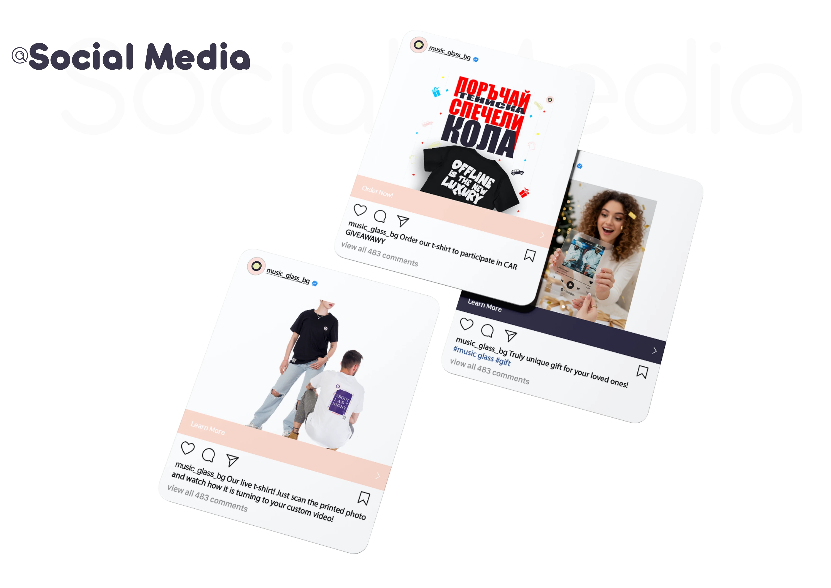
Social Ads
Each ad template was crafted with hierarchy that works for mobile feeds while maintaining brand recognition.
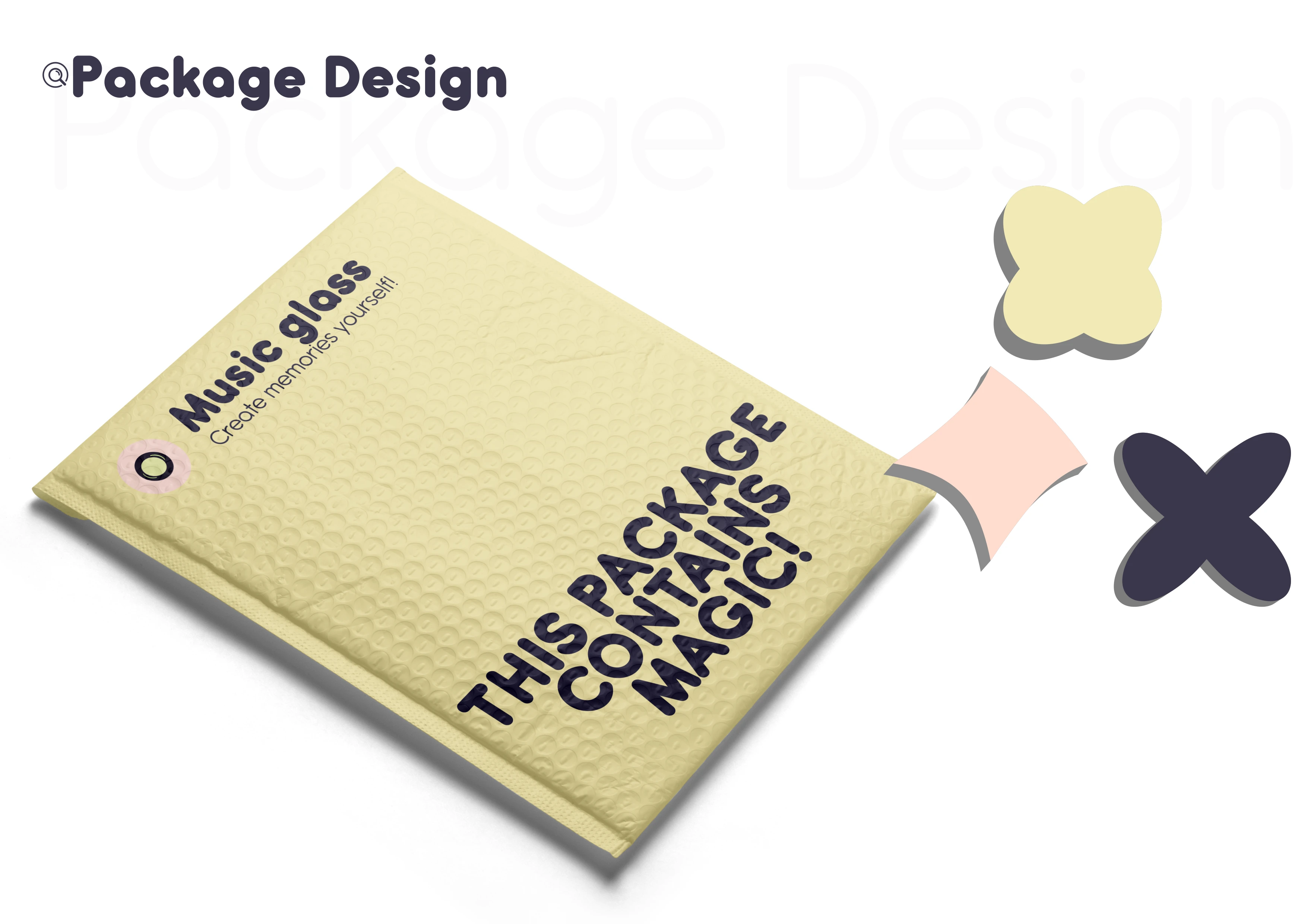
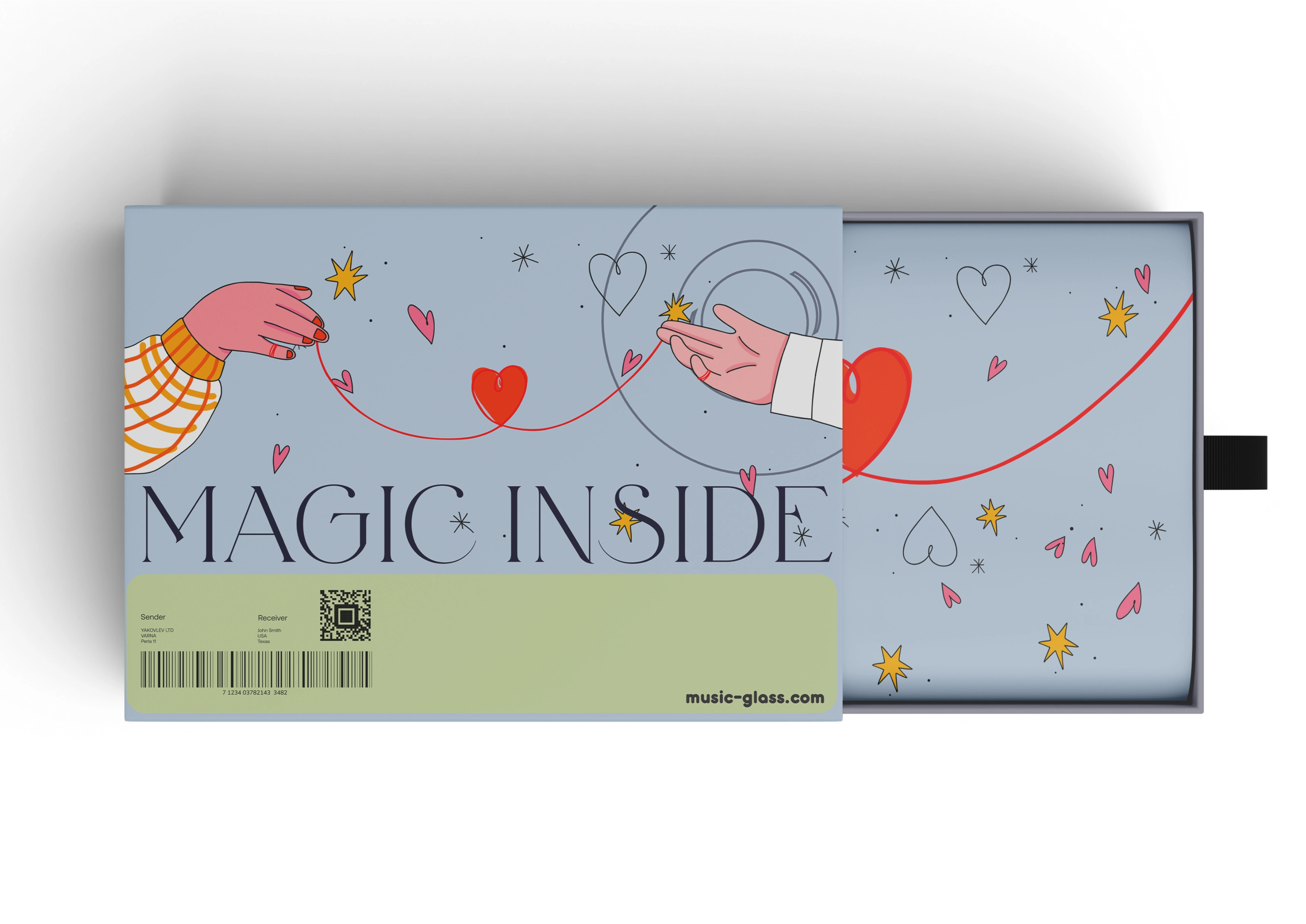
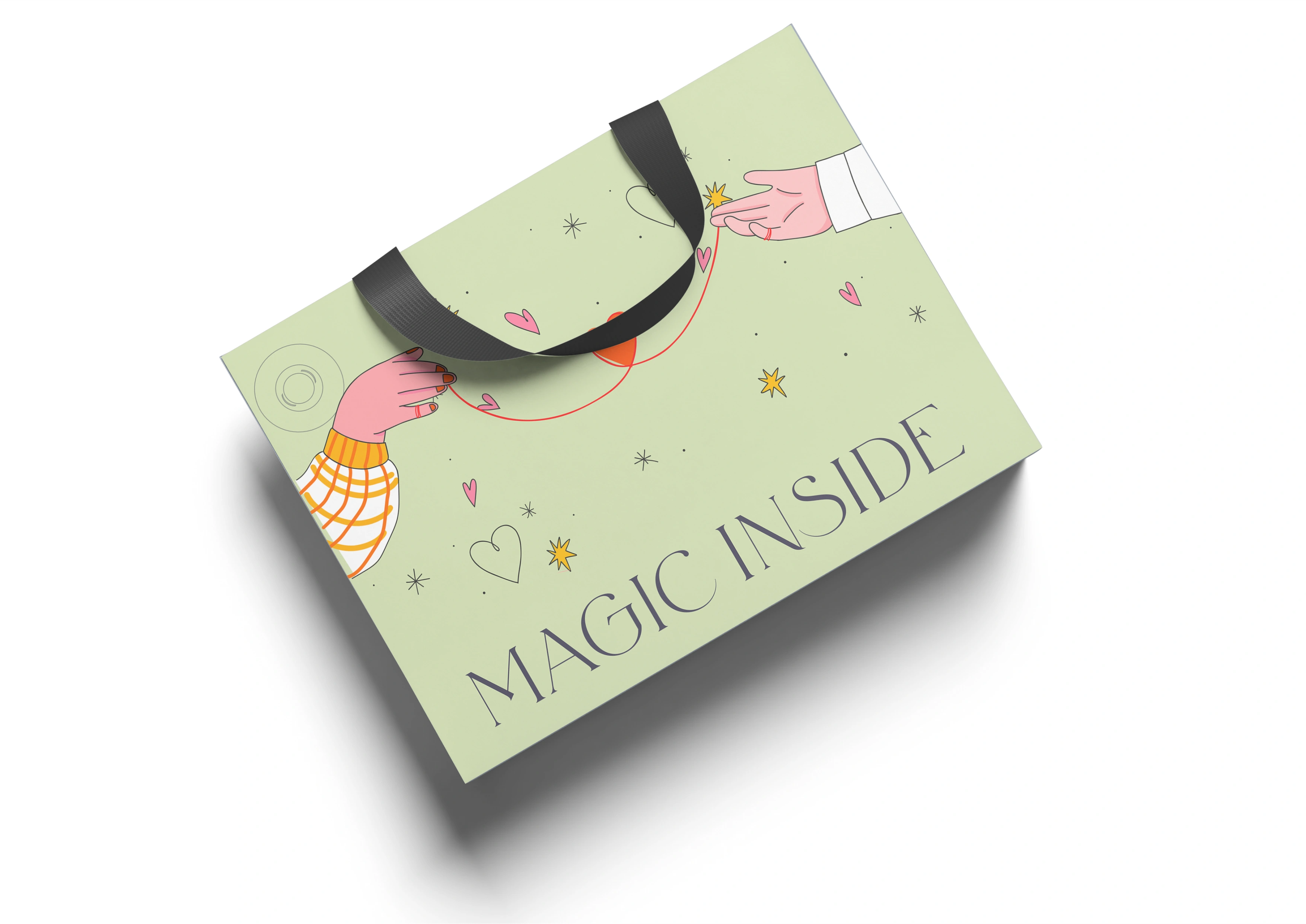
Packaging
The packaging system reinforces premium perception. Given the emotional nature of the gift, packaging had to feel like part of the experience, not just a wrapper.
Production Files
Every asset was fully prepared for implementation:
Figma components, export presets, guideline sheets, and ready-to-print files.
This shows not just aesthetic work, but practical execution.
📌 Results & Impact
This project wasn’t about isolated visuals — it was about creating a brand language that:
became recognizable and emotionally resonant
supports marketing performance
scales across digital and physical media
speeds up production processes
Most importantly:
people don’t buy a music glass product merely because it looks nice.
They buy it because the visual world around it makes them feel something — and that’s what this design system delivers.
🧠 Closing Thoughts
This project deepened my belief that design is not decoration. It’s a tool for:
meaning creation
emotional engagement
business growth
customer connection
My role was to unify emotion with utility — and that’s what this full cycle design system achieves.
Like this project
Posted Feb 19, 2026
Music Glass is a gift brand I built from the ground up, where I led every aspect of the visual and product experience. From identity and logo to packaging.
Likes
17
Views
9
Timeline
Aug 19, 2021 - Ongoing