Built with Jitter
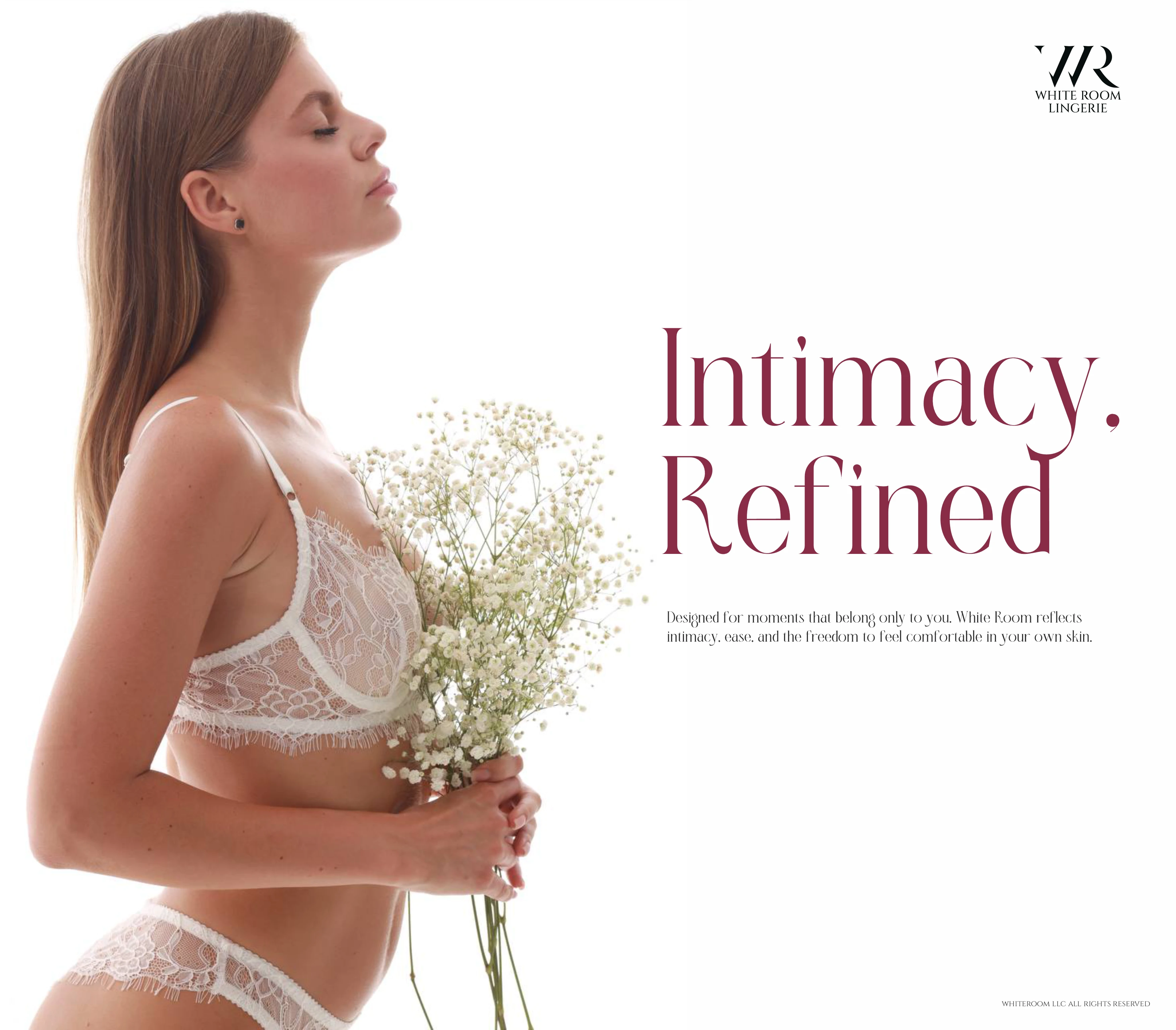
Emotional Brand Identity for White Room Lingerie
Mikhail Yakovlev
🧠 Project Context
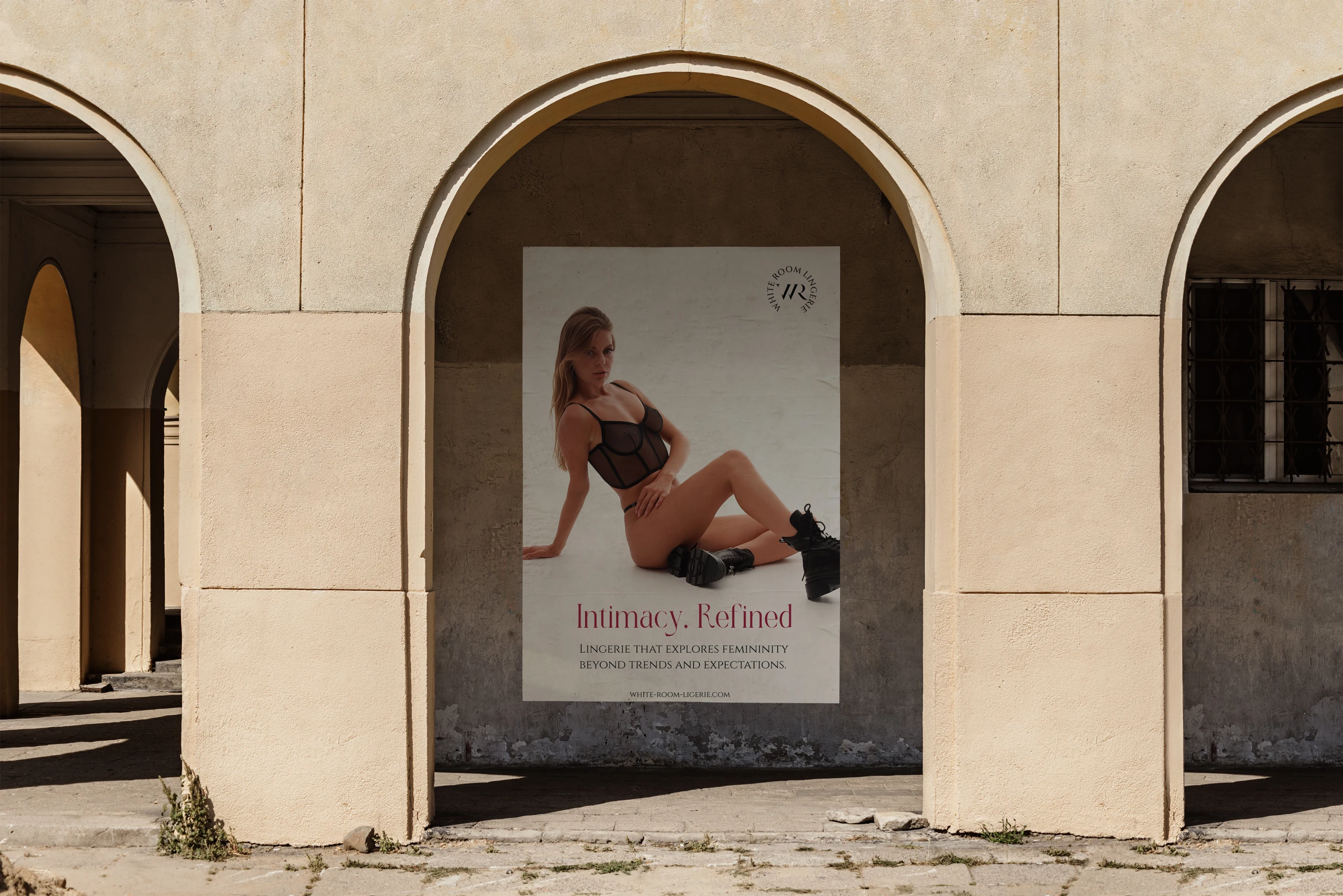
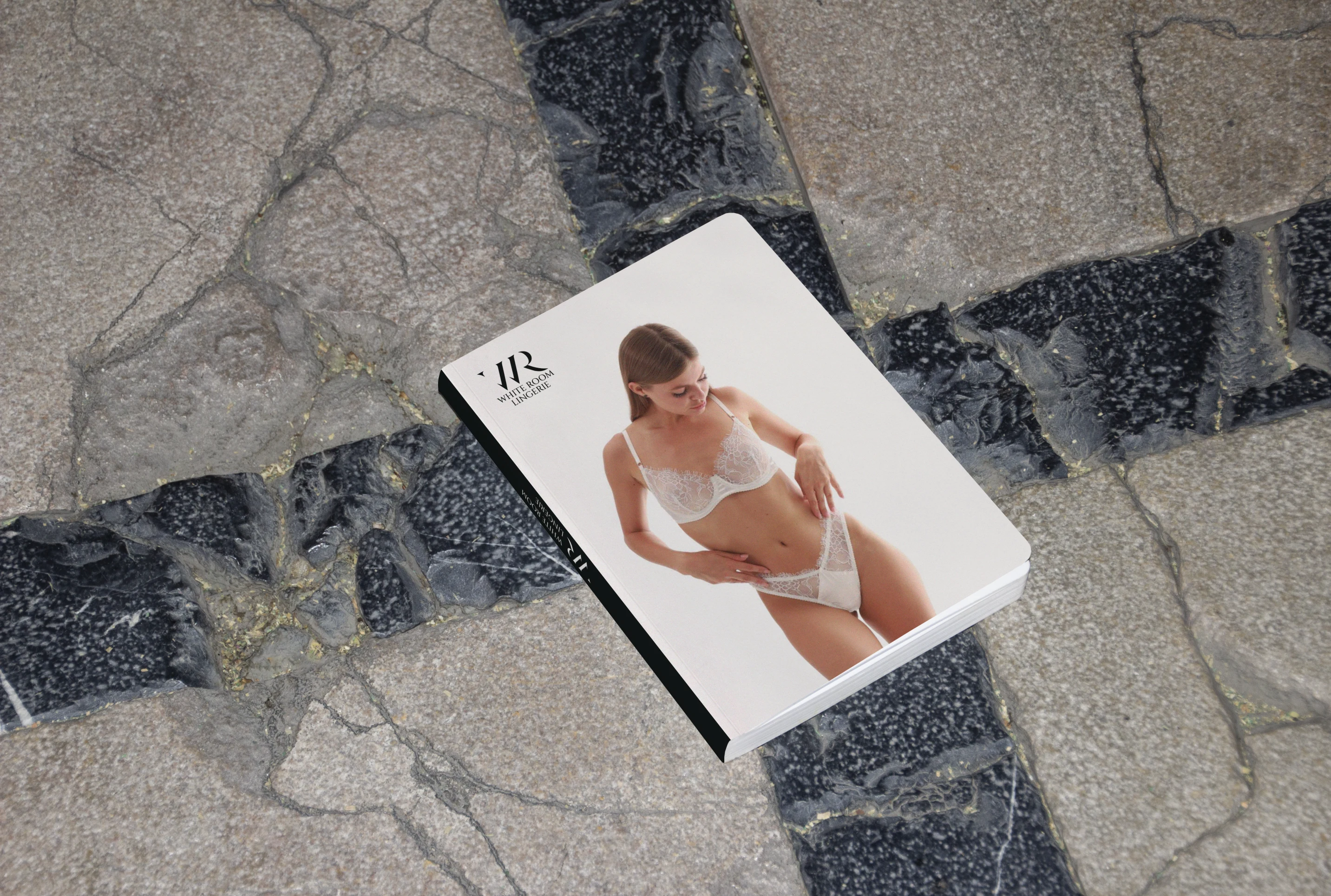
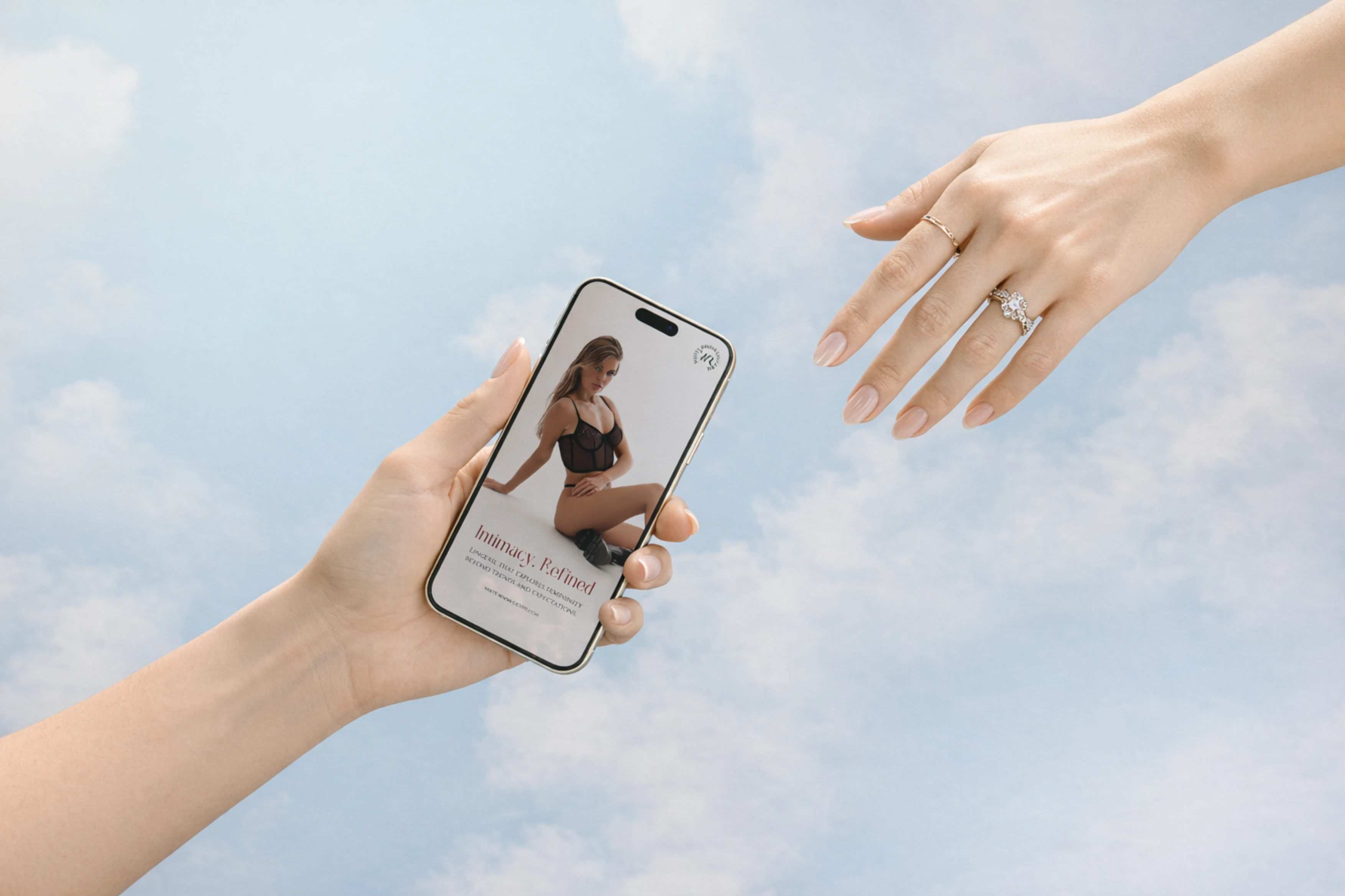
White Room Lingerie is a luxury intimates concept that aims to balance elegance and embodiment. The project isn’t just a flat visual brand. It is a visual interpretation of personal confidence, softness, and depth.
In lingerie branding, common approaches include heavy use of:
sensual photography
black and red palettes
overt sexual codes
White Room differentiates itself with a softer, more refined visual language that centers the emotional experience of the wearer rather than pure desirability.
🧭 Problem & Objectives
The main objective wasn’t simply to create a beautiful logo. It was to build an identity system that does the following:
✔ expresses luxury without pretension
✔ communicates intimacy and elegance
✔ allows versatility across touchpoints
✔ feels cohesive in print, digital, packaging
✔ emotionally resonates with discerning audiences
This system had to lift White Room out of commodity lingerie branding and into the realm of personal luxury experience.
🎯 Audience & Psychological Target
The intended audience comprises:
👩🦰 Women who value premium quality
🧠 individuals seeking confidence through design
✨ consumers who equate luxury with emotional experience
Emotionally, the identity needed to communicate:
✨ softness and elegance
🤍 intimacy and personal value
💎 refinement without ostentation
🔥 subtle sensuality
The brand needed to feel like a trusted confidant, not just a clothing label.
🔎 Design Strategy
To meet these goals, the visual strategy rested on several core pillars:
🎨 1. Elegance Through Minimalism
The identity avoids visual clutter. It uses:
• clean typography
• restrained color palette
• emphasis on space and tactility
This creates a sense of high-end refinement rather than trend-led noise.
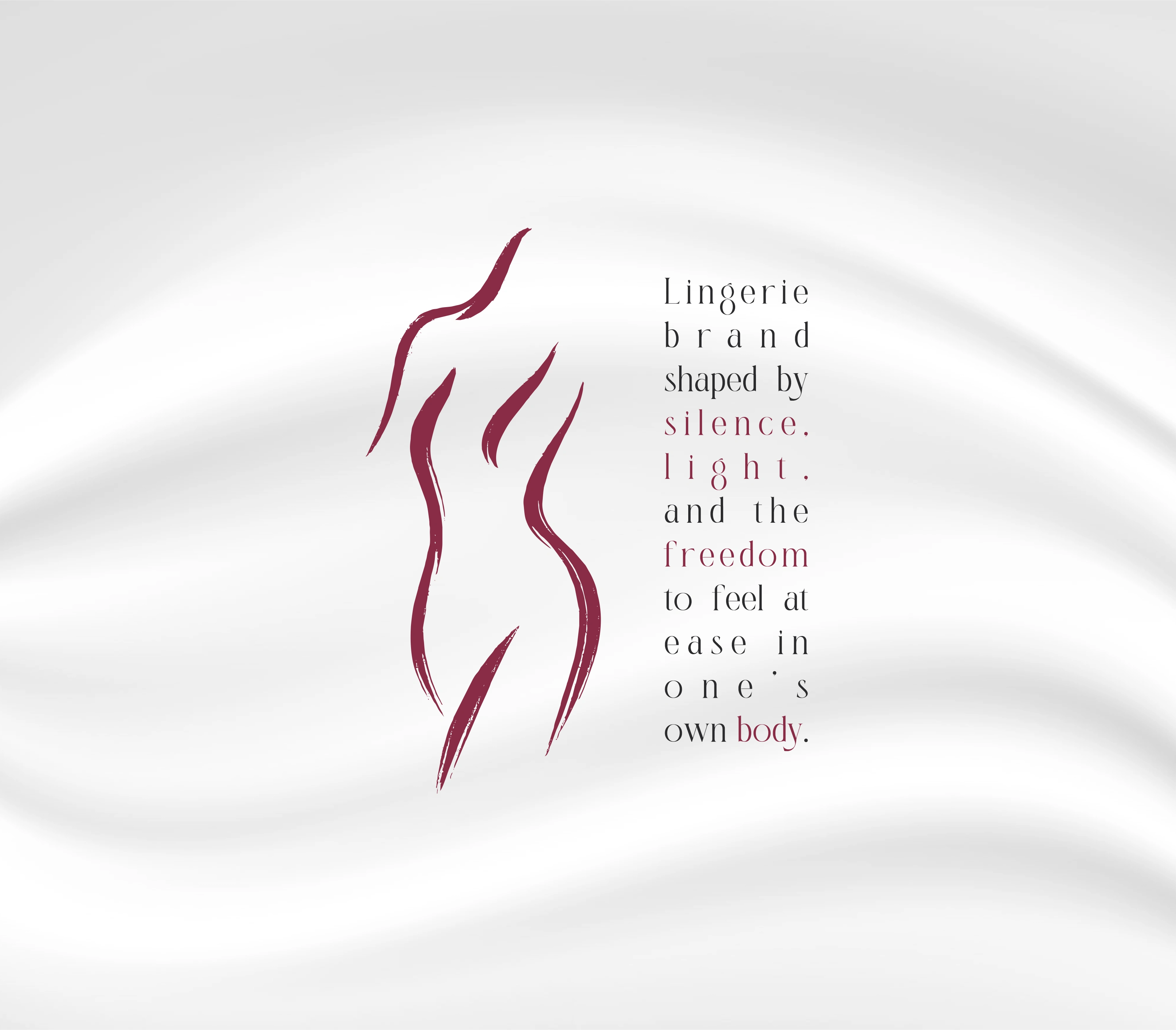
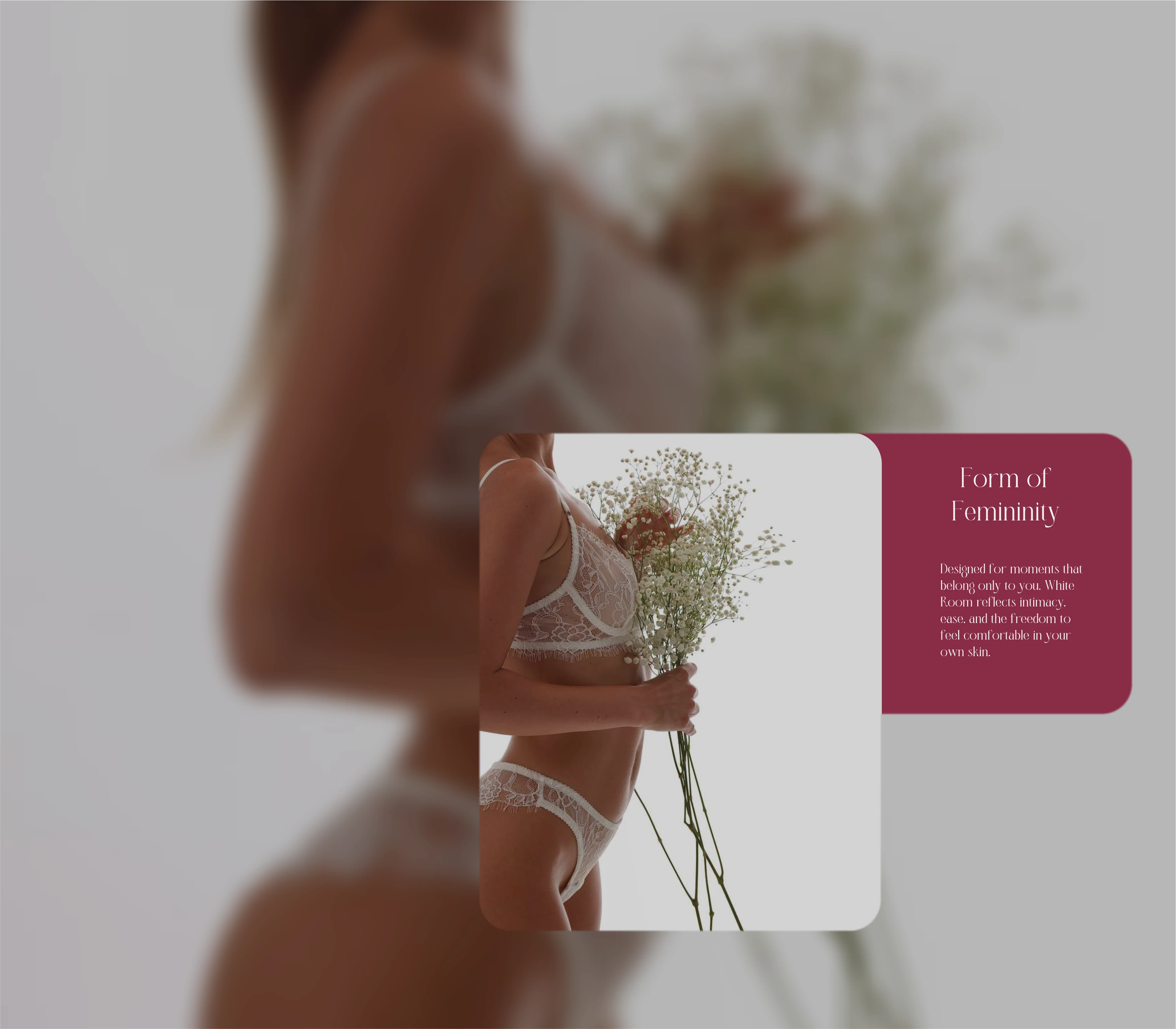
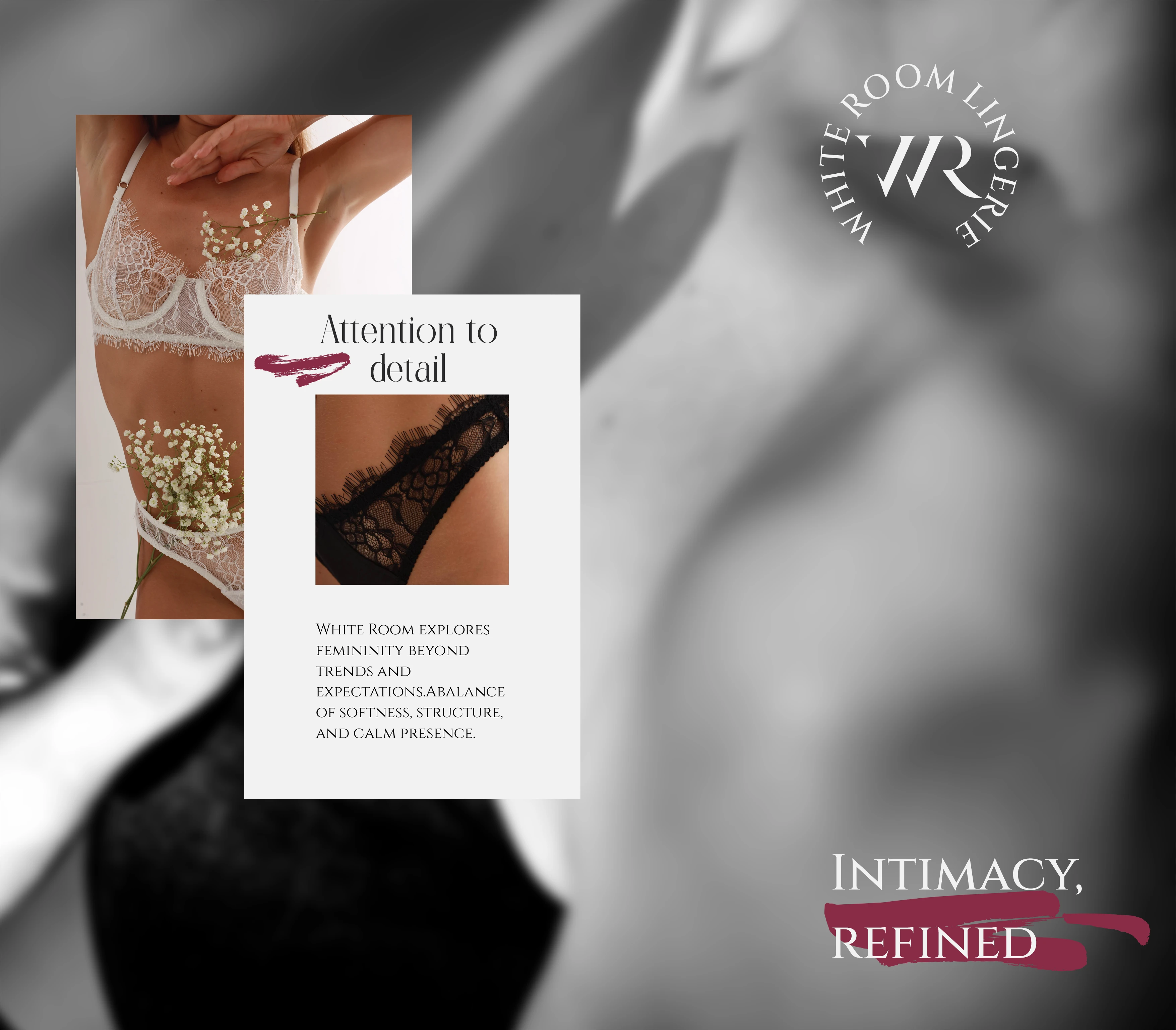
🪞 2. Sensuality Through Form
Shapes and forms in the visual system echo the human body and fabric movement:
• curves and soft contours
• fluid lines reminiscent of lace and drape
• subtle interplay between positive and negative space
This is not literal sensual imagery. It is suggestive through abstraction.
🩱 3. Luxury as Experience
Instead of physical markers like gold foils or heavy embossing alone, the system communicates luxury through:
• balance in composition
• thoughtful hierarchies
• understated elegance
Luxury here is felt, not loudly proclaimed.

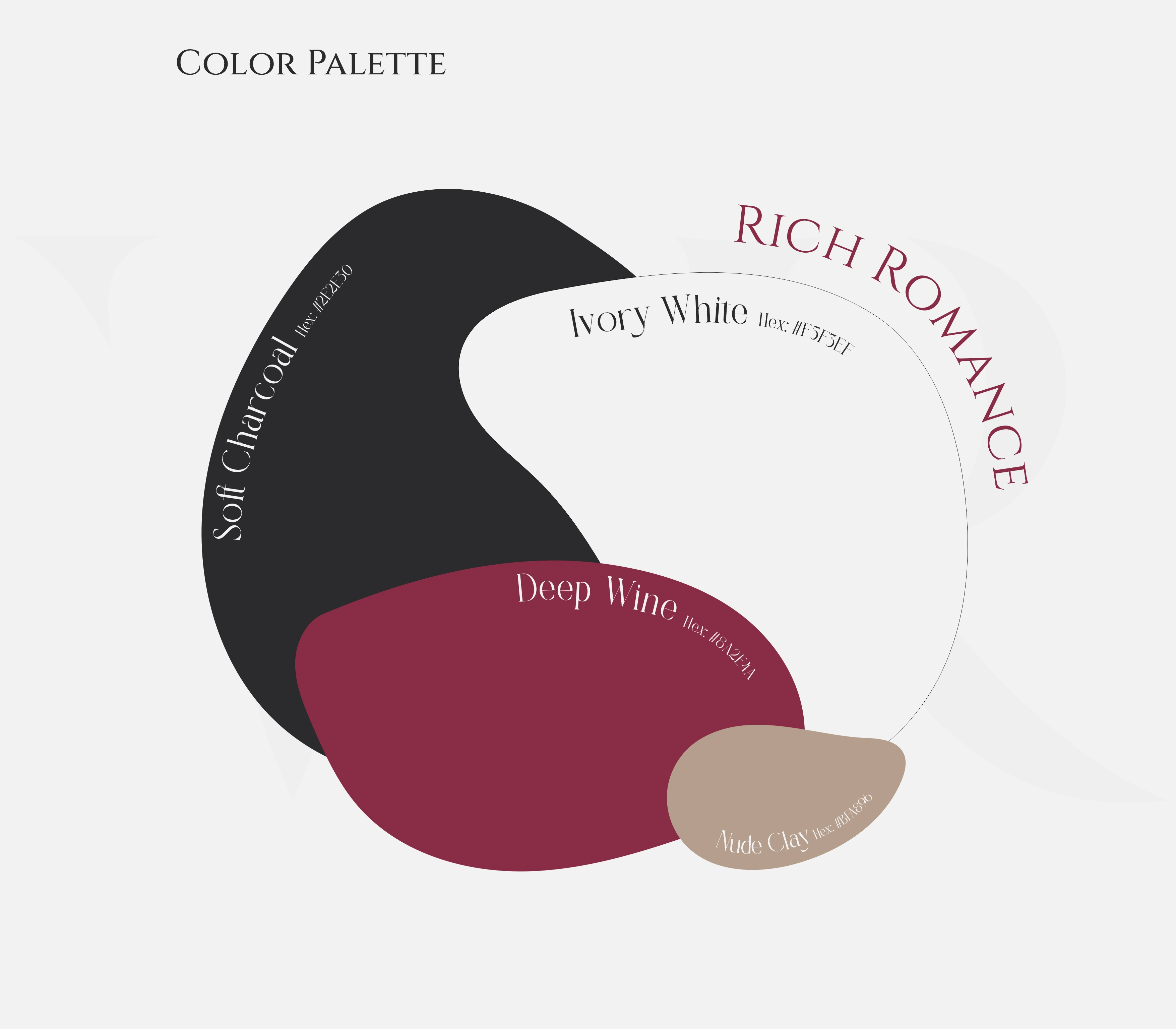
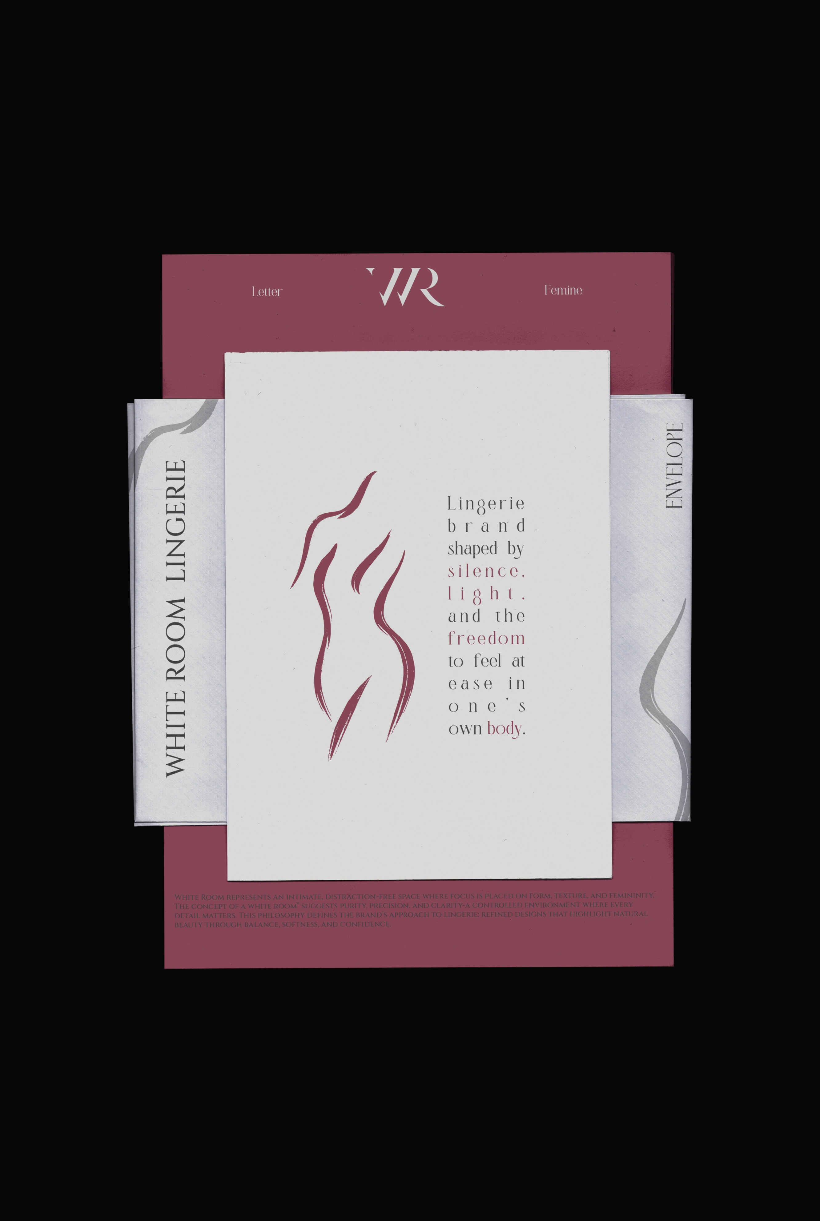
Color Palette
White Room’s palette is grounded in:
• muted neutrals
• soft pastels
• delicate contrasts
These tones convey softness, calm confidence, and visual harmony — a reflection of the brand ethos.
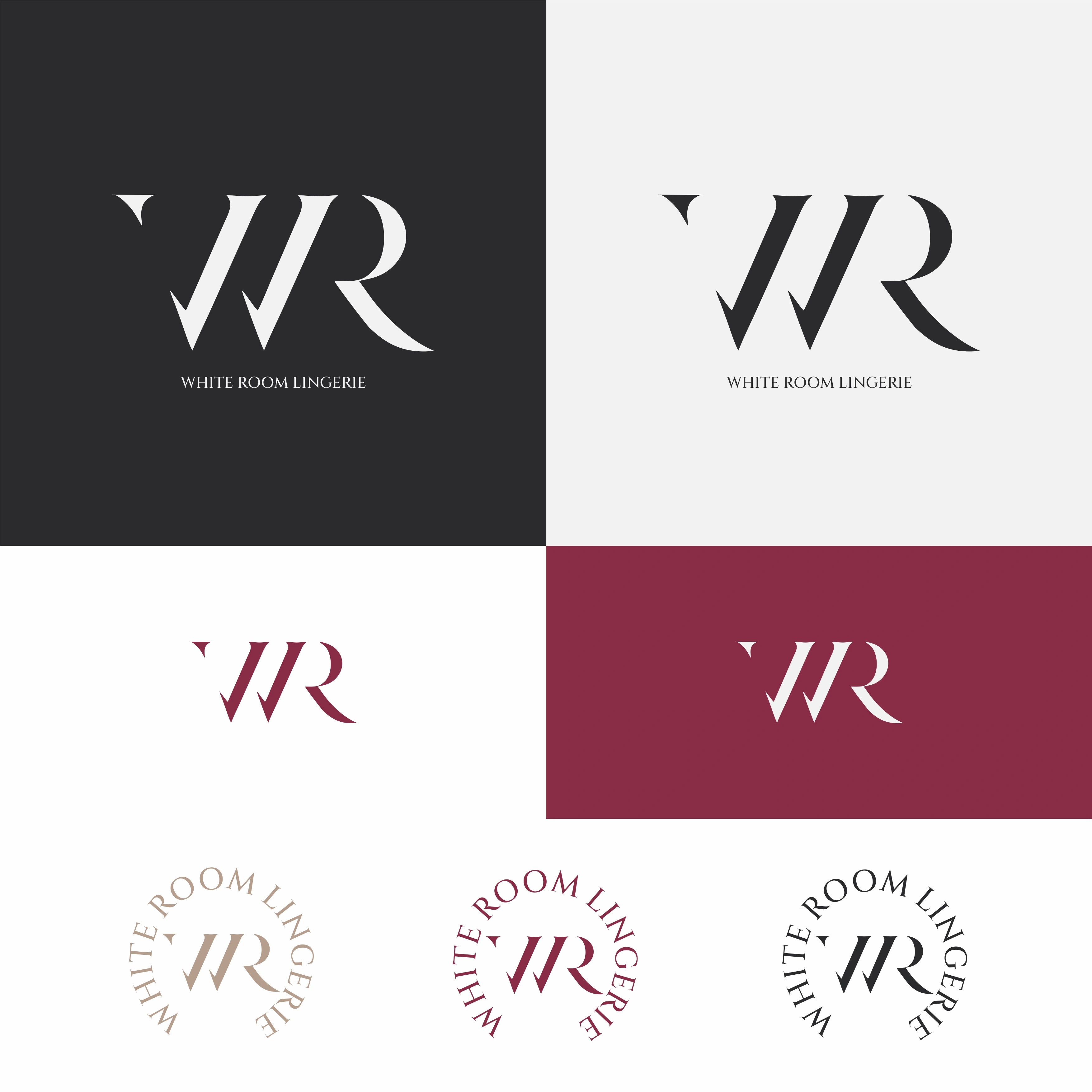
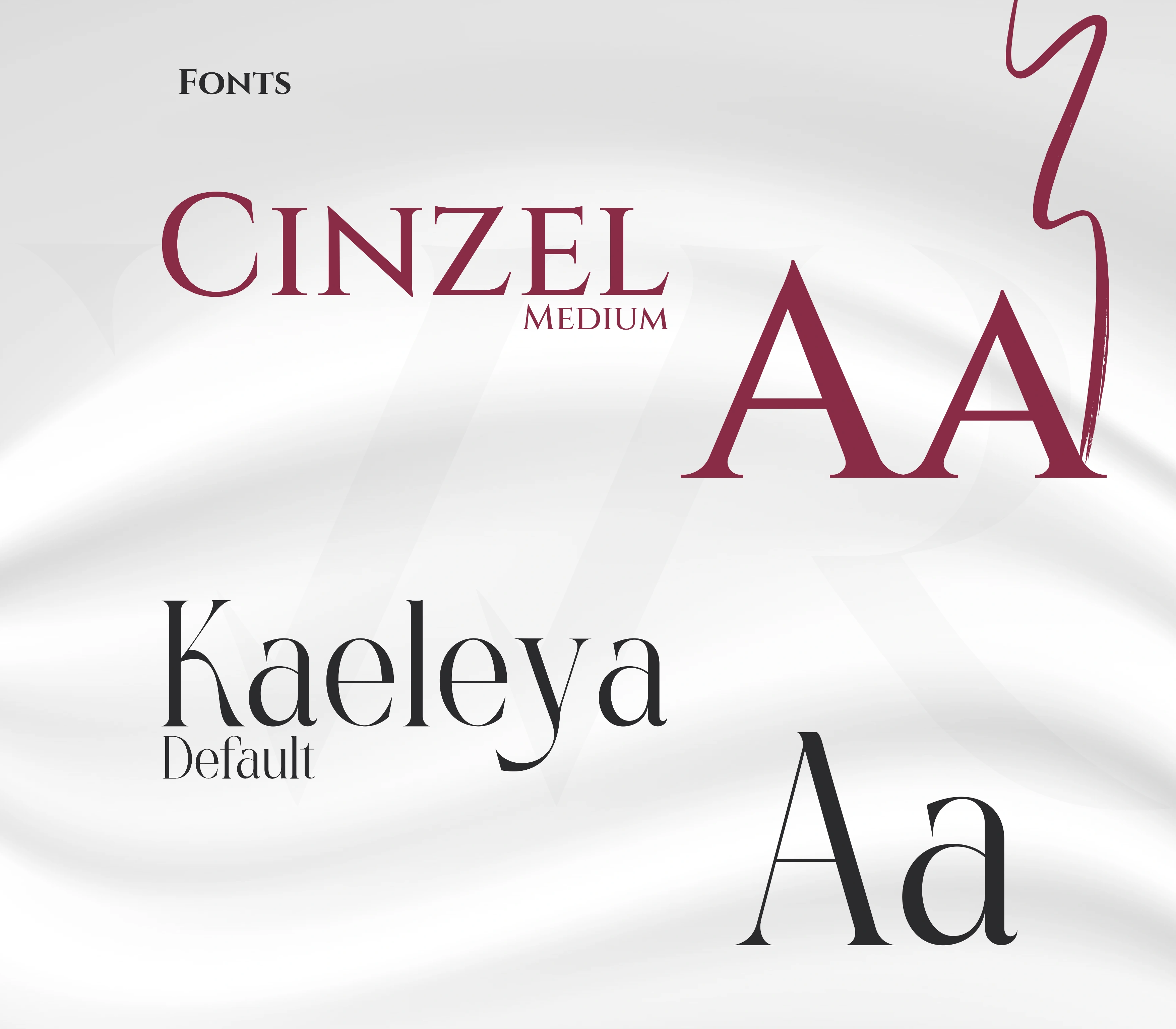
Typography system:
Typography balances:
• elegant serifs for refined messaging
• clean sans for functional clarity
Together, this synergy supports premium expression with functional legibility.
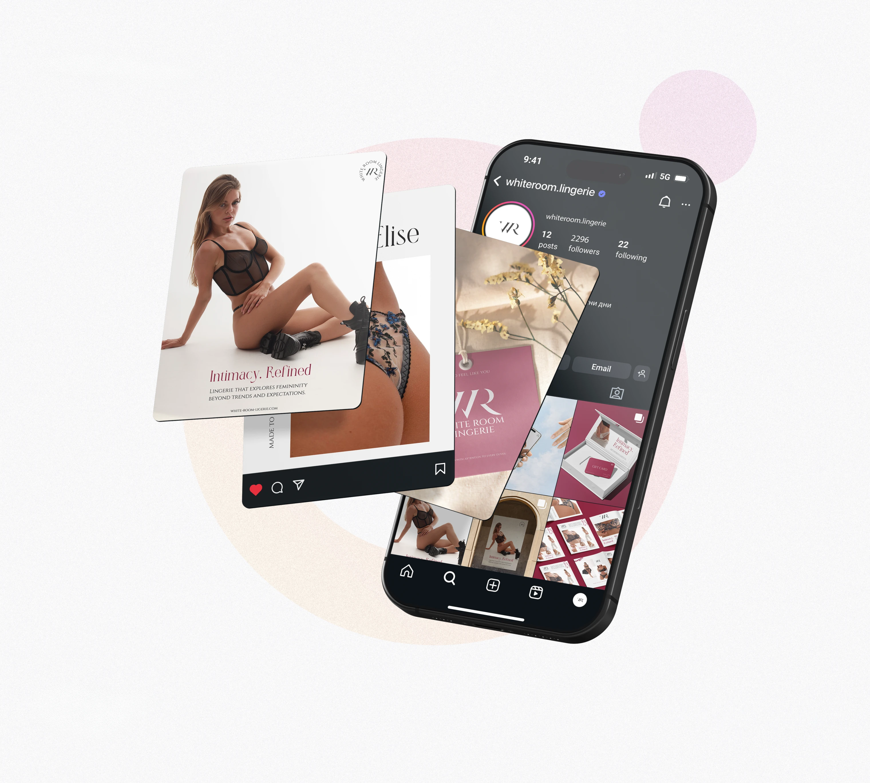
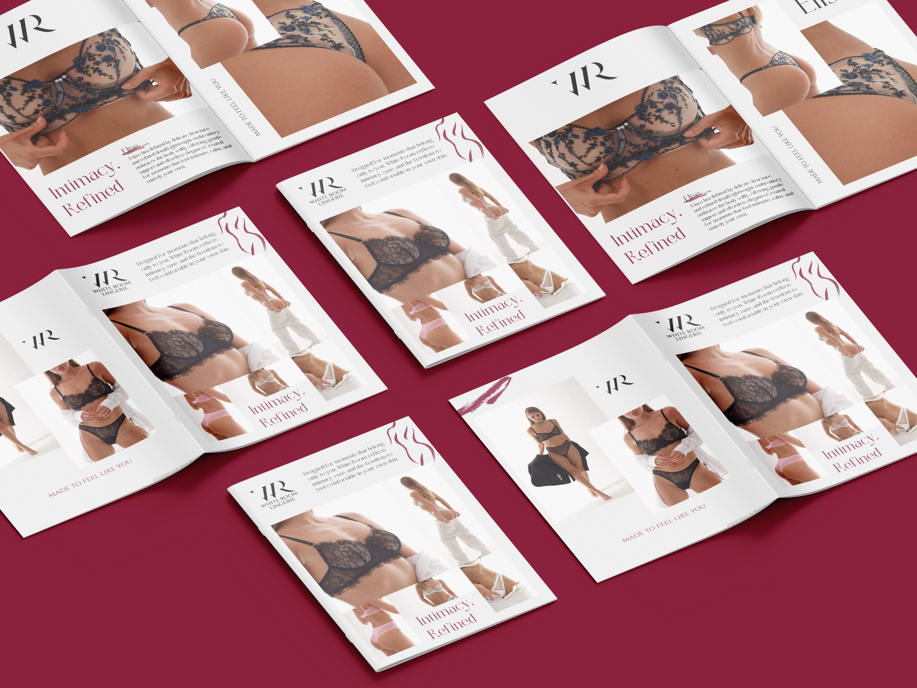
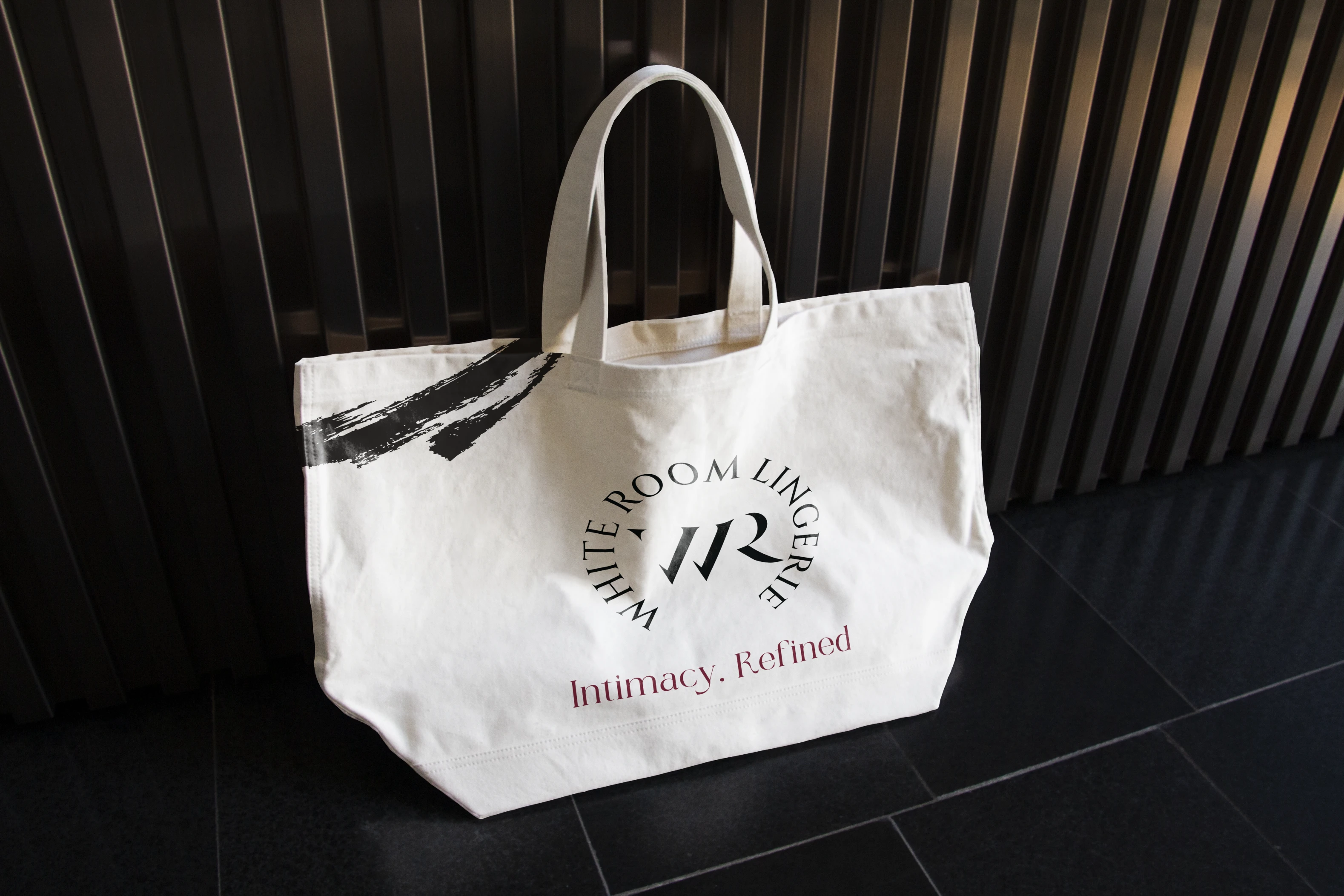
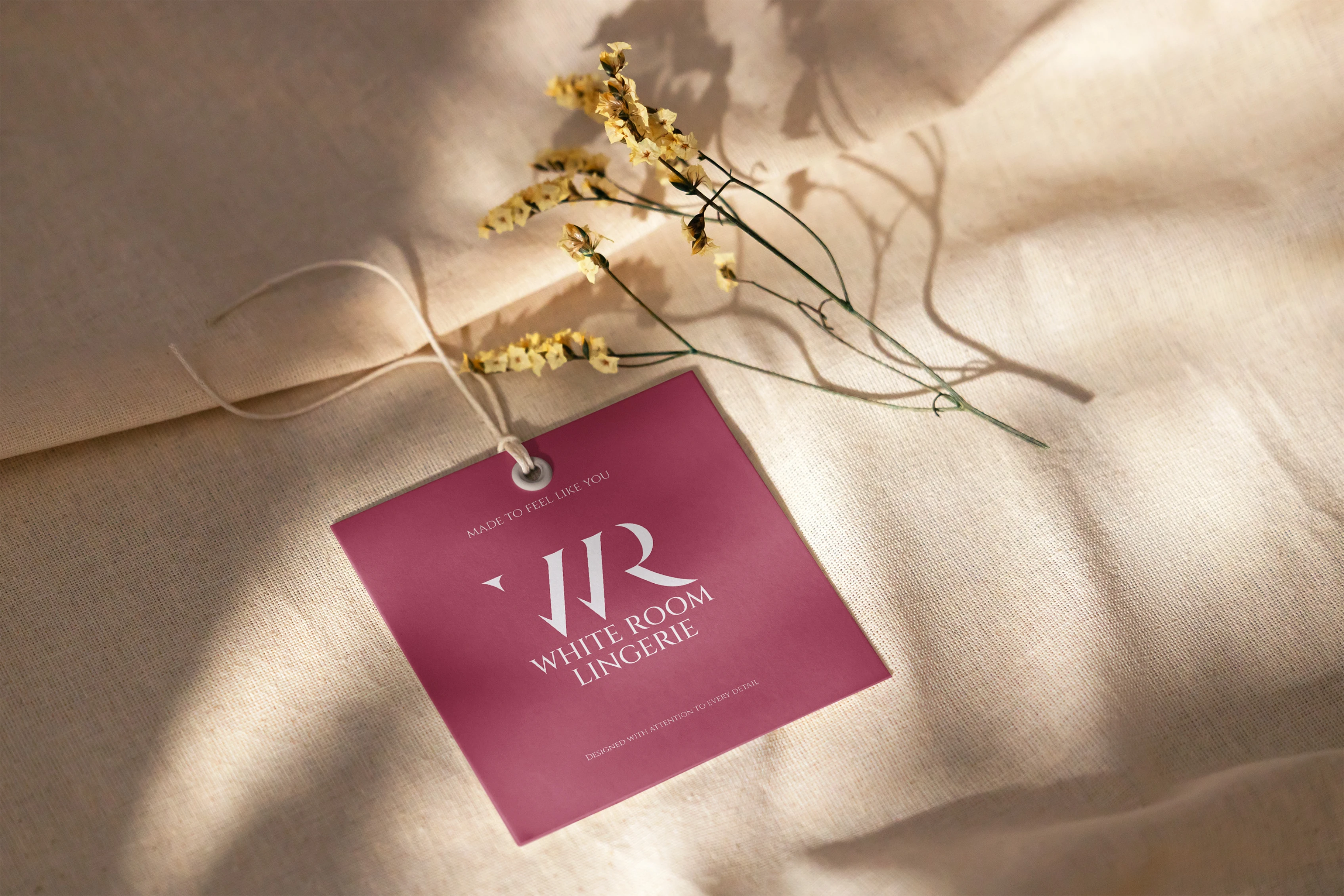
Identity in Action
Across applications — from packaging to digital — the system maintains:
✔ coherence
✔ emotional subtlety
✔ tactile value
Instead of relying heavily on visual tropes common in fashion and lingerie branding, White Room’s identity feels deliberate and personal.
This means every touchpoint feels like part of a unified story rather than disparate marketing elements.


📌 Results & Strategic Value
The identity positions White Room as:
✔ emotionally engaging
✔ visually refined
✔ distinct in a crowded category
✔ premium without superficial luxury cues
The visual strategy supports brand recall through emotional connection, not just aesthetics.
🧠 Final Thoughts
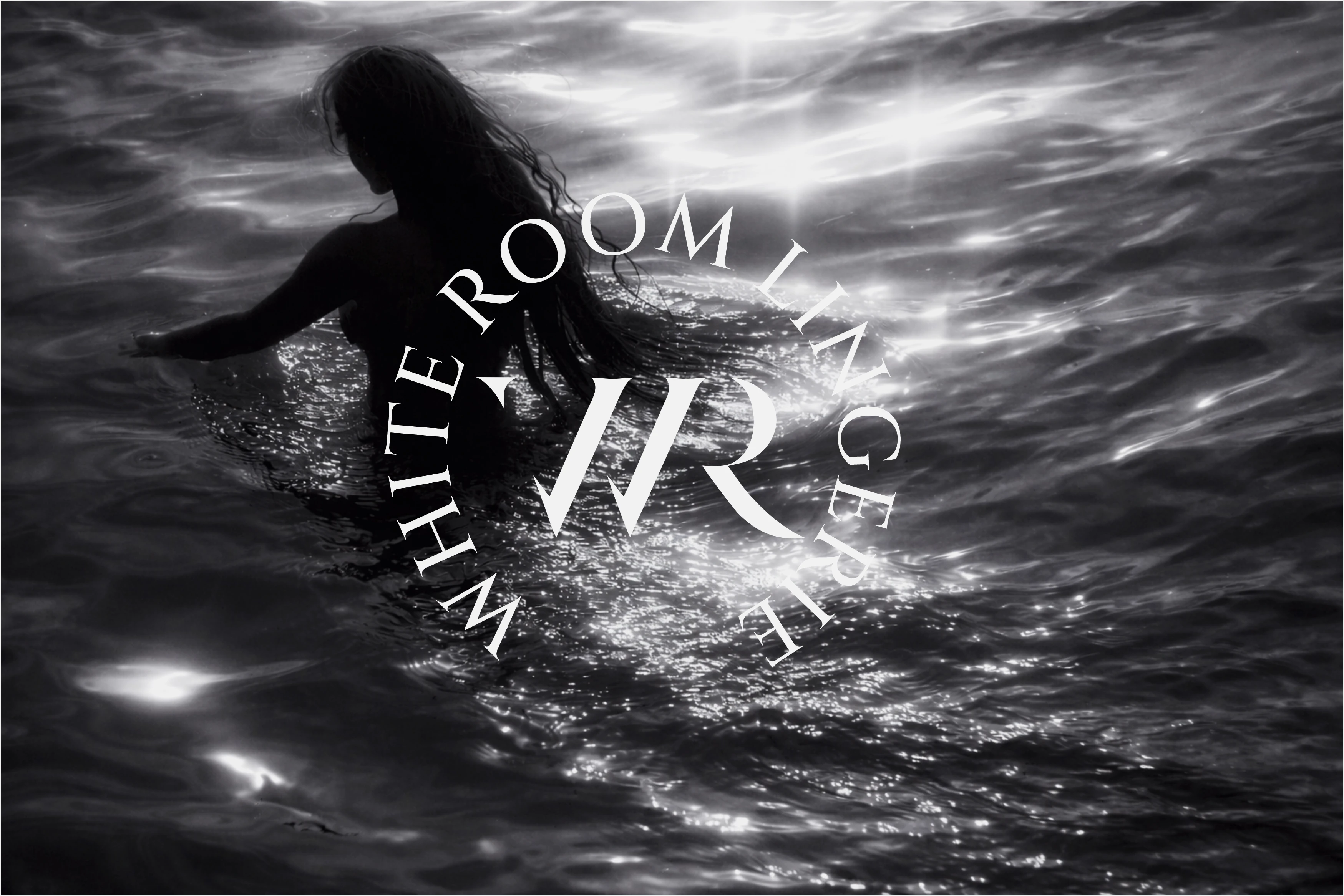
This project is not about selling lingerie. It’s about conveying how it feels — to wear it, to choose it, to experience it. The identity communicates confidence as a visual language.
With White Room Lingerie, I wasn’t designing a logo. I was designing emotional context — a space where elegance and intimacy meet.

Like this project
Posted Feb 19, 2026
Designed a refined, emotionally driven brand identity for White Room Lingerie, including logo, typography, packaging, and visual direction for a luxury feel.
Likes
19
Views
11
Timeline
Mar 19, 2022 - Ongoing