Omni Experience Brand Architecture System
Mikhail Yakovlev
Overview
Omni Experience is a master brand built to unify multiple logistics and infrastructure services under one structured system.
The objective was to create a scalable brand architecture where each subdivision — Tech, Pack, Ship, and Move — operates independently while remaining strategically connected.
The identity positions Omni as a control layer over distance and movement.
Not just transportation, but orchestration.
Not just logistics, but experience.
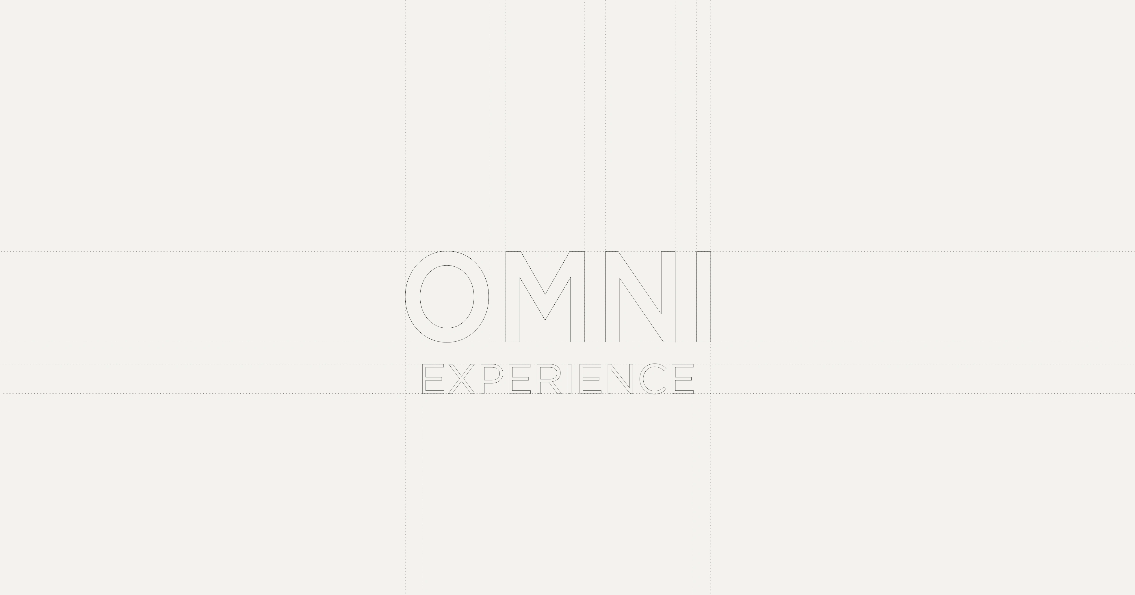
Logo Construction
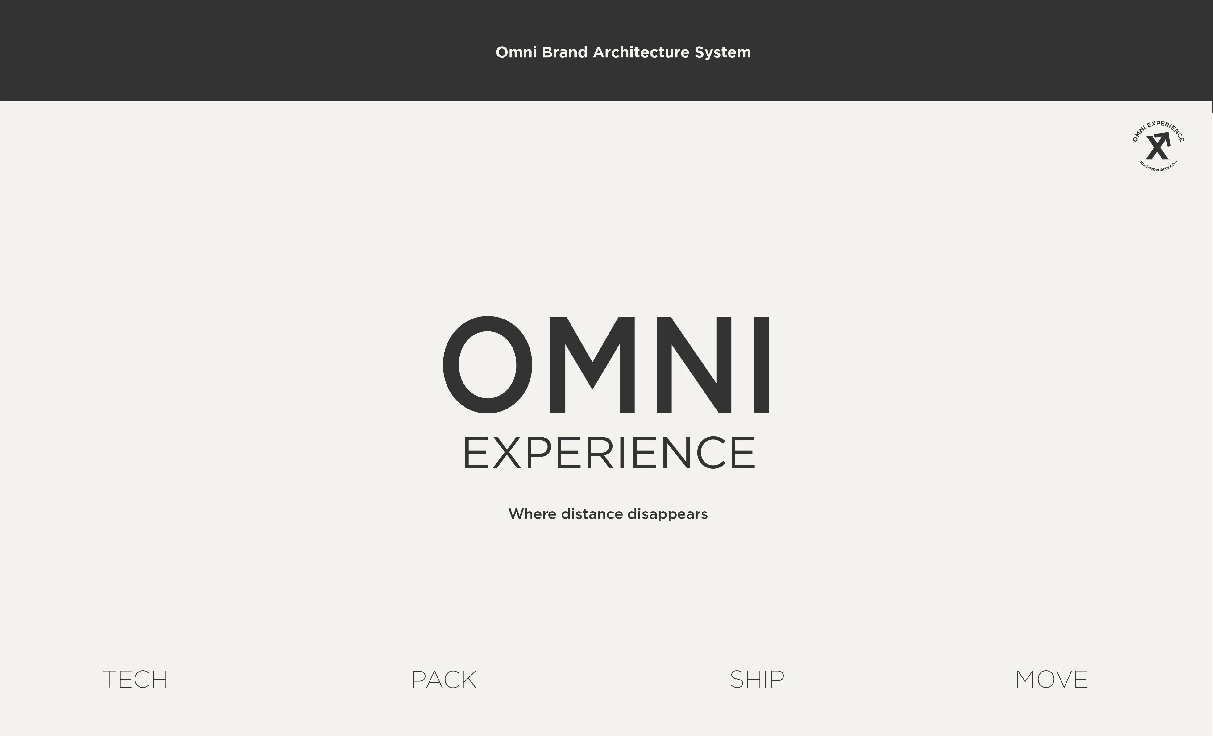
The OMNI Experience logotype is built on strict grid alignment to reinforce structure and control.
Wide spacing and balanced proportions communicate stability and operational clarity. The construction reflects the brand’s core idea: precision in movement and discipline in execution.
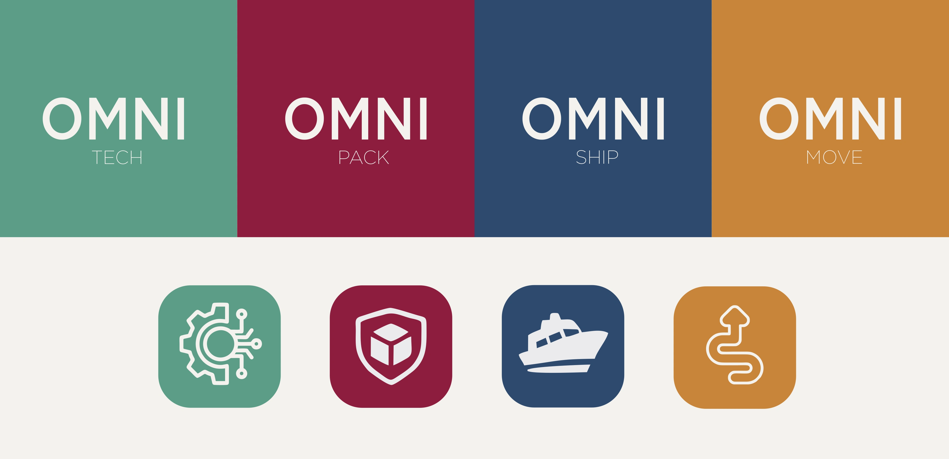
Brand Architecture System
The modular structure allows Omni to scale through four specialized divisions: Tech, Pack, Ship, and Move.
Each sub-brand maintains its own functional identity while staying visually anchored to the master brand. The repetition of “OMNI” reinforces unity, while the secondary descriptors define operational focus within the ecosystem.

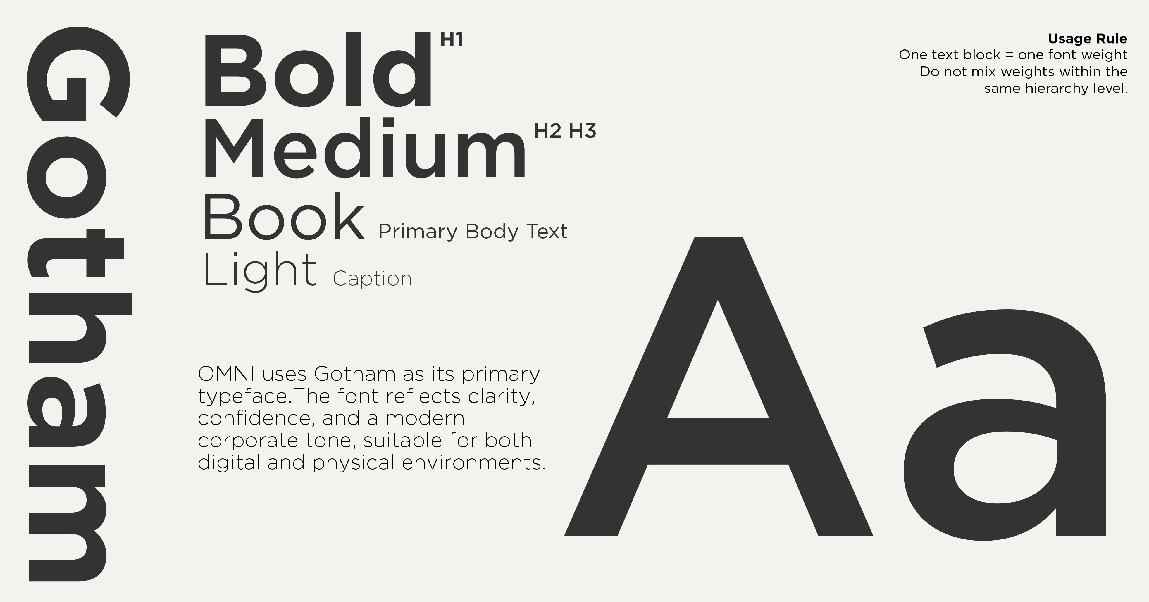
Typography System
Gotham was selected to express clarity, confidence, and modern corporate structure.
A disciplined weight hierarchy defines communication: Bold for impact, Medium for subheads, Book for body text, and Light for captions. Strict usage rules maintain consistency and reinforce the brand’s structured identity across all touchpoints.
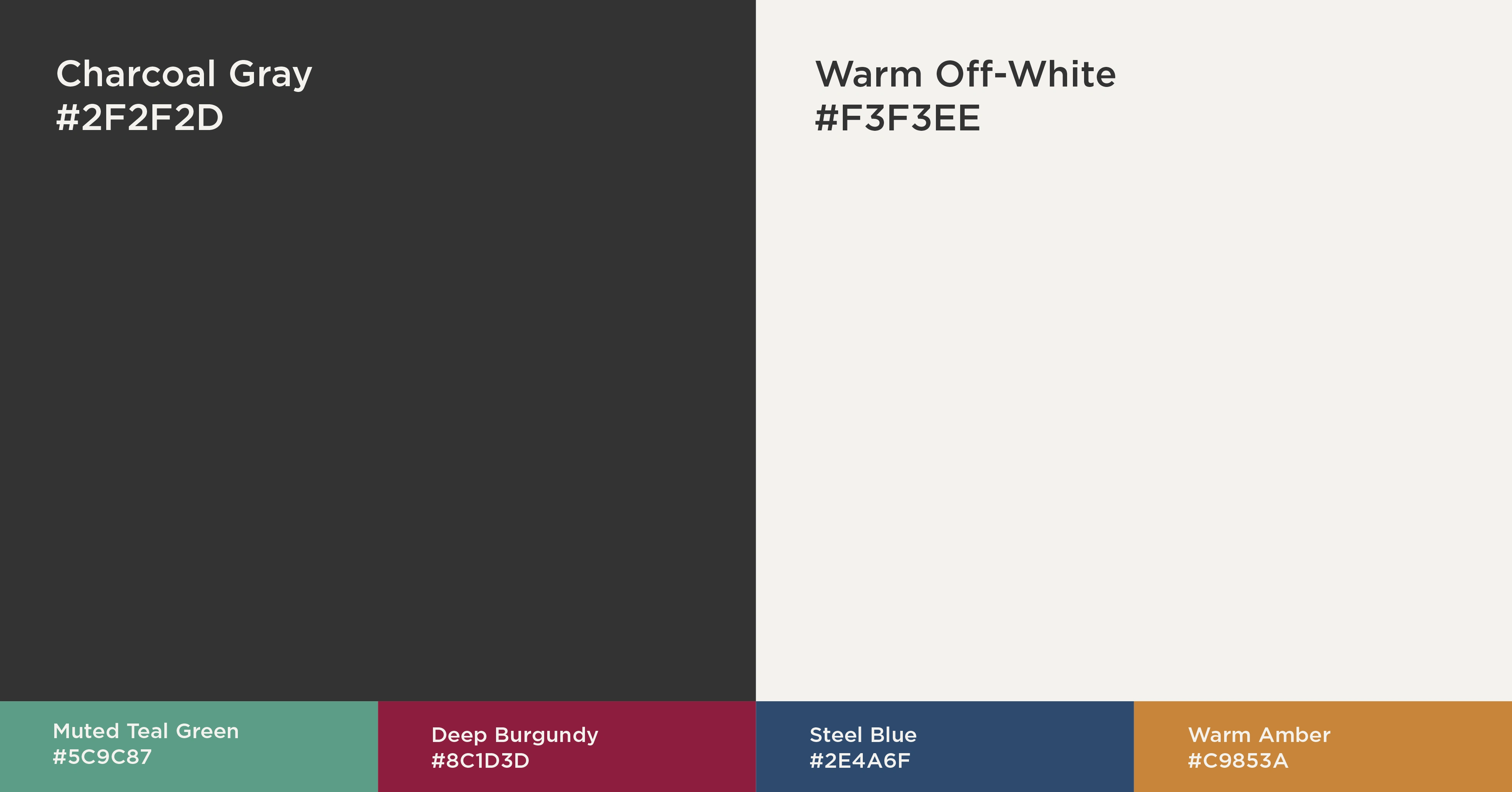
Color System
The color system combines a neutral monochrome base with functional accent tones. Charcoal Gray and Warm Off-White establish the primary foundation, while Muted Teal, Deep Burgundy, Steel Blue, and Warm Amber support sub-brand differentiation.
Why was it built this way?
To preserve institutional credibility at the core while enabling clear operational separation between divisions without losing cohesion.
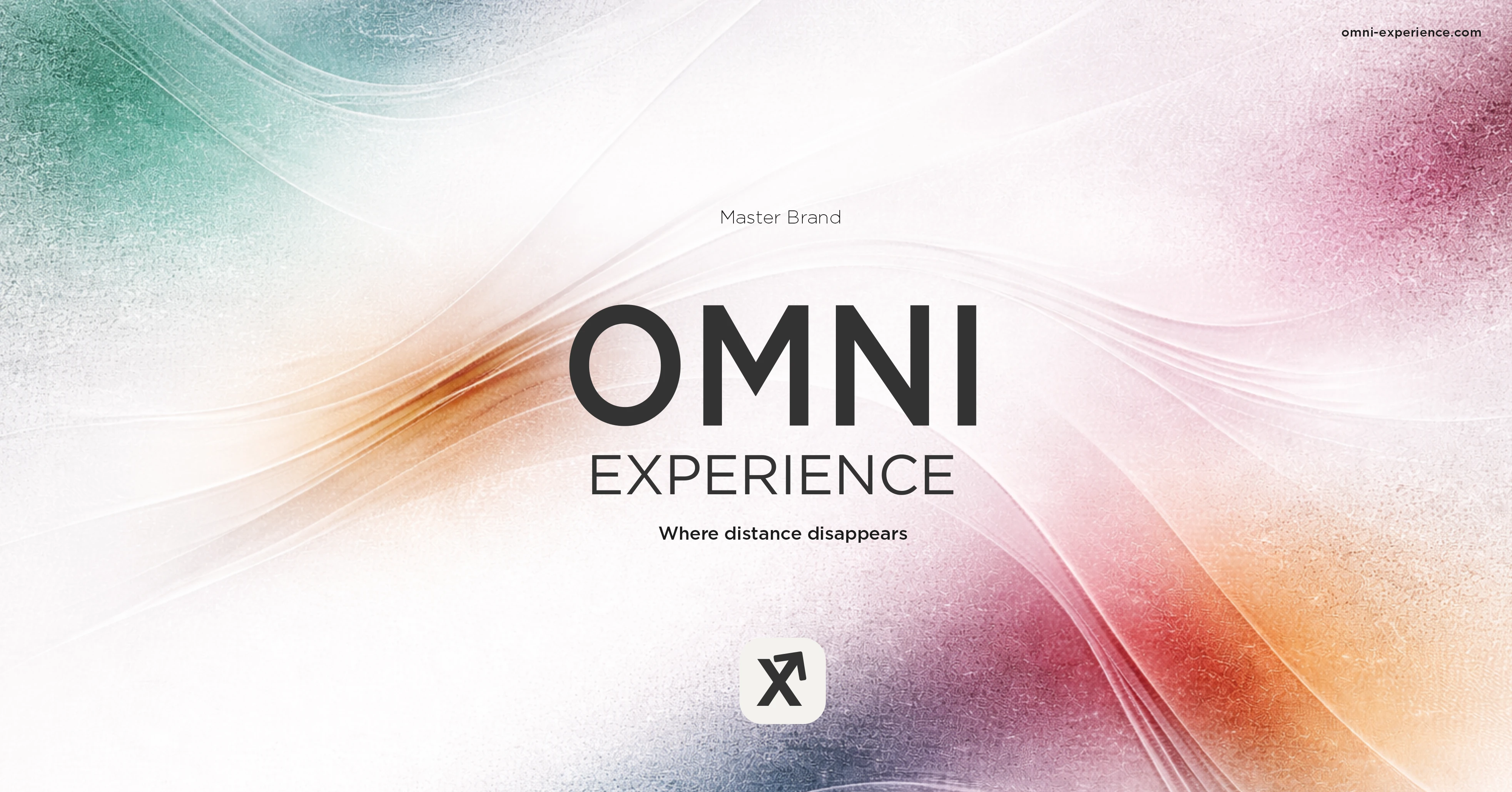
Master Brand Cover
This is the master brand visual — the central identity layer that unifies all Omni divisions under one system. The composition blends structured typography with fluid abstract motion, representing control over distance and movement.
Why was it designed this way?
To visually balance structure and flow. Omni operates in logistics and infrastructure, where movement must be controlled. The clean logotype anchors stability, while the soft gradients and motion lines symbolize dynamic global connectivity.
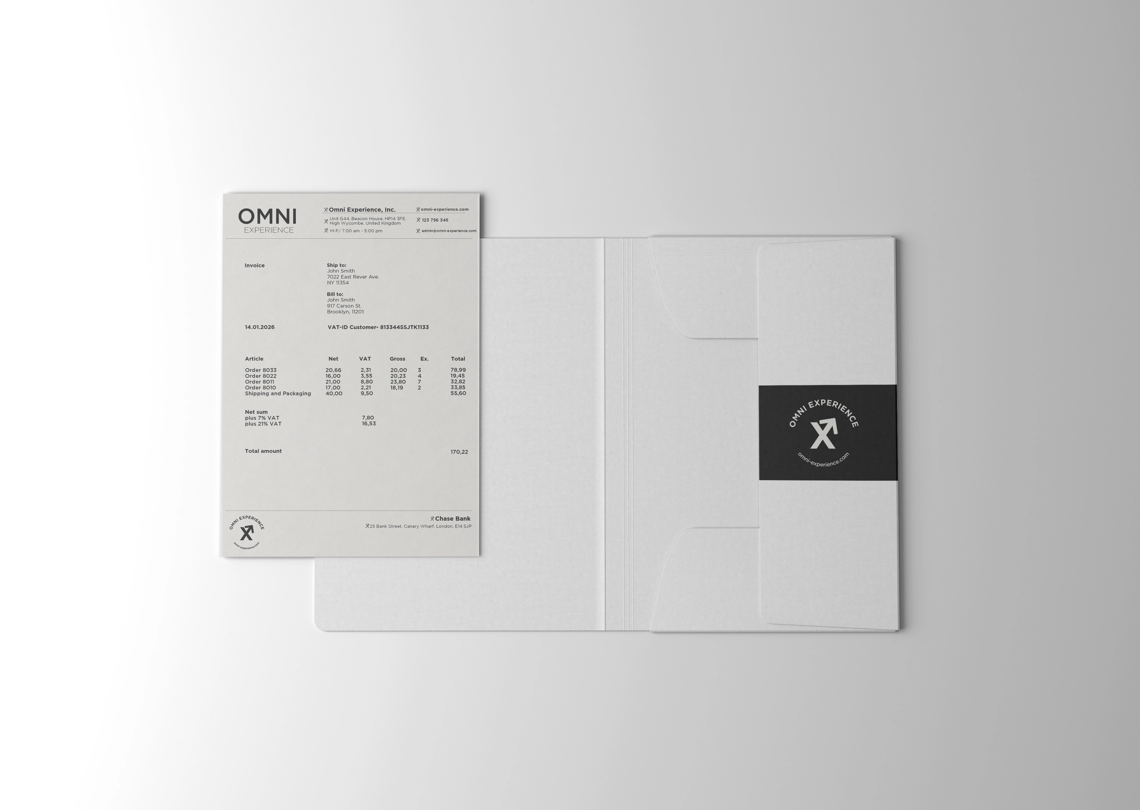
Corporate Stationery
The master brand extends into invoices, folders, and official documents through a clean, minimal layout system. Strong margins, clear hierarchy, and restrained use of the mark maintain institutional consistency.
Why designed this way?
Because infrastructure brands build trust through clarity. Financial and operational documents must feel precise, structured, and reliable.
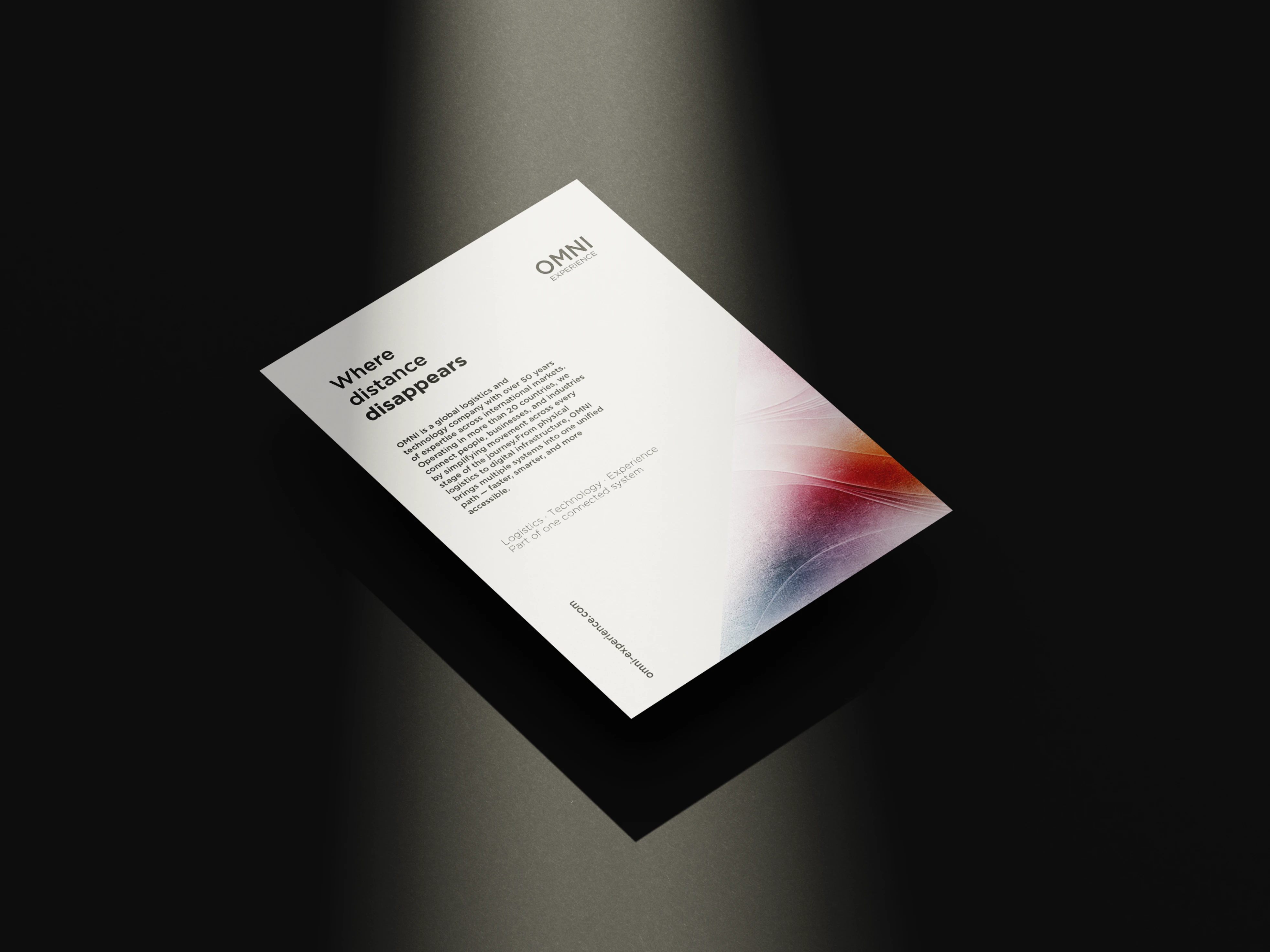
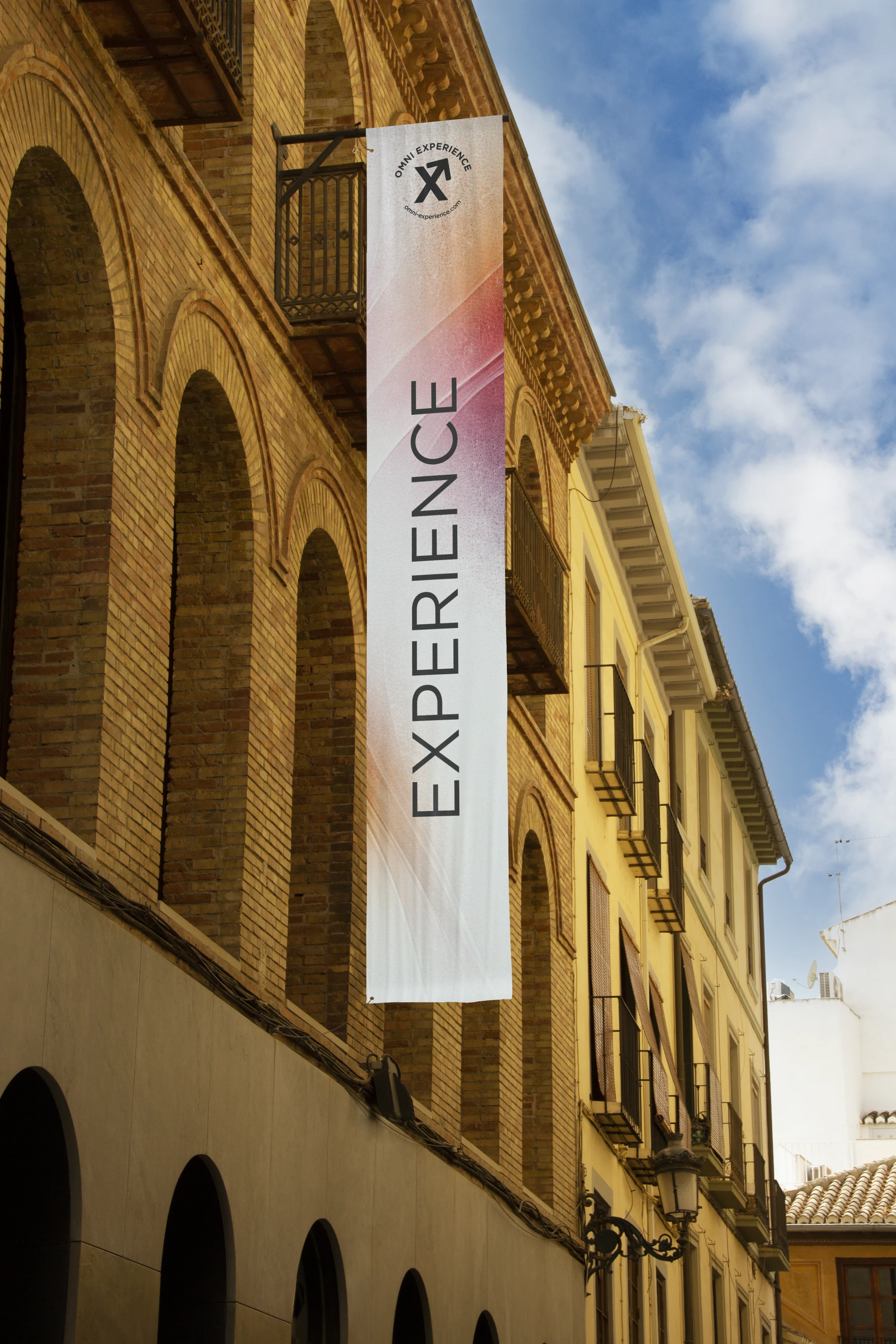
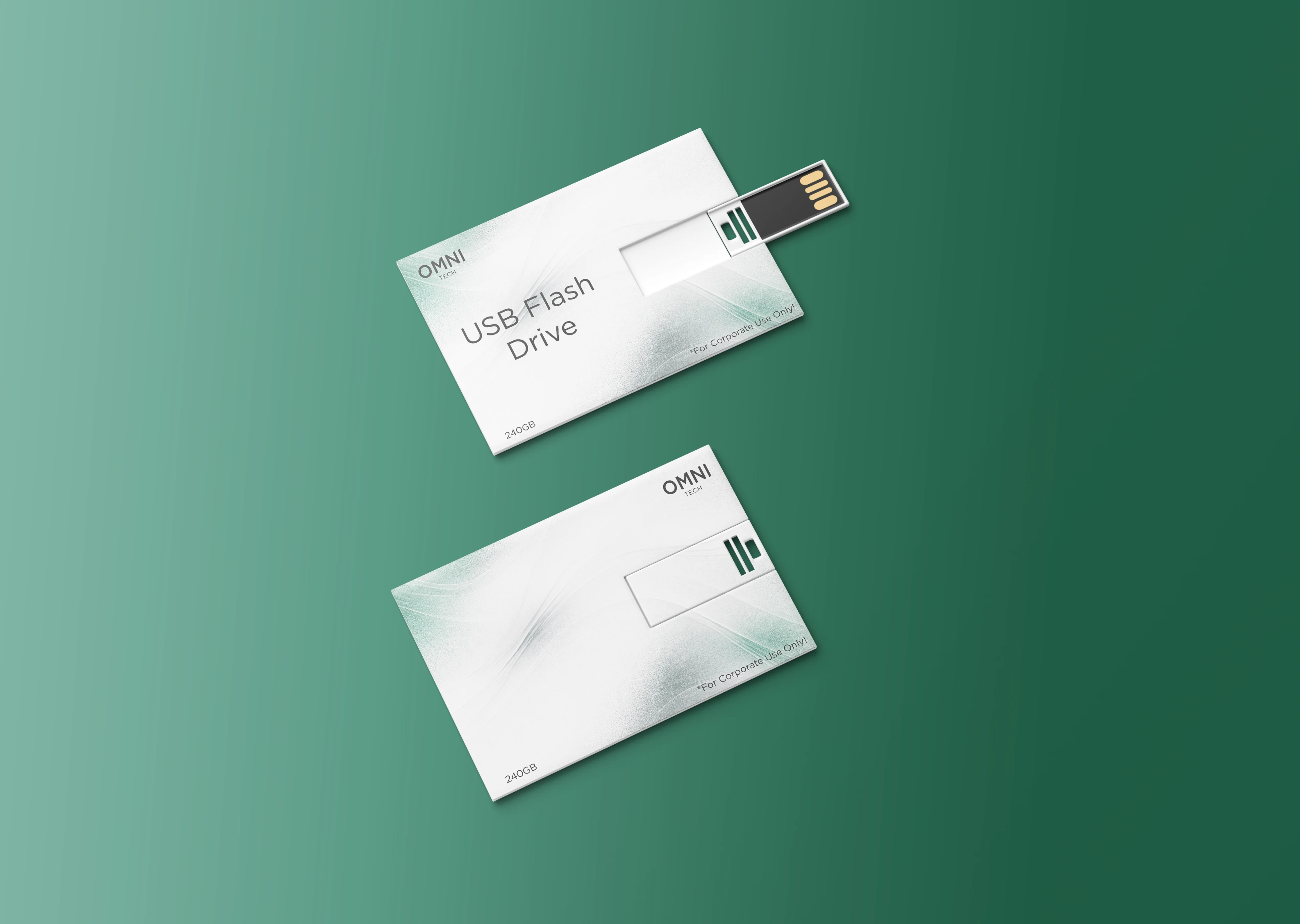
Brand Collateral
Printed materials combine monochrome structure with controlled gradient accents. The visual balance keeps the system professional while introducing subtle motion.
Why this balance?
To ensure the brand feels both stable and dynamic — reflecting controlled movement rather than chaotic activity.
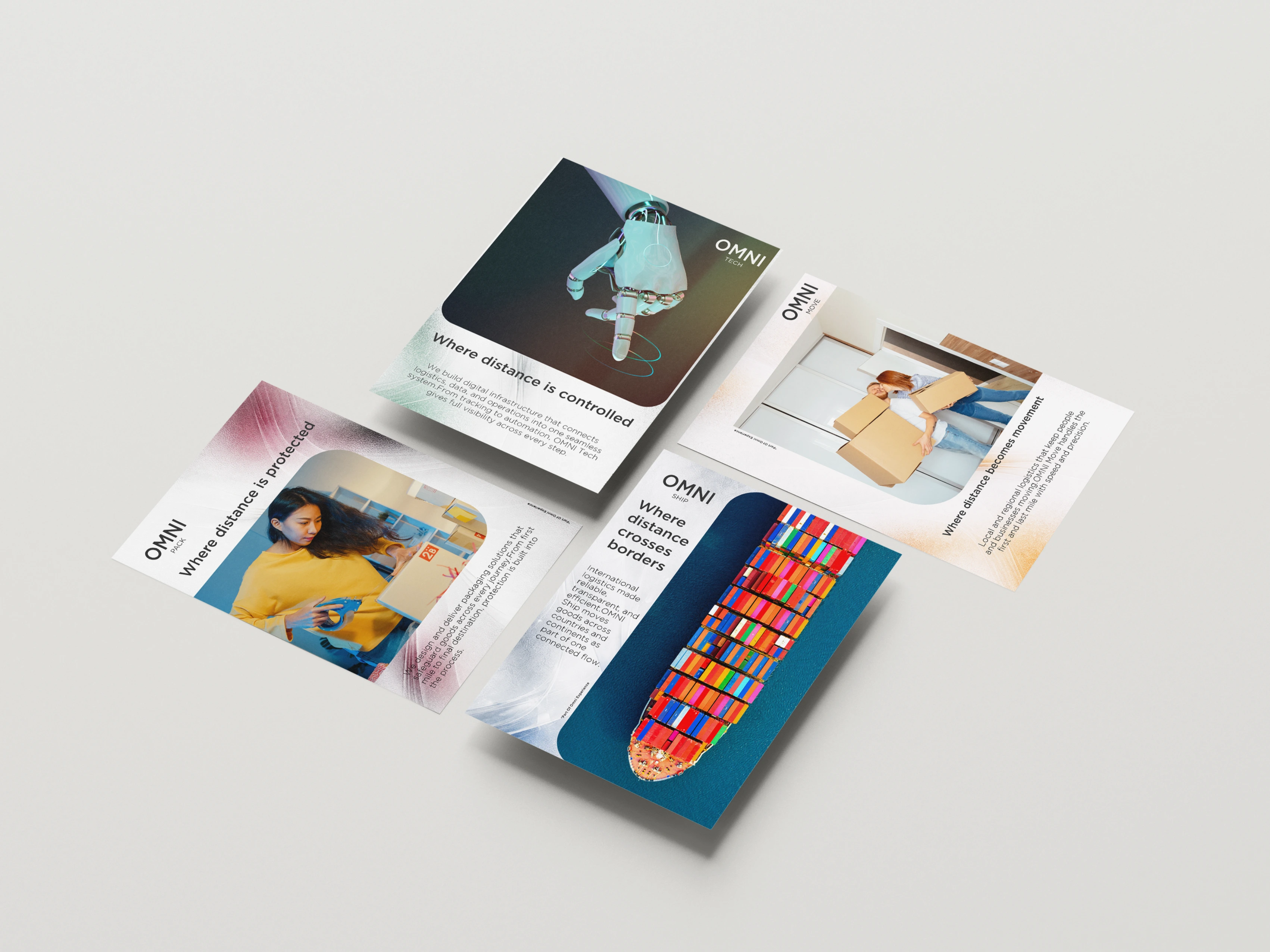
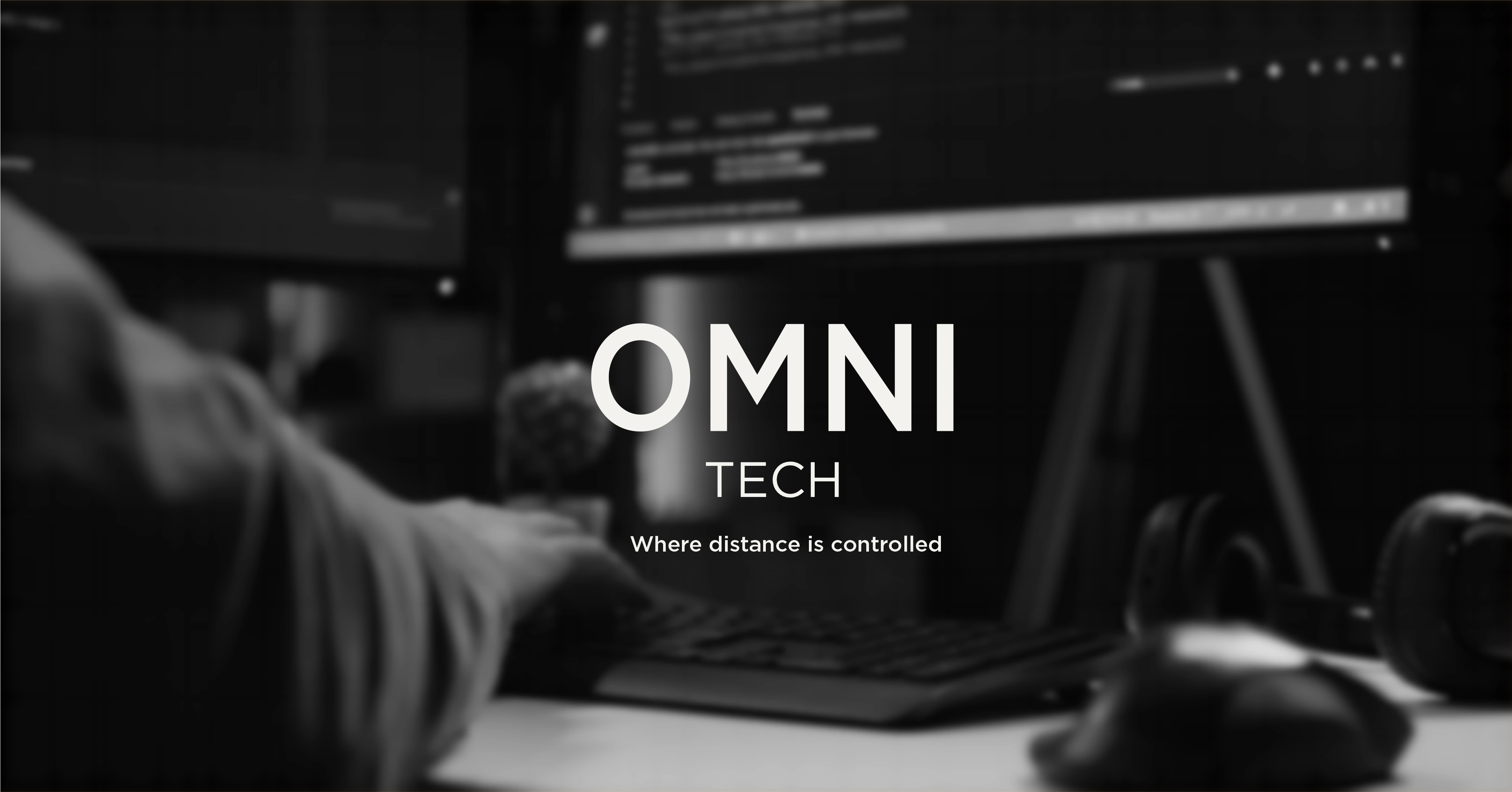
Division Communication
Each sub-brand application integrates photography with its designated color accent, reinforcing functional differentiation while staying aligned with the master system.
Why structured this way?
To allow each division to communicate its role clearly, without fragmenting the overall brand architecture.
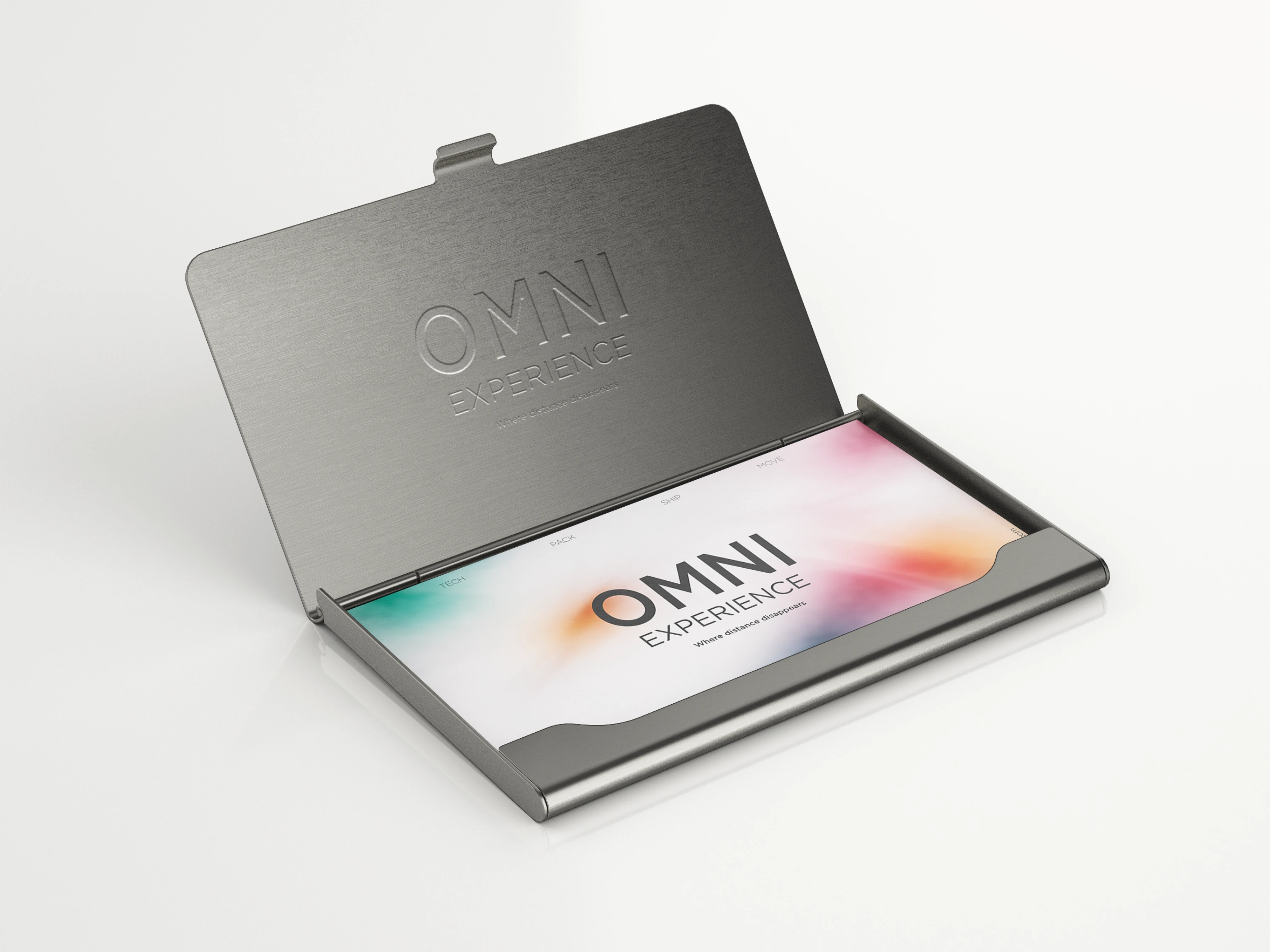
Business Cards
The business cards combine a clean institutional layout with a soft gradient accent tied to the master brand. The front maintains clarity and hierarchy, while the embossed metal case elevates the physical presence of the identity.
Why designed this way?
To express both precision and premium positioning. The minimal structure communicates professionalism, while the material execution reinforces durability, confidence, and long-term value.
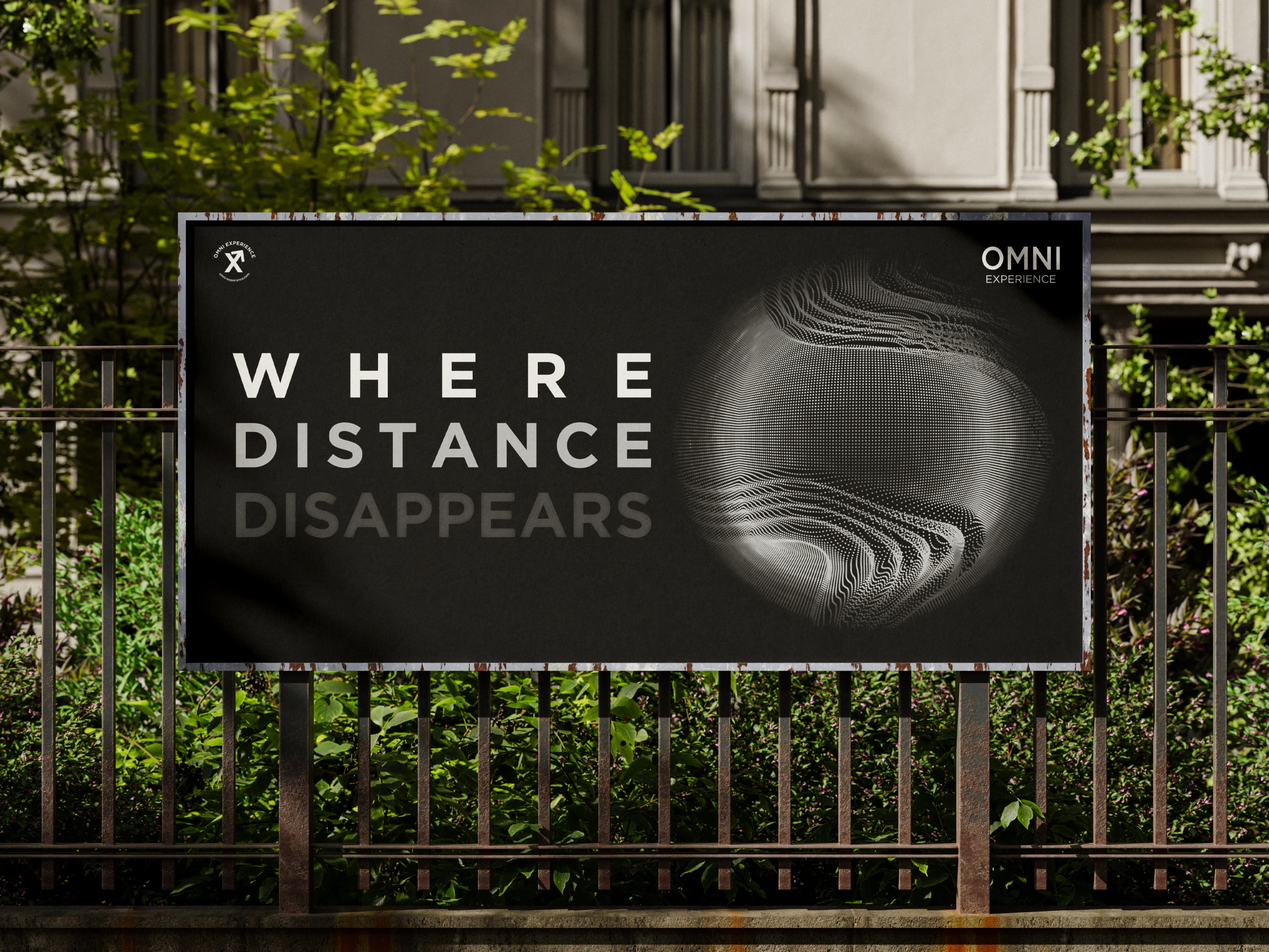
Billboard Application
The billboard translates the master message into a bold public statement. Strong typography, high contrast, and restrained color create immediate readability from distance, while the abstract sphere graphic symbolizes global movement and controlled connectivity.
Why designed this way?
Because large-format communication must be simple, confident, and unmistakable. The composition eliminates noise and reinforces Omni’s core promise: clarity, control, and seamless global distance management.

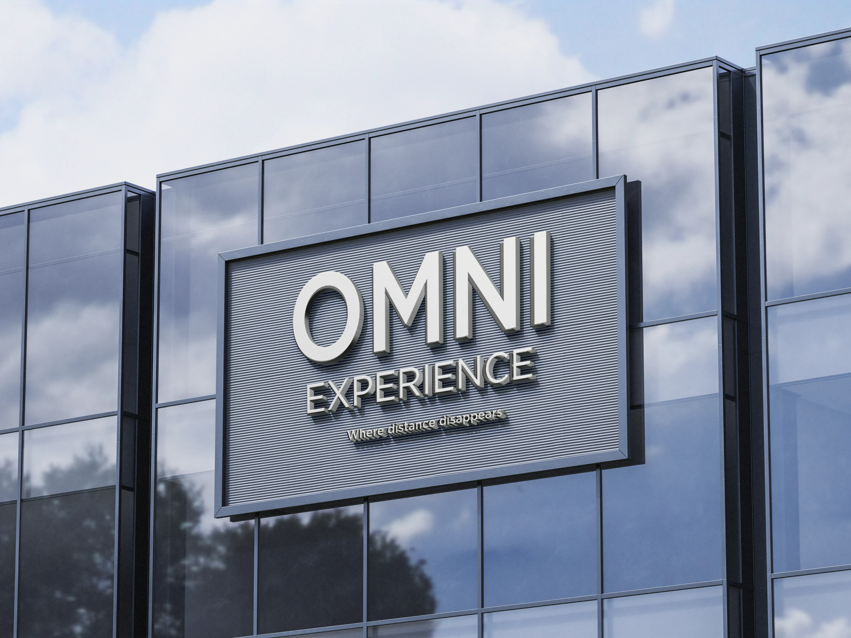
Architectural Signage
The logo is applied as dimensional building signage, reinforcing the master brand in a physical environment. Clean typography and metallic materiality align with modern corporate architecture.
Why designed this way?
Because infrastructure brands must feel permanent and established. The solid, structured signage communicates stability, scale, and long-term presence.
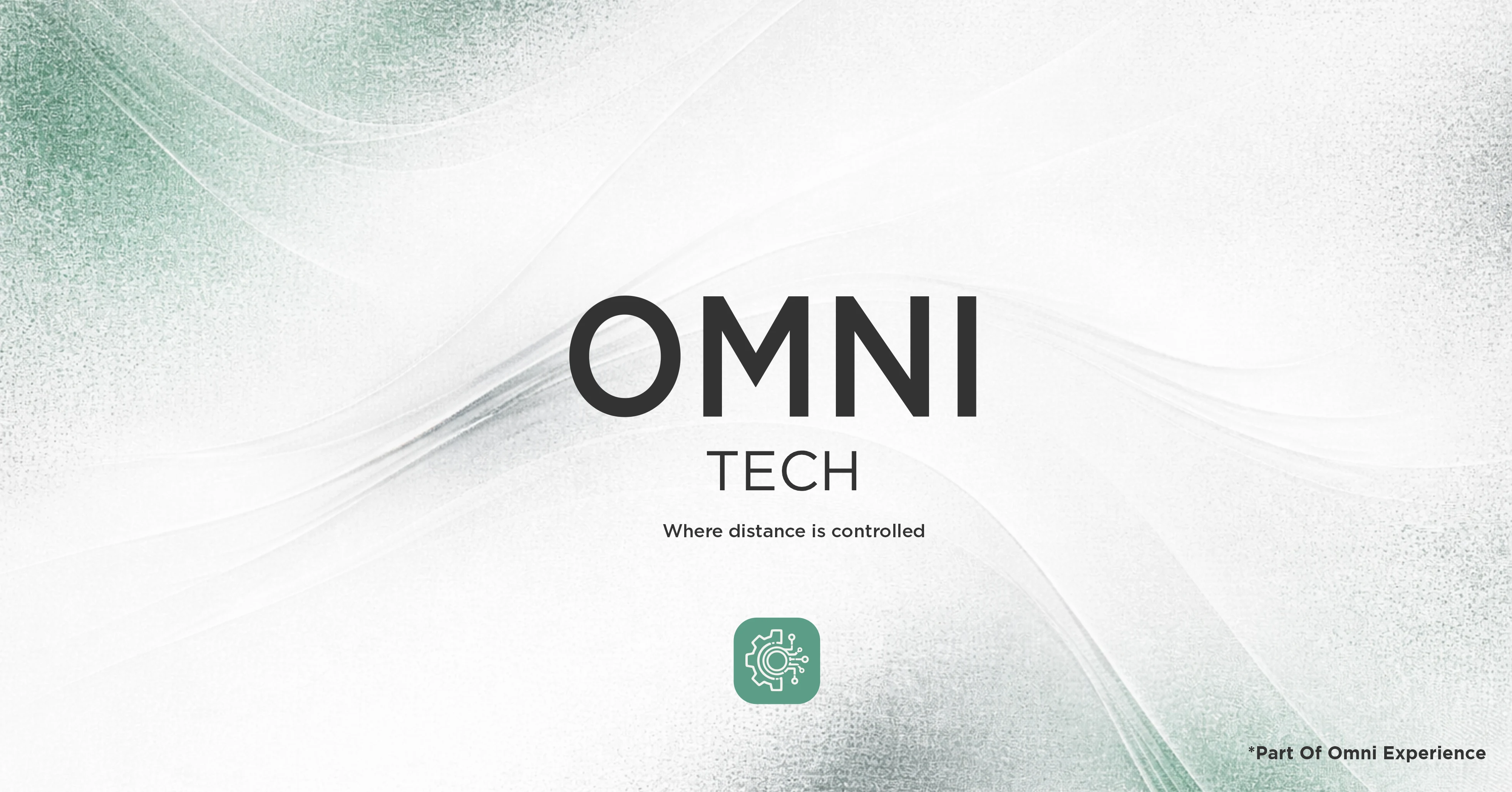
OMNI TECH — Sub-Brand Identity
OMNI TECH is presented as a focused extension of the master brand, maintaining the same typographic system and structured layout. The background gradient shifts toward Muted Teal Green, while the tech icon introduces a functional, system-oriented visual cue. The tagline “Where distance is controlled” defines its operational role within the ecosystem.
Why designed this way?
To ensure consistency while signaling specialization. The shared structure preserves brand unity, while the color and icon differentiate TECH as the technological core of the OMNI architecture.

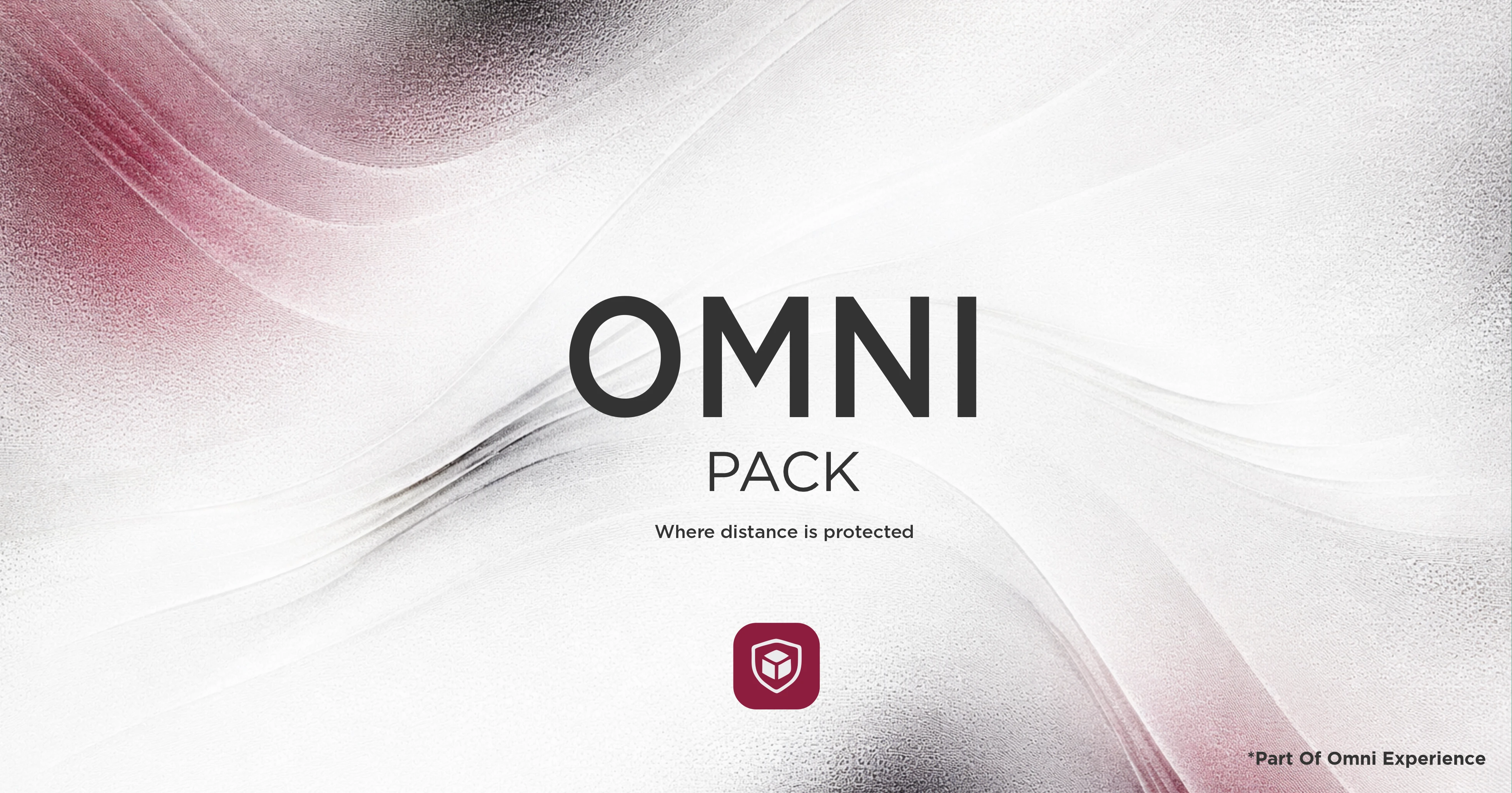
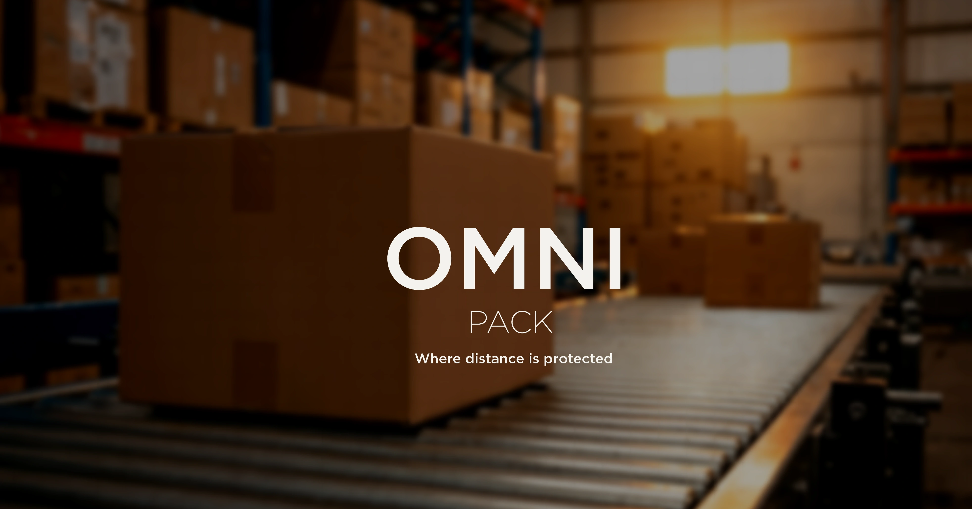
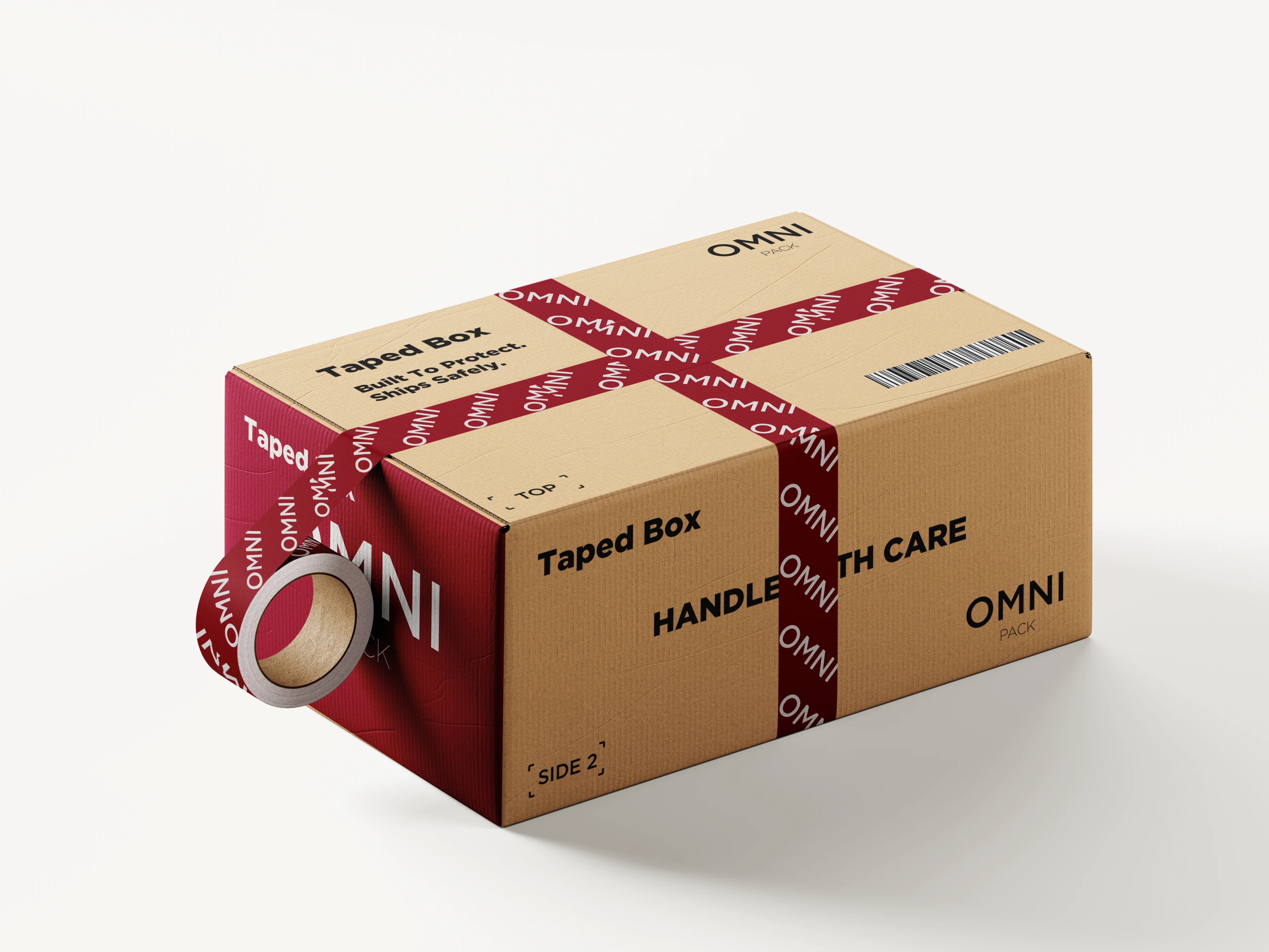
OMNI PACK — Sub-Brand Identity
OMNI PACK extends the master brand into packaging and protection services. The structure remains identical to OMNI TECH, preserving hierarchy and typography. The background shifts toward Deep Burgundy, and the shield-box icon reinforces protection and reliability. The tagline “Where distance is protected” defines its functional promise.
Why designed this way?
To maintain architectural consistency while clearly differentiating function. The color and symbol communicate safety and containment, positioning PACK as the protective layer within the OMNI ecosystem.
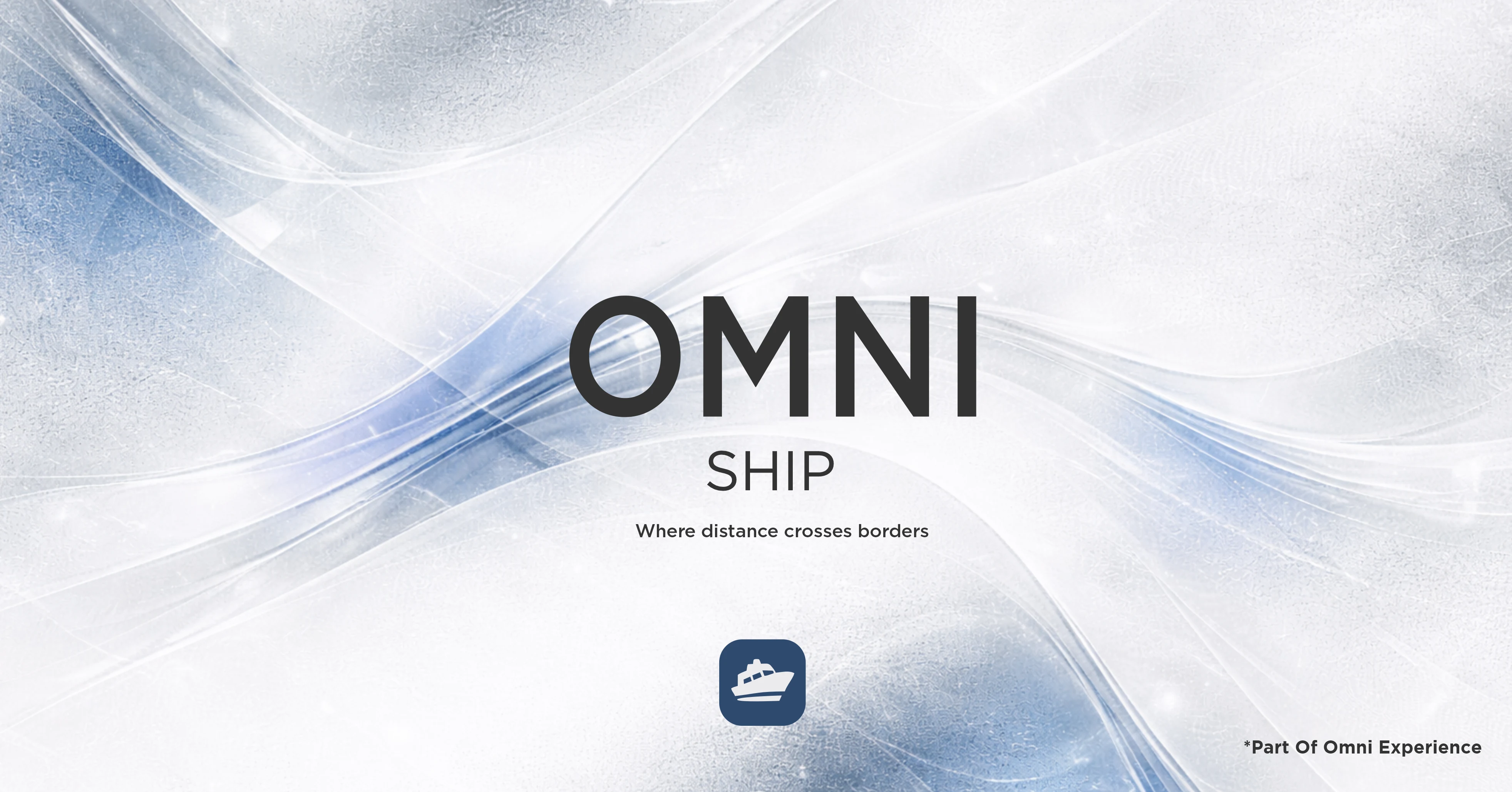
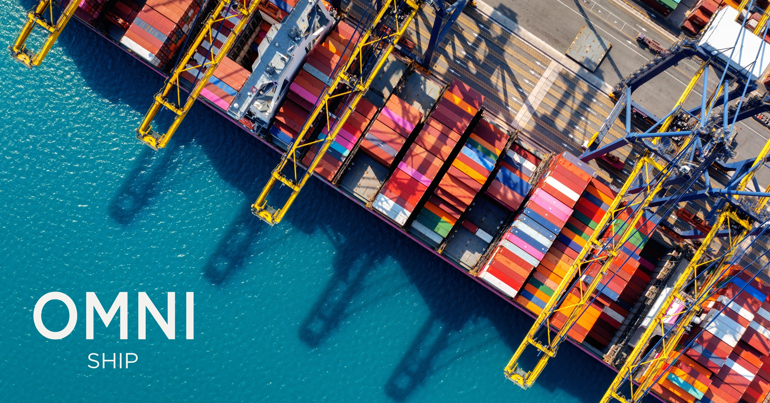
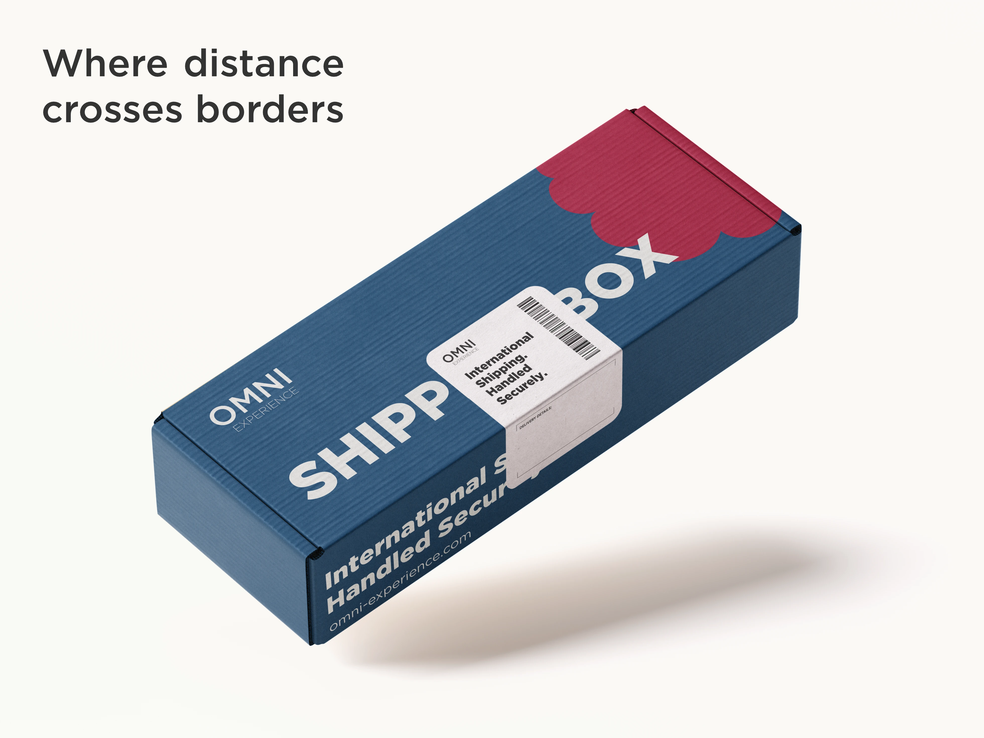
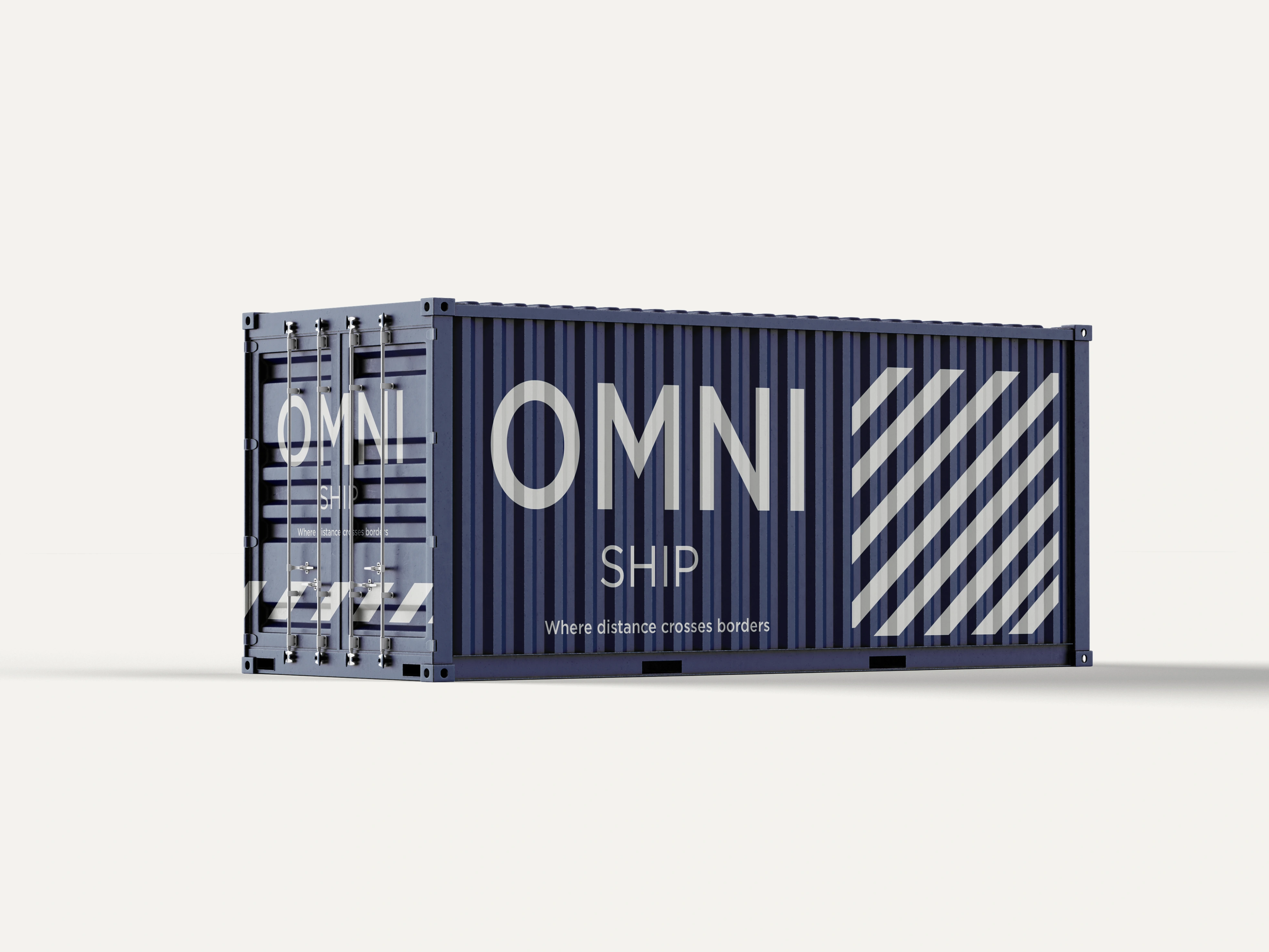
OMNI SHIP — Sub-Brand Identity
OMNI SHIP represents the logistics and transportation layer of the ecosystem. The typographic structure mirrors the master brand to preserve consistency. The gradient shifts toward Steel Blue, while the vessel icon clearly signals global movement. The tagline “Where distance crosses borders” defines its international scope.
Why designed this way?
To express motion, scale, and cross-border capability while remaining structurally unified. The blue tone reinforces trust and reliability, positioning SHIP as the global connector within the OMNI system.
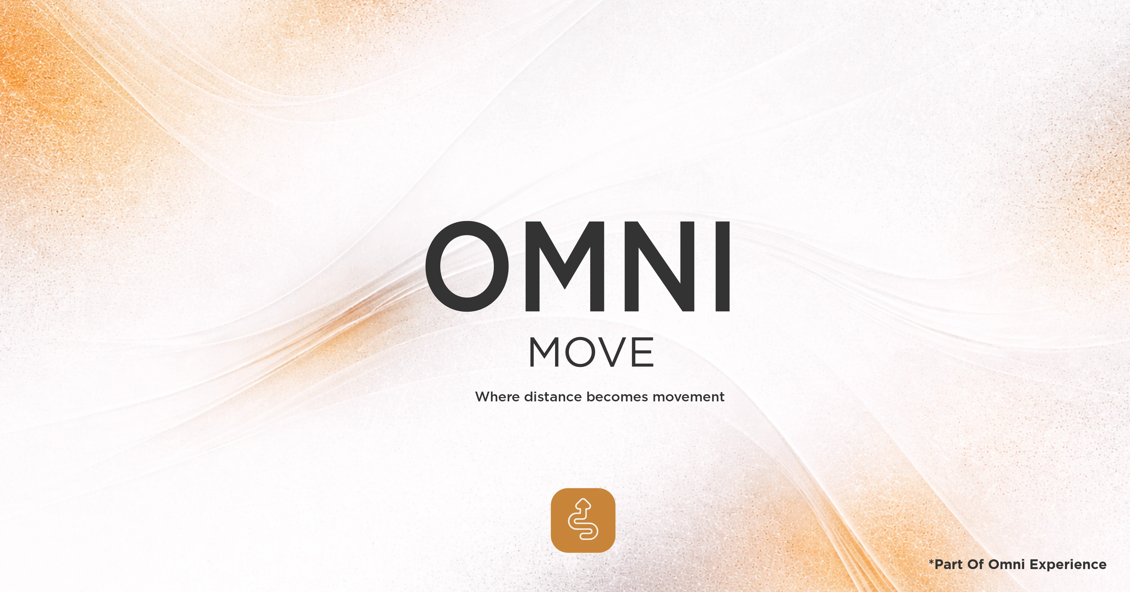
OMNI MOVE — Sub-Brand Identity
OMNI MOVE represents the final operational layer focused on physical movement and delivery execution. The layout follows the same typographic structure to preserve brand cohesion. The gradient shifts toward Warm Amber, and the directional path icon symbolizes flow and controlled motion. The tagline “Where distance becomes movement” defines its functional transformation.
Why designed this way?
To communicate energy and action while maintaining architectural unity. The warm tone introduces dynamism, positioning MOVE as the active force that brings the entire OMNI system into motion.


Summary
OMNI Experience was developed as a structured brand architecture system uniting multiple logistics and technology services under one master brand. The identity balances corporate clarity with emotional fluidity, combining a disciplined typographic system, modular sub-brand structure, and a controlled color framework. Each division maintains visual consistency while expressing a distinct operational role within the ecosystem.
The result is a scalable brand system designed to function across digital platforms, print, spatial environments, and large-scale applications without losing coherence.
Achievements
• Built a clear master brand with four structured sub-brands
• Developed a scalable visual architecture system
• Established consistent typography hierarchy and usage rules
• Created a defined color strategy for functional differentiation
• Designed cohesive iconography aligned with service roles
• Applied the system across stationery, signage, packaging, and outdoor media
• Ensured adaptability for both corporate and infrastructure-level environments
The project demonstrates how strategic structure and visual discipline can transform a multi-service company into a unified, institutional brand ecosystem.
Like this project
Posted Feb 20, 2026
Built a scalable master brand and four sub-brands, creating a clear visual hierarchy and real-world brand system for a complex business.
Likes
16
Views
10
Timeline
Apr 20, 2025 - May 11, 2025