Forni & Figli: Italian Heritage Restaurant Brand Identity
Mikhail Yakovlev
Case Study — Forni & Figli: Italian Heritage Restaurant Brand Identity
When I approached the Forni & Figli project, the objective was clear: create a brand identity that feels like it has existed for generations.
Not trendy.
Not modern minimalist.
Not fusion.
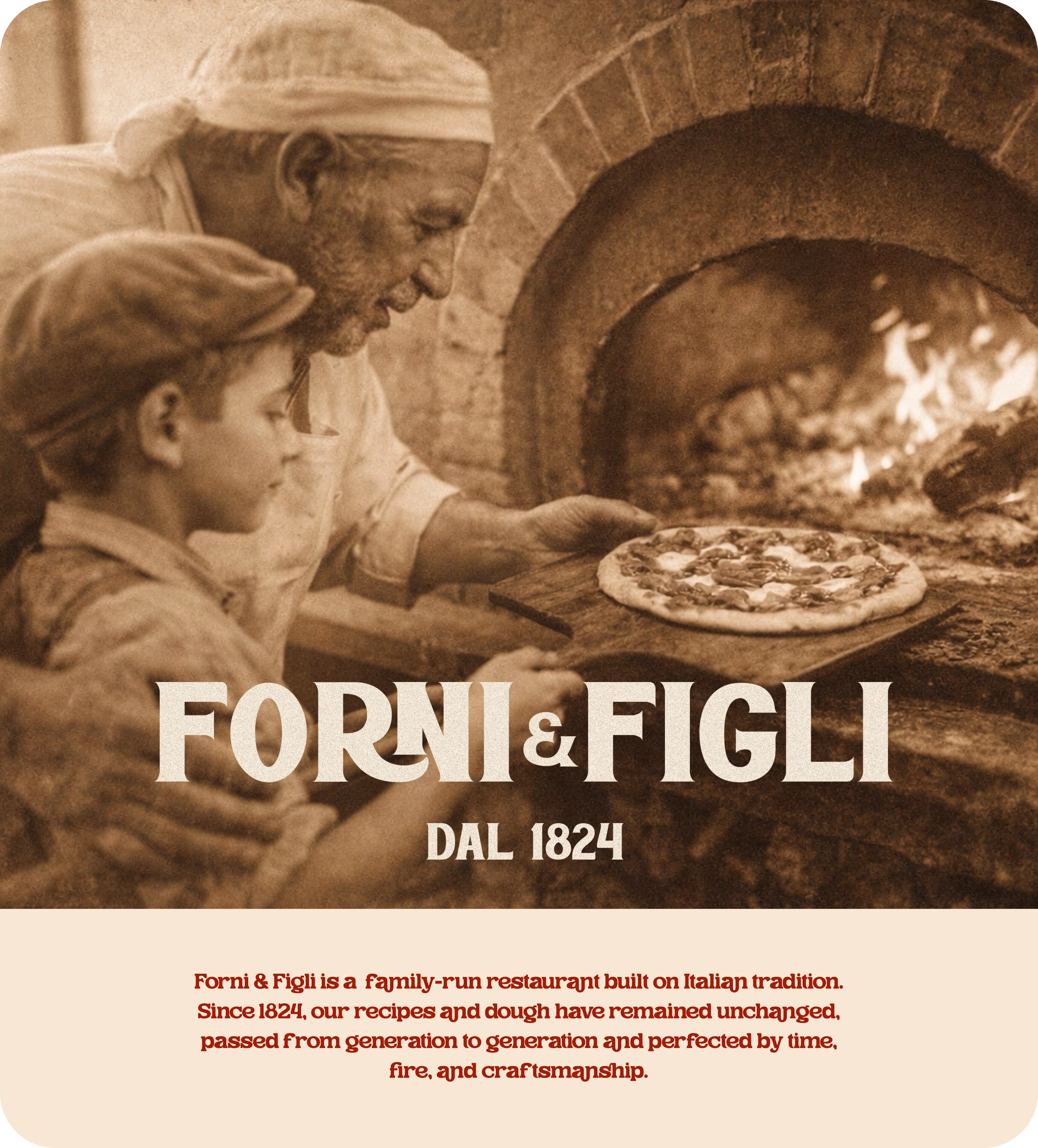
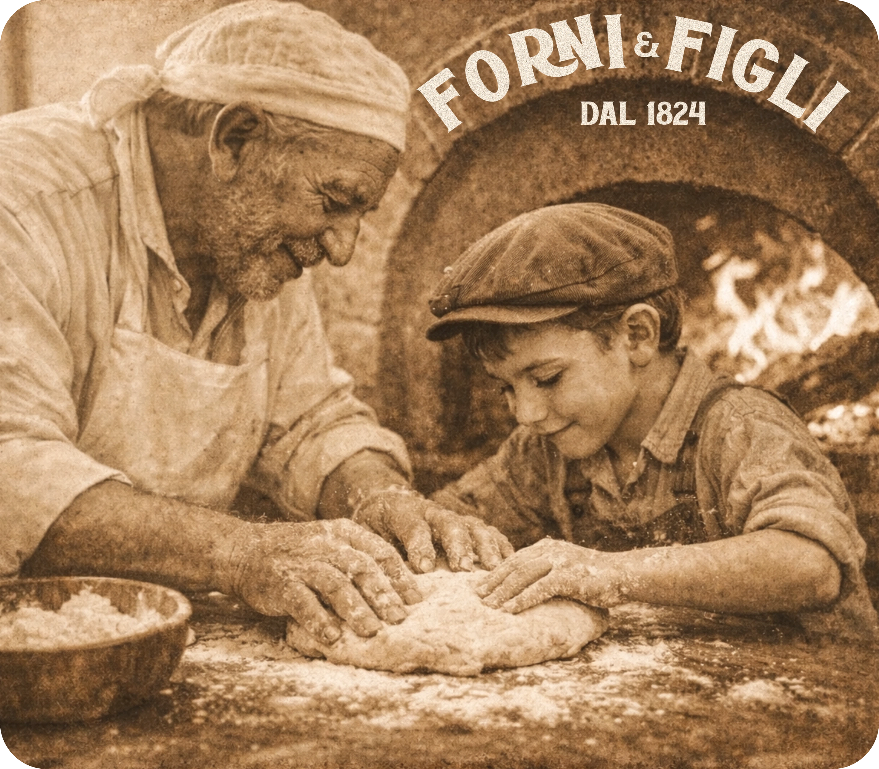
This brand had to feel like it was born in 1824 and never needed to change.
🧠 Project Context
Forni & Figli is positioned as a family-run Italian restaurant rooted in tradition.
The brand narrative centers around:
🍅 generational recipes
🔥 wood-fired craftsmanship
🇮🇹 Italian heritage
👨👩👦 family continuity
“DAL 1824” is not decoration.
It is the emotional anchor.
The identity needed to visually communicate legacy and authenticity before the first bite.
🧭 Problem & Objectives
The challenge was to create an identity system that:
✔ feels historic but not outdated
✔ communicates family legacy
✔ supports packaging and signage
✔ stands out in a crowded pizza category
✔ feels rooted in Italian culture without becoming cliché
The brand had to feel handcrafted and inherited — not manufactured.
🔎 Design Strategy
The system was built around three pillars:
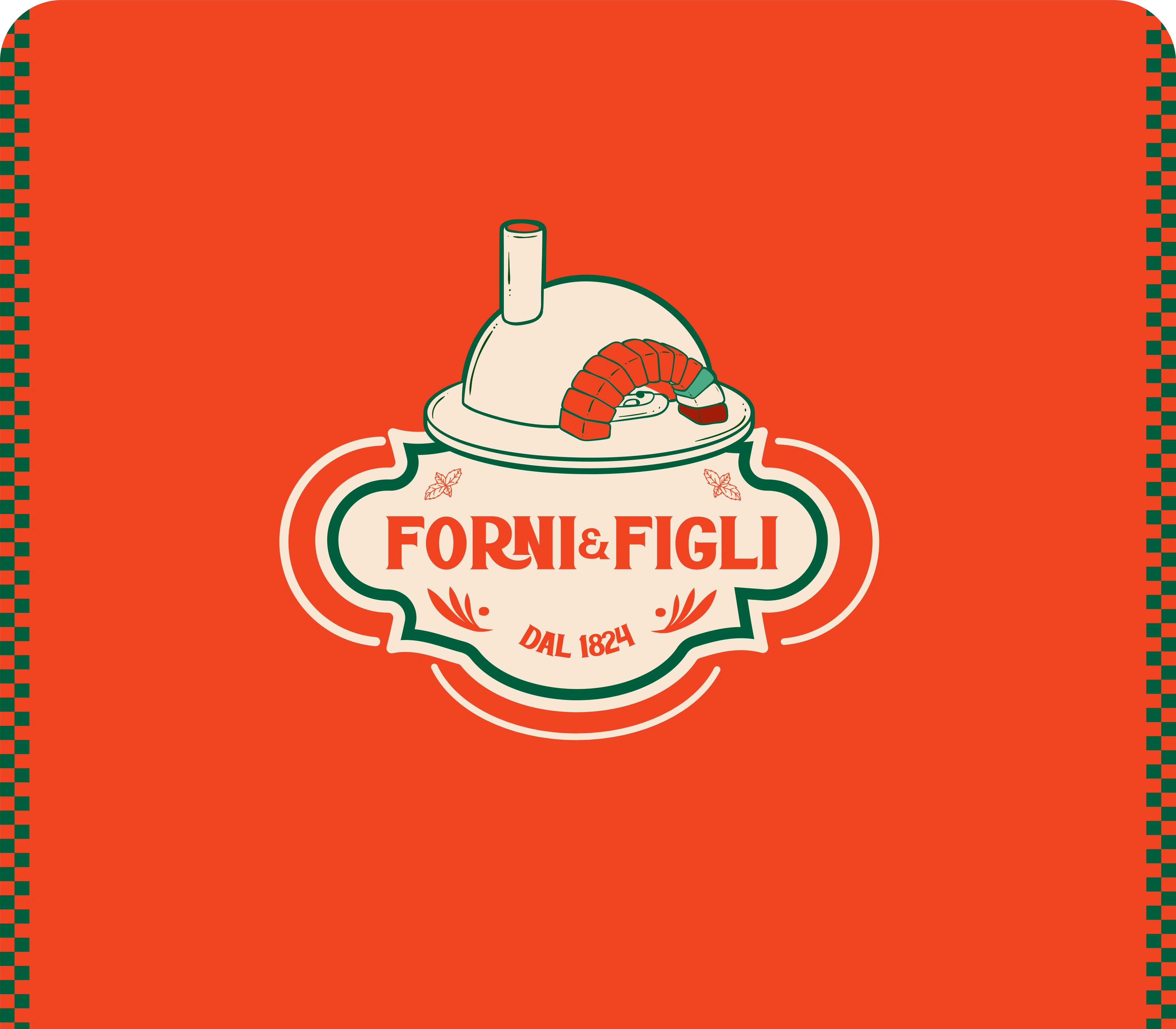
1. Heritage as Foundation
The logotype carries vintage structure and weight.
It feels established, not experimental.
“DAL 1824” reinforces lineage and permanence.
The typography has character — slightly bold, slightly retro — referencing classic Italian signage and old packaging marks.
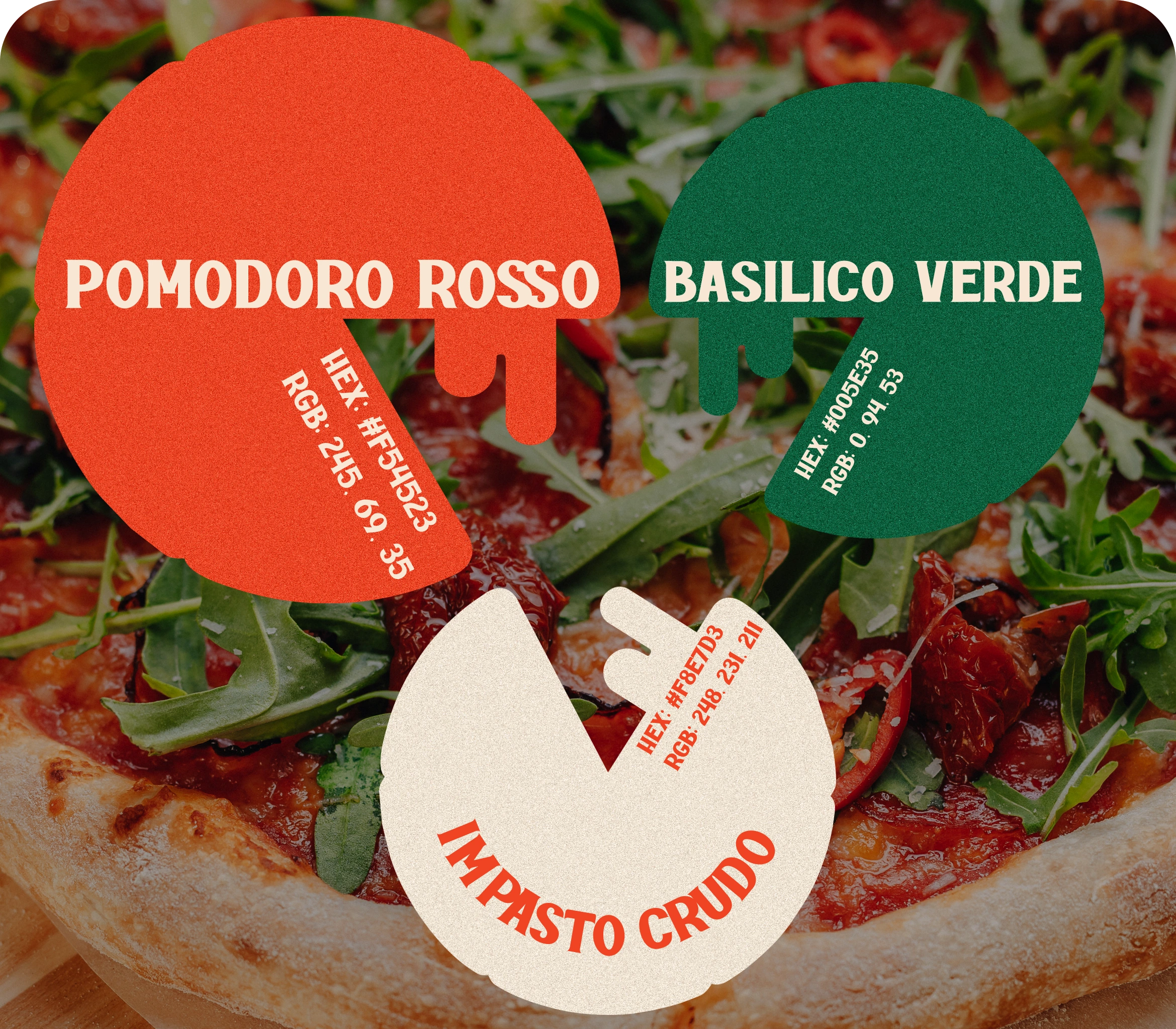
2. Color as Cultural Code
The palette directly references Italian culinary identity:
Pomodoro Rosso — HEX #F54523
Basilico Verde — HEX #005E35
Neutral cream background — HEX #F8E7D3
These are not arbitrary red and green tones.
They are ingredient-driven.
Tomato. Basil. Dough.
The brand color system feels edible and rooted in food culture.
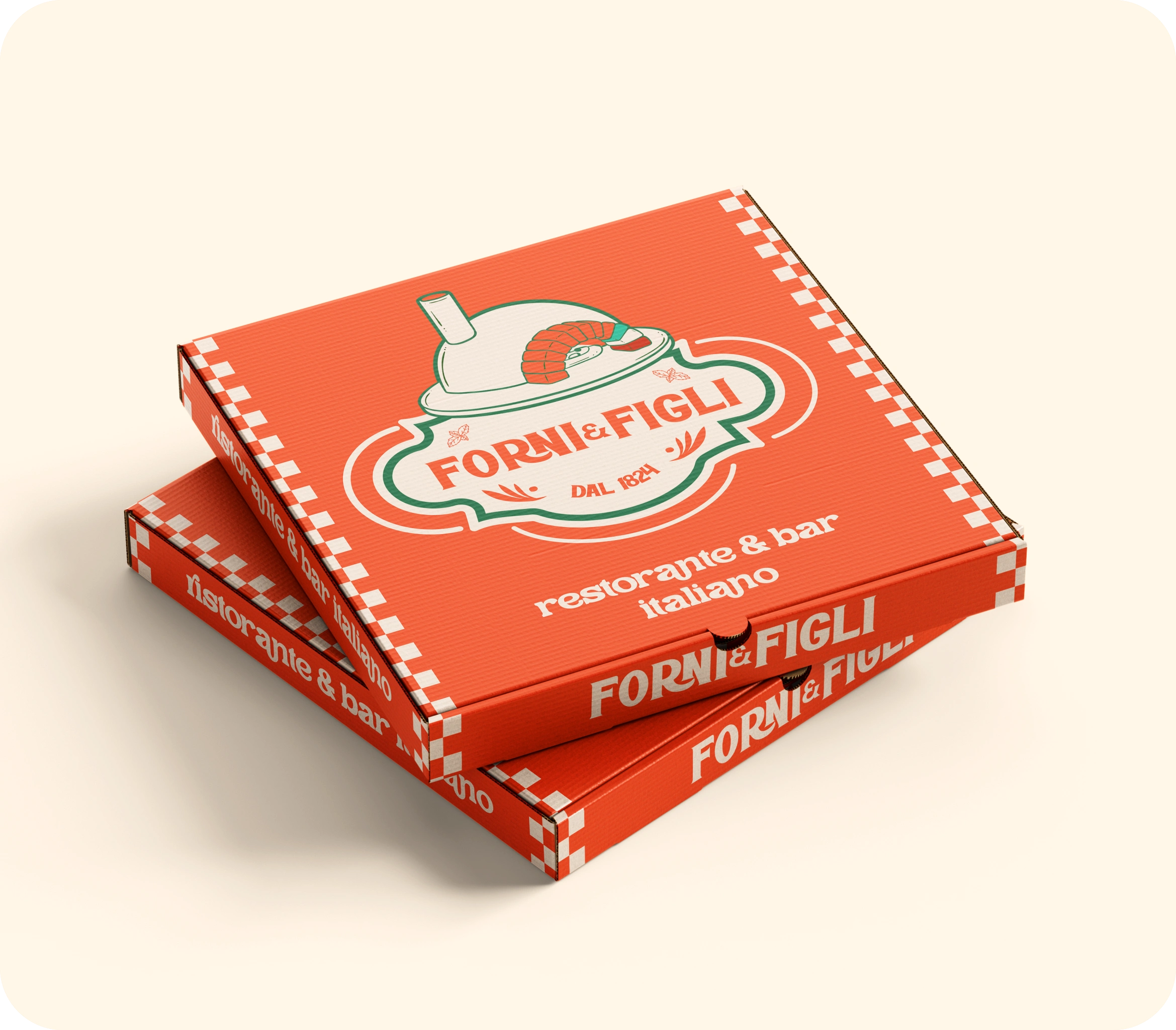
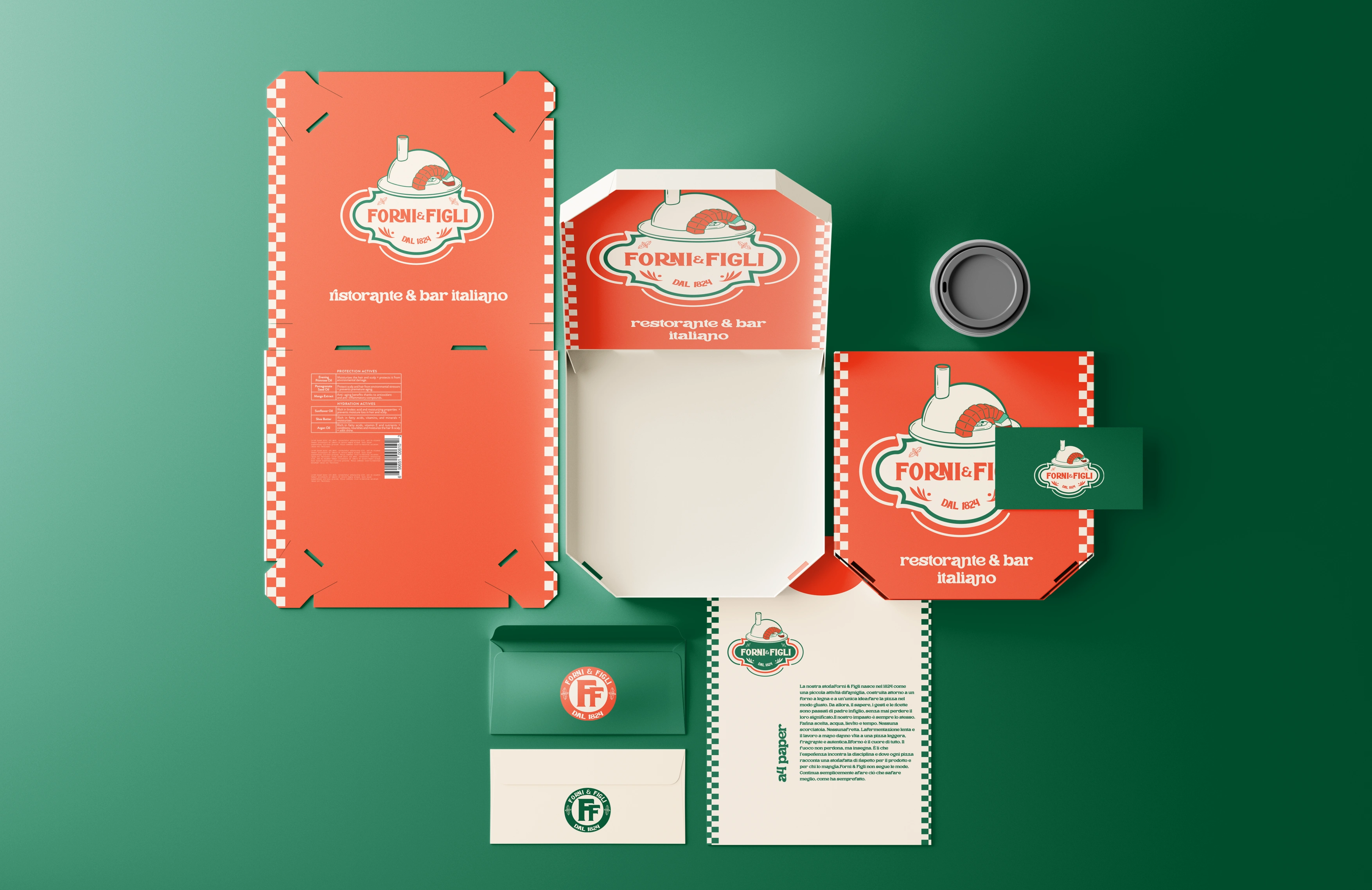
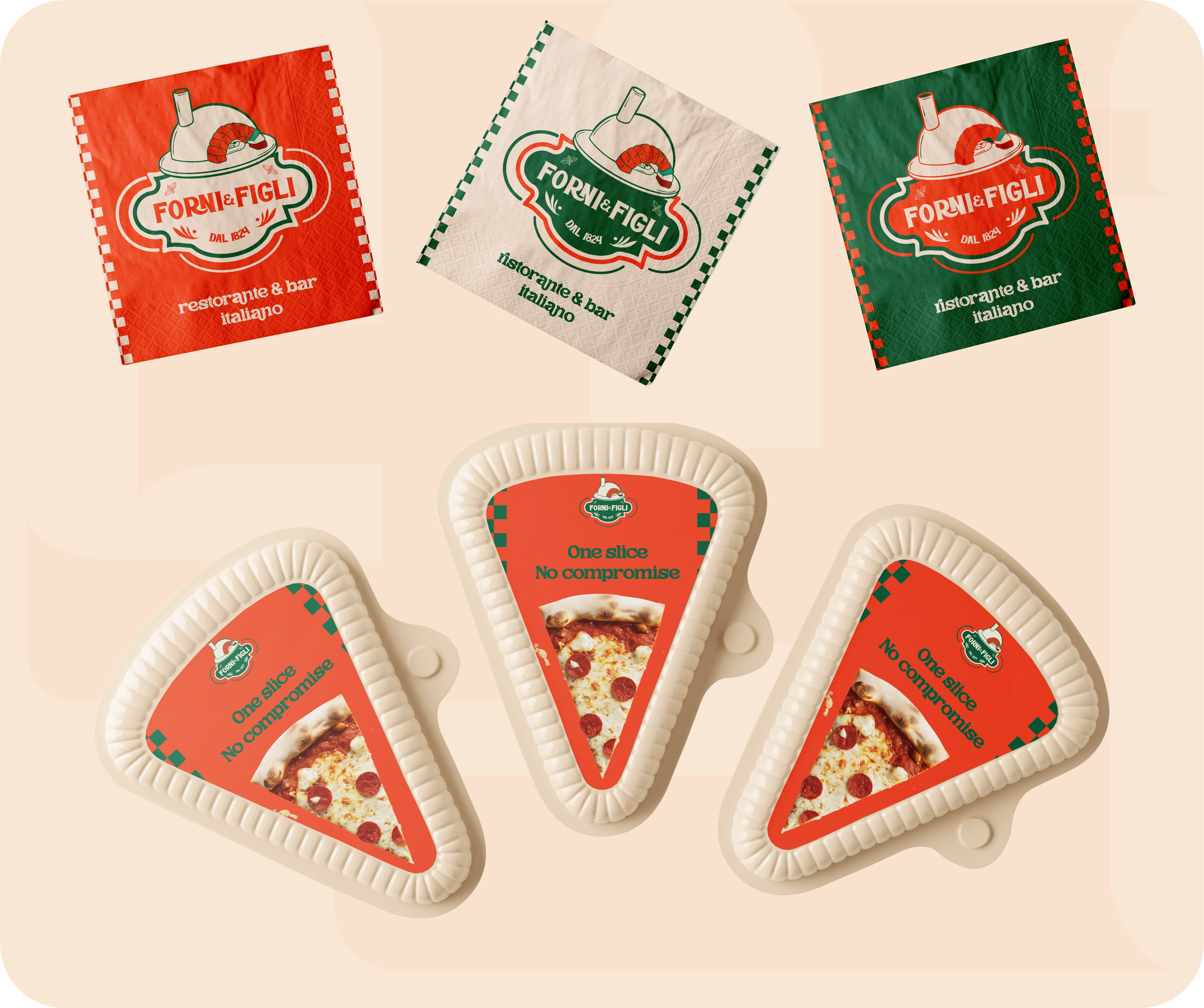
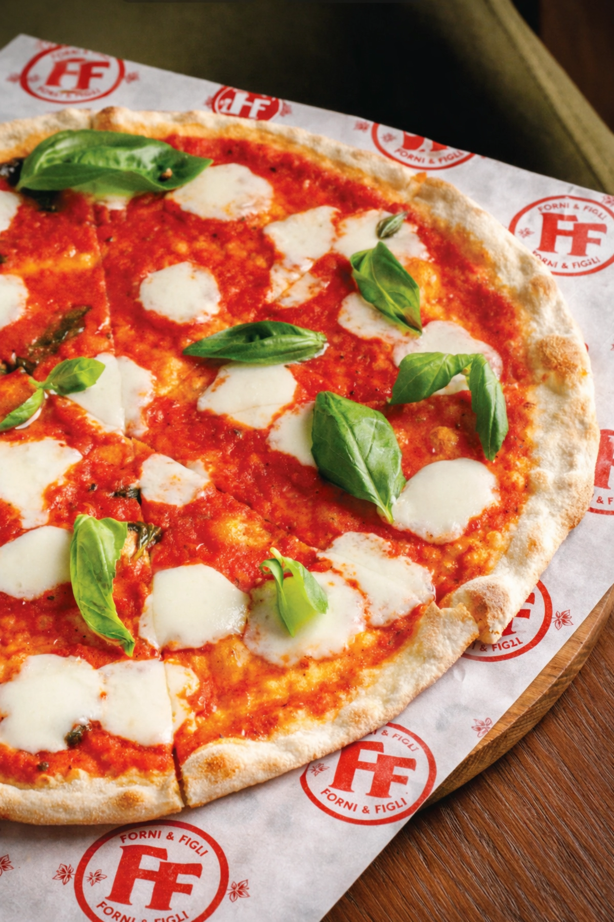
3. Packaging as Presence
The pizza boxes and printed materials are bold and unapologetic.
Large typographic treatments.
High-contrast color blocking.
Strong brand visibility from distance.
This ensures:
✔ shelf impact
✔ takeaway visibility
✔ immediate recognition
Unlike Pelagos, which whispers, Forni & Figli speaks confidently.
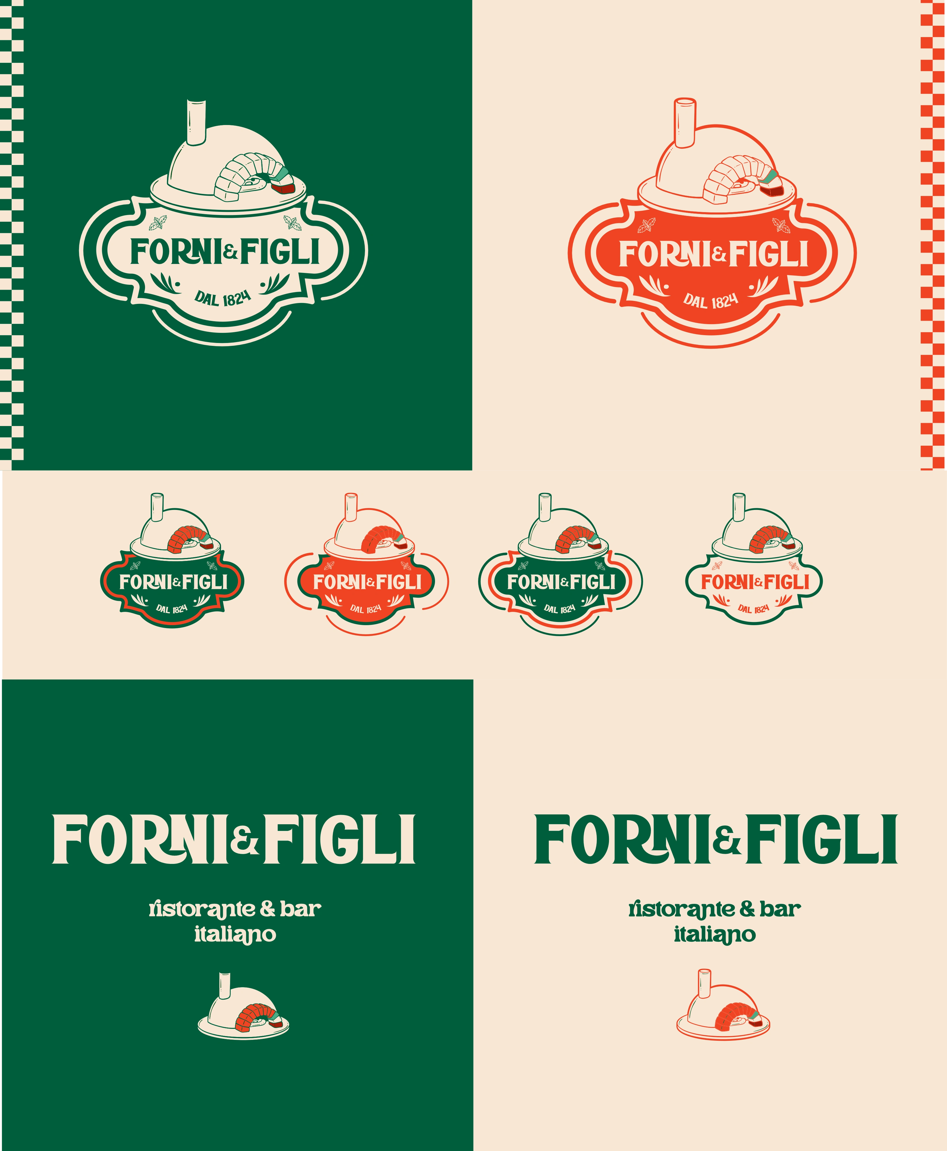
🧱 Identity Components
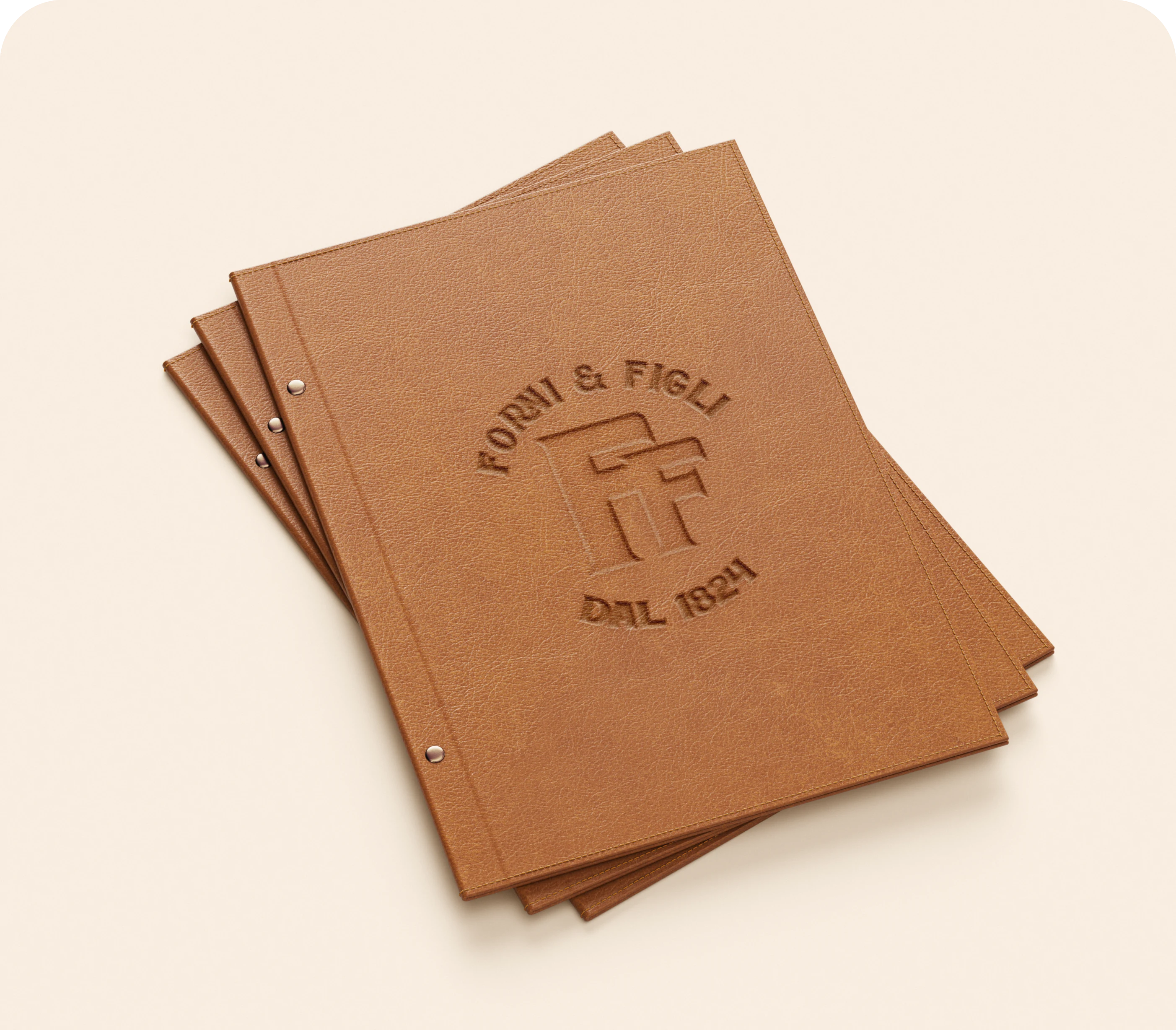
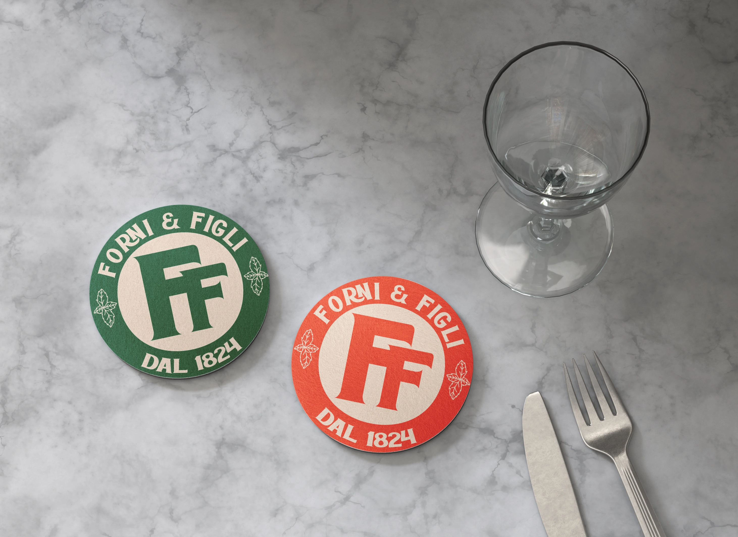
Logo System
The mark includes:
• Primary heritage lockup
• Horizontal usage
• Badge-style variations
• Restaurant & Bar sub-line
The badge construction references traditional Italian emblems and historic food brands.
It feels rooted and structured.
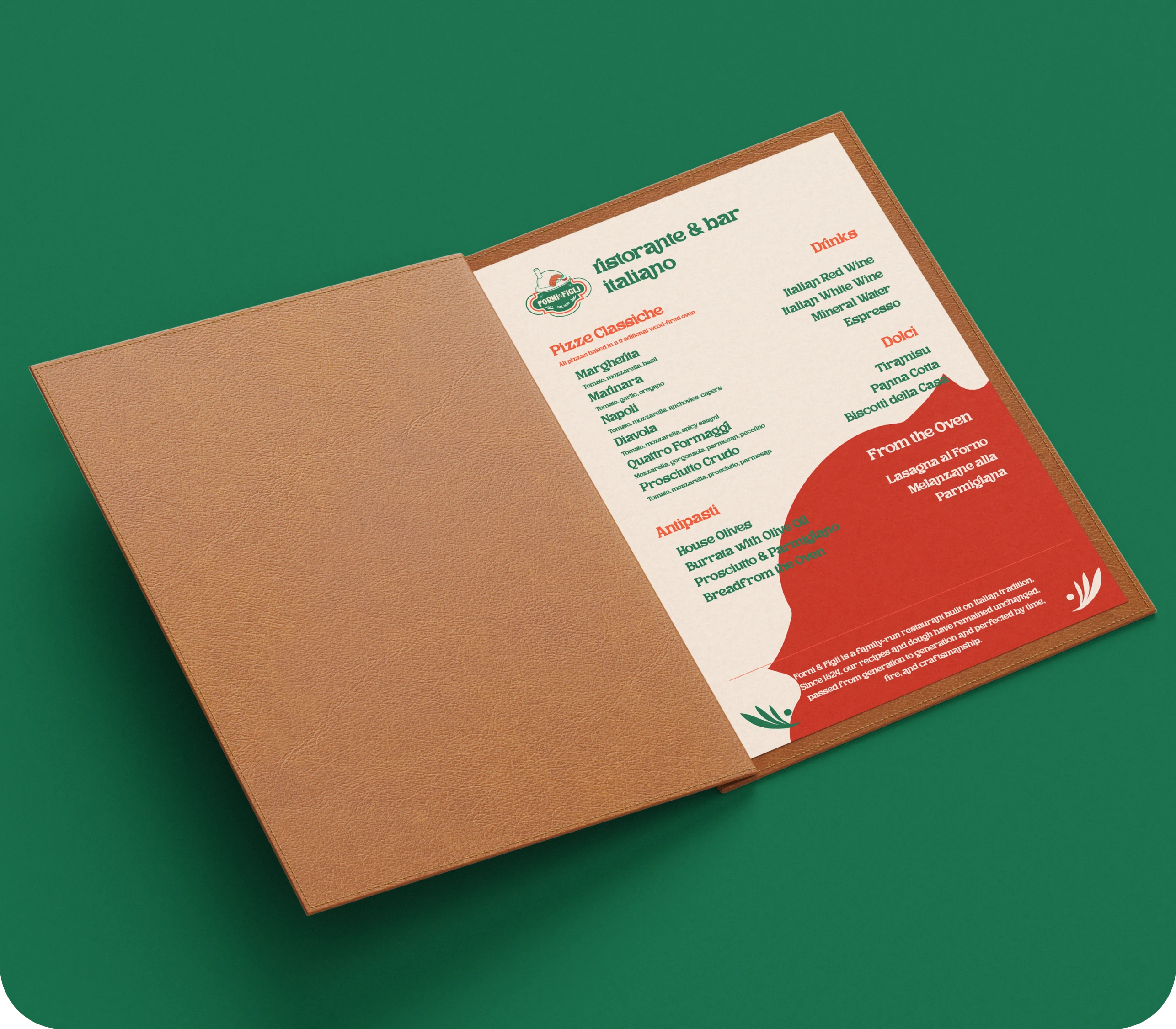
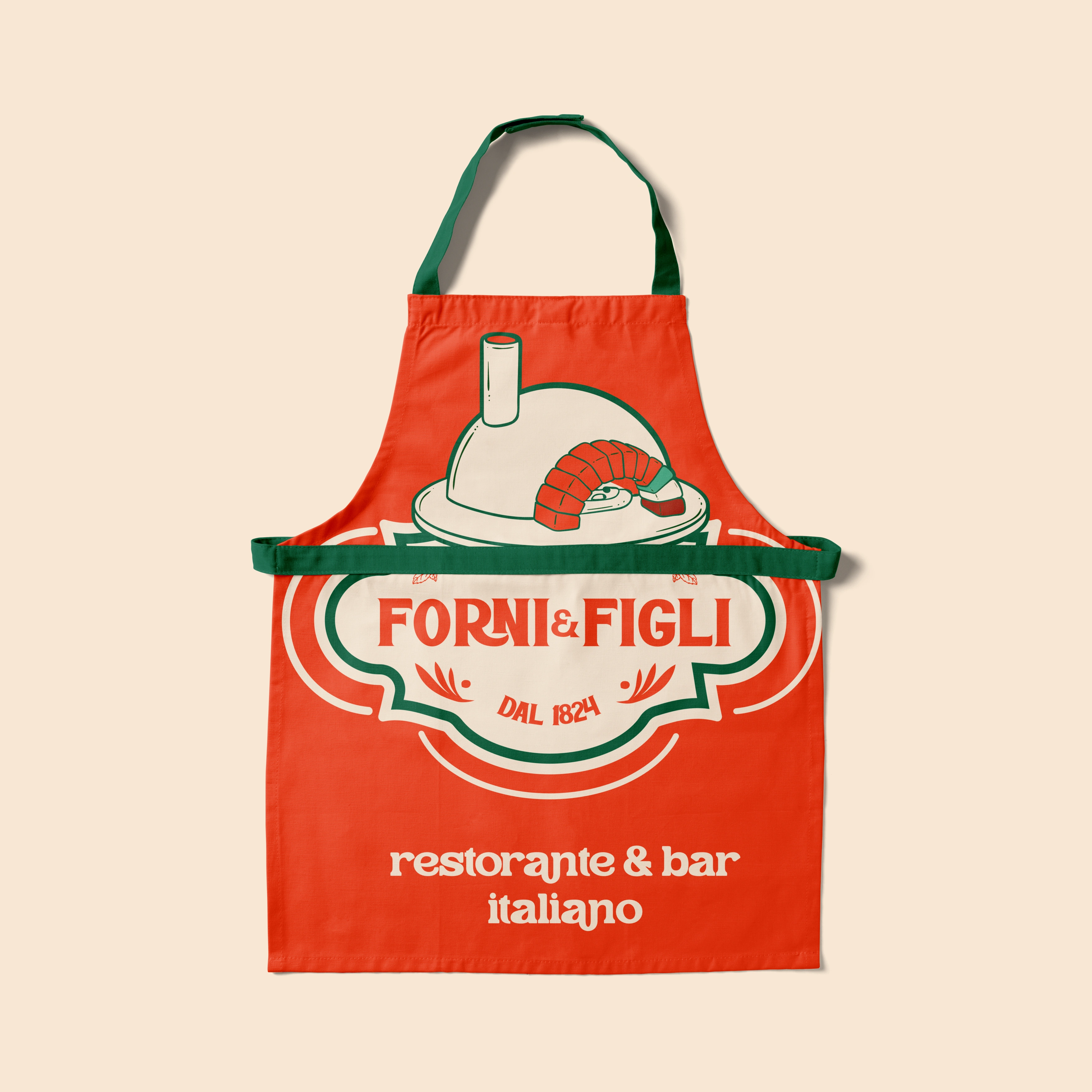
Identity in Action
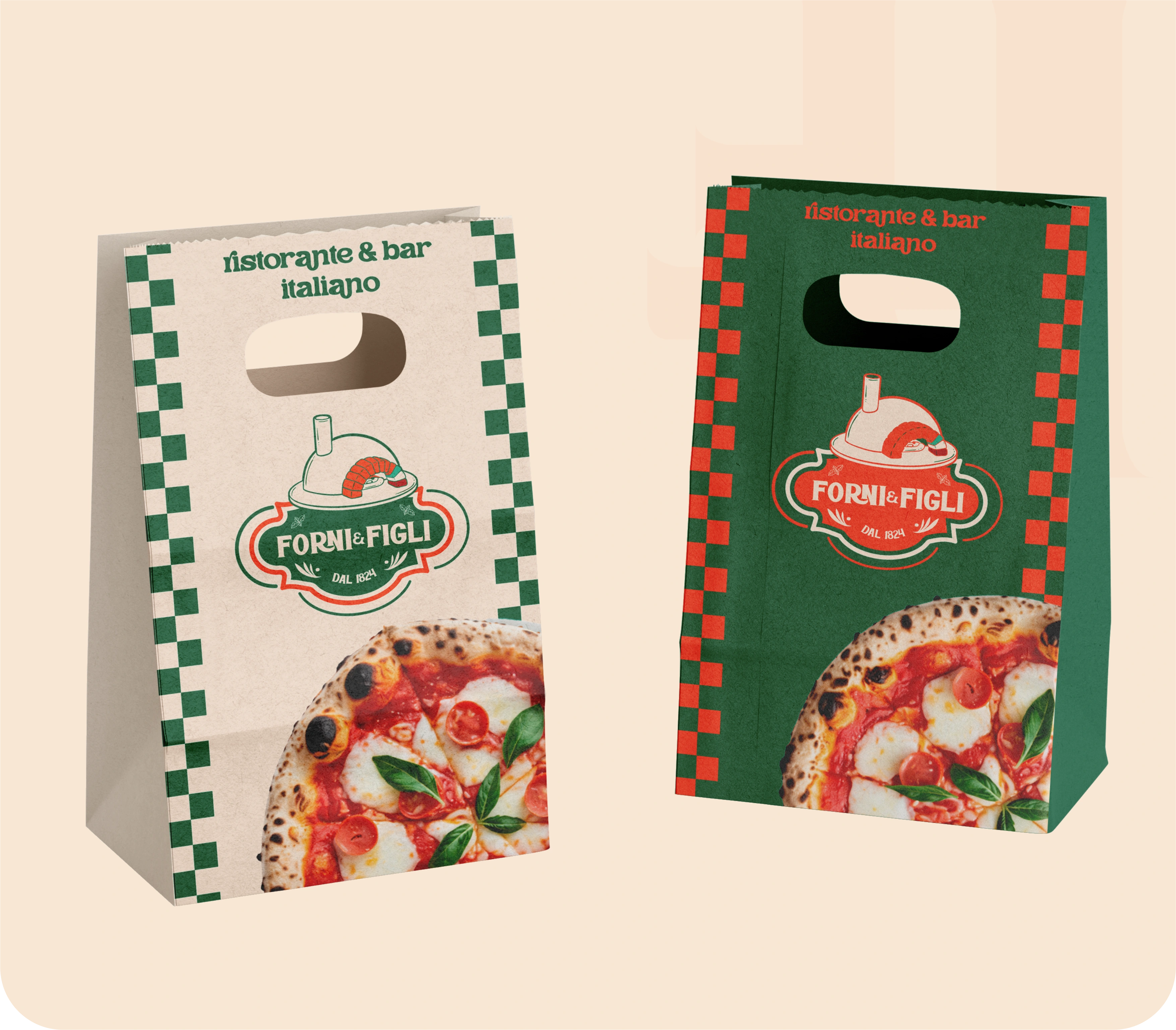
Packaging
The pizza boxes are the hero.
They act as mobile billboards — bold, vibrant, unmistakable.
The typography scales dramatically, ensuring presence during delivery and takeaway.
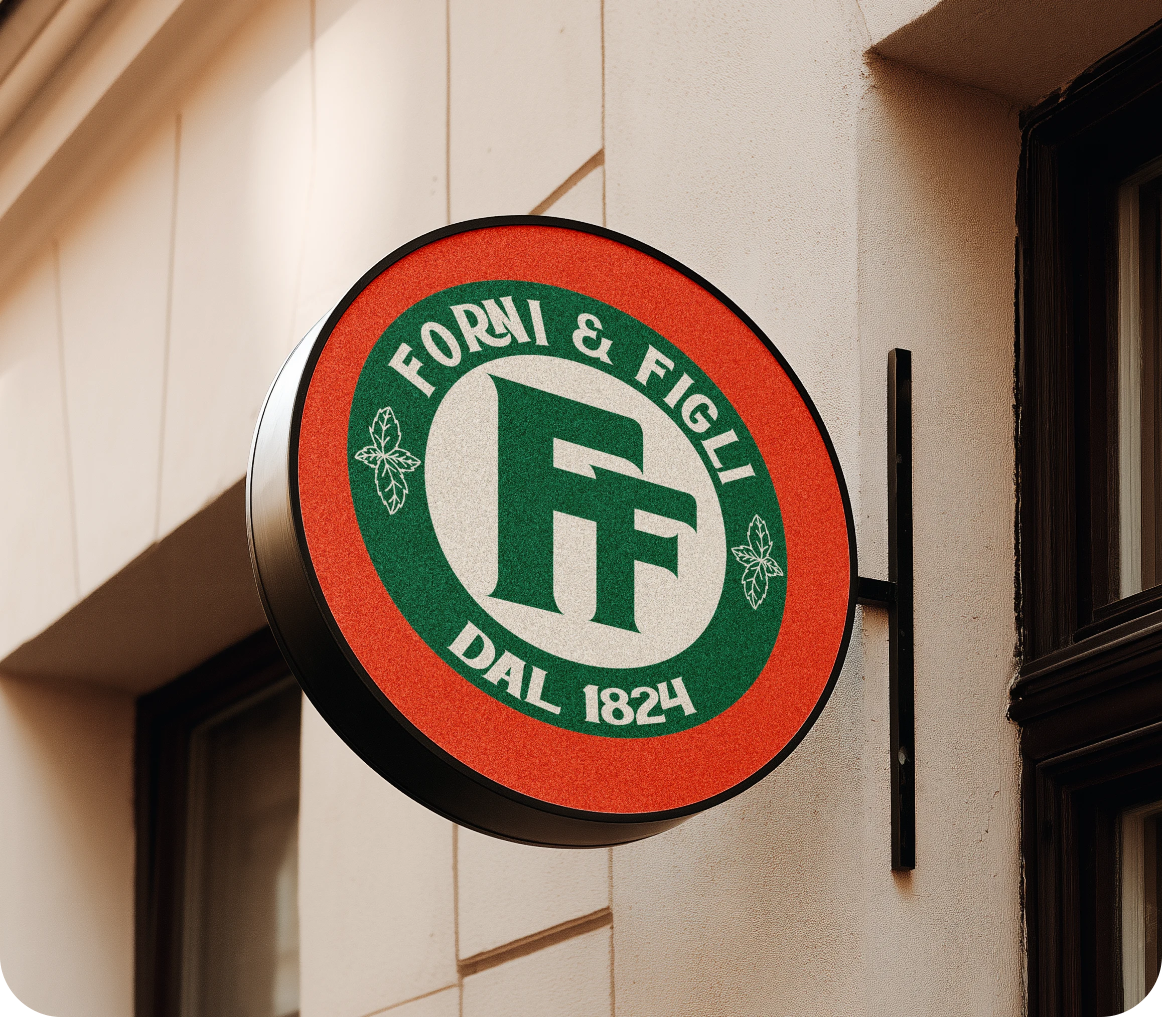
Signage
Exterior signage and badge variations feel authentic — like a restaurant that has been there for decades.
Not temporary.
Permanent.
Brand Extensions
Stickers, menu prints, box interiors, and collateral maintain cohesion.
The system is scalable across:
• delivery
• dine-in
• promotional materials
📌 Strategic Value
Forni & Figli positions itself as:
✔ tradition-driven
✔ confident and bold
✔ heritage-rooted
✔ culturally authentic
✔ recognizable and scalable
The identity builds trust instantly because it feels inherited.
Like this project
Posted Feb 19, 2026
Italian heritage brand identity design for a family-run restaurant, including logo, packaging, typography, and visual system.