pro
Mauricio Pontual
Senior Art Director | AI Campaigns, Branding & Films



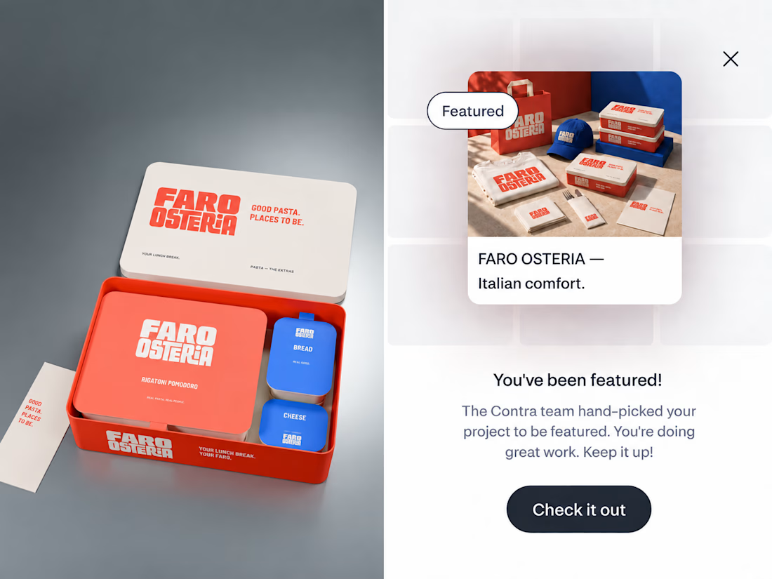
FARO OSTERIA just got featured on Contra! ✨
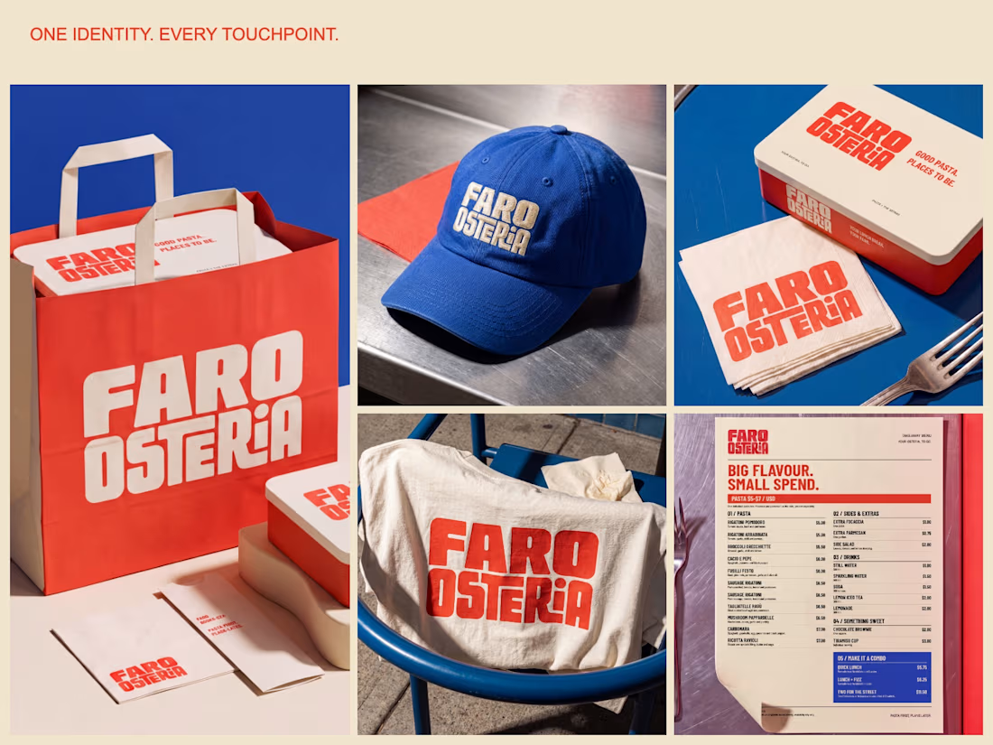
Really happy to see this one selected by the Contra team. I loved building the world around it, from the red pasta boxes and blue caps to the menu and street campaign.
Thank you, Contra, and everyone who has taken a look and supported...

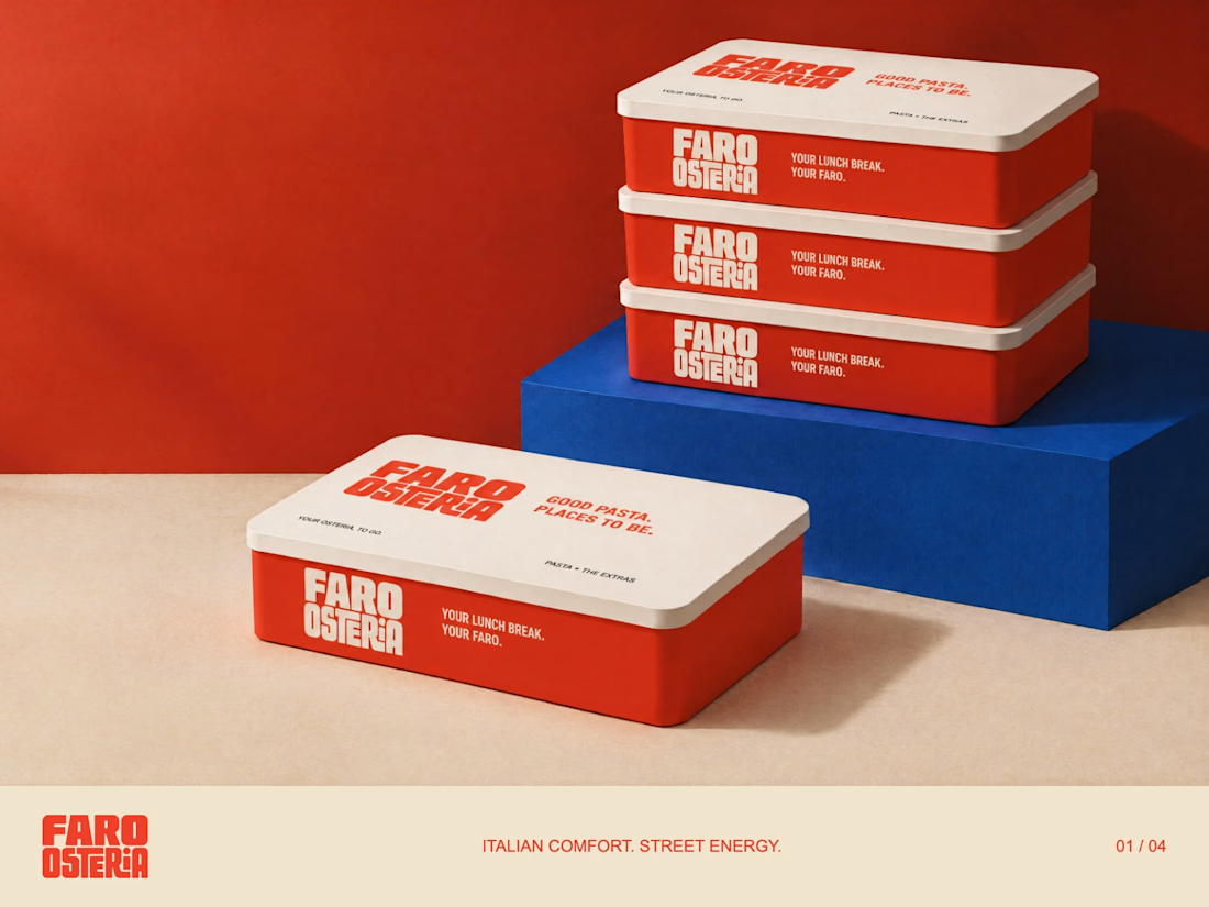
FARO OSTERIA — Italian comfort. Street energy.
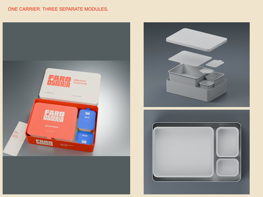
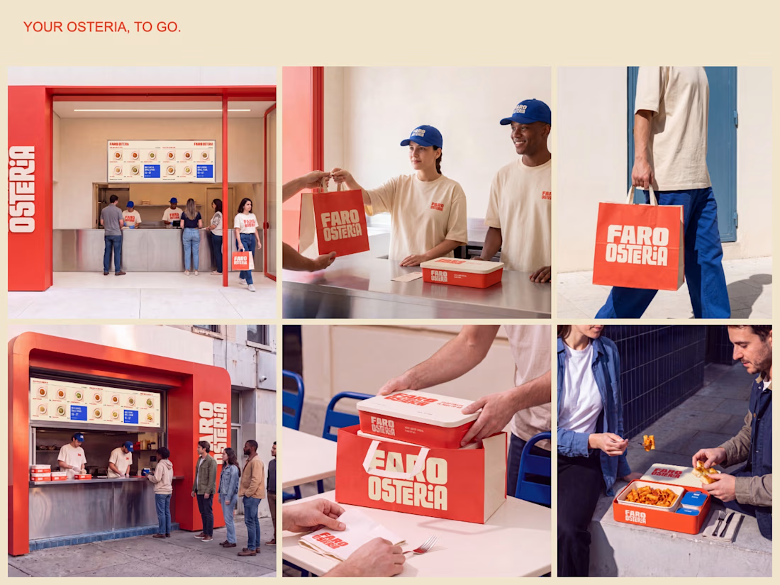
A brand and takeaway concept built around the entire meal: bold packaging, a clear digital menu and a street presence that carries the same identity from counter to customer.
The packaging study uses one carrier with separate pasta,...


BEYOND CAPSULE — Brand Identity, Packaging & Art Direction
Know what is inside.
An independent identity for a fictional US-market supplement line, developed from the information on the label outward.
The starting point was a nutraceutical brand with a futuristic aesthetic. The...


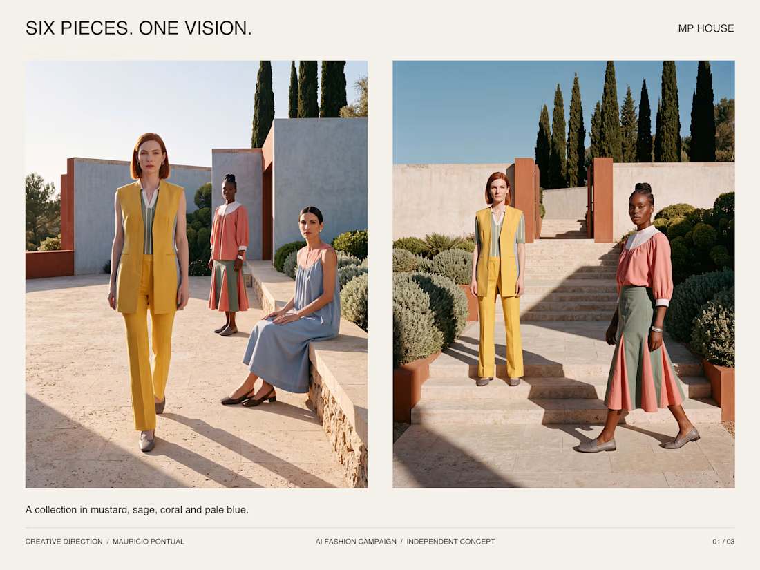
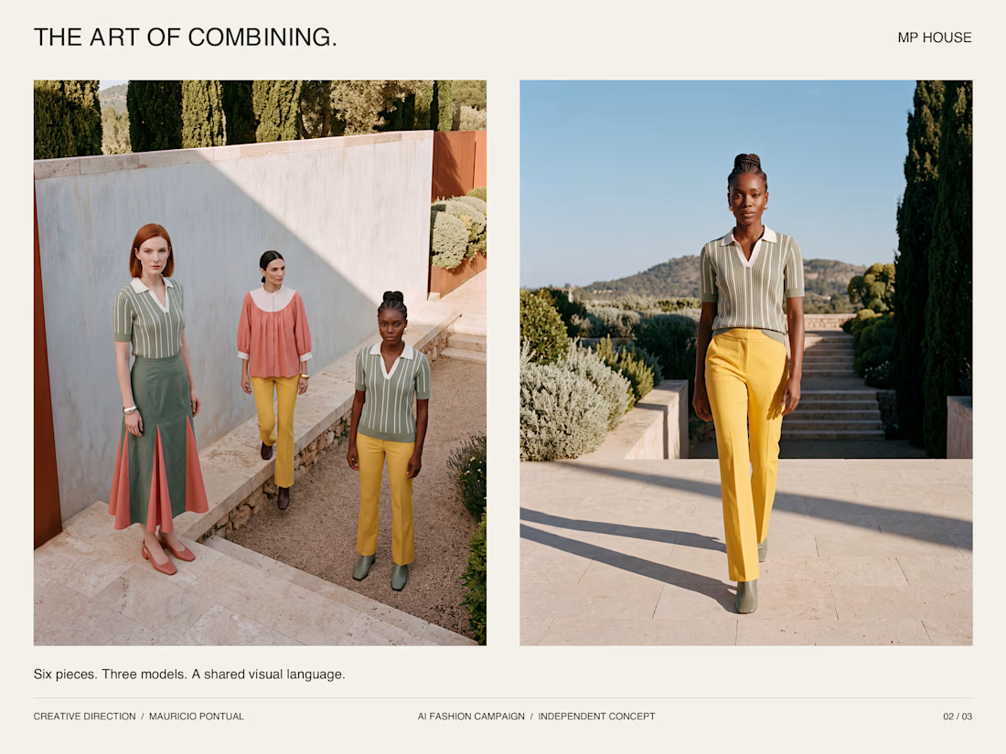
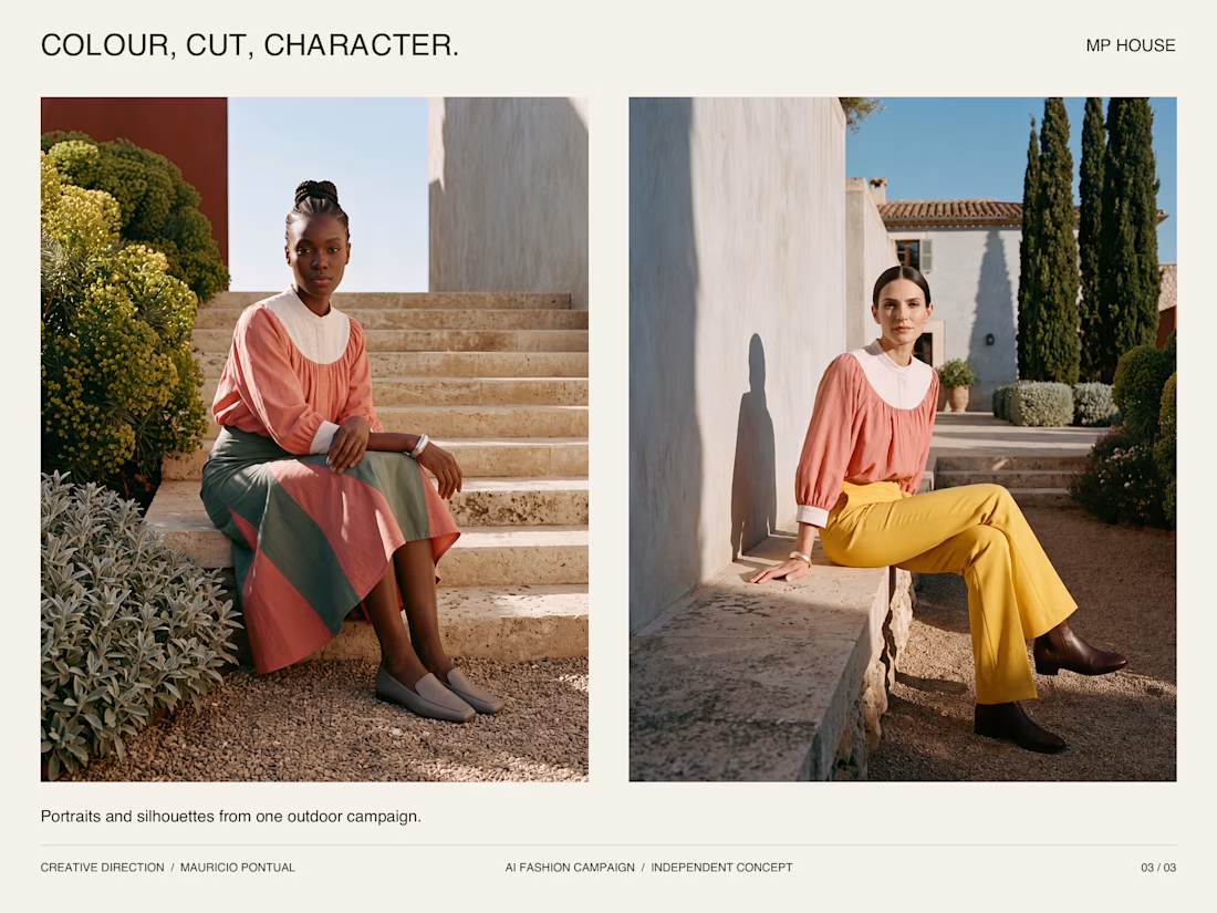
SIX PIECES. ONE VISION.
A conceptual fashion campaign by MP House.
I built a six-piece collection around mustard, sage, coral and pale blue, then explored how those pieces could work together across different looks. The same palette connects the clothing, casting, styling and...


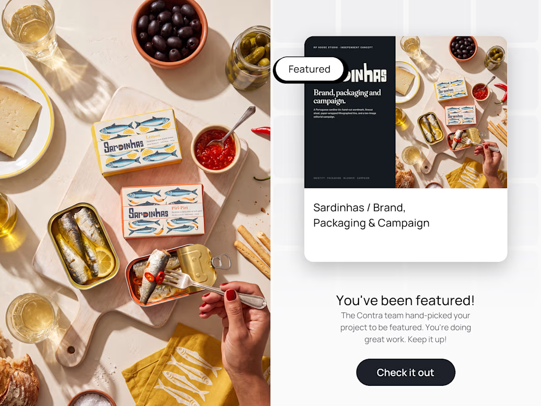
Sardinhas was hand-picked by the Contra team to be featured.
An independent brand concept for a Portuguese sardine tin, built end to end: identity, illustration, packaging, 3D and a ten-image editorial campaign. Hand-cut wordmark, linocut shoal, paper-wrapped lithographed tins...