

Product Designer · Scaling ideas · Mobile · Web · Motion


Product Designer · Scaling ideas · Mobile · Web · Motion


App Designer | Top 1% on Contra | Over 15M downloads
App Designer | Top 1% on Contra | Over 15M downloads


Multidisciplinary designer - Brand, Web, Apps


Multidisciplinary designer - Brand, Web, Apps





Software Architect | From Idea to Production | 140+ Projects
- $100k+
- Earned
- 5x
- Hired
- 5.0
- Rating
- 116
- Followers
Software Architect | From Idea to Production | 140+ Projects


Kajabi Expert - Branded Mobile App Specialist

Kajabi Expert - Branded Mobile App Specialist


Mobile Apps for Businesses & SaaS | UX/UI + Flutter
- $5k+
- Earned
- 4x
- Hired
- 5.0
- Rating
- 147
- Followers
Mobile Apps for Businesses & SaaS | UX/UI + Flutter


AI Automation & Full-Stack Developer | Agents, Apps, n8n
- $25k+
- Earned
- 4x
- Hired
- 5.0
- Rating
- 28
- Followers
AI Automation & Full-Stack Developer | Agents, Apps, n8n



UX/UI Designer for SaaS, Web Apps & Mobile | 7+ Years
- $1k+
- Earned
- 1x
- Hired
- 5.0
- Rating
- 166
- Followers
UX/UI Designer for SaaS, Web Apps & Mobile | 7+ Years
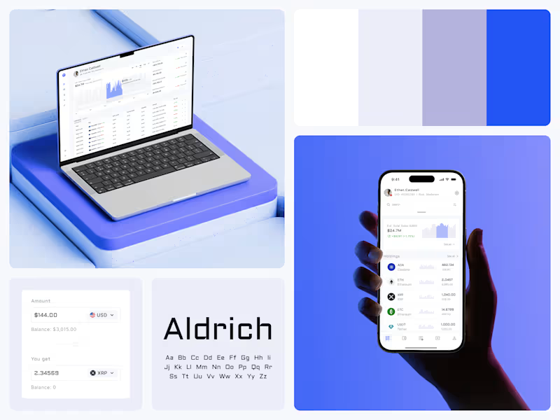
Crypto Portfolio Dashboard
Blue means one thing here: the range you are looking at.
The value chart is a row of thin gray bars, and only the selected date range fills in blue. You read the period that matters and keep the months around it as context.
The phone carries the same chart above the holdings list. Each coin gets its own small bar chart between the name and the amount, so you can scan the whole portfolio for movement without opening a single coin.
Trading screens get busy fast. This one stays light and calm, so the numbers lead: total value, realized and unrealized P&L and open positions, all on one screen.
Designed by the Hue & Machine team.
#Crypto #Fintech #DashboardDesign #TradingPlatform #DataVisualization #UIDesign #ProductDesign #WebApp #MobileDesign #FigmaDesign
73
134
6.3K

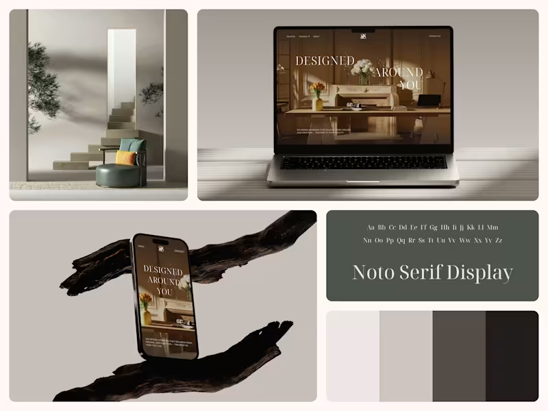
X Gallery - Art Gallery Platform Website
Designing for art without competing with it.
Sometimes the best design work is knowing what not to add.
#WebDesign #UIDesign #MinimalDesign #ArtTech #PortfolioDesign
3
335

Smart Lighting Control App - IoT / Smart Home
The UI should feel like the light itself
What if adjusting your lamp felt less like tapping settings and more like dimming a real switch. The circular brightness control mirrors the glow, the 3D lamp renders show you exactly what you're changing before it changes, and the whole interface sits in darkness so the light is the only thing that pops.
My personal fav detail is the color picker on the saturation screen. You just tap a color and watch the lamp respond. The people who use smart home apps at midnight don't want to think. They want to feel.
#SmartHome #IoT #MobileDesign #UIDesign #DarkUI
4
446