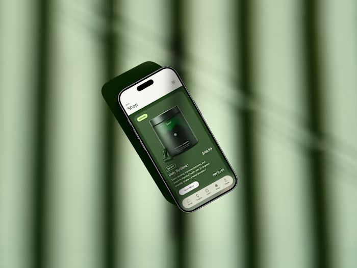
Offgrid: Brand Identity and Positioning

Racheal James


Offgrid - a natural hormone and vitality support brand for men.
Overview
Offgrid is a natural hormone and energy support for men who handle their own problems and are tired of a system that wasn't handling this one.
The Challenge
The challenge was to build a brand that could hold the same category promise — natural hormone and vitality support, backed by real formulation — without borrowing any of that visual language. Something that reads as a decision a man made about his own body, not a lifestyle he's being sold.
The name itself had to carry strategic weight. "Offgrid" doesn't read as a health or biotech word — it reads as independence. It needed a system built around it that claimed that lane (self-reliance, opting out of a broken system) rather than defaulting back to category convention.
Logo Variations
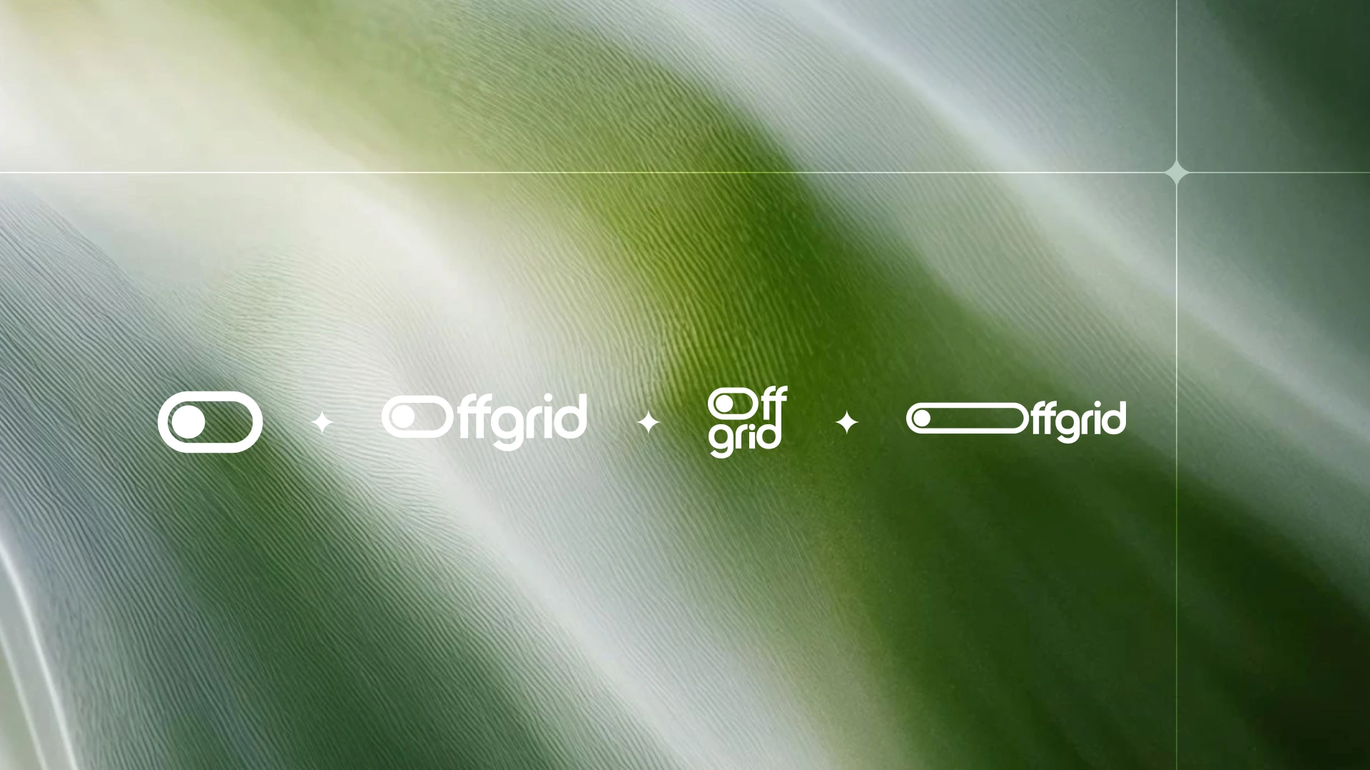
The logo comes in four builds;
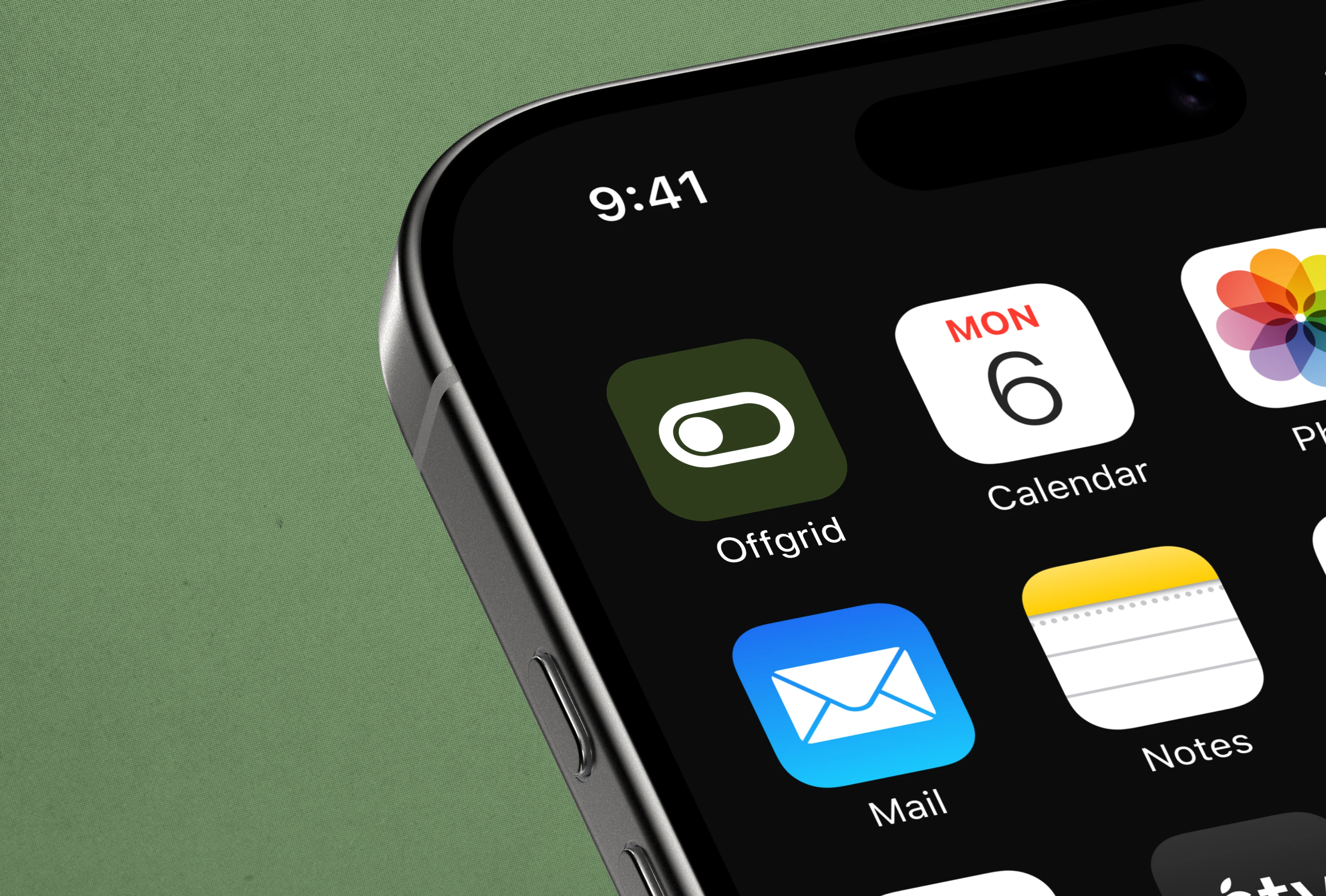
The icon on its own is the one that has to work at the smallest scale (app icon, favicon, profile photo).
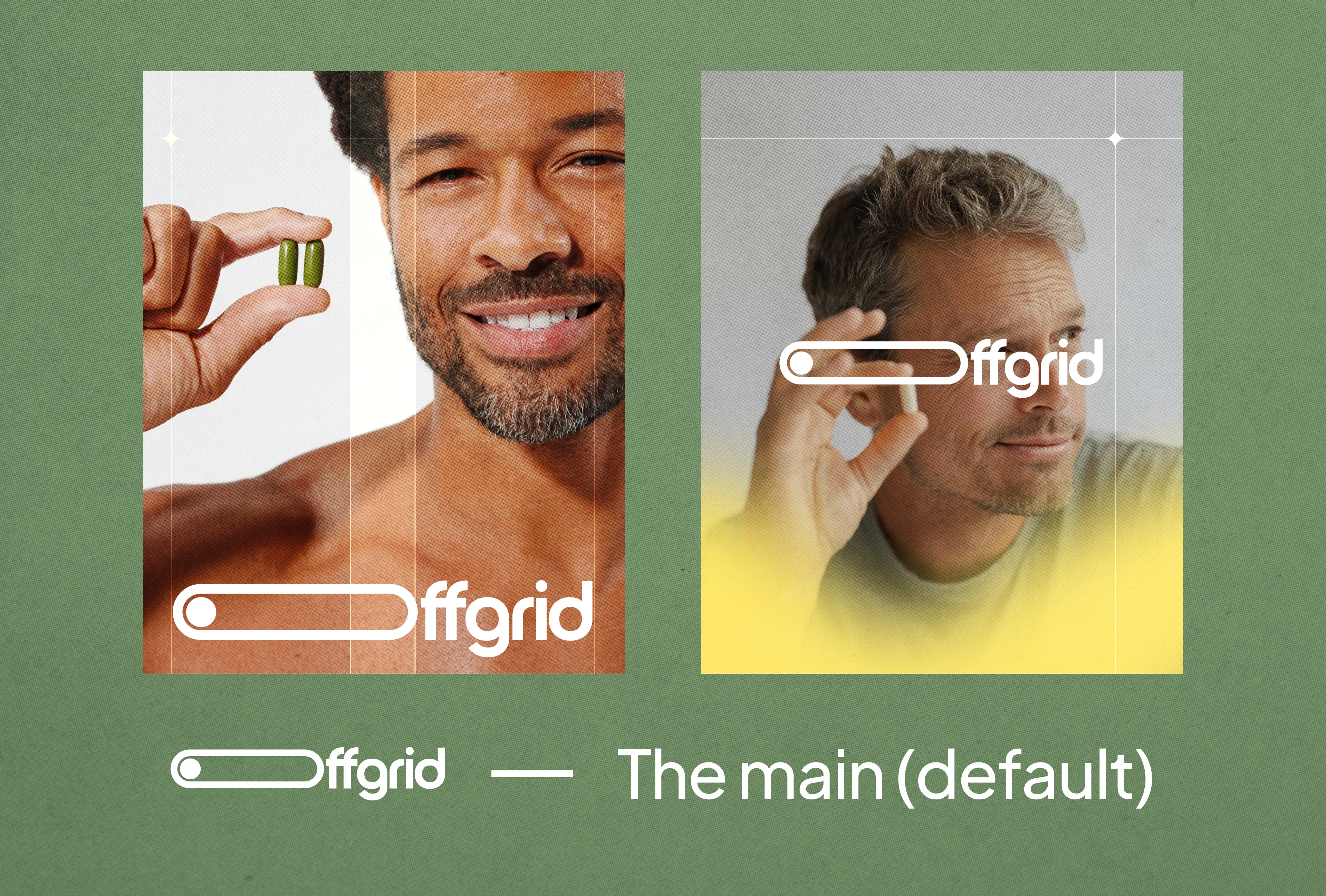
The horizontal lockup is the default.
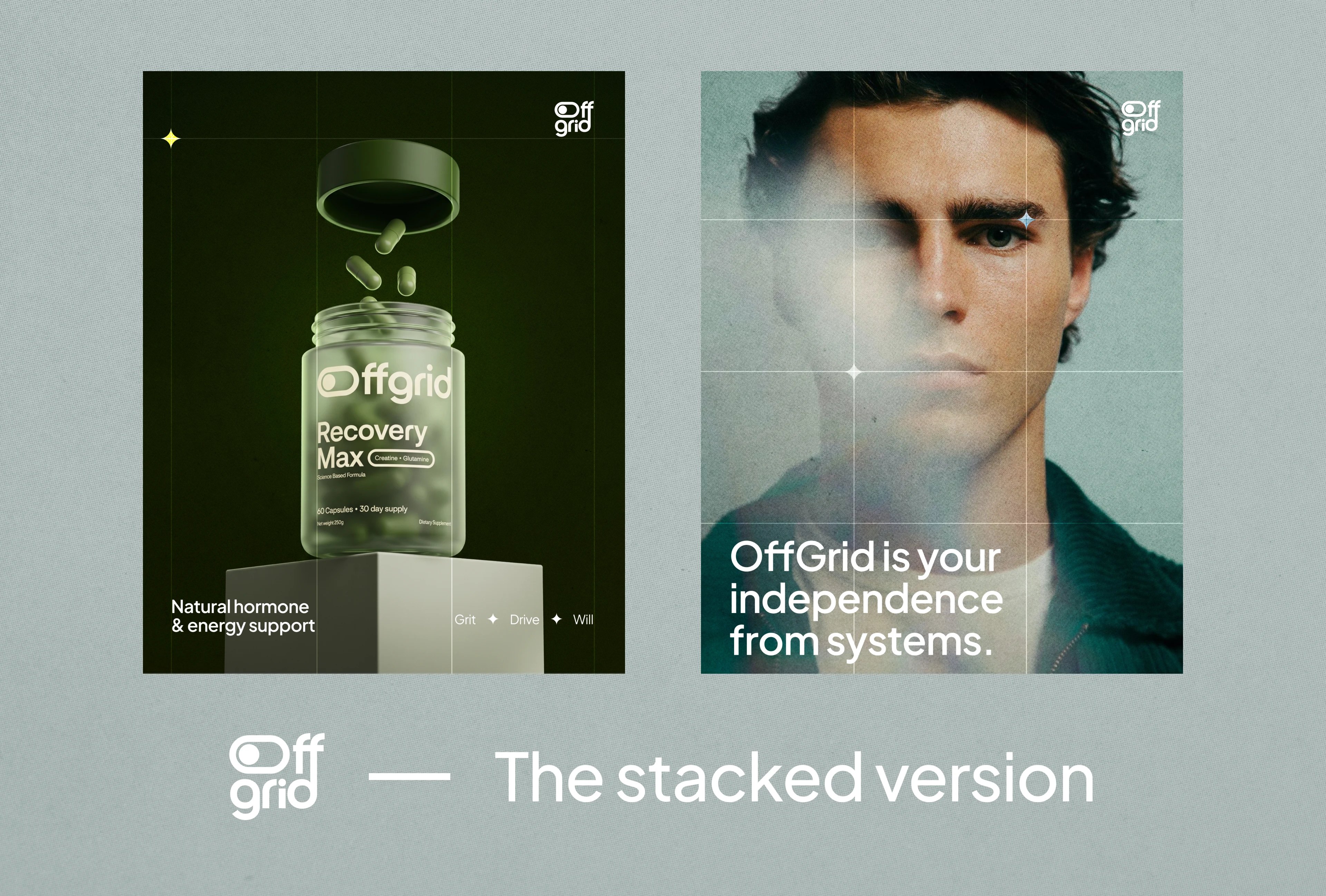
The stacked version solves square or narrow spaces where the wide wordmark won't fit.
The wider, lighter build thins the icon down for places where it sits small and inline.
But they're not just picked for the space they fit.
They get used as a visual element that can function as the brand expression.
How the logos are used to express the brand:
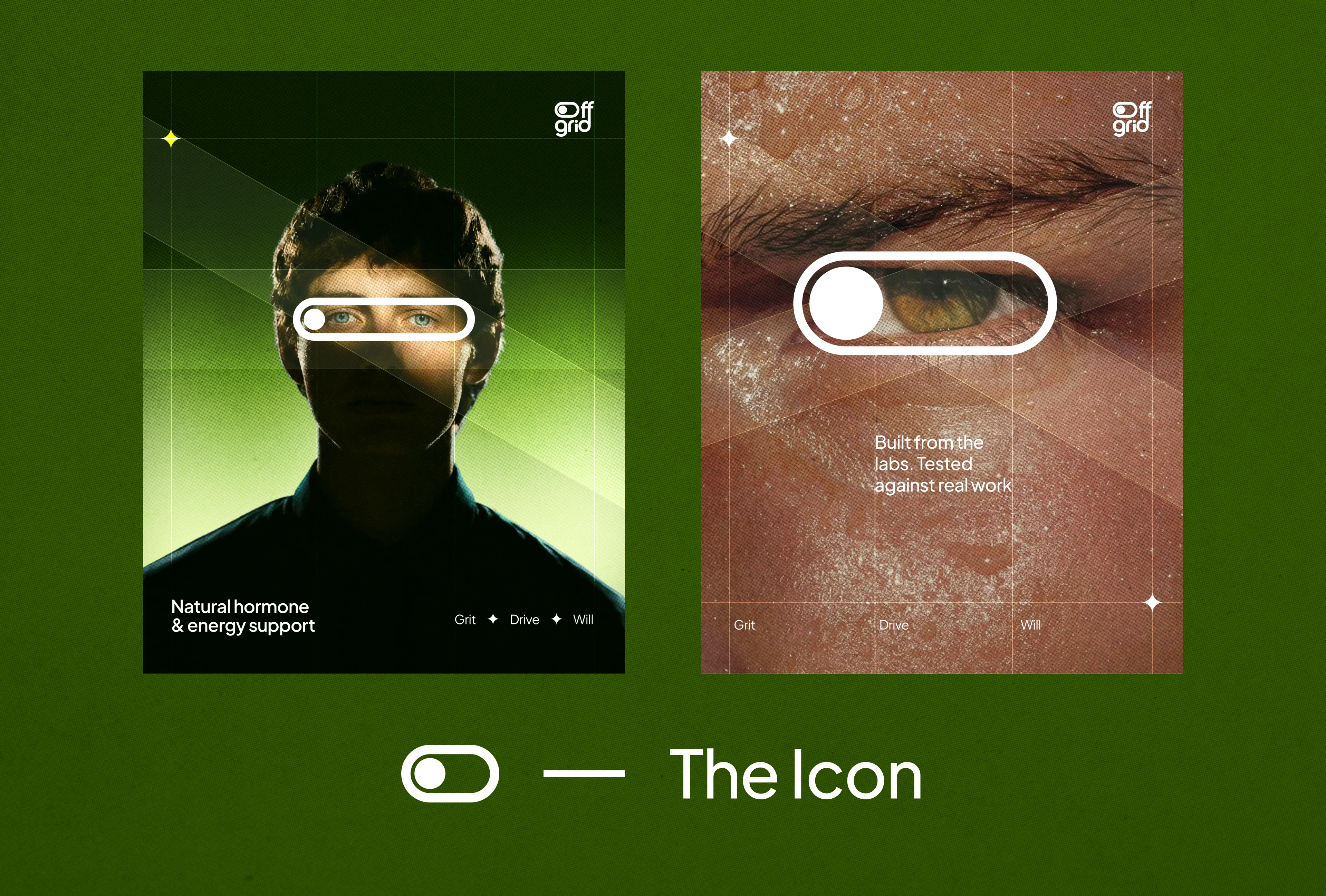
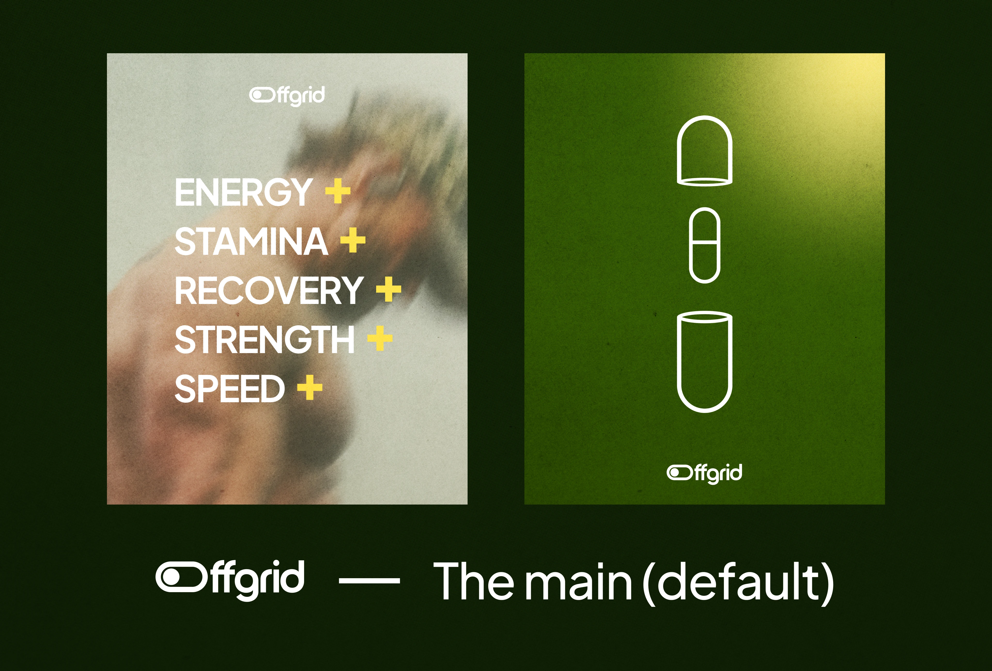
Things to note
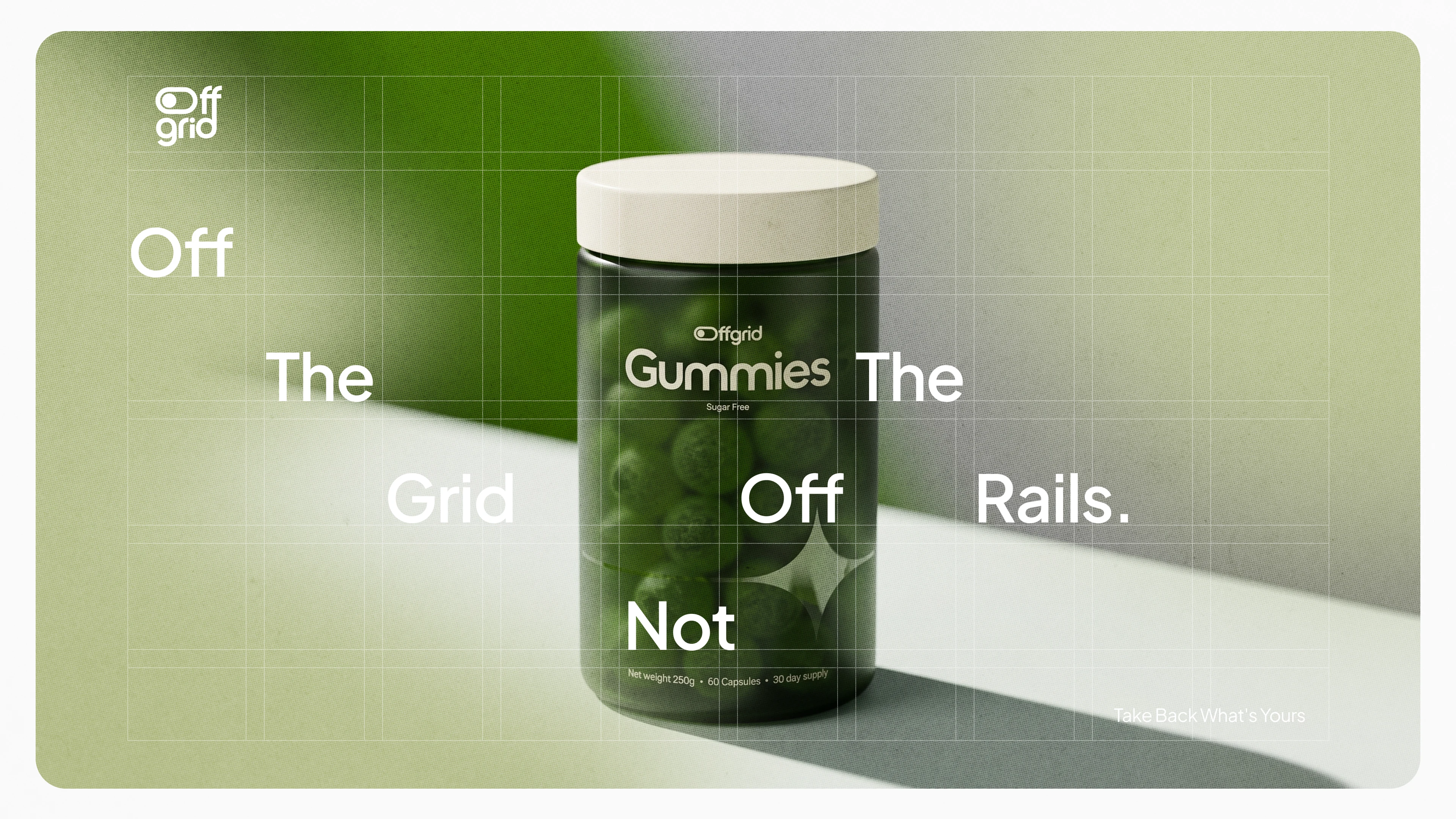
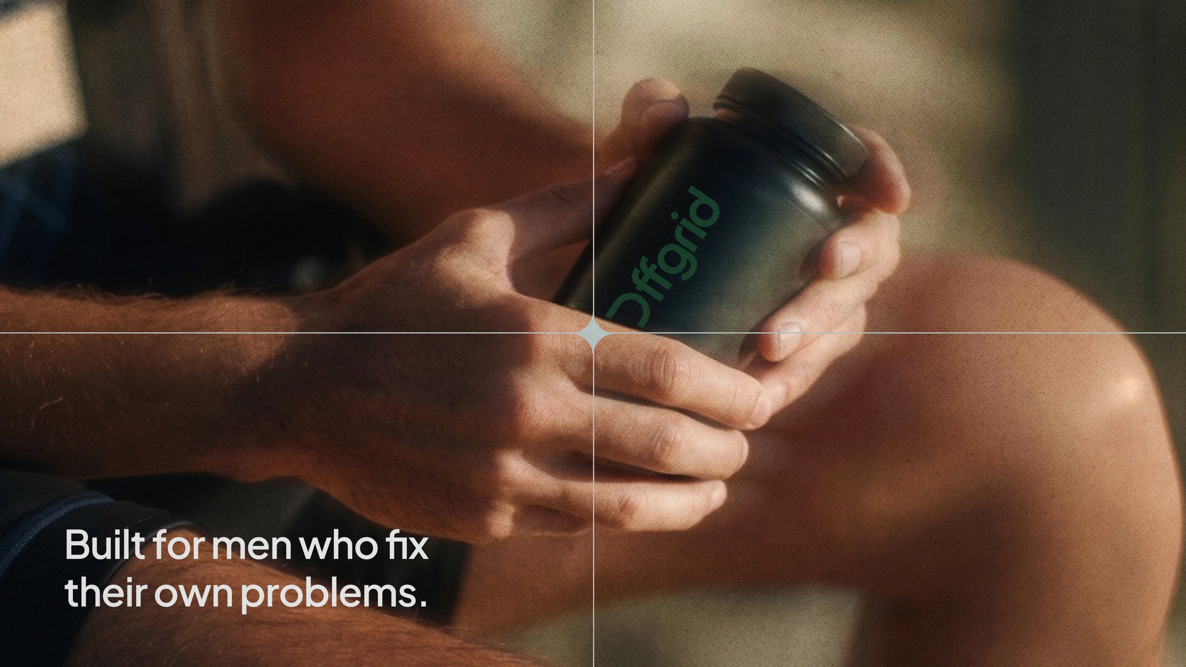
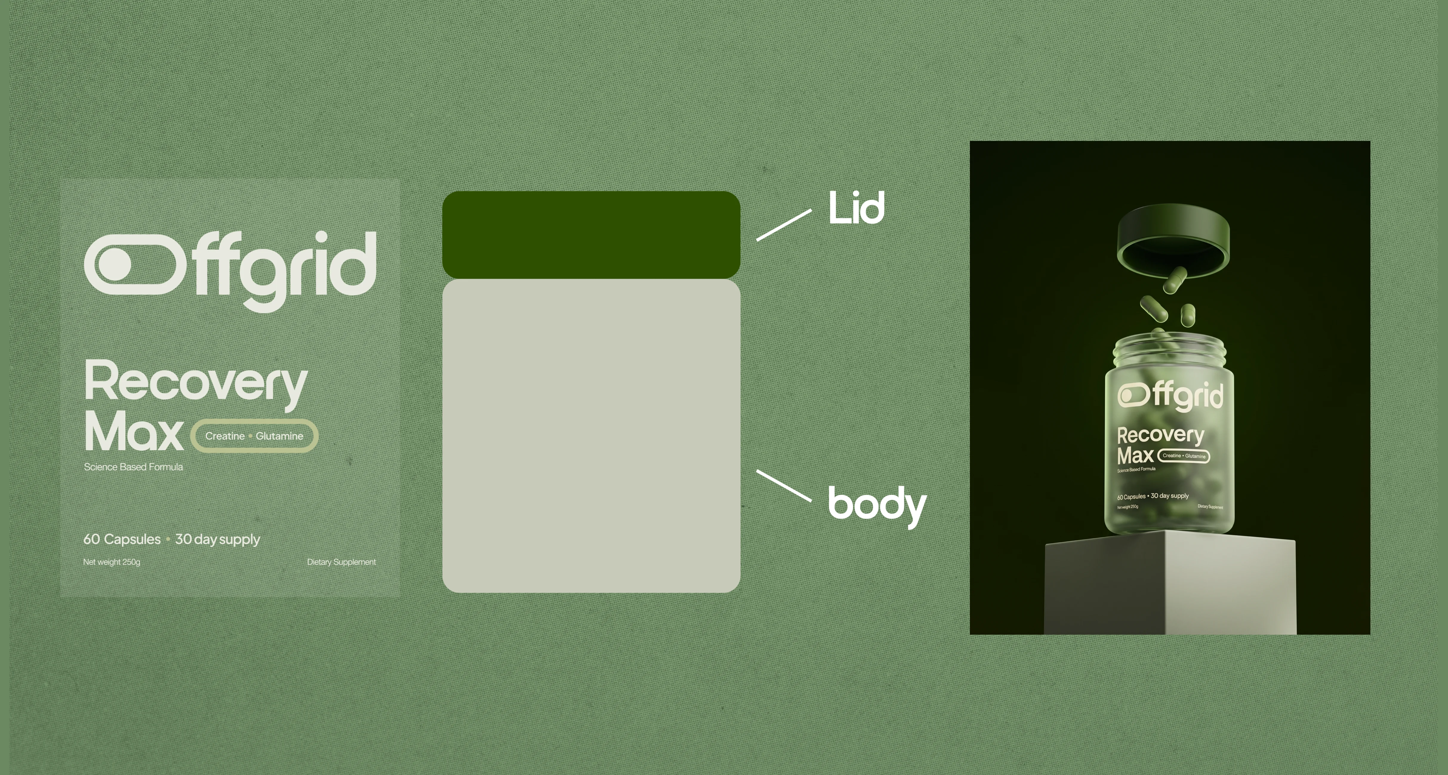
Every detail in this brand is built to say that, not just the copy. The O in the wordmark reads as a toggle switch, with the circle sitting at the "off" end at first glance, but it is also a capsule turned on its side, the same shape as what's actually in the bottle of the main product.
That's not incidental.
The green isn't a wellness color. It reads closer to something growing back than something sold to you.
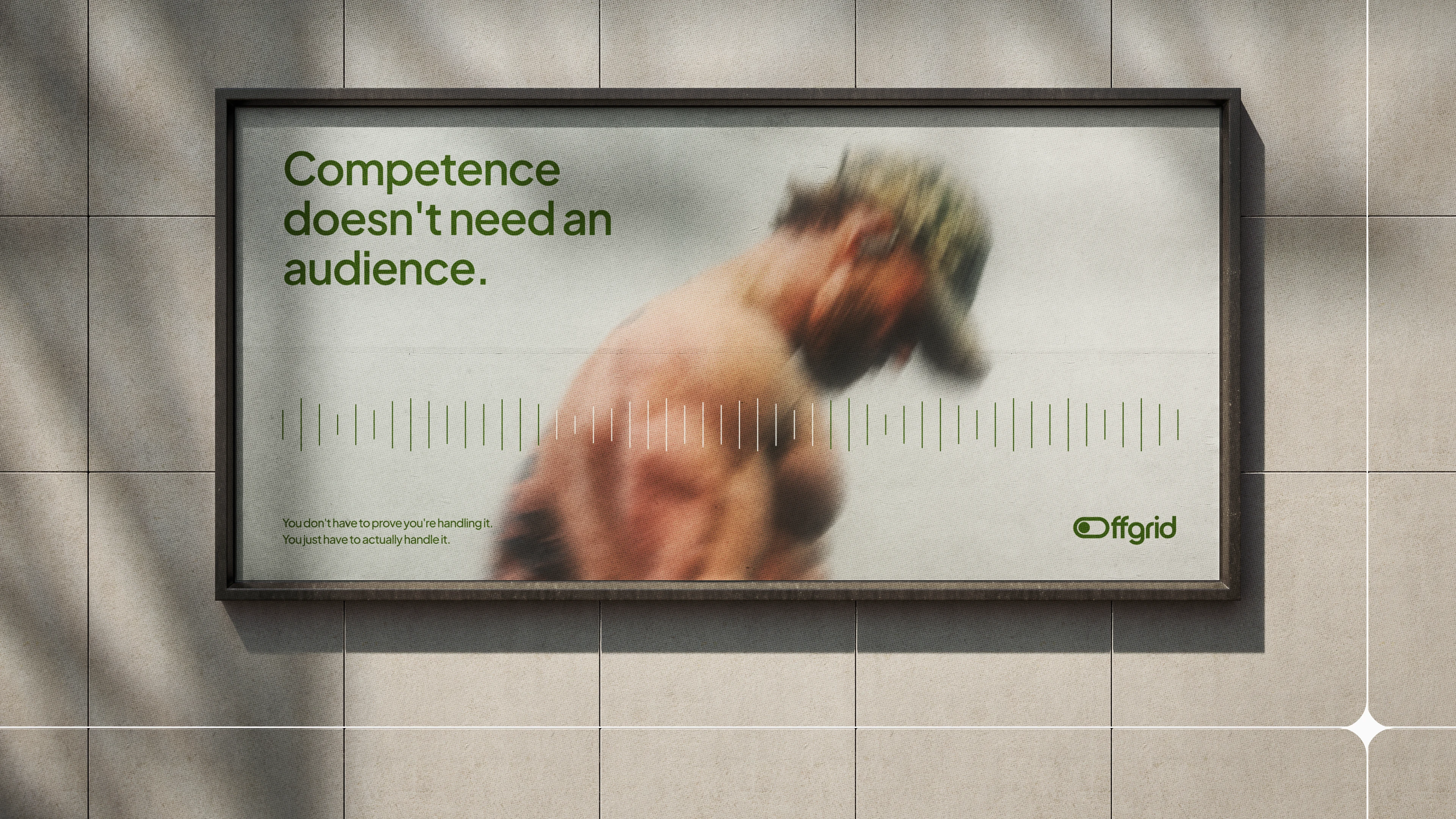
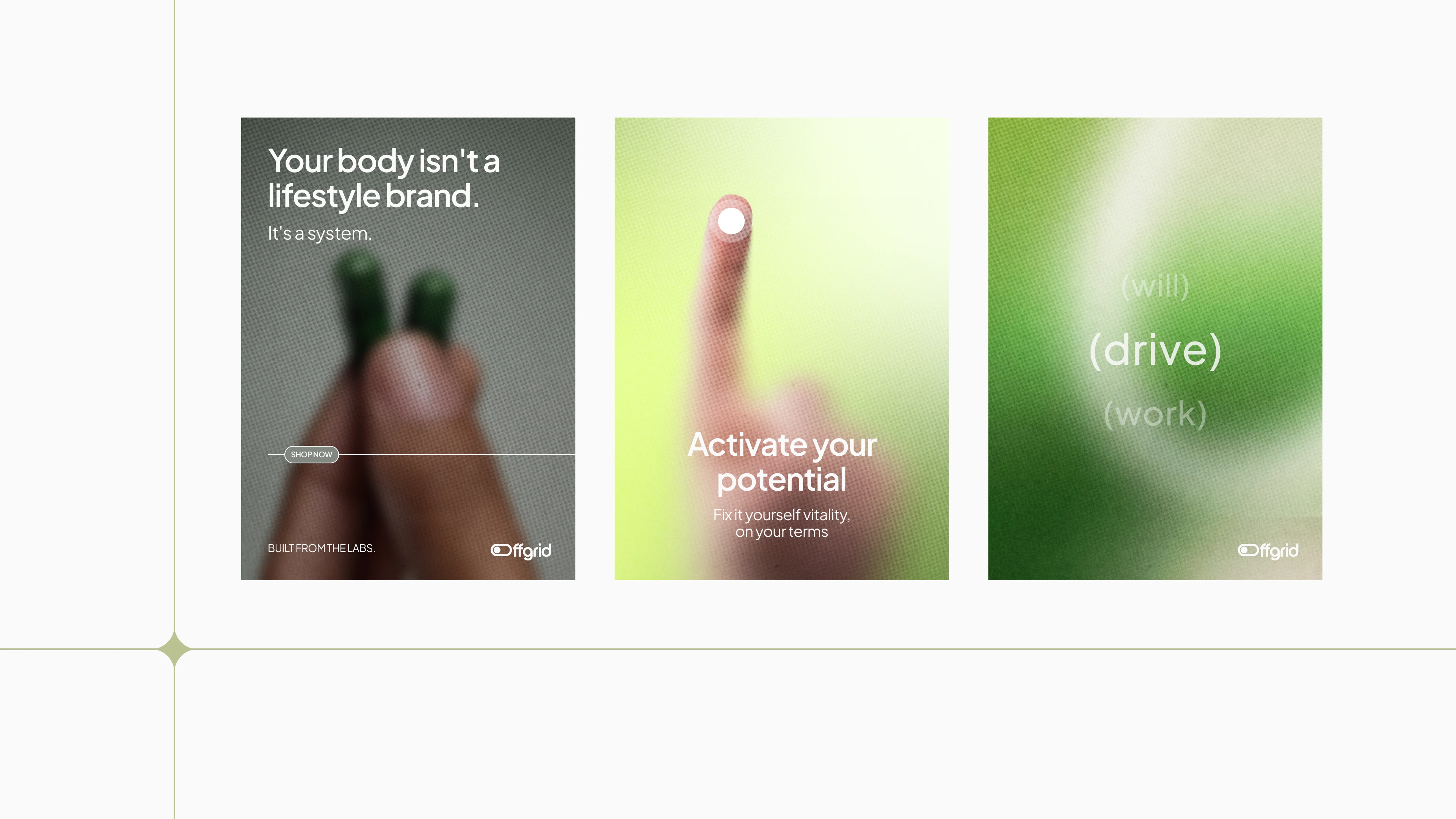
The grain running over every image is there on purpose. The thin grid lines through the layouts, with a small spark landing where they cross...that's the name, literally. A grid.
None of the decisions made here were for decoration.
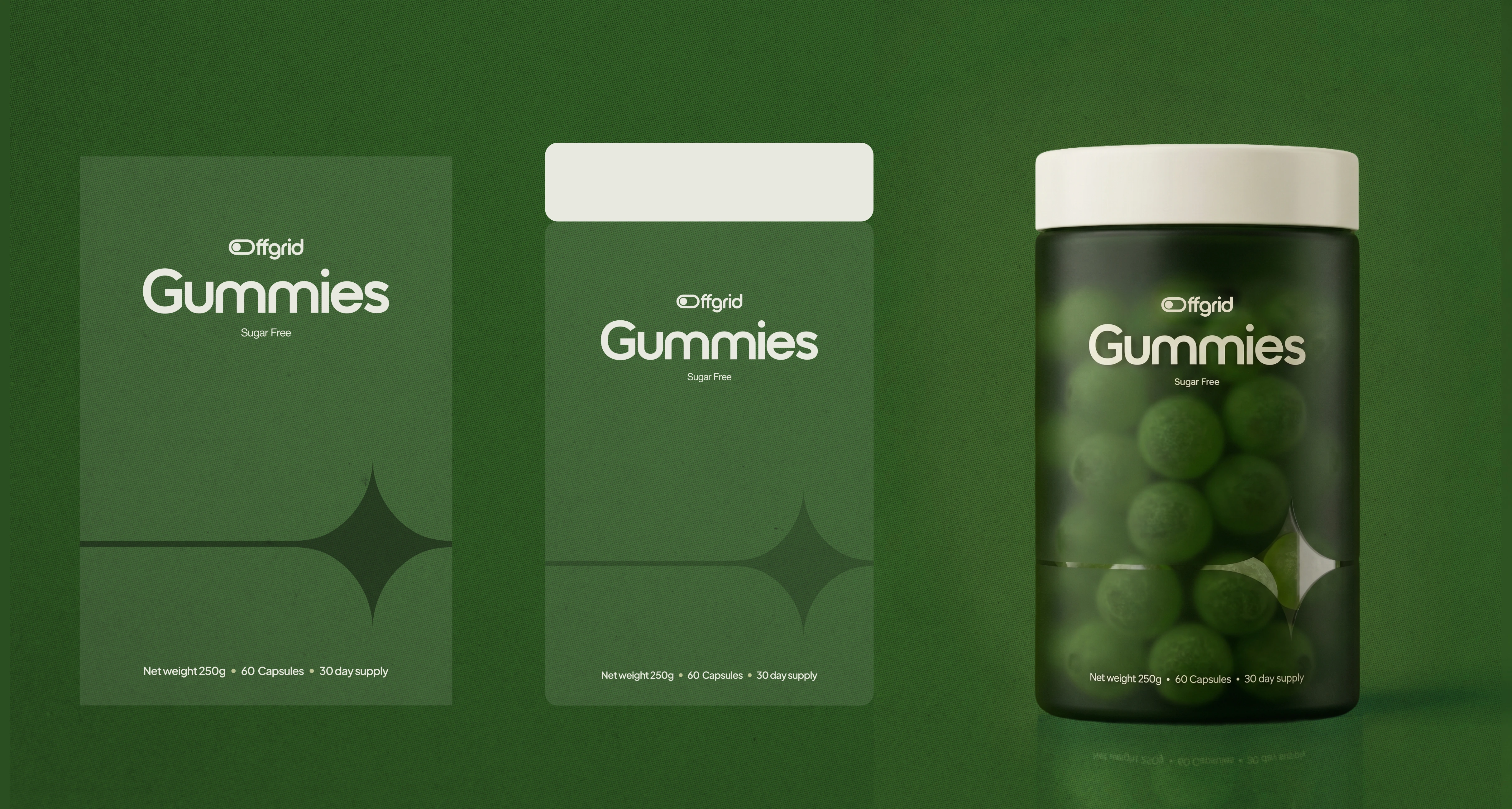
Working on the labels
Outcome
The system delivered: brand strategy & positioning, naming rationale, a four-build logo system, color and typography system, voice and tone guide, packaging design, paid social and ad creative, website design (home, shop hub, four category pages), and brand guidelines deck copy.
Offgrid was built to test a specific bet: that in a category where every competitor has converged on the same visual formula, the real differentiator isn't a new color or a new font; it's a positioning nobody else has claimed, expressed consistently down to the smallest detail of the mark.
Every piece of the system, from the toggle-shaped O to the grain on a product shot, does the same job: making "off the grid" feel like a decision, not a tagline.
Like this project
Posted Sep 22, 2026
Developed a unique brand identity for men's vitality support brand Offgrid.