Conceptual App Design for Seed
Racheal James
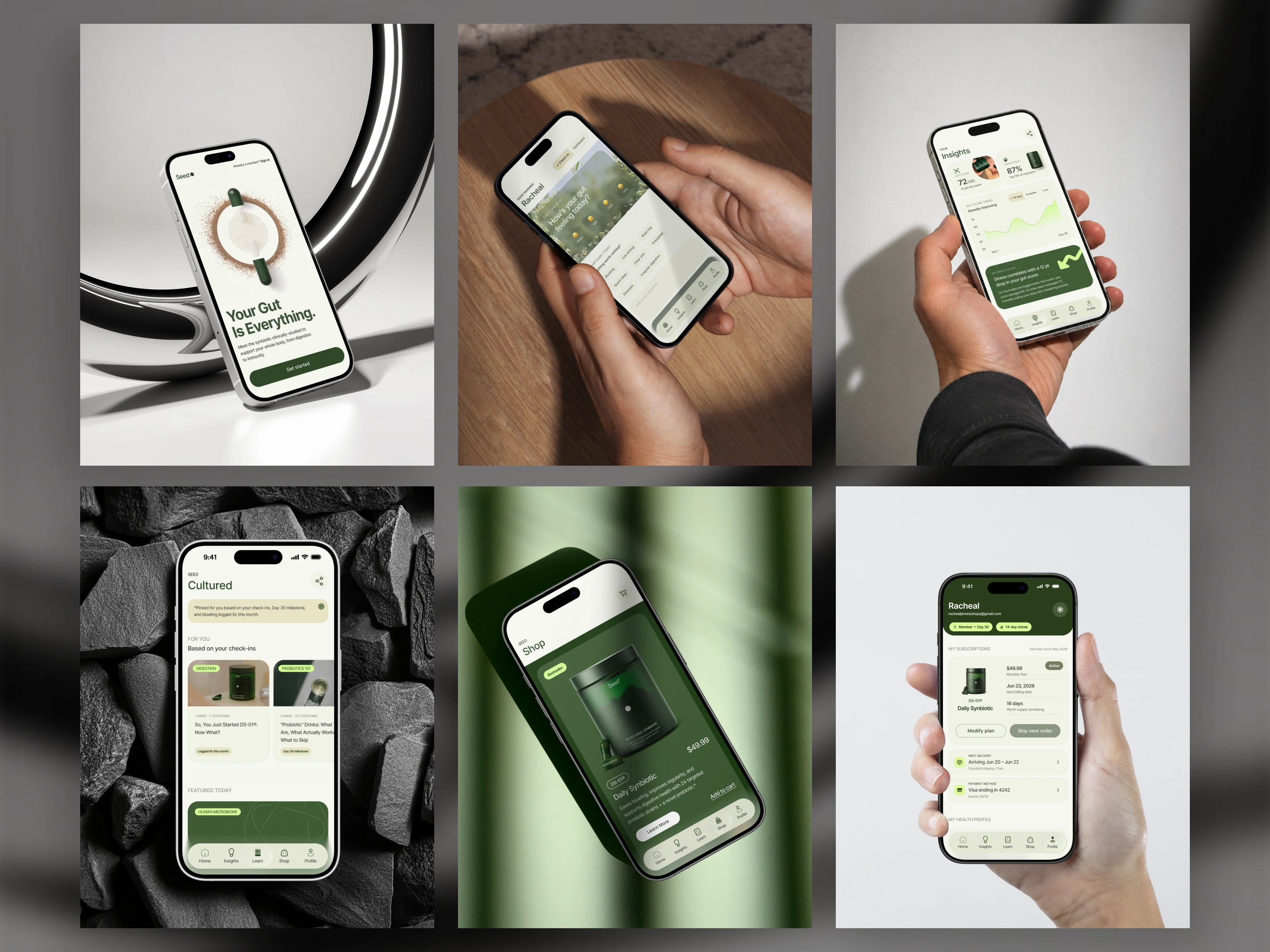
What if Seed had an app?
That’s the question I’ve been sitting with, and instead of just thinking about it, I started designing it.
No brief. No client. just me, Figma, and a brand I actually respect, asking myself what I’d build if it were mine to design.
“What if” projects are underrated.
They’re one of the best ways to test yourself as a designer, because there’s no one to impress, no spec to follow, and nowhere to hide.
It’s just your instincts, your taste, and your process.
I'm sharing the decisions, the dead ends, the moments where something clicked.
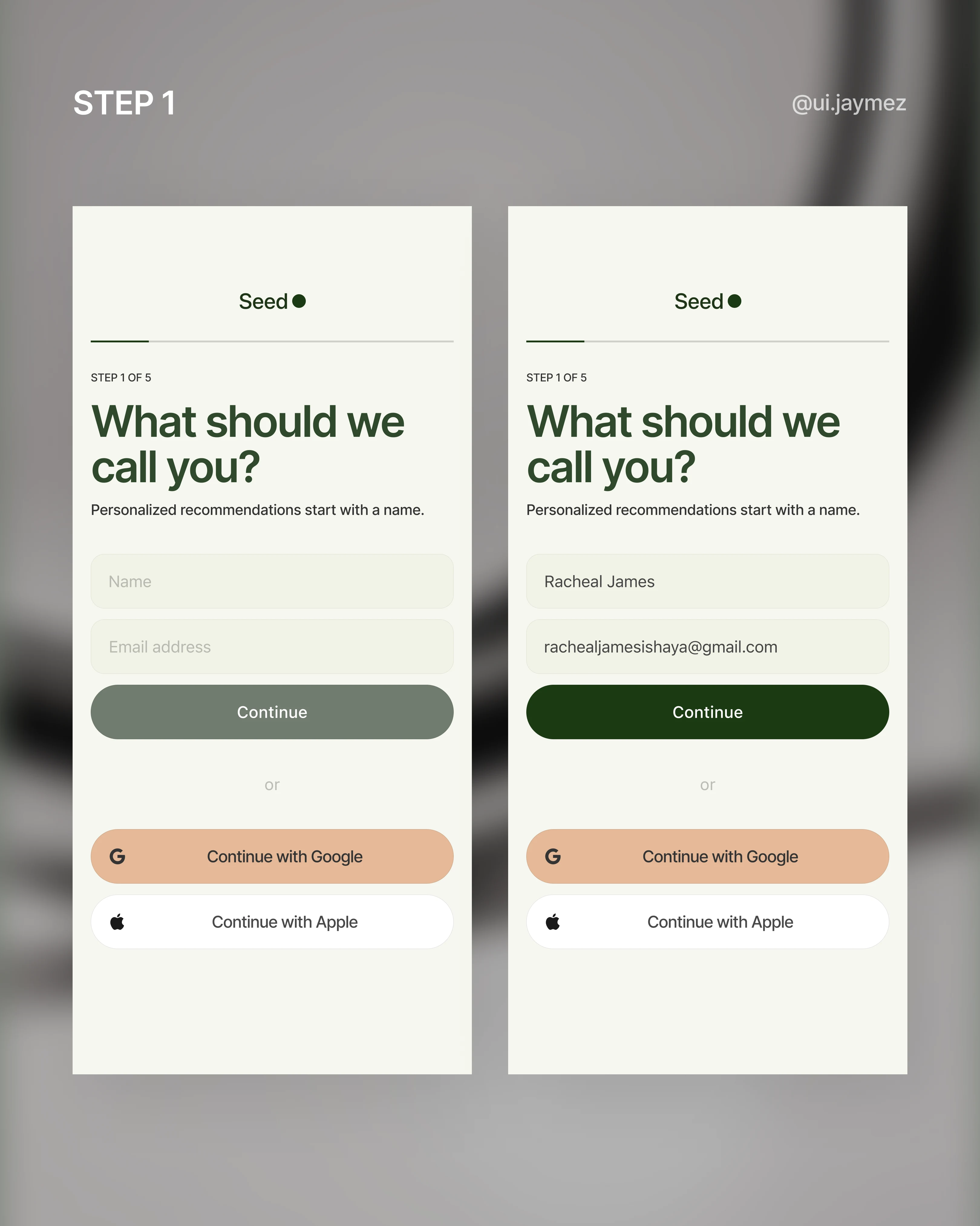
Starting with onboarding.
First flow – the onboarding.
First decision: ask for a name before an email.
Sounds small, but it changes the whole feeling.
"What should we call you?" is a conversation.
"Enter your email" is a form.
Seed's brand is personal; the onboarding should feel that way from the first tap.
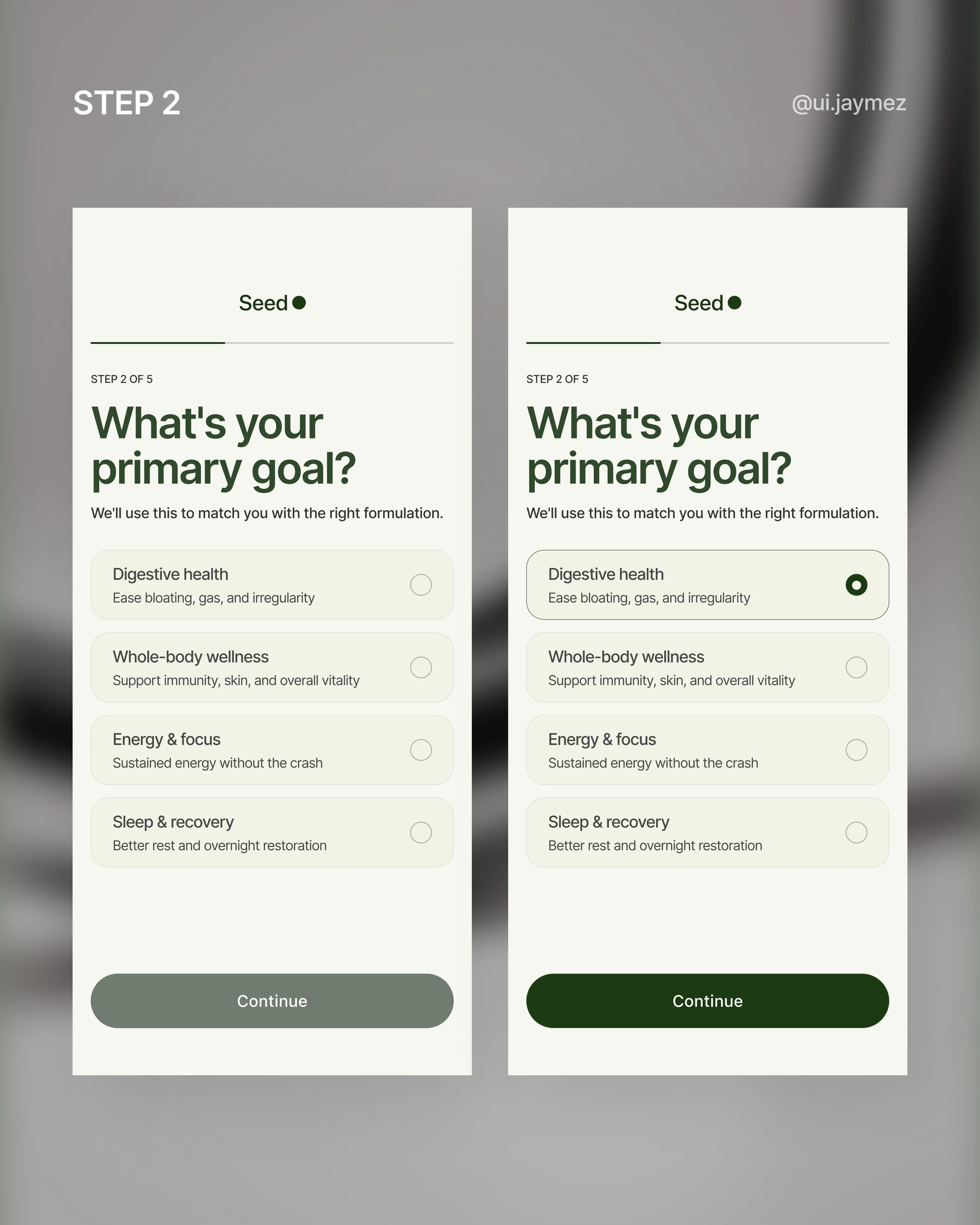
Step 2 is a single question: what's your primary goal? digestion, immunity, skin, energy. One pick.
This isn't just UX housekeeping, it's the routing question that shapes everything downstream.
Your recommendation, your content, your home screen.
It has to feel effortless.
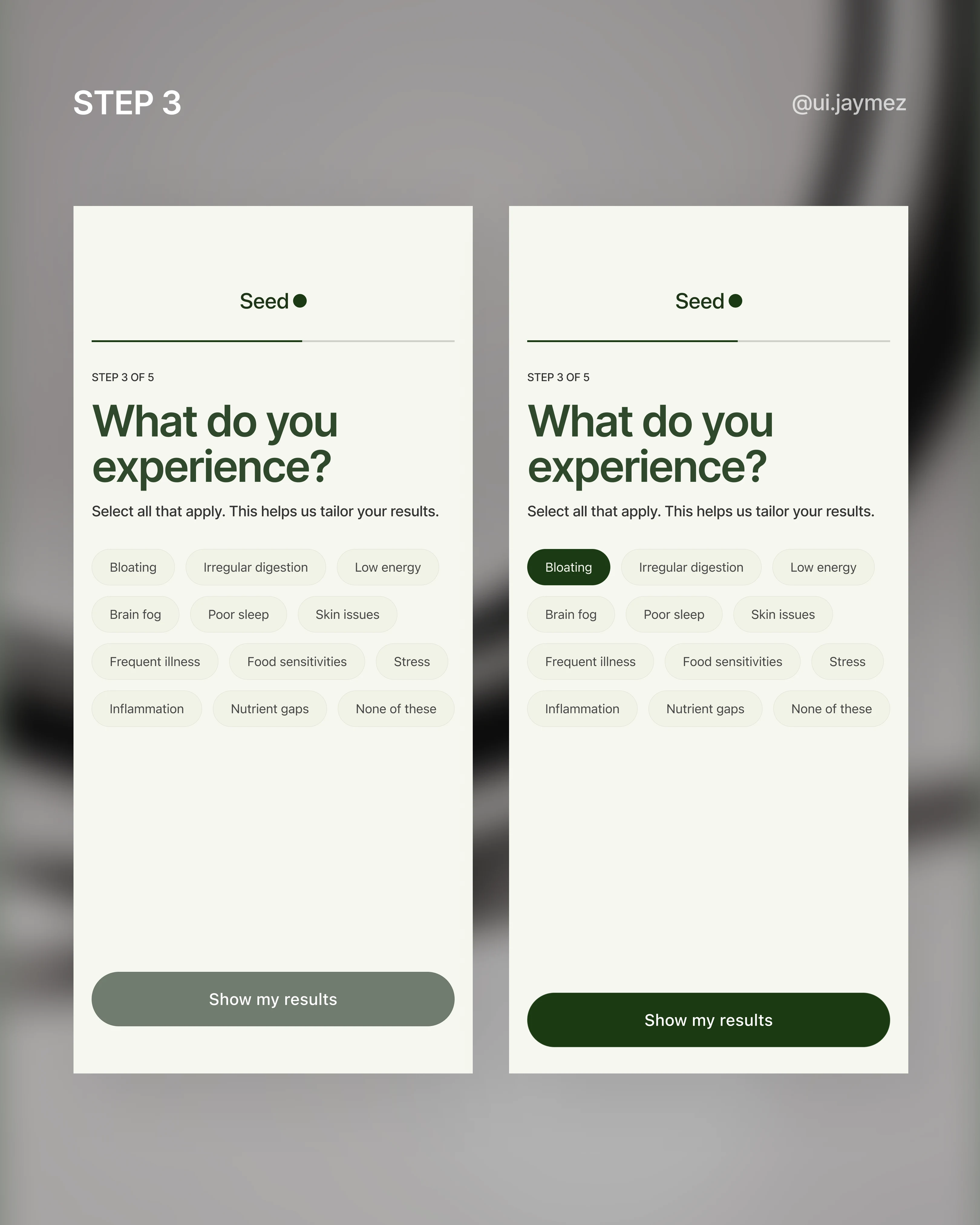
Step 3 gets more specific: symptoms. A multi-select tag grid.
This is where the app starts feeling like it actually knows you.
And "none of these" is always an option, because not everyone comes in with a problem. Some people are just proactive.
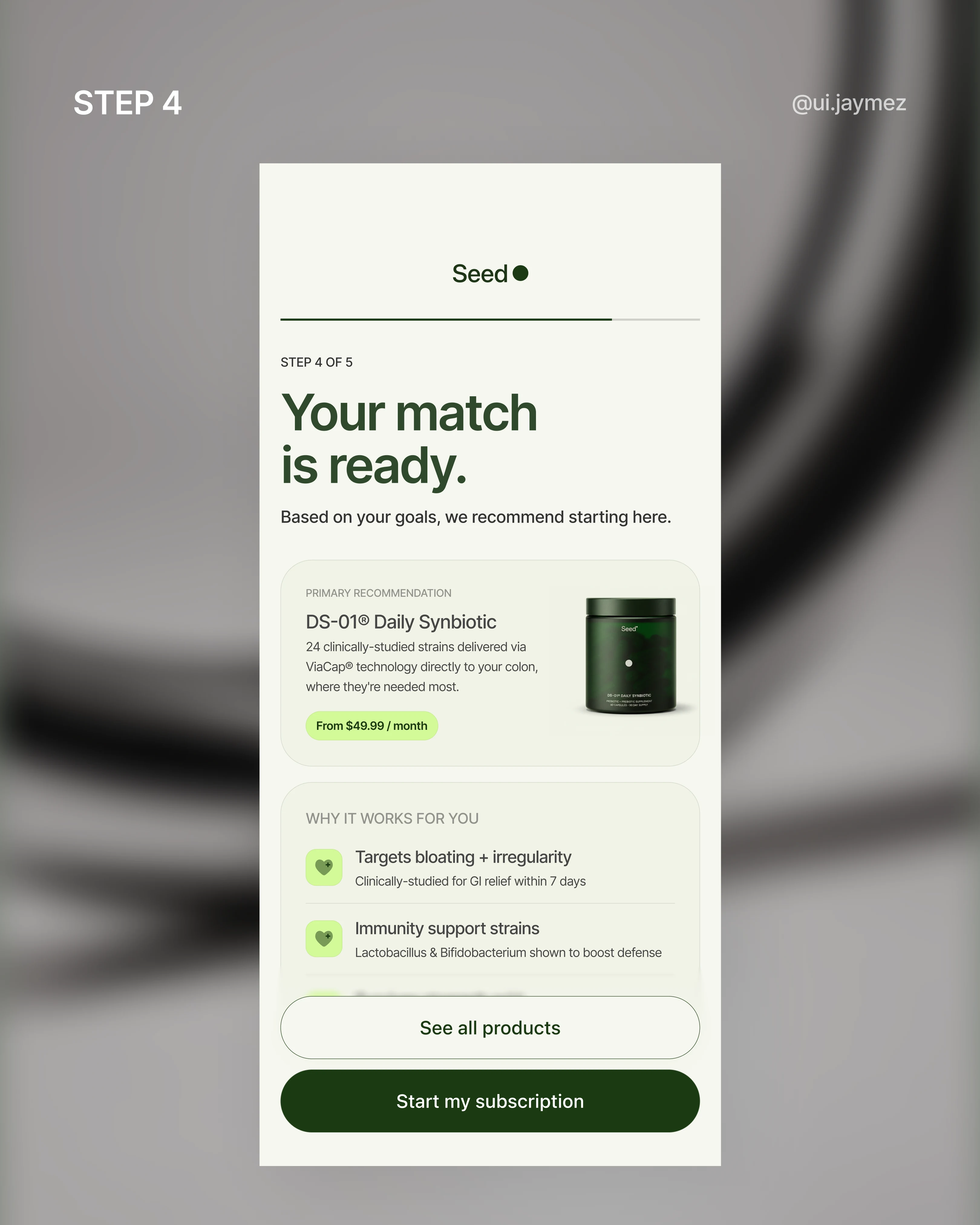
Then comes the payoff screen: your matched product, with three reasons pulled directly from your answers.
This is the moment the onboarding earns its keep. It has to feel like the app listened, not like a generic recommendation with your name swapped in.
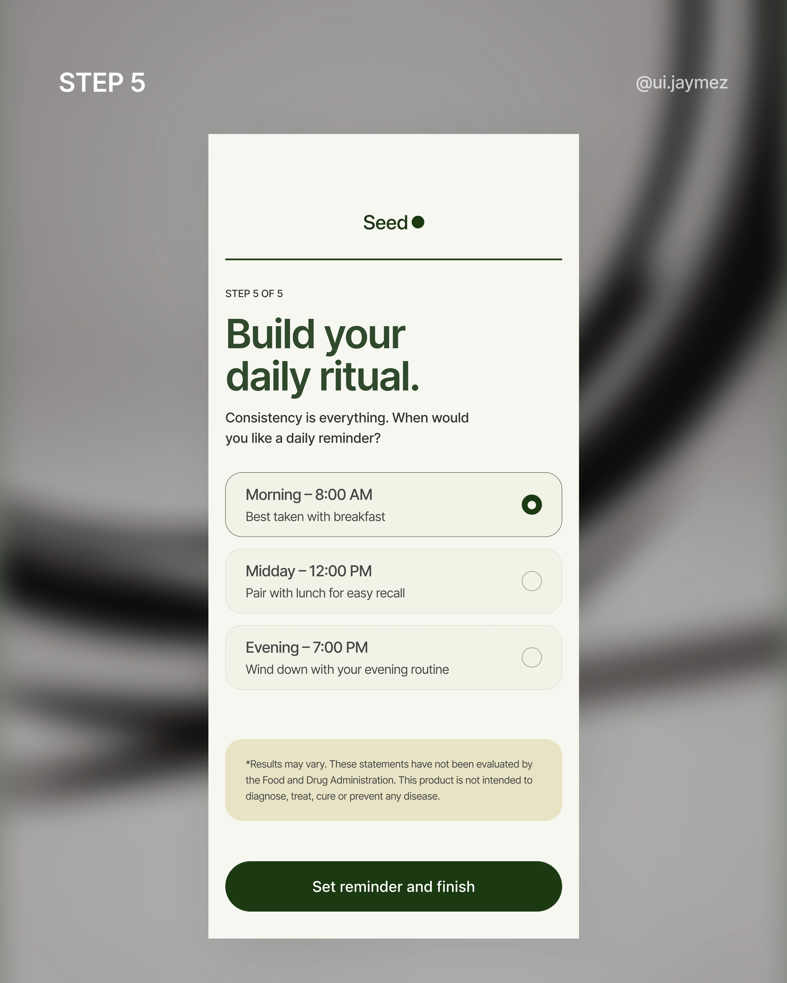
And the last step? Pick a reminder time for your daily ritual. Habit formation. Retention.
The whole reason a subscription product needs an app in the first place.
Every screen had one job. I just tried not to get in the way.
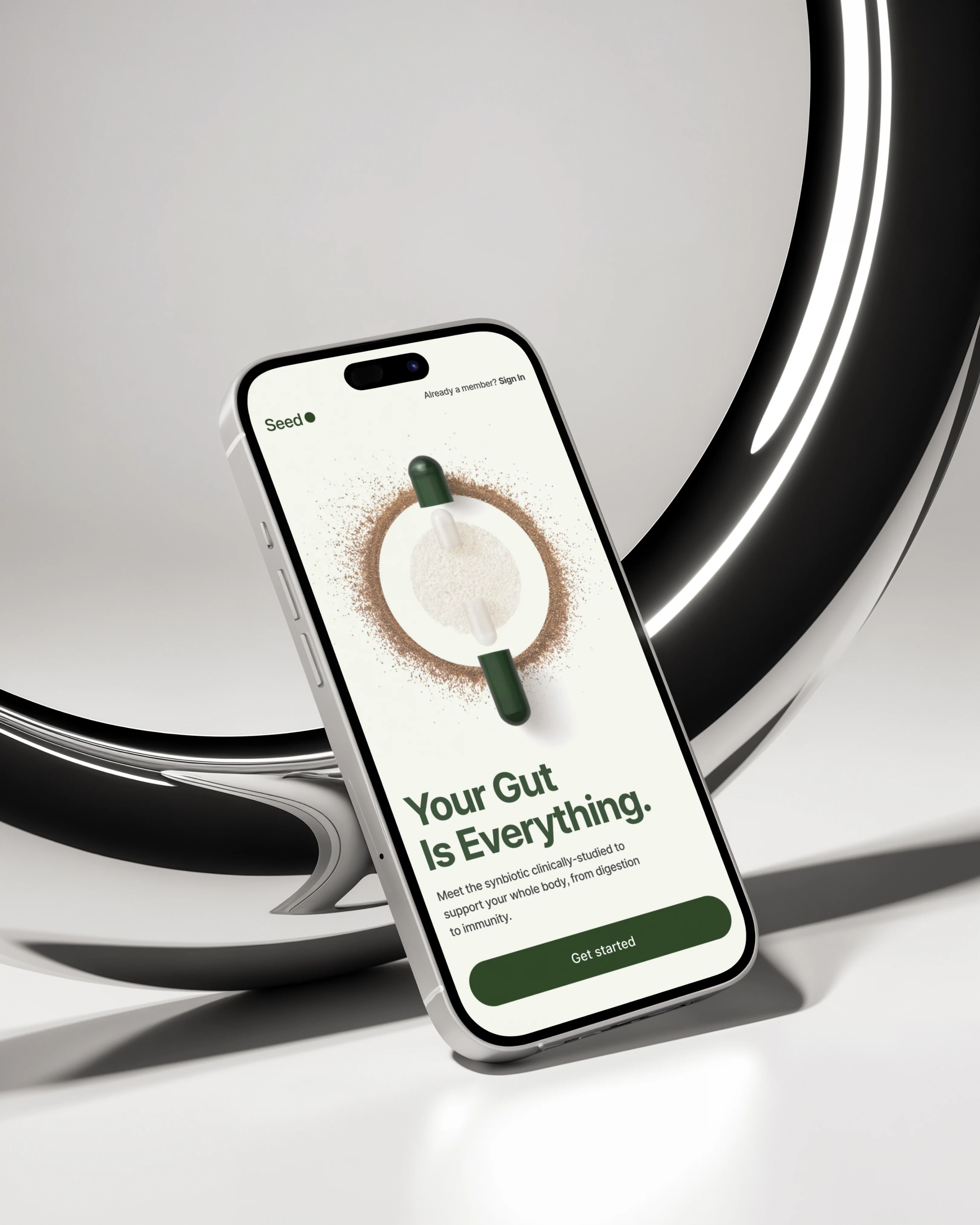
Splash Screen Mockup
Next screen – the home screen.
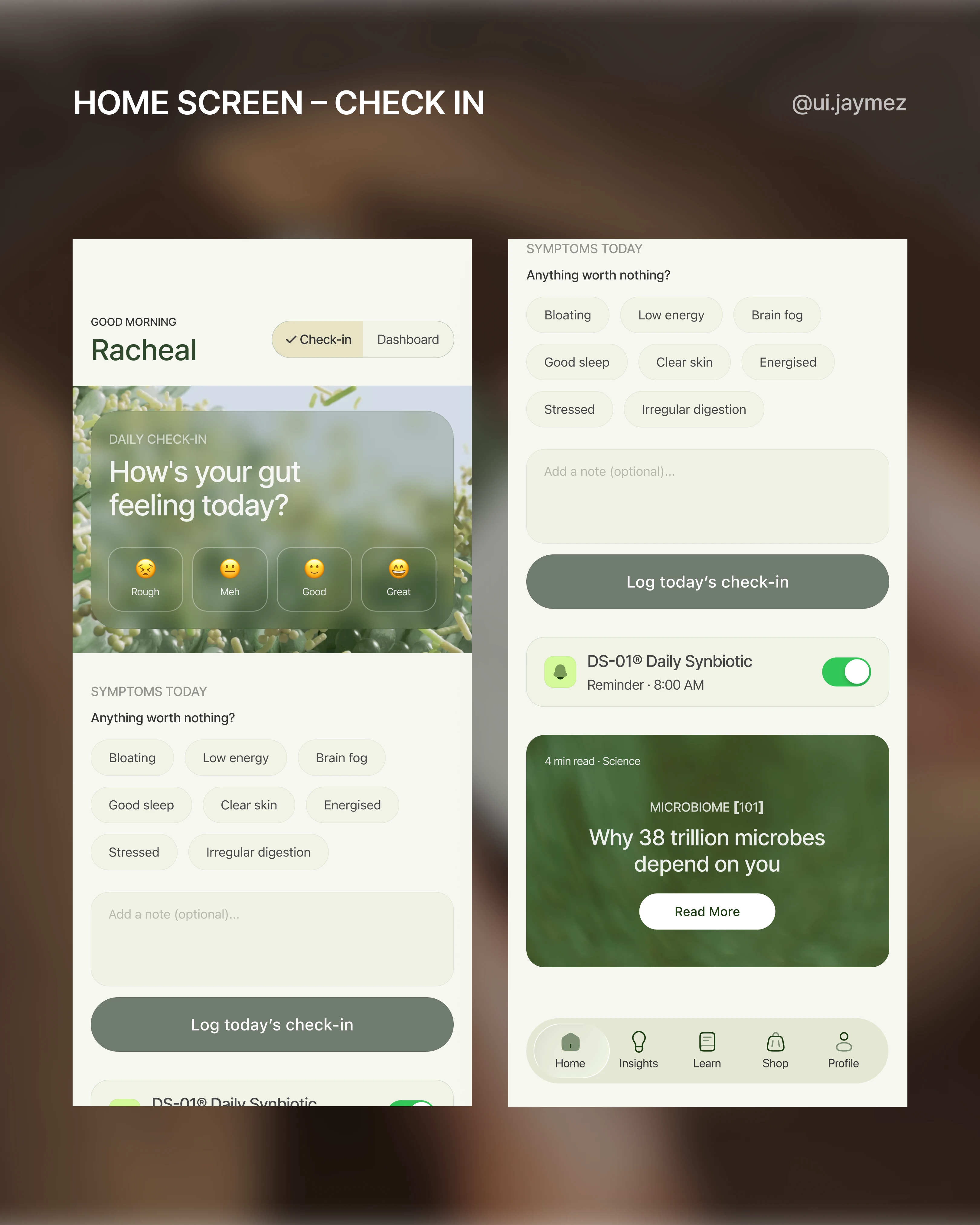
When I started this screen, I asked myself one question: what does a user actually need the first time they open the app every day?
And the honest answer was two things.
To check in and to see where they're at.
So instead of picking one, I designed both on the same screen.
First open of the day? The check-in leads.
"How's your gut feeling today?" – mood, symptoms, a quick note. Simple.
Once it's done, it logs into the system, and the dashboard takes over.
Come back later in the day? Check-in is already done.
The dashboard is the focus. No friction, no repetition.
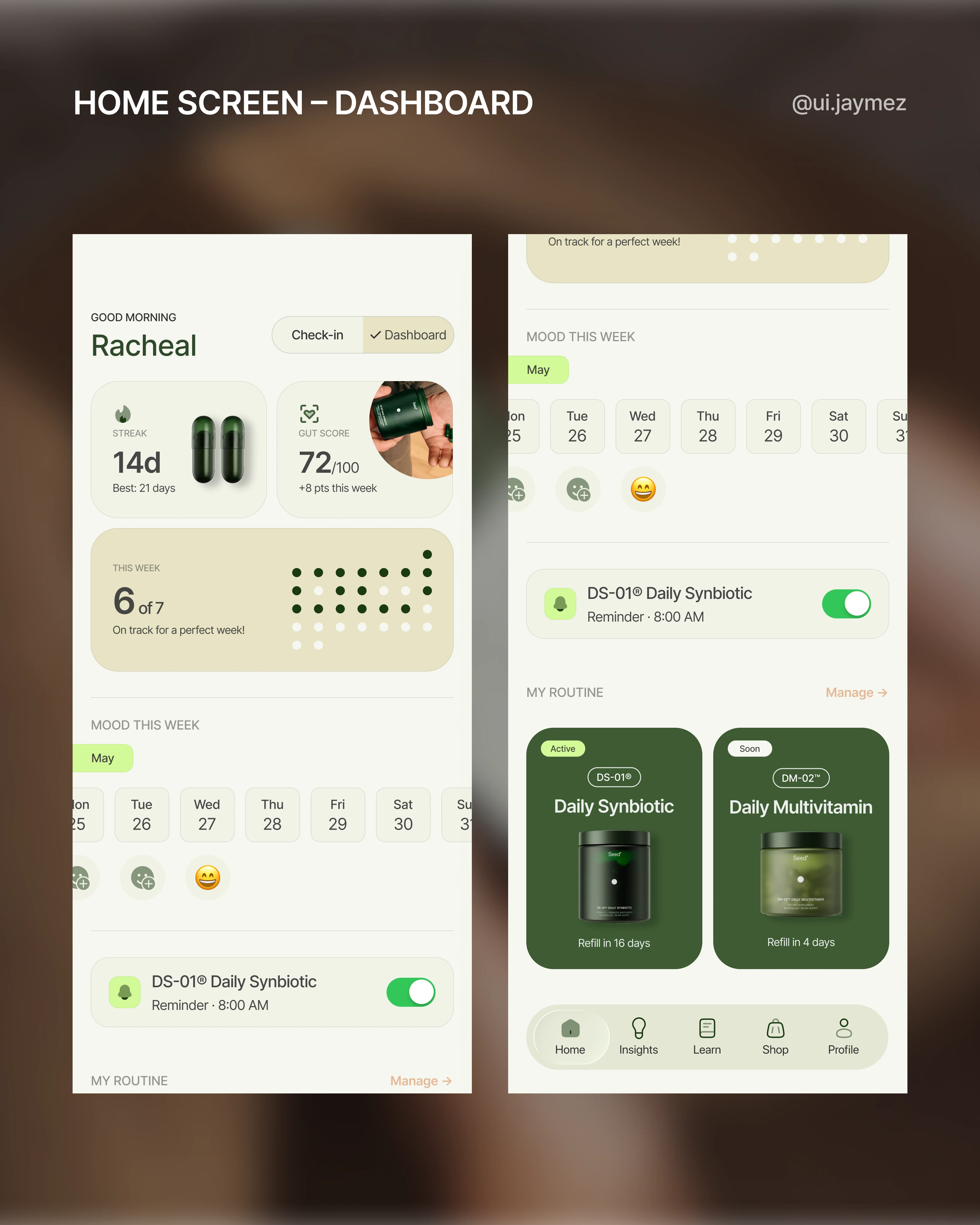
The check-in isn't just a feel-good feature either. It feeds the dashboard: streak, gut score, and mood history.
It makes the data feel like yours, not just numbers floating on a screen.
That's the difference between an app people open once and one they actually build a habit around.
One more decision worth mentioning – the nav.
I scrapped "Progress" as a tab label.
"Progress" sounded too generic for a brand like Seed, and "Progress" became redundant once the dashboard was doing its job.
So the nav became: Home, Insights (instead of progress), Cultured, Shop, Account.
Every word earns its place.
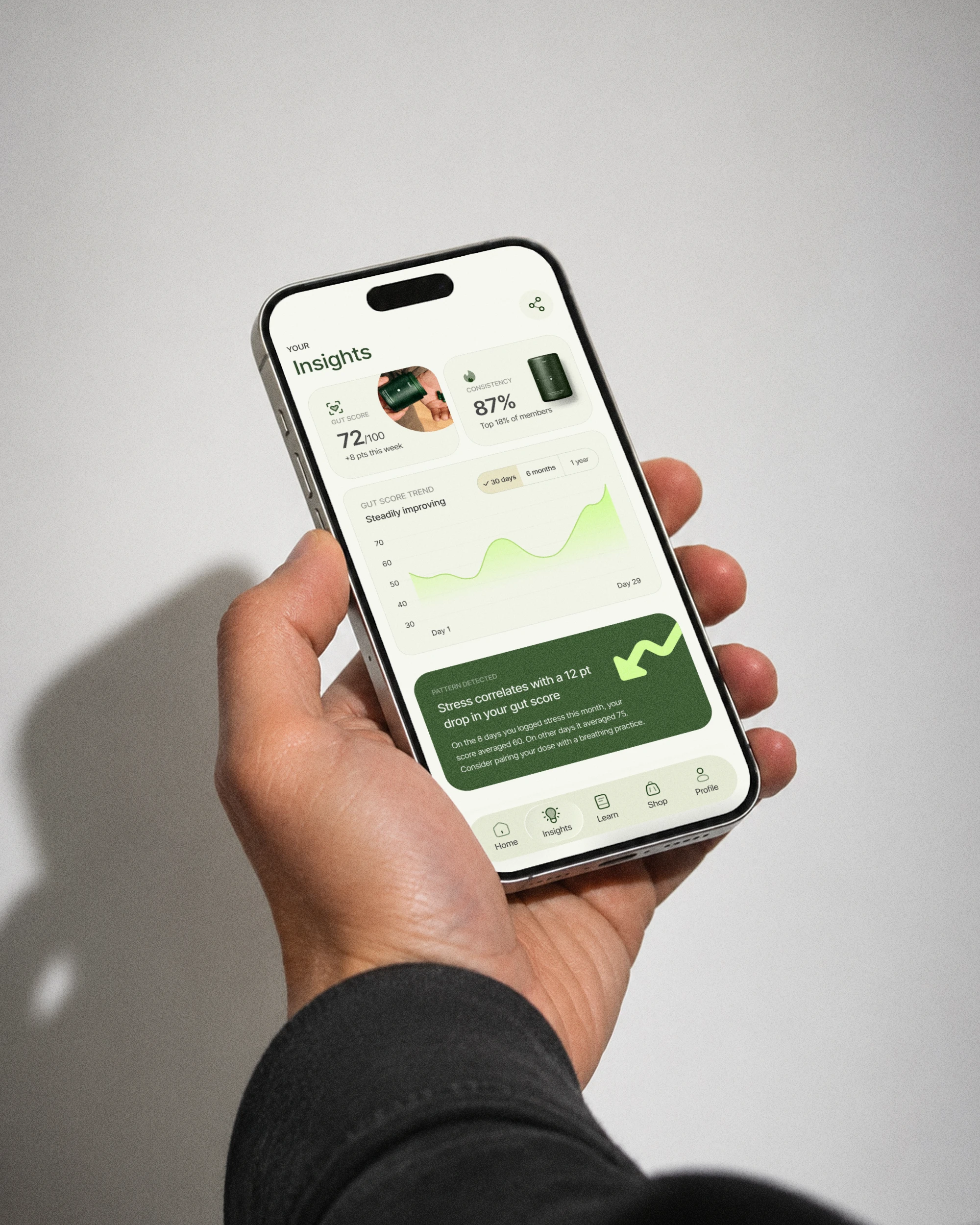
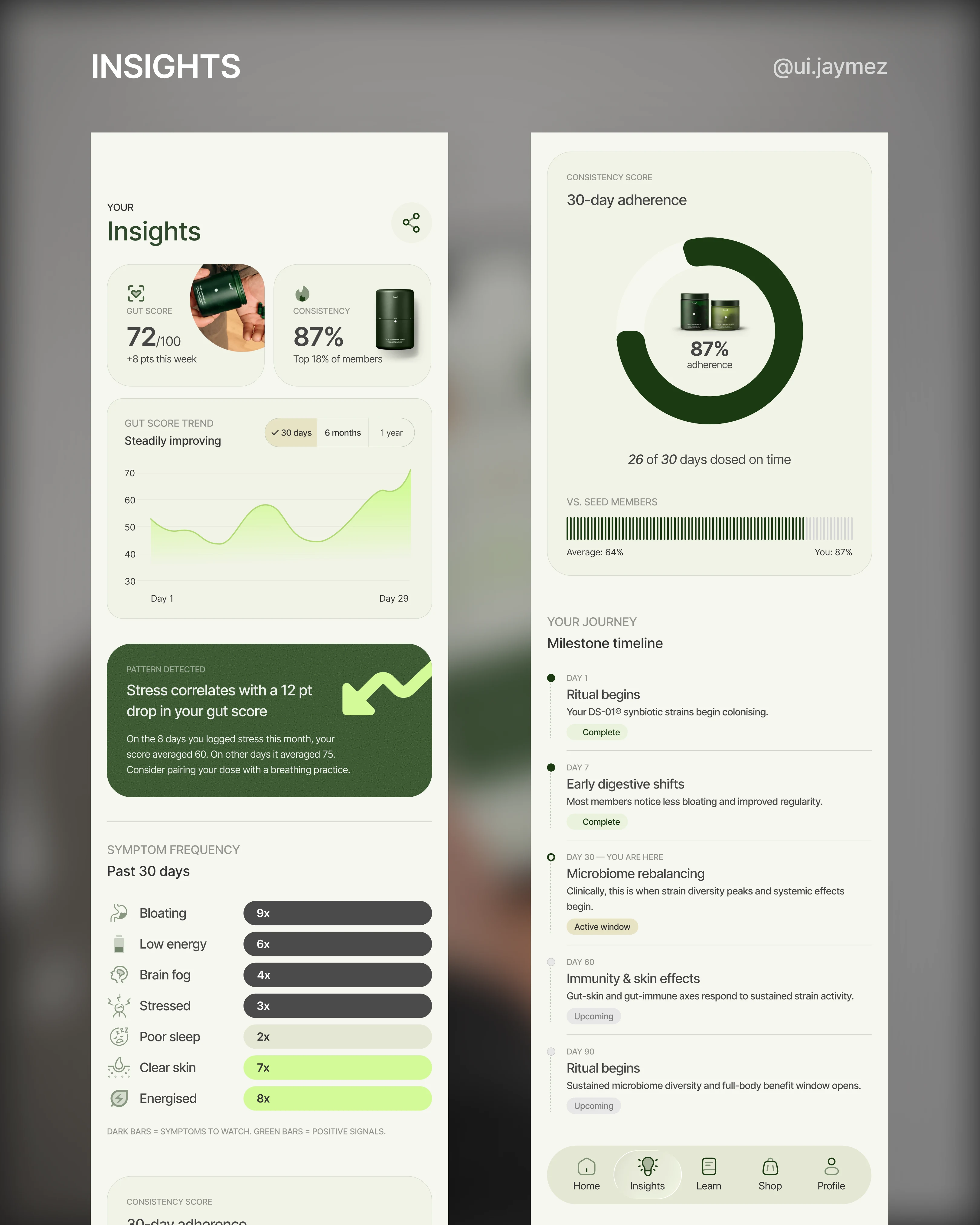
Third flow – Insights & export.
The home screen shows you right now.
Insights shows you what's actually changing.
That distinction drove every decision on this screen.
The dashboard gives you a snapshot, this week's streak, and today's gut score.
Insights earns its own tab by doing something the dashboard can't: showing patterns over time.
A 30, 60, 90-day gut score curve. Symptom frequency: how many times bloating showed up this month versus last.
A consistency score, not just a streak.
But the piece I'm most proud of is the pattern detection card.
"On days you logged stress, your gut score dropped 12 points on average."
That's not a stat. That's the app turning your check-in data into actual intelligence.
It makes every mood log and symptom tag feel like it was worth doing.
No other probiotic app does this, and it fits Seed's science-led brand perfectly.
Then there's the milestone timeline.
"Day 30 – You are here, microbiome rebalancing."
It tells the user that what they're feeling right now is expected and meaningful.
It converts clinical science into a narrative that the user is living through.
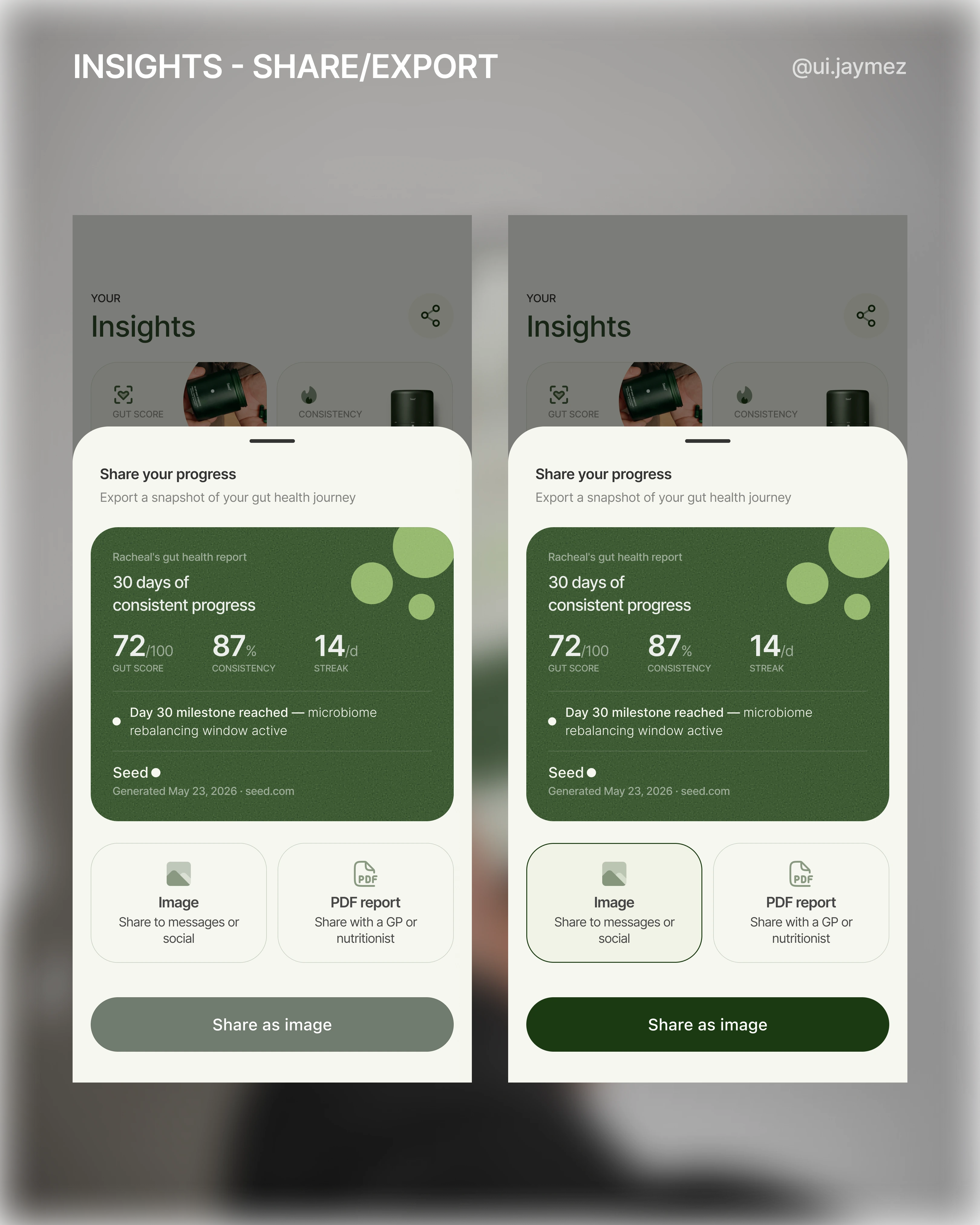
Now the export flow.
I almost put a notification bell in the top right.
Then I stopped and asked: what would actually live in that notification centre?
Dose reminders are already handled by the OS.
There's no social feed.
It would've been empty.
So I replaced it with a share icon instead.
Tap it, and a bottom sheet slides up.
There's a preview of what you're exporting, a branded report card with your gut score, consistency score, and active milestone.
Then two format choices: share as an image, or export as a PDF report.
That split matters.
The image goes to a friend or an Instagram story.
The PDF goes to a GP or nutritionist.
One is social, one is clinical, and both are things Seed's audience actually does.
The exported card has Seed's logo on it.
Every share is passive marketing.
The export isn't a nice-to-have.
It's a trust signal.
Insights Screen Mockup
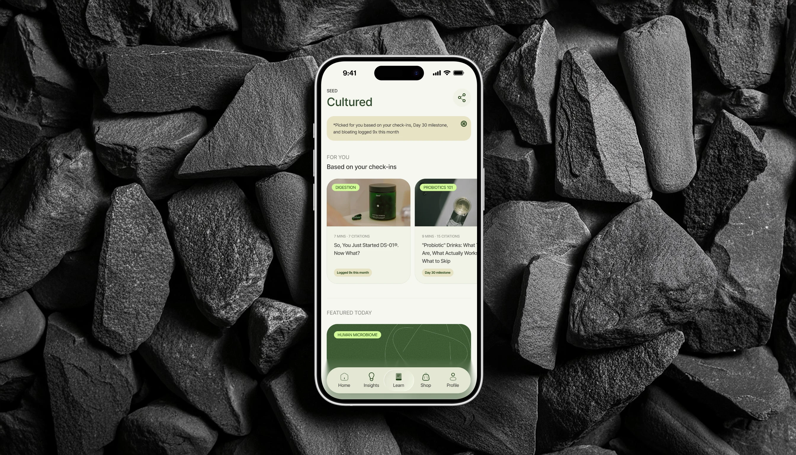
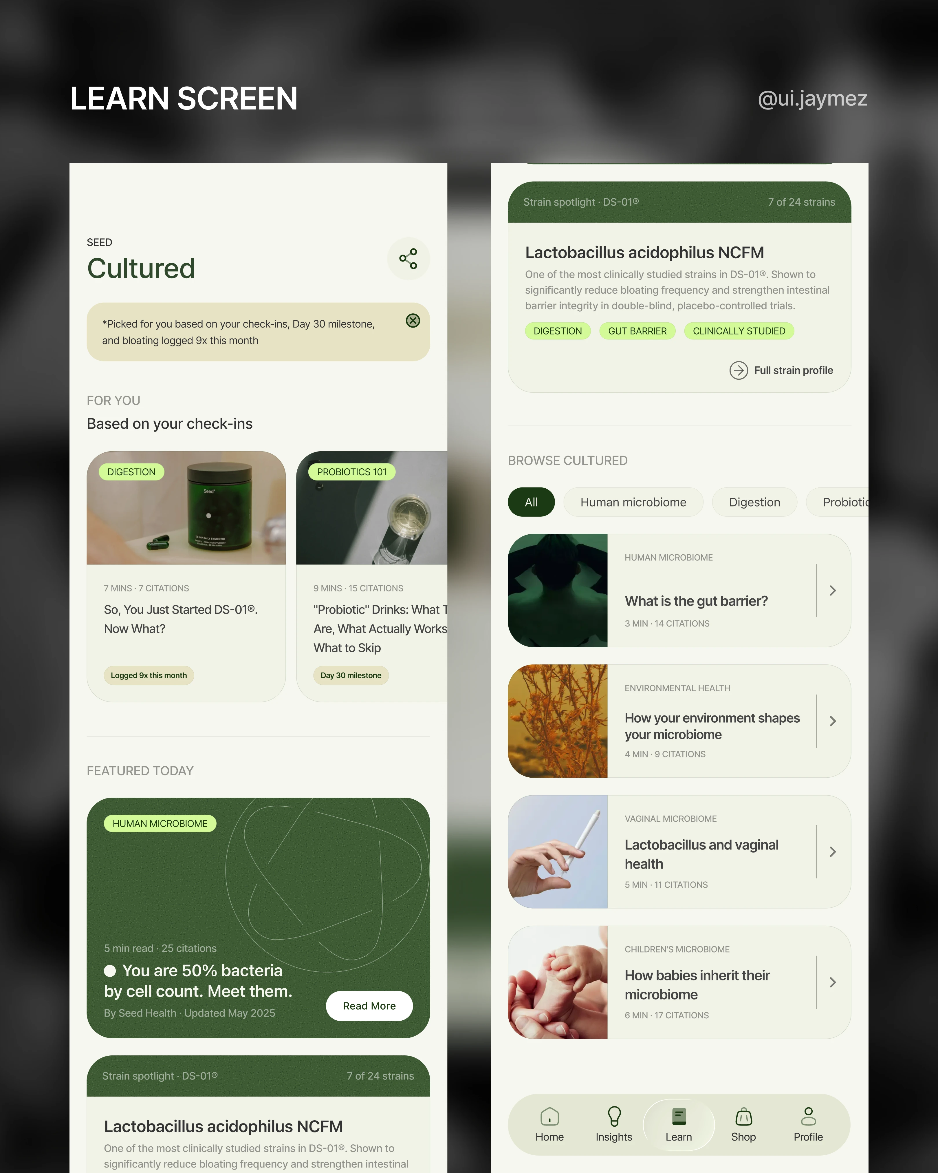
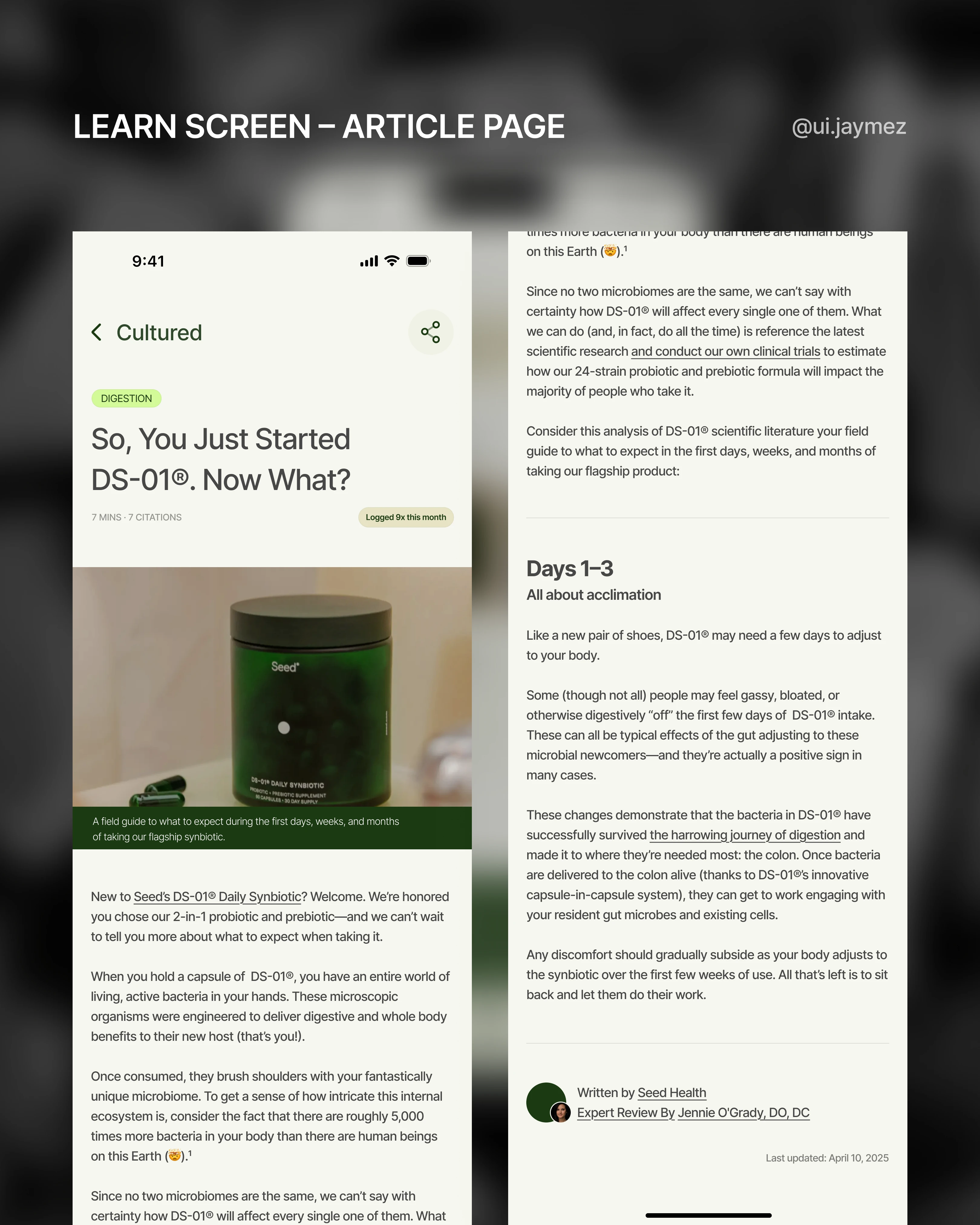
Fourth Flow - Learn screen
Here are some things changed that make this version meaningfully different from the website:
1. The reason banner leads everything.
The first thing the user sees isn't a title or a hero image
It's a single sentence that explains why this content is in front of them: "Picked based on your check-ins, Day 30 milestone, and bloating logged 9x this month"
That sentence alone is the entire justification for the tab.
The website can never write that sentence.
The app can, because it knows who you are.
2. The "why" badge lives on every card.
Small contextual tags beneath each card: "Logged 9x", "Day 30 milestone", "Stress logged 8x".
These connect the content library to the user's actual data, which is what keeps Learn from feeling like a detached blog.
It turns each card from a recommendation into an explanation.
3. Featured Today & Strain Spotlight gate content that deepens over time.
Certain strain spotlights or deep-dive articles could unlock at Day 30, Day 60, Day 90, content that only becomes relevant once you've hit that milestone.
The website can't know where you are in your journey.
4. Push moments. After a low check-in day, the app can quietly surface a relevant Cultured article.
The website never reaches out.
Also, the section is named Cultured, which is the real name Seed uses for their editorial content.
Cultured Screen Mockup
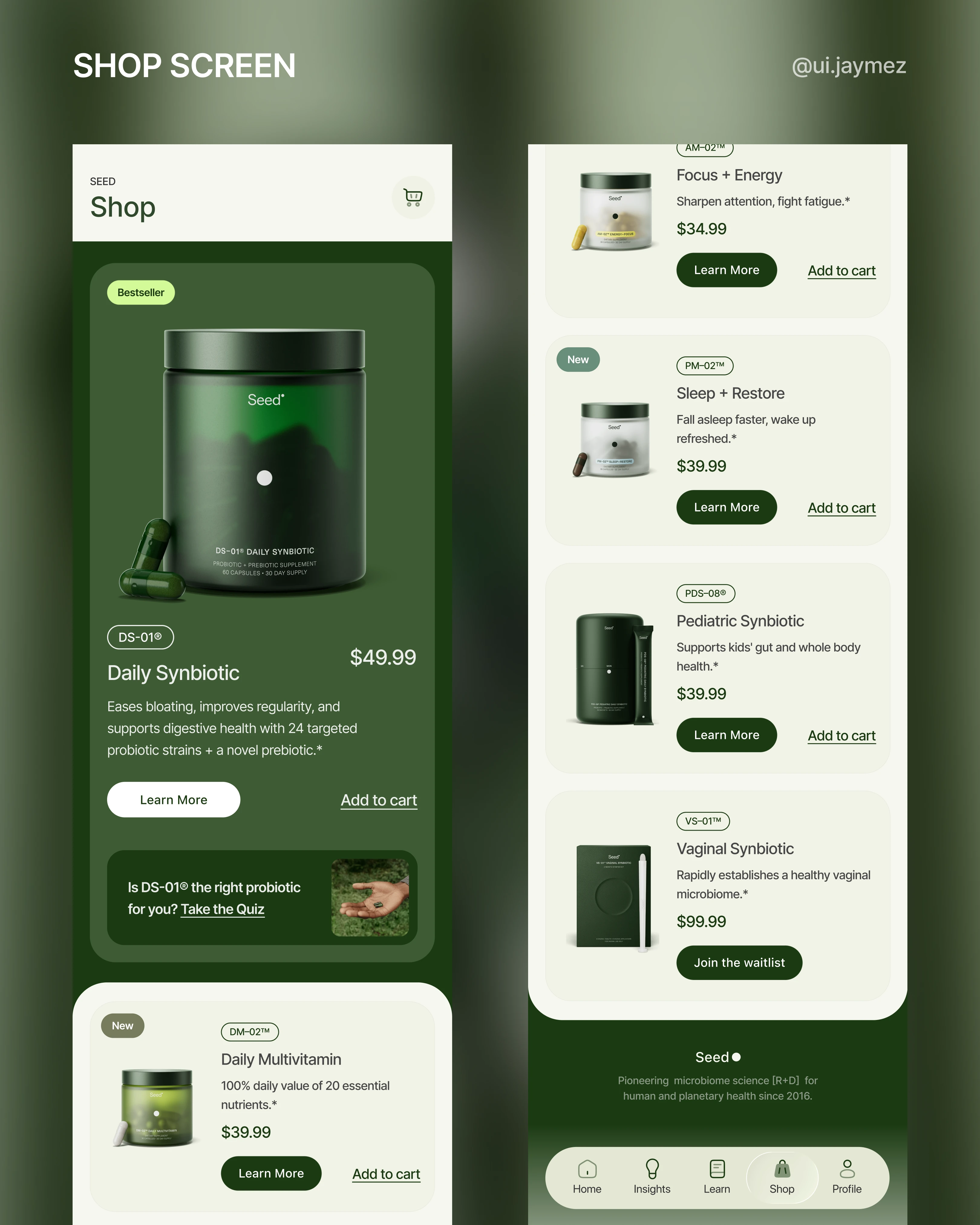
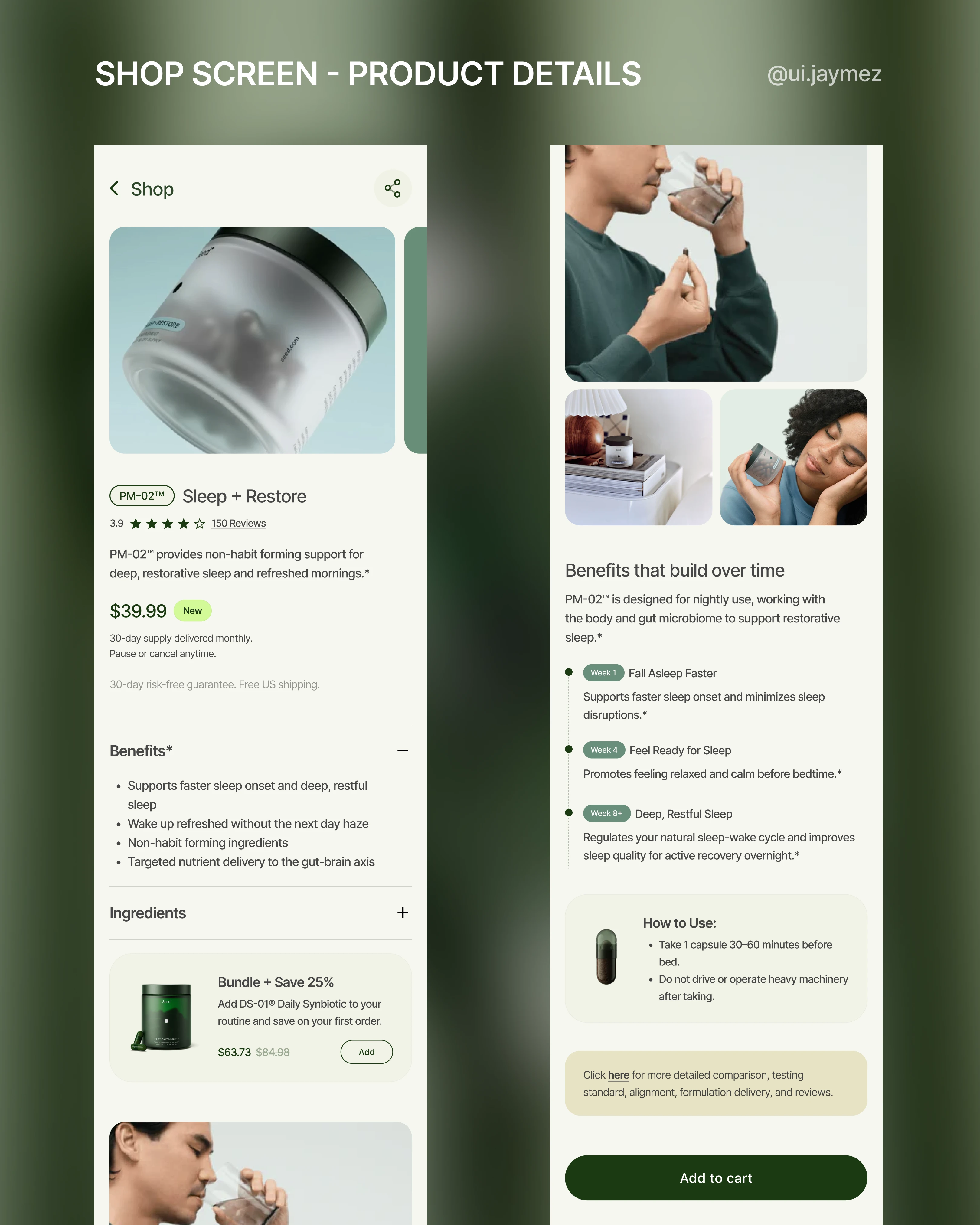
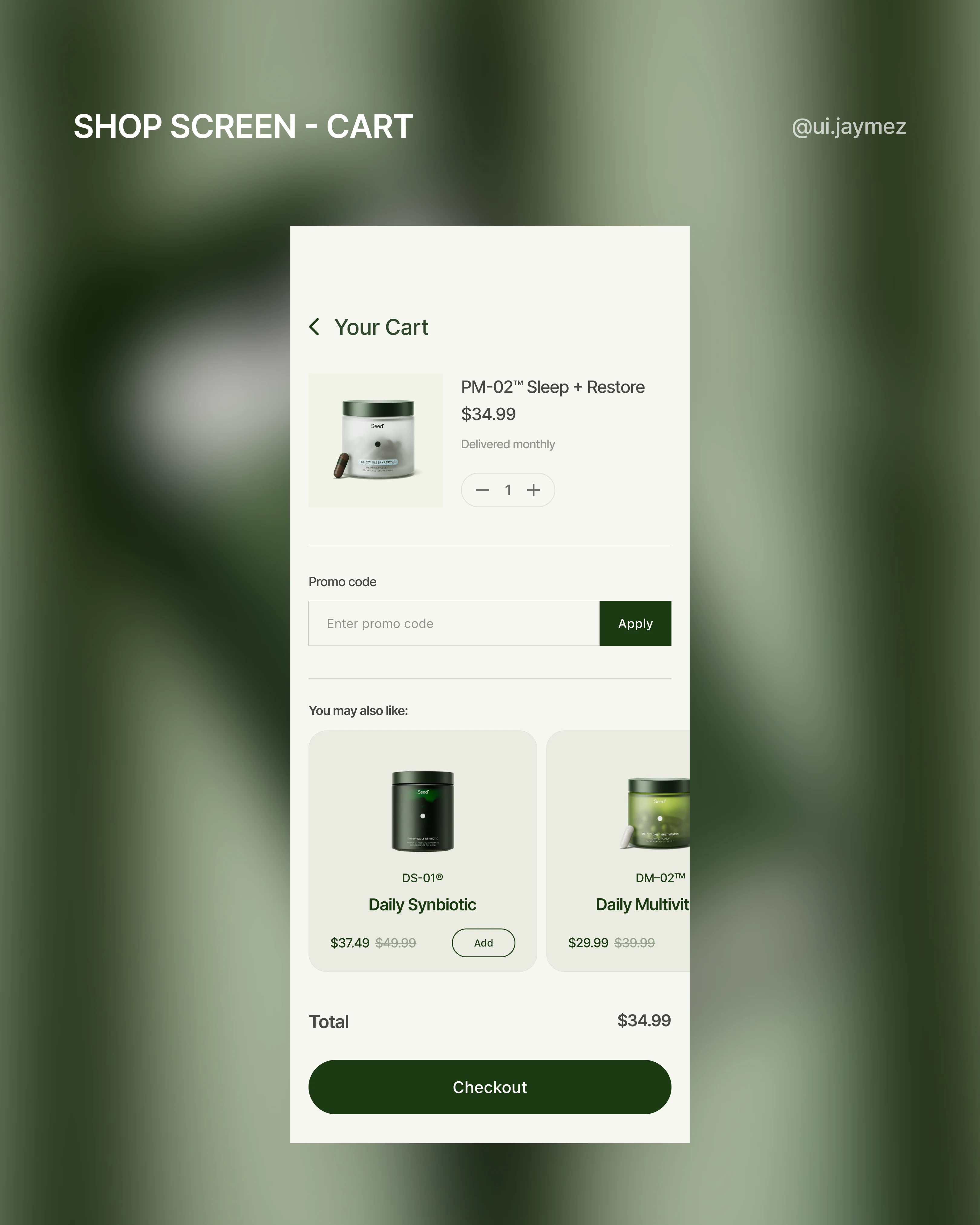
Fifth Flow - Shop
When approaching the Shop screen, I wanted to stay true to the existing Seed brand and e-commerce logic.
After all, the Seed website already has a thoughtful structure and hierarchy.
So instead of reinventing the wheel, I focused on curating and optimizing the experience for mobile.
What I did:
I brought over the most relevant sections from the web shop that help users make confident purchase decisions, like benefits, ingredients, and a “how to use” card.
I also added an alert card at the bottom of the screen for those who need extra details to lead them to the product website page.
I removed sections that tend to overwhelm users on mobile, keeping the interface minimal and direct.
The priority is clarity: let users find, learn about, and add products to cart quickly, without information overload.
Why this matters:
In mobile commerce, users don’t want extra friction; they want clear choices and actions.
The Shop flow stays familiar to Seed’s existing visual language but is tailored for a more direct app experience.
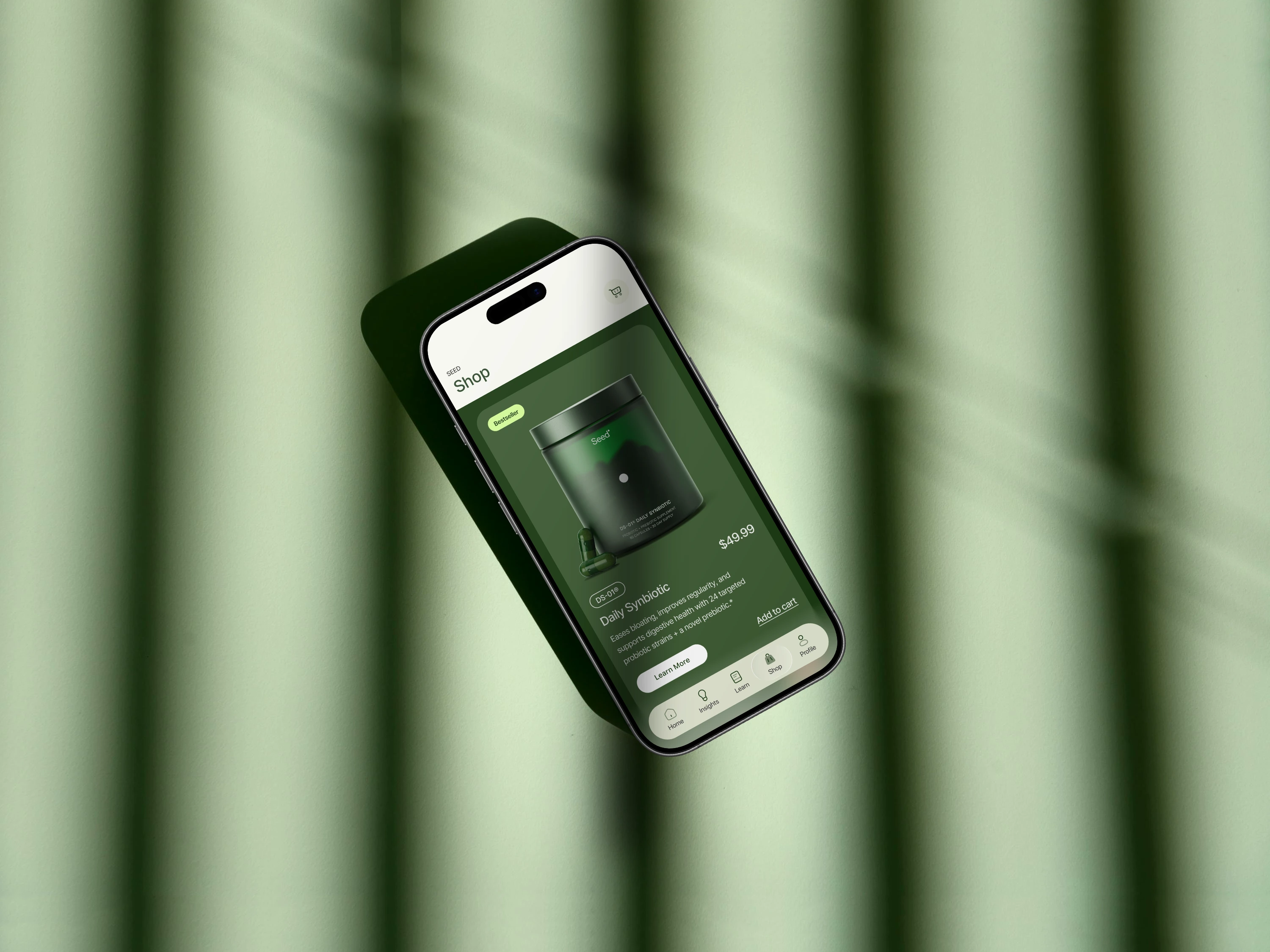
Shop Screen Mockup
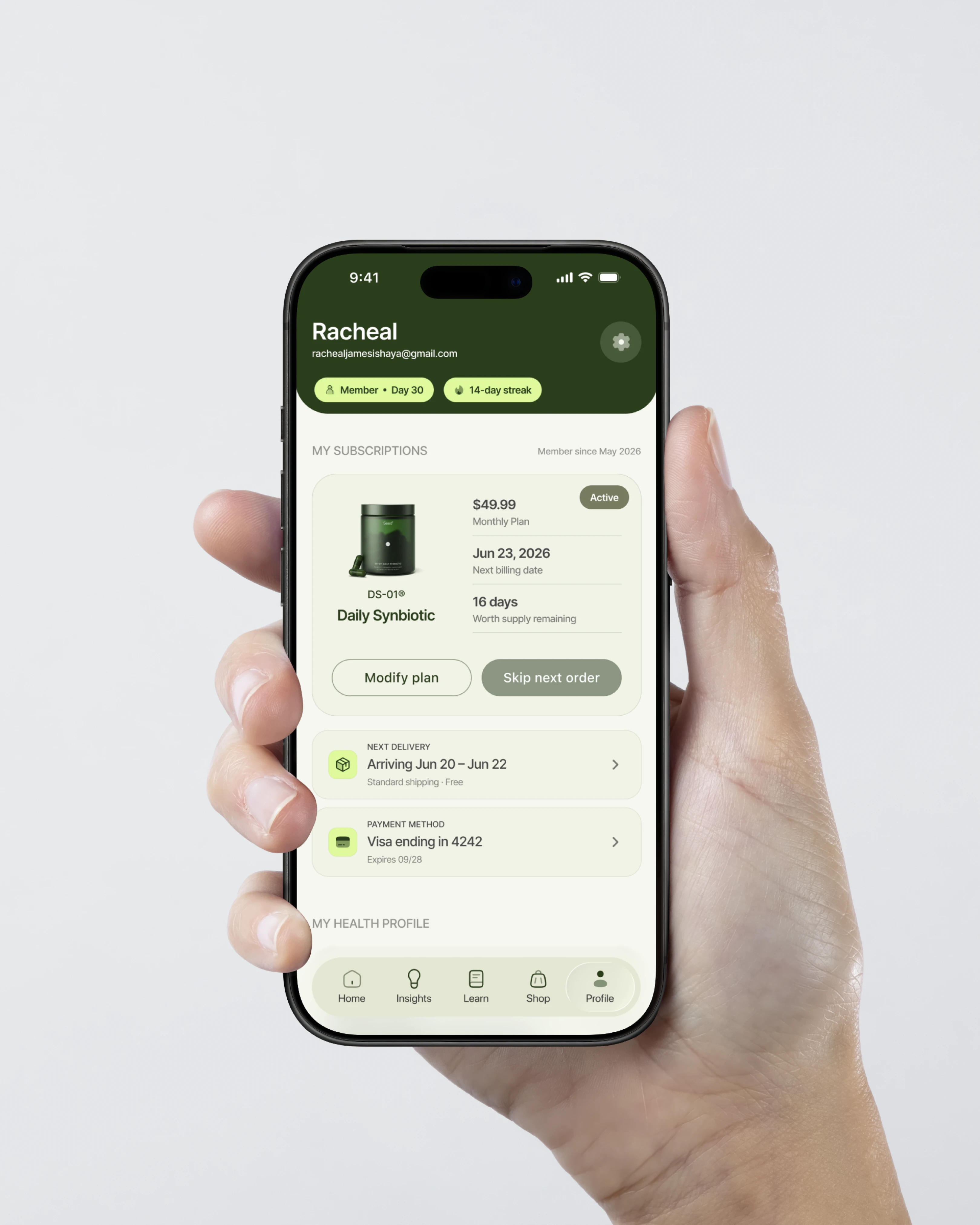
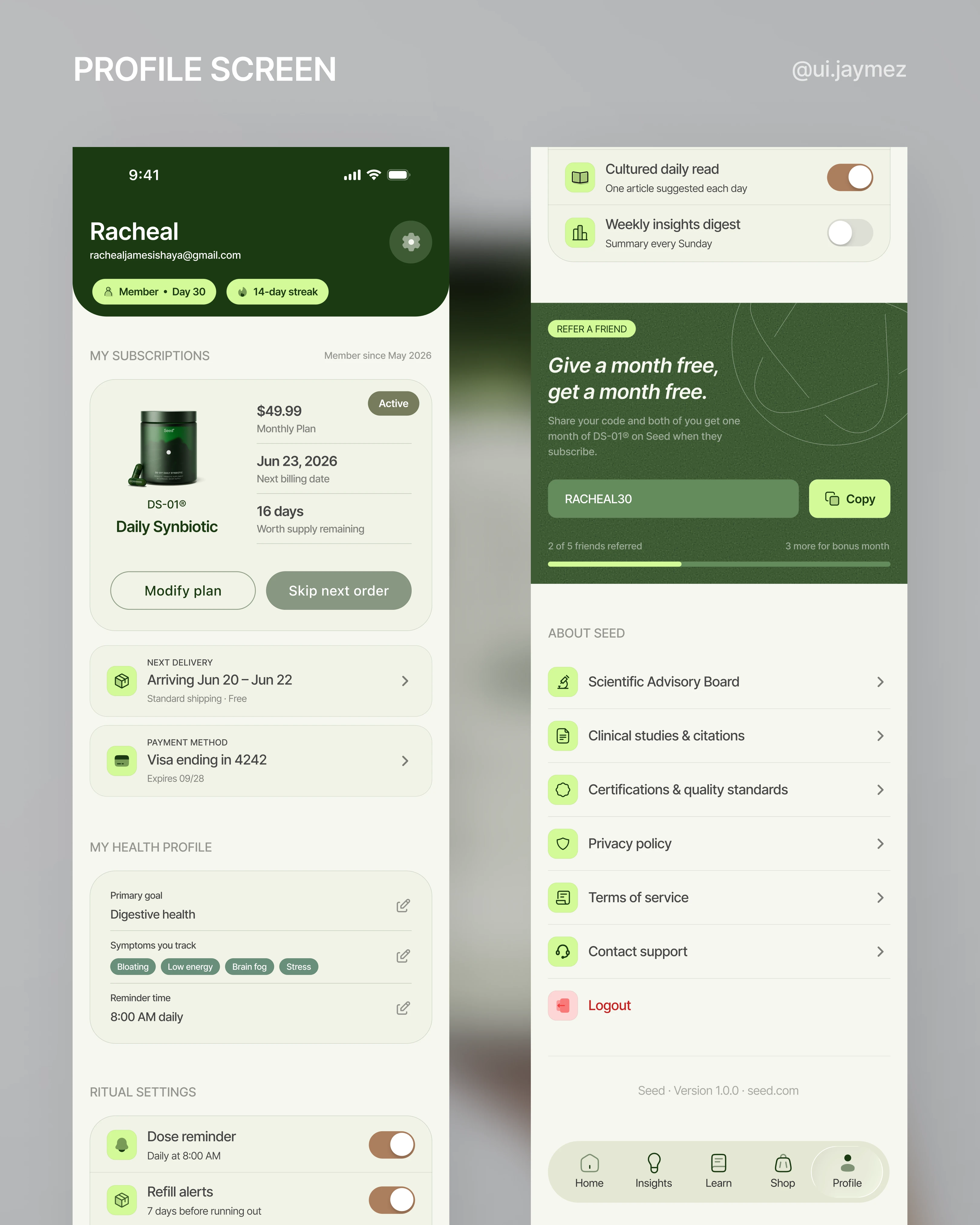
Sixth Flow - Profile
Profile screens are easy to get wrong.
They usually end up as a dumping ground, account settings, help links, and legal pages all crammed into one scroll.
So the first decision was:
What does this screen actually need to do?
For Seed, the answer was three things.
Manage your subscription, reflect your health profile, and reinforce the brand's credibility.
Everything else sits below that.
1. The subscription card.
This is the most commercially important part of the screen.
The user's product, billing date, and supply remaining are all visible at a glance.
But here's the decision I want to talk about: the "skip next order" button.
I made it look slightly disabled. muted, lower contrast, a little receded compared to "modify plan."
That was intentional, and it's a business decision, not just a design one.
Seed's model depends on an active subscription.
A skipped order is a missed delivery, and enough of them is churn.
So nudging the user toward pause over skip is the right move for the business.
But I didn't hide it.
It's still there, still tappable, still legible.
Because removing that control entirely would feel manipulative, and Seed's brand is built on trust.
The design respects the business need without taking the decision away from the user.
2. The health profile section.
This pulls directly from onboarding, primary goal, symptoms being tracked, and reminder time and makes them editable.
The user can see exactly what the app knows about them and change it at any point.
That transparency matters for a brand that leads with science.
3. Ritual settings.
Dose reminder and refill alerts, both on by default.
The refill alert triggers 7 days before supply runs out, which is exactly when a user is most likely to consider cancelling.
Showing up at that moment with a reminder instead of a sales push is the smarter move.
4. The refer-a-friend block.
"Give a month free, get a month free." With its personalised code, and a progress bar showing how close they are to the bonus month.
Its acquisition built into the product without feeling like an ad.
5. The About Seed section.
This isn't filler.
It's the brand's proof of work, surfaced where the most engaged users are already looking.
The people who scroll to the bottom of the profile screen are exactly the people who want to know this stuff.
And that's it!
Like this project
Posted Jun 17, 2026
Designed a conceptual app for Seed focusing on user-centric flows like onboarding and insights, using Figma.
Likes
1
Views
31