Built with Jitter
Art Gallery Mobile App Design for Bidd'me - FinTech
Divan Raj
Verified
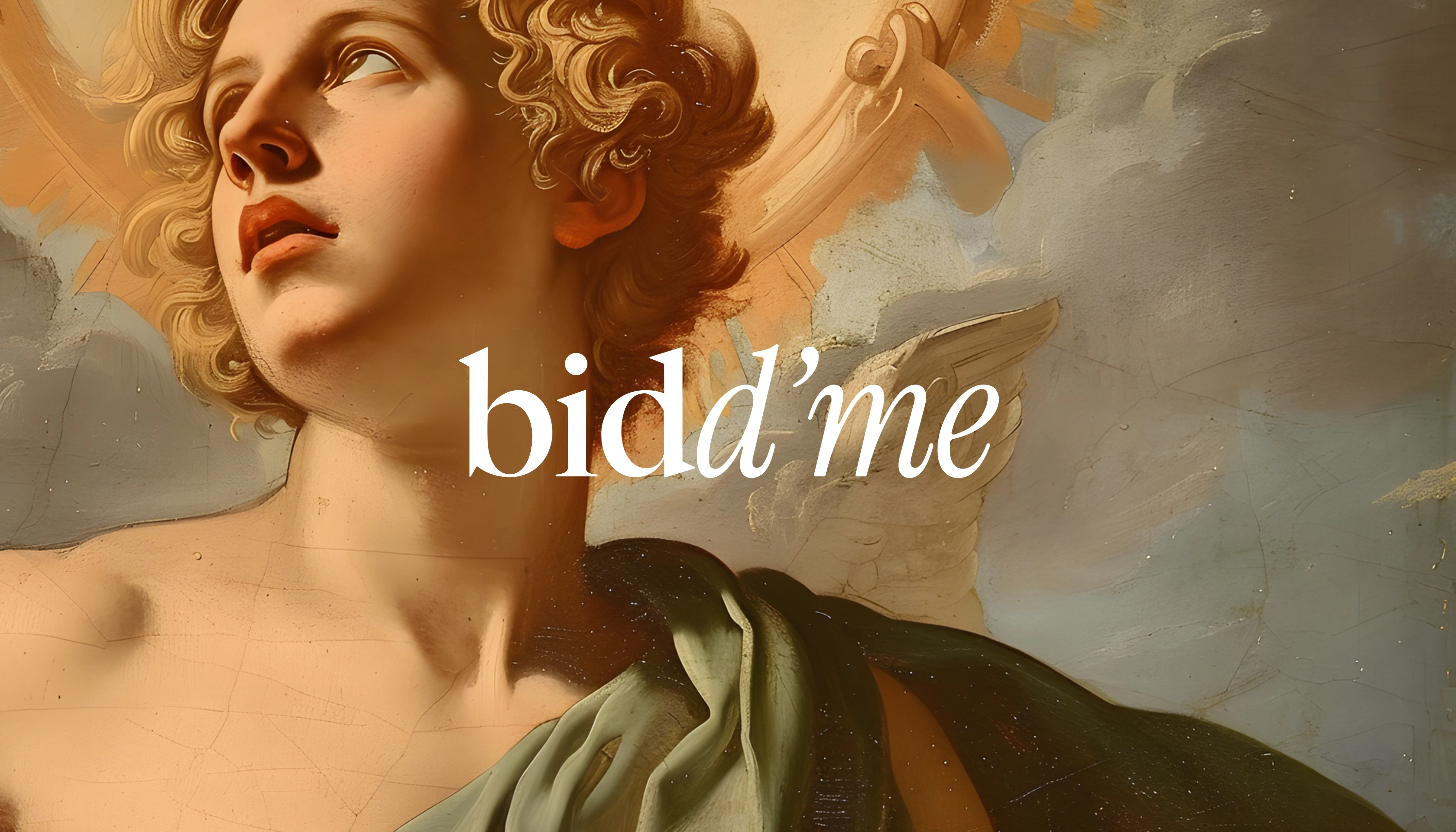
Bidd’me is an art gallery mobile app that lets users bid on artworks. As pieces gain traction and trend, their value can skyrocket, allowing buyers to resell them at a profit.
The product is intentionally designed to feel artistic and expressive, rather than like a typical SaaS application.
Overview
Bidd’me is a mobile art gallery app that allows users to bid on curated artworks. As pieces gain traction and start trending, their perceived value increases—creating opportunities for collectors to resell them at a profit.
Unlike typical marketplace or SaaS-style platforms, Bidd’me is intentionally designed to feel expressive, emotional, and artistic. The interface prioritizes visual storytelling over heavy UI, allowing the artwork itself to take center stage.
Problem
Most bidding or marketplace apps feel transactional and cluttered. They focus on data, numbers, and dashboards, which often distract from the emotional and visual experience of art.
For an art-focused platform, this creates two major issues:
Art loses its emotional impact.
Users feel like they’re using a tool, not exploring a gallery.
Theme
Minimal · Editorial · White · Premium · Art-first
Goal
Design a mobile experience that:
Feels like walking through a modern art gallery.
Puts artwork first, UI second.
Feels premium, minimal, and expressive.
Keeps interactions subtle and non-distracting.
Makes bidding feel intuitive, not transactional.
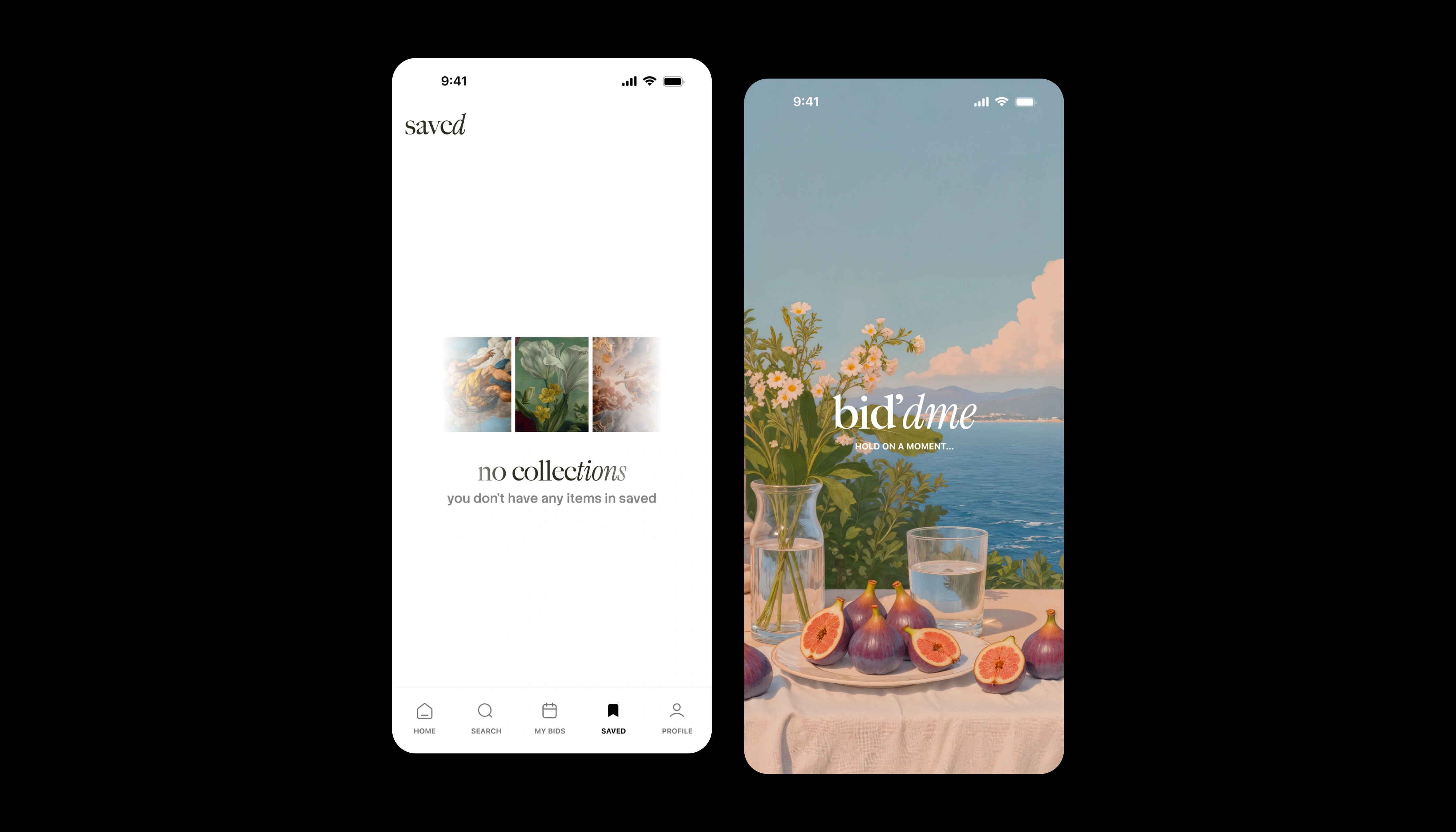
Design Approach
The app follows a minimal editorial theme:
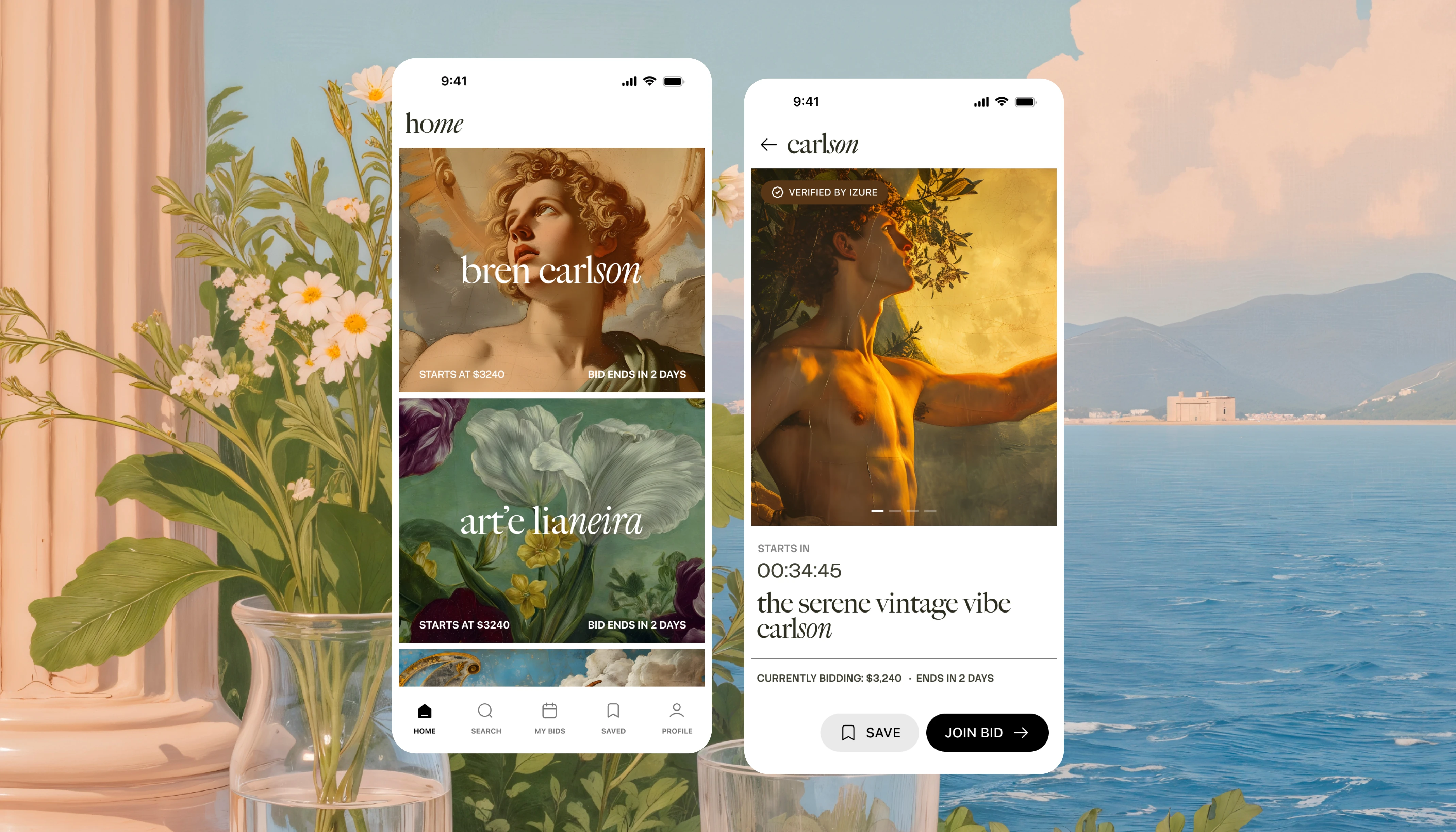
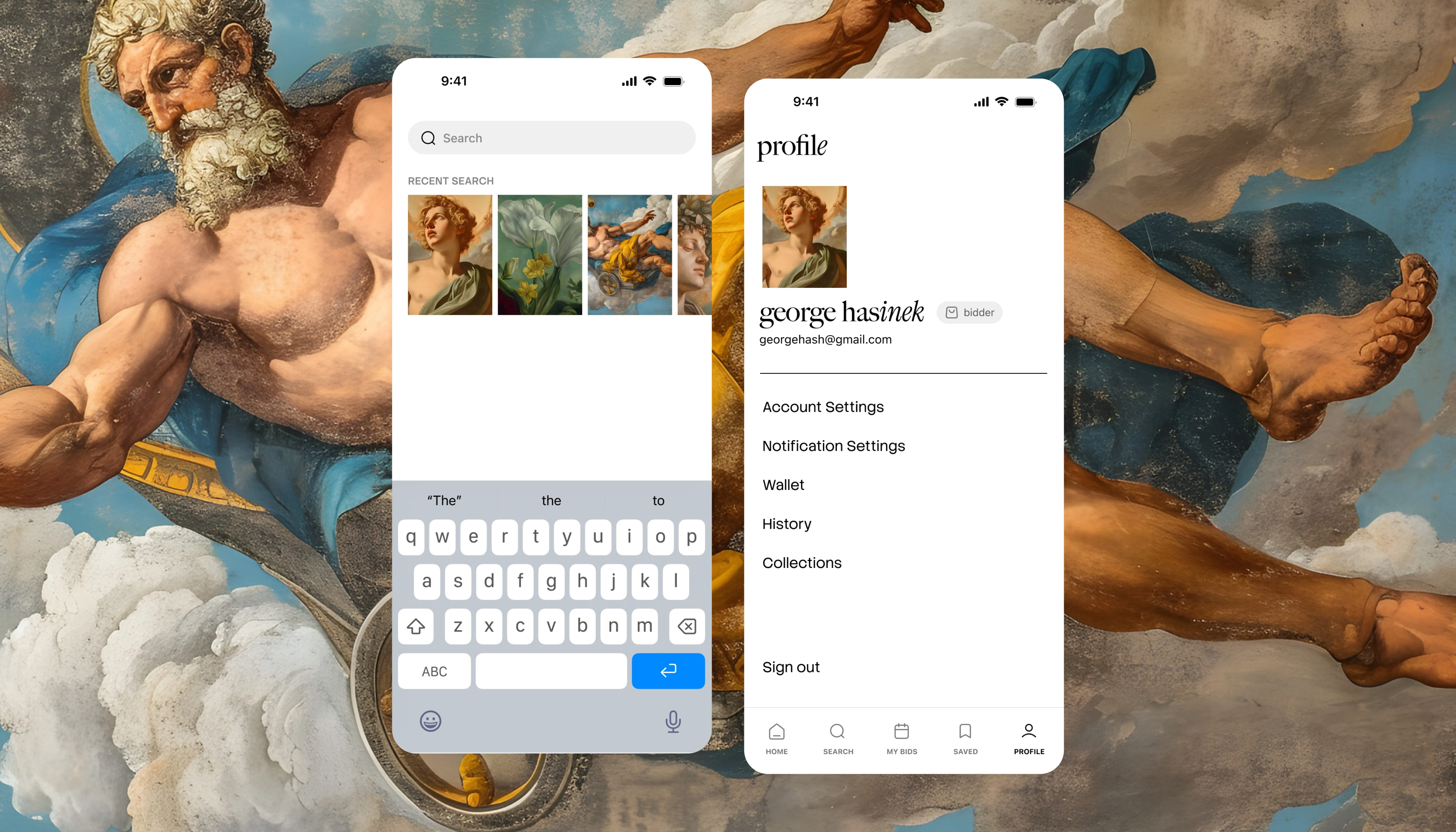
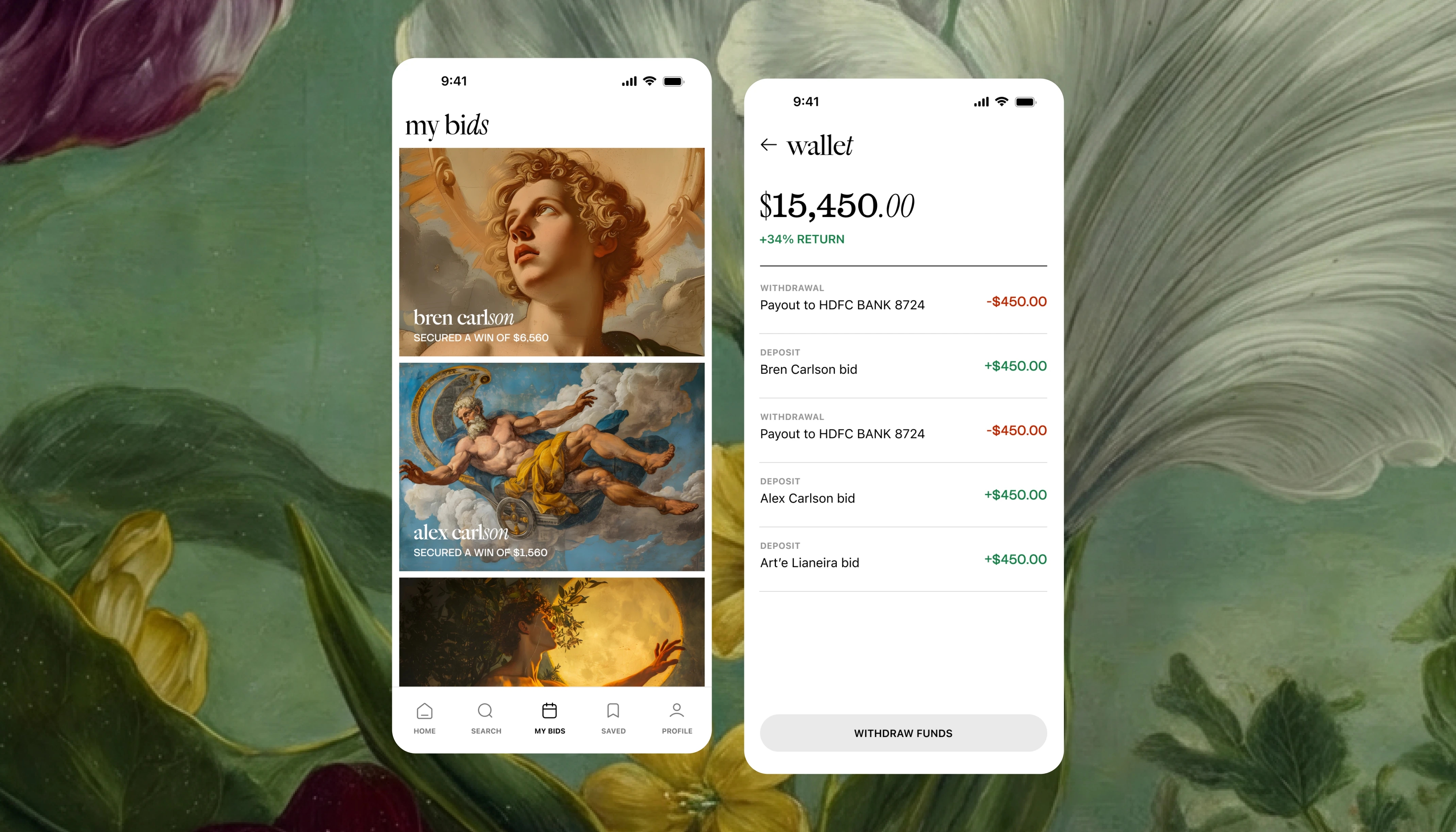
Large, immersive artwork previews
Generous white space
Soft typography
Clean grid
Subtle motion
The idea was to let the artwork breathe and avoid visual noise.
Core Pages
Home – Curated and trending artworks
Search – Discover artists and pieces
My Bids – Active bidding history
Saved Bids – Watchlist for future decisions
Profile – User activity, collections, and preferences
Interaction Design
I focused on subtle, emotional motion instead of flashy animations.
Art should feel calm, not overwhelming. So I avoided loud transitions and instead used:
Soft fades
Gentle scale-ins
Minimal micro-interactions
Smooth page transitions
This makes the experience feel premium and effortless.
Key Design Decisions
1. Big Images First
2. UI in the Background
3. Editorial Layout
Outcome
The final design feels:
Calm
Expressive
Premium
Gallery-like
Emotionally driven
It transforms bidding into an experience of exploration and appreciation, rather than just a transaction.
Here’s a quick animated teaser of the app demo:
Sound ON 🔉
Thanks for taking the time to explore this project.
If you’re looking to improve conversions, build stronger customer trust, and elevate your brand’s overall presence through creative design, this might be the right time to rethink your design strategy.
If this direction resonates with you, I’d love to help bring your next idea to life. Feel free to message me here on Contra to get started.

Like this project
What the client had to say
It was great working with Divan! He turned around designs in record speed and provided creative solutions. His communication was on point and he was very responsive to changes and iteration. Excited to collaborate again!
Allison Nulty Labs, Contra Labs
Feb 8, 2026, Client
Posted Jan 22, 2026
Designed a premium, expressive art gallery fintech mobile application delivering a seamless, immersive, and engaging bidding experience.
Likes
18
Views
520
Timeline
Jan 22, 2026 - Feb 1, 2026
Clients
Contra Labs