Building brands that are understood, trusted & chosen.
- $5k+
- Earned
- 1x
- Hired
- 5.0
- Rating
- 75
- Followers
Building brands that are understood, trusted & chosen.


Marketing sites, ads & A/B for applied AI · CMD Play

Marketing sites, ads & A/B for applied AI · CMD Play


Introducing our latest project for KIS (Keep It Simple).
They came to us at a pivotal moment, transitioning from generic B2B reporting to becoming a specialised Odoo implementation partner.
We helped them own that niche with a brand that's as focused as their new direction.
Built on framer
0
717

📣 New project alert!!
Migrated PassEntry (https://passentry.com/)’s site from WordPress to Framer while preserving layout, CMS, SEO, and analytics. Includes easy content edits and technical layout updates. Deliverables: no-code Framer site, SEO/performance optimisation, analytics, and documentation.
3
37
1K


Creative lab for brand, product and growth.





Award-winning agency specializing in design and development.
- 5.0
- Rating
- 39
- Followers
Award-winning agency specializing in design and development.
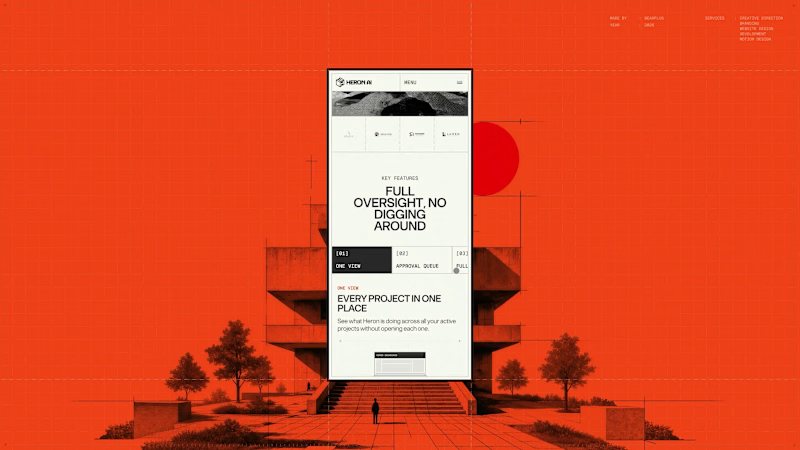
The Heron Dashboard page had to make an agent's work legible after the fact, which is a different job to explaining what the agent does.
The hierarchy leads on time saved rather than activity volume. Heron's positioning rests on hours lost to repetitive modelling, so the product reports back in the same unit, supported by model health, active and pending item counts, and a feed of agent actions. The second half of the page covers contextual code questions, answered against a specific layout and occupancy rather than quoted in isolation.
Mobile treated density as the core problem. The four headline figures are kept grouped so the summary survives a portrait screen, and tabular content is restructured into stacked cards rather than compressed into scrollable tables.
3
146
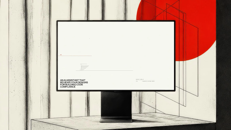
Heron runs inside Revit, Rhino, ArchiCAD and SketchUp, so the site had to read as an instrument rather than a brochure from the first frame.
The preloader replaces the progress bar with a drawing in progress. A red datum line moves up an architectural elevation carrying the percentage value, and the building is drawn in line by line as loading completes. Supporting information sits in the margins in the same register: live cursor coordinates, a project spec card covering type, founding year, focus and location, and a numbered system boot sequence.
Functionally it covers asset loading for the interactive hero, so the drag-to-reveal behaviour responds immediately once the page lands. Editorially it sets the frame before a single line of marketing copy appears.
8
13
745
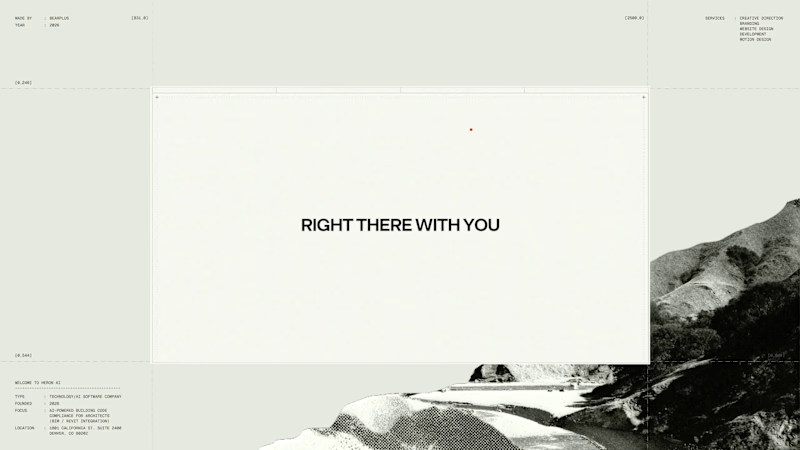
Agent products resist normal product marketing. There's no single interface to screenshot and the category vocabulary has gone generic, so a feature list communicates almost nothing.
We built Heron's explanation as a four-beat scroll that runs the agent's actual loop. The model appears and is watched. Violations surface with plain language and a real IBC clause. An edit is applied after approval. The system learns the firm's standards.
Pacing was the main design problem. Each beat needed enough scroll distance to register as a separate action, without the section becoming so long that people bail before the payoff. The sequence carries the technical detail that would otherwise sit in a spec table.
4
11
721
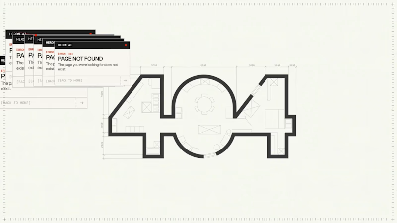
The 404 was treated as a proper page rather than a fallback state.
The number is constructed as an architectural drawing. The 4 and the 0 are formed from walls at true thickness, with furniture laid out inside the resulting rooms and dimension strings running along both edges. It sits inside the same drafting system as the rest of the site rather than borrowing a display typeface.
The error message then repeats. Instead of a single dialog, identical windows cascade back across the canvas, each one carrying the same 404 notice. It reads as a system throwing an unresolved warning over and over, which is the exact behaviour Heron is built to prevent inside a model.
Error pages are never in the brief. They're a good measure of whether a team understood the product or just styled it.
11
11
1K


Helping conscious brands create meaningful change


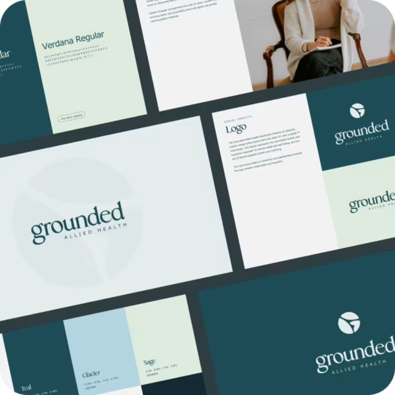

Web Designer/Developer & Digital Marketing
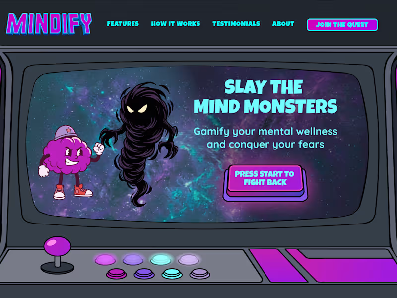
My first attempt to do a 2D character battle animation. Designed in Figma, animated with Rive and putting it all together using Framer. 3 of my favourite tools! Let me explain this conceptual hero section for a mental wellness site:
Let's talk about mental health websites, shall we! They usually lean heavily on the same predictable clinical blues and soft pastels. When creating the hero section for Mindify, I wanted to completely ditch that standard 'play it safe' design. The goal was to tie together 2 totally out there concepts: mental wellness and a retro arcade vibe. And you might be thinking… WTF? Because tackling your mental struggles can genuinely feel like a massive boss battle. By gamifying the experience we turn abstract anxiety into a fun retro fight where you get to grab the joystick and conquer your inner mental monsters. Mental health design does not have to be a bore fest. You really have to think outside the box to build a project that is unique, engaging and packed with a massive wow factor.
See the full case study here: https://cleverquokka.com/case-studies/mindify
1
175
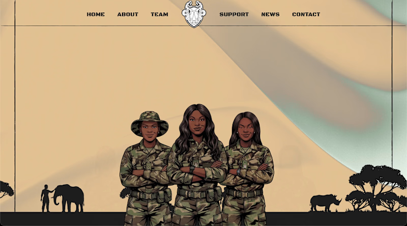
When I found out there was an all-women anti-poaching unit, I knew I had to make this my next side project. Presenting a hero section for the "Black Mambas", an all-women anti poaching unit. I turned some of the members into fierce illustrated characters. Designed in Figma, Built in Framer, animations in Rive.
3
151
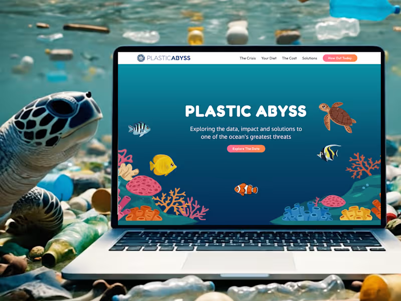
I absolutely love Framer! It allows me to incorporate my illustration/motion design into websites.
Framer is great for educational websites and I’m happy to use it for a passion project I’m working on.
Introducing, PLASTIC ABYSS, an educational website about plastic pollution in our oceans. This affects not just the environment, but humans and future generations.
1
2
152

🚀 High-Converting Web+ Brand Design+ Development


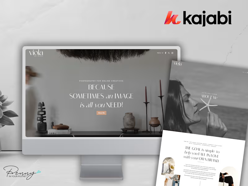
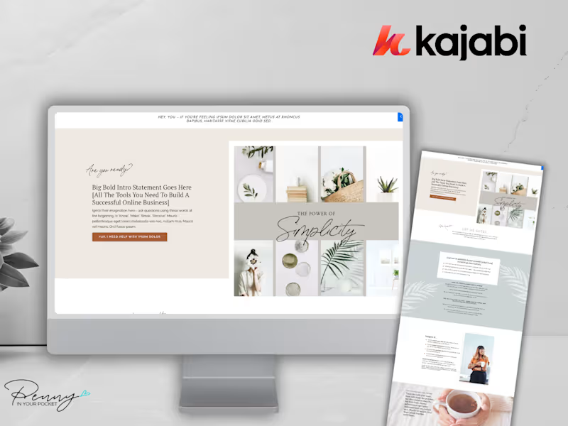
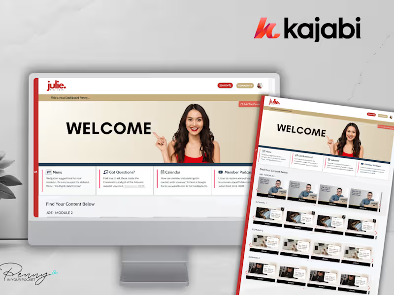
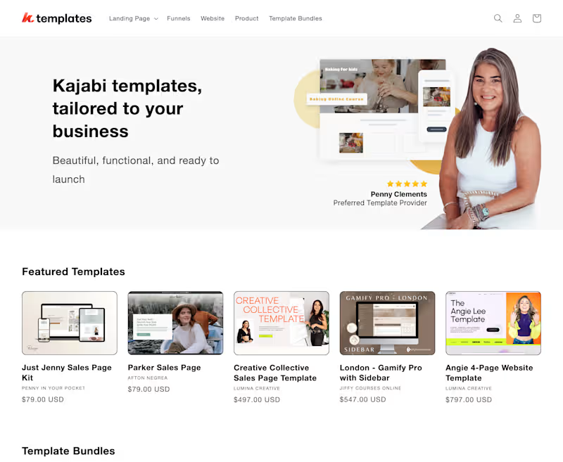
Kajabi Approved Template Developer | Penny In Your Pocket

Kajabi Approved Template Developer | Penny In Your Pocket