
Designing future-proof logos for tech startups.

Designing future-proof logos for tech startups.

Performance-driven Branding for Service Businesses

Performance-driven Branding for Service Businesses

Static design doesn’t cut it for futuristic streetwear anymore.
If a brand targets digital culture, its visuals need to feel alive before the product even drops. 🧪
For Smowq, we moved away from flat graphics and went all-in on high-gloss chrome structures, deep blue lighting, and electric motion lines. It reflects the speed, energy, and raw movement of modern urban identity.
The result: a high-octane visual universe that commands attention instantly.
Would this piece stop your scroll?
4
23
1.1K
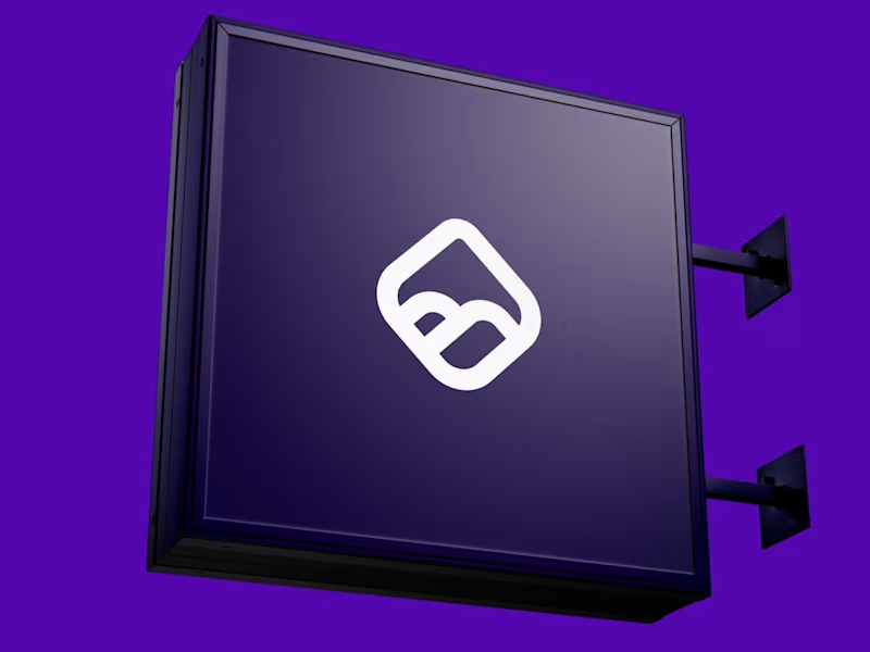
Hot take: High-performance media and premium creative execution should walk hand in hand.
Most agencies in this space lean into generic templates, noisy dashboards, or hyper-aggressive "hustle-bro" aesthetics. It reads functional, but it also feels cheap—like just another interchangeable service provider in a sea of sameness.
For our identity at Montero, we anchored the brand in sleek precision, deep tones, and high-end visual polish. By combining sharp geometry, rich deep purples, and deliberate grid architecture, we moved away from the "commodity agency" feel into true high-ticket creative infrastructure.
It was a deliberate shift: positioning Montero not as an external vendor you hire for cheap clicks, but as a strategic growth partner you invest in to elevate your entire presence.
Would a brand like this deserve a spot at your growth table?
5
7
780

Hot take: aesthetics and clinical results should walk hand in hand.
Most brands in this space lean into cold, sterile whites or aggressive dark tones. It reads functional, but it also feels like something you'd hide in a medicine cabinet, not display on your vanity.
For this rebrand, we anchored the identity in classical beauty and organic sophistication. By combining warm earthy tones, botanical cues, and timeless iconography, we moved away from the "pharmacy product" feel into true high-end personal care.
It was a deliberate shift: positioning the brand not for someone who feels like they are treating a flaw, but for someone investing in a premium daily ritual.
Would a piece like this deserve a spot on your display shelf?
53
86
6.2K

Motion Designer for Apps & SaaS | Launch Videos and Ads


Motion Designer for Apps & SaaS | Launch Videos and Ads
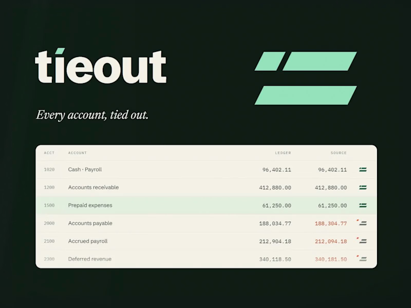
Tieout: Brand Identity Concept for an AI Accounting Tool
Tieout is a fictional AI close assistant for accounting teams. It checks every account against its source and shows the team only what doesn't match. This is a self-initiated concept I made to show how I'd brand a product like this. There is no real company or client behind it.
The idea starts with the accountant's double underline, the two lines that mark a checked, final total. Those same lines make an equals sign, which is what a reconciliation proves. So the mark is a double rule finished by one small piece: the reconciling item that makes two totals agree. That piece also dots the i. Inside the product, an exception is that piece gone missing.
The concept covers the logo suite, type, color with dark mode, product UI, launch and social templates, applications, motion principles, and an animated logo with custom sound.
Every animation follows one rule: things move toward agreement.
1
155
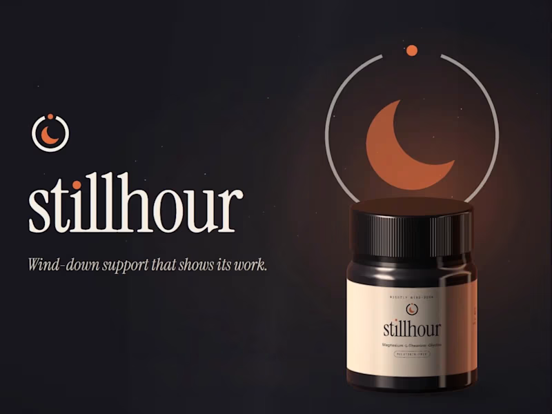
Stillhour: Supplement Brand Identity (Concept)
Stillhour is a self-initiated brand identity concept. The brand is fictional and there was no client. It imagines a melatonin-free drink you stir into warm water before bed to support your wind-down routine.
The strategy started with one problem. Independent lab studies keep finding melatonin products that don't match their labels, so careful buyers have stopped trusting the category. Stillhour's answer is to show its work: every dose printed in full, and a lab report for every lot, linked from the jar.
The mark is a dial that stops at the right hour, with a crescent for stillness. Warm ember on deep night replaces the usual purple sky.
Included: a one-page strategy, logo suite, type and color system, jar and refill packaging with a full side panel, web hero, three social templates, a guidelines page, and an animated logo with custom sound.
1
194
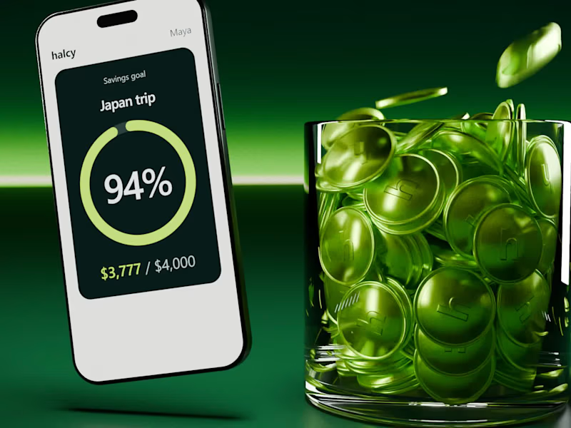
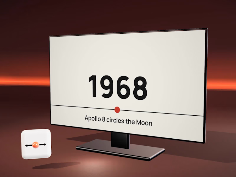
Four video-essay graphics you edit in Premiere
Dates and places are where video essays lose people, so I built four After Effects templates an editor can change without leaving Premiere: a route map, a 3D timeline, a photo with depth and a counting number.
The demo tells a short Apollo 11 story with all four. Change a label, a year or a number in the Essential Graphics panel and the animation follows. Delivered as .mogrt + .aep.
Editors, which graphic do you end up rebuilding most often for essays?
Photo: NASA / Apollo 11 (AS11-44-6552); not affiliated with or endorsed by NASA. Map data: Natural Earth. Music: own track. Adobe, After Effects and Premiere Pro are trademarks of Adobe.
5
3
330

Design that breaks brands out of the cocoon.
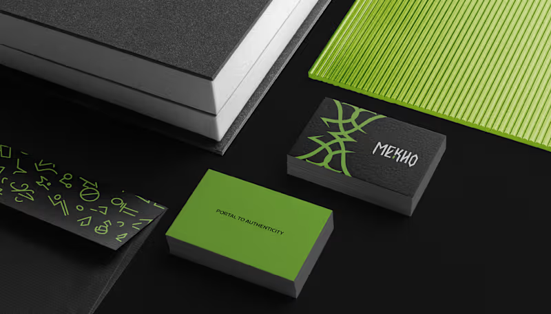
Language can be a portal, where each word opens a passage to new worlds. Yet in the language school market, many brands still communicate in similar ways.
With MEKHO, the goal was to move away from traditional academic imagery without losing credibility or structure. The challenge was to translate depth and authenticity into a consistent visual system for digital environments.
The logotype features angular strokes to convey precision. The symbol combines stylized bat wings, representing guidance, with a form that suggests a coded sign, reinforcing language as a system to be deciphered. The palette builds authority through dark tones, while green acts as a calculated contrast, signaling sophistication and direction.
The result is an identity that positions MEKHO as an immersive brand focused on real communication.
5
10
141

Alquimia do Sabor is a vegan confectionery brand that transforms plant-based ingredients into sensory experiences filled with care, consciousness, and meaning. More than sweets, the brand creates everyday potions, creations that awaken memory, affection, and presence.
2
131

This is the essence of the brand: a hybrid space that connects literature and botany as two forms of care. Here, books are not merely objects, they are seeds of possible worlds. And flowers are not just ornaments, they are gestures of affection, small breaths that soften the day.
2
27
259

NÓRIA is an artisanal fashion studio that brings together gesture, technique, and silence. Each piece emerges as a study of form: soft curves, natural textures, and a drape that follows the body’s own flow. The process is slow and intentional — stitching that respects time, fabric, and touch.
The visual identity begins with the central symbol: four continuous loops inspired by the running stitch. It represents the movement of the thread, the repetition of the gesture, and the delicate precision of patternmaking. The neutral, mineral palette reflects the studio’s aesthetic: calm, tactile, organic. Fine, gentle typefaces support the brand’s editorial character. Graphic elements derived from the loop create visual rhythm, as if the motion of sewing extended across the entire system.
2
18
233

Graphic designer and Art Director +8 years of experience.
- 1x
- Hired
- 5.0
- Rating
- 19
- Followers
Graphic designer and Art Director +8 years of experience.
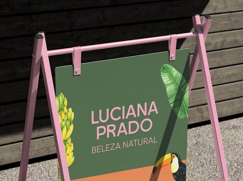


Talking Therapies UK | Brand Design
This is an own private practice, that provides evidence based, quality Psychotherapy services for individuals whom are seeking treatment for a range of mental health difficulties.
The solution was to create a chearful and bright brand. The icon represents the talking act but also the good feeling of share our worries. A serif typography was choosen to give more credibility once the icon is funier.
1
189



Brand Systems & Visual Identity | EGO® | Design, Branding
- 10
- Followers
Brand Systems & Visual Identity | EGO® | Design, Branding
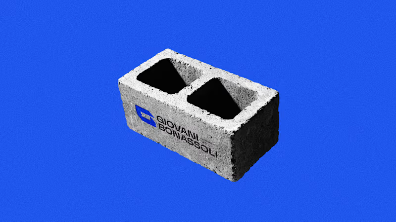
Giovani Bonassoli
Is a civil engineer focused on structural projects — and his brand needed to reflect exactly that: technical precision, clarity and real results.
We built an identity that breaks with the generic look of engineering. An ultramarine blue palette, dark tones and contemporary typography translate the weight of a well-calculated structure into a visual language that holds its own both on a construction site and in the digital world.
From logo to business card, from document templates to social media presence, every touchpoint was designed to communicate one thing: this is an engineer who knows what he's doing.
Strategy, visual identity and brand manual by Gustavo Nolasco.
2
168
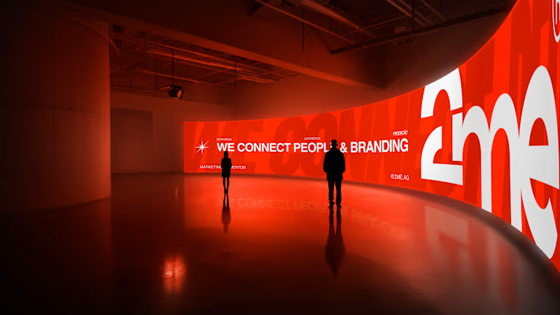
[2ME®]
2ME® is a marketing and experiences company built on a simple belief: every great project begins by connecting people.
We combine strategy, creativity and execution to transform ideas into experiences that strengthen brands, create meaningful connections and generate lasting impact.
The new identity reflects this vision through a bold, contemporary visual system designed to communicate movement, collaboration and presence across every touchpoint.
From campaigns to large-scale events, from digital experiences to physical activations, we create brands and experiences that people remember.
3
209
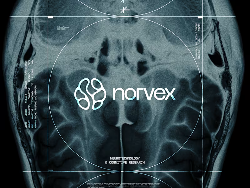
[NORVEX]
NORVEX is a neurotechnology and cognitive research laboratory based in Cambridge, Massachusetts.
Operating at the intersection of neuroscience, cognitive analytics, technology and human performance, Norvex transforms complex data into research, intelligent systems and meaningful insights.
Its new identity reflects this vision through a precise and dynamic visual system, built around intelligence, connectivity and movement.
2
275

Crafting compelling brands and designing stunning websites
- 5.0
- Rating
Crafting compelling brands and designing stunning websites


