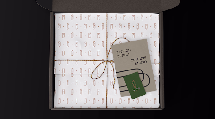
NÓRIA is an artisanal fashion studio that brings together ge...
Carolina Zeferino
NÓRIA is an artisanal fashion studio that brings together gesture, technique, and silence. Each piece emerges as a study of form: soft curves, natural textures, and a drape that follows the body’s own flow. The process is slow and intentional — stitching that respects time, fabric, and touch.
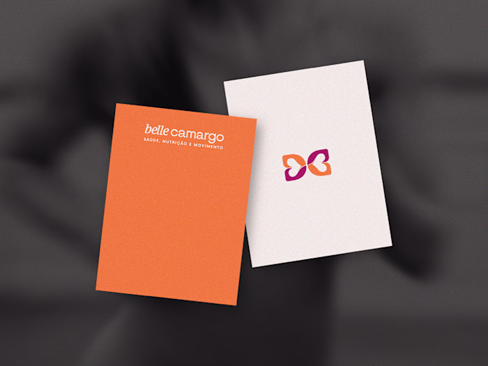
The visual identity begins with the central symbol: four continuous loops inspired by the running stitch. It represents the movement of the thread, the repetition of the gesture, and the delicate precision of patternmaking. The neutral, mineral palette reflects the studio’s aesthetic: calm, tactile, organic. Fine, gentle typefaces support the brand’s editorial character. Graphic elements derived from the loop create visual rhythm, as if the motion of sewing extended across the entire system.
Like this project
Posted Nov 24, 2025
NÓRIA is an artisanal fashion studio that brings together gesture, technique, and silence. Each piece emerges as a study of form: soft curves, natural textur...