Carolina Zeferino
Design that breaks brands out of the cocoon.


Language can be a portal, where each word opens a passage to new worlds. Yet in the language school market, many brands still communicate in similar ways.
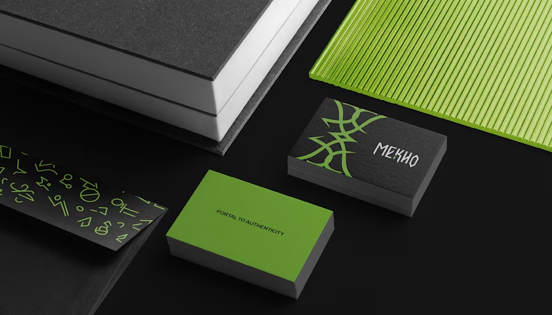
With MEKHO, the goal was to move away from traditional academic imagery without losing credibility or structure. The challenge was to translate depth and authenticity into a consistent visual system for digital environments.
The logotype features angular strokes to convey precision. The symbol combines stylized bat wings, representing guidance, with a form that suggests a coded sign, reinforcing language as a system to be deciphered. The palette builds authority through dark tones, while green acts as a calculated contrast, signaling sophistication and direction.
The result is an identity that positions MEKHO as an immersive brand focused on real communication.
5
10
102
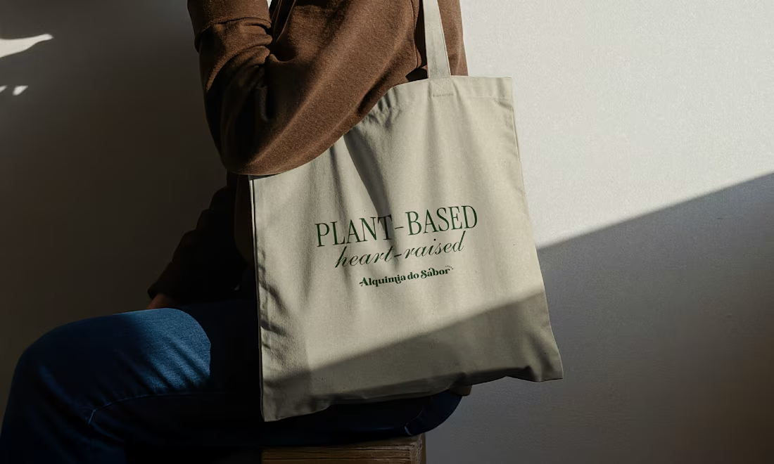
Alquimia do Sabor is a vegan confectionery brand that transforms plant-based ingredients into sensory experiences filled with care, consciousness, and meaning. More than sweets, the brand creates everyday potions, creations that awaken memory, affection, and presence.
2
94
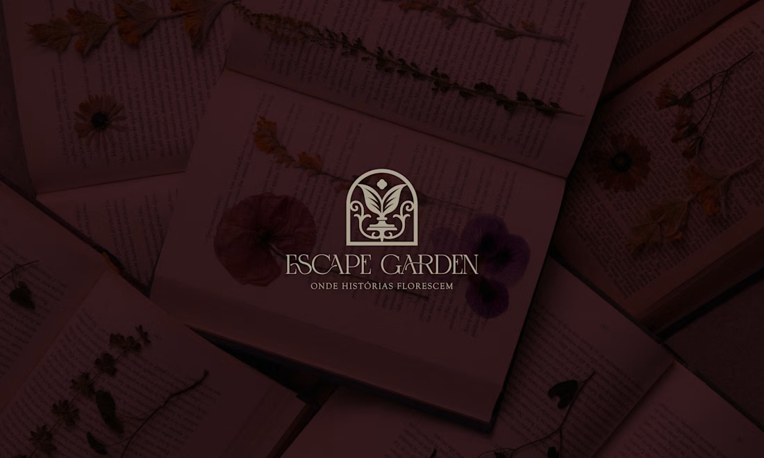
This is the essence of the brand: a hybrid space that connects literature and botany as two forms of care. Here, books are not merely objects, they are seeds of possible worlds. And flowers are not just ornaments, they are gestures of affection, small breaths that soften the day.
2
27
233
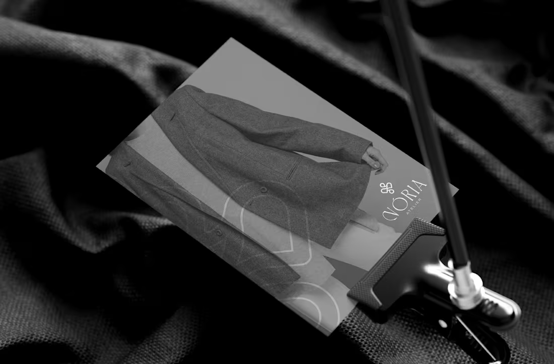
NÓRIA is an artisanal fashion studio that brings together gesture, technique, and silence. Each piece emerges as a study of form: soft curves, natural textures, and a drape that follows the body’s own flow. The process is slow and intentional — stitching that respects time, fabric, and touch.
The visual identity begins with the central symbol: four continuous loops inspired by the running stitch. It represents the movement of the thread, the repetition of the gesture, and the delicate precision of patternmaking. The neutral, mineral palette reflects the studio’s aesthetic: calm, tactile, organic. Fine, gentle typefaces support the brand’s editorial character. Graphic elements derived from the loop create visual rhythm, as if the motion of sewing extended across the entire system.
2
18
203