Sejunta | Brand Identity for MSP reference in Apple ecosystems
Helping Sejunta share with the world the disruptive and modern company they have become.
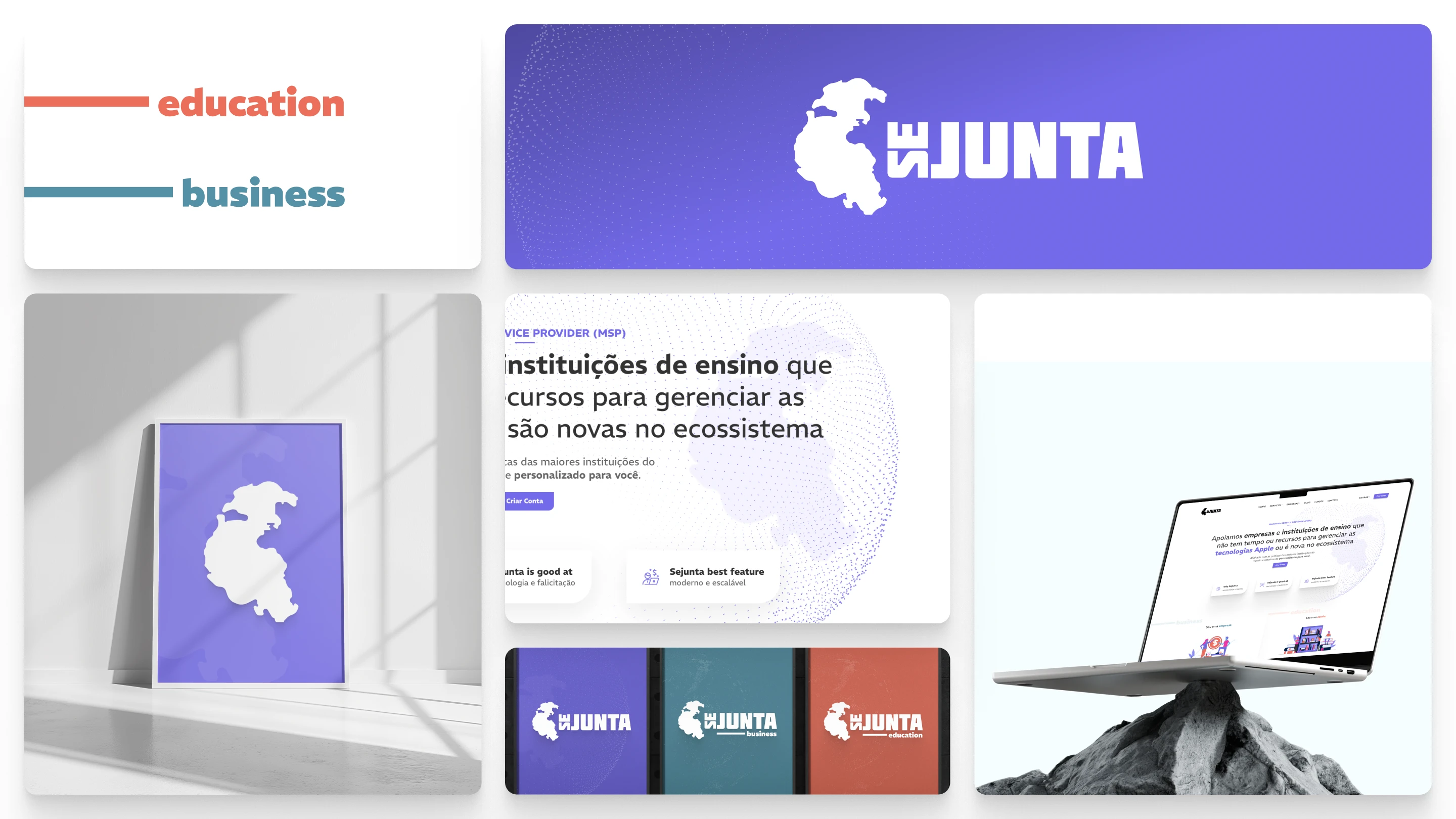
Sejunta's new Brand Identity
At first glance, it may seem risky to change a well-established and successful company like Sejunta. However, since I love a good challenge, I took my shot and embarked on a journey of refinement, enhancing what was already good and elevating it to the next level.
Every detail of this project—every point, line, and curve—was meticulously adjusted to capture and communicate its modernity, versatility, and the significant impact it brings to the market.
Diving deep: unpacking Sejunta through UX
After numerous conversations with Sejunta's CEO, Guilherme Camargo, I had the privilege of getting to know the heart of the company. I learned about its history and motivations, its objectives and strategies, and, most importantly, how it innovates and impacts countless businesses and schools around the world.
I immediately recognized an opportunity to align the company’s evolution with the message conveyed by its brand. I was captivated by Sejunta's transformation and determined to showcase its new identity to the world.
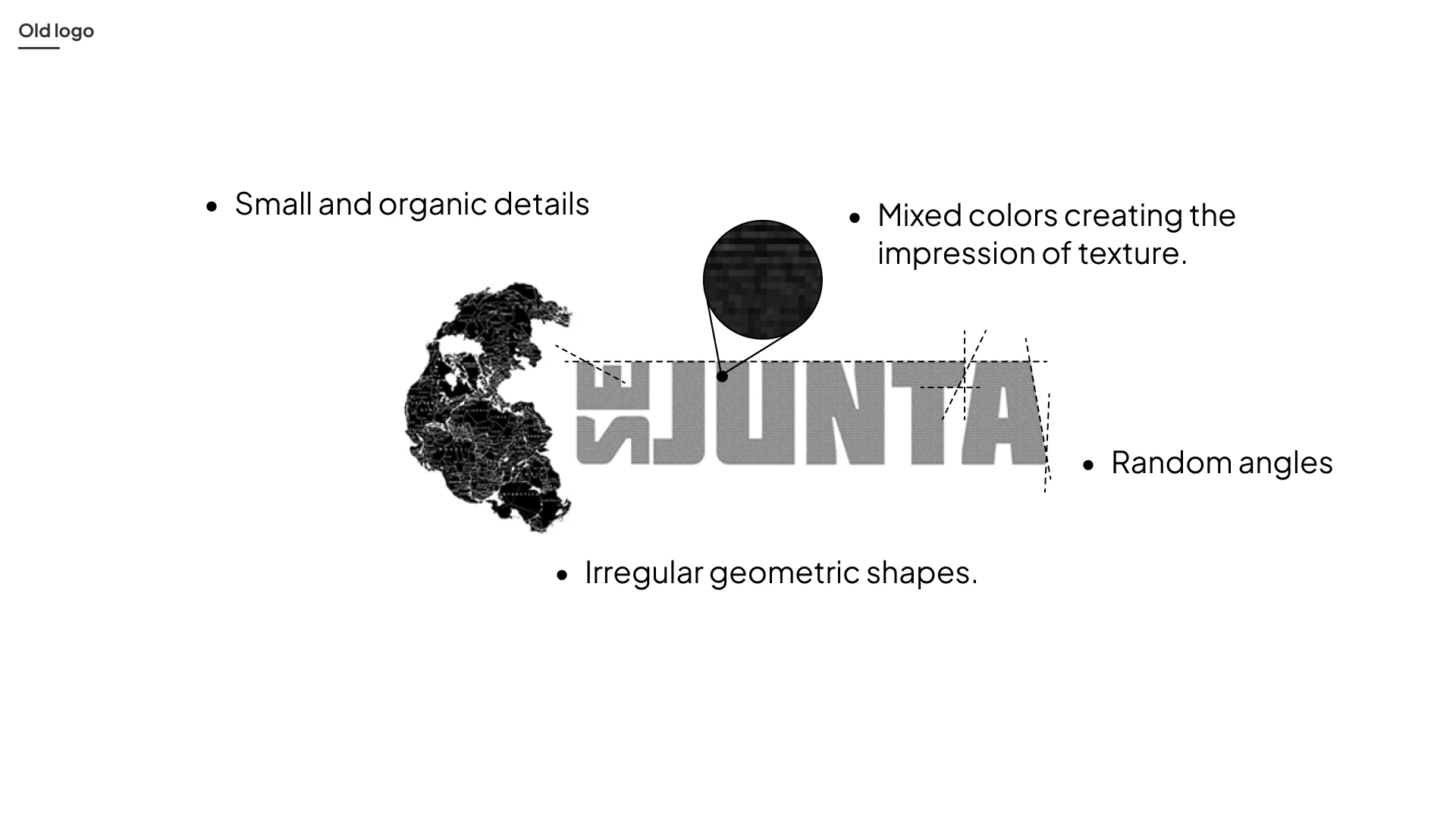
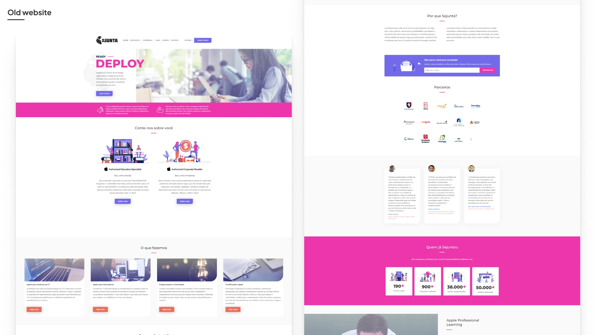
After all, what were the motivations to enhance the visual communication?
Sejunta has grown to become a reference in Apple ecosystems for numerous corporate and educational institutions in Brazil, implementing over 85,000 devices and 322 projects, impacting more than 860,000 users since 2017. Today, it is recognized as both an Apple Authorised Education Specialist and an Apple Corporate Reseller in the country.
After seven years, it was time for its communication to more clearly reflect who it is today and how it connects schools and businesses with the future.
What began as a simple request to update the website as an attempt to achieve such goal, soon revealed that we needed to dig deeper, reevaluating all components of the visual identity.
A robust and comprehensive package was essential for this update, which expanded from the website to include the logo, color palette, visual elements, images, illustrations, and even email signatures.
Breaking down the main components of visual Identity
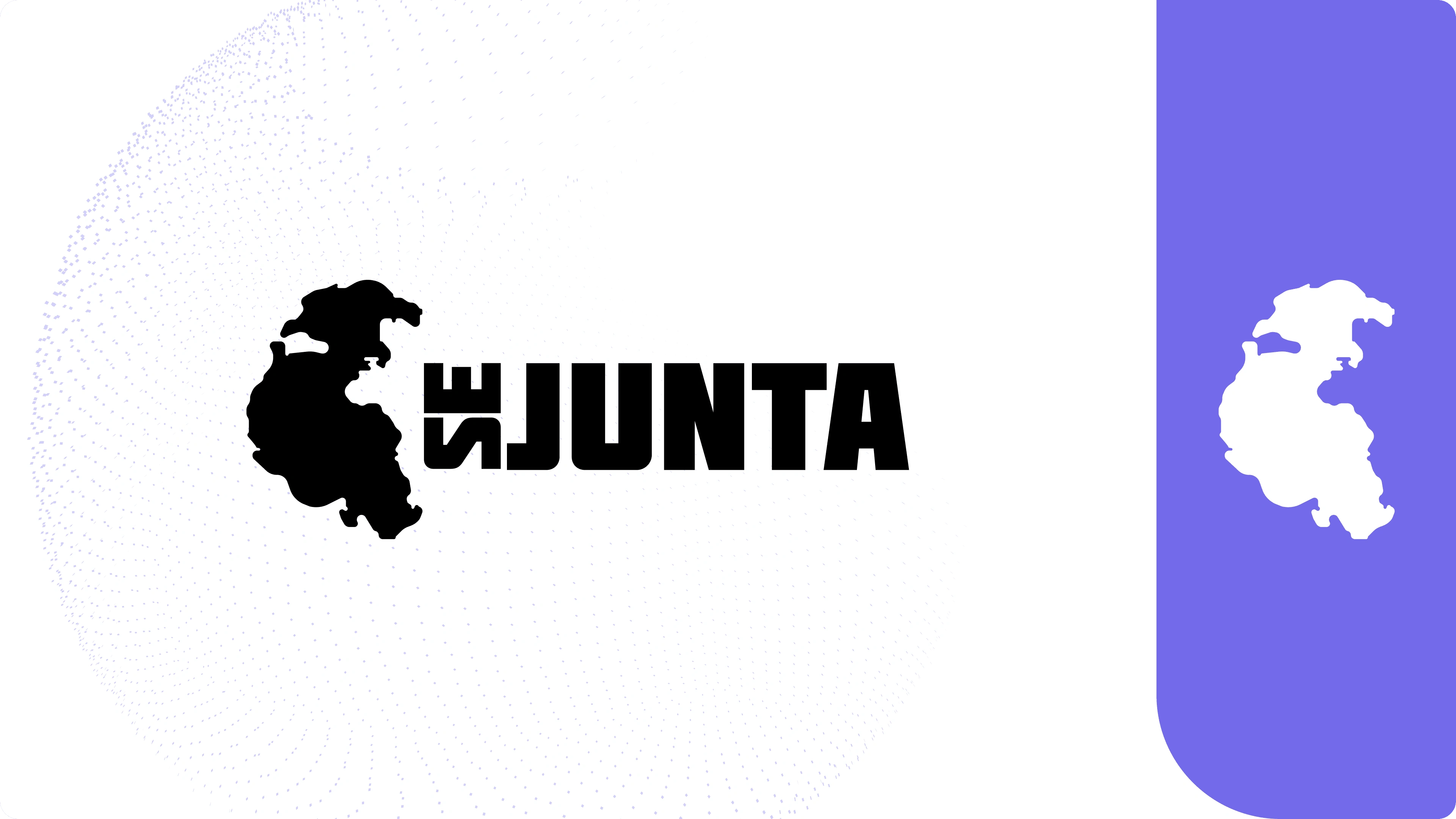
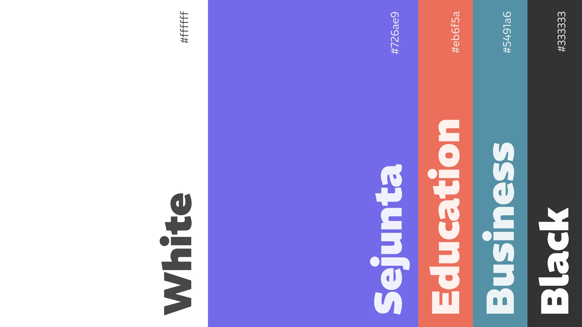
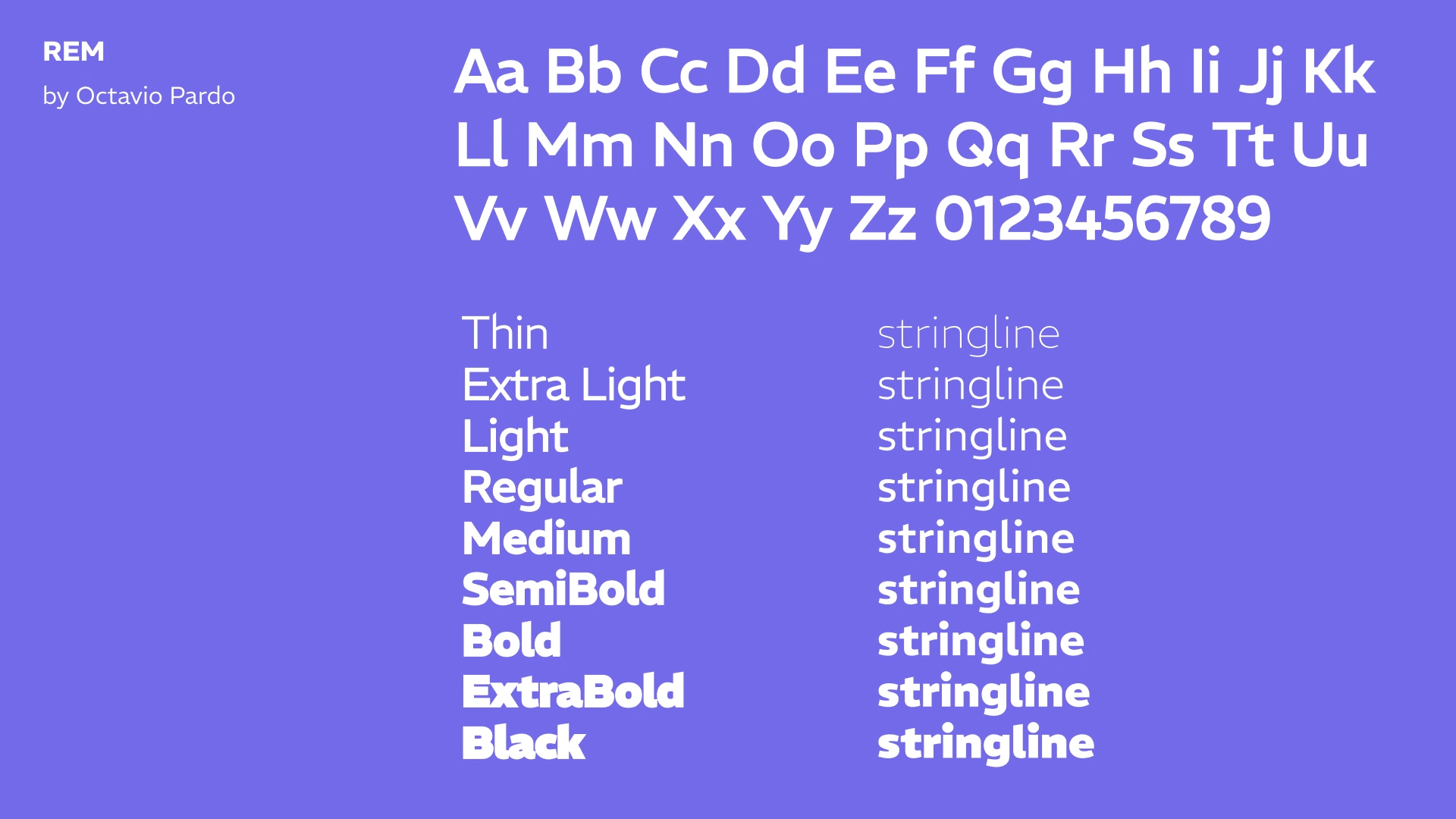
I started working on all visual elements such as logos, icons, typography, tone of voice, images, and illustrations, which together formed the new brand identity of Sejunta. This time, however, this elements was radiating qualities like: reliable, innovative, secure, scalable, versatile, expert, modern, and transformative.
Website Redesign for Sejunta
The new design enhances user experience, making it easier for visitors to access information and engage with the brand.
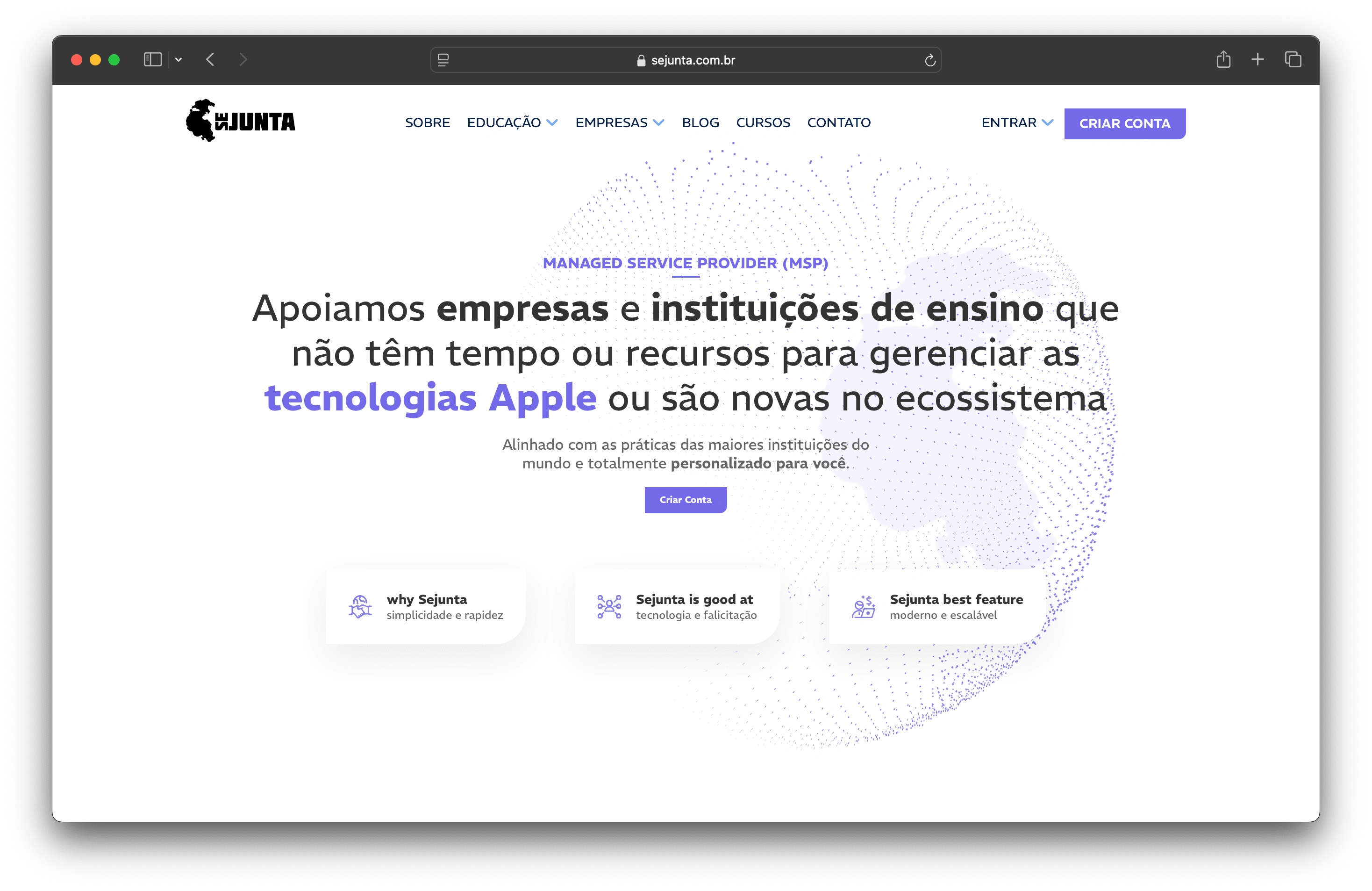
https://sejunta.com.br/
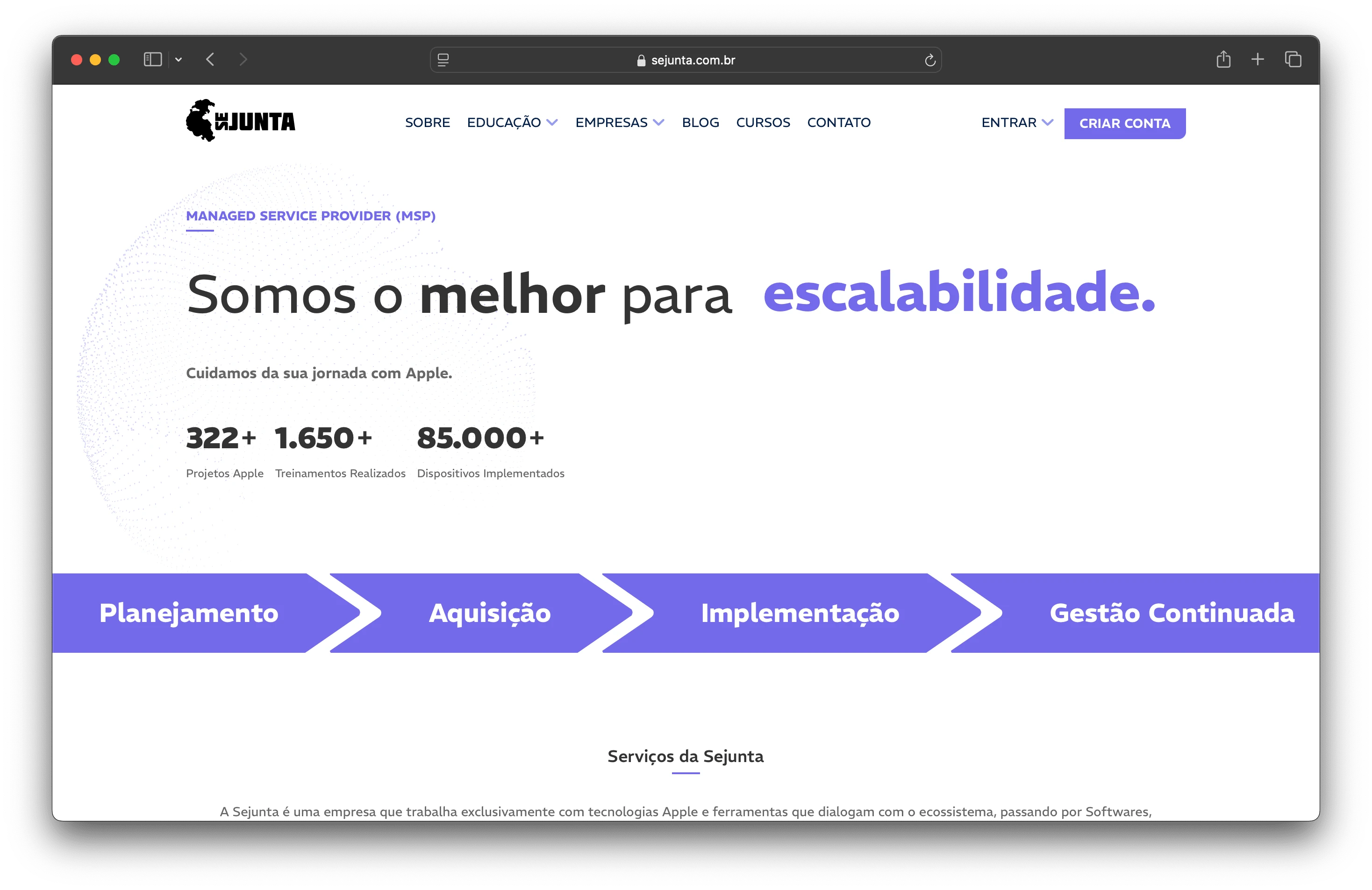
https://sejunta.com.br/sobre
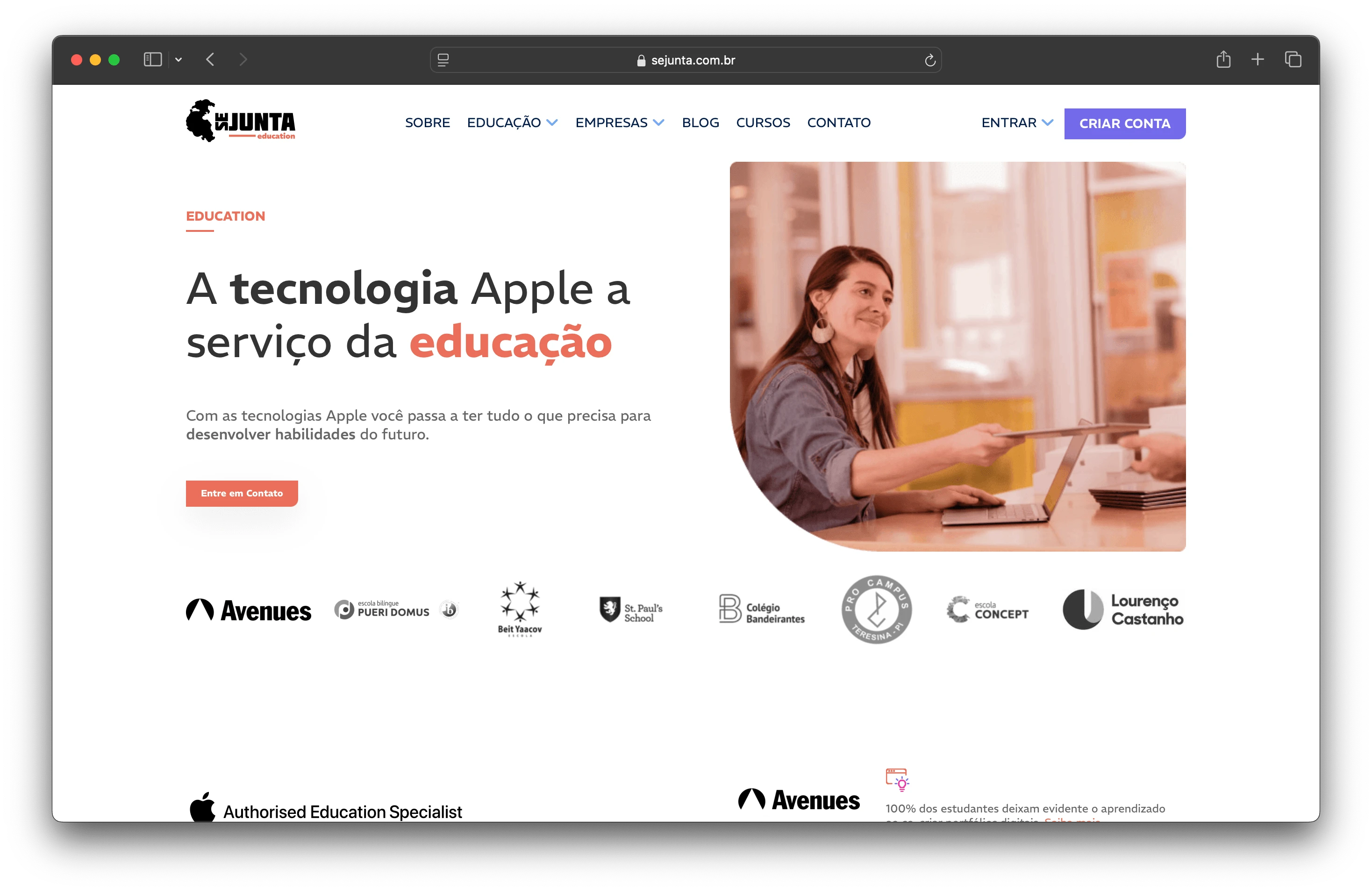
https://sejunta.com.br/educacao
Importance of a Good Website
A well-designed website is essential for any business for several reasons:
First Impressions: A professional site builds credibility and trust.
Market Reach: It allows businesses to attract a wider audience.
Cost-Effective Marketing: A website serves as a 24/7 marketing tool.
Brand Identity: It helps solidify the company's brand presence.
Customer Engagement: A good site facilitates better interaction and support.
In summary, the redesign not only improves Sejunta's visual appeal but also strengthens its market position in a digital-first world.
Like this project
Posted Oct 15, 2024
Every point, line, and curve was meticulously adjusted to capture and communicate its modernity, versatility, and impact it brings to the market.

