Freelance Design Systems Specialists in State of São Paulo
Sign Up
Post a job
Sign Up
Log In
Filters
2
Projects
People
Gabriel Franco
São Paulo, Brazil
Crafting Interaction Experiences
5.0
Rating
16
Followers
Follow
Message
Crafting Interaction Experiences
2
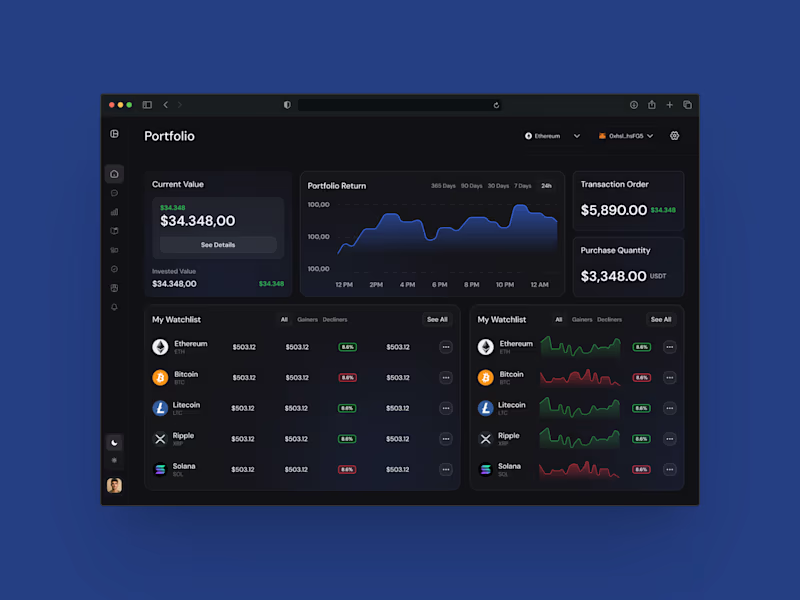
AI Chat Assistant for Axes Crypto Platform
2
3
2
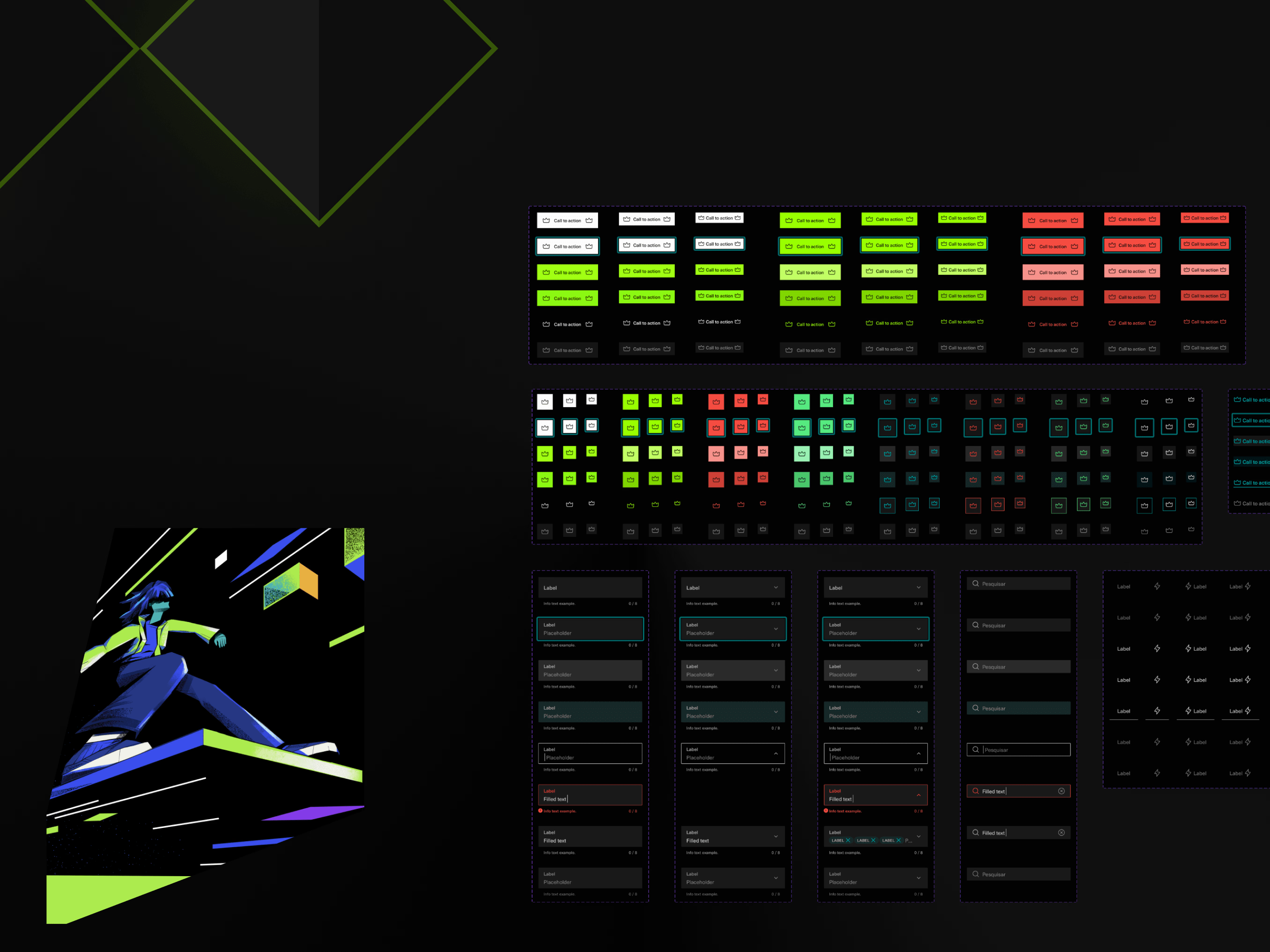
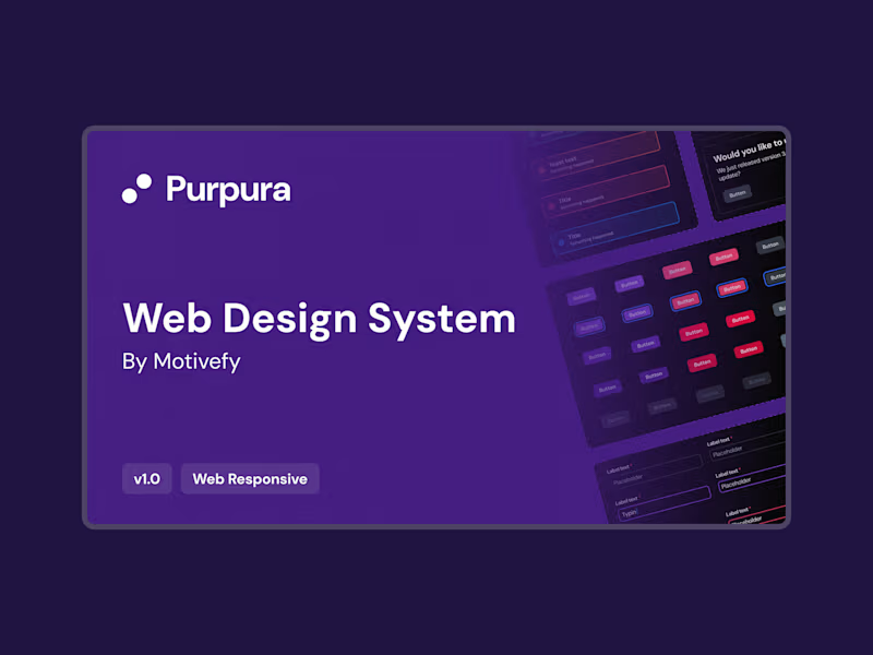
Purpura Design system
2
9
2
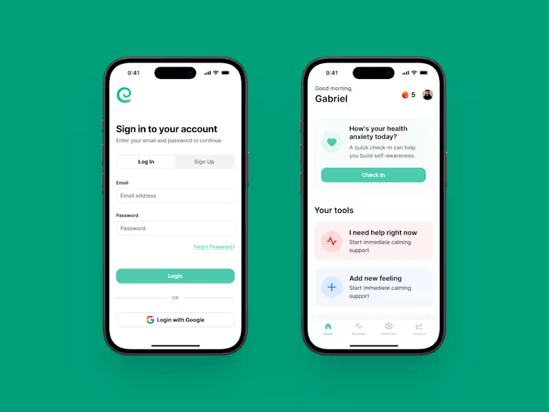
App design for MindEase Anxiety App
2
4
2
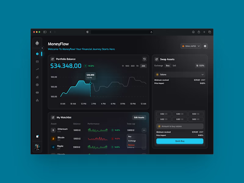
Dashboard design for Flow
2
5
Design Systems Specialist
(2)
Follow
Message
Mariana Fernandes
Bauru, Brazil
UX/UI Designer creating intuitive experiences
Follow
Message
UX/UI Designer creating intuitive experiences
0
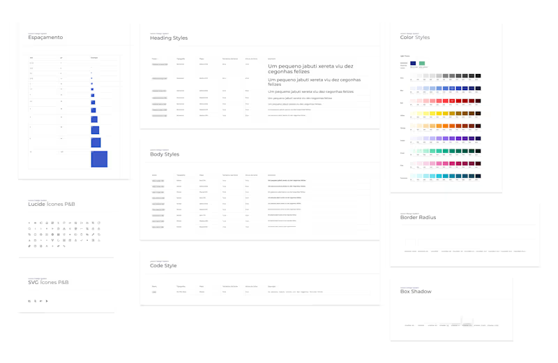
Design System - Lecom Tecnologia
0
5
0
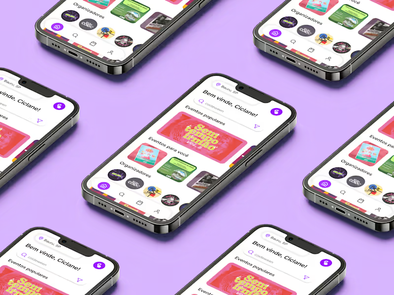
Glera - Event App
0
7
0
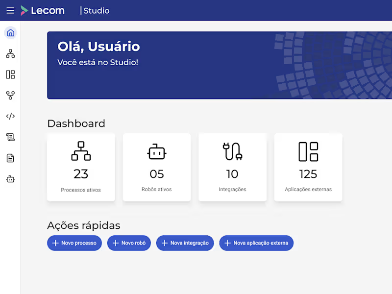
Studio Module Redesign
0
6
0
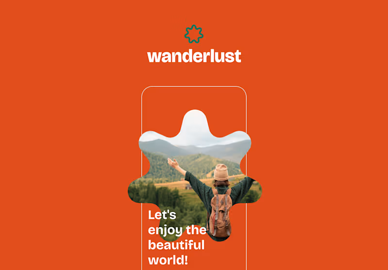
Wanderlust - Travel App
0
2
Design Systems Specialist
(4)
Follow
Message
Victor Mayrinck
São Paulo, Brazil
Product designer building end-to-end digital products.
Follow
Message
Product designer building end-to-end digital products.
8
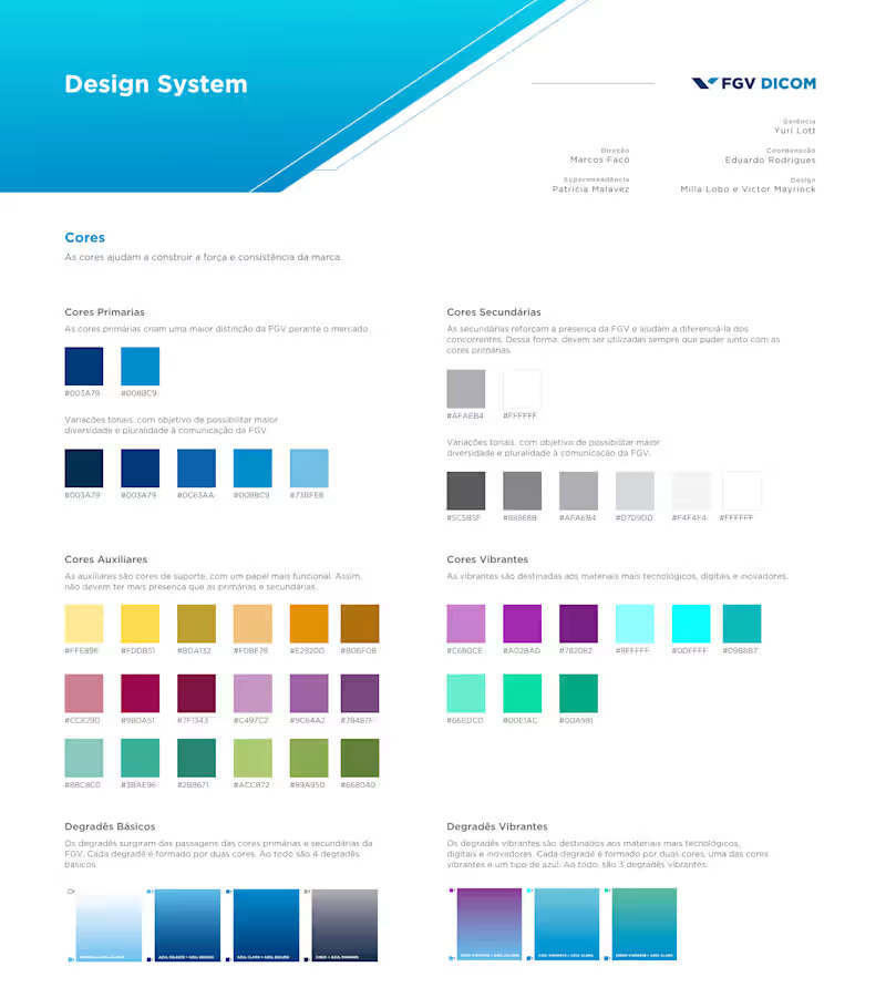
FGV’s Design System When I joined FGV, the institution’s websites were developed independently, each with its own visual style, without alignment to the official brand guidelines and with limited mobile responsiveness. This lack of consistency resulted in a fragmented user experience, weakened visual unity, and ultimately devalued the brand perception. The creation of a centralized Design System was essential to address these issues, establishing a cohesive, modular, and scalable visual language across all digital properties. As a result, FGV’s websites gained visual consistency, improved usability, and seamless navigation between platforms, strengthening brand recognition and delivering a more intuitive and reliable experience for users.
2
8
81
2
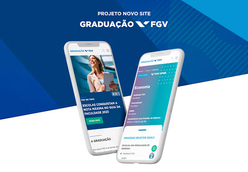
New FGV Undergraduate Website As Product Designer on the FGV Undergraduate Website project, I led the end-to-end design process to unify a fragmented digital ecosystem into a cohesive, user-centered platform. I mapped the full candidate journey, defined information architecture and structured the site based on real user needs and decision stages, from discovery to delivery, ensuring that key content and actions were easy to find. I translated research into navigable wireframes, conducted usability tests to validate assumptions and incorporated insights into the final UI, all while aligning the visual design with FGV’s design system to create a more intuitive, engaging and high-conversion experience.
2
21
1
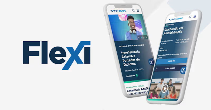
Flexi | Modular framework for design systems Flexi is a modular framework that enables website content management using the design system in a user-friendly way, with a strong focus on user experience. It allows all components from the design system library to be integrated into the CMS, ensuring that content management follows the visual standards established in the MIV and adheres to usability best practices, while maintaining the personality and integrity of FGV’s visual communication.
1
46
0
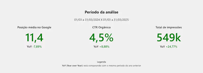
Organic Performance Report I led the conception and execution of the organic performance report for the FGV Undergraduate website to understand how SEO, user behavior and conversion impacted overall results. I integrated data from Google Analytics and Google Search Console to analyze traffic, sessions, clicks, impressions and rankings. I also used ChatGPT to support competitive SERP analysis and track sessions originating from ChatGPT, expanding insights into emerging discovery channels. To deepen user experience analysis, I reviewed behavioral data and satisfaction surveys through Hotjar. The synthesis of these sources generated actionable insights that fed a continuous UX / CRO optimization backlog, guiding testing initiatives, content improvements and conversion flows within an ongoing monitoring framework focused on growth.
0
21
Design Systems Specialist
(1)
Follow
Message
Rafael Calvacante
São Paulo, Brazil
Design systems & WCAG accessibility for B2B SaaS.
New to Contra
Follow
Message
Design systems & WCAG accessibility for B2B SaaS.
0
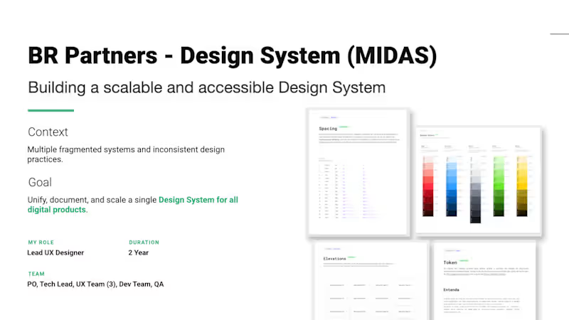
BR Partners — MIDAS Design System: Building Scalability & Accessibility Project Overview At BR Partners, a leading Brazilian investment bank, the digital product ecosystem faced a critical challenge: design and development teams were operating across multiple fragmented systems with inconsistent practices. As the Lead UX Designer on a 2-year transformation journey, I led a cross-functional team comprising a PO, Tech Lead, three UX Designers, Developers, and QA to build, document, and scale a single, unified source of truth: the MIDAS Design System. - Role: Lead UX Designer - Duration: 2 Years - Team: PO, Tech Lead, 3 UX Designers, Dev Team, QA The Challenge & Discovery Phase Before writing code or drawing a component, we had to map the chaos. We initiated a deep Research, Audit, and Architecture phase to uncover cross-team friction points. - Research Activities: Conducted a comprehensive audit of three or more existing design libraries and ran qualitative interviews with design, product, and engineering teams to map workflows. - Component Duplication: Siloed teams were rebuilding the same elements differently. - Lack of Accessibility: Products lacked inclusive design standards. - Outdated Tokens: Color and styling variables were hardcoded or obsolete. - No Documentation: Zero centralized guidance on how or why components should be used. - Strategy: Accessibility and documentation were defined from day one as our non-negotiable foundations for true scalability. Implementation & Architecture We shifted the cultural and technical paradigm from a chaotic setup into a unified system of truth by designing an advanced, token-based architecture from the ground up. - Token-Based Architecture: Built a strict hierarchical token system covering colors, typography, spacing, and elevations to allow seamless mode switching, such as Light and Dark modes. - Enterprise Tooling & Documentation: Centralized the entire system using Figma, Backstage, and Storybook, ensuring absolute alignment between design files and live code. - Mandatory Accessibility: Integrated strict WCAG 2.1 accessibility standards directly into foundations and components. - Design-Led Delivery: Structured our workflow to operate two sprints ahead of development, clearing roadblocks and refining component specifications before implementation. - Real-World Validation: Successfully piloted the new system on high-complexity products, including the bank's core CRM and intensive investment dashboards. Measurable Impact The MIDAS Design System completely overhauled how digital products are built at BR Partners, proving that design systems are cultural and operational investments, not just visual ones: - 60% Faster Design-to-Dev Handoff: Drastically reduced friction, alignment meetings, and redlines. - 40% Fewer Inconsistencies: Eradicated visual and functional regressions across separate platforms. - 100% Team Alignment & Shared Ownership: Established a collaborative product culture across designers, product managers, and engineers. Reflection & Growth Managing a project of this scale reinforced several core product principles that define my leadership style today: - Deep User Understanding Drives Meaningful Solutions: Internal teams, including designers and developers, are users too. Their workflows dictate the product's success. - Scalable Design Systems Empower Teams: Efficiency unlocks creative space for teams to focus on solving complex user problems rather than arguing over button paddings. - Cross-Functional Teamwork Creates Better Products: True impact happens when design, engineering, and data insights blend seamlessly together.
0
41
0
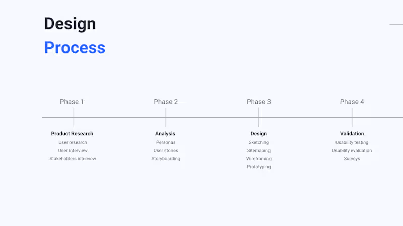
Sabor de Viver – Danone Nutricia E-commerce Project Overview Sabor de Viver is the official e-commerce platform for Danone Nutricia in Brazil. The primary challenge was to perform a complete reformulation of the legacy platform (based on Magento 1.0), which suffered from outdated technology and poor usability, directly impacting company revenue. With approximately 80% of the target audience accessing the site via mobile, the mission was to create a modern, mobile-first experience. The Process Following a Design Thinking approach, the project was divided into four strategic phases to ensure the solution met both user needs and business goals: Phase 1: Discovery & Research – Conducted extensive user research, stakeholder interviews, and qualitative interviews to uncover the motivations behind purchasing decisions and shopping behaviors. Phase 2: Analysis – Synthesized findings into personas, user stories, and storyboarding to map the ideal customer journey. Phase 3: Design – Developed the solution through sketching, sitemapping, and wireframing, culminating in high-fidelity prototyping. Phase 4: Validation – Rigorous usability testing and evaluations were performed to refine the interface and ensure a frictionless experience. Key Deliverables Mobile-First Interface: A completely redesigned navigation focused on fluidity and ease of use for smartphone users. Visual Identity & Design System: Implementation of a modern aesthetic using a refined color palette and typography (Bariol for titles for its unique look and Lato for body text to ensure transparency and readability). Streamlined Shopping Journey: Redesigned product pages with clear nutritional information, simplified "Add to Cart" flows, and an intuitive checkout process. Order Management: A transparent order tracking system to improve post-purchase user satisfaction. Results & Impact The redesign led to a significant improvement in the platform's performance and user perception: Sales Growth: The project delivered a 20% to 25% increase in sales revenue within the first year of the new platform's launch. Enhanced Navigation: Achieved a more intuitive and fluid user experience, successfully prioritizing the mobile-first strategy. Modernized Tech Stack: Successfully migrated from an obsolete system to a platform capable of supporting Danone's digital growth.
0
29
0
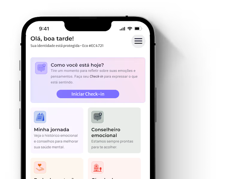
Case Study: Ecoa.me (http://Ecoame.app) — Corporate Emotional Safety Infrastructure Role: Lead Product Designer. Focus: Strategic Design, UX Research, Privacy by Design, and Regulatory Compliance (NR-01). 1. The Challenge: Bridging the Silence in Corporate Mental Health The mental health landscape in Brazil reached a critical point in 2024, with a record 472,000 work leaves, a 68% increase compared to 2023. Research indicated that the most severe situations—such as domestic violence, harassment, and discrimination—rarely reach HR departments because employees fear retaliation or lack a safe, trusted channel. Furthermore, the NR-01 regulation (effective May 2026) now mandates that all Brazilian companies actively manage psychosocial risks as part of their Risk Management Programs (PGR). Existing "wellness" solutions, like meditation apps or individual therapy, were identified as reactive and insufficient because they focus on individual symptoms rather than the structural causes of distress in the workplace. 2. UX Research & Scientific Foundation As a Senior Product Designer, the process began with deep academic and social research rather than interface design. Society-Centered Design (SCD): The product was built on SCD principles, which shift the unit of attention from the "individual user" to the social conditions they inhabit. Integrative Review: I conducted a review of evidence regarding the mental health of single mothers and work precarity in Brazil. The findings showed that support networks function as essential protective infrastructure for mental health. Archetype Insight: We identified our primary operational users as often earning between 1 to 3 minimum wages, with lower levels of education and digital literacy. This dictated a need for extremely simplified UX and language. 3. Product Evolution & Strategy The product evolved from a "wellness benefit" into a robust compliance and safety infrastructure. Outcome-Driven Design: We repositioned the narrative to focus on outcomes (preventing crises and legal liabilities) rather than just features (anonymous support). Modular Architecture: I designed an ecosystem with four tiers—Essential, Performance, Pro, and Compliance—to meet companies at different levels of maturity, integrating clinical audits and full support for the new regulatory requirements. 4. The Solution: Design & UX A. Privacy by Design & Technical Anonymity The core UX differentiator is irreversible anonymity through architecture, not just a policy promise. Token-Based Access: Users login via a unique 6-digit token generated by HR, with no link to their name, ID (CPF), or email within our platform. Security-First UI: To protect users in high-risk environments, the design includes a disguised version (hidden UI) of the app to prevent discovery on shared or monitored devices. B. Core Features for Care Emotional Check-in: A daily flow to monitor mood and detect early warning signs of burnout or violence via Ethical AI. SOS Button & Circle of Care: A shortcut for immediate emergencies (e.g., ongoing violence or suicidal crisis) that alerts pre-configured trusted contacts. Human Connection: Access to specialized counselors for active listening and stabilization in under 3 minutes. C. Ethical Management Dashboard The UI challenge was to display high-value data without ever identifying the individual. Aggregated Insights: HR views an average emotional score, predominant emotions, and a weekly heatmap to identify when and where risks concentrate. AI Priority Cards: The system highlights patterns (e.g., "High anxiety at 6 PM on Tuesdays") to guide preventive interventions like workshops or schedule adjustments. 5. Impact & Business Results The solution was designed to deliver tangible organizational value: Efficiency: A targeted 30% reduction in absenteeism and a 20% reduction in turnover. ROI: An estimated 2.3x return on investment within the first year. Compliance: Automatic generation of technical evidence for 4 out of 6 central requirements of NR-01. 6. Design System & Visual Identity Color Palette: Use of primary purple (#7C3AED) and soft support colors to convey calm, trust, and professional safety. Illustration vs. Photography: A strict directive to use illustrations to represent vulnerability, avoiding the stigma of associating real people with trauma or suffering in corporate materials. This case demonstrates the ability to merge visual design, academic research, and business strategy to solve a complex and urgent social problem in the Brazilian corporate market.
0
29
0
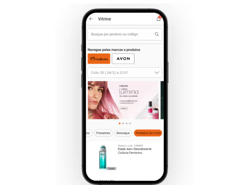
This project focused on revolutionizing the experience of Natura & Avon beauty consultants by introducing a modern e-commerce platform that elevates product visibility. My role as the lead UX designer involved crafting a seamless user experience through the integration of the new Design Systems. This project matters because it not only enhances the consultants' ability to showcase products but also strengthens the connection between the brands and their customer base. With beauty consultants at the forefront of sales, improving their tools directly impacts business growth and customer satisfaction.
0
63
Design Systems Specialist
(1)
Follow
Message
Giselle Jensen
São Paulo, Brazil
Innovation and strategy for a better future.
Follow
Message
Innovation and strategy for a better future.
0
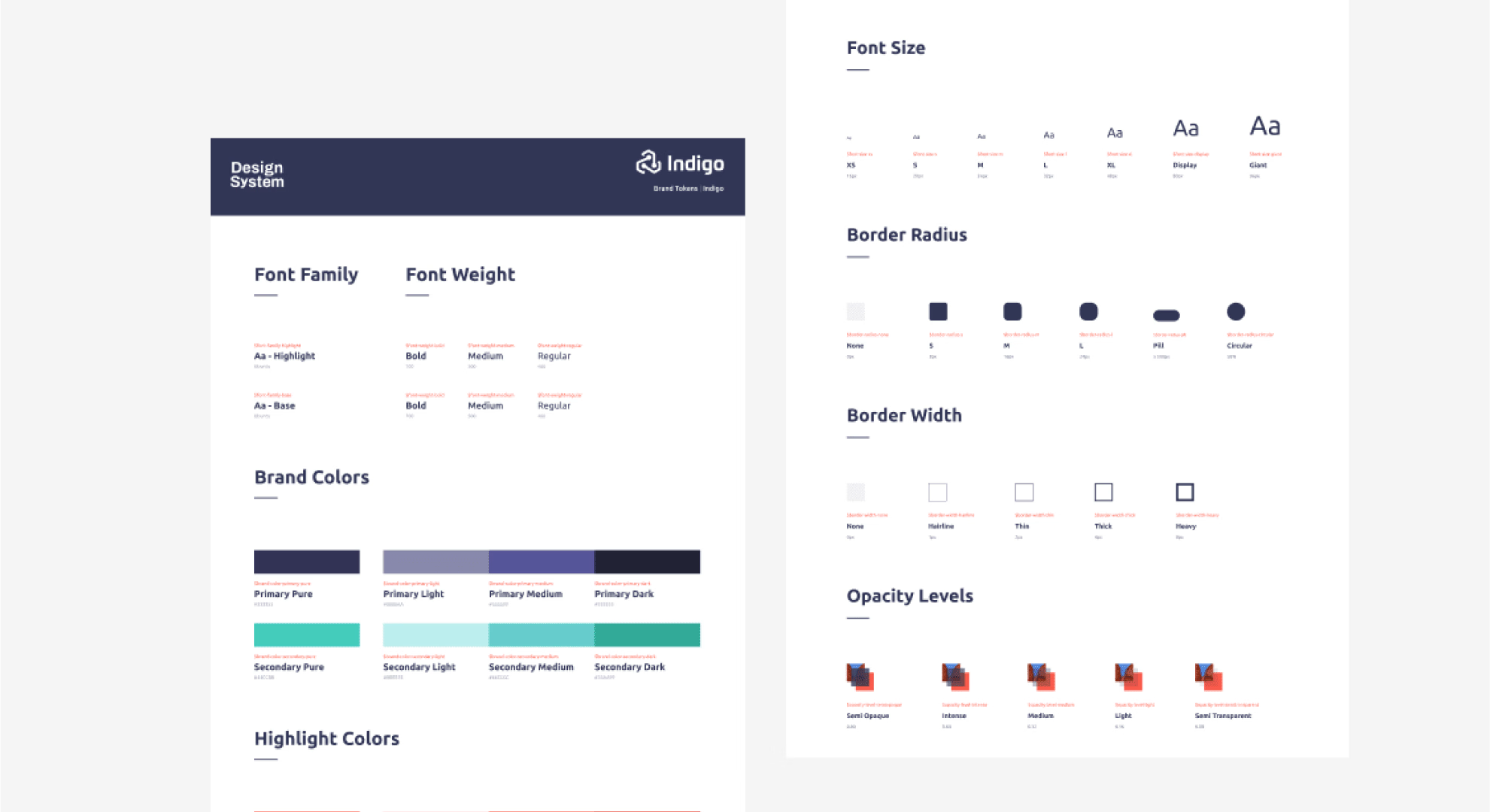
Célula: Creating a Design System to optimize a Startup
0
22
0
Creating Ambev’s innovation strategy for a cohesive portfolio
0
41
0
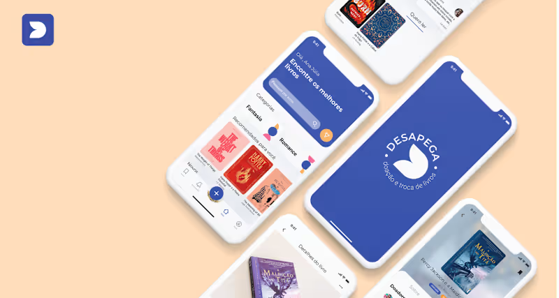
Desapega: How can we increase the lifespan of books left unused?
0
23
View more →
Design Systems Specialist
(1)
Follow
Message
Lucas Lima
São Paulo, Brazil
Reliable Product Designer with Striking Visuals
Follow
Message
Reliable Product Designer with Striking Visuals

0
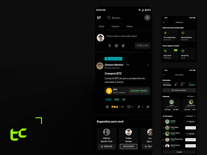
TC - Design System & Ops
0
15
0
Dattos - Process Automation Tool
0
13
0
Copy Trade - Mobile App
0
5
View more →
Design Systems Specialist
(1)
Follow
Message
Theo Perez Nordahl
São Paulo, Brazil
Senior designer-developer building scalable digital products
New to Contra
Follow
Message
Senior designer-developer building scalable digital products
0
Case study: BMC Figma organisation
0
2
0
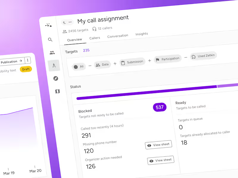
Case study: Zetkin design system
0
3
3
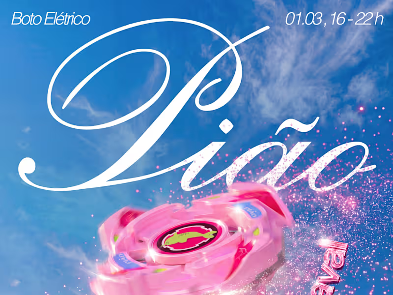
We just announced the second edition of Pião, an electronic music event I’m organizing with a friend. This time: Pião de Pós-Carnaval. The name plays on both a post-Carnival hangout/party and a spinning top, so I thought it was the perfect excuse to feature a Beyblade, one of my favorite childhood toy franchises. Process - Bought a 3D Beyblade model - Designed stickers in Figma and applied them, along with custom textures, in Womp 3D - Added spin effects and glitter in Nano Banana - Color grading in Adobe Lightroom - Final composition, typography, background, and extra sparkles in Figma What do you think of the result? And if you’re in São Paulo in early March, come through!
1
3
81
0
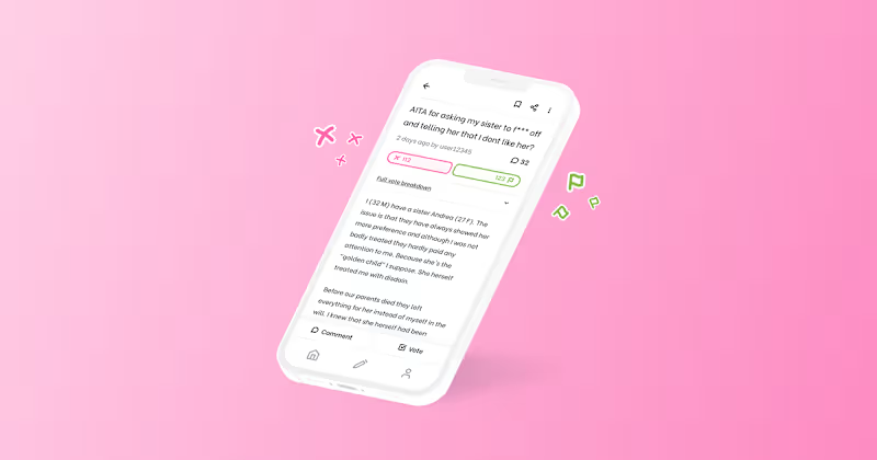
Case study: AITA app
0
12
Design Systems Specialist
(2)
Follow
Message
Renan Costa
São Paulo, Brazil
Brand, visual and experience design.
Follow
Message
Brand, visual and experience design.
0
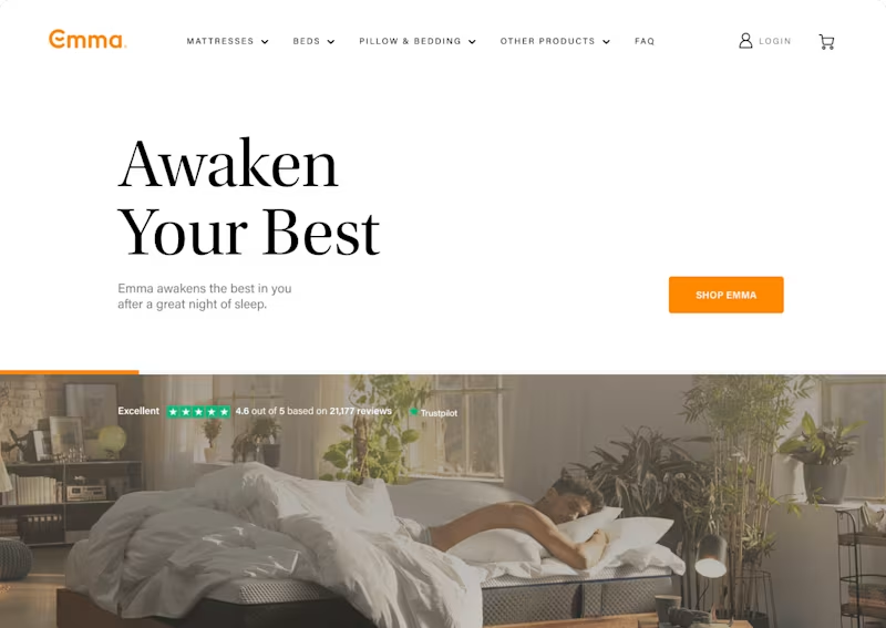
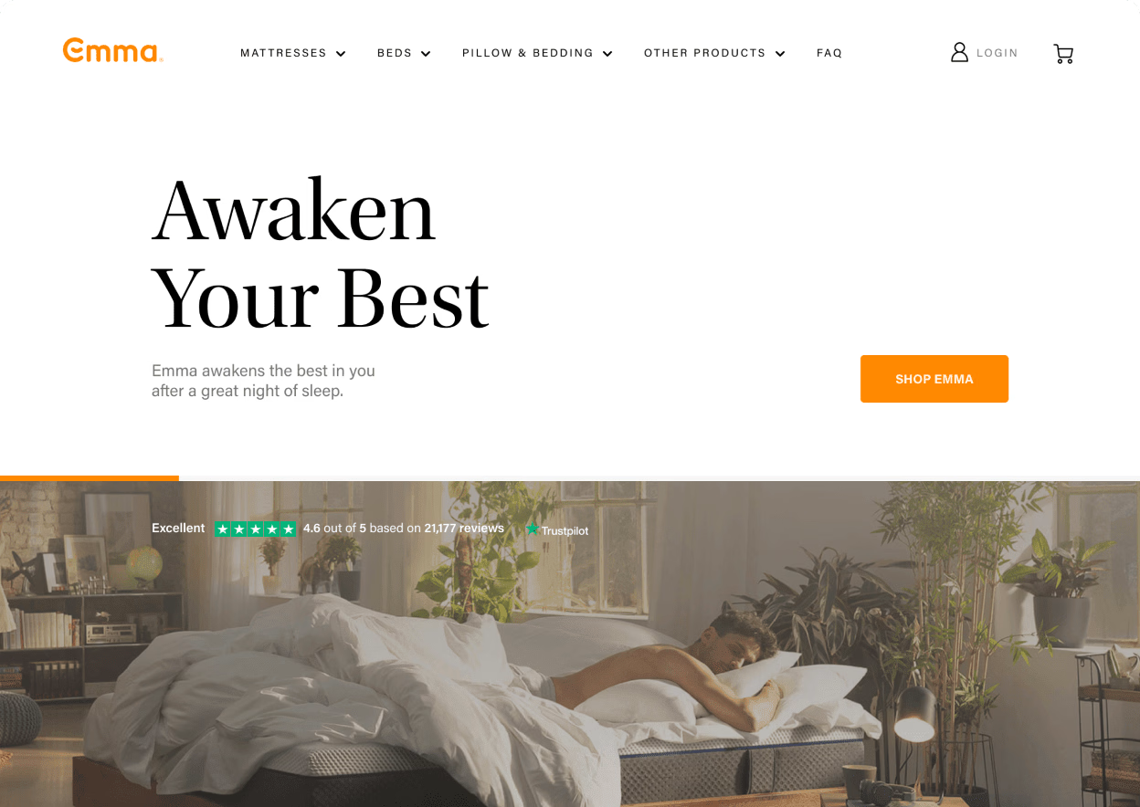
Emma
0
3
0
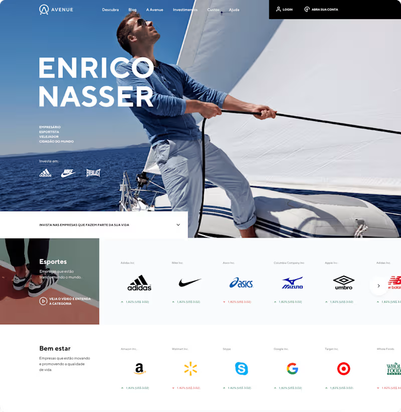
Avenue Bank
0
22
0
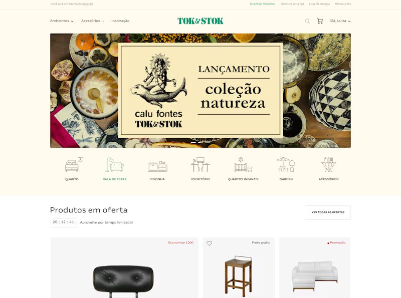
Tok&Stok
0
18
View more →
Design Systems Specialist
(1)
Follow
Message
Explore people