Design System - Lecom Tecnologia
Mariana Fernandes

Building Consistency Across the Platform
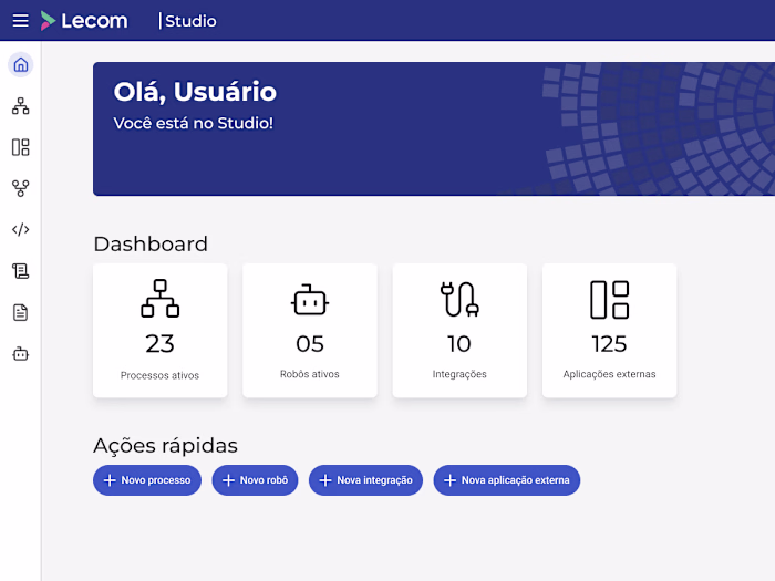
Since November 2024, I’ve been leading the hands-on part of the development of Lecom’s design system in collaboration with front-end developers, addressing long-standing challenges in design consistency and efficiency.
The Challenge
Prior to this project, Lecom’s platform lacked a unified design system, resulting in:
• Inconsistent design across modules
• No standardized patterns or reusable components
• Projects frequently starting from scratch, leading to time inefficiencies for both designers and developers
Approach & Process
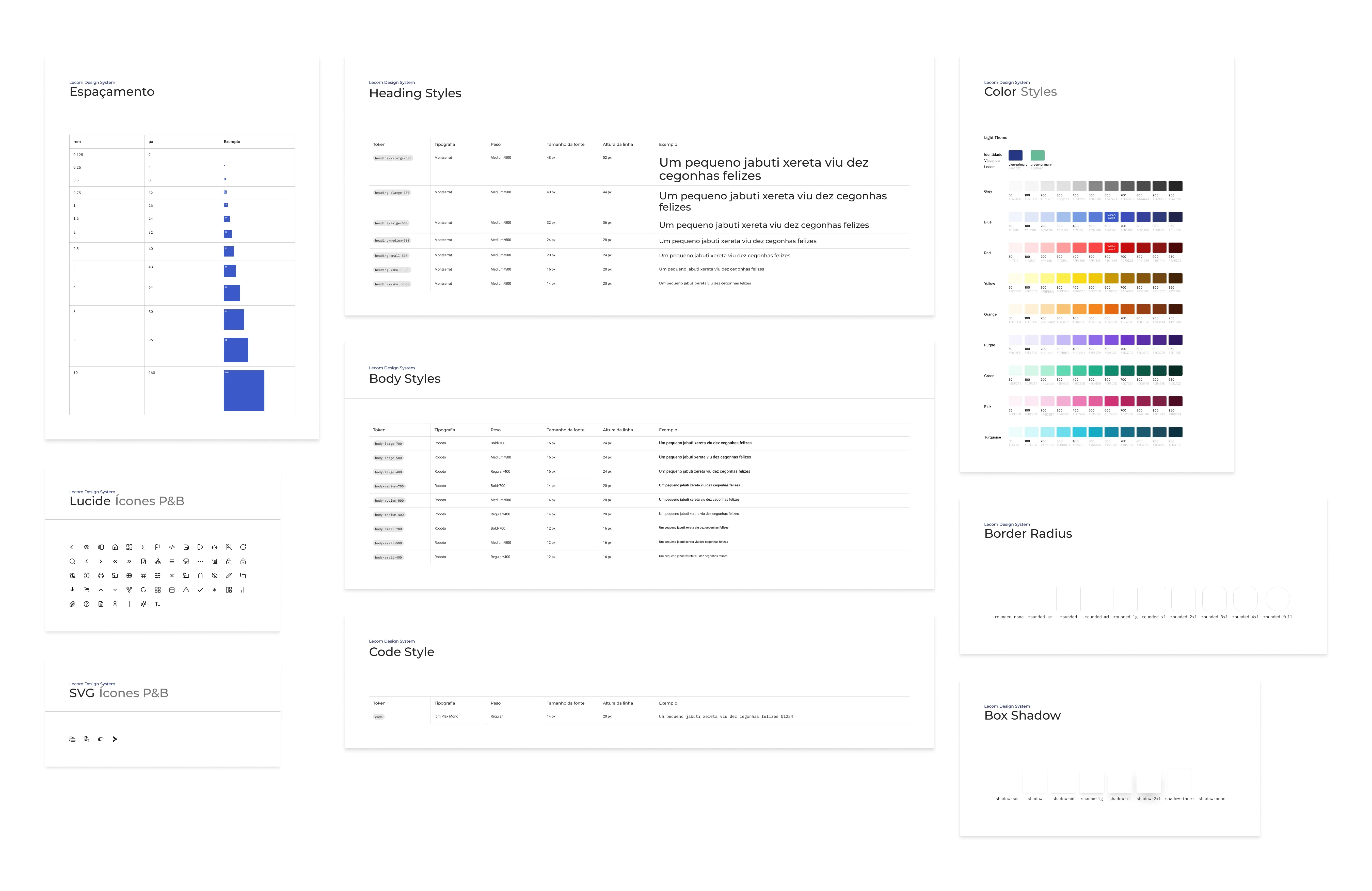
To kick off the project, I began by studying existing design systems (IBM Carbon, Material Design, Atlassian, ShadCN, Tailwind) and established a foundational style guide for Lecom. This guide outlines:
• Color palettes
• Typography
• Icons
• Border radius
• Shadows
• Grids and spacing
The front-end and design teams collaborated to identify commonly used components and new ones necessary for future projects. Our goal is to create a robust library of components that streamlines workflows and ensures visual cohesion across the platform.
We hold bi-weekly meetings to align on progress, address development challenges, and find balance between creating components from scratch or modifying existing ones. This collaboration has deepened my knowledge of design tokens, component states, and standardization practices.
Current Progress
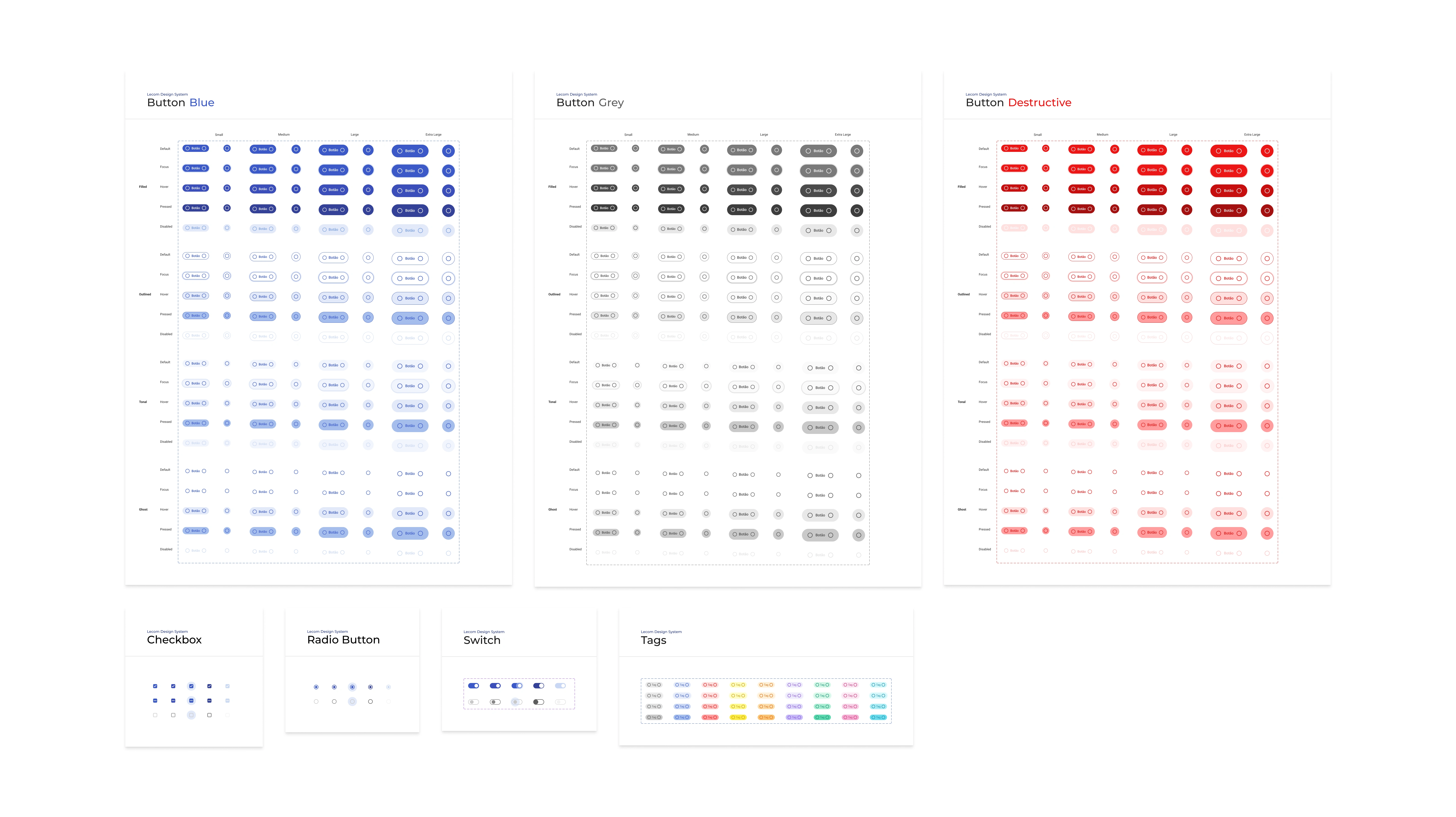
Ready Components
Button, Headings, Checkbox, Radio Button, Switch, Tags, Tooltips
Documentation
Each component is fully documented on Notion and the development space, ensuring alignment between design and implementation
Ongoing Work
We are currently gathering and creating use cases for all components, ensuring they reflect brand guidelines while being flexible enough to fit the platform’s evolving needs
Outcome & Vision
Although still in its early stages, the design system is already fostering greater consistency across Lecom’s platform and laying the groundwork for scalable, efficient designs in the future.
Like this project
Posted Feb 24, 2025
Building Lecom's design system to ensure consistency, scalability, and efficiency, unifying UI components for a seamless user experience.
Likes
0
Views
5