
Unforgettable Web & Brand Design for SaaS Products


Unforgettable Web & Brand Design for SaaS Products

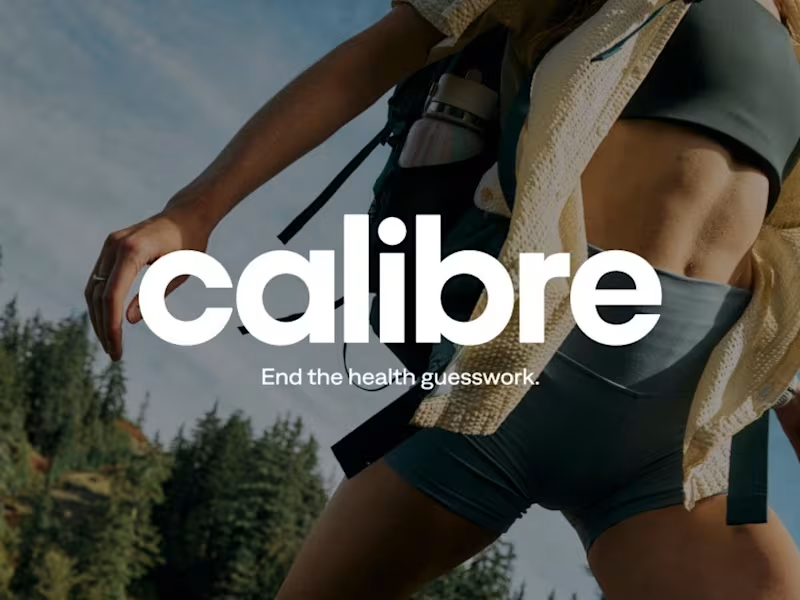
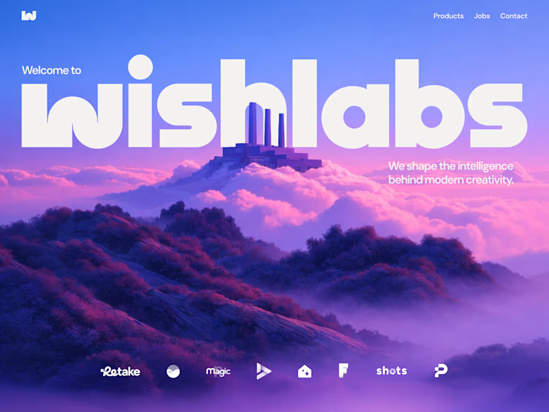
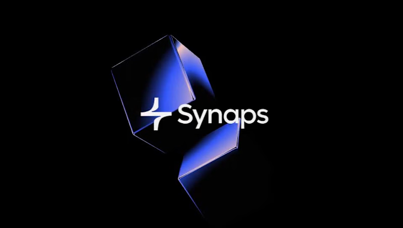

Brand & Web Designer | Gold Laus Award | Ex-FutureBrand
Brand & Web Designer | Gold Laus Award | Ex-FutureBrand


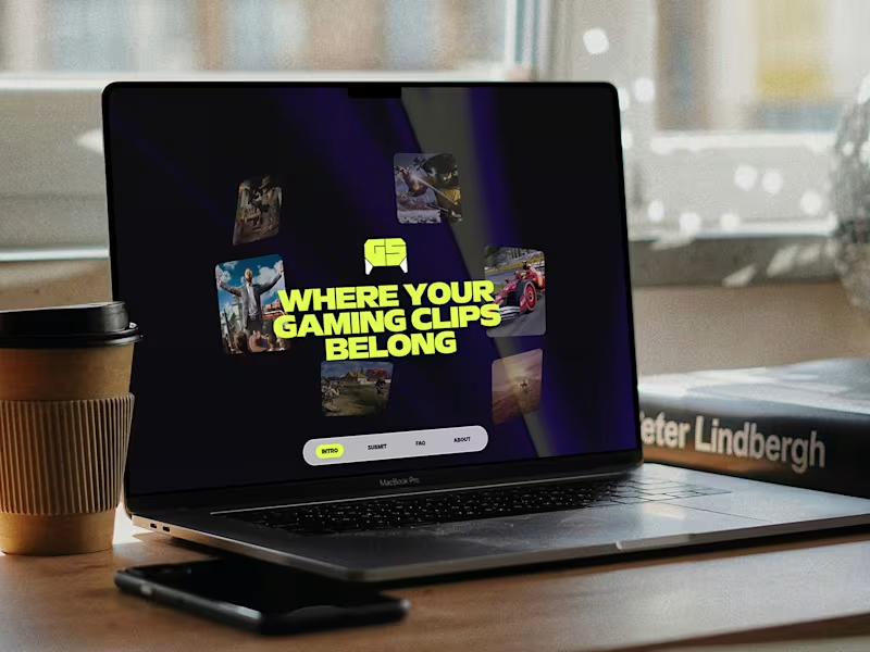

Rive Animator for Interactive Product Experiences

Rive Animator for Interactive Product Experiences




Creative designer blending strategy, style & AI tools.
- $1k+
- Earned
- 5x
- Hired
- 5.0
- Rating
- 196
- Followers
Creative designer blending strategy, style & AI tools.
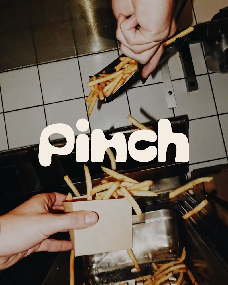
Bland is a choice.
Pinch is a concept brand for a mid-high salt line made to live on the counter, not in the cupboard. Five flavors, five two-color tins, one refillable keepsake people leave next to the bar cart.
I built the full identity: wordmark, lid lockups, hand-stamped pattern system, tone of voice, and art direction.
More from the system coming soon.
78
121
6.1K



Brand Identity Designer | Logo, Rebranding & Guidelines

Brand Identity Designer | Logo, Rebranding & Guidelines




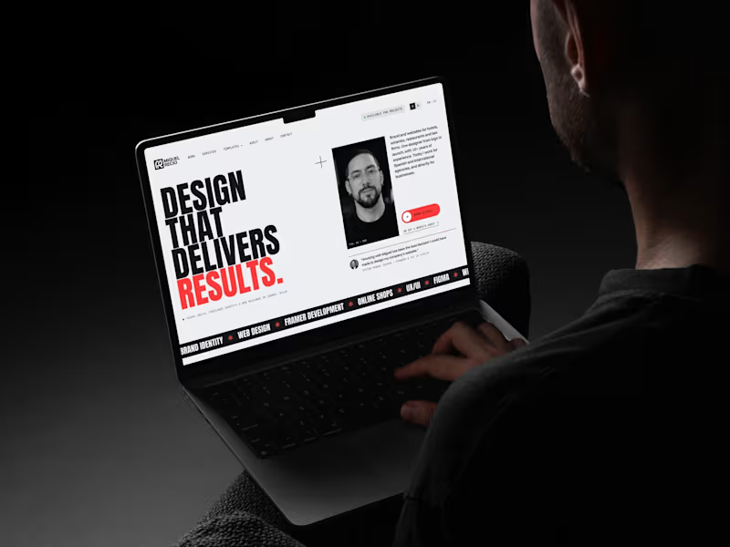
Brand & web design for premium businesses · Figma + Framer
- $5k+
- Earned
- 1x
- Hired
- 5.0
- Rating
- 24
- Followers
Brand & web design for premium businesses · Figma + Framer

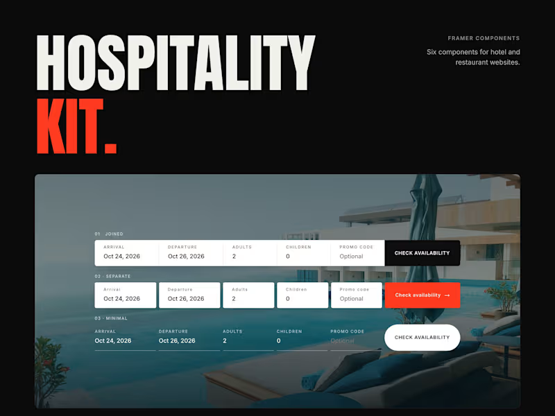
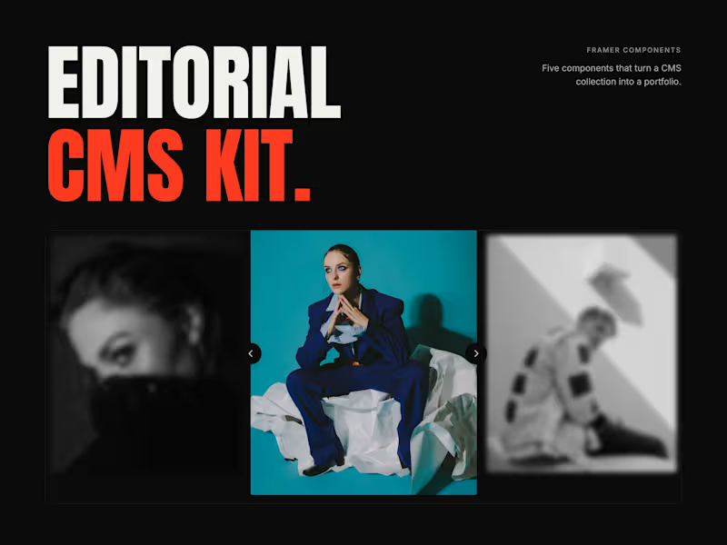

Helping brands turn their vibe into websites
- $•••••
- Earned
- 1x
- Hired
- 5.0
- Rating
- 31
- Followers
Helping brands turn their vibe into websites

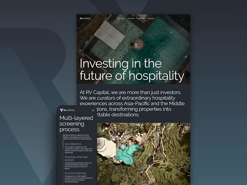


Design studio for the New Internet

Design studio for the New Internet
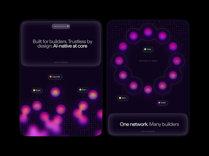
Unreleased branding concept for an AI-powered decentralised network for indexing, computing, and analytics.
The brand revolves around data particles—how information moves, transforms, and forms the system. The layout follows the same logic, built from modular blocks that reflect the product’s scalability. These particles become the core visual language: used as abstract graphics for brand mood or combined into clusters to illustrate context and interactions. A flexible identity fully rooted in the behaviour of data.
11
37
284

We were tasked with branding Quip, the world’s first worldwide quantum computer. A deeply technical product at the intersection of decentralized computing, quantum research, and post-quantum security. Our challenge was to make it resonate with both institutions and crypto-native audiences.
The idea behind Quip was ambitious. Our job was to find a metaphor that could carry it, something simple enough to become a brand, but deep enough to reward a closer look. We found it in a butterfly.
Our Design Director Arseniy walks through the whole process, from briefing and first concepts to final identity.
2
204
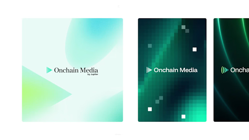
Branding for Jupiter Onchain Media
We started the identity by going wide. Several directions, each one pushing somewhere different: from editorial with serif type and muted tones to bold digital-native systems.
The goal was to build an accessible media platform — without stepping away from the core brand identity. We explored bold territories along the way.
But the strongest move was the one that stayed consistent with the core Jupiter brand. Restraint won.
The final identity for Jupiter Onchain Media is clean, confident, and built to hold up across everything it touches. We built a flexible gradient pattern system that works as background or hero graphic. This system pairs perfectly with a new logomark that nods to the original and expands the Jupiverse into media.
1
3
220