Multitech Auto Repair - Brand strategy & identity

Miguel Recio
$1.3K+ earned


Multitech Auto Repair is an independent workshop in Fairfield, California, specialized in European vehicles: Mercedes-Benz, BMW, Audi, Volkswagen and Porsche. Their positioning is summed up in one line: European Precision. Dealership Quality Care.
The challenge was that the brand didn't communicate the level of the work. Independent shops compete against dealerships on trust, and trust is built on perception. Multitech needed an identity that looked as precise as their service.
The answer is a system built on engineering language: technical greys, structured grids, monospaced details, with controlled bursts of energy. No automotive clichés, no flames, no chrome gradients. Precision as an aesthetic.
The result is a complete, documented identity. A badge style emblem built on a single module. A Steel/Carbon palette with a controlled Ignition accent. A four typeface system where every font has one job. And a 34 page manual that keeps the brand consistent from a favicon to building signage.
An independent shop competing on dealership trust
MULTITECH Auto Repair is an independent workshop in Fairfield, California, specialized in European vehicles — Mercedes-Benz, BMW, Audi, Volkswagen and Porsche. Independent shops compete against dealerships on trust, and trust is built on perception.
The identity borrows its language from engineering itself: modular grids, monospaced type, blue-tinted greys and one controlled burst of energy. No automotive clichés. Precision as an aesthetic.
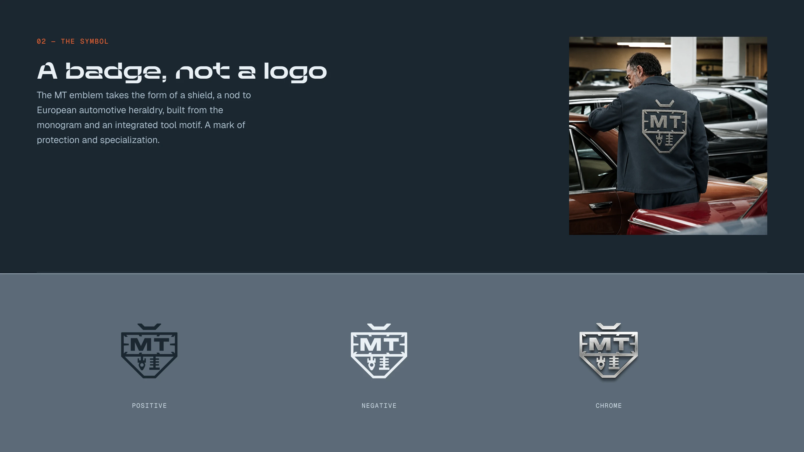
A badge, not a logo
The MT emblem takes the form of a shield, a nod to European automotive heraldry, built from the monogram and an integrated tool motif. A mark of protection and specialization.
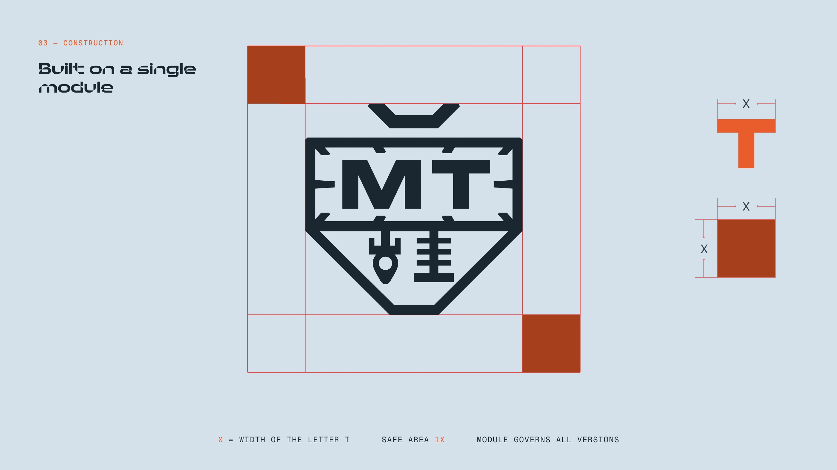
Built on a single module
The width of the letter T defines the unit X. Every proportion, clear space and alignment in the symbol derives from it — the same grid that governs the full identity.
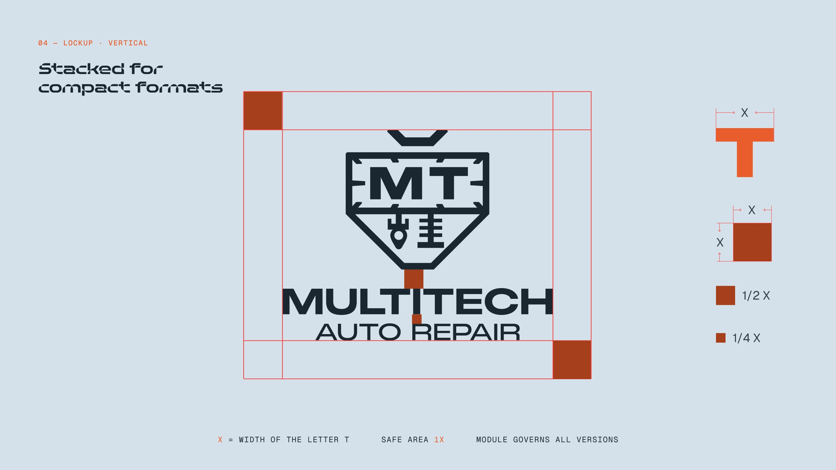
Stacked for compact formats
A stacked configuration for compact or centered formats. The same modular logic, re-proportioned so symbol and wordmark stay balanced when height is the constraint.
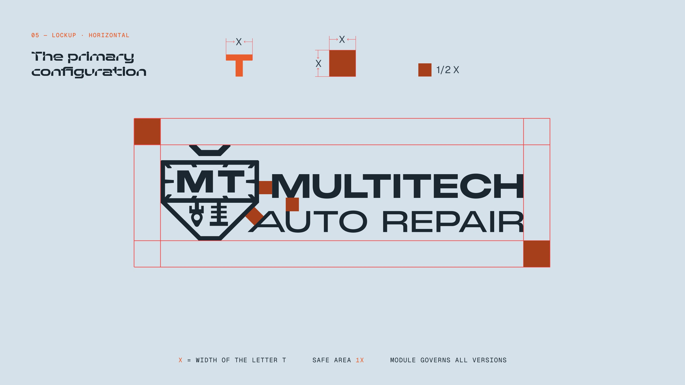
The primary configuration
The primary lockup pairs symbol and wordmark on a shared baseline. Clear space is fixed at 1X; internal spacing at ½X keeps the relationship constant at any size.
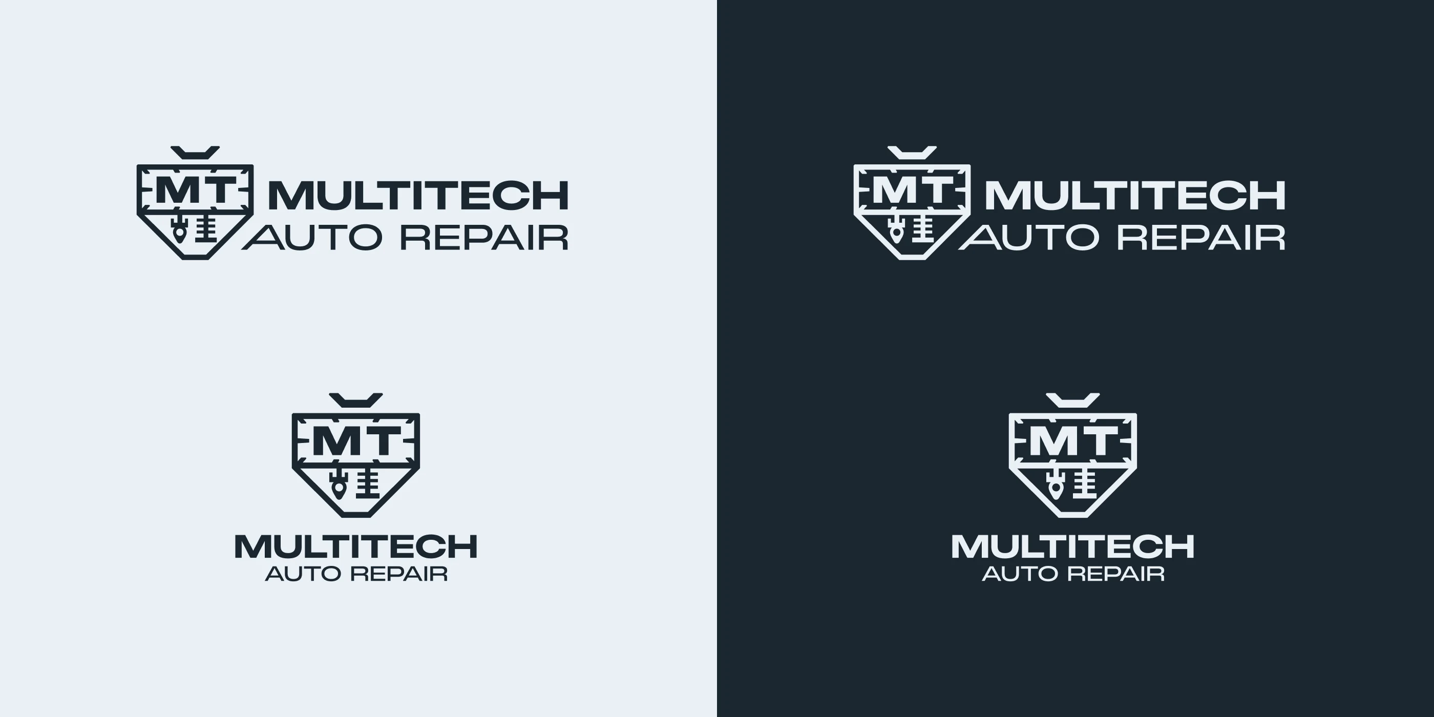
One system, every background
Positive and negative treatments across Steel and Carbon backgrounds, plus a chrome execution reserved for premium, high-impact applications.
Steel, Carbon, Ignition
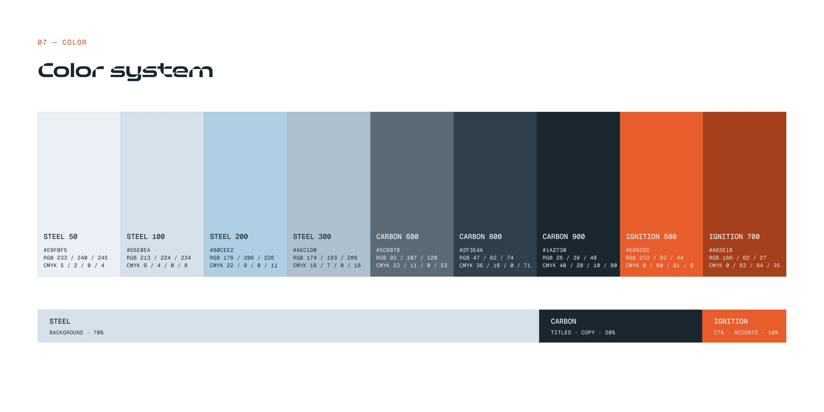
Steel, blue-tinted light greys, creates the clean technical foundation. Carbon brings depth and structure to titles and copy. Ignition, a controlled orange, is reserved for CTAs and accents. The hierarchy is deliberate, 70 / 20 / 10, so the accent keeps maximum impact.
Four levels, one job each
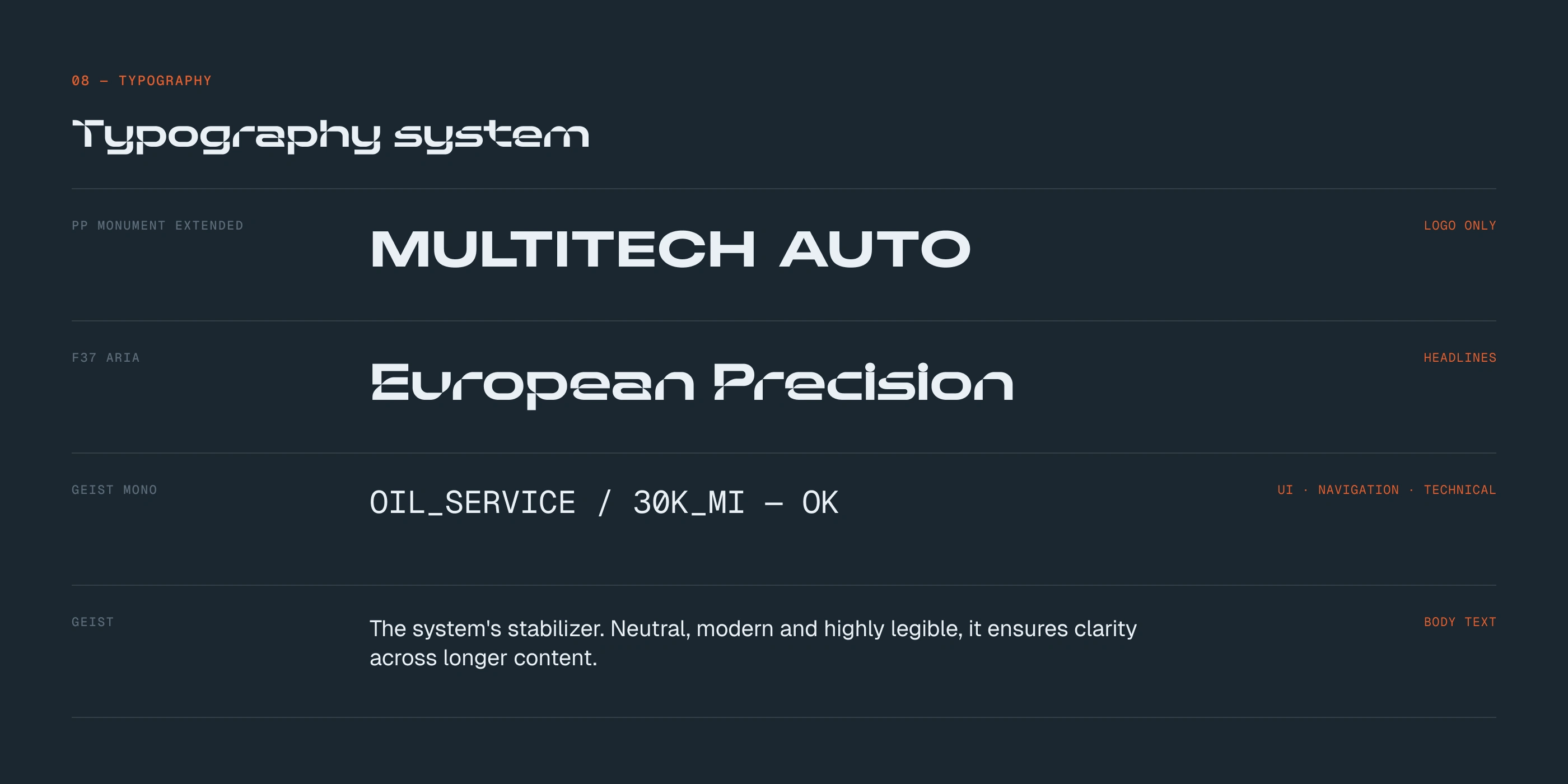
PP Monument Extended is reserved exclusively for the logo. F37 Aria carries the headlines with geometric tension. Geist Mono handles UI, navigation and technical elements, the monospaced structure evokes instrumentation and mechanics. Geist stabilizes the system in body copy.
Precision in every frame
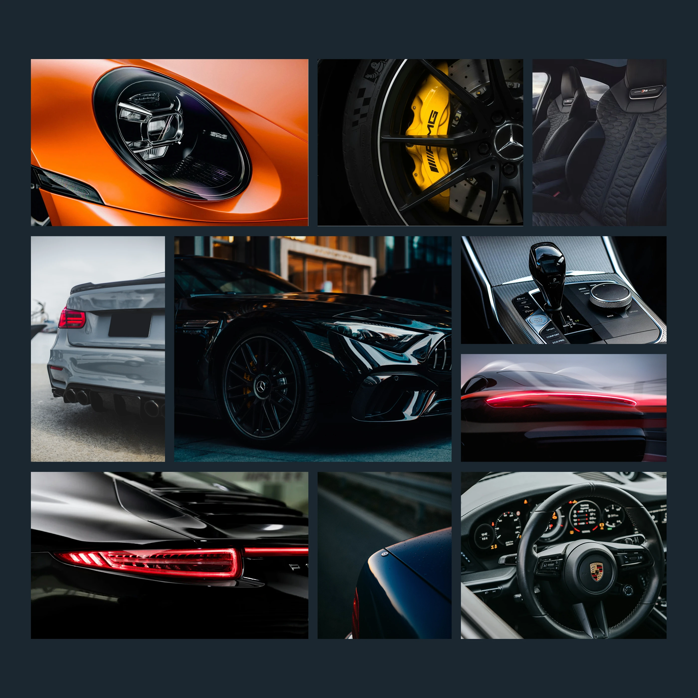
Photography favors tight crops on engineered detail: headlights, calipers, stitching, carbon. Controlled directional light, deliberate reflections, dark grounds. Craft over decoration.
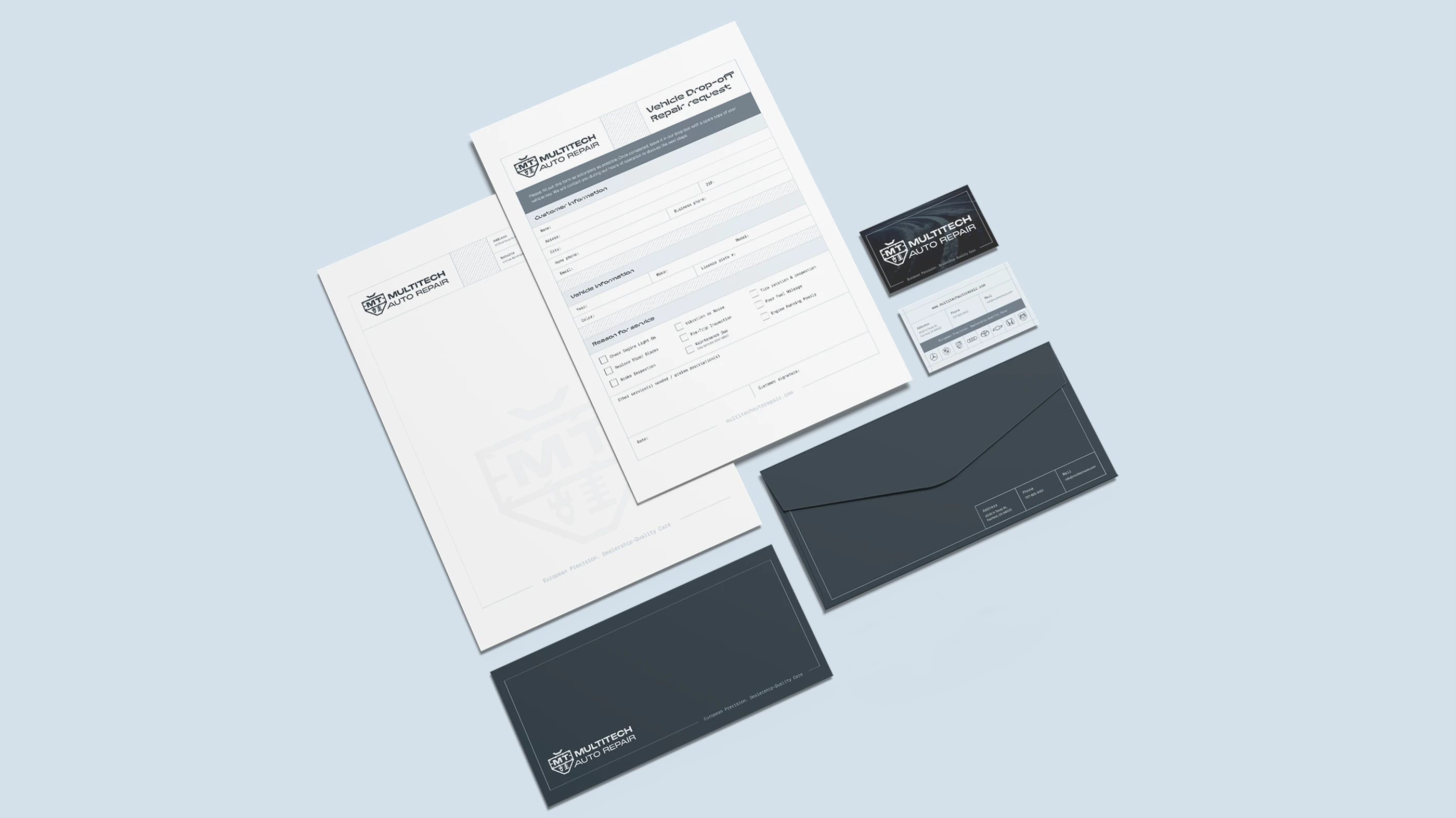
Built for daily use
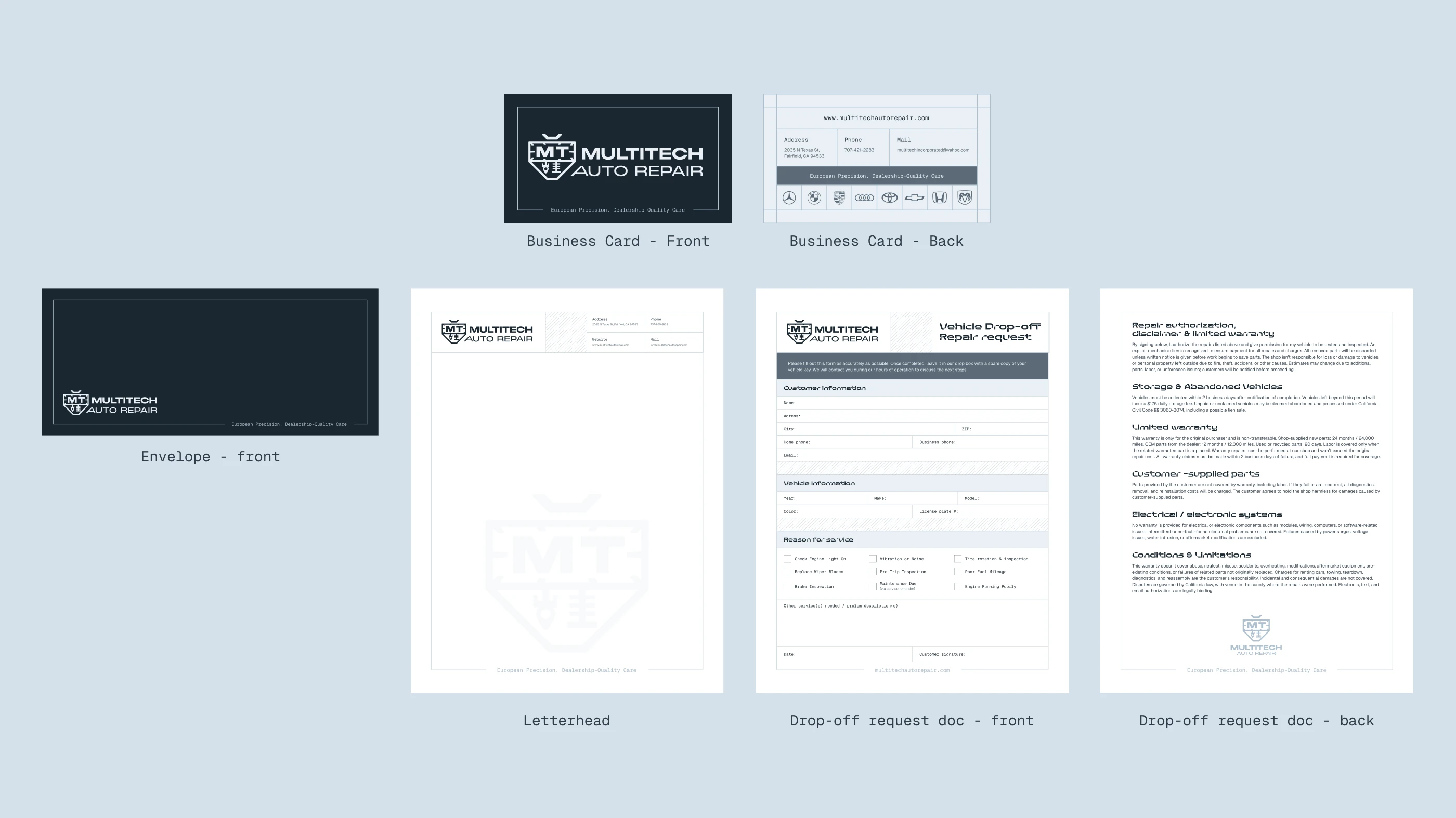
The identity translated into everyday operational touchpoints: business card, letterhead, envelope and the vehicle drop-off request form.
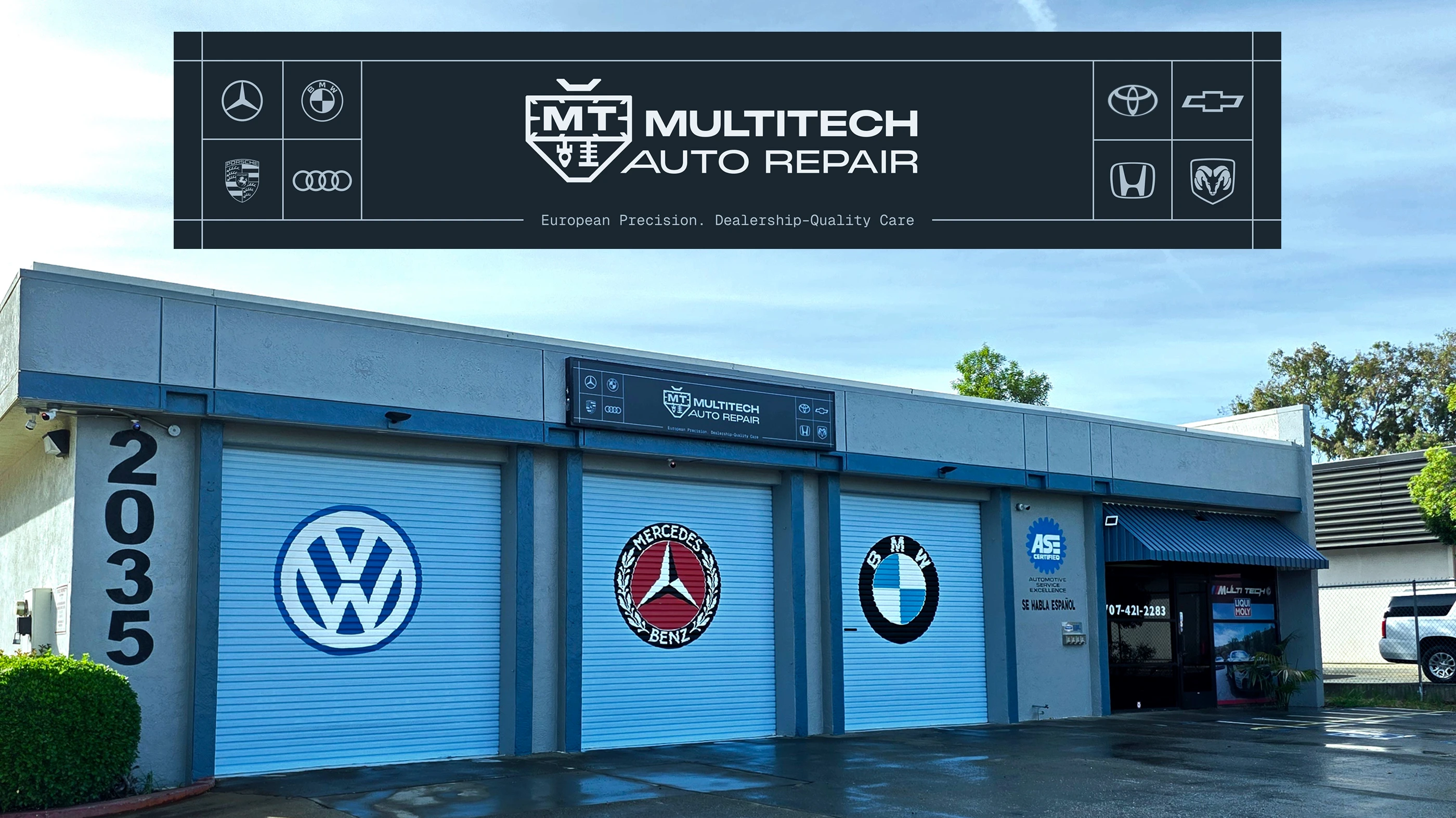
The system at street scale
Storefront signage sits alongside the European marques the workshop specializes in, claiming the space with quiet authority.
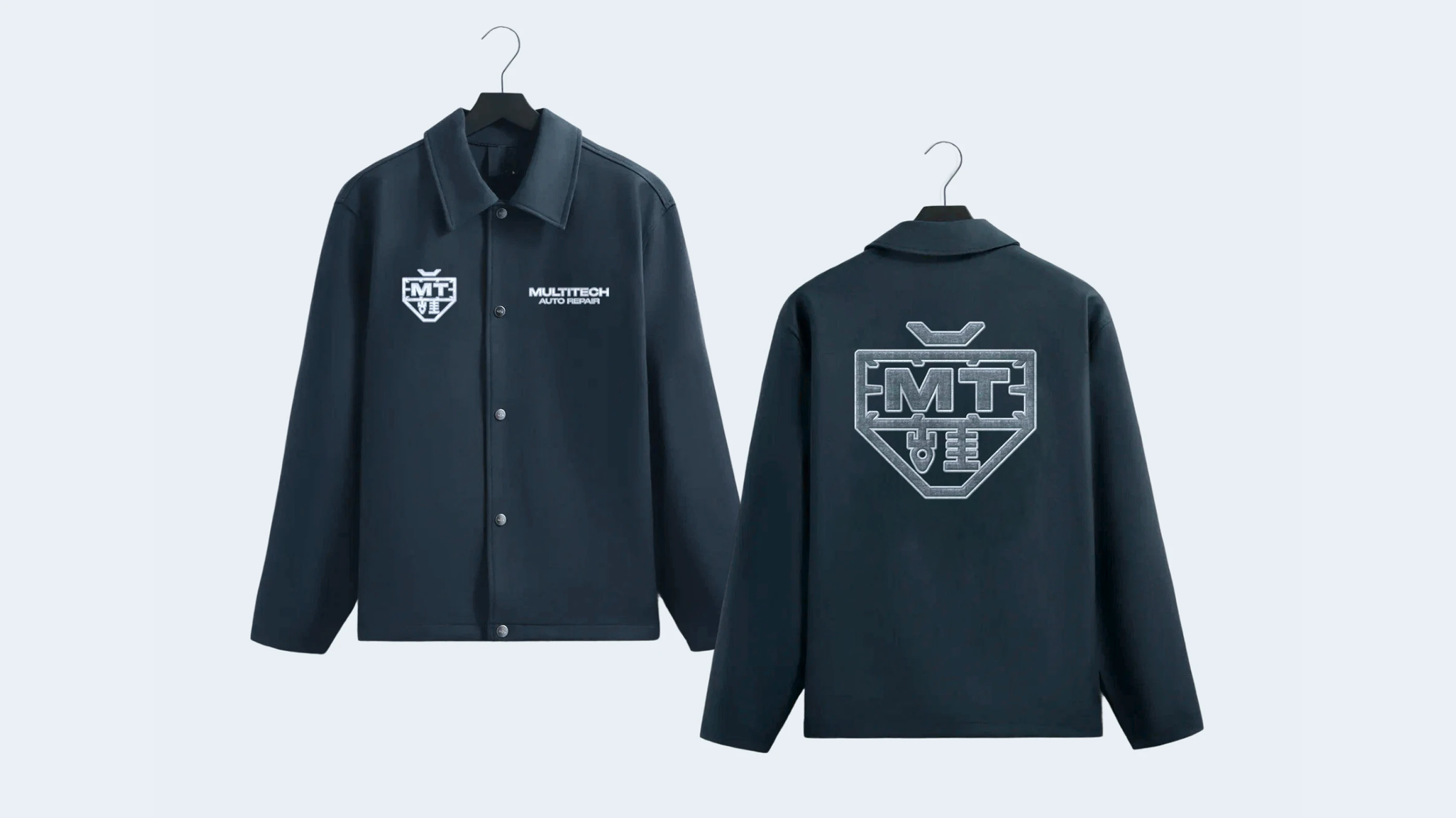
The team as a brand asset
A Carbon work jacket carries the mark into the bay, symbol and wordmark on the chest, the emblem embroidered large across the back.
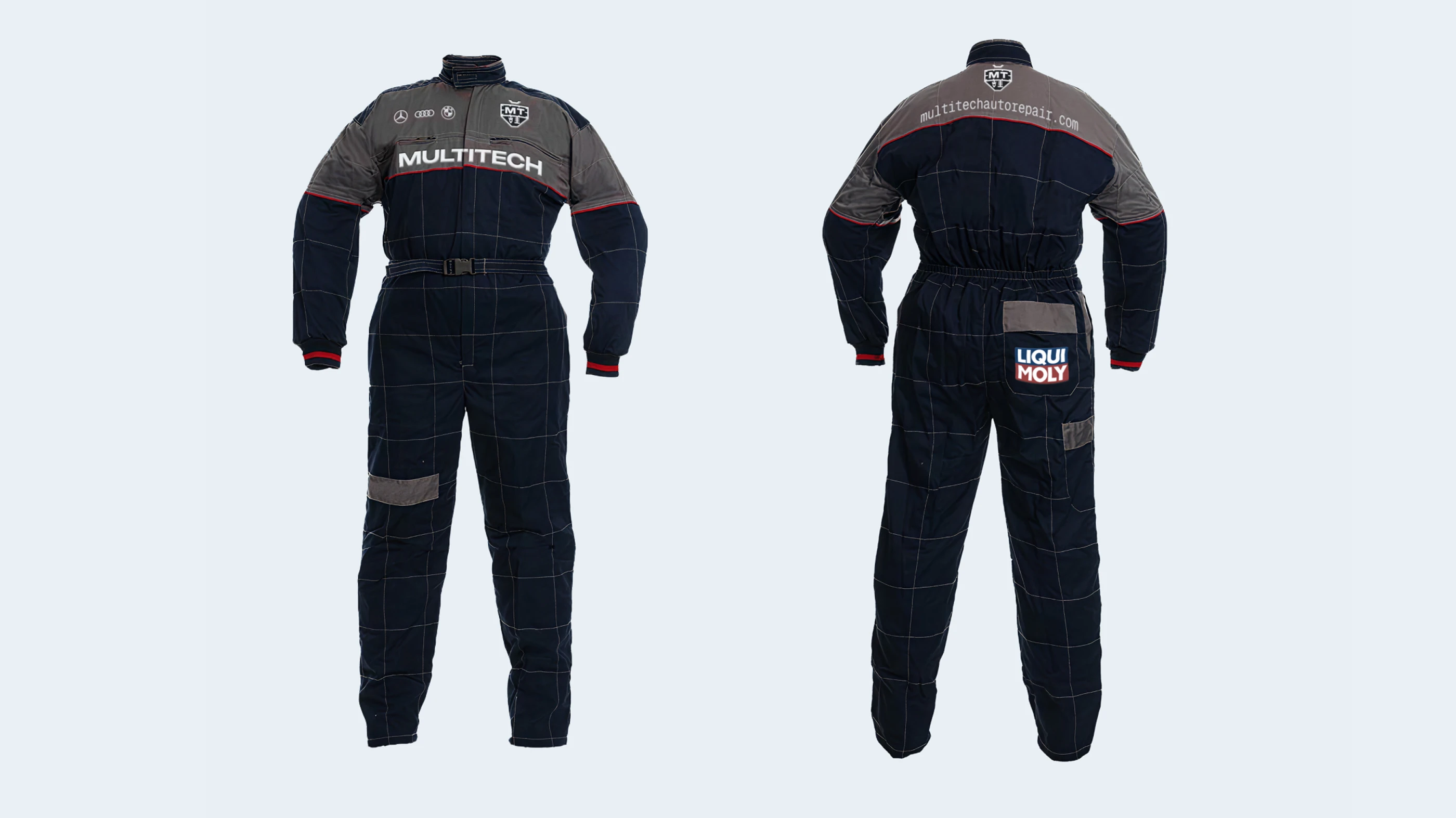
Built for the workshop floor
A full workshop coverall in the corporate Carbon tone: professional, consistent and unmistakable across every service interaction.
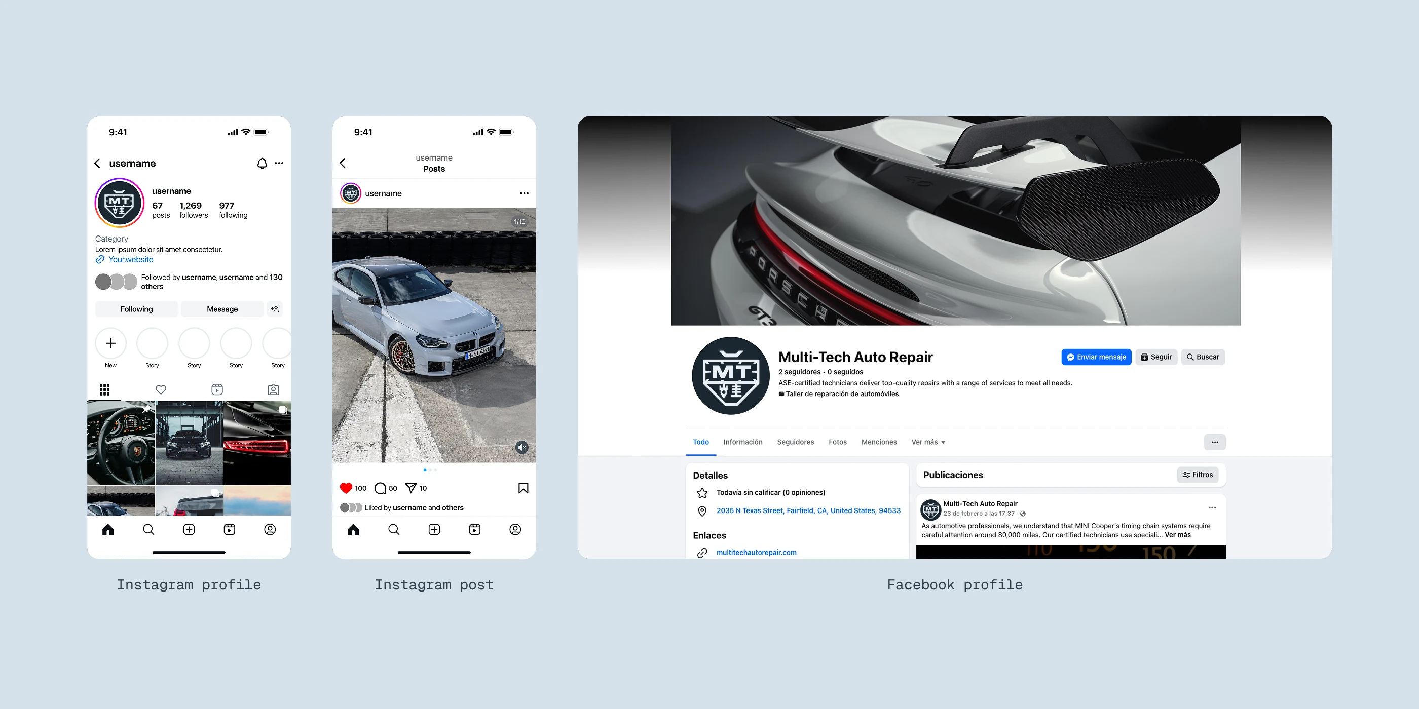
A digital-first presence
Profile, post and page templates built on the symbol for instant recognition, the system holding together across platforms.
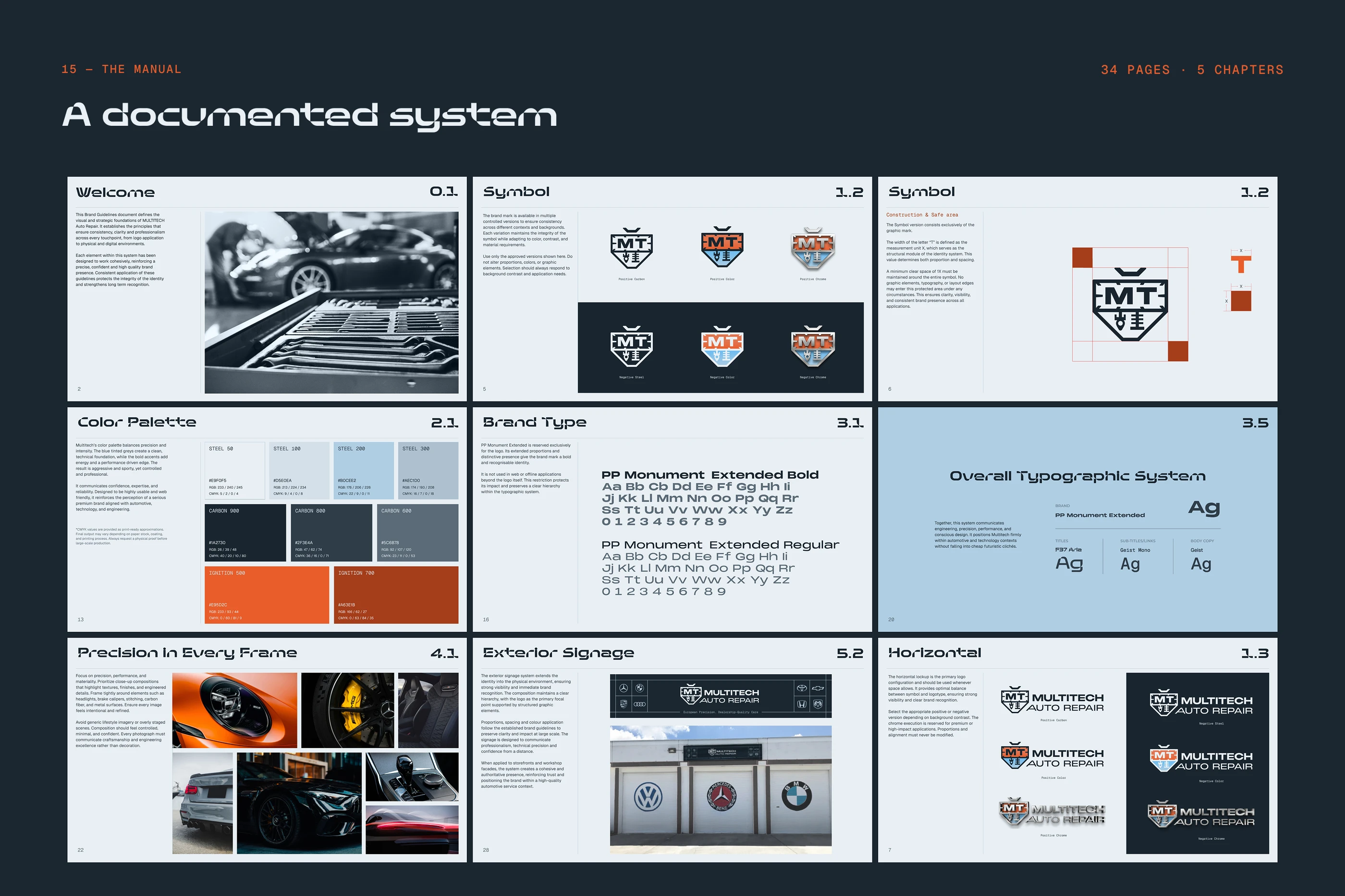
A documented system
34 pages across five chapters: logo construction, colour hierarchy, typography, photography direction and applications. The brand stays consistent without me in the room.
Like this project
What the client had to say
Miguel Recio is genuinely talented, taking the time to understand your company's needs and elevating it to the next level. If you're looking for someone who takes pride in their work, you are in the right place.


Jeffrey Rojas, Multi Tech Auto Repair
Mar 10, 2026, Client
Posted Jul 23, 2026
A precision-driven identity for an independent Fairfield, CA workshop specializing in premium European makes, engineered to feel as exact as the work itself.
Likes
1
Views
41
Earned
$1.3K+
Timeline
Feb 13, 2026 - Mar 9, 2026
Clients
Multi Tech Auto Repair