Branding for Jupiter Onchain Media We
Relate Studio
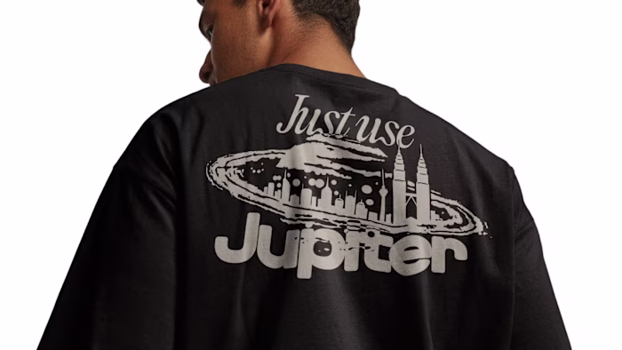
Branding for Jupiter Onchain Media
We started the identity by going wide. Several directions, each one pushing somewhere different: from editorial with serif type and muted tones to bold digital-native systems.
The goal was to build an accessible media platform — without stepping away from the core brand identity. We explored bold territories along the way.
But the strongest move was the one that stayed consistent with the core Jupiter brand. Restraint won.
The final identity for Jupiter Onchain Media is clean, confident, and built to hold up across everything it touches. We built a flexible gradient pattern system that works as background or hero graphic. This system pairs perfectly with a new logomark that nods to the original and expands the Jupiverse into media.
Like this project
Posted May 21, 2026
Branding for Jupiter Onchain Media We started the identity by going wide. Several directions, each one pushing somewhere different: from editorial with serif...
Likes
0
Views
1