Brand & web redesign for my own studio

Miguel Recio


The redesign of miguelrecio.es, my own studio site: identity and web design for hotels, wineries, law firms and agencies. It started as a Framer template; when the studio outgrew it, I moved it to a hand-built Astro site and redesigned it as a point of sale. A strict, visible 12-column grid; Anton set huge against JetBrains Mono labels and Switzer for reading; paper greys and one red that marks only the key word, the figure and the call to action. The identity lives in a pixel language: images that resolve from blocks, page transitions and a playable 404. Built by hand in Astro, in English and Spanish, fast and accessible (Lighthouse mobile 96–99 performance, 100 accessibility). CSS Design Awards: Special Kudos and the public UI, UX and Innovation awards.
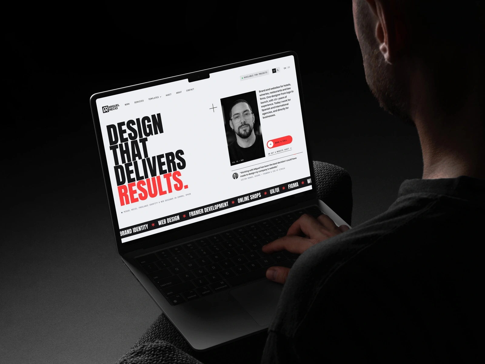
The new home: Anton set huge, one red and the portrait that flips on hover.
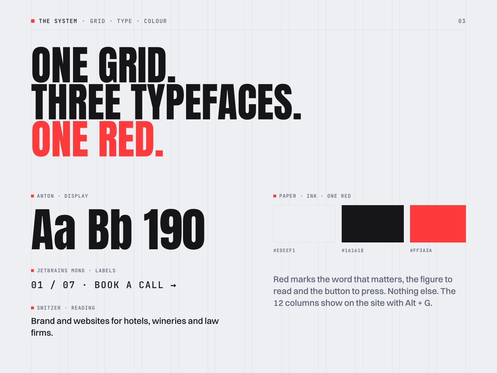
The system: a visible 12-column grid, three typefaces with one job each, and paper, ink and a single red.
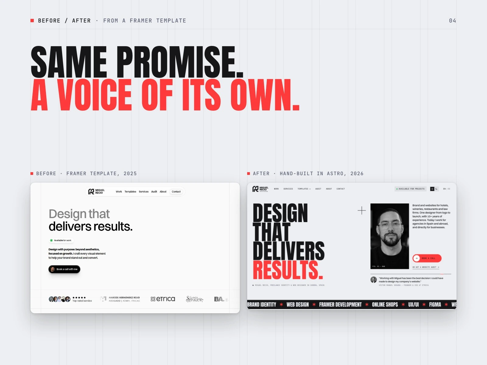
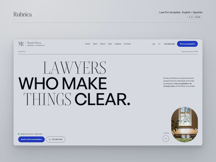
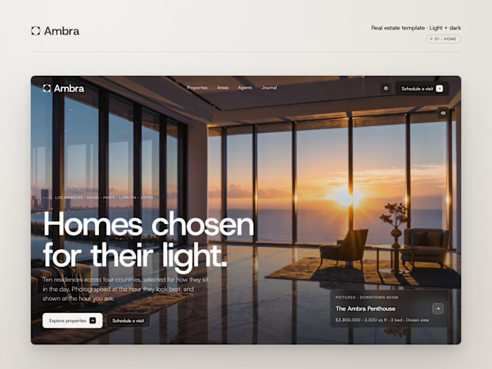
Before and after. The same promise, moved from a Framer template to a hand-built site with a voice of its own.
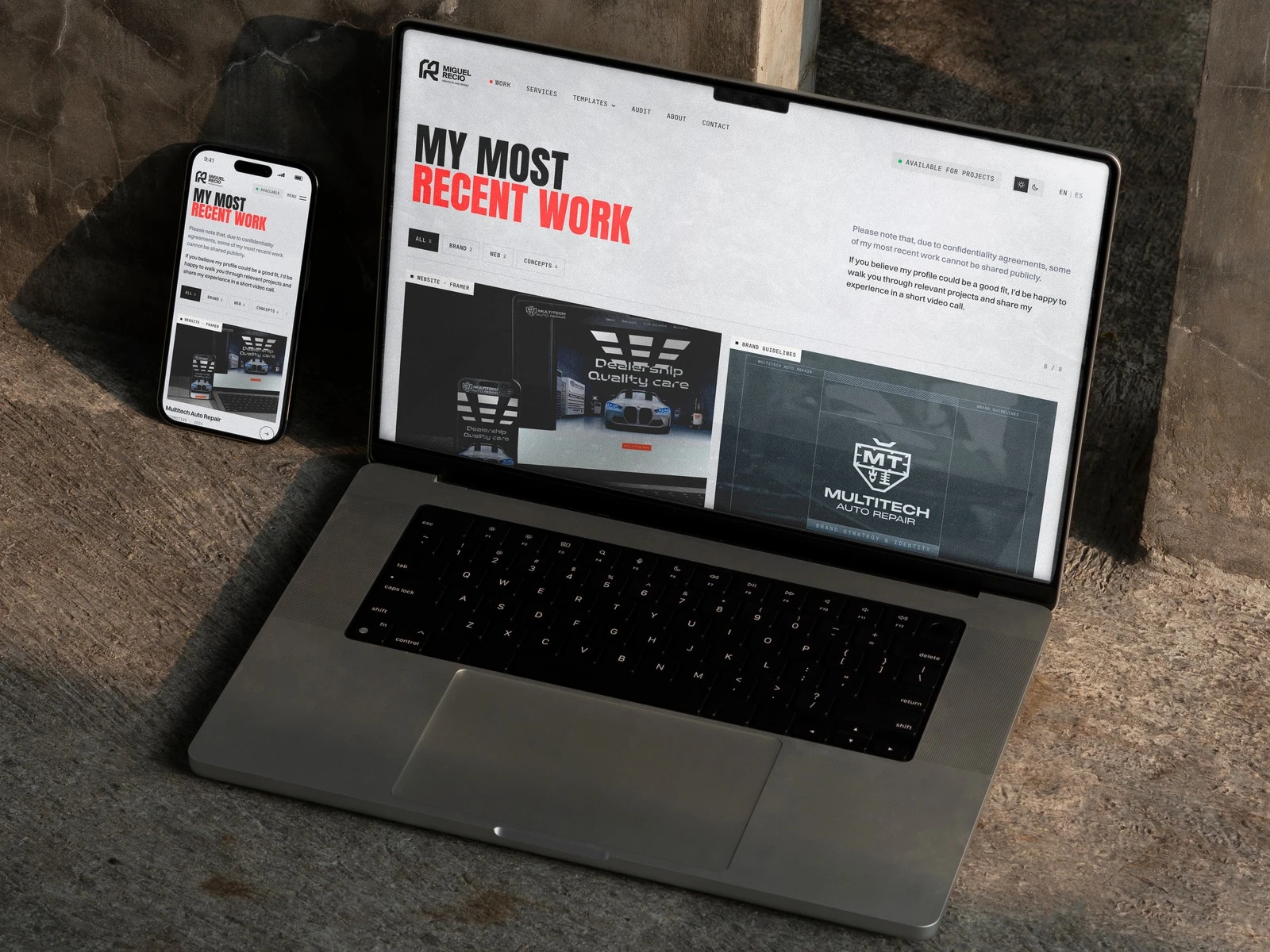
Selected work, newest first, with filters by discipline.
The project index: each name previews its project on hover.
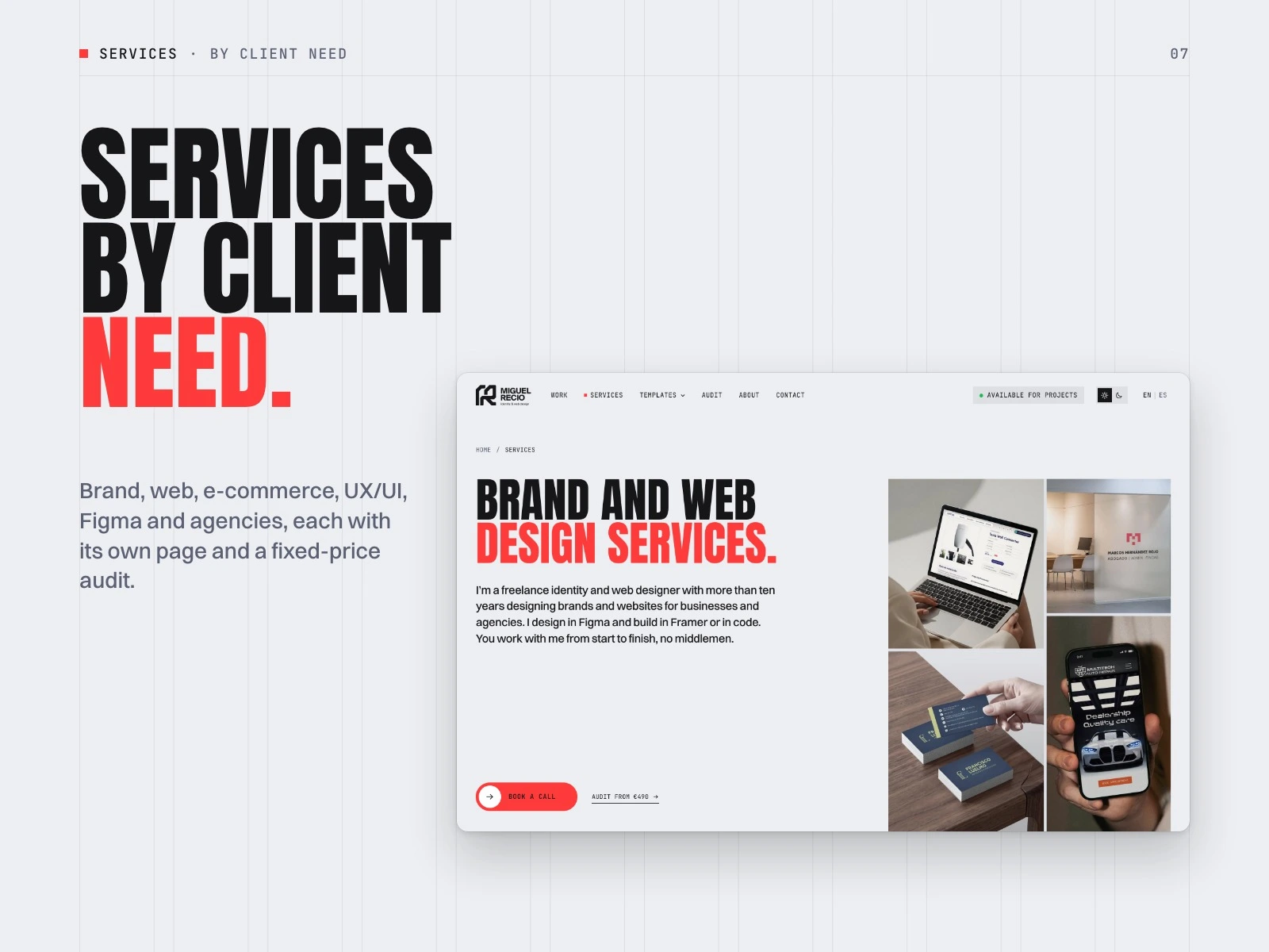
Services organised by client need, each with its own page.
Pages break into pixels and resolve into the next one.
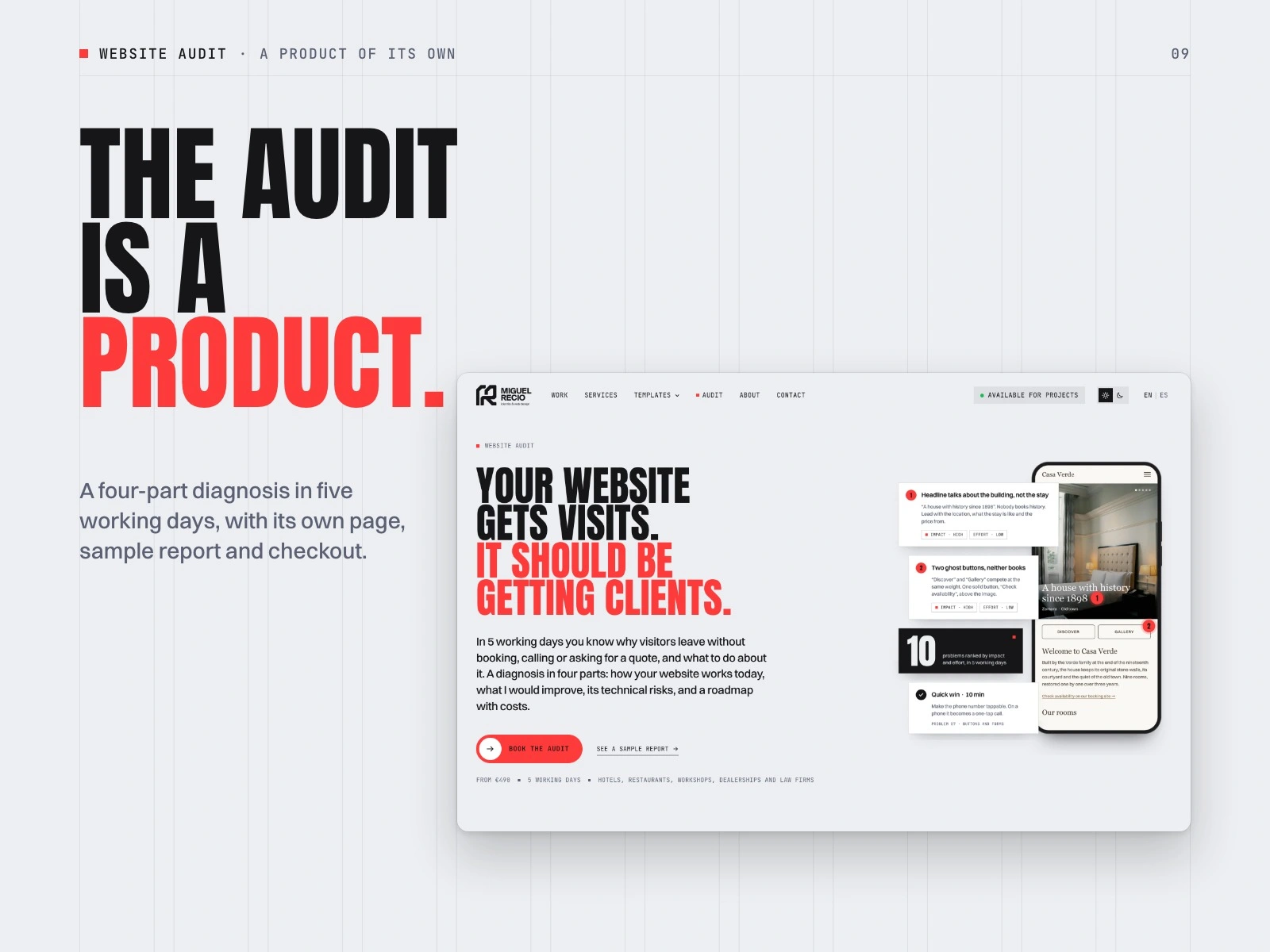
The website audit as a product: its own page, sample report and checkout.
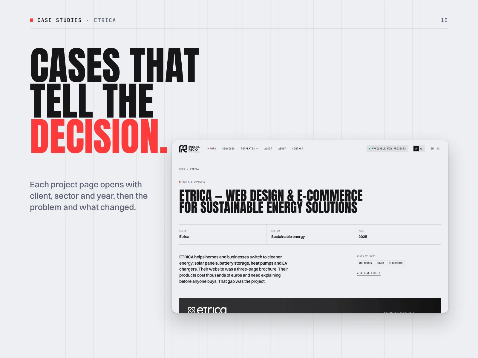
Case studies open with client, sector and year, then the problem and the decision.
The 404 turns an error into a pixel storm you can blast.
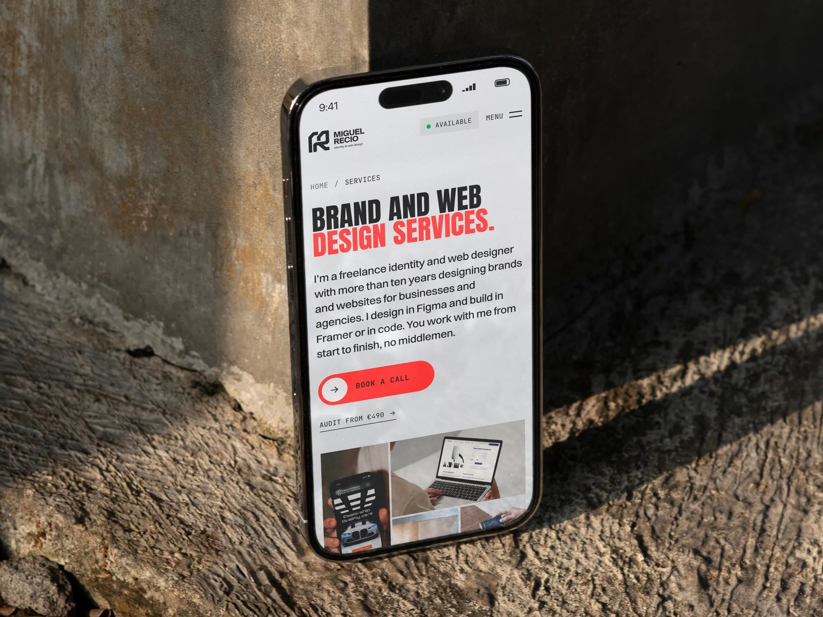
Designed for phones first.
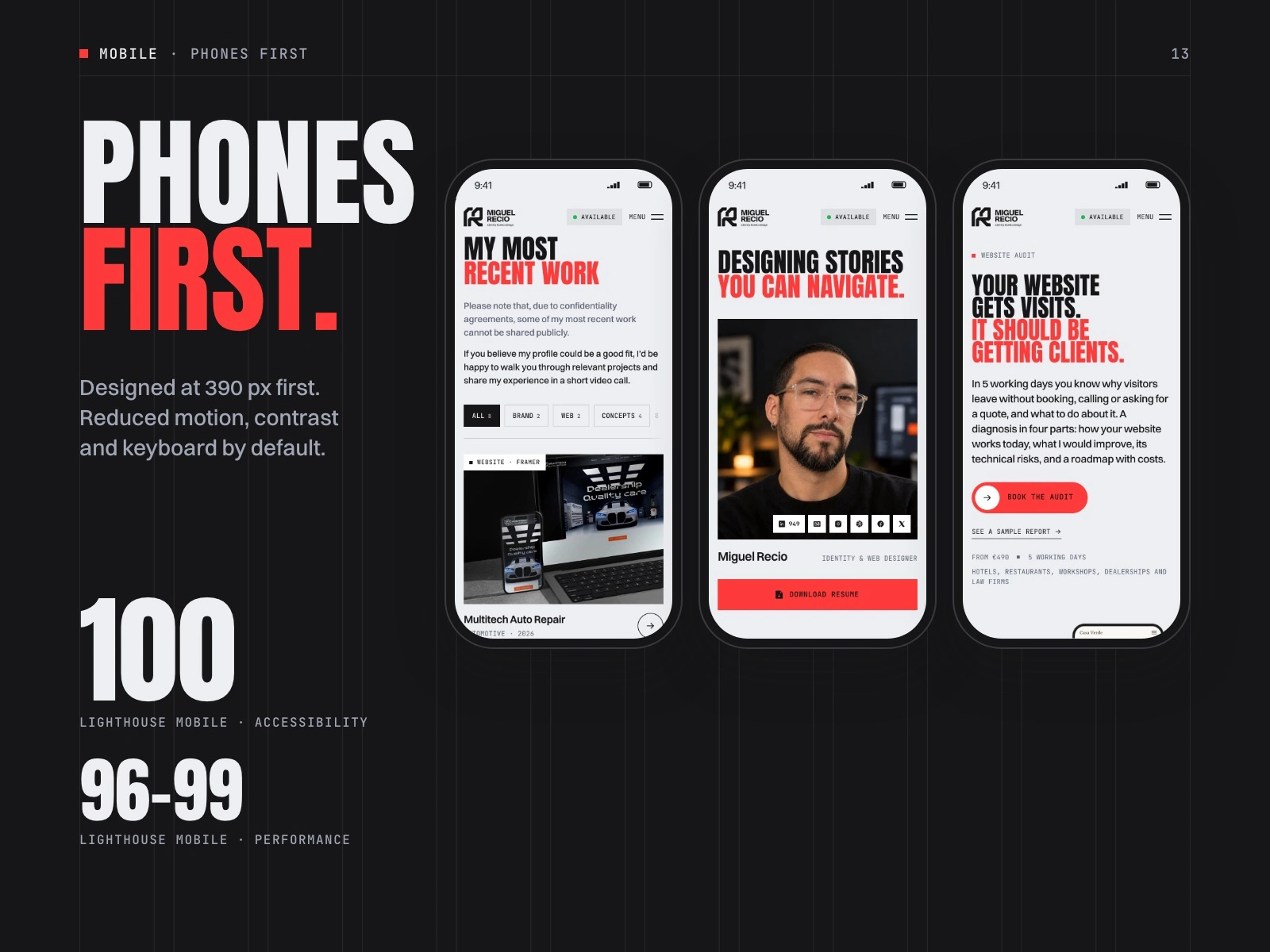
Mobile, accessible and fast: Lighthouse mobile 96–99 performance, 100 accessibility.
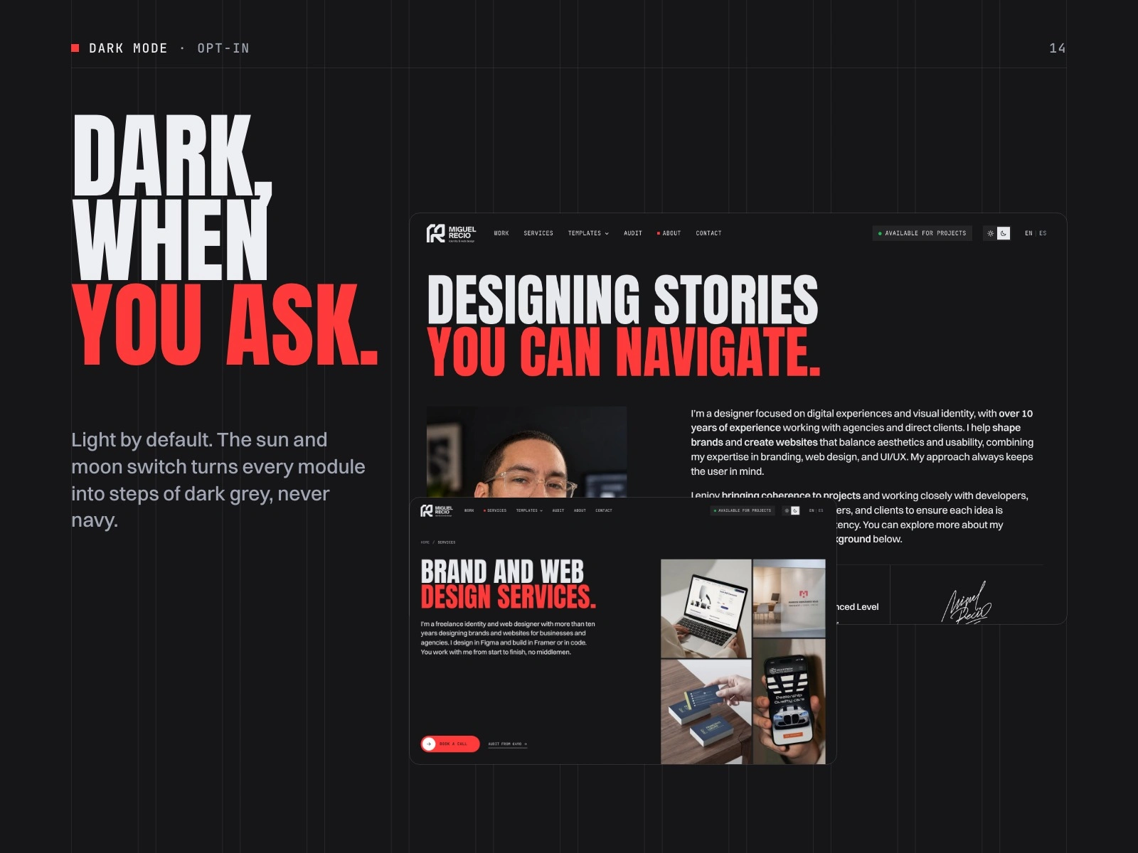
Dark mode is opt-in and built from steps of dark grey.
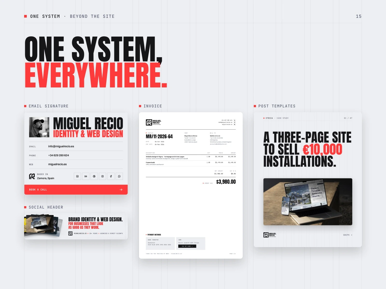
The same system runs the email signature, invoices, social headers and post templates.
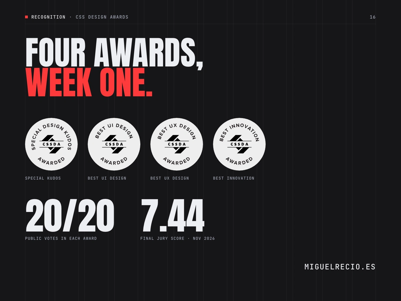
Four awards in week one at the CSS Design Awards: Special Kudos, Best UI Design, Best UX Design and Best Innovation. 20/20 public votes in each, 7.44 final jury score.
Like this project
Posted Nov 6, 2026
My studio site, redesigned as a point of sale: Swiss grid, huge type, one red, a pixel language. Hand-built in Astro. Four CSS Design Awards.
Likes
0
Views
0