Logofolio 2025
Elena Perini
Verified
1 collaborator
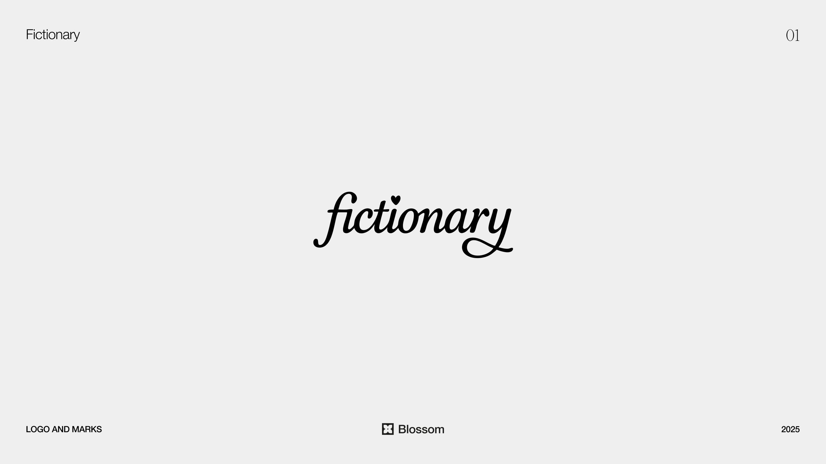
Fictionary
Fictionary is a storytelling platform designed to empower underrepresented voices and fan-driven communities through immersive, high-quality narratives and inclusive creator tools. The audience spans young adults and deeply engaged readers who are drawn to emotional, character-driven storytelling.
The logo is a fully custom wordmark designed to feel soft, expressive, and fluid. Instead of relying on rigid or geometric structures, the letterforms follow a more organic rhythm that reflects the nature of storytelling itself.
A key detail is the ligature between the F and I, which creates continuity and gives the word a more natural flow. The dot of the “i” is replaced with a subtle heart — a small but intentional gesture that references themes of romance, connection, and emotional investment within the platform.
The terminal of the “y” extends into a gentle twirl, adding movement and personality. This detail reinforces the idea of stories unfolding and evolving over time.
The result is a logo that feels intimate and expressive, aligning with both the tone of the product and the identity of its users.
Eduardo Briceño
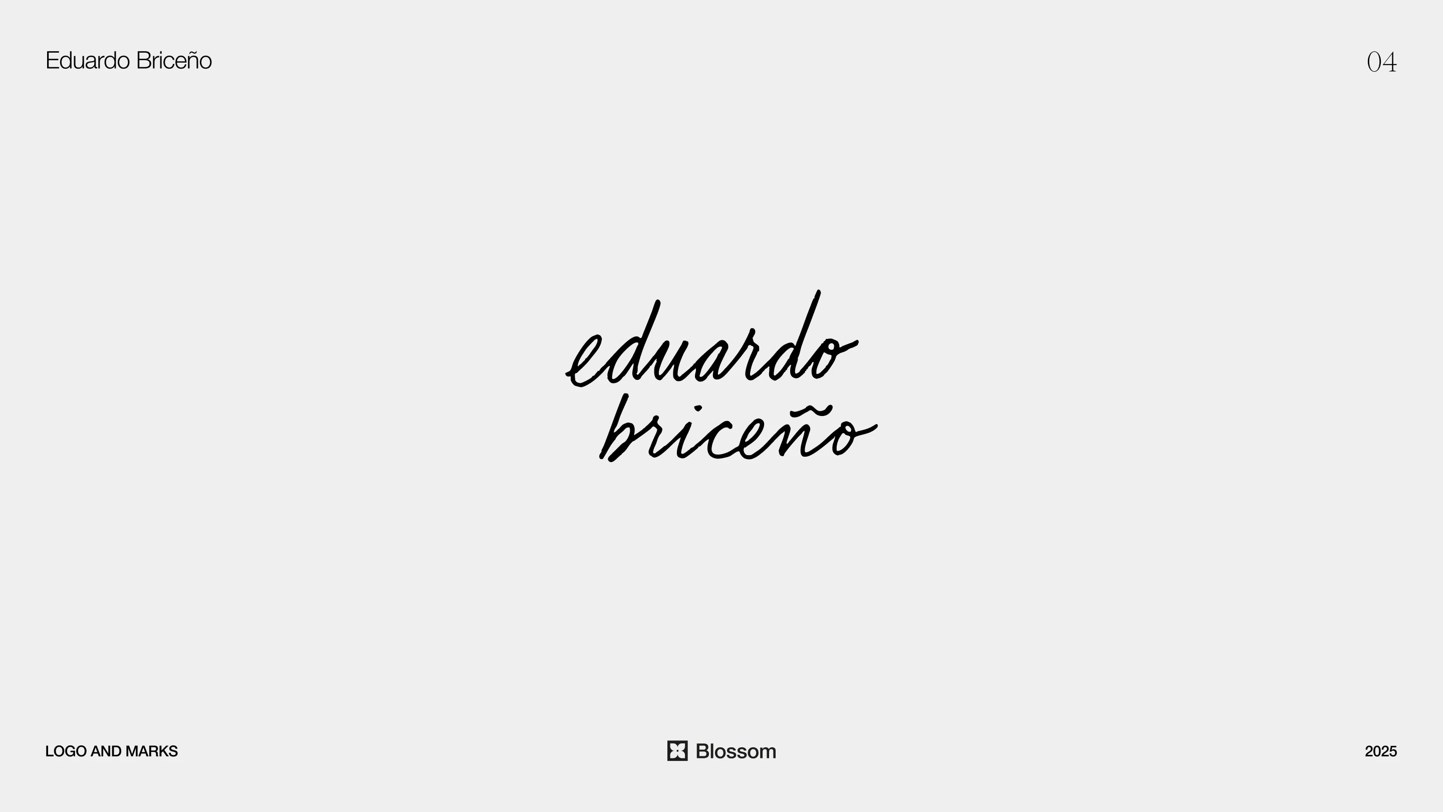
For Eduardo Briceño, the goal was to create a mark that feels authored rather than designed — something grounded, human, and reflective of a body of work built on depth and research.
The wordmark was first drawn by hand, then refined and vectorized. This process preserves subtle irregularities in the letterforms, giving the final result a tactile, organic quality.
The overall feel is calm and rooted. Instead of aiming for a polished, corporate aesthetic, the logo leans into a more natural, almost “earthy” presence. It communicates credibility through restraint and intention, allowing the typography to act as a direct extension of voice.
Synaps
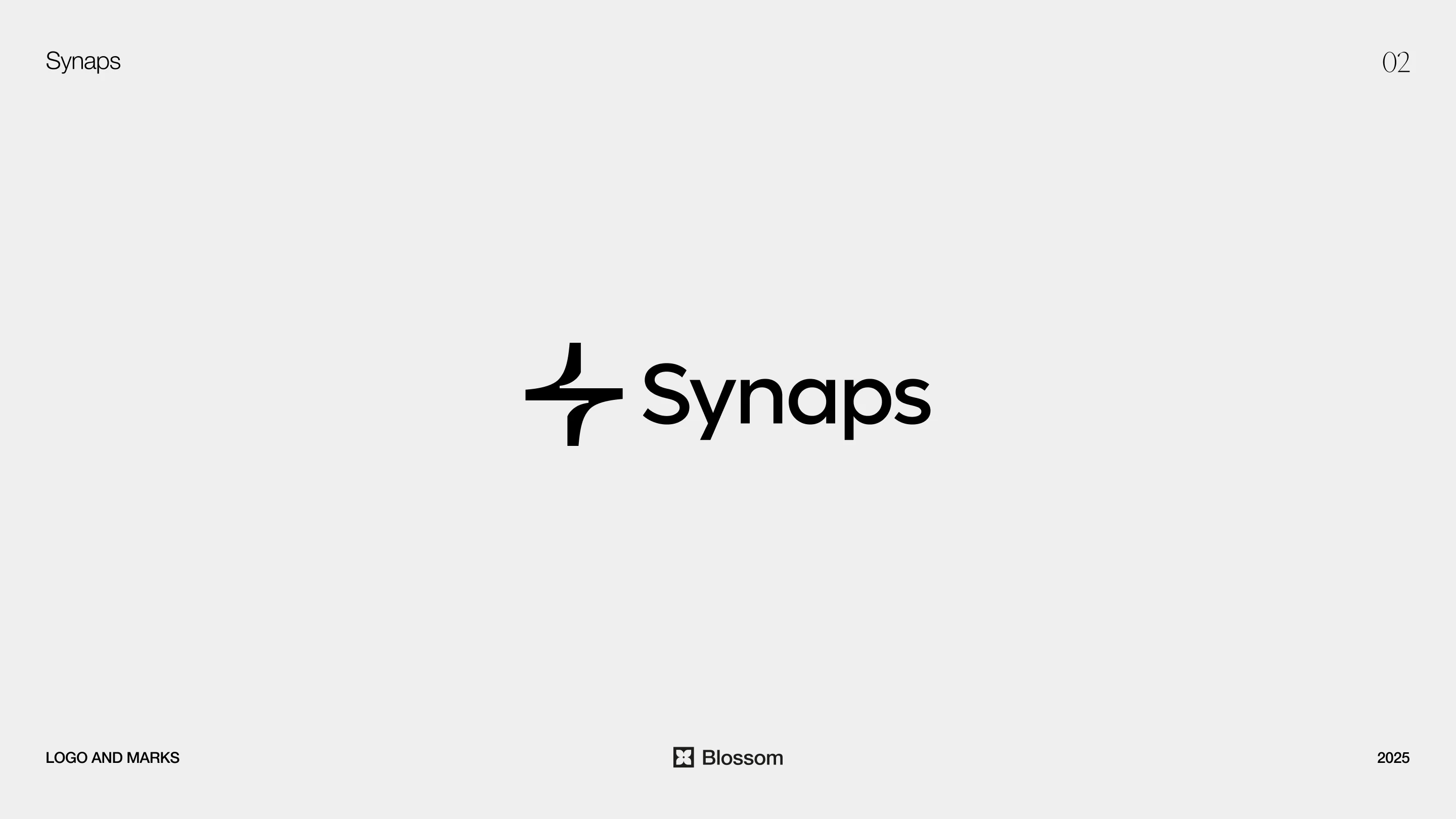
Synaps is an AI platform operating within the architectural space, where clarity and structure are essential.
The focus here was on balance — specifically the relationship between the logomark and the wordmark. The system is designed to feel precise and controlled, ensuring it integrates naturally across product interfaces.
The typography is clean and highly legible, supporting usability while maintaining a distinct identity. Every element is reduced to what is necessary, allowing the brand to function effectively in a technical environment without visual noise.
The Inner Network
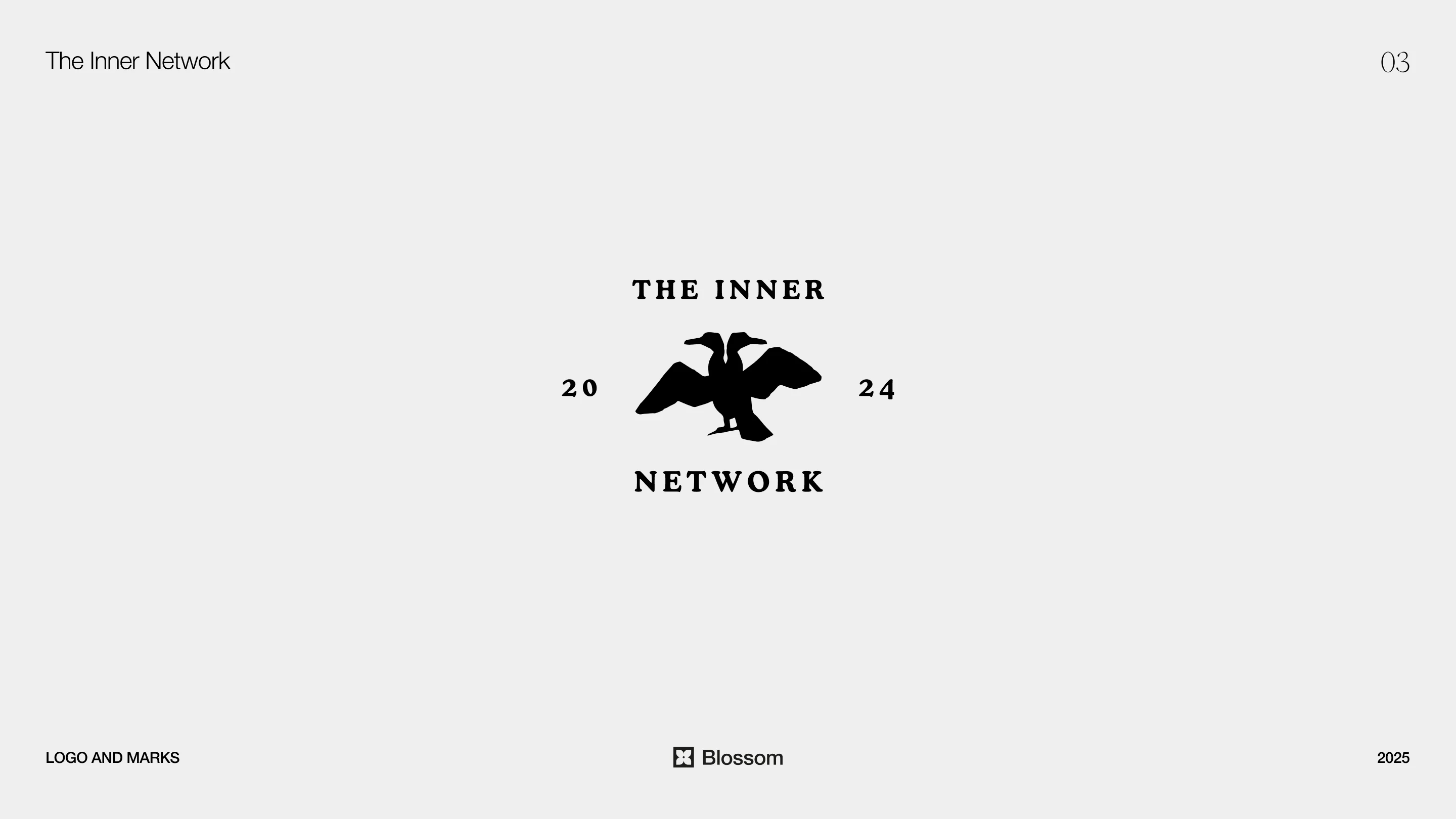
The Inner Network is a networking club built around connection, exchange, and shared growth. The identity draws from a more classic visual language to create a sense of depth and belonging.
The central symbol features a double-headed cormorant. This element introduces a sense of duality — representing exchange, perspective, and the idea that meaningful networks are built through reciprocity. It reflects both inward reflection and outward connection.
The choice of a natural, almost heraldic symbol contrasts with the digital nature of networking, grounding the identity in something more timeless and symbolic.
Japan Guide
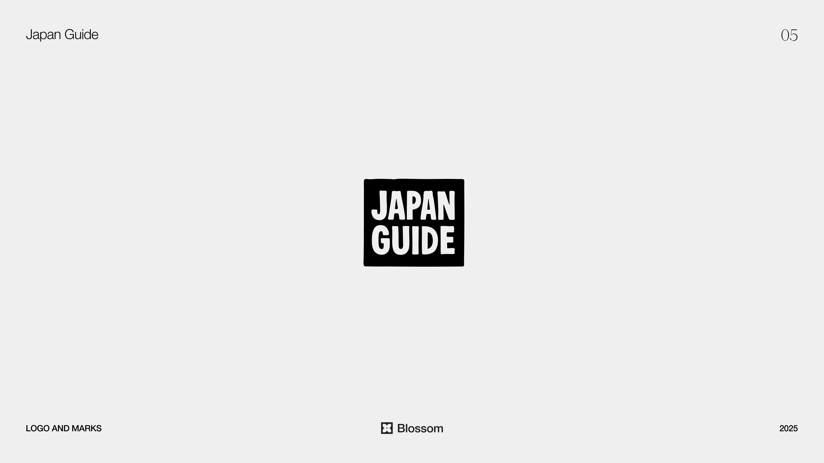
For Japan Guide, the concept is built around structure with intentional imperfection.
The logo uses a square as its base form, referencing balance, order, and spatial clarity. However, the edges are slightly irregular, introducing a human quality within an otherwise rigid system.
This contrast creates a more nuanced identity — one that feels precise yet approachable. It avoids stereotypical visual cues while still capturing a sense of cultural sensitivity through restraint and proportion.
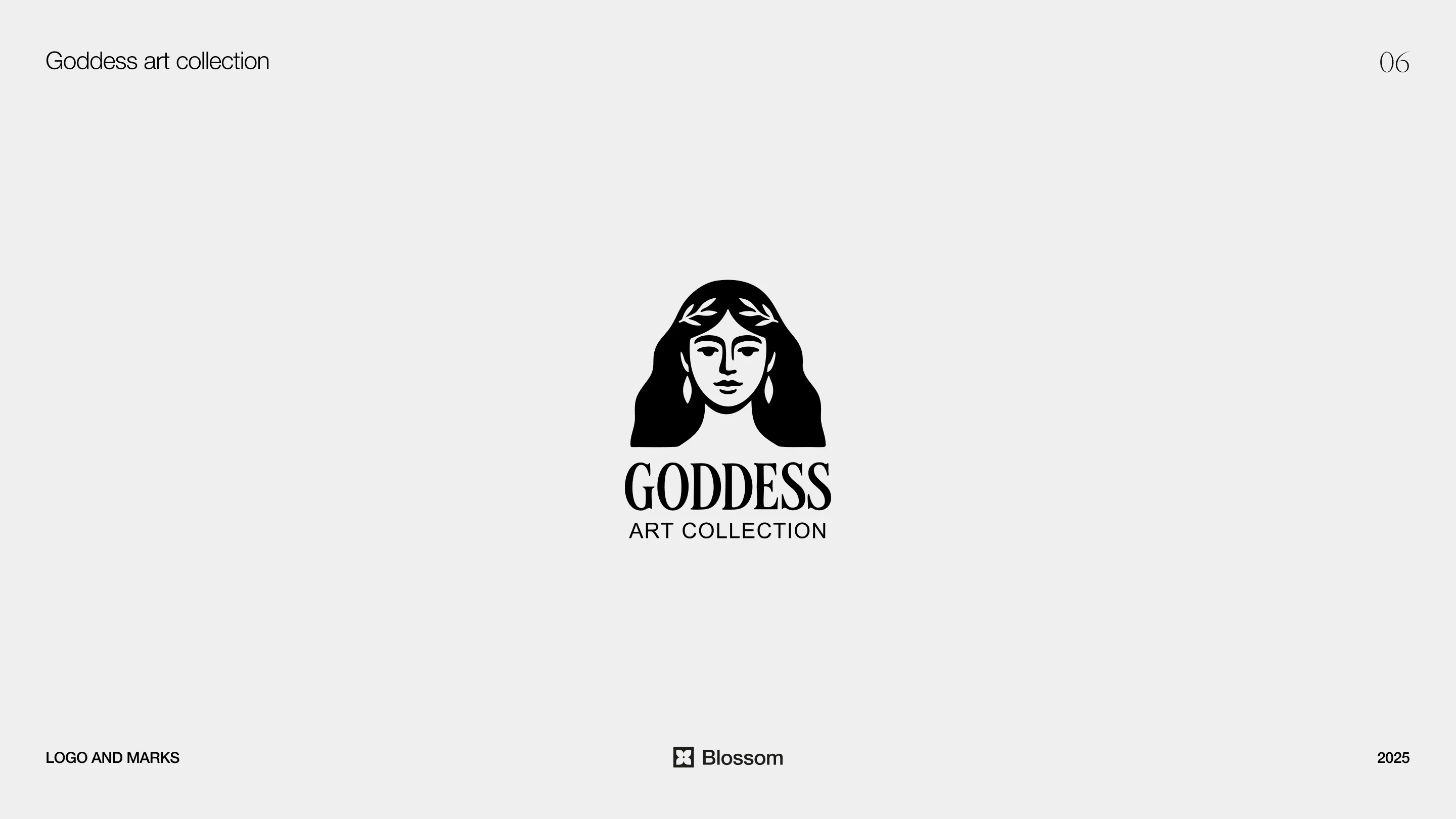
Goddess Art Collection
Goddess Art Collection is a handmade brand focused on artistic objects, candles, and floral compositions. The identity needed to feel refined while staying connected to craft and materiality.
The logo combines a custom serif wordmark with a stylized feminine figure — a goddess crowned with a laurel. The symbol introduces references to mythology, nature, and ritual, positioning the brand within a more timeless visual space.
The typography is elegant and controlled, ensuring the mark remains balanced rather than overly decorative. The relationship between symbol and type allows the identity to scale across packaging and digital applications with consistency.
The result is a brand that feels intentional, feminine, and rooted in artistry.
Like this project
Posted Nov 26, 2025
A selection of logos crafted across a range of projects for startups and personal brands, each built with a clear concept and a distinct visual direction.
Likes
2
Views
94
Timeline
Oct 30, 2024 - Dec 13, 2024
Clients
GREGORY MARK MGMT LLC
Collaborators