Building.
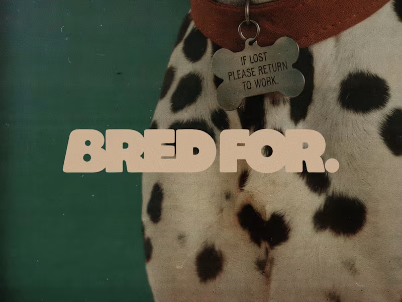
BRED FOR. is a fictional dog brand built on one idea: every breed was bred for a job, and the instinct never left. Collies herded sheep, poodles retrieved ducks, Yorkies hunted rats, Dalmatians ran beside fire carriages, so each product turns a breed's original work into an everyday object.
Style 01 is built from Japanese and Korean folk art found at the Cleveland Museum of Art, The Met, LACMA and the Rijksmuseum, and designs the products as soft, deadpan designer objects.
Style 02 is built from early colour autochromes and a 1914 lithographic poster from the Rijksmuseum and the Albertina, and turns every scene into a modern fashion campaign with an archival feel.
The two Styles were chained with Edit image: Style 01 products placed into Style 02 scenes, every headline rewritten in the brand's dry, deadpan voice. The strongest images were selected, upscaled and finished with a logo made in Recraft Logo Maker.
Style 01 (products): https://www.recraft.ai/styles/b8e1a6b6-ae61-49db-907d-74229530b596
Style 02 (campaign): https://www.recraft.ai/styles/7f2a89de-d69a-4fad-aa0d-ba6302c9a2f3
40
53
6.6K
JUMA
Good habits, no bargaining.
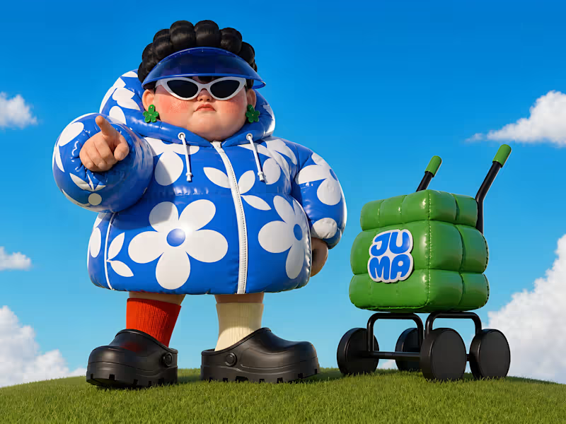
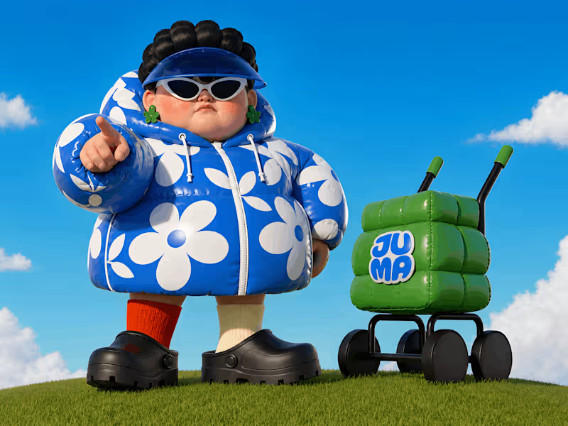
JUMA comes from the Korean ajumma archetype: the auntie who is loud, practical, caring, stubborn, and somehow convinced she is always right.
And like any serious ajumma, she comes with a cart. Nobody knows what is inside, but it probably fixes the problem.
Not a soft wellness mascot. JUMA is the one who sees you skipping breakfast, doomscrolling, avoiding basic tasks, and immediately steps in.
Brush your teeth. Eat something. Drink water. Finish the thing. Go outside.
JUMA lives as both a digital and physical mascot. She can nudge you from an app, sit on your desk as a habit object, show up in your bathroom, or take over a billboard.
→ Link (https://www.recraft.ai/project/bdaafe65-677a-438d-b6e6-e33d2f1aa2d3)
6
16
1.7K

Valuable UX/UI for your Business



Framer Expert & Partner


Crafting brand-focused experiences through Framer

I built a brand universe inspired by the vastness of space.
This is the branding for BUSINESS CANVAS, a Korean B2B SaaS startup — also known as BCU (BUSINESS CANVAS Universe).
If you’re interested in cosmic concepts, you’ll enjoy uncovering the hidden meanings and Easter eggs woven into the design.
For the full version, check out the project on my profile (https://contra.com/_7ecfzm2p?referralExperimentNid=DEFAULT_REFERRAL_PROGRAM&referrerUsername=_7ecfzm2p)! 🌌
1
120

The Studio PLASTIC BAG website was inspired by an airport —
a place where every journey begins.
My identity, a plastic bag drifting in the wind, is about freedom, weightlessness, and not forcing direction.
An airport felt like the right metaphor — a space of waiting, excitement, and possibility before taking off.
I wanted the site to capture that feeling.
Not just to show what I’ve made, but to tell why I make things —
to remind myself that design isn’t just about form,
but about meaning, timing, and the moments before something begins.
2
117


Brand designer shaping identities felt before they are read
- 22
- Followers
Brand designer shaping identities felt before they are read

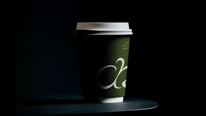
More than tea,
it is a moment to turn inward and reflect.
We chose dark tones to express the awakening that comes from looking within, capturing the deep and meditative essence of matcha.
What do you think about eerie concept of match brand?
View full work (https://nu-fik.com/chachacha)
2
3
181


Creative Social Media Strategist & Rebrand Designer
Creative Social Media Strategist & Rebrand Designer


Graphic Designer / Branding Identity & Strategy
- 1x
- Hired
- 5.0
- Rating
- 1
- Followers
Graphic Designer / Branding Identity & Strategy


Designing the face of your brand : Expert graphic designer✌️
Designing the face of your brand : Expert graphic designer✌️