Freelance Typographers in Punjab
Sign Up
Post a job
Sign Up
Log In
Filters
2
Projects
People
SUBHAN DESIGNS • Identity & Packaging
pro
Lahore, Pakistan
Identity & Packaging Systems Beyond Category Conventions
$1k+
Earned
5.0
Rating
49
Followers
expert
Follow
Message
Identity & Packaging Systems Beyond Category Conventions
3
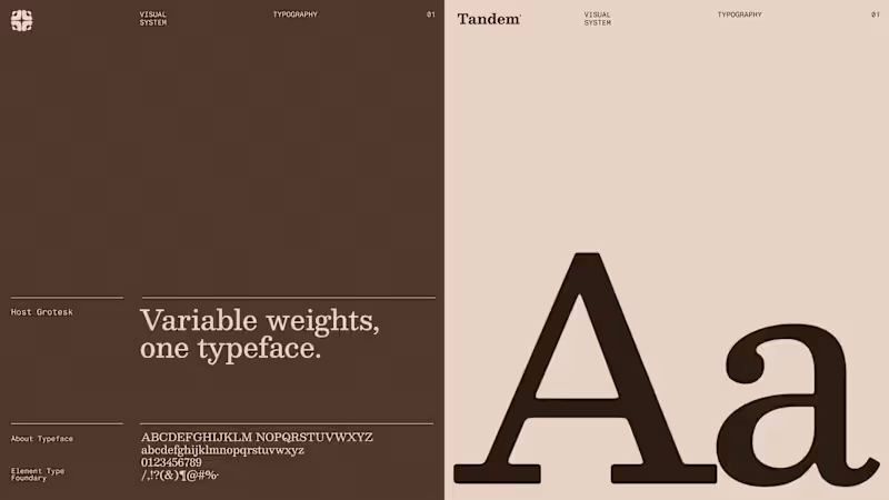
How do you brand an organization built around people working together? Meet Tandem, a workforce management company operating across Europe, handling everything beyond recruitment, from housing and transport to daily operations. In a market dominated by corporate, transactional identities, we wanted Tandem to feel human, established & trustworthy. A calm, grounded palette, editorial typography and a visual language inspired by official documentation brought credibility without losing approachability. But the heart of this direction was its logo. A North Star formed in negative space, surrounded by people. A symbol of coordinated efforts, where every individual plays a role in moving things forward. The mark even extended into a distinctive pattern system. Unfortunately, this direction didn't make the final cut. Do you think it deserved a place in Tandem's final identity? P.S. Building a brand that refuses to look like everyone else in its category? Send me a DM. I'd love to hear what you're building.
3
147
5
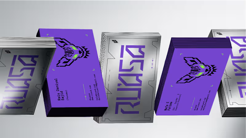
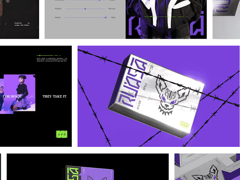
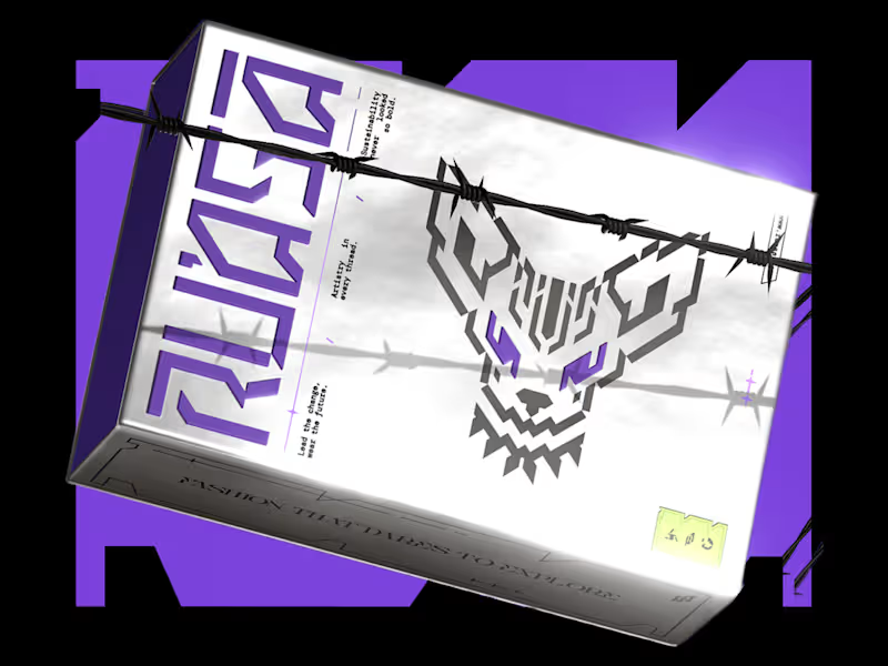
Scalability should never come at the cost of personality when building an Identity. A strong identity carries one big idea consistently, from the biggest brand moments to the smallest touchpoints, without losing what makes it distinctive. To me, that’s one of the clearest signs of a system built to last. For Ru’asā, this was especially important. The identity is intentionally maximalist, which meant every application had to carry the same energy without becoming inconsistent or overwhelming. The challenge was building something expressive, yet systematic enough to scale. And that’s exactly what we built. Here are some of the touchpoints we created for Ru’asā. Do they feel like they belong to the same world?
2
5
602
3
RU’ASĀ — Identity | Packaging | Collaterals
1
3
40
14
"We weren’t sure what our brand should look like. They gave us a clear path forward.” That’s how our client described their experience working with us on Ru’asā. They came to us with a clear ambition: build a premium fashion brand that goes beyond category conventions. Derived from the Arabic ra’is, meaning chief or leader, Ru’asā celebrates individuality and rebellion against conformity. We built the complete brand experience across Strategy, Creative Direction, Visual Identity, Packaging Experience and Collaterals. The full project is live. Take a look at how we brought the brand to life here (https://www.behance.net/gallery/241790871/Techno-Gothic-Branding-Packaging-for-Fashion-Brand) Building a brand that aims to set the standard rather than follow one? I’d love to hear from you
4
14
663
Typographer
(2)
Follow
Message
Waleed B.
pro
Lahore, Pakistan
I Design What People Remember. Not Just Pretty.
1x
Hired
5.0
Rating
76
Followers
Follow
Message
I Design What People Remember. Not Just Pretty.
6
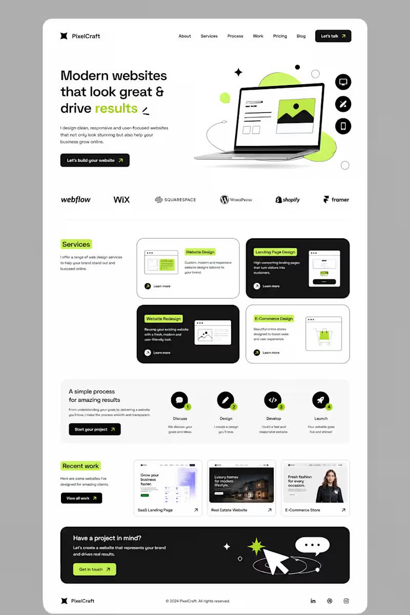
I didn’t want to build another website that simply “looked good.” I wanted to build something that felt clear, modern, and actually guided people toward taking action. So I started with a simple idea: less clutter, more clarity. I built the layout around strong typography, clean spacing, bold contrast, and small lime-green accents to make important elements stand out. Then came the details — service cards, responsive sections, portfolio previews, a simple process, and CTAs placed where they naturally make sense. The goal was simple: Make the website feel good to explore — and even better to use. This is what I love about web design. It’s not just about designing a pretty page. It’s about turning an idea into an experience. #Graphic Designer #Webdesigner #Website Designer
6
6
576
0
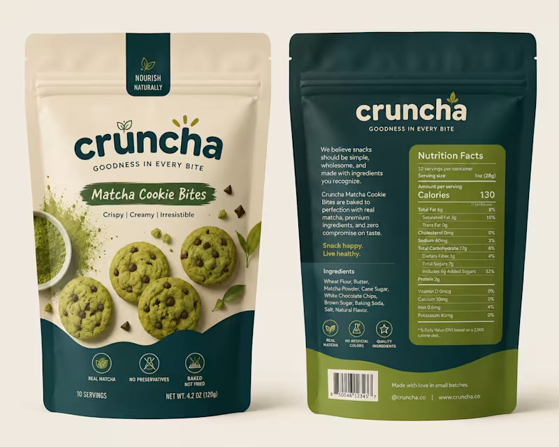
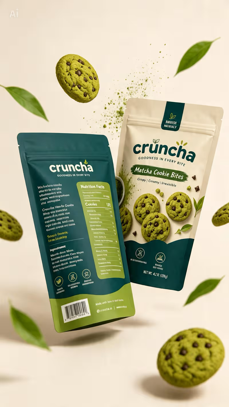
Cruncha was one of those projects I genuinely loved working on. ✦ From exploring the visual direction and color palette to shaping the packaging and bringing the whole concept together, every detail felt intentional. It gave me the freedom to experiment, think beyond the obvious, and turn a simple idea into something that actually feels like a brand. And honestly, the best part? I walked away from this project feeling like I’d actually earned something — not just completed another design.
0
195
2
Behind the Design ✦ This concept started with one goal: make the packaging feel as good as the product itself. I wanted to move away from the usual bright-green matcha aesthetic, so I explored a mix of warm ivory, deep teal, and muted olive — giving it a more premium yet approachable feel. The bold typography adds personality, while the curved color blocks and ingredient photography give the packaging a distinctive shelf presence. Piece by piece, the colors, typography, imagery, and packaging style came together to create something that feels fresh, playful, premium, and memorable. Sometimes the final design looks simple — but there’s a lot of thought behind every detail. ✦
2
303
1
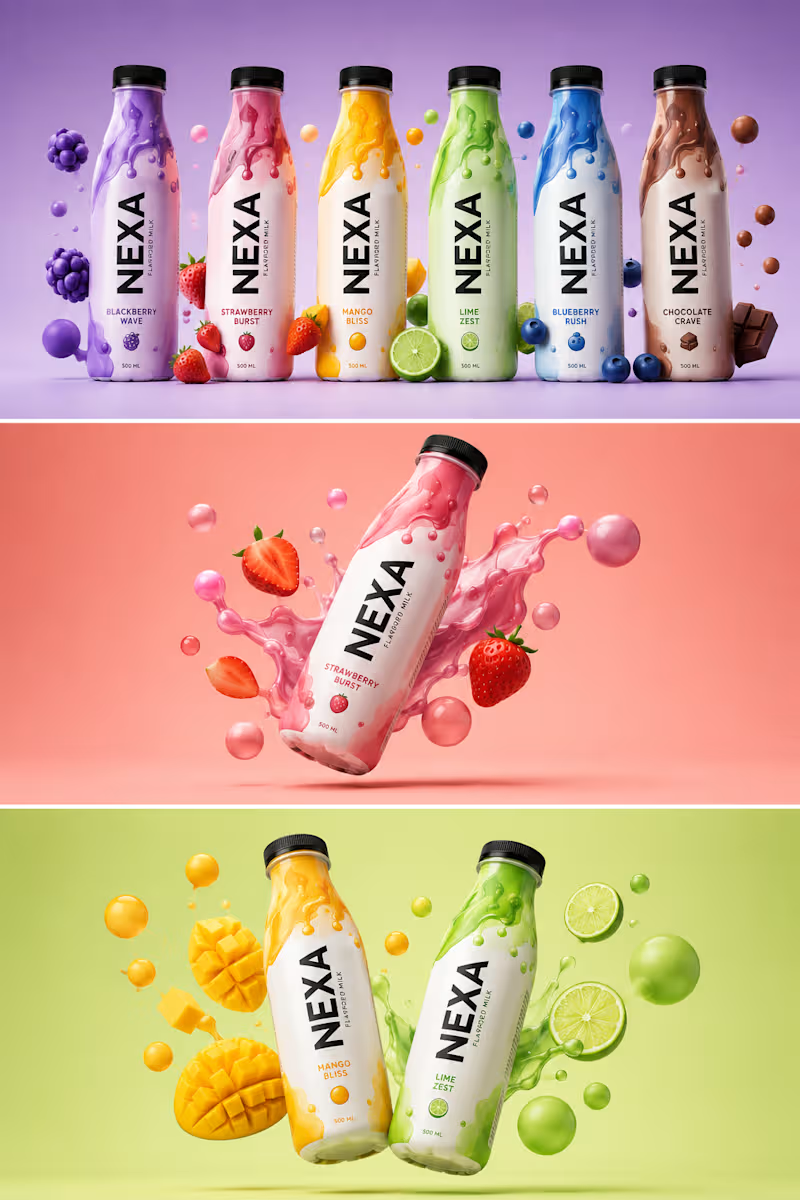
𝐁𝐄𝐇𝐈𝐍𝐃 𝐓𝐇𝐄 𝐃𝐄𝐒𝐈𝐆𝐍 𝑨 𝑵𝑬𝑾 𝑷𝑹𝑶𝑱𝑬𝑪𝑻. 𝑨 𝑵𝑬𝑾 𝑪𝑯𝑨𝑳𝑳𝑬𝑵𝑮𝑬. Every project teaches you something. This time, it was about creating a beverage brand that feels bold, playful, and unforgettable. The goal was simple: design a brand that stands out on the shelf and connects instantly with the right audience. 🎯 𝐌𝐘 𝐀𝐏𝐏𝐑𝐎𝐀𝐂𝐇 Bold Contrast – Each flavor has its own identity. Fluid Patterns – Inspired by energy and motion. 3D Visuals – To make the product look alive and irresistible. Storytelling Through Color – Every shade has a purpose and a mood. 💡𝐖𝐇𝐀𝐓 𝐈 𝐋𝐄𝐀𝐑𝐍𝐄𝐃 • Design is not just about looks, it’s about emotion. • The right colors and composition can make a product speak. • Patience, details, and iteration always pay off. 𝐀𝐍𝐎𝐓𝐇𝐄𝐑 𝐒𝐓𝐄𝐏 𝐅𝐎𝐑𝐖𝐀𝐑𝐃. 𝐀𝐍𝐎𝐓𝐇𝐄𝐑 𝐋𝐄𝐒𝐒𝐎𝐍 𝐋𝐄𝐀𝐑𝐍𝐄𝐃. 𝐎𝐧 𝐭𝐨 𝐭𝐡𝐞 𝐧𝐞𝐱𝐭. → TOOLS USED: Adobe Photoshop, Adobe Illustrator FOCUS • Brand Identity • Color Psychology • 3D Composition 𝐓𝐈𝐌𝐄 𝐒𝐏𝐄𝐍𝐓 Concept to Final – 2 Days Grateful for the process. Excited for what’s next. #graphicdesigner #brandidentity #branddesign #packgaing #barnding #designer
1
165
Typographer
(5)
Follow
Message
Muhammed Ahmed
Chakwal, Pakistan
Web design and motion design for startups.
5.0
Rating
33
Followers
Follow
Message
Web design and motion design for startups.
2
Keeping it simple yet effective. What would you rate it?
2
2
333
0
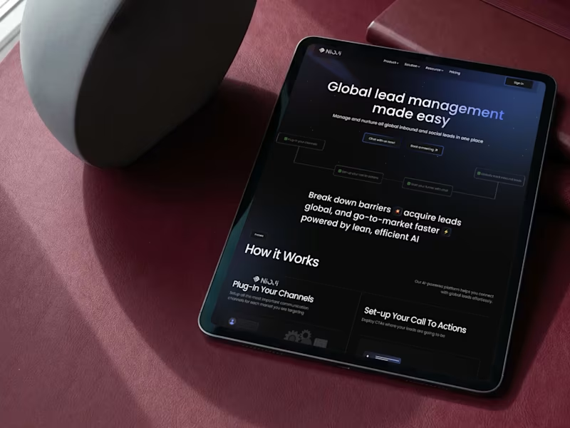
Landing Page Design NioJi
0
9
0
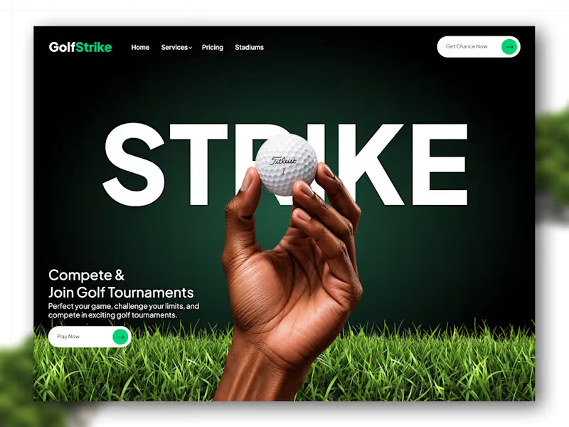
A golf experience built around one simple idea: make the first swing happen before the first click. Designed a bold, high-contrast landing page for GolfStrike combining sports energy, editorial typography, and a dark-to-green visual system to create something that feels competitive without losing clarity. Built for golfers who want to compete, discover tournaments, and play more. Designed in Figma. What would you change about the experience?
0
270
3
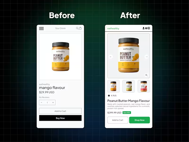
Sometimes, poor sales aren't caused by a bad product they're caused by poor presentation. The way you showcase your product has a huge impact on whether people trust it, remember it, and ultimately buy it. This is a simple before-and-after redesign of the same product. Nothing about the product changed. Only the shopping experience did. Better visuals. Better hierarchy. Better product presentation. Which one would you be more likely to buy from? Design doesn't just make things look better it helps products sell better.
2
3
314
Typographer
(4)
Follow
Message
Aayma Noor
Lahore, Pakistan
Graphic Designer & Accounting Freelancer.
9
Followers
Follow
Message
Graphic Designer & Accounting Freelancer.
0
Sora & Stone — The Terracotta Vessel Series
0
0
0
Educational Brand Identity & Marketing Collateral
0
0
0
NŪDE: Vanilla & Oud Body Oil Launch Campaign
0
0
View more →
Typographer
(3)
Follow
Message
Fajar Chaudhry Muhammad Naeem
Lahore, Pakistan
Marketing Graphic Design
New to Contra
Follow
Message
Marketing Graphic Design
0
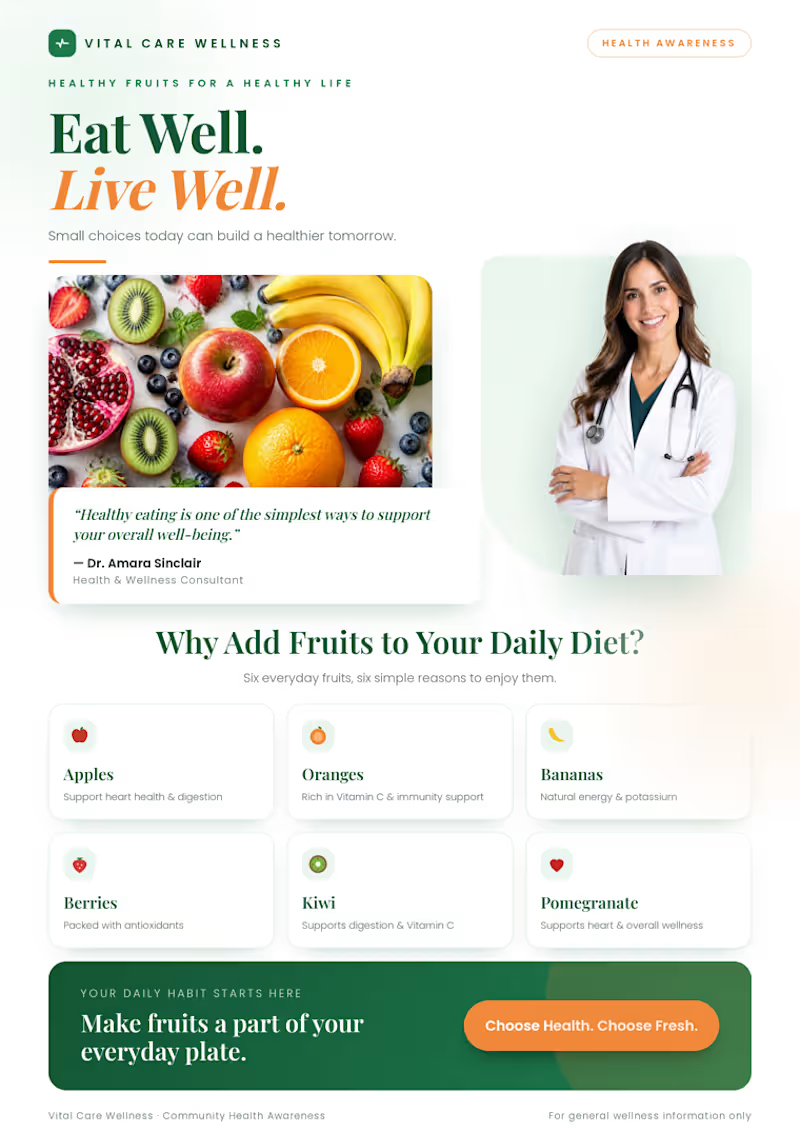
Healthy Fruits Landing Page 🍊 Designed a fresh, modern, and engaging wellness landing page focused on healthy eating and fruit awareness. 🌿 Key Highlights Doctor profile and wellness quote section Clear CTA to encourage healthy habits Soft shadows, rounded cards, and balanced spacing 🛠 Skills & Tools UI/UX Design · Web Design · Landing Page Design · Visual Hierarchy · Typography · Color Theory · Responsive Design 🎯 Goal: Turn health awareness into a visually engaging and easy-to-understand digital experience.
0
35
0
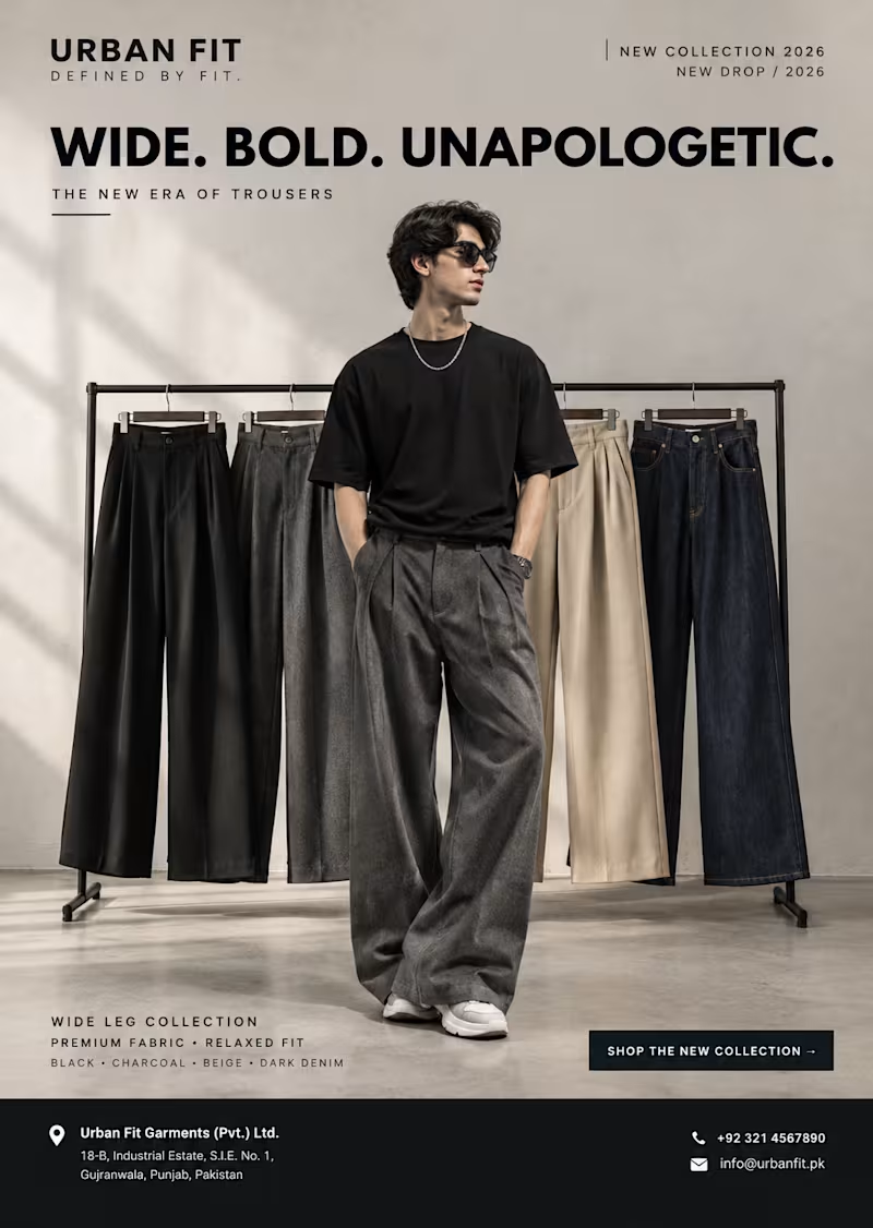
Project Name: URBAN FIT — Wide Leg Collection 2026 🖤 Description: Big fits, bigger attitude! 😎🔥 Redefining streetwear with bold wide-leg trousers, premium style, and effortless confidence. Designed to make every step a statement. 👖✨
0
44
0
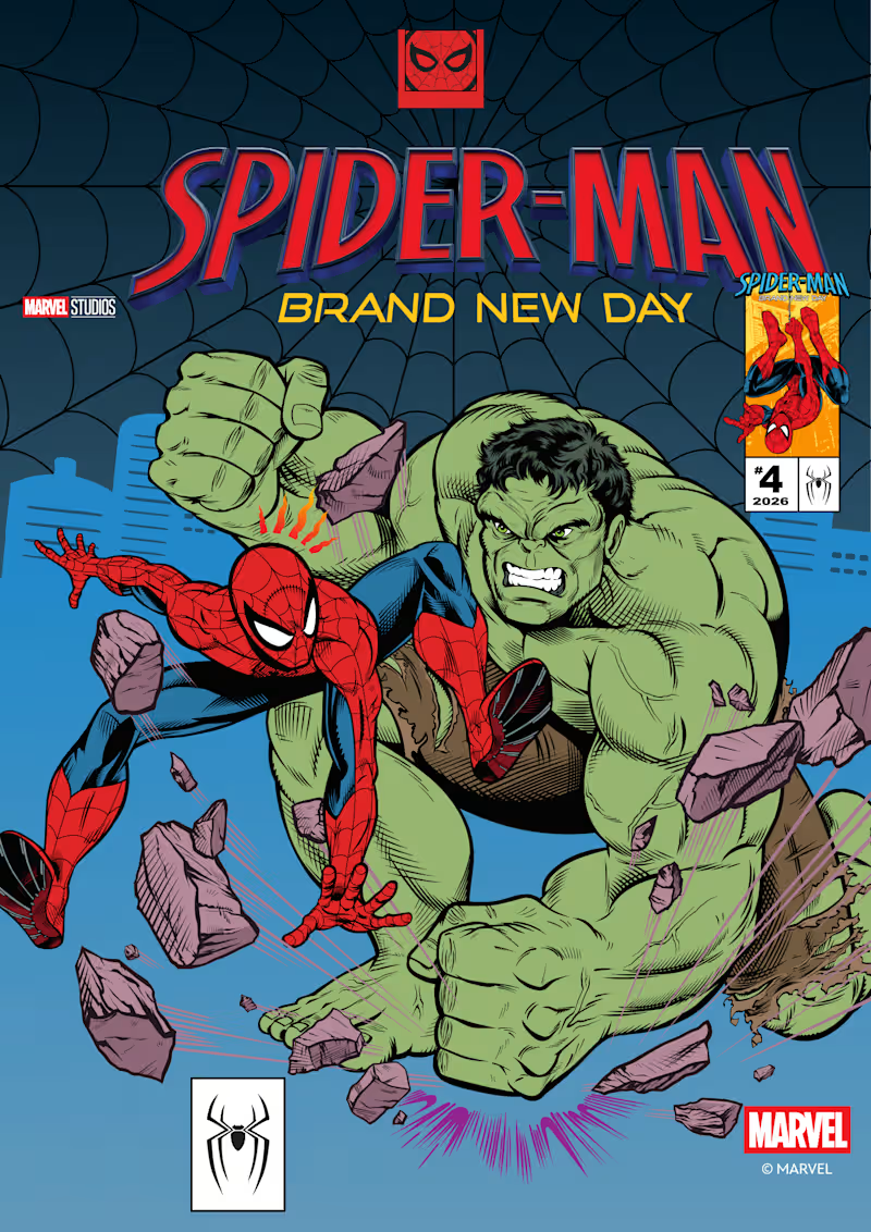
Project Name Spider-Man — Comic Book Art & Character Illustration Project Description The Challenge: Create an eye-catching Spider-Man illustration that captures the energy, action, and iconic style of superhero comics while engaging comic book fans. The Approach: I focused on dynamic composition, bold colors, expressive character details, and dramatic visual elements inspired by classic comic book aesthetics to bring the character to life. The Outcome: A striking, comic-inspired visual that celebrates Spider-Man's iconic personality through engaging character styling, vibrant artwork, and dynamic visual storytelling.
0
41
0
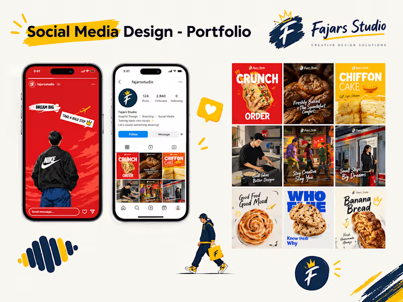
Project Title: Social Media Magic — Visuals That Stop the Scroll 🎨 Problem: Brands need eye-catching social media content to stand out, attract attention, and build a consistent visual identity. Solution: I created bold, creative social media designs featuring engaging layouts, vibrant colors, and modern typography to make brand content more appealing. Deliverables: Instagram Posts, Social Media Campaigns, Promotional Graphics & Brand Visuals.
0
13
Typographer
(3)
Follow
Message
Abrar A. Faiz
Lahore, Pakistan
Senior Designer & Art Director | Premium CPG Brands | Remote
1x
Hired
4
Followers
Follow
Message
Senior Designer & Art Director | Premium CPG Brands | Remote
0
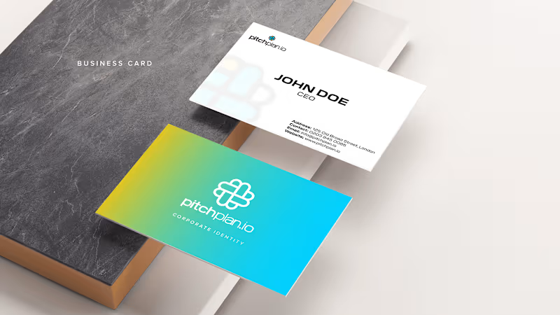
Pitchplan.io - Brand Identity
0
8
0
NIC LUMS | Interior Graphics
0
10
0
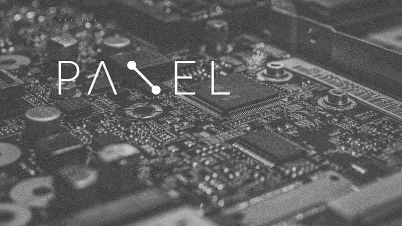
Panel - Brand Identity - Logo Design
0
9
0
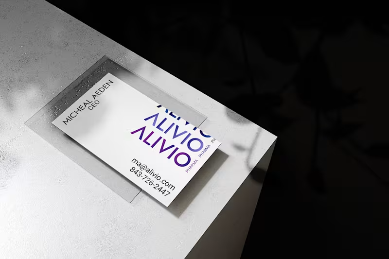
Alivio Pharma - Formation of a Brand
0
16
Typographer
(5)
Follow
Message
AREEBA AKMAL
Sialkot, Pakistan
Creative Designer • YouTube • Branding • Visuals
62
Followers
Follow
Message
Creative Designer • YouTube • Branding • Visuals
2
I MET THE WORLD'S FUNNIEST HORSE! Client Project Spotlight🌍 Designed this high-CTR YouTube travel thumbnail for a client, combining bold typography, expressive visuals, and a premium click-focused layout. Every element was crafted to grab attention and boost click-through potential. ✨ Custom YouTube Thumbnail Design 🎯 Travel Vlog Niche 🚀 Designed for maximum engagement
2
304
2
Before & After See the Difference a Professional Thumbnail Makes
2
300
2
A powerful transformation deserves a thumbnail that gets clicks. 🚀 For this project, I designed a high-CTR "Then vs Now" YouTube thumbnail using bold typography, strong color contrast, and a clean visual hierarchy to instantly communicate progress and success. Every element was carefully placed to maximize curiosity, engagement, and click-through rate while maintaining a premium, professional look. Need thumbnails that make your content impossible to ignore? Let's work together. #ThumbnailDesign #YouTubeThumbnail #GraphicDesign #CTR #ContentCreator #VisualStorytelling #PersonalBrand #FreelanceDesigner #Portfolio #YouTubeGrowth
2
292
2
A high-converting VSL thumbnail designed to grab attention instantly and maximize click-through rate. I focused on bold typography, clean composition, strong visual hierarchy, and premium color contrast to make the key message stand out at first glance. Every element was carefully placed to create a professional, scroll-stopping design that helps content get more clicks and engagement. 🚀 Need thumbnails that drive results, not just look good? Let's work together.
2
276
Typographer
(9)
Follow
Message
Fajar Rizwan
Lahore, Pakistan
CS student & designer automating the future with AI.
New to Contra
Follow
Message
CS student & designer automating the future with AI.
1
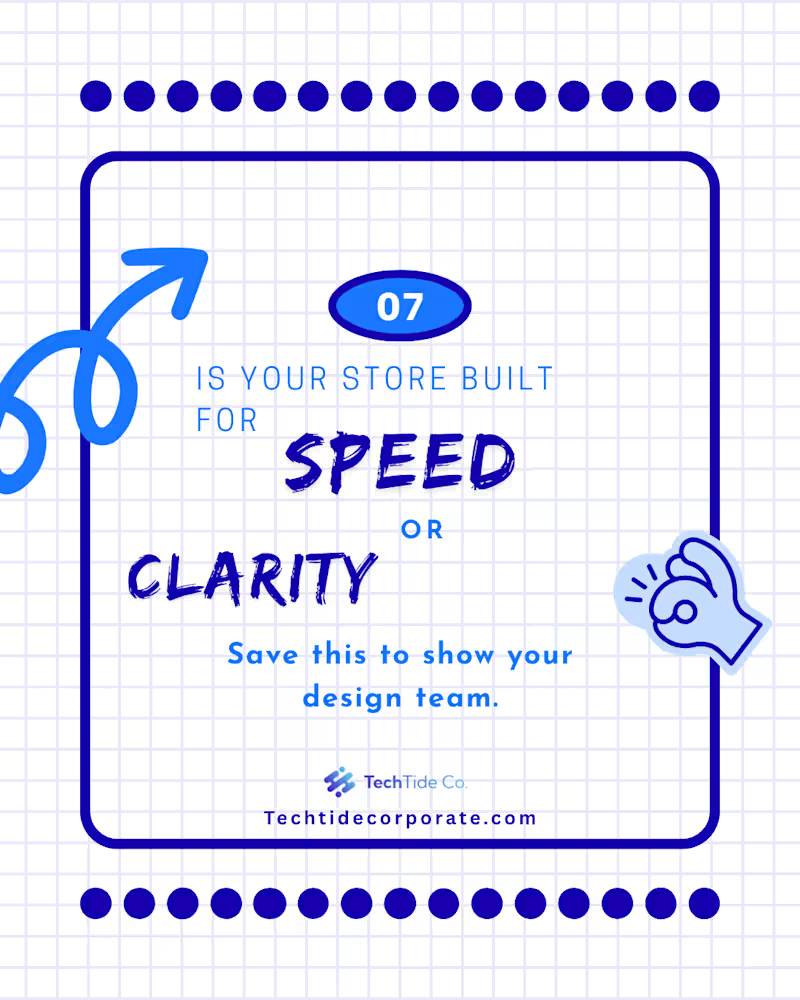
Since you mentioned Part 1 was about the "Psychology" and the "Problem," Part 2 needs to be about the "Solution" and the "Action." This makes you look like a designer who doesn't just point out flaws but actually knows how to fix them. Here is the professional English text for your Part 2 Contra post: Project Title: The "5 Confident Clicks" Framework – UX Case Study (Part 2 of 2) The Design Challenge: Following the psychological groundwork laid in Part 1, this second installment focuses on the practical execution of a high-conversion user journey. The challenge was to visualize a framework that balances speed with user certainty, ensuring that every interaction leads the customer closer to a "Confident Yes." My Creative Approach: In this concluding part, I transitioned from identifying myths to presenting actionable architectural solutions. My design strategy included: Framework Visualization: I designed the "5 Confident Clicks" roadmap, using a step-by-step visual flow to show how information should be staggered to prevent user overwhelm. Blueprint Detail: I maintained the blue-on-white technical aesthetic to ensure continuity from Part 1, signaling to the audience that this is a data-driven design solution. Clarity over Speed: I utilized custom icons and directional cues to demonstrate that "Certainty Converts." The design illustrates that a guided path, even if longer, significantly reduces cart abandonment. Conversion Optimization (CRO): The final slides focus on the "Visit" and "Contact" CTAs, transforming the educational experience into a direct lead-generation tool for the client. The Final Result: This two-part series serves as a comprehensive masterclass in modern UX. By the end of this installment, the viewer isn't just informed—they are equipped with a tangible framework to audit and improve their own digital storefronts. Series Conclusion: This completes the "Psychology of Conversion" series. While Part 1 challenged the status quo, Part 2 provides the roadmap for the future of digital interaction. “Mystery kills the sale. Certainty converts.”
1
64
1
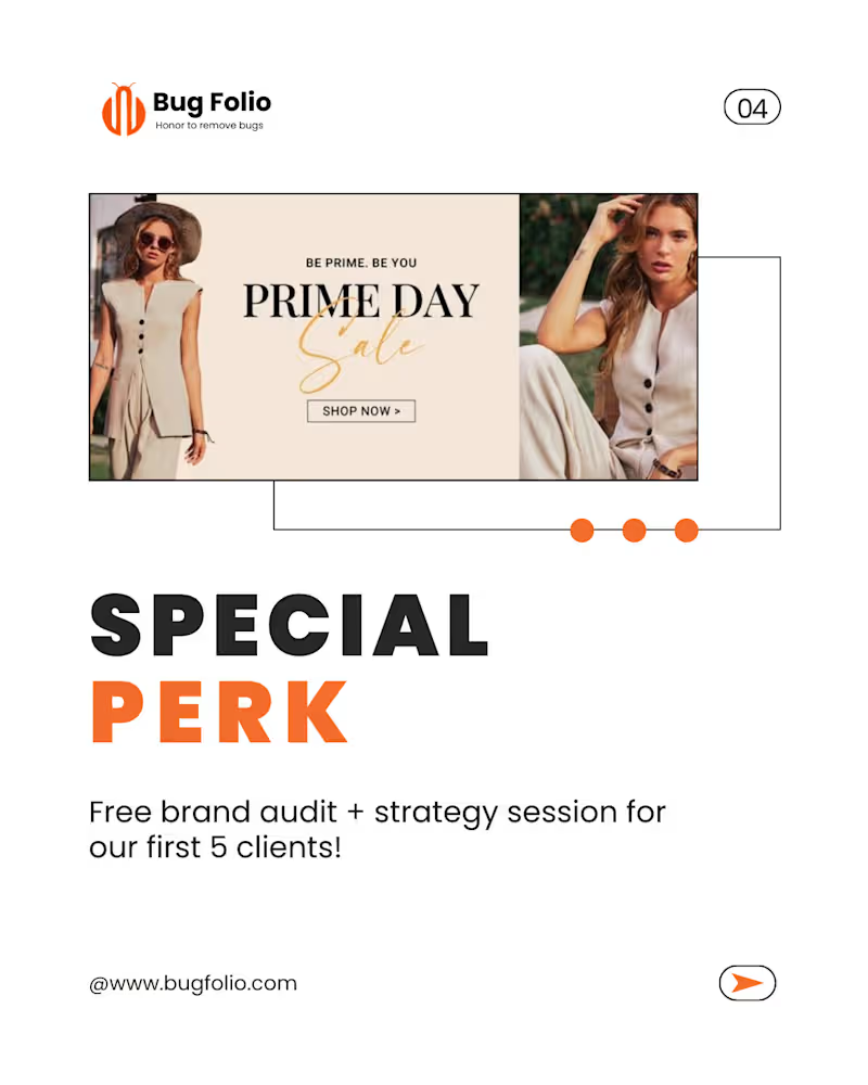
This new set of designs has a Fashion & Lifestyle vibe with a focus on Marketing Strategy (Offers, Sales, and Growth). It looks like a "Launch Campaign" or "Promo Kit." Here is the professional English text for your Contra post, focusing on your role as a Graphic Designer: Project Title: Fashion E-commerce Branding & Promotional Campaign Design The Design Brief: The goal of this project was to design a high-conversion promotional campaign for a fashion-forward brand. I needed to create a visual identity that felt premium yet accessible, focusing on driving "Growth" and "Sales" through clean, modern aesthetics. My Creative Approach: For this project, I moved away from abstract doodles and focused on High-Fashion Editorial Layouts. My design decisions included: Editorial Minimalism: Using a clean white base with bold, structured typography to give the brand a "luxury" feel. Strategic Call-to-Actions (CTAs): Designing the "Ready to Grow" and "Special Perk" sections to stand out using high-contrast orange tones, specifically aimed at increasing conversion rates. Lifestyle Integration: Carefully selecting and framing imagery to ensure the product (fashion) remained the focus while the text provided the strategic marketing value. Consistency Across Assets: Ensuring that the brand audit and strategy session offer looked cohesive with the "Prime Day Sale" visuals, creating a seamless user journey. The Results: The final delivery included a set of versatile marketing assets tailored for social media and web banners. These designs don't just look good—they are engineered to stop the scroll, build professional credibility, and convert cold traffic into loyal clients.
1
46
1
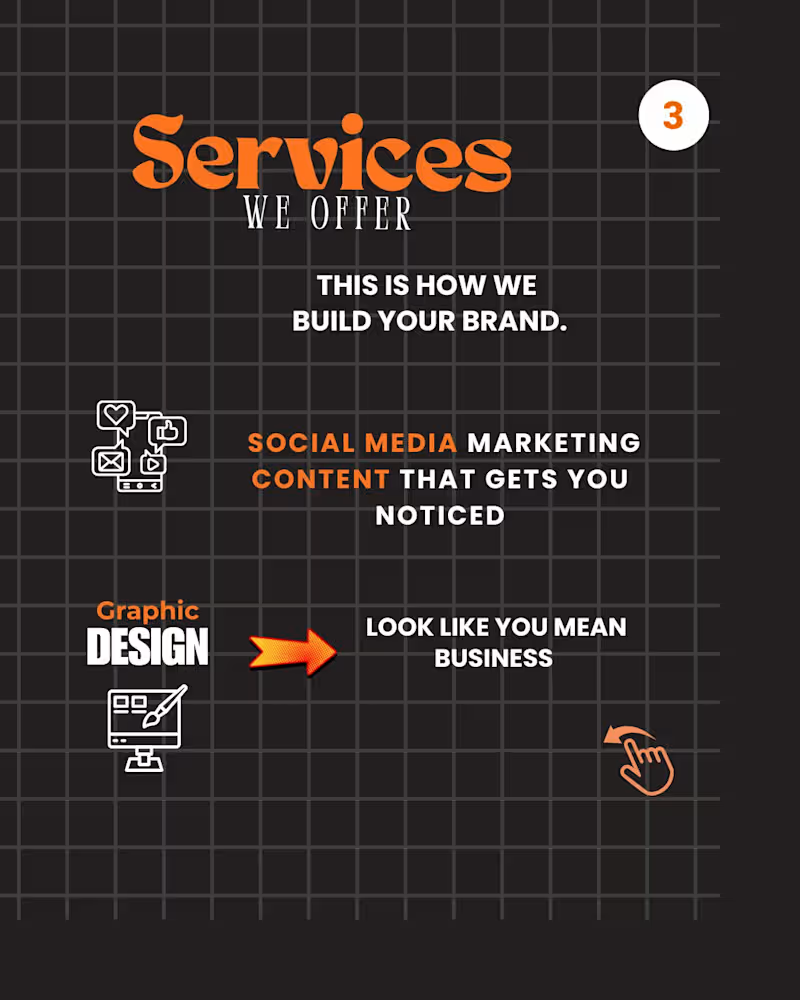
Project Title: Strategic Visual Storytelling – Brand Awareness & Engagement Campaign The Design Challenge: The objective of this project was to create a high-impact social media campaign for Bug Folio. The goal was to move beyond "pretty pictures" and develop a visual narrative that addresses core business pain points—specifically the high cost of a weak brand identity and the lack of digital trust. My Creative Approach: As the Lead Graphic Designer on this project, I focused on a "Minimalist-Bold" aesthetic to ensure the message was the hero. My process involved: Visual Hierarchy: Utilizing high-contrast typography to draw the eye immediately to key phrases like "Your Brand EXISTS" and "Weak Branding Costs You." Grid-Based Layouts: Implementing a structured dot-grid background (visible in the design) to maintain technical alignment and professional balance across all slides. Conceptual Illustration: Incorporating metaphors like the megaphone and hand-drawn doodles to humanize the brand while maintaining a "stop-the-scroll" quality. Psychology of Design: Using negative space strategically to ensure that complex information regarding social media presence and website conversion remained digestible for the audience. The Results: I delivered a cohesive set of educational carousels designed to convert viewers into leads. The final assets bridged the gap between brand strategy and visual execution, providing the client with a professional identity that builds instant authority in their niche.
1
47
0
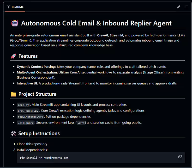
Taking corporate email automation beyond basic template generation. 🚀 I just open-sourced a new project: Autonomous Cold Email & Inbound Replier Agent! This is a modular, production-ready system built completely in pure Python using CrewAI for multi-agent orchestration and Streamlit for a clean, modern interactive UI. As shown in image_ea414f.png, the system moves away from single-prompt generation and splits the operational workload into specialized, sequential steps to ensure high-quality enterprise triage: Dynamic Context Parsing: Ingests dynamic company names, specific roles, and product offerings to craft completely personalized pitch assets based on an internal knowledge base. Multi-Agent Orchestration: Uses a CrewAI sequential flow to separate analysis from execution. A Triage Officer handles data categorization while a Business Correspondent handles context-aware drafting. 100% Free-Tier & Cost Compliance: Powered entirely by high-performance models via free-tier API orchestration (utilizing gemini-2.5-flash via Google AI Studio and Groq Cloud AI as a high-speed secondary model). Interactive UI Safety: Features a polished Streamlit interface (onee.py (http://onee.py)) to monitor active server queues and act as a human-in-the-loop gatekeeper to approve drafts before they go live. The repository is modularly structured, completely production-ready, and optimized with strict exception handling to respect rate limits safely. 🔗 Check out the code here: https://github.com/26FajarRizwan/Cold_Email_Replier_Agent #CrewAI #Streamlit #AIEngineering #Python #GenerativeAI #LLMs #OpenSource #Automation #GoogleGemini
0
59
Typographer
(3)
Follow
Message
Explore people