Freelancers in Piedmont
Sign Up
Post a job
Sign Up
Log In
Filters
1
Projects
People
Sergey Bertagnini
pro
Turin, Italy
Website Designer and Design Partner
$10k+
Earned
2x
Hired
327
Followers
expert
Expert
Follow
Message
Website Designer and Design Partner
2
Fleet Command UI — Interface Design for Multi-Drone Operations
2
66
12
Visitors don't have time to read. That's why I use 3D, motion and interaction to turn a hero section into an explanation. One scroll. One story. Zero confusion.
2
12
1.7K
6
Human-AI startup on product hunt asked me for a revamp Made in @Framer
5
6
1.6K
19
Overlander 3D website
19
93
Follow
Message
Sina Nourmousavi
pro
Turin, Italy
Framer Expert • Web Designer • AI Digital Designer
$1k+
Earned
2x
Hired
5.0
Rating
125
Followers
expert
Expert
Follow
Message
Framer Expert • Web Designer • AI Digital Designer
4
Gold geometric earrings under warm directional studio light. Profile, three-quarter, wind-blown hair, macro down to every wire. Grey backdrop, pore-level skin. Every frame generated through prompt engineering and creative direction.
4
4
463
13
New Framer template coming soon
6
13
590
3
Costume slider that loads from the CMS. WIP
3
318
15
I recently worked on a yoga studio website and had a great time exploring different tools to shape the visual atmosphere. The light rays were recreated in @Unicorn Studio , which allowed me to play with different effects and properties. Everything else, from layout to interactions, was built in @Framer This project was a good reminder of how combining the right tools can elevate even simple concepts. Experimenting, adjusting, and refining each detail made the process genuinely enjoyable.
10
15
658
Follow
Message
Sara Cudemo
pro
Turin, Italy
Brand Design | Web Design | Website Copywriting
5.0
Rating
32
Followers
expert
Follow
Message
Brand Design | Web Design | Website Copywriting
3
Not all donuts come out with a hole 🍩 It's an Italian saying: "Non tutte le ciambelle escono con il buco." It means not everything turns out as planned. And sometimes that's exactly what needs to happen. I presented this new identity. Every detail intentional. I so was proud. Then silence. "We love it. BUT..." That BUT was the turning point. They realized something I hadn't seen. It looked polished. It felt modern. But it didn't feel like them. And, they were right. I had given them what they asked for, not what they needed. So we restarted. Still, I loved this brand identity so much that it felt wrong not to share it. Key lesson: great branding is being willing to let go of what you like and finding what actually works.
3
3
114
16
Spent extra time polishing every detail on this homepage. I focused on strategy and clear, simple content. And on design that feels clean but engaging. No flashy animations. No effects that distract or slow the page. Just subtle motion to keep visitors interested. Everything supports one goal: help people understand, and then act. Here’s what happened: - People spend 2x more time on the page - 10% of visitors take real action - 4+ qualified leads come in every day Full walkthrough in the video. What do you think? Drop your thoughts 👇 P.S. If you need a website that performs and still looks premium, DM me. Open for Feb–Mar projects.
16
223
3
Not every project needs a full brand identity. Sometimes founders just need something simple to get started. This is Drommer, a business lab where founders test and build sustainable ideas together. They are still in the early stages. But now they can talk to customers and investors with confidence. A clear and professional identity does that. I personally love how it turned out. What do you think?
2
3
152
0
Lorenzo's new Brand Identity and Website
0
15
Follow
Message
Gabriele Mo
Turin, Italy
Rive Animator & Brand Designer
5.0
Rating
56
Followers
expert
Follow
Message
Rive Animator & Brand Designer
2
Most UI icons are static. But interfaces don’t have to be! I’ve been experimenting with a set of interactive icons built with Rive that respond to hover and click, creating subtle micro-interactions that improve feedback and usability. Small interaction details like these can make digital products feel significantly more polished and intuitive. Curious to hear your thoughts!
2
244
3
My Rive Projects
3
92
0
Hot Cut - Case study
0
20
2
Group Nexus - Case study
2
17
Follow
Message
Chiara Arcostanzo
Turin, Italy
Art Director & AI Creative
75
Followers
Follow
Message
Art Director & AI Creative
15
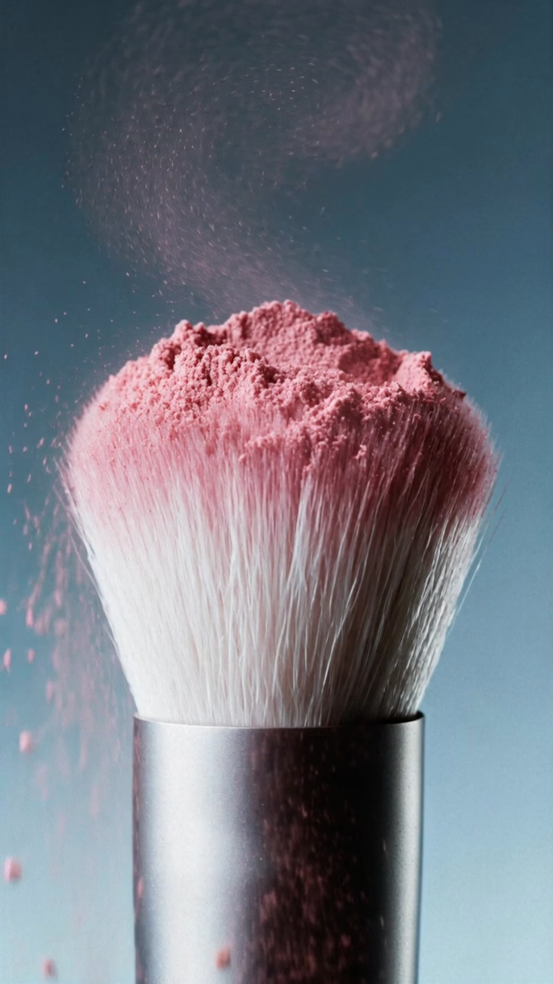
A campaign is a set that holds together. I built a small beauty texture series: brush, blush, pencil, lipstick. Same coral-on-teal palette, same light across all four, so it reads as one system. Stills and animation were both developed in Magnific (https://www.linkedin.com/company/magnific/), then edited in Adobe (https://www.linkedin.com/company/adobe/). It is texture content that a beauty brand could drop straight into social, e-commerce or a campaign, or use to pre-visualise a direction before committing to a shoot. If you're a beauty brand, or an agency working with one, and this is the kind of content you need, let's talk www.chiaraarcostanzo.com (http://www.chiaraarcostanzo.com) 📬
2
15
256
23
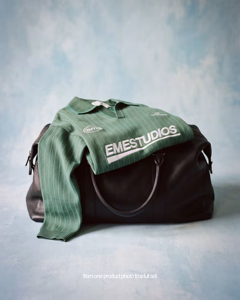
A full shoot, built from a single product photo. I started with one flat e-commerce packshot, the same asset any brand already has, and built the rest: fabric detail, styling, and the product worn, on two models, across front, profile and back. One coherent world, one locked direction. It works two ways: as pre-production, to explore several directions before a shoot and decide with something real in front of you, and as final, campaign-ready visuals for social and e-commerce, refined down to the detail. And it scales in every direction: more products and full looks, several models in a single frame, different sets and moods from the same starting assets, and motion. Find out more at https://lnkd.in/eXN3mFQE (https://lnkd.in/eXN3mFQE)Self-initiated project on EME STUDIOS (https://www.linkedin.com/company/eme-studios/) pieces, not affiliated. I’m closing my calendar for the coming month. If this could fit your brand, my inbox is open 📬
13
23
781
20
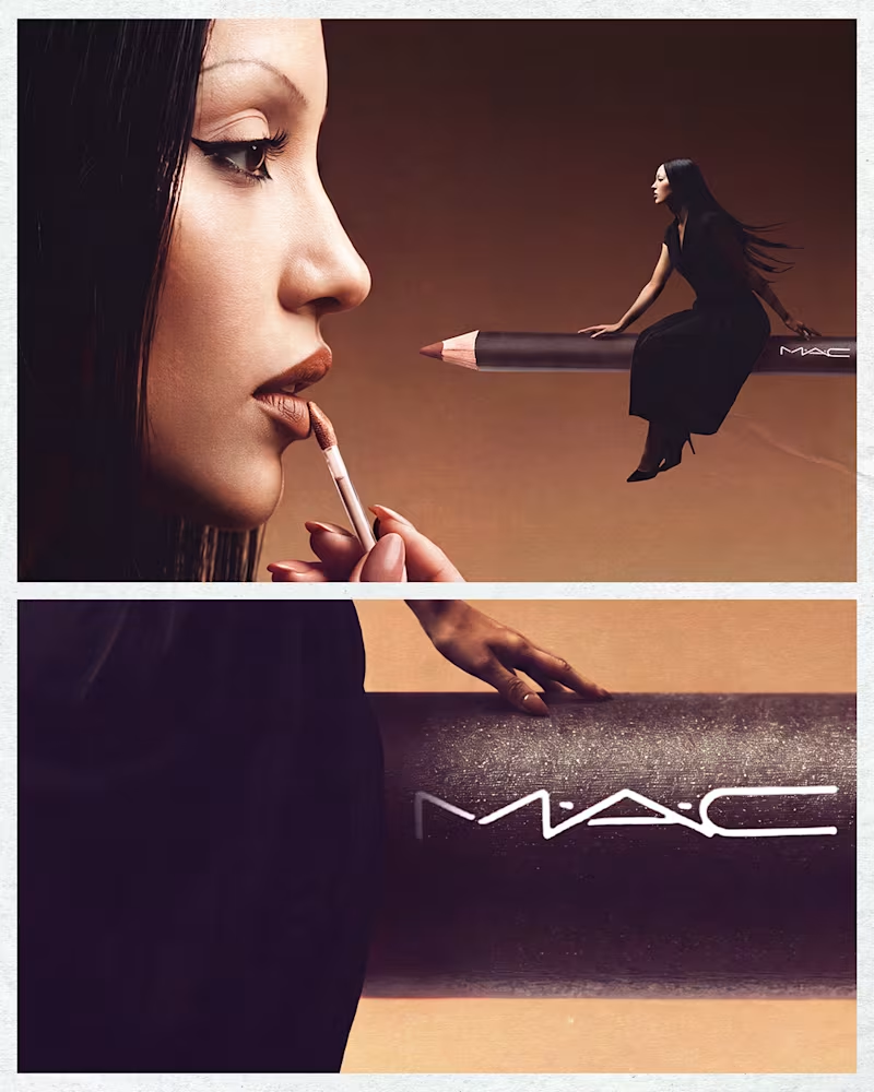
A self-initiated exploration of how AI-driven visuals can expand the range of beauty assets available to a brand, starting from clean studio-style references and pushing them into more editorial, surreal territory while keeping product and character consistency across the full set. Workflow: Base images built in Flora using a node-based setup. One node for the master composition, additional nodes for scale variants, detailcrops, and the studio-reference version. Character, makeup and lighting kept consistent across the set through the same reference chain. Final color, retouch and finishing in the Adobe suite. Personal project, not affiliated with the brand.
10
20
657
19
IKEA — Lighting up your best dreams AI-generated campaign concept Full creative direction and image production for a personal IKEA campaign concept: from prompt engineering to final retouch. The idea: a sleeping figure in a set built half like a bedroom, half like a stage, where light does most of the storytelling, shifting from near-darkness to a warm sunrise-like glow, as if dawn were happening just out of frame. I handled the full pipeline: prompt engineering and art direction in Claude, image production in Flora with Nano Banana Pro, post-production in Adobe Photoshop and Lightroom. From the hero shot, I also generated a coherent set of product-level close-ups using the same prompt and source image, same light, same mood, no separate shoot required. Personal concept, not affiliated with the brand.
14
19
1.1K
Follow
Message
Gabriel Brando Naretto
Turin, Italy
Automotive Concept Designer crafting iconic vehicles.
$5k+
Earned
2x
Hired
5.0
Rating
36
Followers
Follow
Message
Automotive Concept Designer crafting iconic vehicles.
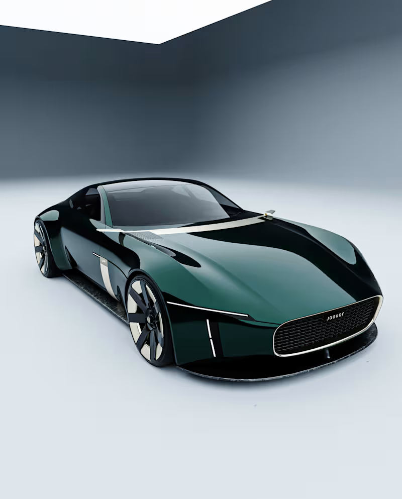
1
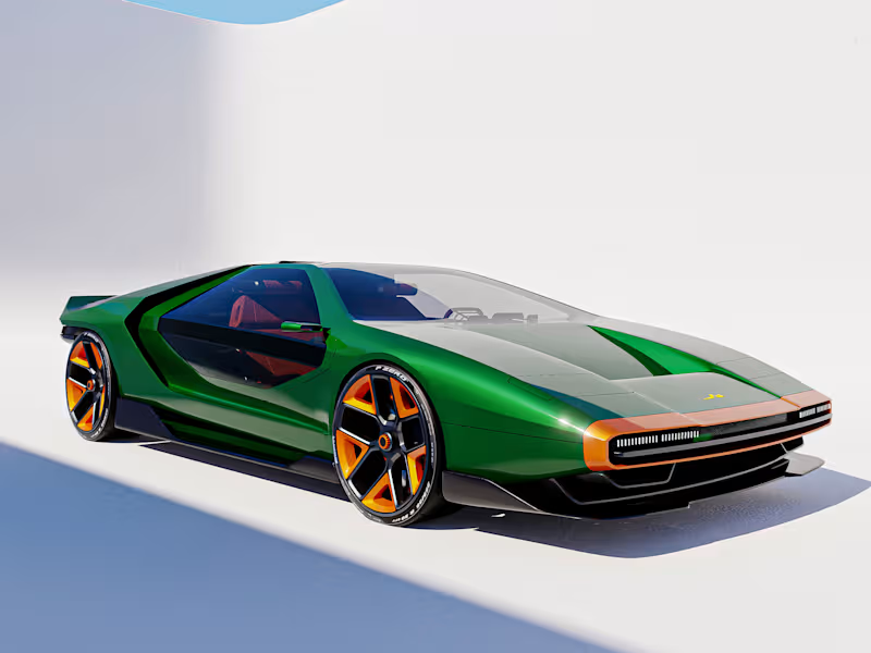
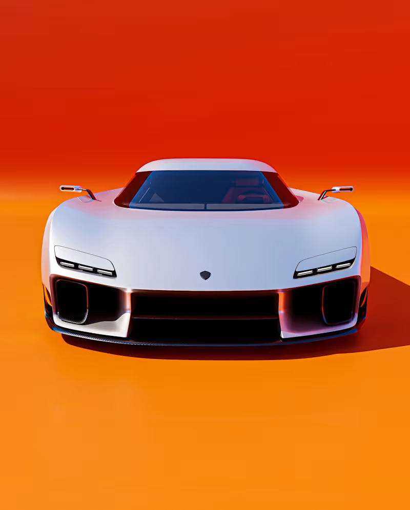
Koenigsegg Eidos
1
8
2
Jaguar Type T Concept
2
16
2
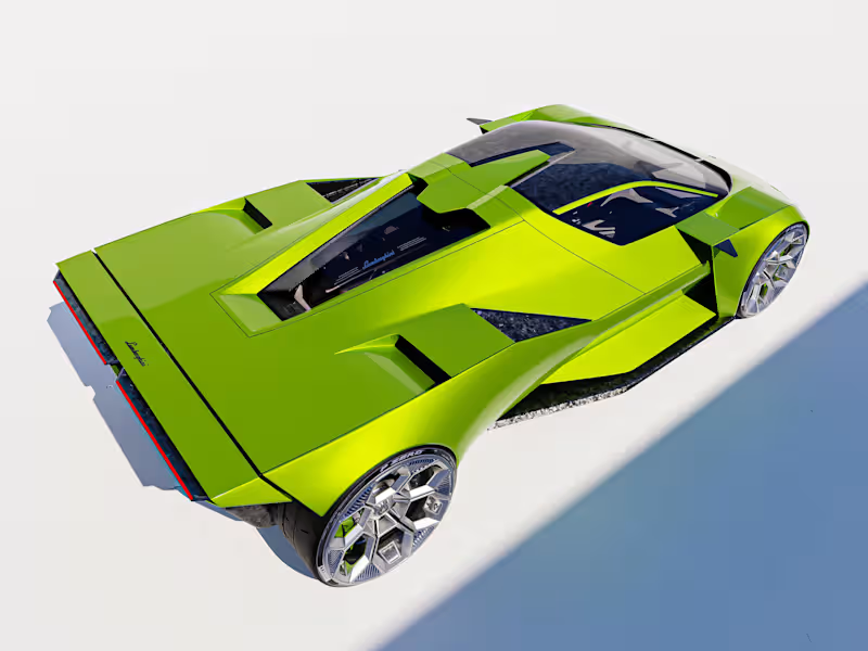
Lamborghini Vettore V12 - Gabriel Naretto
2
14
1
Project Eterna
1
13
Follow
Message
Eric Trovò
pro
Turin, Italy
Brand identity for founders who need to look credible, fast.
Follow
Message
Brand identity for founders who need to look credible, fast.
1
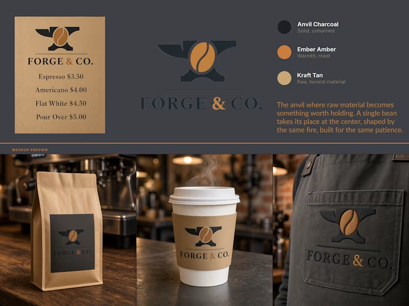
Forge & Co - Brand Identity A coffee roastery identity built on a single idea: the fire that shapes metal is the same fire that roasts a bean. Forge & Co needed a mark that earned its name instead of just wearing it. The brief was a brand for a small-batch coffee roaster with a blacksmithing angle in its backstory, and most routes toward that end up either literal "hammer and mug, done to death" or decorative "metal textures slapped on packaging with no reason behind them". The solve: an anvil as the container, a coffee bean at its center. Same fire, same patience, same idea of raw material becoming something worth holding, told through one symbol instead of two competing ones. Palette stays in that register. Anvil Charcoal for the base, Ember Amber for warmth and roast, Kraft Tan for raw, honest material, nothing glossy or overdesigned. Applied across packaging, cup sleeve, and apron, the mark holds up at a half inch or across a storefront without losing the idea.
1
60
0
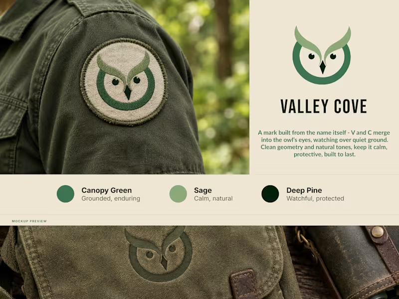
New brand mark - Valley Cove. Built it straight from the name: the V and C merge into the owl’s eyes. Canopy Green, Sage, Deep Pine. Feels grounded, calm and solid. Works stitched as a patch, works debossed into leather. Had to hold up both ways, so I designed it to. Opinions?
0
61
3
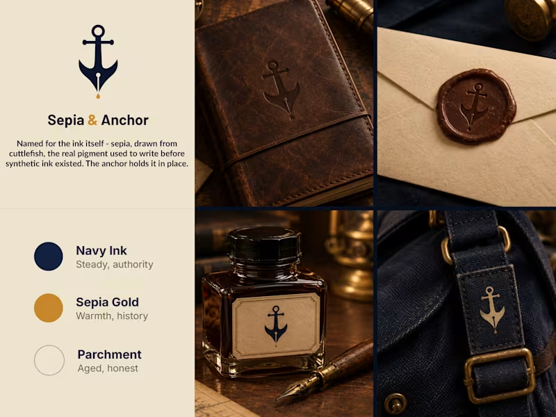
Sepia & Anchor - Brand Identity for a Stationery & Correspondence Co. Introducing the brand identity for Sepia & Anchor, a stationery and correspondence brand built around a single historical fact: sepia ink was once drawn from real cuttlefish, long before synthetic ink existed. The anchor holds it steady. This brand sheet features a navy, gold, and parchment palette applied across real materials - embossed leather journal, wax-sealed envelope, the ink bottle label itself, and a canvas bag tag - showing how one mark and one story carry consistently across every surface a correspondence brand actually touches. Brand Highlights: - Embossed leather journal cover - Wax seal with the anchor mark - Ink bottle label design - Canvas bag tag application - Navy, sepia gold, and parchment palette - Concept-driven mark tied to the brand’s real namesake Brand Name: Sepia & Anchor Industry: Stationery & Correspondence Tagline: Written to last.
2
3
202
0
AI Image Enhancement — Raw to Brand-Ready
0
450
Follow
Message
Tina Sirakova
Turin, Italy
Architect | Interior Designer | Senior AI Creative
60
Followers
Expert
Follow
Message
Architect | Interior Designer | Senior AI Creative
18
Furniture Brand Interior Editorials | FLORA A series of interior visuals developed fully through AI for a well-known 125-year-old NYC-based home & furniture brand. Complex editorial environments built through structured generative workflow systems - balancing atmosphere, material accuracy, composition, lighting, and product density across every scene ✨
9
18
475
31
Interior Design Renovation | Weavy What started as an outdated bedroom filled with old furniture was transformed into a fresh, modern design - all while preserving accurate geometries and incorporating style references shaped around the client’s needs. 💡 Step 1: Clearing the existing space 🎨 Step 2: Rebuilding the room with the new interior design 📐 Step 3: Producing technical drawings ⚡️ Step 4: Creating a 360° walkthrough video The full transformation was developed in Weavy: from capturing existing conditions → to redesign → to technical documentation → to immersive visualization 🪄
2
31
665
36
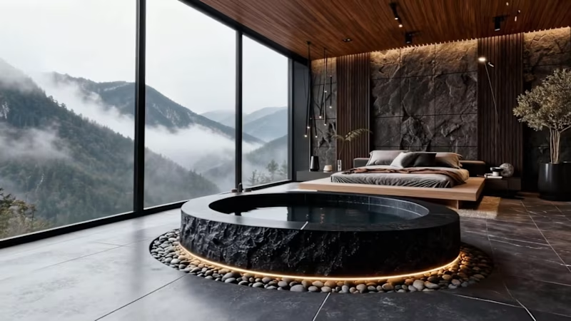
Mountain Retreat Room Concept | FLORA Contemporary comfort rooted in nature - located in the mountains, this hotel room blends stone, marble, wood, and glass into a grounding atmosphere. A palette of gray, charcoal, and matte black mirrors the surrounding landscape, while natural light floods the space through large openings. Diffuse accent lighting softens the edges, revealing the textures of the materials and creating a quiet balance between rugged and refined 💫
5
36
836
22
Dior Storefront Facade | ComfyUI → Runway → Krea Reimagined with floral elements and organic forms - an exploration of how natural shapes can merge with high-end retail architecture. Balancing elegance, minimalism and a touch of futurism, the concept blends reality with surreal elements to create a photorealistic yet dreamlike boutique that integrates into its urban environment while still standing out as a statement piece 🌸
22
623
Follow
Message
Explore people