The network for creativity
Join 1.25M professional creatives like you
Connect with clients, get discovered, and run your business 100% commission-free
Creatives on Contra have earned over $150M and we are just getting started
Back to feedPost

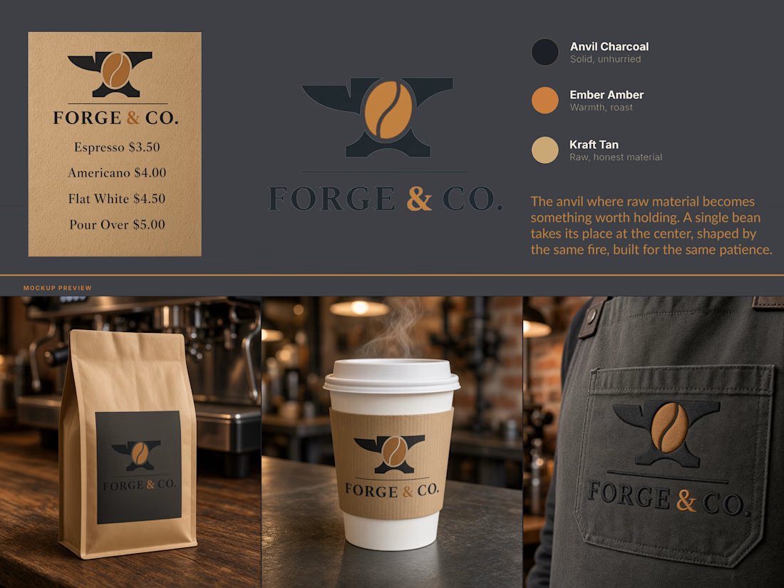
Forge & Co - Brand Identity
A coffee roastery identity built on a single idea: the fire that shapes metal is the same fire that roasts a bean.
Forge & Co needed a mark that earned its name instead of just wearing it. The brief was a brand for a small-batch coffee roaster with a blacksmithing angle in its backstory, and most routes toward that end up either literal "hammer and mug, done to death" or decorative "metal textures slapped on packaging with no reason behind them".
The solve: an anvil as the container, a coffee bean at its center. Same fire, same patience, same idea of raw material becoming something worth holding, told through one symbol instead of two competing ones.
Palette stays in that register. Anvil Charcoal for the base, Ember Amber for warmth and roast, Kraft Tan for raw, honest material, nothing glossy or overdesigned. Applied across packaging, cup sleeve, and apron, the mark holds up at a half inch or across a storefront without losing the idea.


The network for creativity
Join 1.25M professional creatives like you
Connect with clients, get discovered, and run your business 100% commission-free
Creatives on Contra have earned over $150M and we are just getting started



Related posts

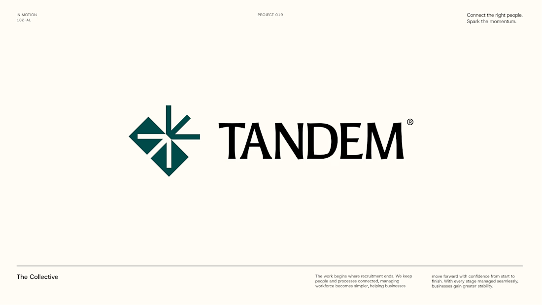
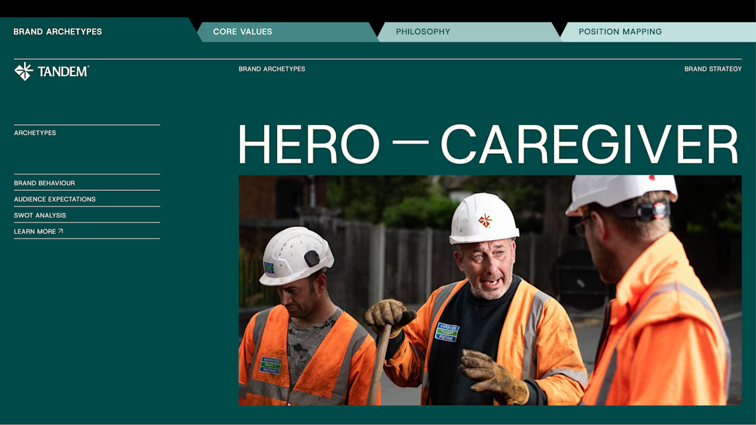
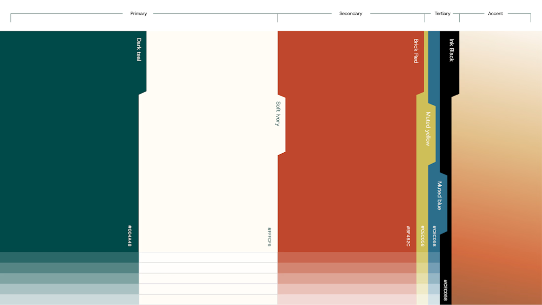
Wrapping up another brand identity project for a workforce management company.
We're currently putting together the full case study, but here's an early look at some of the visuals. Really pleased with how this one has come together!
We explored several distinct creative directions before arriving at the final identity. And there's plenty of interesting work that didn't make the cut.
While we prepare the full case study, I'm thinking of sharing some of those rejected directions and the thinking behind them.
Would you be interested in seeing what didn't make it?


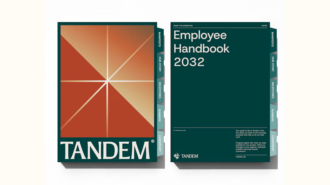


Good branding isn’t just about how a logo looks. It’s about what it represents.
Sharing one of our recent projects: NEXU, a fintech brand identity built around connection, trust, and opportunity.
The idea was to create a visual identity that makes finance feel more human and approachable. The symbol brings together the gesture of reaching out and the strength of a bridge, representing the connection between people, capital, and opportunity.
From the logo concept to the broader visual identity, every detail was designed to communicate confidence, clarity, and progress.
It’s always rewarding to see how a simple visual idea can tell a much bigger story.
Would love to hear what you think!
Check it out
#BrandIdentity #LogoDesign #Fintech #BrandDesign #ContraCommunity

Fantastic work

HealthSense Brand Identity
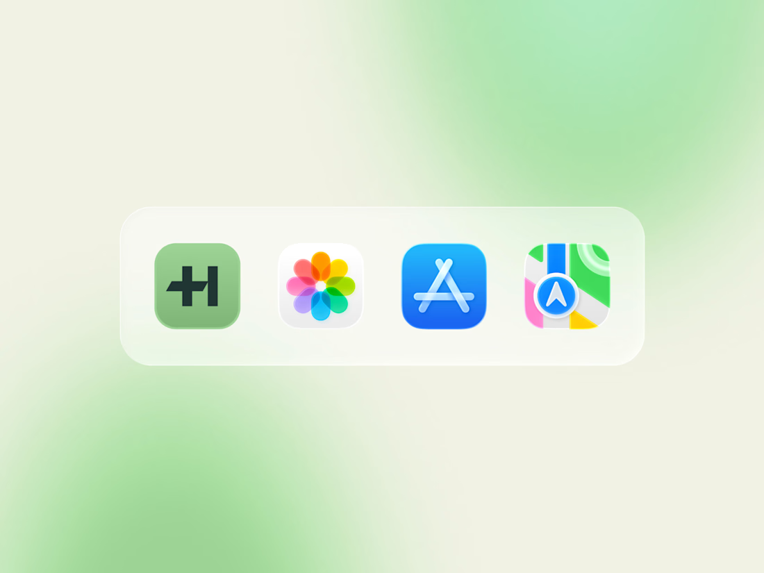
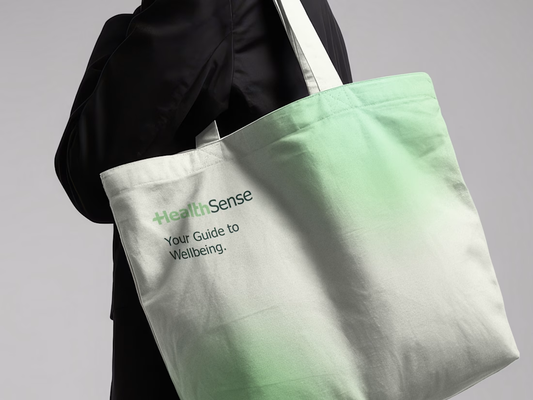
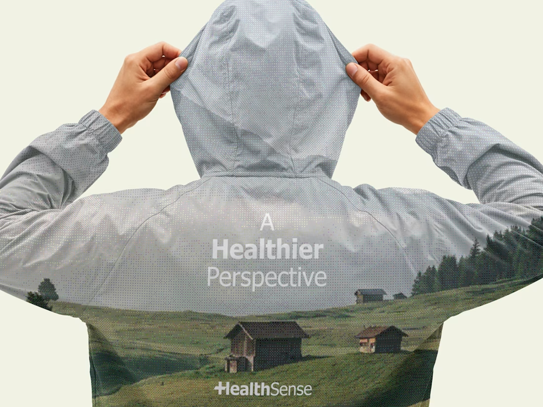
A brand identity project I worked on in March 2026 for HealthSense, a Singapore-based health and wellness information brand focused on making health knowledge clear, accessible, and easy to understand.
The client envisioned something simple, clean, and modern, but with meaning behind it. I explored a minimal wordmark with a medical cross integrated into the lettering, creating a direct connection to healthcare while keeping the identity clear, professional, and memorable.



Great brand identity 🎉🎉


