
pro
Eric Trovò
Brand identity for founders who need to look credible, fast.
- 12
- Followers


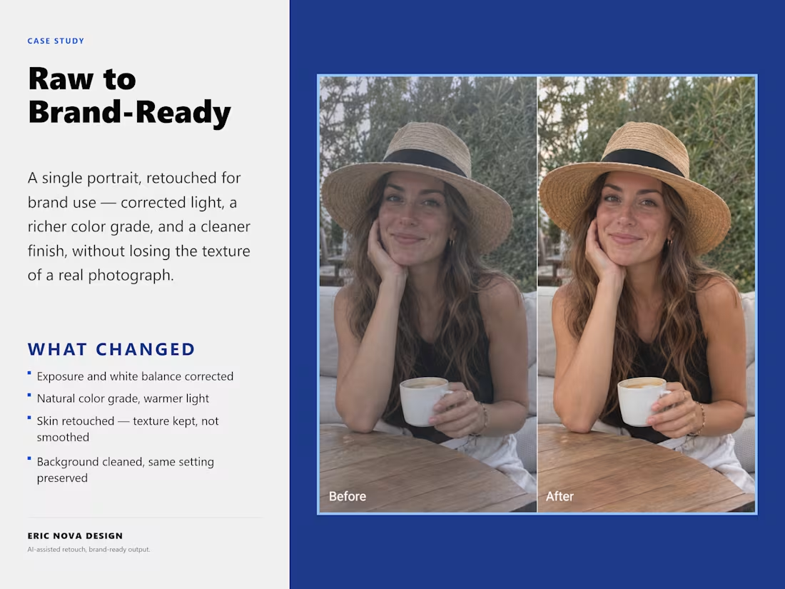
AI Image Enhancement - Raw to Brand-Ready
0
3
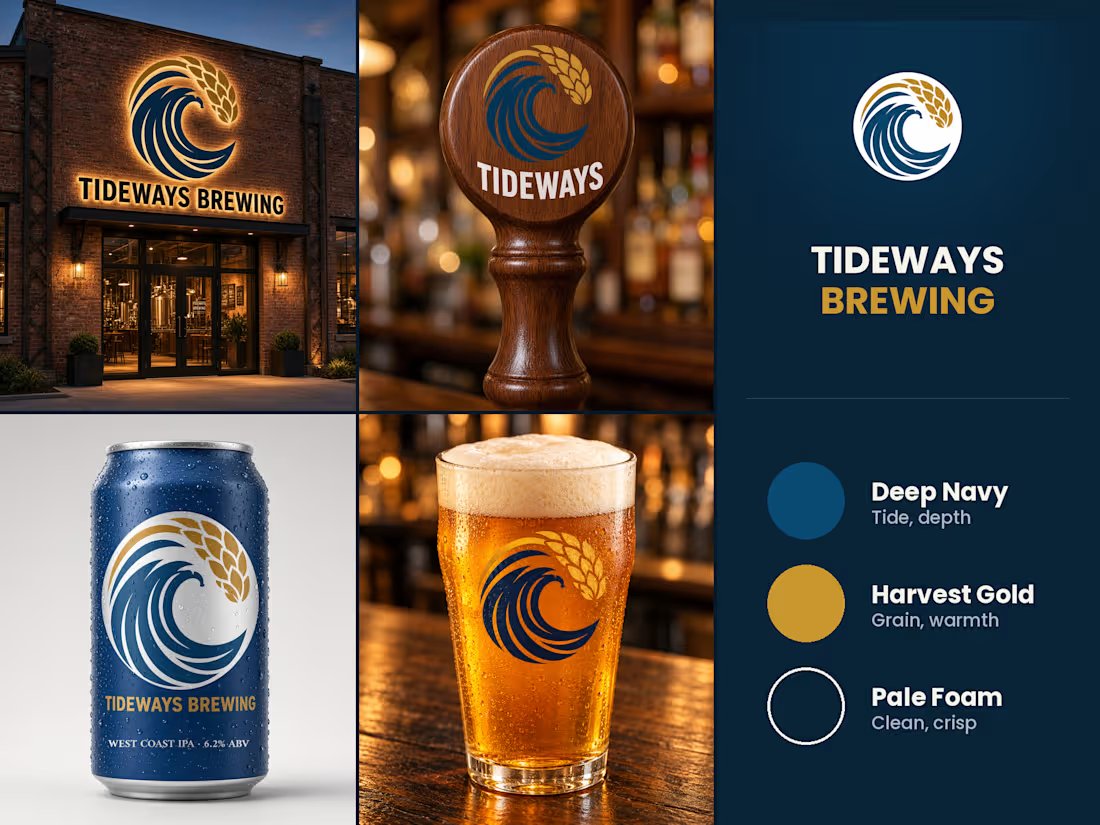
Tideways Brewing - Wave & Wheat, One Mark
0
3
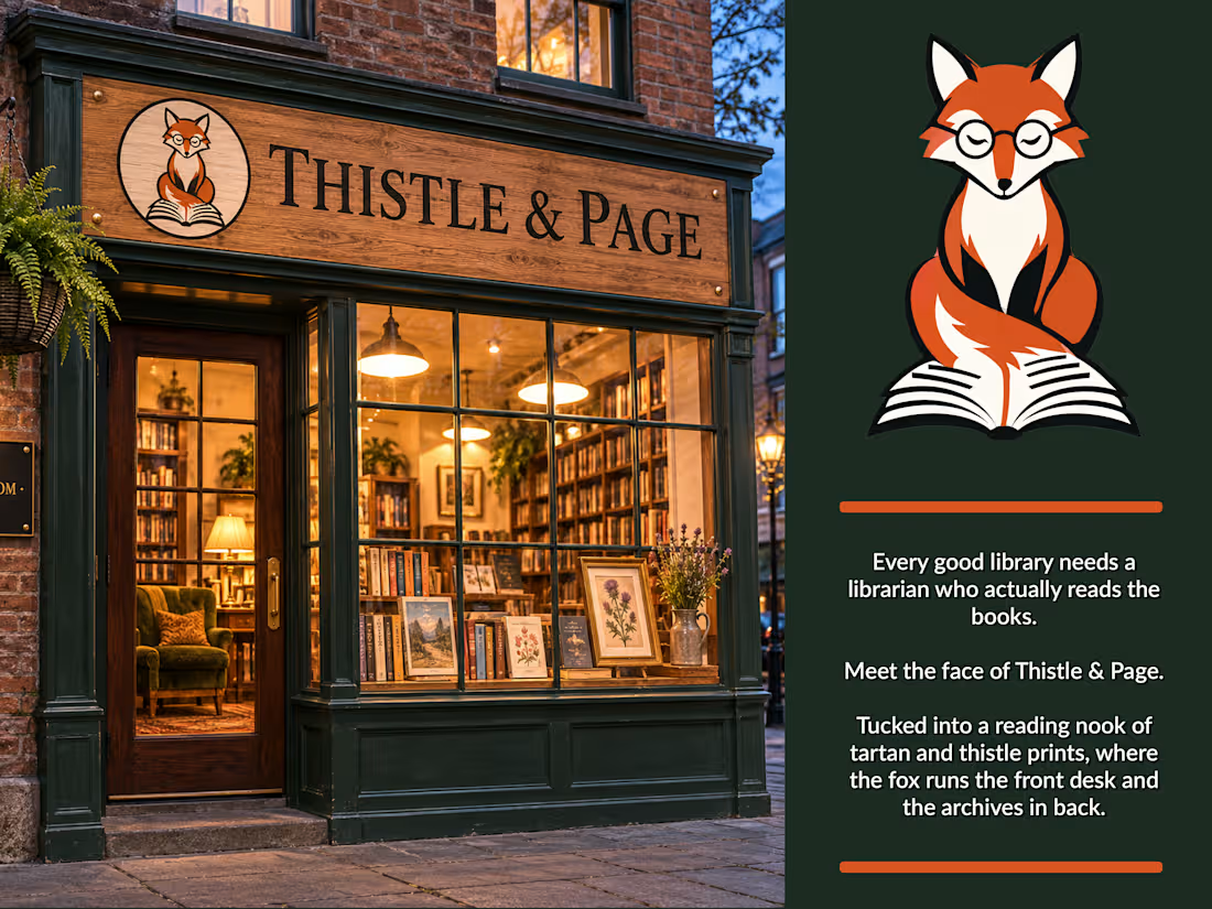
Brand mascot design - Thistle & Page
A character mark built for a boutique bookshop/library concept, designed to carry the brand across signage, print, and digital touchpoints.
The brief: a mascot that feels literary without being twee, warm enough for signage, clean enough to scale down to a favicon. The fox-with-glasses motif nods to the “quiet scholar” archetype, paired with an open book that doubles as a stable base shape across sizes.
Deliverables: primary mark, circular badge variant (for physical signage/stamps), and a mock storefront application to show the system in context.
Open to brand identity work for cafés, bookshops, boutique retail, and other character-driven concepts - see portfolio for more.
2
378
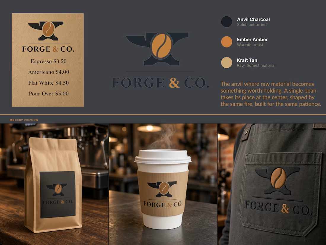
Forge & Co - Brand Identity
A coffee roastery identity built on a single idea: the fire that shapes metal is the same fire that roasts a bean.
Forge & Co needed a mark that earned its name instead of just wearing it. The brief was a brand for a small-batch coffee roaster with a blacksmithing angle in its backstory, and most routes toward that end up either literal "hammer and mug, done to death" or decorative "metal textures slapped on packaging with no reason behind them".
The solve: an anvil as the container, a coffee bean at its center. Same fire, same patience, same idea of raw material becoming something worth holding, told through one symbol instead of two competing ones.
Palette stays in that register. Anvil Charcoal for the base, Ember Amber for warmth and roast, Kraft Tan for raw, honest material, nothing glossy or overdesigned. Applied across packaging, cup sleeve, and apron, the mark holds up at a half inch or across a storefront without losing the idea.
2
353