pro
Eric Trovò
Brand identity for founders who need to look credible, fast.
- 12
- Followers


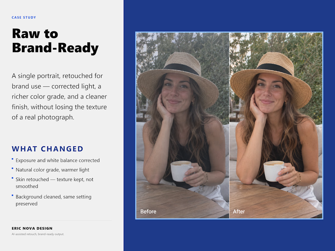
A raw portrait taken to brand-ready: corrected light, richer color grade, retouched skin, texture kept, not smoothed, background cleaned.

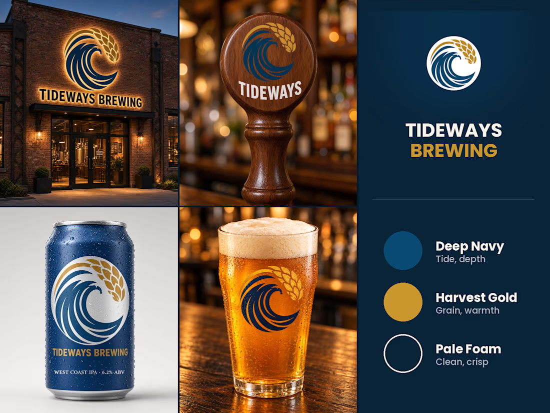
Built this for Tideways Brewing - a wave and a stalk of wheat folding into one mark, a full West Coast IPA brand built around it.
Took it past the logo: signage on the building, a tap handle, the can, the pour. Same mark holds up lit up at night, carved into wood, wrapped around a can, printed on glass.
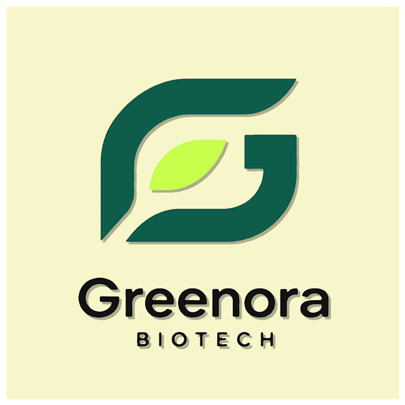
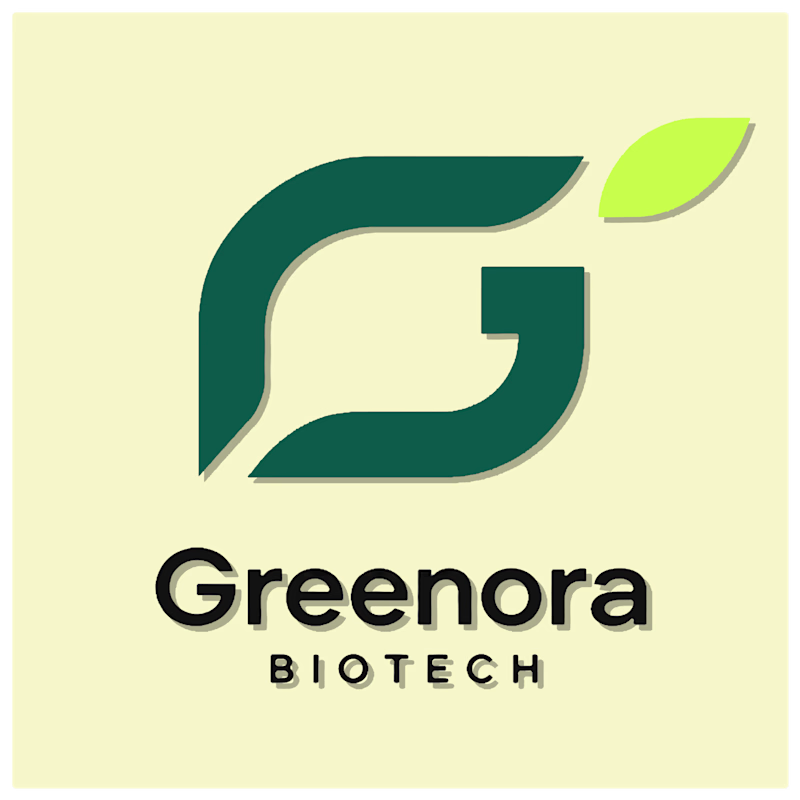
Two directions for a biotech logo. Same mark, one small addition.
- Option A folds the leaf directly into the G’s lower curve, so the two shapes share a single stroke instead of sitting side by side.
- Option B tucks a leaf into the negative space above the G, nodding to the...
3 voted
75%
1 voted
25%
4 votes
Closed
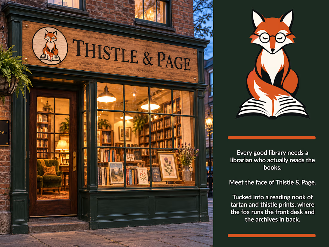
Brand mascot design - Thistle & Page
A character mark built for a boutique bookshop/library concept, designed to carry the brand across signage, print, and digital touchpoints.
The brief: a mascot that feels literary without being twee, warm enough for signage, clean enough to...

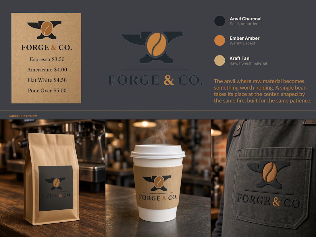
Forge & Co - Brand Identity
A coffee roastery identity built on a single idea: the fire that shapes metal is the same fire that roasts a bean.
Forge & Co needed a mark that earned its name instead of just wearing it. The brief was a brand for a small-batch coffee roaster with a...